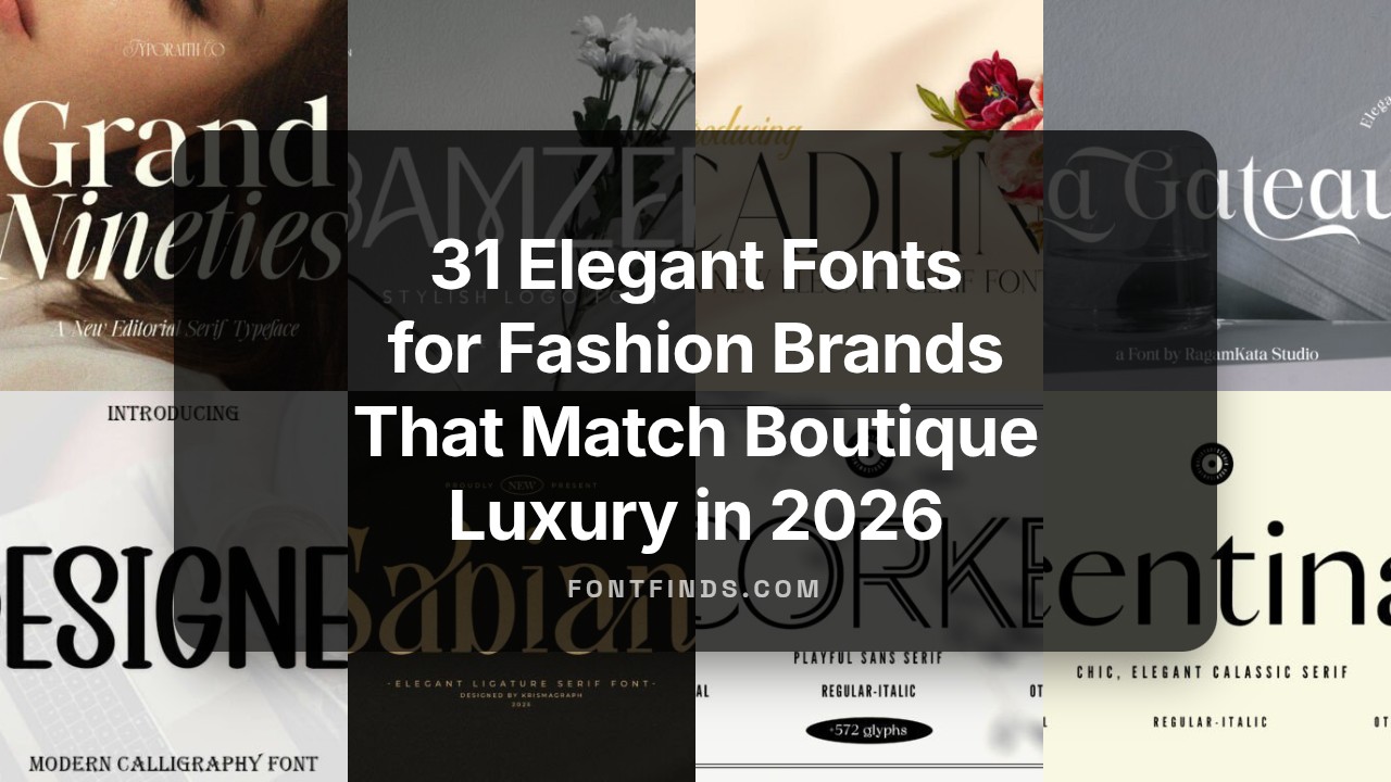
31 Elegant Fonts for Fashion Brands That Match Boutique Luxury in 2026
Fonts for fashion brands are the visual handshake that sets mood before a customer reads a single word. Typeface choice signals whether a label is modern, vintage, playful or luxe.
This article groups 31 curated type options – serif, sans, display and script – with quick notes on pairing, weights and ideal uses for hang tags, editorial spreads and ecommerce. Expect short examples and practical tips to help you pick a clear voice for your collection.
1. Grand Nineties Font
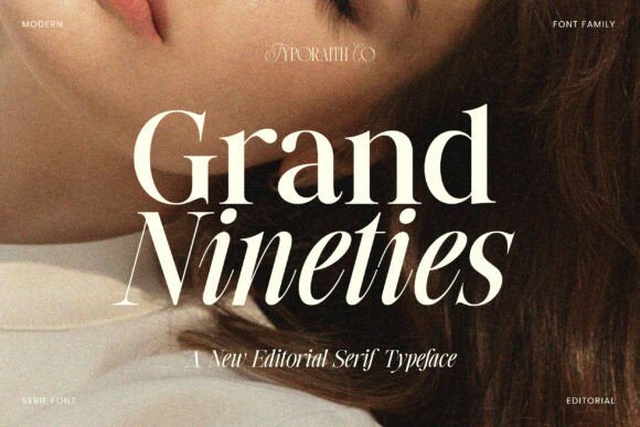
Grand Nineties is a modern editorial serif that channels the typography of high-fashion magazines with a poised, premium voice. Its refined serifs, long italics, and balanced proportions create a readable yet decorative look suited for mastheads, luxury packaging, and brandmarks. Grand Nineties ranks among the best Fonts for fashion brands for projects that need a distinct editorial presence and memorable letterforms.
Technically it pairs generous counters with precise stroke modulation, which keeps headlines crisp at large sizes while offering personality in tighter layouts. Thoughtful kerning, optional ligatures, and multiple weights make it easy to craft a cohesive identity across print and digital touchpoints when combined with a neutral sans for supporting copy.
╰┈➤ Download Grand Nineties Font
My Recommendation: I reach for Grand Nineties when a brief asks for refined glamour without resorting to cliché script faces. Its italics and ligature options let you suggest couture handwriting while remaining type-driven, so logos, perfume labels, and magazine covers all benefit. Use it where you want a fashion-forward editorial tone that still feels dependable across formats.
2. Cadline Serif Font
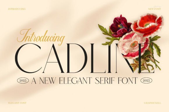
Cadline Serif is built for bold headlines and strong brand statements: crisp terminals, defined stems, and a clean stroke contrast create an authoritative look that reads well on covers and signage. The design balances presence with legibility, so large display settings retain clarity without feeling heavy. This makes Cadline a reliable choice for packaging, posters, and logo work that demands visual gravity.
Spacing and weight options allow tight typographic control, while multilingual support makes it practical for international releases. For calmer editorial grids pair Cadline with a geometric sans to soften the page and maintain hierarchy between titles and body text.
╰┈➤ Download Cadline Serif Font
My Recommendation: I recommend Cadline when a client needs typography that clearly declares a brand’s confidence-storefronts, editorial covers, or modern product packaging are ideal. Its sharp strokes give names weight and ensure headlines cut through busy layouts. Pair it with a neutral sans for long copy to keep the overall design crisp and readable.
3. Jenura Serif Font
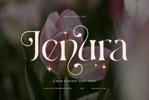
Jenura Stylish Serif favors slender serifs, expressive alternates, and graceful curves to deliver a refined fashion sensibility. High-contrast letterforms and decorative ligatures let headlines and logos feel bespoke without bespoke lettering. The face works well for boutique identities, premium packaging, and editorial headlines that need personality with restraint.
Use alternates selectively to create signature words, and allow generous tracking for longer display lines to preserve legibility. Jenura complements minimalist sans serifs in body copy and performs beautifully in close-knit layouts like lookbooks, label art, and hero titles where detail counts.
╰┈➤ Download Jenura Serif Font
My Recommendation: I choose Jenura when the brief asks for a handcrafted, editorial edge that still reads as polished. Its alternates and ligatures deliver distinct wordmarks quickly, which is great for boutique branding and limited-run packaging. Use it for fashion lookbooks, boutique logos, and advertising where a refined, decorative serif will carry the visual story.
4. The Nostalgic Remain Font
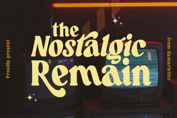
The Nostalgic Remain reimagines old-style serif letterforms with cleaner proportions and subtle contrast, offering a voice that reads archival yet current. Its gently bracketed serifs and tapered terminals give headlines an elegant cadence while the italics add a quiet, handcrafted flair. When selecting Fonts for fashion brands , this face lends couture personality to logotypes, editorial covers, and luxury packaging without tipping into pastiche.
Small caps, discretionary ligatures, and a balanced weight range let it function across display and longer-form applications; opt for the heavier weights for packaging and the lighter ones for refined editorial headings. Give it generous tracking at large sizes to let the serifs sing, and use slightly tighter spacing for dense text to maintain flow. On textured paper or embossed foil, its stroke modulation reads beautifully and rewards tactile production choices.
╰┈➤ Download The Nostalgic Remain Font
My Recommendation: I pick The Nostalgic Remain when a label needs to feel storied and meticulous-think heritage ready-to-wear, artisanal perfume, or premium stationery. Its alternates and small caps make monograms and logotypes feel handcrafted without being ornamental. Use it where history and refinement should be obvious at a glance.
5. Corke Font
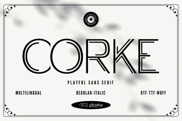
Corke Font pares forms down to geometric clarity, presenting a clean grotesque skeleton softened by rounded corners to prevent a sterile feel. Open counters and a solid x-height ensure legibility even at small sizes, while angled terminals and distinct strokes give headlines a modern, assured character. The family’s range of weights and condensed cuts suits interfaces, signage, and crisp editorial layouts that demand clarity and restraint.
For logos, try tightened uppercase tracking; for UI elements, allow a bit more breathing room to improve tap targets and readability. Numerals are well-proportioned for product grids and price displays, which is handy for lookbooks and e-commerce listings. Pair Corke with a textured or old-style serif to introduce warmth, or let it lead a minimalist identity for contemporary ready-to-wear labels.
My Recommendation: I reach for Corke when a brand needs a neutral but characterful sans that performs across screen and print. It’s reliable for catalogues, web shops, and modern retail signage because of its clean forms and generous hinting. Use it when clarity is paramount but you still want a distinct typographic voice.
6. Designer Font
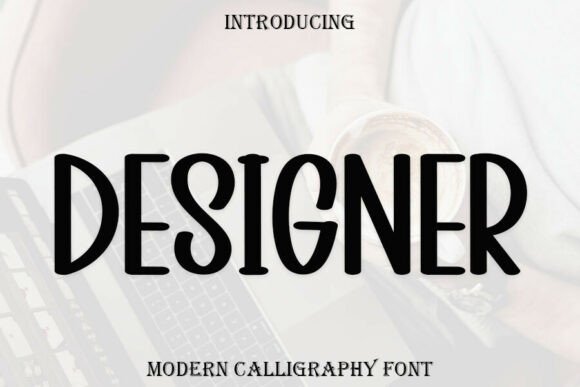
Designer Font is a tall, calligraphic display face that merges brush-like rhythms with disciplined proportions to create a high-fashion presence. Long ascenders, compact counters, and optional swashes produce headline shapes that read intentional rather than decorative, making it a strong choice for mastheads or signature logotypes. The crafted alternates and ligatures give each wordhand a bespoke, editorial feel appropriate for couture communications.
Allow ample white space around set pieces and avoid reducing it below display sizes-the subtle details live in scale and negative space. Combine it with a roomy serif for extended copy to establish clear hierarchy, or contrast it against a neutral grotesque for modern brand systems. Thoughtful use of alternates will reward you with bespoke marks for packaging and limited-edition campaigns.
My Recommendation: I’d use Designer Font when a project needs a refined, signature-led look-bridal houses, boutique labels, and fragrance launches are ideal fits. Treat it as a headline or logo tool rather than body text, and exploit alternates for bespoke wordmarks. It creates memorable, upscale touches without excessive ornamentation.
7. Arnold Script Font
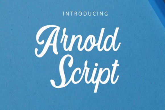
Arnold Script is a bold script face built around sinuous curves and expressive stroke endings that read most clearly at headline scale. Its heavy appearance and generous terminals give logos and packaging a couture attitude, making it a strong pick for brand marks, invitation headlines and editorial covers; designers building Fonts for fashion brands will appreciate the alternate glyphs and ligature set for creating signature wordmarks. The letterforms strike a balance between hand-written gesture and controlled silhouette, so short phrases keep a crafted, high-end presence without feeling fussy.
On the production side, extensive OpenType features-contextual alternates, discretionary ligatures and tightened kerning-make refinement straightforward when tuning single-word logos or stacked titles. It performs best when used sparingly as a focal element: shopfronts, hangtags, hero headers and limited-edition labels where scale lets its flourishes breathe. For longer copy pair it with a neutral sans to avoid visual competition, and when printing choose textured stocks or foil to emphasize its tactile quality. The result reads like a practiced signature rather than casual script, which helps many fashion identities feel bespoke.
╰┈➤ Download Arnold Script Font
My Recommendation: I would choose Arnold Script when a project needs a confident signature that reads luxurious at a glance. Its alternates let me tweak the personality of a wordmark without redrawing letters, and it responds beautifully to foil, embossing or high-contrast photography. Use it as the primary typographic flourish for logos, invitations and hero art rather than for body text.
8. Garavintage Font
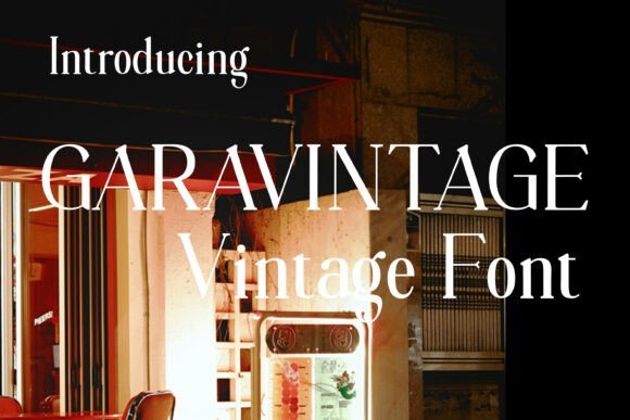
Garavintage Font channels old-style serif traits-softly bracketed serifs, modest contrast and carefully tapered strokes-that read as cultivated and timeless rather than ornamented. Those refined details give headlines and logotypes an artisanal couture feel that pairs naturally with tactile finishes such as letterpress, debossing and metallic foil. OpenType additions like small caps and contextual alternates expand typographic rhythm at large sizes, making it well suited for magazine mastheads, boutique packaging and elegant signage. Its display focus means the character of each serif is legible and resonant in single-line treatments.
When deployed in real projects Garavintage rewards scale: product labels, campaign headers and editorial spreads show off the subtle serif shaping, while smaller sizes may need optical adjustments to preserve stroke clarity. It pairs effectively with a clean geometric sans for modern contrast or with sparse photography that lets the type do the storytelling. The font is a strong choice when a brand wants an understated vintage voice without resorting to clichés, and it holds up across print and high-resolution digital applications.
My Recommendation: I reach for Garavintage when a brief calls for a refined, heritage-leaning identity-think lookbooks, boutique stationery and artisanal packaging. Its serif details work especially well with tactile production techniques like embossing and foil stamping, where the letterforms gain physical presence. Use it for display work where the serif shapes can register clearly and lend an authentic, polished tone.
9. Cal Font
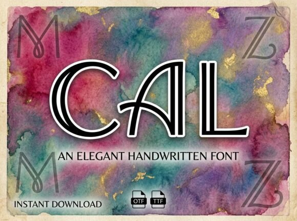
Cal Font presents a handwritten display voice with a distinctive inline or double-stroke construction that reads like a practiced signature rather than casual scrawl. Tall proportions, sweeping loops and a relaxed baseline produce vertical rhythm that suits boutique branding, perfume labels and editorial headers where an airy, human touch is desirable. The inline detail makes it ideal for layered color treatments-outline, fill and shadow can be separated to create depth without extra ornament. Its overall effect is personable and considered, giving wordmarks a handcrafted presence without appearing improvised.
From a technical angle Cal offers alternates and swash options that allow quick customization of logotypes without custom lettering, and it benefits from generous tracking and display-scale use so the inline motif remains visible. Pair it with a low-contrast serif or a neutral sans for longer copy to maintain hierarchy, and reserve it for headlines, logos and packaging where personality matters most. The font’s layered potential is especially useful for seasonal campaigns and limited runs where colorways and texture are part of the identity strategy.
My Recommendation: I choose Cal when I want a brand to feel artisanal yet polished-the inline strokes make layered color treatments easy and distinctive. It’s perfect for boutique labels, cosmetics and small-batch product packaging where a signature look strengthens recognition. Use Cal as a headline or logotype rather than as body copy to preserve its handcrafted charm.
10. Centina Font
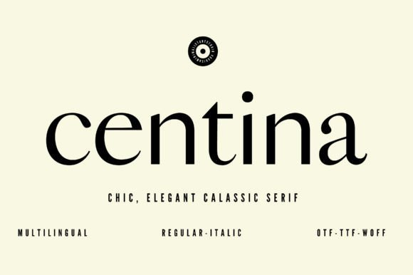
Centina is a refined sans-serif that balances chic minimalism with a subtle geometric backbone. Its slightly condensed proportions and tapered terminals create a compact, elegant silhouette that reads well in logotypes and headline settings. The face was hinted for crisp rendering on screens and maintains clarity in print thanks to careful spacing and open counters. As one of the cleaner choices among Fonts for fashion brands , Centina projects a contemporary luxury without resorting to ornamentation.
Because its medium contrast and generous x-height hold up at smaller sizes, Centina works across product labels, editorial body copy, and UI components, while heavier weights command attention in large-format branding. I recommend pairing it with a warm serif or an expressive script to introduce contrast; tight tracking on all-caps settings creates authoritative wordmarks. The multilingual glyph set simplifies international rollouts and keeps brand voice consistent across markets.
My Recommendation: I reach for Centina when I need a modern, fashion-forward identity that still feels timeless. Its condensed shapes let a logotype occupy less space while retaining presence, which is ideal for labels and narrow website headers. The multilingual coverage and clean hinting make it a safe choice for brands expanding globally.
11. Lune Font
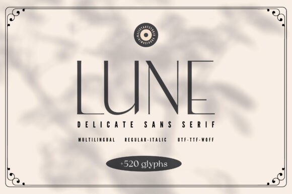
Lune is a thin-stroked sans-serif that favors restrained, elegant letterforms and deliberate white space. With a 520-glyph set and both regular and italic styles, it gives designers subtle ways to introduce emphasis without heavy modulation. The narrow proportions and delicate strokes work beautifully for mastheads, editorial covers, and upscale web headers where an air of minimal refinement is desired.
Keep in mind that Lune’s hairline details demand generous sizes or higher contrast backgrounds to remain legible, particularly on matte packaging or older screens. Complement it with a sturdier serif or a geometric sans for readable body text and use increased tracking for all-caps headlines to prevent visual crowding. Pay close attention to diacritics and italic pairings when typesetting multilingual lines.
My Recommendation: I recommend Lune for projects that call for subtlety and a minimalist aesthetic-think boutique websites, lookbooks, and gallery signage. It shines in large display roles but needs testing at small sizes and on varying substrates to avoid loss of detail. Pairing it with a strong companion face yields an elegant, well-structured hierarchy.
12. Cinema Authentic Font
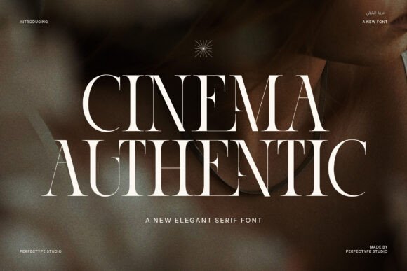
Cinema Authentic is a serif with crisp terminals and a poised, slightly theatrical rhythm that suits premium editorial and branding work. Its sharp serifs and refined stroke contrast give headlines a confident presence, while the included ligatures and alternates provide tasteful personality for custom wordmarks. The family reads as both modern and rooted in tradition, making it a strong choice for magazines, boutique packaging, and identity systems that need a touch of gravitas.
Use Cinema Authentic at larger sizes to showcase its ligatures and optical details; tightened kerning and selective alternates create bespoke logotypes without commission. The regular weights remain readable for extended copy when typeset with modest leading, and the display weights deliver impact on posters and packaging. Thoughtful pairing with a neutral sans can keep layouts contemporary while preserving the typeface’s classic character.
╰┈➤ Download Cinema Authentic Font
My Recommendation: I turn to Cinema Authentic when a project needs refined tradition with character-luxury labels, mastheads, and premium collateral are perfect fits. Its alternates let me craft distinctive marks without bespoke lettering, saving time while achieving a handcrafted feel. On printed materials and high-res digital artboards it consistently reads as both elegant and authoritative.
13. The Fivebox Font
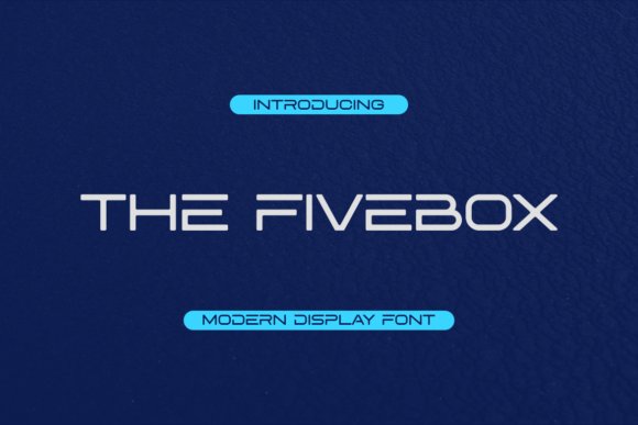
The Fivebox is a geometric display font built from sharp, box-like strokes and deliberately open counters that give headlines a clean, assertive character. Within brand toolkits and especially among Fonts for fashion brands , its rigid yet refined letterforms create immediate recognition on shopfront signs, lookbooks, and logo marks without feeling fussy.
Because the face reads strongly at large sizes, it works best as a headline or wordmark rather than dense body text; tight tracking and slight negative letterspacing emphasize its engineered rhythm. Pair it with a neutral humanist sans for supporting copy or with a delicate serif to add contrast, and you have a bold typographic voice suitable for runway campaigns, editorial covers, and product hero shots.
My Recommendation: I reach for The Fivebox when a brand needs a modern, architectural stamp that reads from across a room. Its geometric precision makes logo work and retail signage easy to read and very repeatable across materials. Use it for bold editorial covers, minimal brandmarks, and tech-forward fashion labels where clarity and attitude matter.
14. Sabiant Font
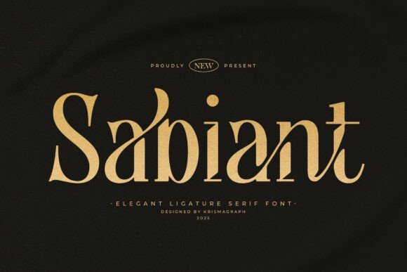
Sabiant is a high-contrast ligature serif that balances refined curves with crisp terminals, producing an elegant, editorial tone ideal for premium brands. The font’s carefully drawn alternates and ornamental ligatures allow typographic flourishes without overwhelming a layout, making it excellent for mastheads, monograms, and luxury packaging.
At display sizes the delicate brackets and tapering strokes read as handcrafted details; when combined with generous leading they give spreads a sophisticated, breathable rhythm. Designers will find Sabiant pairs beautifully with a restrained sans for body text, or as the primary voice for boutique labels, wedding suites, and upscale catalogs where typographic refinement matters most.
My Recommendation: I would choose Sabiant for projects that need a refined, couture presence – think couture labels, editorial features, and boutique packaging. The built-in ligatures and alternates let you craft unique logotypes and elegant headlines without extra illustration work. It’s especially useful when you want typography that reads as both classic and carefully considered.
15. Valturin Font
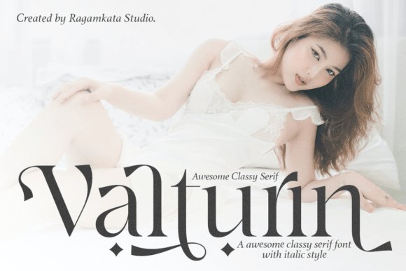
Valturin is a minimalist serif with long extenders and subtle stroke contrast that lend a quietly luxurious air to logos and editorial layouts. Its PUA encoding gives instant access to decorative glyphs and stylistic ligatures, so custom letter combinations and vintage-inspired initials are available without complex font tools.
The typeface performs particularly well at mid to large sizes where its refined proportions and thin hairlines can breathe; tight tracking brings out its fashion-house sensibility for labels and hangtags. For a restrained, upscale identity use Valturin as the headline or wordmark layer and reserve a crisp sans or fine-bodied serif for supporting copy to maintain hierarchy and clarity.
My Recommendation: I pick Valturin when a project calls for subtle luxury rather than loud ornamentation; it reads as curated and calm on packaging, business cards, and lookbooks. The PUA glyph set makes crafting distinctive initials and ligature-driven logos fast and reliable. This is a great choice for boutique fashion houses, premium stationery, and editorial spreads that favor understatement and precision.
16. Generate Condensed – Fonts for fashion brands
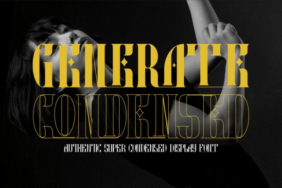
Generate Condensed is a narrow serif built for display work where condensed proportions and sculpted terminals give headlines an assertive, editorial presence. The letterforms show strong stroke contrast and compact counters that read as architectural at large scales, making them ideal for logo wordmarks, magazine mastheads, and poster statements. Because of the tight width, careful kerning and subtle tracking adjustments pay off, turning short phrases into memorable emblems rather than cluttered lines. Pairing this face with a calm, humanist sans helps maintain legibility while letting the serif carry the personality; Fonts for fashion brands will often rely on exactly this kind of typographic tension.
In practice, Generate Condensed performs well on textured papers, foil-stamped labels, and monochrome hero images where its shapes can breathe against negative space. It responds nicely to high-contrast treatments-emboss, edge-burn, or reversed white on black-so long as you preserve large enough sizes for the fine details to remain visible. For tight logo lockups consider converting key letter pairs into custom kerning or ligatures to keep rhythm intact. The typeface rewards editorial experimentation: short headlines, product names, and seasonal campaign art all gain a refined, compact authority when set in this face.
╰┈➤ Download Generate Condensed – Fonts for fashion brands
My Recommendation: I’d reach for Generate Condensed when a brand needs a concise, upscale headline or a compact logotype that reads like couture. Its condensed build allows longer names to fit into tight spaces without losing character, and the high-contrast strokes translate beautifully to embossed or foil treatments. Ideal for high-fashion editorials, limited-edition packaging, and boutique signage where a strong serif signature signals refinement.
17. Dynames Font
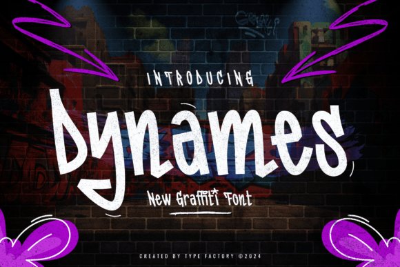
Dynames channels graffiti energy with bold, angular letterforms and a raw spray-painted texture that feels immediate and loud. Irregular baselines, sharp terminals, and splatter-like details create a handcrafted, analog look that demands large-format use-posters, album covers, and streetwear drops are natural fits because the face reads as expressive lettering rather than a neutral type voice. Its rough edges give compositions attitude, so contrast and layering with cleaner elements help avoid visual overwhelm.
When using Dynames, treat it as a headline-only solution: raster effects and layered masks enhance the spray texture, and vectorized outlines work well for screen printing or embroidery separations after some cleanup. For visual balance, pair it with a crisp geometric sans or a simple slab for smaller copy, and reserve the font for campaign art, event branding, and garment graphics where a rebellious, handcrafted presence is desired. Consider color blocking and bold gradients to amplify the street-level aesthetic without losing legibility.
My Recommendation: I use Dynames when a project needs authentic street credibility-festival posters, mixtape covers, or capsule-collection graphics where attitude matters more than neutrality. It reads best at display sizes and benefits from layered treatments or simplified vector cleanup for production. If you want gritty, energetic type that reads like hand-sprayed lettering, Dynames delivers that raw character perfectly.
18. Bamzer Font
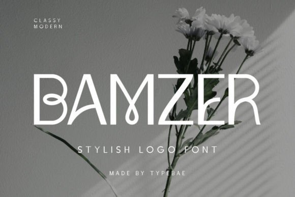
Bamzer is a sans serif logo font distinguished by a soft, sculpted curvature that gives wordmarks a friendly yet refined silhouette. The letterforms balance geometric structure with warm terminals and generous counters, which makes text feel open and legible across digital interfaces and physical tags alike. Its unique curves create recognizable negative-space moments-useful for monograms and compact logotypes that need to remain distinct at small sizes or on-label prints.
On-brand applications for Bamzer include ecommerce headers, product labels, and identity systems where clarity and character are both priorities. The face adapts well to responsive typography: slightly increasing tracking and size for web body text keeps the shapes comfortable, while tighter settings work for compact logo locks. For contrast, pair Bamzer with a delicate serif for long-form editorial or a neutral grotesque for UI elements to preserve hierarchy and readability.
My Recommendation: I pick Bamzer when a client wants a modern, personable wordmark that reads cleanly on both screens and sewn labels. Its curved forms give logos a memorable silhouette without being ornamental, and the open counters aid legibility at small scales. Best suited for contemporary apparel labels, lifestyle tech-fashion brands, and sites where a refined, accessible brand voice is needed.
19. La Gateau Font
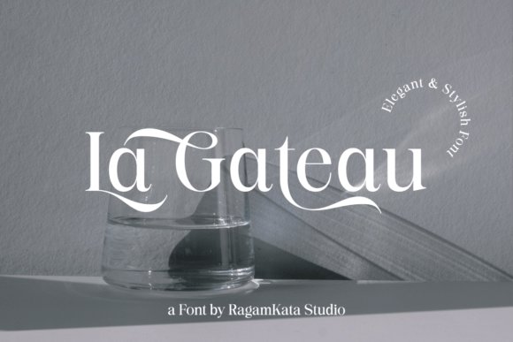
La Gateau is a serif with refined, high-contrast strokes and rounded terminals that feel both graceful and deliberate; its ligatures and subtle swashes give logos and headlines a couture finish. When building Fonts for fashion brands , this face reads as polished at large sizes while retaining character in tight headline settings, thanks to careful letterspacing and a slightly condensed rhythm.
The family includes small caps, alternate characters, and well-tuned kerning that make it straightforward to craft distinctive wordmarks or magazine mastheads. Use La Gateau for embossed packaging, editorial covers, and luxe web headers where an upscale personality and readable forms are required.
My Recommendation: I would reach for La Gateau when a project needs a refined, classical voice without feeling old-fashioned. Its ligatures and alternates make logo work feel custom, and the clear shapes hold up in print and on-screen. Ideal for luxury labels, boutique packaging, and fashion editorials where tasteful drama matters.
20. Goldage Font
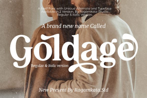
Goldage is a serif that balances warmth with formal structure, offering soft contrast and generous counters that read beautifully in print and on digital displays. The letterforms have purposeful terminals and optional stylistic alternates that let designers dial between conservative and more expressive looks for marquees or editorial lead-ins.
Built-in ligatures and refined numerals support brand identity work, while its moderate x-height helps with legibility at smaller headline sizes. Consider Goldage for boutique logos, lookbook headings, and elegant invitations where a refined, readable presence is required without appearing overly ornate.
My Recommendation: I’d choose Goldage for projects that need a polished but approachable serif voice-think fashion lookbooks, boutique identity systems, and premium catalogs. Its alternates and numerals make typesetting feel custom without extra effort. It pairs especially well with a minimal sans for body text to maintain sophistication with clarity.
21. Theossaint Font
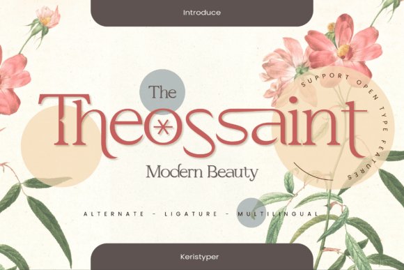
Theossaint blends contemporary geometric shapes with classic serif details to create a confident display face that immediately commands attention in headlines and logos. Clean strokes, sharp terminals, and strong contrast make it a standout choice for brands that want a modern, editorial-forward presence without abandoning traditional serif elegance.
Weights and optical sizes give designers tools to shape tone from subtle to bold, while alternate caps and tight kerning help with compact wordmarks. Use Theossaint for fashion labels, magazine mastheads, and storefront signage where a crisp, modern attitude needs to read as premium.
My Recommendation: I prefer Theossaint when a project calls for a modern serif with attitude-perfect for contemporary fashion brands, bold editorial layouts, and striking logo work. Its range of weights and alternates makes it flexible across print and digital touchpoints. Pair it with a spare sans for body copy to keep the look fresh and focused.
22. Sunyshine Font
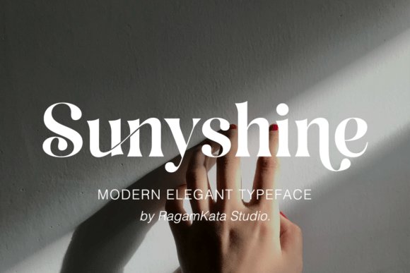
Sunyshine is a refined serif with high-contrast strokes and delicate ligatures that give headlines a poised, couture feel. Its curved terminals and extended ascenders make it read as luxurious at display sizes and hold personality in logotypes and mastheads. The type’s warm rhythm and open counters suit Fonts for fashion brands in identity work, editorial covers, and premium packaging. Small caps and alternate characters allow subtle brand differentiation without heavy ornamentation.
Technically, Sunyshine ships with multiple weights, optical italics and a thoughtful kerning table so spacing stays elegant across large headlines and tight logo marks. The ligatures and discretionary swashes can be used sparingly to add flourish to monograms or product names while keeping legibility intact. Pair it with a neutral sans for body copy or with a restrained slab for bold statement titles to balance refinement with modern clarity.
My Recommendation: I reach for Sunyshine when I need a quiet formality that still reads like couture-perfect for luxury womenswear, jewelry, or perfume labels. Its ligatures and italics give signature marks a handcrafted look while remaining readable at display scales. Use alternates sparingly so the brand reads curated rather than ornate.
23. That Appeal Font
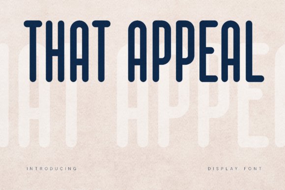
That Appeal is a tall, condensed display font with rounded terminals and a steady vertical rhythm that commands attention without feeling blunt. Its high x-height and tight letterforms maintain legibility across posters, shopfront signage and social feeds, while a subtle retro inflection gives it character. The compact proportions make it ideal for tight logo compositions, capsule collections and bold headline systems.
Spacing has been optimized for display use, so tracking adjustments are minimal even at large scales; alternate glyphs and numeric sets add flexibility for packaging and pricing blocks. Pair it with a light serif or an airy geometric sans to create contrast between headline strength and supporting text. It translates well to screen and print, resisting blur at distance and retaining presence on labels and billboard art.
My Recommendation: I pick That Appeal when a project needs assertive, compact typography-streetwear drops, posters, or beverage labels where space is constrained but impact matters. The rounded terminals soften the condensed geometry, keeping the voice approachable rather than aggressive. It’s a reliable choice for high-visibility headlines and tight logo marks.
24. Miracle Family Font
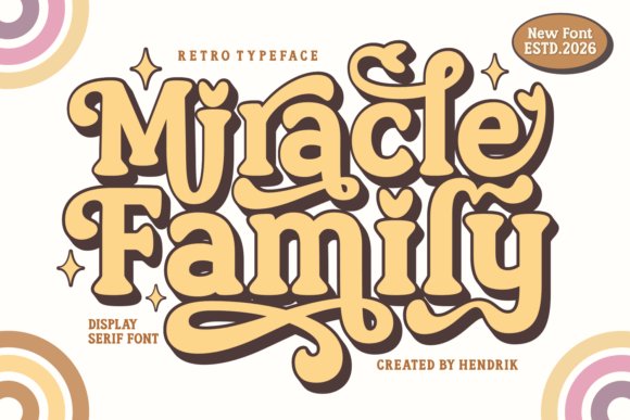
Miracle Family offers a set of retro-inspired display fonts that blend 70s warmth with contemporary finishing, including serif and sans variants with playful curves and swash options. Alternates, contextual ligatures and layered outlines make it especially useful for apparel prints, stickers and social artwork where typography needs personality. These cuts read lively at medium sizes and create eye-catching badges, labels and brand motifs.
The family includes multiple weights, rounded and condensed cuts, plus color-ready or textured files suited to sublimation and Cricut crafts; spacing and kerning are tuned for decorative use. For editorial spreads or lifestyle branding, pair the groovy headlines with muted body text so attention stays on display elements. Use stylistic sets to introduce variety across a capsule collection while retaining a cohesive visual voice.
╰┈➤ Download Miracle Family Font
My Recommendation: I use Miracle Family for festival merch, retro-inspired streetwear, or indie label collections when I want a warm, nostalgic tone that still feels fresh. The alternate glyphs and layered styles let me craft distinct marks across garments and social assets without extra illustration work. It’s particularly handy for print-on-demand and craft production because the files are production-friendly.
25. Muloka Kerash Font
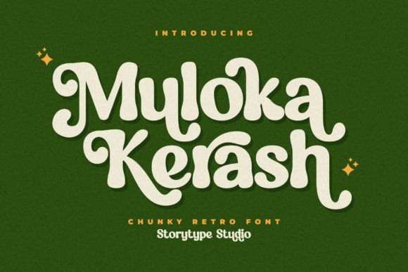
Muloka Kerash is a playful serif that channels retro signpainting with approachable charm; its slightly flared terminals and lively stroke contrast lend headlines an unmistakable character. Among Fonts for fashion brands , it performs as a personality-forward choice for lookbooks, seasonal campaigns, and boutique labels that want a wink of nostalgia without losing clarity. The typeface reads handcrafted and warm, which helps soften bold photographic layouts and brings a tangible voice to product tags and editorial headers.
Built primarily for display, Muloka Kerash shines at larger sizes where its idiosyncrasies become memorable motifs rather than distractions, yet it remains readable in short lines and logos. Use bolder weights for wordmarks and lighter cuts for secondary headings, pairing it with a low-contrast grotesque for continuous copy to preserve hierarchy. Its retro tone suits streetwear drops, capsule collections referencing past decades, and boutique packaging that benefits from a lively, familiar face.
╰┈➤ Download Muloka Kerash Font
My Recommendation: I’d reach for Muloka Kerash when a creative brief calls for vintage flare with friendly personality-perfect for capsule collections, streetwear, and artisan labels. It makes headlines and hang tags feel distinctive without heavy ornament. For projects that need instant recognition and a warm, nostalgic tone, this font delivers reliably.
26. Sofilera Font
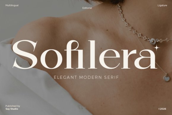
Sofilera refines serif traditions through soft terminals and measured stroke contrast, producing a look that reads feminine and modern without appearing fussy. Generous proportions and a smooth curve language give it editorial weight in hero banners and mastheads while preserving approachability at medium sizes. Thoughtful ligatures and subtle stylistic alternates inject personality where needed but keep text lines graceful and legible.
This typeface works well across print and high-resolution screens; its balance makes logos appear composed and packaging copy quick to scan. Employ heavier styles with tighter tracking for strong headlines and lighter weights for captions and product details to maintain tonal consistency. Sofilera fits couture lookbooks, beauty and bridal branding, and luxe packaging where typography must communicate refinement and modern taste.
My Recommendation: I would choose Sofilera when a brand needs refined femininity that still reads contemporary-great for skincare, bridal, and fashion editorials. Its ligatures and proportions help craft layouts that feel premium without being showy. For identity work where typography carries the mood, Sofilera is a dependable, stylish option.
27. Overse Font
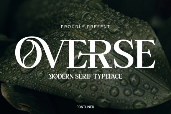
Overse is a modern serif with crisp terminals and vertical stress that delivers a clear, assertive voice for headlines and logos. Sharp bracketed serifs and compact counters give visual authority, making it suited to editorial spreads and brand marks that require composure. The face maintains legibility in dense grids and becomes distinctive in large display use, functioning as a confident typographic signature.
Because Overse holds form at small sizes and asserts presence in display, it translates well onto packaging, mastheads, and identity systems where typographic hierarchy matters. Pair it with a narrow grotesk to sharpen contrast or set it against minimalist imagery so the type can take center stage. Its structured temperament is a solid match for luxury ready-to-wear, corporate fashion houses, and premium lifestyle labels aiming for enduring professionalism.
My Recommendation: I’d pick Overse when a project demands a firm, professional type voice-ideal for brand marks, editorial work, and premium packaging. It balances character and clarity, performing reliably across print and digital touchpoints. For designers building minimalist, refined identities, Overse supplies a steady, polished foundation.
28. Bether Font
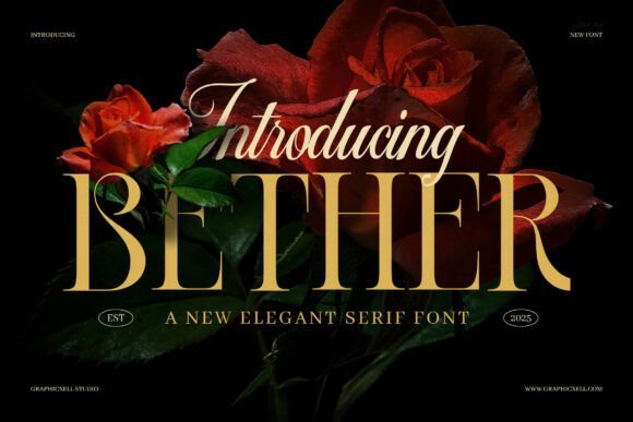
Bether is a refined serif with softly rounded terminals and firm stroke contrast that reads strongly at headline sizes. Its tidy letterforms give logos and mastheads a poised, editorial presence while remaining surprisingly legible in short body copy. Bether is a go-to choice when designing Fonts for fashion brands because it signals luxury without excess and pairs naturally with cleaner sans styles.
The family offers a few weights and italics that hold crisp shapes across print and responsive web use, so kerning and spacing feel intentional rather than accidental. Use it for boutique identities, lookbook headlines, and premium packaging where a hint of classic proportion keeps the visual language restrained yet confident. Small caps and alternative characters add subtle personality for labels and pull quotes.
My Recommendation: I would pick Bether when a project needs a refined serif that reads as both editorial and commercial. Its restrained curves suit luxury boutiques, magazine mastheads, and lifestyle websites where clarity matters at larger sizes. I appreciate how it pairs with minimalist sans fonts, giving designs a polished, elevated feel without being ornate.
29. Camera Font
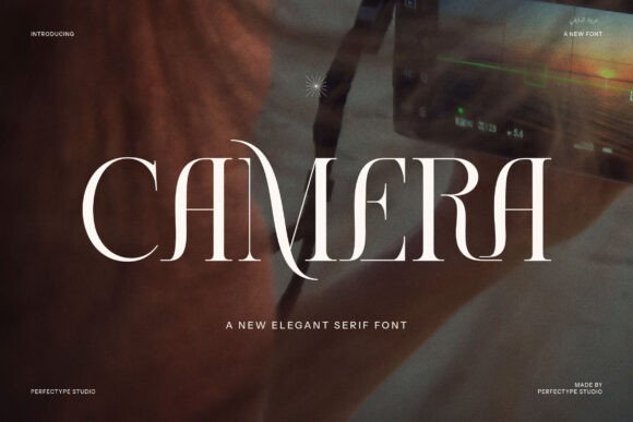
Camera blends traditional serif rhythm with a modern sense of proportion, marked by thoughtful ligatures and selective alternates that inject personality into headlines. The letterforms feel balanced and precise, which makes the face excellent for identity work where subtle typographic details communicate quality. Its voice is poised enough for high-end brand systems while still flexible for editorial layouts and web typography.
On the technical side, Camera’s spacing and set of alternates simplify tight logo lockups and headline treatments, and the consistent stroke terminals support crisp reproduction on both coated paper and screens. Consider it for restaurant menus, fashion lookbooks, and product catalogs that need a reliably polished serif with character. Pair with a narrow grotesque for captions to maintain hierarchy without visual clutter.
My Recommendation: I recommend Camera when a project requires a serif that feels cultivated but not fussy. Its ligatures and alternates let you introduce distinctive letterpairing in logos and headlines, while the core shapes stay readable across print and web. I often reach for Camera for boutique editorial spreads and upscale packaging because it gives designs a memorable, refined tone.
30. Nature Reserve Font
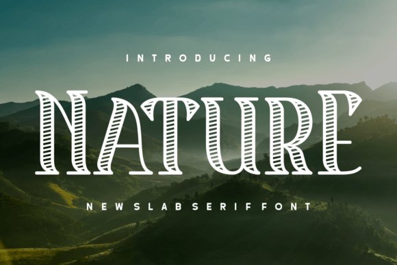
Nature Reserve is a slab serif that balances rugged presence with refined detailing, delivering a vintage-inflected aesthetic suited to branded merchandise and display typography. The heavy serifs and squared terminals give letterforms a sturdy silhouette that works well on posters, apparel prints, and signage, while subtle modulation in the strokes keeps the face from feeling blunt. Its persona reads both heritage-driven and fashion-forward depending on styling.
Use Nature Reserve for labels, logo marks, and editorial covers where tangible texture and a confident voice matter; it reproduces well in letterpress or embossed finishings. Mixing it with a narrow sans or a flowing script creates contrast that highlights the slab’s architectural qualities. The font thrives in brands that want craft-driven character without sacrificing readability at larger scales.
╰┈➤ Download Nature Reserve Font
My Recommendation: I’d choose Nature Reserve for projects that need a bold, tactile serif with personality-think artisan fashion labels, outdoor-inspired capsule collections, and statement tees. Its slab structure holds up in print treatments like embossing or screen printing, giving physical products a handcrafted feel. It’s a reliable pick when you want typography that reads as both authentic and design-forward.
31. Lenorha Font
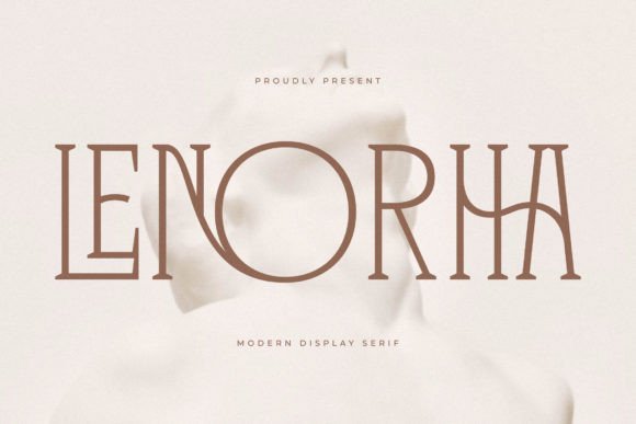
Lenorha Font presents a poised, elegant serif voice for labels and editorial headers, characterized by sculpted terminals, softly bracketed serifs and medium contrast that sing at display sizes. As a thoughtful selection among Fonts for fashion brands , it keeps a heritage aura without feeling ornate – letterforms feel measured, ligatures tasteful, and spacing predictable, which helps when composing tight logotypes and mastheads. The italic leans refined rather than frantic, making it useful for subheads and pull quotes.
Technically, Lenorha performs well in print finishes like embossing and foil thanks to clear stroke endings, and it holds up in digital interfaces because of sturdy counters and consistent hinting. Designers will appreciate the range of weights plus small caps and discretionary ligatures for monograms and couture wordmarks, giving options for subtle hierarchy. Pair it with a neutral grotesque for body copy to create contrast between classical presence and modern readability.
My Recommendation: I reach for Lenorha when a brief asks for a dignified, heritage-driven type voice-its letterforms photograph cleanly on labels and convey credibility in editorial spreads. The small caps and ligature set make building monograms straightforward, and the weight range lets me dial tone from reserved to more assertive. I’d use it for luxury packaging, boutique branding, or magazine covers where a refined serif anchors the visual identity.
Type choices shape how a brand is perceived across packaging, social content and the product itself. Use the sample faces and pairing notes here to test combinations that match your seasonal story or permanent identity.
Try mockups at multiple scales, check legibility in real contexts, and refine contrast between headline and body text. Small adjustments to weight, spacing and style lead to a cohesive presence that feels intentional to customers and press alike.