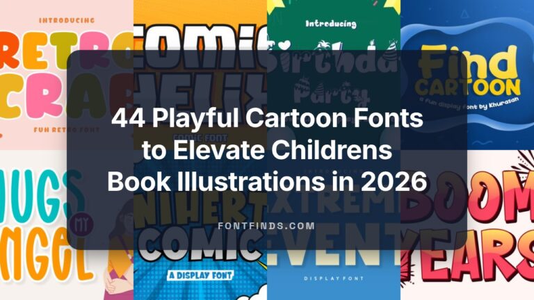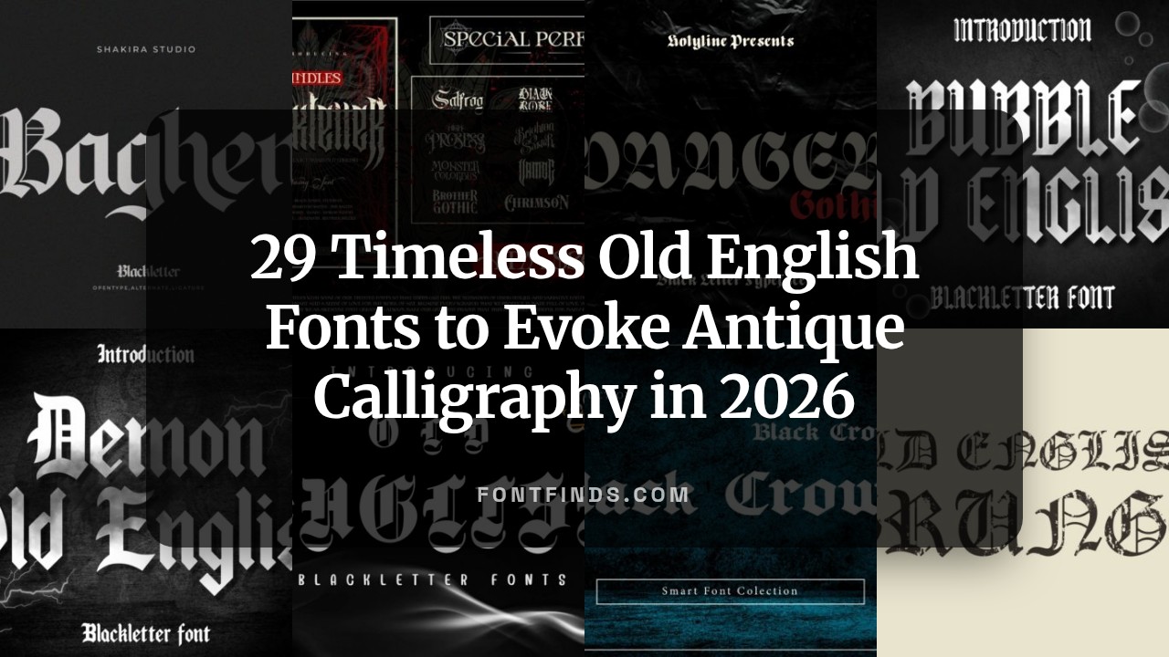
29 Timeless Old English Fonts to Evoke Antique Calligraphy in 2026
The best old english fonts blend ornate character with practical legibility, giving projects an immediate sense of age and authority. In this collection of 29 Timeless picks, you’ll find everything from traditional blackletter cuts to refined hybrids suitable for web and print.
Each entry includes suggested uses, pairing ideas, and licensing notes so you can choose the right face for book covers, historic branding, tattoo art, film titles, or editorial headers. Whether you seek heavy display styles or simpler revived forms, this guide helps you match mood to function quickly.
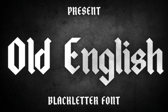
1. Old English Font
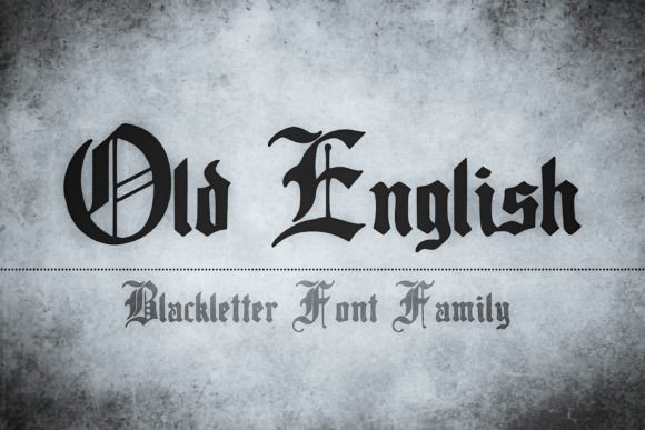
Old English is a stately blackletter font that channels medieval manuscript energy with compact textura letterforms and high-contrast strokes. As part of a broader family of old english fonts, it delivers ornate capitals and sharp diagonal serifs that instantly read as antique and ceremonial. The glyphs feel hand-cut, with ligatures and swash accents that emphasize tradition and gravitas.
Use it where atmosphere matters: book covers, certificates, brewery labels, or alt-rock band logos that require a historic aesthetic while pairing with a neutral sans for body text. Because of its dense shapes, small sizes benefit from increased tracking or display-only use, and enabling OpenType flourishes gives authentic period detail. Its pronounced personality makes it ideal when heritage and formality must dominate the design language.
My Recommendation: I reach for this font when I need immediate historical gravitas-wedding invites, craft beer labels, or period film posters-because its textura-inspired strokes and decorative ligatures create instant authenticity. For best results I use it at display sizes and pair it with a clean sans to avoid visual competition. If you want a ceremonial, heritage-forward look, this font reliably sells that mood.
2. Old English Texas Font
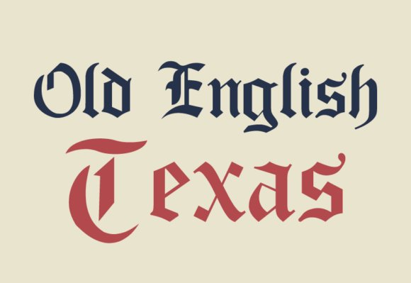
Old English Texas Font takes classic blackletter bones and amplifies them with bold terminal serifs and a rugged Western inflection that reads both vintage and muscular. The letterforms are thicker and more decorative than traditional textura, favoring substantial strokes and pronounced terminals that make headlines pop. Ornamented capitals and extended strokes give it a distinct frontier-meets-gothic personality.
This face thrives in applications that demand impact-posters, band merch, signage, tattoos, and apparel-where its heavy contours become the focal point. Pair it with weathered textures or leather-inspired palettes and balance it against minimalist supporting type to avoid visual overload. Pay close attention to spacing and scaling to preserve its decorative integrity at different sizes.
╰┈➤ Download Old English Texas Font
My Recommendation: I use Old English Texas when I want bold vintage Americana with gothic undertones-logo marks, apparel collections, and poster art all benefit from its robust shapes. It performs best at medium-to-large sizes, so I avoid it for long passages or small text. When designing, I combine it with distressed textures and roomy letterspacing to highlight its western flair without losing legibility.
3. Old English Font
Old English Font presents a simplified take on blackletter motifs that adapts well to everyday craft and stationery projects, offering decorative flair without the full complexity of archival scripts. Its letterforms are slightly more open than dense textura, which helps legibility on greeting cards, mugs, T-shirts, and social posts where small-scale clarity matters. The overall tone is decorative yet approachable, making it versatile for casual creative uses.
Because it bridges ornamental style and practical readability, it’s a great choice for makers, indie brands, and DIY projects that need historic flavor without typographic fuss. Use it for headers, monograms, and accent work while keeping body text neutral and uncluttered. Test physical mockups-vinyl, embroidery, and print-to confirm stroke tolerance before final production.
My Recommendation: I recommend this version for small businesses and crafters because it balances ornamentation with usable legibility across print and fabric. It reduces headaches in production when scaling designs for mugs, cards, or apparel, and it adapts well to monograms and headers. For approachable vintage character without heavy typographic complexity, this is a dependable pick.
4. Dark Old English Font
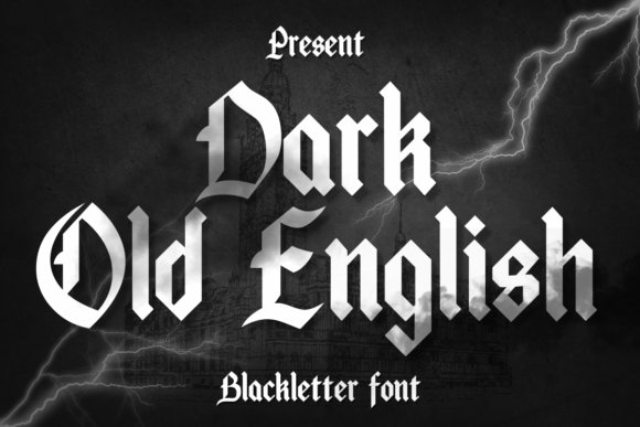
Dark Old English packs dense, inked strokes and compact counters into a dramatic blackletter texture that reads historic and contemporary at the same time. Its vertical stress, sharp terminals, and tight spacing give headlines a carved, tactile feel that performs powerfully in posters, signage, and album art. As one of the more assertive old english fonts, it preserves traditional letter proportions while tightening rhythm for modern display use.
Because of its high contrast and ornate capitals, Dark Old English shines at large sizes where its flourishes remain legible and animated; small text will obscure fine details. Designers will value its strong baseline rhythm and the way it contrasts with clean sans or light scripts for layered compositions. Use bold color fields or subtle distressing to emphasize the gothic presence without overpowering surrounding elements.
╰┈➤ Download Dark Old English Font
My Recommendation: I use Dark Old English when I need a headline that reads as handcrafted and authoritative-perfect for band posters, tattoo mockups, and bold packaging. Its heavy strokes reproduce well in print and embossing, giving designs a tactile, vintage weight. Choose it when you want a dramatic, gothic statement that still plays nicely with contemporary layouts.
5. Bubble Old English Font
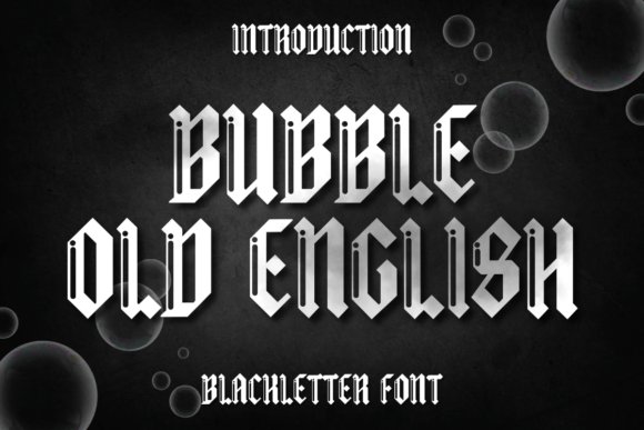
Bubble Old English reinterprets medieval letterforms with rounded terminals and softened bowls, producing a playful blackletter variant that still nods to gothic roots. The softened curves and expanded counters create a friendly silhouette, delivering a retro-meets-modern vibe that reads approachable rather than forbidding. This makes it especially effective for lifestyle branding, sticker art, and projects seeking a nostalgic but jaunty personality.
On a technical level, its generous spacing and forgiving forms improve legibility for display treatments and embroidered applications where fine detail can be lost. Pair Bubble Old English with geometric sans fonts or distressed textures to accent the contrast between classical structure and contemporary softness. Limit ornate pairings and favor simplified initials or ligatures for cleaner compositions and easier reproduction across merchandise.
╰┈➤ Download Bubble Old English Font
My Recommendation: I’d reach for Bubble Old English when a design needs character without harshness-think streetwear labels, craft-product packaging, or playful editorial headlines. Its rounded blackletter aesthetics translate beautifully to patches, labels, and merch, and it scales reliably for both print and digital. Use it when you want medieval flavor delivered with warmth and attitude.
6. Black Crown Font
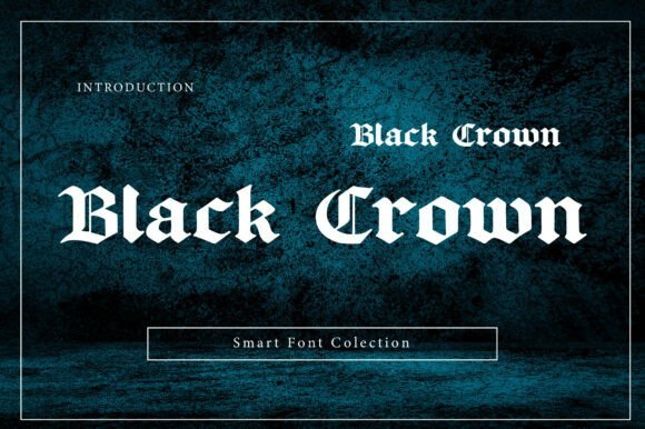
Black Crown is a commanding blackletter display drawn with pointed arches, pronounced serifs, and regal proportions that communicate authority and luxury. High contrast strokes and dramatic capitals forge a throne-like presence ideal for logos, editorial mastheads, and album covers that need an immediate visual anchor. The family includes stylistic alternates and swashes to customize wordmarks while retaining a convincing historical feel.
Because of its ornamental nature, Black Crown works best when used selectively-headlines, seals, or packaging where the type can dominate the composition without competing with heavy copy. It pairs exceptionally well with neutral sans-serifs and textured backdrops that amplify its vintage gravitas while protecting legibility. For designers chasing a noble, theatrical voice, Black Crown strikes a precise balance between elegance and bite.
My Recommendation: I favor Black Crown for premium branding and projects that demand dramatic, historical character-boutique labels, luxury packaging, and theatrical posters benefit most. Its decorative caps and alternates let you craft bespoke wordmarks with impact while remaining legible at display sizes. Use it when you want design that feels both authoritative and artfully crafted.
7. King’s Decree Font
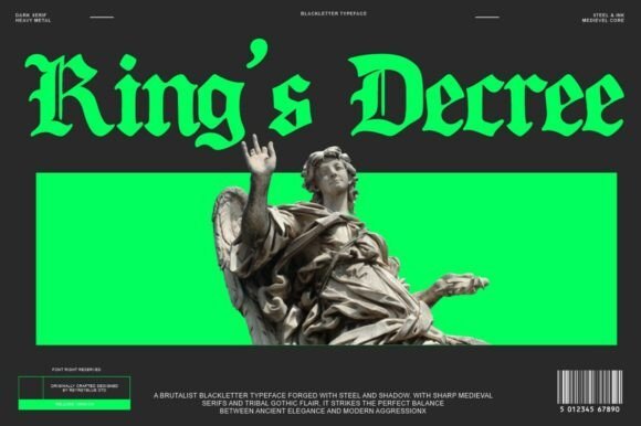
King’s Decree is a bravura blackletter font that channels medieval chancery and monumental inscriptions, projecting sovereign authority. Its sharp terminals, high-contrast strokes, and ornamental ligatures make it immediately suited to display work, delivering a theatrical, dark elegance. Among modern old english fonts this face balances ornamental complexity with deliberate spacing so words remain readable even at headline scales.
The type family includes uppercase and lowercase sets, numerals, punctuation, plus extended language support and useful OpenType features such as discretionary ligatures and stylistic alternates. Tight kerning and pronounced vertical stress create a strong silhouette that reads especially well on album covers, luxury packaging, tattoos, and fantasy branding. If you need a font that reads like a royal proclamation while staying practical for production, King’s Decree fits the brief.
╰┈➤ Download King’s Decree Font
My Recommendation: I reach for King’s Decree when I want typography that feels ceremonial yet usable; its dramatic letterforms give instant gravitas to identity and packaging work. The OpenType alternates let me toggle ornamentation depending on the context-subtle for luxury labels, bold for posters. Use it for projects that need a historic, authoritative voice without sacrificing production control.
8. Scarlet Crown Font
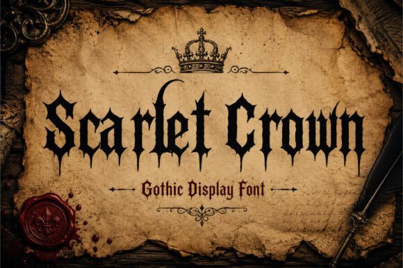
Scarlet Crown is a forceful gothic display font that leans into heavy-metal aesthetics, merging pointed serifs and aggressive contrast to create tension on the page. Ornamented terminals and razor-like strokes give it a visceral edge that sparks character-driven identities without resorting to cliché. The weight and rhythm of its letterforms demand large-scale use, where texture and silhouette become the message.
Designed as a headline-first typeface, Scarlet Crown excels on band logos, streetwear prints, event posters, and horror or gaming packaging; small sizes will lose its decorative detail. Pair it with a clean geometric sans for body copy to preserve hierarchy and let the blackletter forms breathe. The font’s strong personality makes it a statement tool for designers after attitude rather than subtlety.
╰┈➤ Download Scarlet Crown Font
My Recommendation: I use Scarlet Crown when a project needs to feel confrontational and theatrical-its attitude reads beautifully in photography and merch mockups. The ornamental caps and aggressive strokes are perfect for band identities and poster work where boldness is the brief. Treat it as a display asset and pair it with neutral body type for best results.
9. Black Malor Font
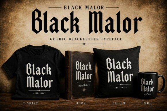
Black Malor revives gothic tradition with measured restraint, trading flamboyance for architectural precision and balanced contrast. The letterforms feel rooted in medieval calligraphic rules but are modernized with clearer counters and more even stroke widths to improve legibility. This makes Black Malor a rare blackletter that reads well in editorial headlines and refined packaging.
The typeface’s geometry supports tight typographic color and consistent texture across paragraphs of display-sized text, while ornamental touches remain available through alternates. Use it for projects requiring a historical nod without sacrificing contemporary clarity-think boutique labels, museum signage, and feature magazine mastheads. Its disciplined construction also pairs gracefully with serif or humanist sans companions.
My Recommendation: I pick Black Malor for projects that need historic flavor delivered with editorial polish; it’s perfect for brands that want authenticity without visual heaviness. Its balanced strokes keep layout predictable and production-friendly, which is a huge practical win. Ideal for magazines, curated apparel, and premium packaging where readability and heritage must coexist.
10. Westend Ridge Font
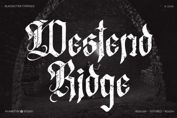
Westend Ridge channels classic blackletter energy with a warm retro grain, marrying pointed spurs and dramatic thick‑to‑thin strokes with softened terminals for improved readability. Its ornamented capitals and alternate swash glyphs read like a contemporary revival of old english fonts while remaining tuned for modern display work, giving designs a genuine antique character without feeling slavish to historical forms.
Under the hood Westend Ridge offers OpenType ligatures, stylistic sets, and contextual alternates so you can toggle between a restrained headline or a fully embellished lockup; kerning and spacing are generous for large‑format use. It shines on posters, boutique packaging, and editorial mastheads where texture and heritage matter, and pairs especially well with neutral sans faces to create contrast between vintage detail and modern clarity.
╰┈➤ Download Westend Ridge Font
My Recommendation: I reach for Westend Ridge when a project needs authentic gothic flavor that still reads well at headline sizes. Its alternates and ligatures give me flexible control over ornamentation without swapping fonts, which is handy for identities and labels. Use it for craft packaging, concert posters, or anywhere you want a touch of nostalgic craftsmanship with contemporary usability.
11. Black Sultanah Font
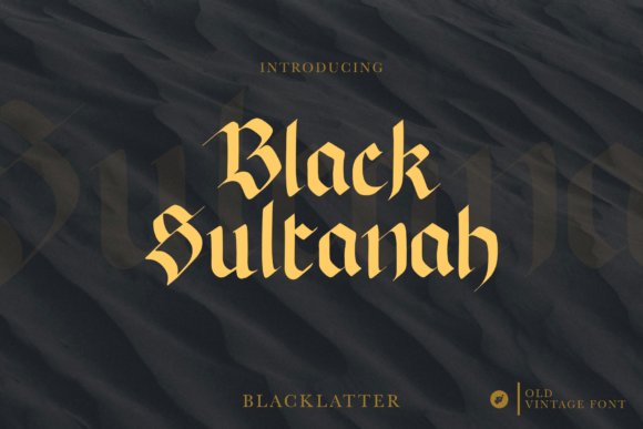
Black Sultanah channels the ornate drama of medieval manuscripts with dense, angular strokes and flourished terminals that immediately communicate formality and gravitas. The typeface’s decorative caps and heavy stroke modulations make it well suited to heraldic logos, certificates, and signage that require a ceremonial presence rather than subtlety. Despite its baroque silhouette, it retains enough internal counter space to remain legible in short display settings.
Designed as a statement face, Black Sultanah includes discretionary ligatures and swash options to enhance visual rhythm, but those features should be used sparingly to avoid clutter. Pairing it with a clean geometric or humanist sans keeps layouts readable while preserving the font’s ornamental impact. Remember that this style is optimized for headlines and emblems-not body copy-so manage tracking and leading accordingly.
╰┈➤ Download Black Sultanah Font
My Recommendation: I recommend Black Sultanah when you need a typeface that reads as authoritative and ceremonial from the first glance. Its rich decoration makes it ideal for logos, diplomas, and packaging that benefit from historic resonance. For balanced compositions, combine it with a simple sans to let the blackletter flourish do the heavy lifting while maintaining overall clarity.
12. Gothic Font
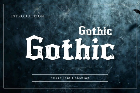
Gothic Font is a bold blackletter display face built around strong vertical stems, compact counters, and pointed connectors that give headlines a commanding, immediate presence. Influenced by medieval typography but refined for modern use, it balances dramatic form with deliberate spacing so short phrases and titles remain readable and impactful. The result is a raw, authentic voice that suits gritty or vintage‑inspired projects.
Technically the design favors high contrast and tight kerning optimized for large sizes, and it includes stylistic alternates to vary joins and crossbars for customized textures. Use Gothic Font for posters, album art, and logotypes where a striking, uncompromising mark is needed; avoid extended blocks of text where density can fatigue the eye. When paired with airy serifs or neutral sans‑serifs it becomes an instant focal point that anchors bold layouts.
My Recommendation: I use Gothic Font when a design demands an unapologetically powerful display face that reads historically informed yet modern. Its strong contrast and alternates let me craft dramatic headlines and logos with minimal fuss. It’s perfect for music promotion, editorial covers, and identity projects that benefit from a bold, vintage‑tinged statement.
13. Danger Gothic Font
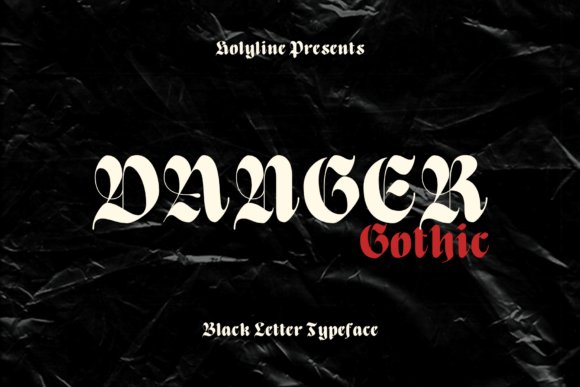
Danger Gothic recasts the blackletter tradition into a casual, contemporary typeface with playful contours and unexpected terminals. It borrows hallmarks of medieval letterforms but smooths them into a more approachable, modern silhouette; designers will notice hints drawn directly from old english fonts while avoiding heavy ornamentation. The result reads elegant without feeling overwrought, giving headlines a strong personality that still plays nicely with clean layouts.
The family offers a focused character set optimized for display use, with pronounced caps, alternate swashes, and clear punctuation that make logo work and packaging simple. It pairs well with geometric sans and light scripts, and performs strongly in large sizes for posters, social visuals, and merchandise, with careful kerning and lively contrast to ensure visual impact on labels and watermarks.
╰┈➤ Download Danger Gothic Font
My Recommendation: I would reach for Danger Gothic when I want a blackletter voice that feels modern and approachable-great for boutique branding, editorial headlines, or limited-run merchandise. Its playful strokes add personality without overpowering minimalist layouts, and the display-focused alternates make logo marks sing. Use it where you need historic flair that reads fresh across both print and social channels.
14. Bundles Blackletter Font Bundle
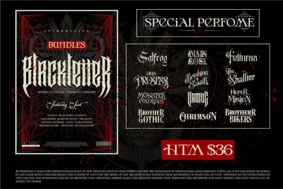
This 12-font collection delivers a wide survey of blackletter moods, from dense Victorian blocks to sharp metal-inspired cuts and restrained gothic designs. Each face emphasizes a different historical flavor, enabling designers to choose between ornate, theatrical, or utilitarian tones depending on the concept. The group leans vintage and dramatic, with bold stroke contrasts and angular terminals that immediately convey an old-world aesthetic.
Because the bundle spans multiple personalities and weights, it’s especially useful for layered compositions-use a heavy headline face for impact and a lighter companion cut for secondary text, or combine metallic caps with a refined blackletter for premium packaging. Be mindful that many styles are intended for display work and lose clarity at tiny sizes; they excel on posters, signage, album art, and nostalgic branding projects and are convenient for studios needing a ready-made typographic toolkit.
╰┈➤ Download Bundles Blackletter Font Bundle
My Recommendation: I recommend this bundle when you need a comprehensive set of historical blackletter styles without hunting down individual fonts. It’s ideal for retro branding, editorial projects, and music or beverage packaging where tonal consistency matters. For best results, reserve the most ornate cuts for large-scale or decorative use and pair them with neutral text faces for readability.
15. Vintage Old English (old english fonts)
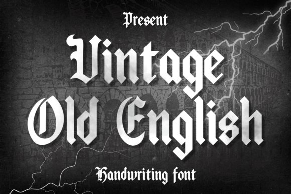
Vintage Old English revives traditional blackletter shapes with warm, slightly distressed strokes that recall hand-engraved signage and heirloom ephemera. It emphasizes readable capitals and tasteful lowercase alternates, making it surprisingly adaptable for tactile applications like greeting cards, mugs, banners, and stationery. The look feels nostalgic and crafted, offering a heritage vibe without tipping into cliché.
On the technical side, the font provides a generous x-height and roomy counters that aid legibility at mid sizes, while built-in ligatures and stylistic alternatives enhance historical authenticity. Pair it with a clean sans for body copy and reserve the display face for titles, labels, or short phrases to maintain impact; subtle distressing or layered shadows can amplify its vintage character on packaging or poster art.
╰┈➤ Download Vintage Old English (old english fonts)
My Recommendation: I’d choose Vintage Old English when a project needs a handcrafted, retro sensibility-think boutique stationery, limited-edition apparel, or artisanal product labels. Its balance of ornamentation and clarity makes it reliable for short, decorative lines that feel authentic. I like using it as the focal display type while supporting it with modern, neutral text faces to keep compositions looking contemporary.
16. Old English Grunge Font
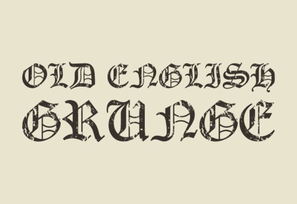
Old English Grunge is a blackletter revival that fuses Gothic letterforms with a deliberately weathered, distressed texture; the characters feel ink-bleed, scratched, and imperfect, delivering a tactile, rebellious personality. As one of the more visceral old english fonts options, its broken strokes, rough terminals, and uneven fills create instant vintage attitude that works especially well for posters, band art, tattoo flash, and gritty apparel branding. The design balances ornamentation and readability so the type remains impactful at display sizes without losing its raw edge.
Use this face big and unapologetic: headline treatments, album covers, and merch where texture is the message will benefit most. Pair it with a clean geometric sans to avoid visual clutter and reserve it for short copy for maximum effect. For printing, emphasize contrast or mild halftone overlays to accentuate the distressed detail while preserving legibility.
╰┈➤ Download Old English Grunge Font
My Recommendation: I reach for Old English Grunge when a project demands rebellious authenticity-the distressed strokes give real attitude that polished blackletters lack. It’s my go-to for rock posters, streetwear logos, and tattoo-inspired layouts where texture and grit are part of the story. Use it sparingly in headlines and treatments that need a lived-in, tactile presence.
17. Queen Old English Font
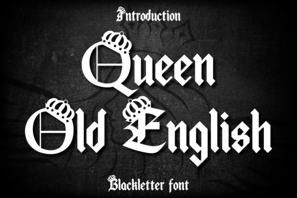
Queen Old English Font modernizes regal blackletter with heightened stroke contrast and decorative crowned capitals that read like heraldic lettering. It preserves Gothic verticality but introduces wider counters and refined terminals so the letters feel both noble and legible at display scale. A set of alternates and ligatures allows you to build monogram-style marks and ornamental wordmarks without resorting to heavy ornamentation.
This typeface excels on luxury packaging, fantasy-inspired branding, and event stationery where a sense of nobility is desired; gold foils and embossing amplify its aristocratic tone. Use capitals sparingly for maximum impact and tweak kerning to prevent the design from feeling crowded. Pair with a slender serif or modern sans to provide contrast and keep compositions contemporary.
╰┈➤ Download Queen Old English Font
My Recommendation: I choose Queen Old English Font when I want aristocratic drama with modern clarity-those crowned letters make immediate impact. It’s perfect for premium labels, fantasy book jackets, and upscale invitations that need a historic but refined voice. With careful spacing and finishes like foil or embossing, it elevates brand identity quickly.
18. Old English Font
Old English Font is a faithful blackletter display inspired by medieval calligraphy, featuring angular strokes, dense letter color, and pronounced vertical rhythm reminiscent of illuminated manuscripts. The crisp hairlines and wedge-shaped serifs create a commanding presence that suits mastheads, signage, and tattoo motifs while retaining a sense of historic authenticity. Its restrained ornamentation makes it practical for print and digital headlines where a traditional Gothic voice is desired.
Because of its compact texture and tight counters, use it at larger sizes and add tracking for improved legibility; avoid setting body copy in this face. It shines against neutral backgrounds and minimal layouts that let its sculpted letterforms dominate the composition. To bring it into contemporary projects, pair with a warm grotesque or humanist sans to balance the vintage weight without diluting the historic character.
My Recommendation: I select Old English Font when a project needs authentic period flavor that reads strongly at display scales. It’s ideal for event posters, editorial mastheads, and heritage branding where historical authority matters. With careful spacing and a complementary modern typeface, it gives headlines a timeless, powerful presence.
19. Ragnar Gothic Font
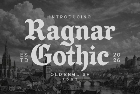
Ragnar Gothic channels medieval gravitas into a bold contemporary typeface, combining heavy blackletter strokes with restrained counters for improved legibility. Its letterforms balance historical ornamentation with simplified terminals, so text stays readable at display sizes and in logos. As a modern take among old english fonts, it feels muscular without becoming fussy, making it immediately striking on posters or packaging.
The family offers tight kerning, prominent swashes for initials, and alternates that let designers dial the intensity from gritty to refined. For branding-especially streetwear labels, craft breweries, and metal band identities-Ragnar supplies a raw, handcrafted presence while maintaining clean line rhythm for digital use. Typeface details like robust ascenders and squared serifs ensure the design reads well across apparel, signage, and album art.
╰┈➤ Download Ragnar Gothic Font
My Recommendation: I reach for Ragnar Gothic when I need an Old English edge that still reads on small surfaces. Its robustness and stylistic alternates make it perfect for identities that must feel both historic and modern. Use it for logos, merch, or posters where strong personality and legibility are equally important.
20. Black Raven Font
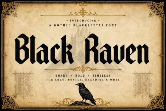
Black Raven embraces a theatrical gothic voice, its long vertical strokes and razor-sharp hairlines carving a dramatic silhouette. The face leans on blackletter conventions but tempers them with controlled contrast so headlines remain legible at a glance. This intense visual character makes it ideal for album art, posters, and editorial headlines that need instant mood and presence.
What sets Black Raven apart is how architectural motifs-pointed arches and ornamental ribs-translate into letterforms that feel deliberately ritualistic yet elegant. Display alternates and ornamental ligatures let you compose striking monograms or product labels that read as crafted artifacts. Apply it where atmosphere is the primary message and let careful spacing amplify its cinematic impact.
My Recommendation: I’d pick Black Raven when atmosphere is the main objective-gothic novels, dark-themed beverages, or limited-edition apparel all benefit from its intensity. Its ligatures and display weights make logos and covers memorable while rewarding careful typographic treatment. Avoid long passages; this is a headline and logotype workhorse rather than text type.
21. Baghen Font
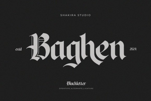
Baghen channels classic blackletter charm with refined curves and delicate terminals that recall hand-cut metal type. The design emphasizes balanced counters and tasteful ornamental details over excessive flourish, making it unexpectedly adaptable for both print invitations and web headers. Its vintage poise reads as dignified rather than fussy, adding a sense of heritage to stationery and boutique branding.
Subtle alternates and tasteful swashes give Baghen personality without overpowering a layout, while consistent stroke contrast aids readability in medium-sized headlines. The font pairs especially well with neutral sans-serifs, allowing its historic character to anchor modern compositions. Use it to impart authenticity on packaging, signage, and identity systems that require quiet elegance.
My Recommendation: I recommend Baghen when you want old-world blackletter aesthetics that remain classy and usable across formats. It’s a go-to for wedding invites, artisanal labels, and boutique identities where subtle historic flavor matters. Pair it with a clean sans to keep layouts legible and contemporary.
22. Antique Gothic Font
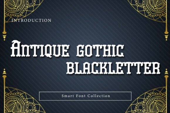
Antique Gothic is a bold display blackletter that channels medieval manuscript energy with contemporary clarity. Its sharp, angular strokes and compressed vertical rhythm deliver a dramatic silhouette suited to headers, badges, and emblems. Ornate terminals and subtle hairlines add decorative richness while keeping forms legible at larger sizes.
The face excels on posters, album covers, brewery labels, and identity marks that demand historic presence and theatrical flair. When paired with simple sans-serifs it provides strong contrast and modern compositional balance. If you’re assembling a typographic toolkit for authentic period styling or vintage branding, Antique Gothic has a rightful place in curated old english fonts collections.
╰┈➤ Download Antique Gothic Font
My Recommendation: I’d choose Antique Gothic for projects that need immediate historic gravitas-think craft beer labels, rock or metal album art, and heritage branding. Its ornamental capitals read as crafted and authoritative, making it ideal for logos and headlines rather than body text. Use it large, pair with a clean modern sans for support, and lean into minimal color to let the detailing sing.
23. Wicked Olde English Font
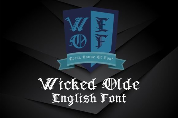
Wicked Olde English wears its Victorian-gothic inspiration proudly, blending high-contrast blackletter shapes with decorative swashes and slightly softened terminals. Subtle irregularities and hand-lettered cues create a lived-in, antique feel that reads as both ornate and approachable. It’s a display face built more for personality than dense typography.
This type is especially effective for themed posters, book covers, tattoo art, and specialty packaging where a dramatic vintage mood is desired. Tight tracking at large sizes intensifies its theatricality, while generous leading helps preserve clarity. Use Wicked Olde English when you want evocative period character without tipping into kitsch.
╰┈➤ Download Wicked Olde English Font
My Recommendation: I pick Wicked Olde English when projects demand theatrical, turn-of-the-century charm-event posters, heritage product labels, or nostalgic brand marks. Its slightly weathered, decorative forms are excellent for one- or two-word headlines that set a mood. Keep it out of body copy and pair with neutral backgrounds to let its personality remain the focal point.
24. Gabrielo Font
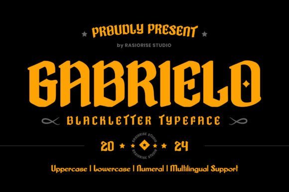
Gabrielo occupies the intersection of blackletter tradition and modern sans sensibility, simplifying ornate letterforms into bolder, cleaner strokes. Folded stems and pointed shoulders remain recognizable, but the reduced contrast and streamlined counters improve legibility on screens and print. The face reads as a contemporary nod to calligraphic heritage rather than a direct revival.
Gabrielo works well for logos, packaging, editorial headlines, and merchandise where blackletter attitude is desired without excessive ornamentation. Its alternates and robust capitals let designers craft tight badges or expansive mastheads with equal confidence. I value Gabrielo when a design needs Old English–inspired character paired with practical clarity and flexible weights.
My Recommendation: I use Gabrielo when a project needs blackletter attitude but also requires clear reproduction across digital and physical formats-labels, headers, and branding do very well. Its pared-back forms make it versatile for small-format uses, unlike many ornate blackletters. Favor it when you want historic flavor without sacrificing contemporary readability or responsive behavior.
25. Perrownt Font
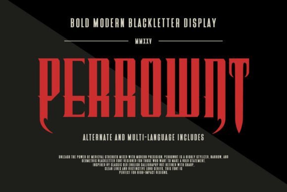
Perrownt is a narrow, geometric blackletter that fuses medieval gravitas with razor‑clean modern geometry; the result reads like a futuristic take on classic ornamentation and sits comfortably among old english fonts used for bold display work. Its elongated verticals and pronounced, knife‑edged serifs produce a relentless rhythmic texture in headlines, making compact typographic compositions feel disciplined and kinetic. Despite its decorative vocabulary, counters and stroke modulation are engineered for clarity so short words hold up at larger sizes.
Alternates, extended glyphs and PUA‑encoded ornaments give designers instant access to historic swashes and international characters without extra tooling, while deliberate spacing makes it ideal for apparel marks, craft‑beer packaging and gaming UI. Treat Perrownt as a display face – pair it with a neutral grotesque or humanist sans to create hierarchy and visual contrast. Subtle distressing, metallic inks or raised print finishes amplify its hybrid heritage‑meets‑industrial personality.
My Recommendation: I’d reach for Perrownt when I want a commanding, contemporary‑blackletter look that still reads well on product and screen. Its geometric precision pairs easily with modern UI elements while alternates add plenty of character for logos and packaging. Use it for craft breweries, metal bands, and game titles that need a historic attitude with a futuristic edge.
26. Malitia Vetus Font
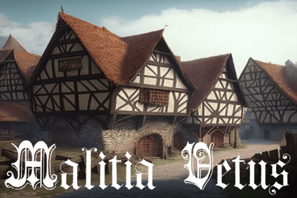
Malitia Vetus channels the spirit of illuminated manuscripts through a decorative blackletter that leans on Lombardic majuscules and Tuscan flairs rather than pure Gothic severity. The strokes feel hand‑chiseled, with generous ornamental capitals, tight ligatures and tapered terminals that mimic quill pressure and the rhythm of historic calligraphy. Its tactile texture conveys authenticity while remaining sufficiently controlled for short headlines and display text.
Because of its historical fidelity, this typeface excels at reproducing medieval documents, certificates, and book covers where period accuracy matters; its initials and ornamented caps make strong standalone identity marks. Designers can extract fancy capitals for signage, seals or packaging embellishments. For extended copy, combine Malitia Vetus with a clean serif or neutral sans to preserve legibility and let the ornamentation remain the focal point.
╰┈➤ Download Malitia Vetus Font
My Recommendation: I use Malitia Vetus when a project needs convincing historical flavor-think certificates, museum labels, and period‑style book covers. Its ornate initials double as decorative assets you can repurpose across layouts and collateral. Pair it with a plain body face to let the capitals do the storytelling without sacrificing readability.
27. Old English Bundle Font
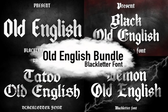
The Old English Bundle assembles a range of blackletter personalities-from tattoo‑ready scripts to heavy Gothic display cuts-so you have multiple historic voices in one package. Each face brings distinct angles, serifs and ornamental treatments, allowing you to craft layered typographic hierarchies for logos, band merch and vintage posters without losing stylistic cohesion. The fonts prioritize headline impact, with kerning and spacing tuned for display rather than long passages.
Bundling different stylistic variants encourages experimentation: pair a cleaner ‘Black’ weight for primary marks with a rougher ‘Demon’ or ‘Tattoo’ cut for secondary badges and patterns, and use the included PUA glyphs to access alternates and ligatures quickly. Files typically arrive in industry formats with multilingual coverage and clear license notes, streamlining use across print and digital. For maximum effect, combine these typefaces with textured inks, embroidery or distress overlays to emphasize handcrafted, vintage character.
╰┈➤ Download Old English Bundle Font
My Recommendation: I recommend this bundle when you want versatile blackletter options at your fingertips for music, apparel, or poster work. Its mix of styles reduces the need to source separate families and makes it easy to build cohesive brand systems. The PUA glyphs and consistent production quality save setup time and let you focus on composition and finishing techniques.
28. Demon Old English Font
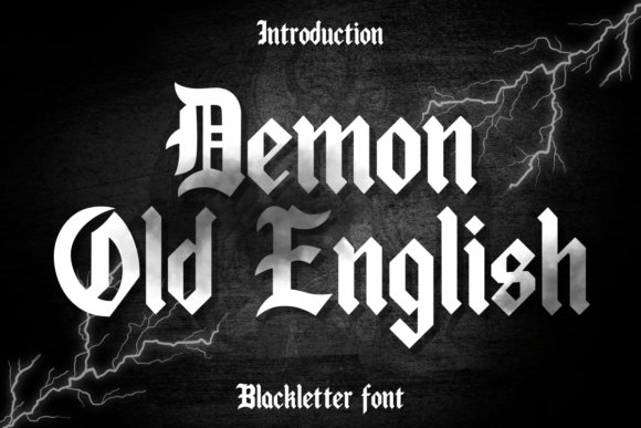
Demon Old English channels classic blackletter with sharply defined strokes, dense counters, and ornamental swashes that echo medieval manuscripts and modern Gothic branding. Its heavy weight and tightly spaced letterforms create immediate impact for headlines, signage, and packaging, while built-in ligatures and decorative capitals add authentic period flair. As part of the broader conversation about old english fonts, Demon stands out for balancing historical ornamentation with surprising legibility, making it a strong choice when you need a commanding, dramatic display face.
On the technical side, Demon performs best at display sizes where its high-contrast lines and intricate interior shapes remain visible; small text can lose detail. For cleaner compositions, pair it with a neutral sans or geometric grotesque and increase tracking for longer phrases to avoid visual crowding. Use its muscular presence for logos, posters, record covers, or certificate headers where a bold, antiquated voice is the primary goal.
╰┈➤ Download Demon Old English Font
My Recommendation: I reach for Demon Old English when a project needs instant historical weight-album art, boutique labels, and dramatic editorial covers all benefit. Its ornate capitals and tight contrast deliver gravitas without descending into cliché. Use it sparingly as a display face to preserve impact and legibility.
29. Tattoo Old English Font
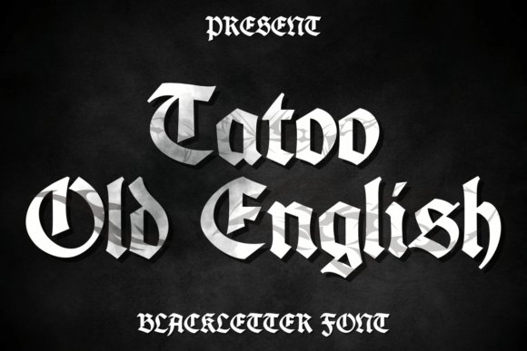
Tattoo Old English reimagines blackletter through a hand-drawn, inked aesthetic, offering a gritty, textured take on Gothic script that reads as both nostalgic and contemporary. Its irregular strokes and distressed terminals give designs a human touch, making it ideal for apparel, tattoo flash, and social-first graphics that need attitude rather than strict formality. This version leans into imperfection, trading pristine precision for personality and visual warmth.
Best used at medium to large sizes, Tattoo Old English shows its character most clearly in badges, headers, and wordmarks rather than long paragraphs. Combine it with muted palettes, layered textures, or halftone treatments to amplify its tattoo-inspired vibe and consider simplified alternates for tighter logo work. It’s particularly effective for streetwear branding, band merch, and lifestyle projects where a handcrafted, rebellious look is desired.
╰┈➤ Download Tattoo Old English Font
My Recommendation: I recommend Tattoo Old English when you want a tactile, rebellious spin on Gothic lettering for merchandise, posters, or identity projects. Its hand-rendered feel brings warmth and attitude that polished blackletter revivals often lack. Use it for headlines and logos where expressive character matters more than formal perfection.
These 29 selections make it easy to find an old english font that fits your project’s tone without getting lost in overly decorative detail. By focusing on purpose-display versus text, print versus screen-and checking licensing, you can use historic styles with modern confidence.
Start by testing a few options from the categories above, pair a stronger blackletter with a neutral serif or sans for balance, and prioritize readability at the intended size. With the right choice, your work will convey heritage and craftsmanship throughout 2026 and beyond.