Elegant Fonts in 2026: 16 Beautiful Typefaces I Keep Reaching For
People throw the word elegant at almost any pretty font, but the ones that actually read as refined have something in common: restraint in the right places and detail in the others. I pulled together 16 elegant fonts I keep coming back to in 2026, across serifs, scripts and a couple of sans faces, and noted where each one earns its place. If you want to go deeper later, these all sit inside the broader rules of good typography.
A quick note before the picks: nearly everything here is a display face, meant for names, headlines and short lines. For longer text I lean on one of the calm sans options and let the showy face do the talking. If you want a category-by-category deep dive, I split these themes into separate guides, including luxury serif fonts, romantic calligraphy fonts and elegant wedding fonts.
- Elegant fonts with a soft, floral lean
- High-contrast display faces for headlines
- Quiet, modern sans for the base
- Script that still feels current
- Quick answers
Quick picks by use case
- Logo or wordmark: Kalorama, Modern Romance
- Wedding names and save-the-dates: Adelia, Advance Elegant
- Editorial or magazine headline: Eliganthe, Quiet Lumie
- Soft, floral branding: Roses Garden, Gelgira
Elegant fonts with a soft, floral lean
These read warm and a little romantic rather than austere, which suits beauty, florals and lifestyle work.
Roses Garden
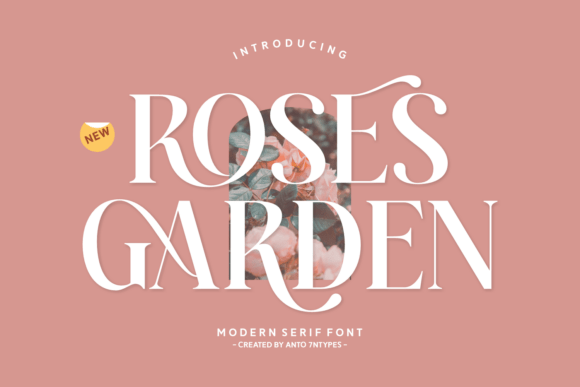
Roses Garden opens the list because it does something most serifs here don’t: it works in a warm coral-orange by default, which sets a softer, more floral tone than the usual black on white. The letterforms are modern with gentle flourishes on the capitals, so it reads as decorative without tipping into fussy. I’d use it for a florist logo, a perfume label, or the cover of a spring lookbook. Pair it with a quiet sans for body copy and let the headline carry the personality. Keep it at display sizes; the detailing fades under about 24px.
Gelgira
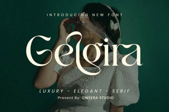
Gelgira is a modern romantic serif with swashes that extend off the capitals and a noticeable thick-to-thin contrast. It lands somewhere between a branding face and an editorial one, comfortable on a boutique logo or a magazine standfirst. The swashes are the signature feature, so use them where there’s space to let them open up rather than crowding them into a tight lockup. For body text I’d switch to a calmer companion and let Gelgira handle the headline. It suits beauty, fashion, and wedding stationery especially well.
Matreal
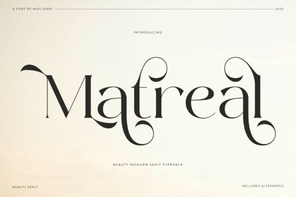
Matreal is a modern serif with teardrop terminals and a softly calligraphic feel, so it bridges the gap between a script and a straight serif. The curves give it warmth without losing the structure you need for longer text. I’d use it for an organic skincare brand, a boutique hotel, or a recipe book where the type should feel handcrafted but still legible. It holds detail down to mid sizes, which is more forgiving than the steep-contrast display faces. Pair it with a simple sans for captions and let Matreal set the tone in headers.
Megarin
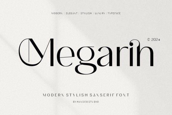
Megarin is a display serif with a vintage streak, the kind of face that nods to old signage and book jackets without feeling like a costume. The shapes are classy and a little decorative, good for a wordmark that wants some history behind it. I’d put it on a bakery sign, a perfume label, or a chapter heading. It has a clear, readable structure, so it survives at slightly smaller sizes than the hairline serifs here. Pair it with a clean sans and it reads as considered rather than fussy.
High-contrast display faces for headlines
Steep thick-to-thin contrast gives a layout that polished, fashion-magazine snap. Keep them large so the hairlines hold.
Eliganthe
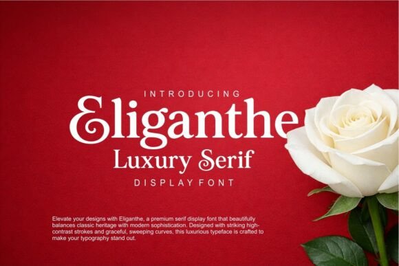
Eliganthe is a display serif with real backbone. The contrast between thick stems and hairline serifs is steep, which gives headlines a polished, fashion-magazine snap. It carries a classical skeleton but the proportions feel current, so it suits both a heritage brand and a newer label that wants to look established. I reach for fonts like this on editorial spreads, title pages, and packaging where one strong word has to do the work. Set it large and tracked slightly open; cramped, the fine serifs start to fight each other.
Roseta
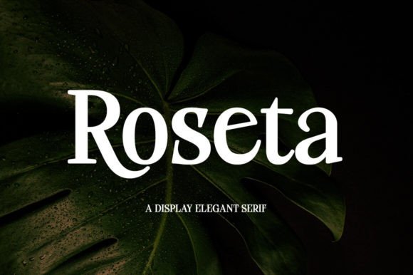
Roseta is a thick, balanced display serif made for short bursts of text that need to look high-end. The weight is fairly even, so instead of delicate hairlines you get solid, confident letterforms that read clearly even at a glance. That makes it a good fit for poster titles, book covers, and logo wordmarks. It has enough character to stand alone, so I wouldn’t bury it in a busy layout. Set one or two words large, give them space, and pair anything finer for the details.
Quiet Lumie
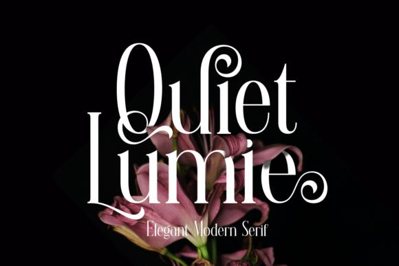
Quiet Lumie lives up to the first half of its name and ignores the second: it’s a restrained, high-contrast serif with thick verticals and fine connecting strokes. The effect is quietly luxurious, the sort of type you see on a jewelry box or a wine label. It photographs well against both pale and dark backgrounds, so it’s flexible for packaging mockups. Because the contrast is steep, keep it at headline sizes and avoid thin printing on textured stock where the hairlines can drop out. A plain sans handles the rest.
Kalorama
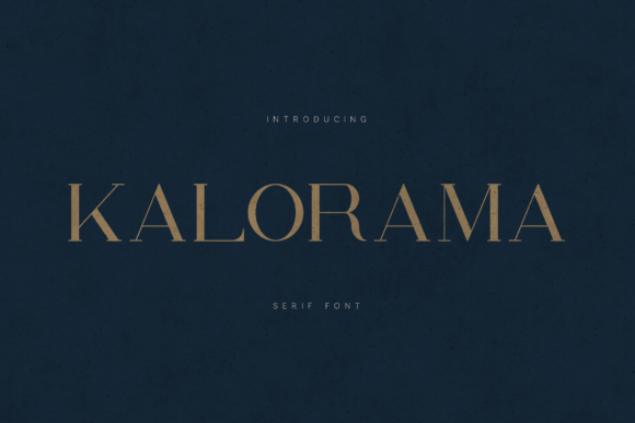
Kalorama is the workhorse luxury serif of this lineup: high contrast, classical roots, and proportions tuned for branding and editorial layouts. It looks expensive without trying too hard, which is exactly what you want on a fashion logo or a magazine spread. The hairlines are fine, so it rewards larger sizes and good printing. I’d anchor a brand system around it and pair it with a neutral sans for everything functional. If I had to pick one face here for a high-end identity, Kalorama would be on the shortlist for its mix of polish and flexibility.
Quiet, modern sans for the base
Every ornate face needs a calm partner. These two handle body copy and small print while the display faces lead.
Luxury Romance
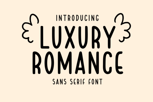
Luxury Romance is the calm one in this group: a clean sans serif with soft, balanced shapes and no decorative noise. That restraint is its strength, since it gives romantic projects a modern, uncluttered base that won’t compete with a fancier display face. I’d use it for body copy on a wedding website, the supporting text on minimalist packaging, or a quiet logotype. It pairs naturally with any of the scripts here, carrying the small print while they handle the headline. Generous letter spacing keeps it feeling premium rather than plain.
Modern Romance
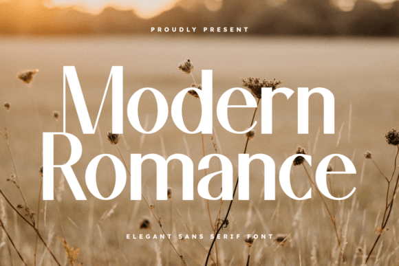
Modern Romance is a sans with a high-fashion attitude: narrow proportions, even strokes, and a cool, editorial calm. Where Luxury Romance feels soft, this one feels sharper and more runway-ready, which makes it a strong pick for a fashion label, a beauty line, or a magazine masthead. Set in all caps with open tracking, it looks expensive and confident. It also works well as a contrast partner to a flowing script, the plain face grounding the ornate one. Keep layouts spare so its restraint does the talking.
Script that still feels current
Handwriting that reads modern rather than old-fashioned, good for names, cards and a personal touch.
Adelia
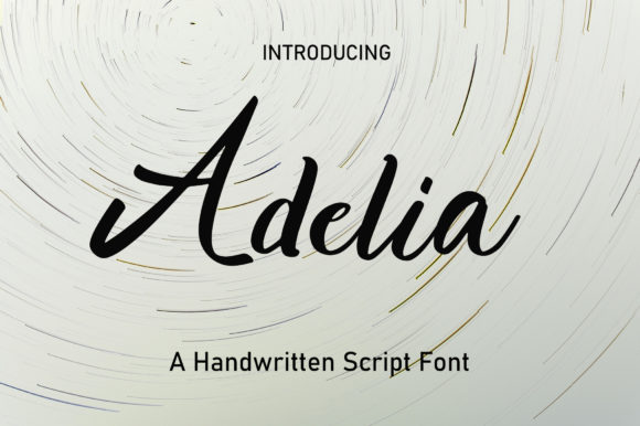
Adelia is a calligraphy script that sits high and low across the baseline, with letters that lean and swing rather than march in a straight line. That movement is the whole point: it feels handwritten and a little sweet, the kind of thing you’d letter onto a save-the-date or a candle label. The thin connecting strokes give it a delicate look, so it pairs nicely with a sturdier serif for contrast. Watch the line spacing, since the tall loops can collide. Best for short, romantic phrases rather than full paragraphs.
Finytaels
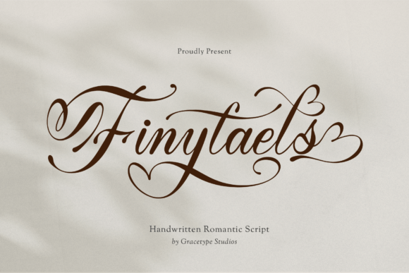
Finytaels is fluid cursive with long, sweeping connectors that tie one letter into the next. It has a confident, almost ribbon-like flow, which makes it feel personal rather than mechanical. The descenders stretch out, so it shines as a one-line statement across an invitation or a romantic quote print. There are alternate letterforms in the family, handy when two of the same letter sit side by side and you want to avoid an obvious repeat. Give it breathing room above and below, and keep body text in something plainer.
Amorette
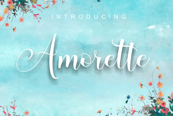
Amorette is a romantic calligraphy script built around rounded curves and tidy swashes. It reads as friendly and a little dreamy rather than formal, which makes it a comfortable choice for greeting cards, packaging, and social posts. The swash alternates let you finish a word with a flourish or keep it plain, depending on the layout. Because the strokes stay fairly even in weight, it holds up slightly better at smaller sizes than the hairline scripts here. Pair it with a simple serif or sans and it sits happily as the accent.
Madison Sauvage
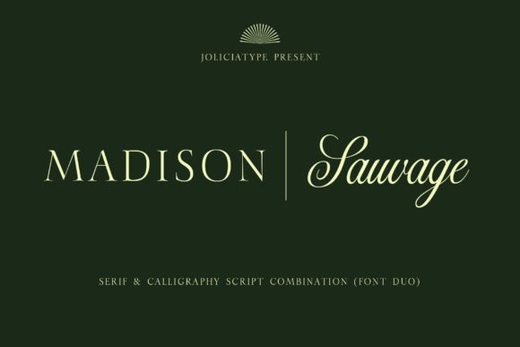
Madison Sauvage blends a classic serif structure with a calligraphic script, so within one family you get both a steady, heritage-leaning face and a hand-lettered partner. That makes it a smart all-in-one for branding work, where you might set a label name in the script and the tagline in the serif. The script has a refined swing rather than a loud one, which keeps the whole thing grown-up. It suits boutique fashion, stationery, and editorial covers. As always with mixed families, test the script at the smallest size you plan to print.
Hello Beautiful
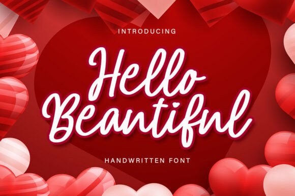
Hello Beautiful is a modern handwritten script with the loose, affectionate rhythm of a note written by hand. It leans into a chic, love-letter mood, so it suits cards, beauty packaging, and quote prints aimed at a softer audience. The connecting strokes vary a touch in weight, which keeps it feeling genuine rather than traced. Use it for a name or a short line; in long paragraphs the personality starts to wear. It pairs cleanly with a quiet sans, which carries the smaller copy while it handles the greeting.
Advance Elegant
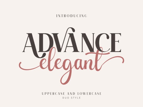
Advance Elegant is really two voices in one purchase: a high-contrast serif and a flowing script that share the same family. That pairing is genuinely useful, because you can set a name in the script and the supporting words in the serif without hunting for a second typeface that matches. The script half has a romantic swing; the serif half keeps things readable. I’d use it on a wedding suite or a salon brand where you want both a signature feel and clean information. Mind the script’s legibility at small sizes.
If I had to pick one face to build a whole identity around, it would be Kalorama for the structure and Modern Romance for the body text. Pair those two and you can carry a brand from a logo all the way down to the footer. Browse the rest by mood in the modern minimalist fonts guide when you want something quieter.
Quick answers
Are these elegant fonts free for commercial use?
Most come with a commercial license through Creative Fabrica, but always read the license on each product page before using a font in paid client work.
Which elegant font works best for a logo?
For a logo you usually want clarity at small sizes, so a clean serif like Kalorama or a quiet sans like Modern Romance tends to beat a fine-stroked script.
Can I pair two of these fonts together?
Yes. It often looks best to put one display serif or script with one plain sans, letting the decorative face handle the headline and the simple one carry the body text.
Disclosure: some links on this page are affiliate links. If you buy through them I may earn a small commission, at no extra cost to you. I only feature fonts I would be happy to use in my own work.