Clothing brand logo ideas are usually presented as a wall of pretty marks with no mention of the thing that actually decides whether a logo works: where it ends up. A logo that looks refined on screen can clog into an unreadable blob once it is woven into a neck label at fifteen millimetres wide. This guide organises twenty concepts by brand positioning, and each one includes the typography, palette, and the specific application where it will fail if you are not paying attention.
Why Positioning Comes Before Design
Clothing brand logo ideas cannot be evaluated in isolation, only against what the brand is trying to be. A thin tracked-out serif is exactly right for a quiet luxury label and completely wrong for kids’ clothing, and neither judgement has anything to do with whether the mark is well drawn.
So before browsing clothing brand logo ideas, settle three things: what price point you are selling at, who you are competing against, and whether the customer is buying identity or utility. Those answers eliminate most of the options below, which is the point. A brief that permits everything produces nothing.
About these examples. Every mark shown is an original concept made for this guide using invented brand names. None is a real company. Use them to understand the reasoning, not as artwork to copy, since a working identity has to be drawn for one specific business.
Quiet Luxury
Understated, expensive, and deliberately unbranded. The restraint is the message.
Quiet luxury
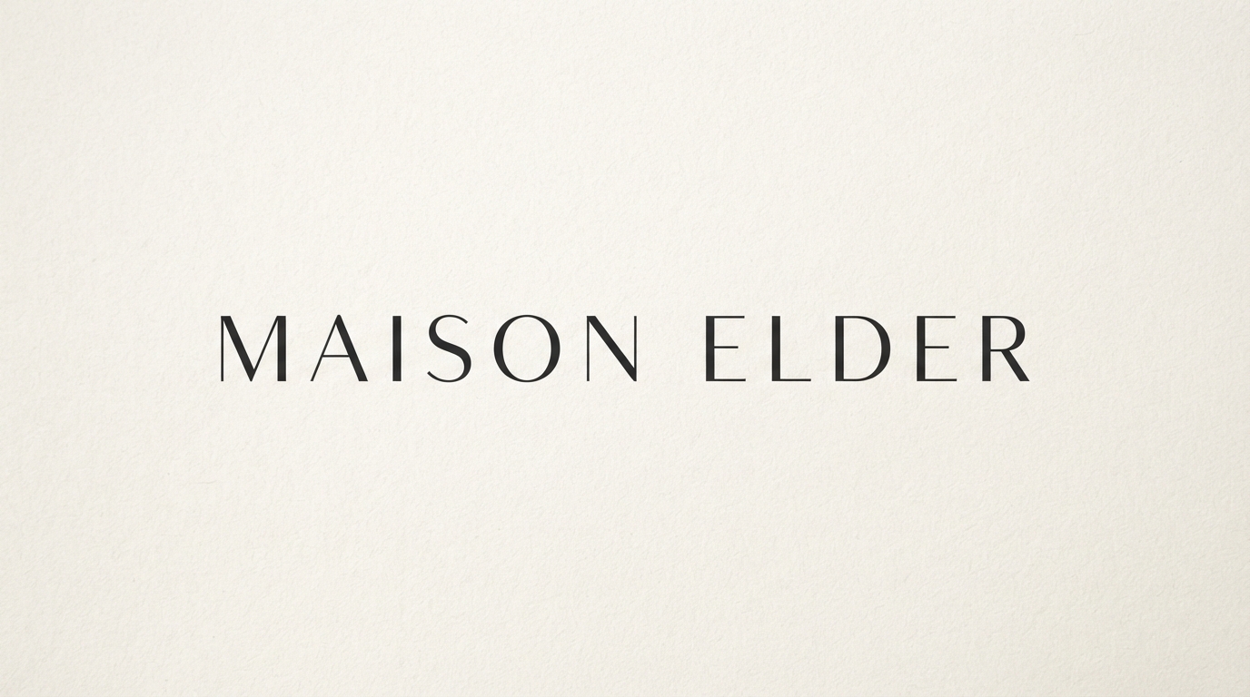
Maison Elder
How it reads: Expensive and self-assured. The extreme letter spacing implies the brand has nothing to prove and no need to shout.
Typography: Thin high-contrast serif, tracked out heavily. The hairlines do the signalling.
Palette: Near-black on warm off-white. Introducing a second colour would undercut the restraint.
Where it lives: Printed lookbooks, shop fascia, tissue paper. Excels anywhere it gets space around it.
Watch out for: Embroidery. Those hairlines clog in thread, so you need a heavier cut specifically for stitched applications.
Quiet luxury
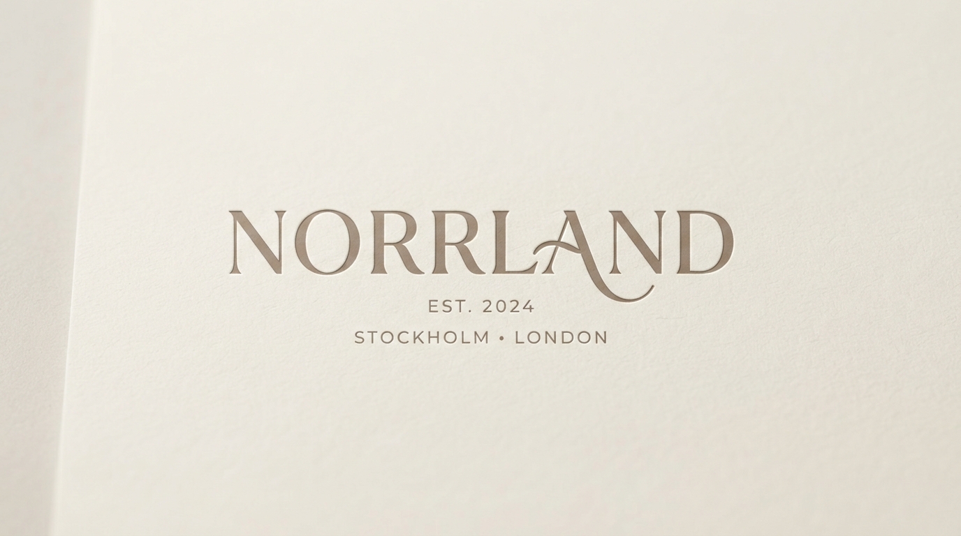
Norrland
How it reads: Established and international. The city line beneath does more positioning work than the name itself.
Typography: Refined serif with a subtle swash on one letter, so it is not entirely anonymous.
Palette: Warm taupe on cream. Tonal rather than contrasting, which reads as considered.
Where it lives: Debossed on packaging, foil-blocked on boxes. Built for tactile print rather than screens.
Watch out for: The city line dating badly if you relocate. Keep it on a separate layer you can pull without redrawing.
Minimal Modern
Clean, geometric, design-conscious. Sells to people who notice typography.
Minimal modern
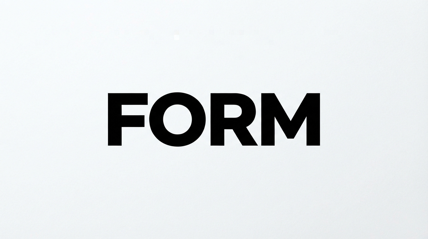
FORM
How it reads: Confident and contemporary. Tight tracking on a heavy geometric sans reads as architectural.
Typography: Heavy geometric sans, tracking pulled tight. Short names only, since this gets unwieldy fast.
Palette: Pure black on white. Anything else weakens the starkness that is the entire point.
Where it lives: Large chest prints, tote bags, shop windows. Scales up better than almost anything else here.
Watch out for: Genericness. Heavy geometric sans is the default of a thousand brands, so the name has to carry the distinctiveness.
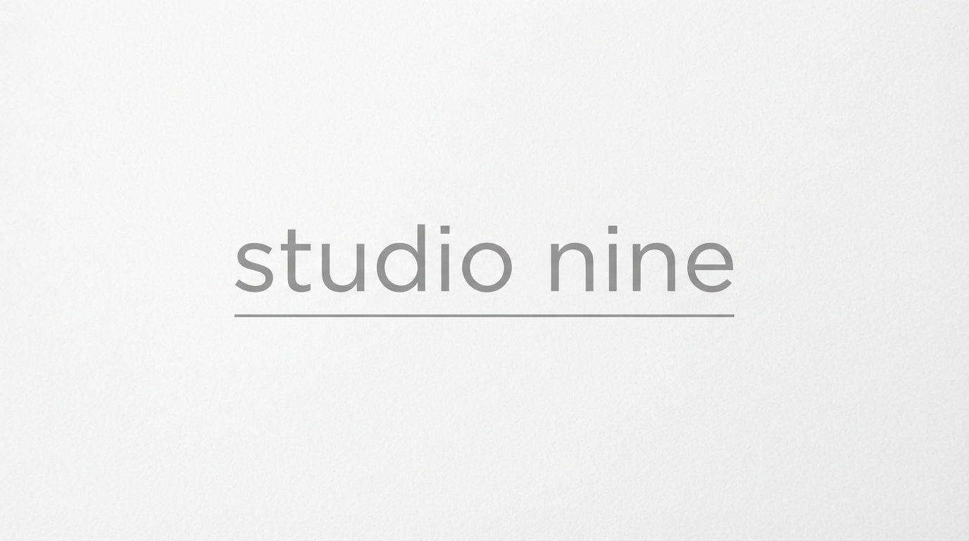
Minimal modern
studio nine
How it reads: Understated and design-literate. Lowercase signals informality without tipping into casual.
Typography: Light sans in lowercase, with a thin rule providing the only structure.
Palette: Soft grey on white. Deliberately low contrast, which suits a brand talking to other designers.
Where it lives: Website headers, digital lookbooks, business cards. Screen-first rather than garment-first.
Watch out for: Low contrast failing on garments. What reads on a white screen vanishes on heather grey fabric.
Vintage Americana
Heritage cues, workwear roots, and manufactured provenance.
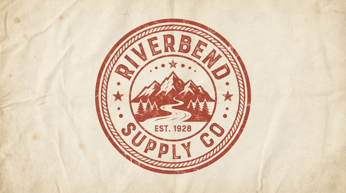
Vintage americana
Riverbend Supply Co
How it reads: Trustworthy and hard-wearing. The rope border and est date borrow credibility from a century of outdoor outfitters.
Typography: Condensed slab serif curved around the ring. Needs a face that survives distortion on a radius.
Palette: Faded rust red on unbleached canvas. The fading is doing narrative work.
Where it lives: Screen prints on heavyweight cotton, canvas totes, enamel pins. Built for texture.
Watch out for: Detail loss. Everything inside a circular badge shrinks together, so simplify aggressively for small applications.
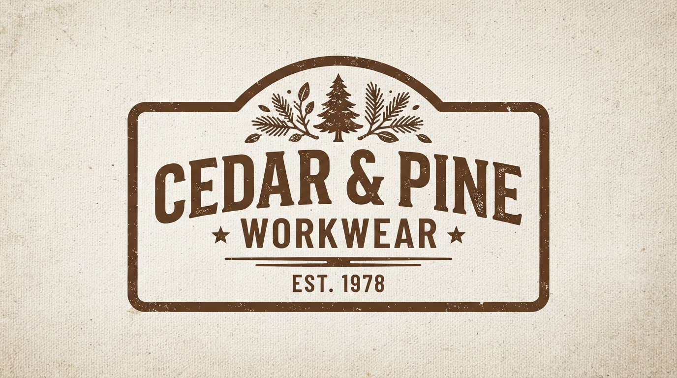
Vintage americana
Cedar & Pine Workwear
How it reads: Honest and functional. The frame plus est date is workwear shorthand understood instantly.
Typography: Bold condensed slab serif with a lighter secondary line. Two weights create the hierarchy.
Palette: Walnut brown on natural canvas. Warm, earthy, and consistent with the 2026 move toward grounded tones.
Where it lives: Woven labels, hang tags, back prints on chore coats.
Watch out for: Category saturation. Heritage workwear branding is crowded, so the illustration inside has to be genuinely specific.
Boho
Handmade warmth, earth tones, and a visible human behind the label.
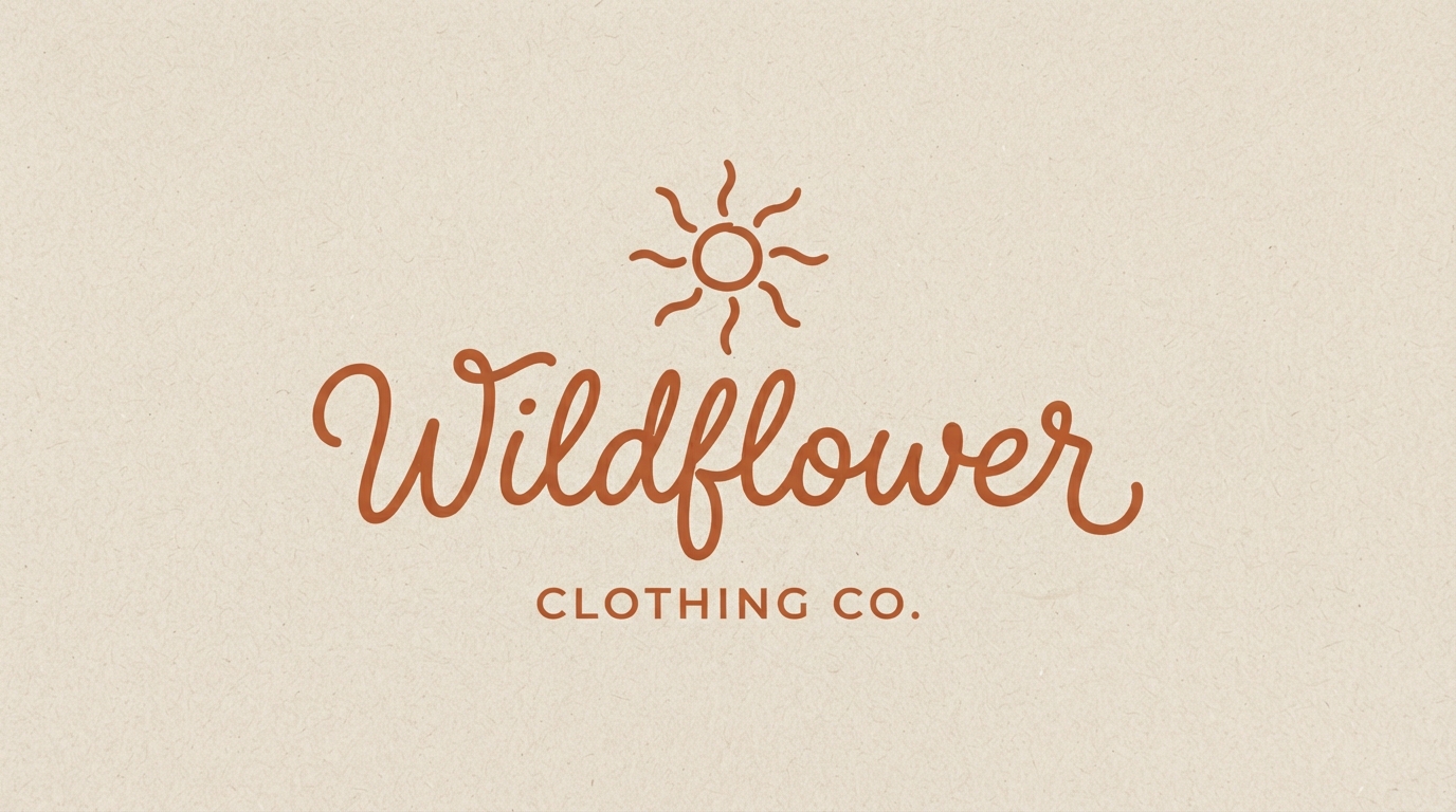
Boho
Wildflower
How it reads: Warm and handmade. The script implies a person behind the brand rather than a corporation.
Typography: Flowing handwritten script. Needs real ligature support or the letter connections will give it away.
Palette: Terracotta on sand. Earth tones without going literally brown.
Where it lives: Woven labels, tissue paper, market stall signage. Small-batch contexts.
Watch out for: Legibility at small sizes. Scripts lose their connections first, and a broken script looks like an error.
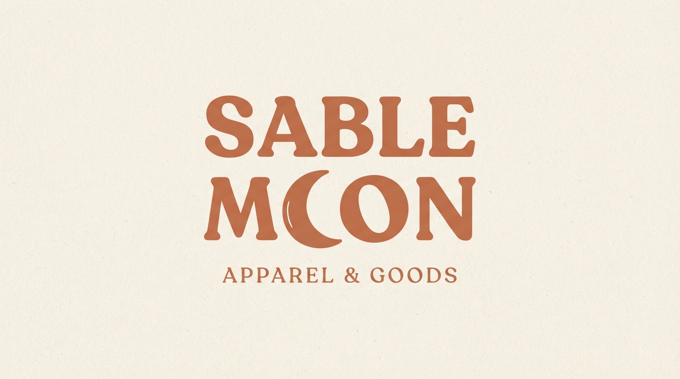
Boho
Sable Moon
How it reads: Mystical but grounded. The moon replacing a letter is a clean piece of visual wordplay.
Typography: Soft rounded serif with generous counters, which is what makes the letter substitution possible.
Palette: Muted clay on cream. Sits in the warm neutral territory dominating 2026 palettes.
Where it lives: Garment labels, packaging seals, social avatars. The compact stack works well as a square.
Watch out for: Substitution clarity. If people read the moon as a C, the wordplay has failed.
Athleisure
Motion, technical clarity, and marks that read fast at small sizes.
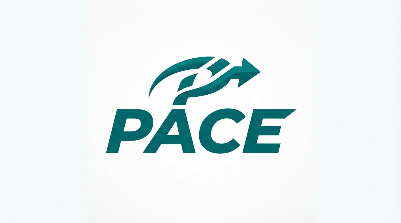
Athleisure
PACE
How it reads: Forward motion. The italic angle does the entire job, no arrow icon required.
Typography: Bold italic sans. The slant should be consistent across every letter, including the counters.
Palette: Deep teal on white. Notably restrained for athletics, which is what makes it feel current.
Where it lives: Chest prints, leggings waistbands, water bottles. Small applications where a mark must read fast.
Watch out for: Italic on curved surfaces. On a sleeve or a bottle, an italic mark can look accidentally crooked.
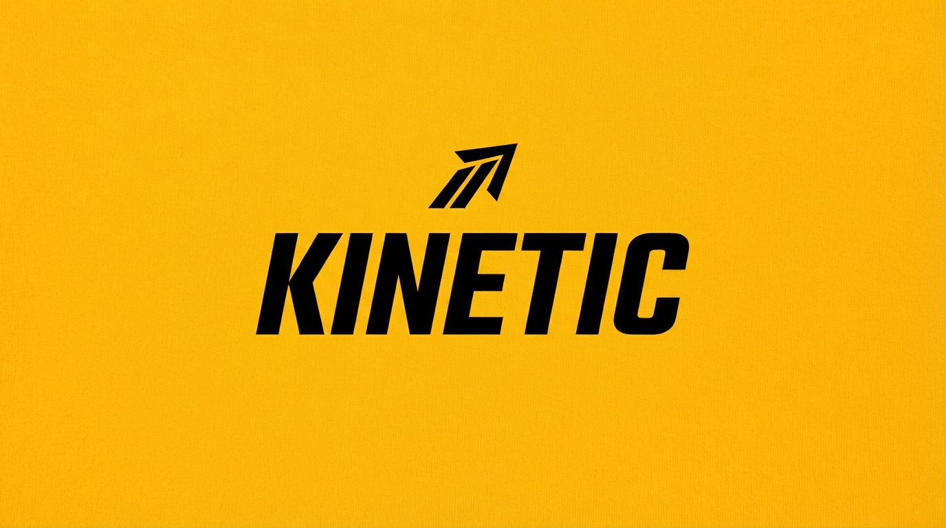
Athleisure
KINETIC
How it reads: Technical and energetic. The abstract mark gives the brand something usable as a standalone icon.
Typography: Wide condensed sans with even stroke weights, so it holds up under stretch on knit fabric.
Palette: Black on amber. High contrast for visibility, which matters for activewear seen in motion.
Where it lives: Performance fabric prints, app icons, packaging.
Watch out for: Fabric stretch. Type printed on jersey distorts when worn, so avoid delicate proportions.
Y2K Revival
Chrome, saturation, and knowing nostalgia for late nineties graphics.
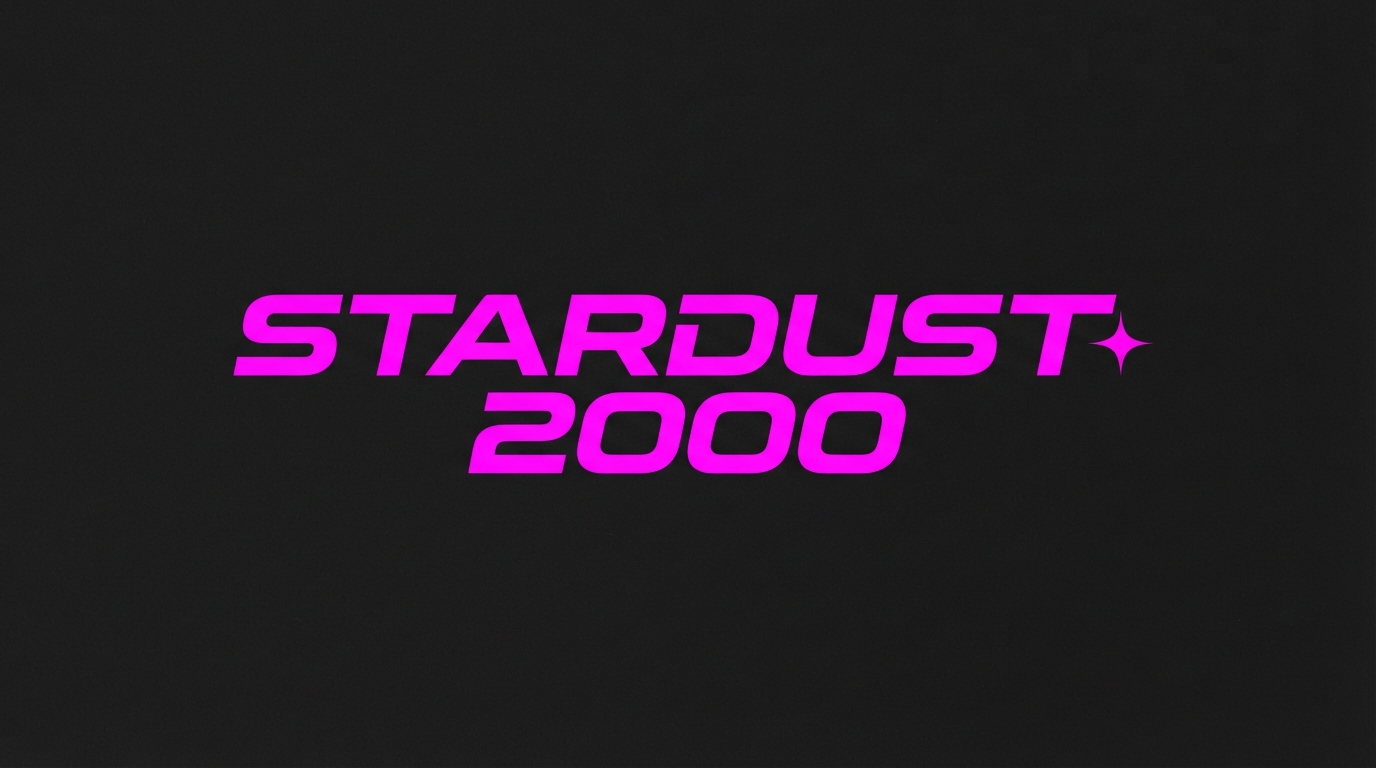
Y2K revival
STARDUST 2000
How it reads: Nostalgic and knowing. The stretched techno face is a direct quotation of late nineties graphic design.
Typography: Stretched techno sans with squared curves. The horizontal distortion is intentional here, not sloppy.
Palette: Electric fuchsia on near-black. Maximum saturation, the opposite of the quiet luxury end of this list.
Where it lives: Graphic tees, sticker packs, social content. Fast fashion cycles rather than heritage building.
Watch out for: Trend lifespan. Y2K revival is a moment, and this mark will date. Build that expectation into the plan.
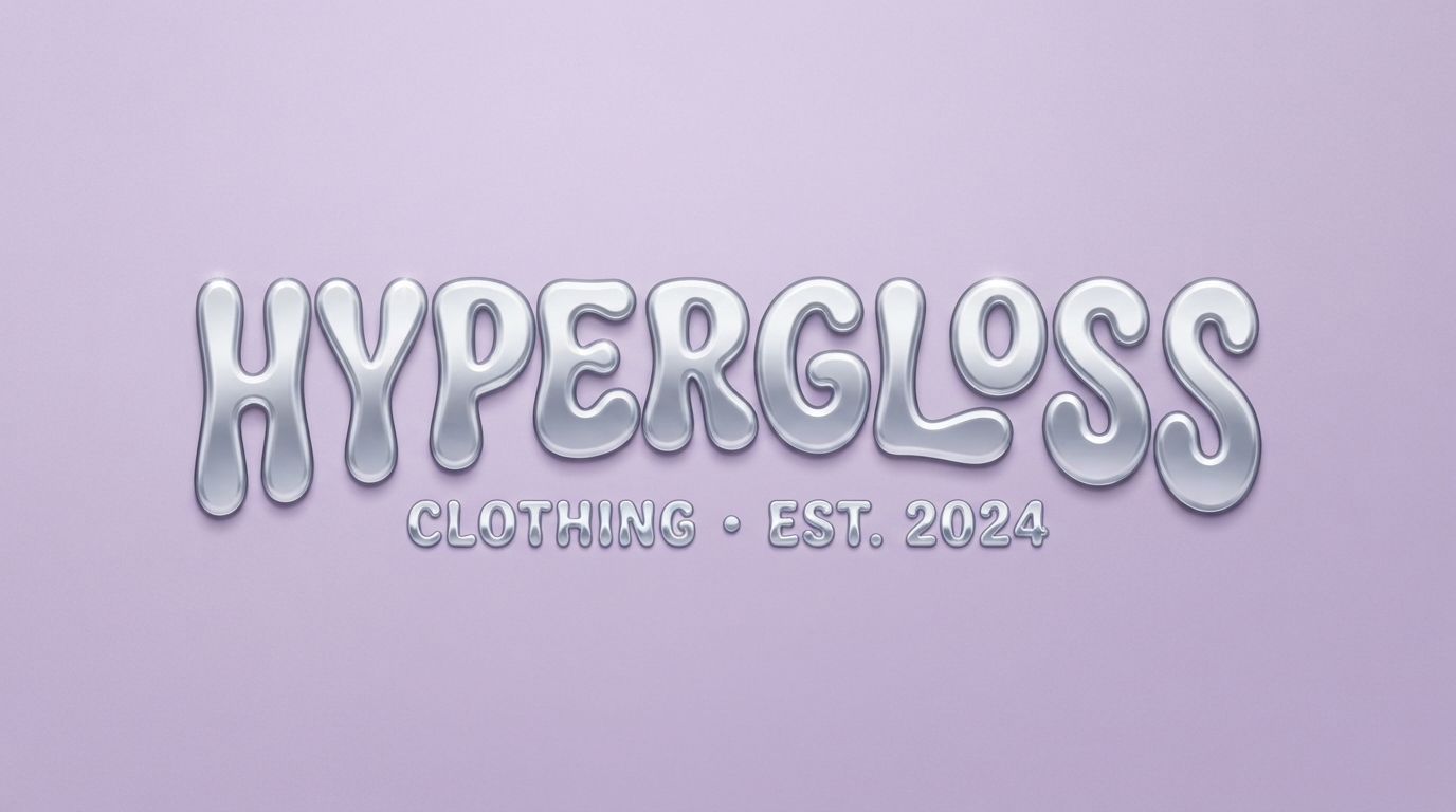
Y2K revival
hypergloss
How it reads: Playful and synthetic. The chrome gradient is pure surface, and that is the point.
Typography: Bubbly rounded sans in lowercase. Soft forms keep it friendly rather than aggressive.
Palette: Silver gradient on lilac. Gradients here are a feature, not a flaw.
Where it lives: Digital-first. Instagram, product pages, DTG prints that can reproduce gradients.
Watch out for: Single-colour reproduction. A chrome gradient collapses in screen printing and embroidery, so build a flat alternate.
Sustainable
Restraint, natural materials, and avoiding the greenwashing cliche.
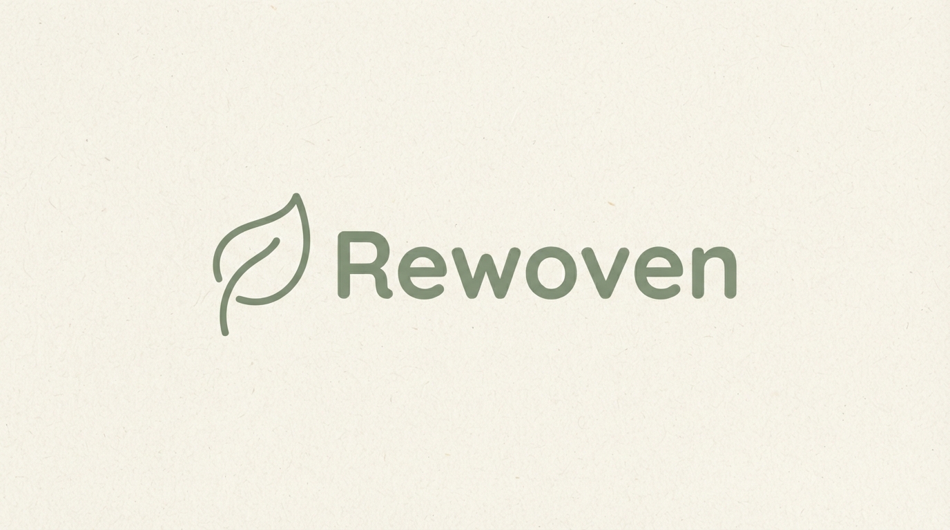
Sustainable
Rewoven
How it reads: Considered and low-impact. The humanist sans reads as human without resorting to a handwritten font.
Typography: Humanist sans with slightly open apertures, which keeps it warm rather than corporate.
Palette: Sage green on natural cream. Restrained enough to avoid looking like greenwashing.
Where it lives: Recycled card swing tags, organic cotton labels, minimal packaging.
Watch out for: Leaf cliche. Every sustainable brand uses a leaf. If yours is generic, the mark communicates nothing specific.
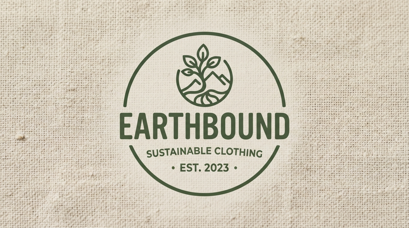
Sustainable
EARTHBOUND
How it reads: Rooted and unfussy. The circular outline gives a plain wordmark a fixed, stampable silhouette.
Typography: All-caps organic sans with subtly irregular strokes, which prevents it feeling machine-made.
Palette: Moss green on undyed linen tone. Colour drawn from the material rather than applied to it.
Where it lives: Ink stamps on card, undyed labels, hessian and canvas.
Watch out for: Circular frames shrinking badly. Test the outline weight at label size before finalising.
Kids and Intimates
Two specialist categories with very different but equally strict rules.
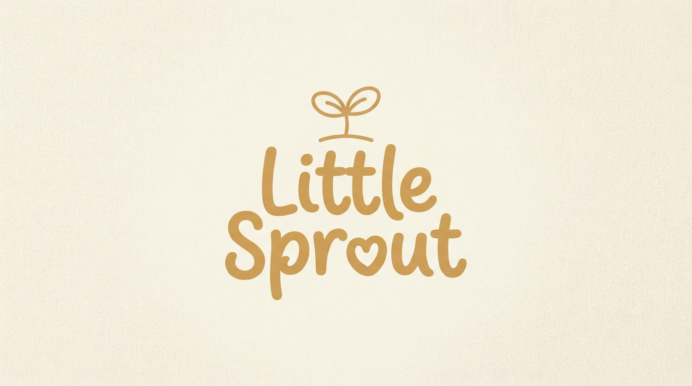
Kids and baby
Little Sprout
How it reads: Gentle and safe. Rounded letterforms with no sharp terminals read as soft, which parents respond to.
Typography: Rounded script with even, chunky strokes. Thin scripts read as fragile rather than friendly here.
Palette: Warm mustard on cream. Avoids the pastel default and looks less generic for it.
Where it lives: Soft woven labels, gift packaging, growth charts. Everything touchable.
Watch out for: Safety-critical labels. Care and sizing labels must stay legible, so never set them in the logo script.
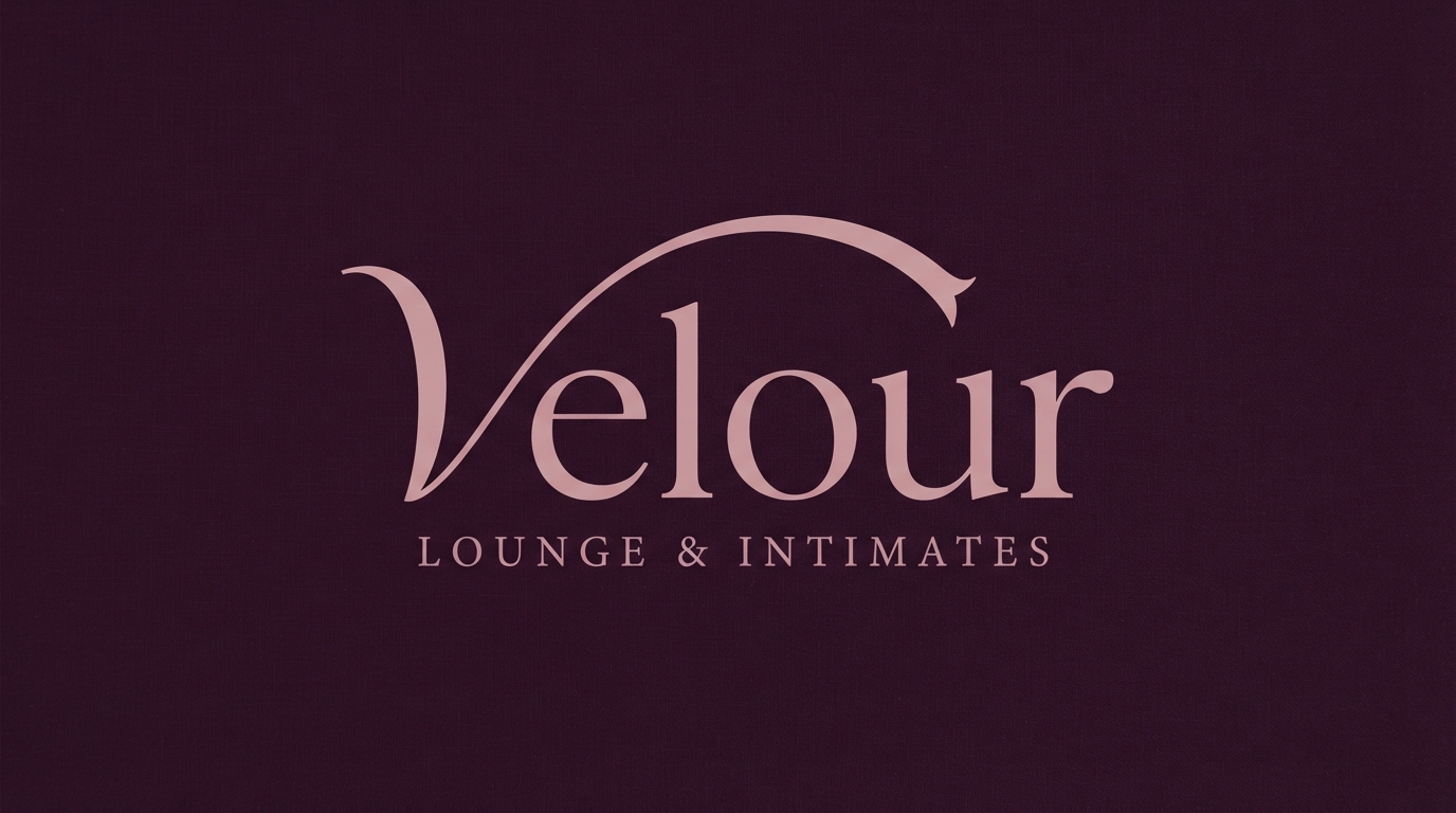
Lingerie and intimates
Velour
How it reads: Intimate and refined. The elongated ascender adds a gesture without adding a decorative flourish.
Typography: Delicate italic serif. Italic implies softness in a way an upright face cannot.
Palette: Dusty rose on deep plum. Tonal and low contrast, which suits the category.
Where it lives: Satin woven labels, tissue paper, small boxes. Everything soft and small.
Watch out for: Satin label reproduction. Fine italic serifs blur on woven satin, so simplify for that specific application.
Where Logos Actually Live
Four applications that decide whether a clothing logo works in practice.
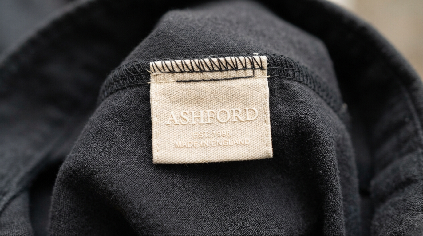
Application
The woven label
How it reads: This is where most clothing logos actually get seen, and where most of them fall apart.
Typography: Simplified. Woven labels have a hard resolution limit set by thread density, so fine detail is impossible.
Palette: Two colours maximum. Every additional thread colour raises the unit cost meaningfully.
Where it lives: Neck labels, side seam tags, waistbands.
Watch out for: Submitting your screen logo unchanged. Ask the manufacturer for their minimum stroke weight and redraw to it.
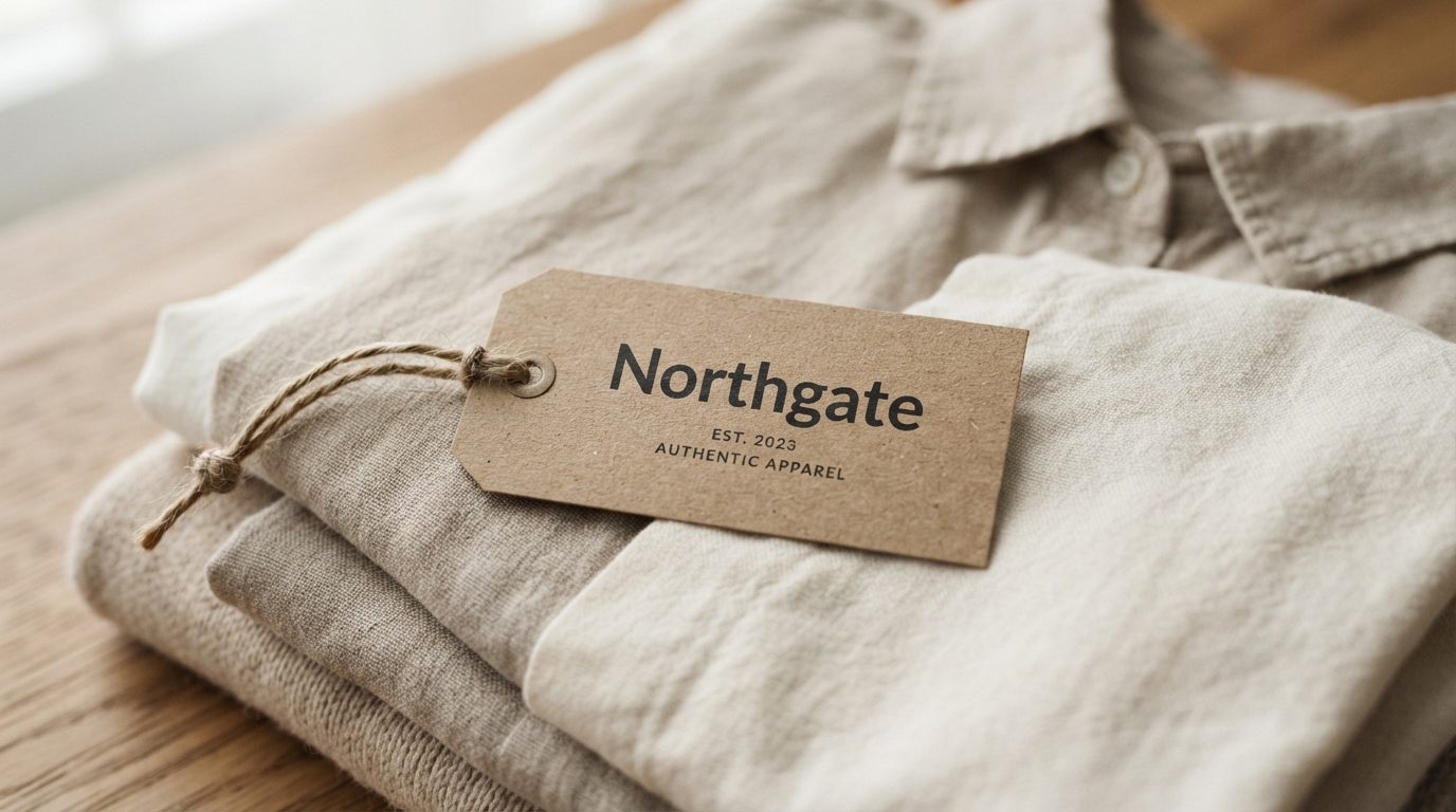
Application
The hang tag
How it reads: The one piece of brand collateral a customer holds before buying. It has to feel like the price point.
Typography: Whatever your primary lockup is, but printed rather than screen-rendered, so check the weight on uncoated stock.
Palette: Ink absorbs and spreads on kraft and uncoated card, so lines print heavier than they preview.
Where it lives: Attached to every garment, plus reused as a business card in practice.
Watch out for: Stock choice undermining positioning. Glossy card on a heritage brand kills the story instantly.
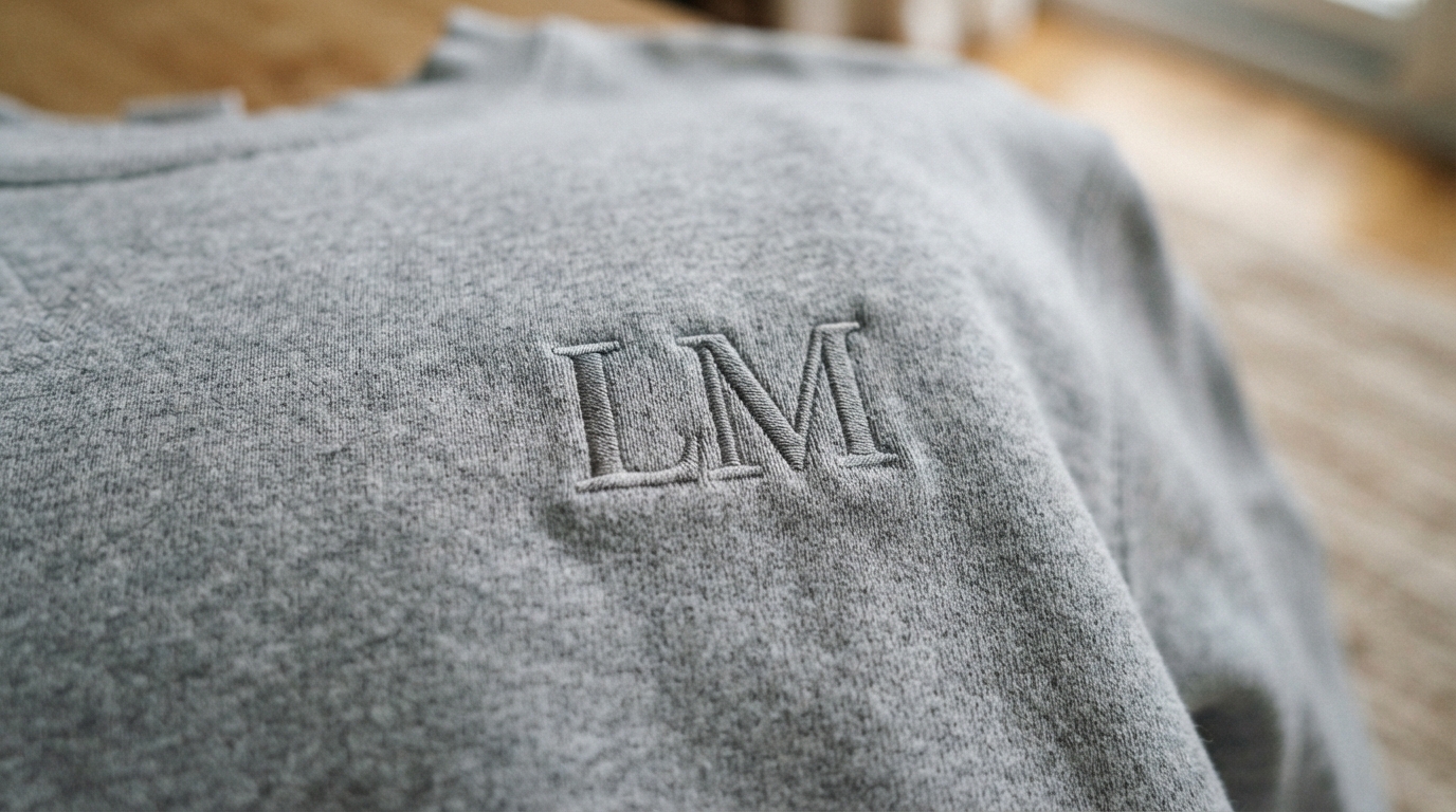
Application
Tonal embroidery
How it reads: Quiet and premium. Tonal embroidery, thread close to fabric colour, signals confidence over branding volume.
Typography: Bold and simplified. Embroidery has a minimum stroke width, typically around 1.5mm, below which stitches collapse.
Palette: One or two thread colours. Tonal choices read more expensive than contrasting ones.
Where it lives: Chest hits, sleeve details, cap fronts.
Watch out for: Fine serifs and scripts. These are the first things to fail in stitch, so always create an embroidery-specific cut.
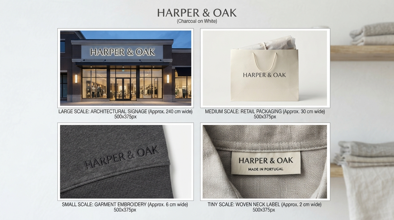
System
The scalability system
How it reads: One mark, four sizes, each simplified for its context. This is what separates a brand from a graphic.
Typography: Consistent typeface across all tiers, with detail removed rather than substituted as size decreases.
Palette: Should hold in full colour, single colour, and reversed at every tier.
Where it lives: Storefront, packaging, garment print, woven label.
Watch out for: Building only one version. The manufacturer will scale it crudely if you do not supply the variants yourself.
The Garment Reality Check
This is the section most collections of clothing brand logo ideas leave out entirely, and it is the one that decides whether your mark survives manufacturing.
Embroidery has a minimum stroke width
Roughly 1.5mm, depending on the machine and thread. Anything thinner collapses into a mess. This kills fine serifs, delicate scripts and hairline rules, which is why premium brands so often have a separate embroidery cut of their logo.
Woven labels are lower resolution than you think
Thread density sets a hard limit. A label is typically fifteen to forty millimetres wide, and detail simply cannot exist at that scale. Ask your manufacturer for their specification before designing, not after.
Screen printing charges by colour
Each colour is a separate screen, a separate setup fee, and another registration risk. Two-colour maximum is the practical rule for small runs, and one colour is cheaper and often stronger.
Fabric moves, paper does not
A print on jersey distorts when the garment is worn and stretched. Marks with tight internal spacing or delicate proportions suffer most. Test on the actual fabric before committing to a production run.
Choosing the Typeface
Apparel branding leans on wordmarks more than any other category, so the typeface carries most of the weight in these clothing brand logo ideas.
Most clothing brand logo ideas live or die on the typeface, since apparel branding leans heavily on wordmarks rather than symbols. Starting points by direction:
Check the licence before committing. Many font licences separate desktop use from merchandise and trademark use, and apparel is precisely the case where that distinction matters most.
Questions People Ask
What kind of logo works best for a clothing brand?
A wordmark, in most cases. Apparel customers buy into a name they can say, and a name is far easier to build recognition around than an abstract symbol when you have no marketing budget.
How big should a logo be on a t-shirt?
A standard chest print sits around 75 to 100mm wide, a full front or back print around 250 to 300mm. Small left-chest hits are typically 60 to 90mm. Print your artwork at actual size and hold it against a shirt before approving anything.
Can I use the same logo on labels and on prints?
Not usually without modification. Woven labels and embroidery need simplified, heavier versions. Design the system upfront rather than letting a factory approximate it for you.
How do I narrow down clothing brand logo ideas for my label?
Start with positioning rather than aesthetics. Once you have fixed your price point and competitor set, most of the directions above eliminate themselves without you having to judge them visually.
How many colours should a clothing logo use?
One or two for anything screen printed, since each colour adds a screen and a setup cost. Keep a full-colour version for digital use and a single-colour version for production.
Do I need to trademark my clothing brand logo?
If you plan to sell at any scale, it is worth investigating early. Search your category before you print stock, because discovering a conflict after a production run is expensive to unwind.
Looking for typefaces to build your label on? Browse the full Creative Fabrica font library →