Streetwear logo design ideas are easy to find and hard to use, because most collections show the mark and skip the two things that determine whether it works: where the style comes from, and whether it survives being printed on fabric. This guide is organised by subculture, since each one carries its own visual grammar and its own production constraints. Every example below includes the origin of the style, the typography it needs, and the specific print method it demands.
Why Streetwear Branding Follows Different Rules
In most categories a logo supports the product. In streetwear the logo frequently is the product, since a plain black tee and a printed black tee differ only by the mark. That changes the brief completely: the logo has to be something a customer actively wants to display, not merely a mark of origin.
It also means streetwear logo design ideas must carry cultural information. Streetwear audiences read subcultural signals fluently and spot borrowed ones instantly. Blackletter says something specific. Varsity says something different. Choosing between them is a positioning decision, not a styling one, which is why the streetwear logo design ideas below are grouped by subculture rather than by shape.
About these examples. Every mark shown is an original concept created for this guide using invented brand names. None represents an existing company. They are here to explain the reasoning, not to be copied, and imitating an established brand’s mark in this category is both legally and commercially a bad idea.
Blackletter and Gothic
The dominant streetwear lettering style, and the one with the deepest history.
Blackletter
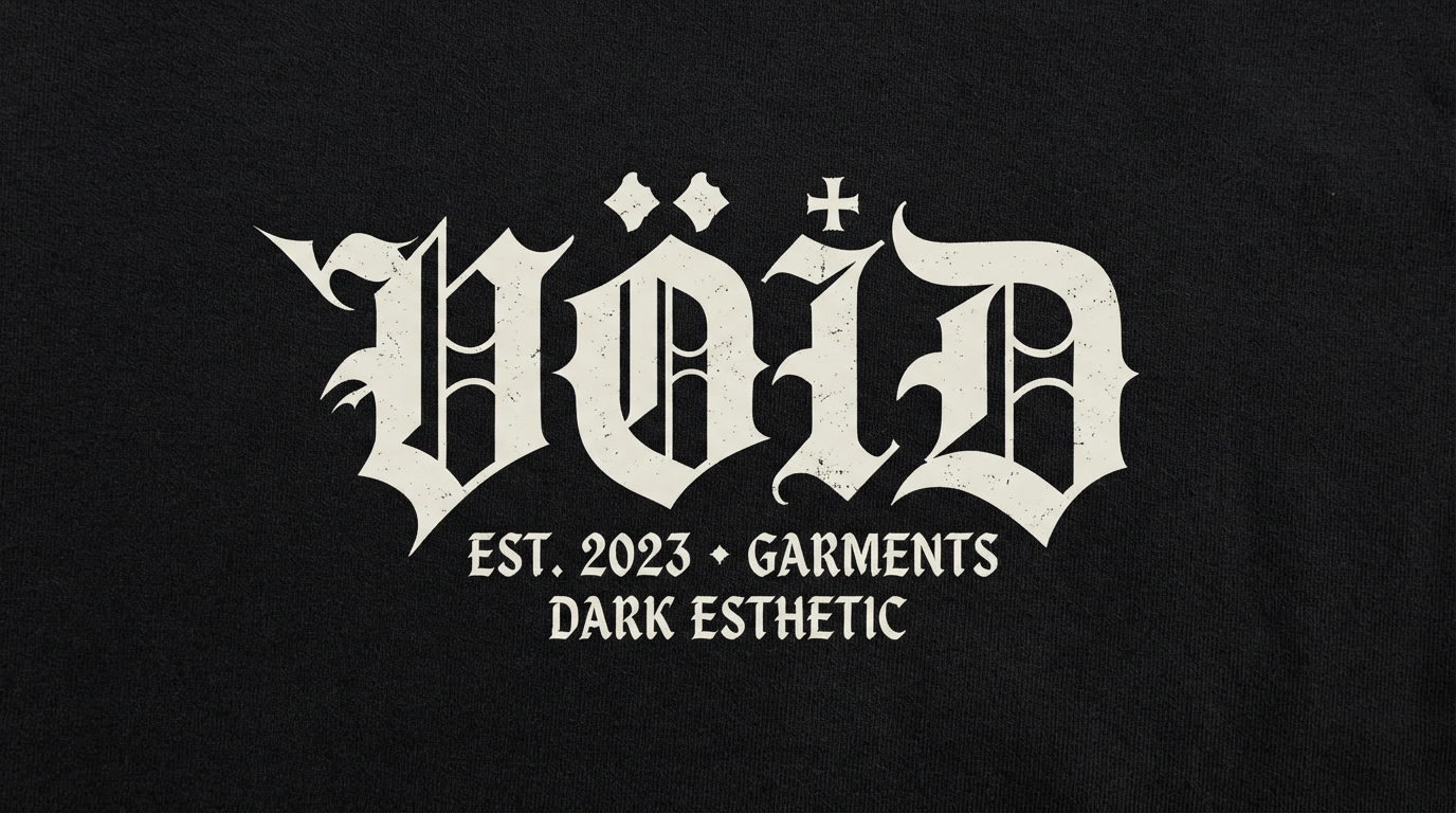
VÖID
Where it comes from: Blackletter reached streetwear via heavy music and West Coast lowrider script, both of which borrowed it from European manuscript hands.
Typography: Heavy blackletter capitals with a lighter gothic secondary line. Two weights create hierarchy without a second typeface. See our blackletter font guide.
Print notes: Blackletter is dense, which suits screen printing. Plastisol ink holds the tight counters better than water-based.
Watch out for: Counters filling in. Blackletter has small enclosed spaces that clog when ink spreads on dark fabric.
Blackletter
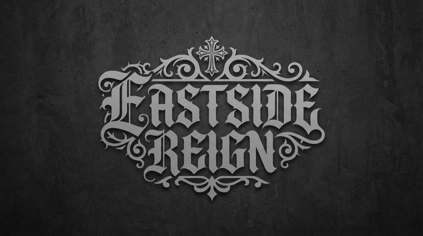
Eastside Reign
Where it comes from: Ornate blackletter with religious iconography comes from Chicano lettering traditions, later absorbed into tattoo and streetwear culture.
Typography: Ornate blackletter with a decorative detail. Our bold display font guide covers faces built to survive at small sizes.
Print notes: Silver grey on charcoal is low contrast, which reads as premium but demands a thicker ink deposit to hold the detail.
Watch out for: Cultural borrowing without understanding. This lettering tradition carries real history, and lazy imitation reads as such.
Varsity and Collegiate
Borrowed from American athletics, structurally demanding to print.
Varsity
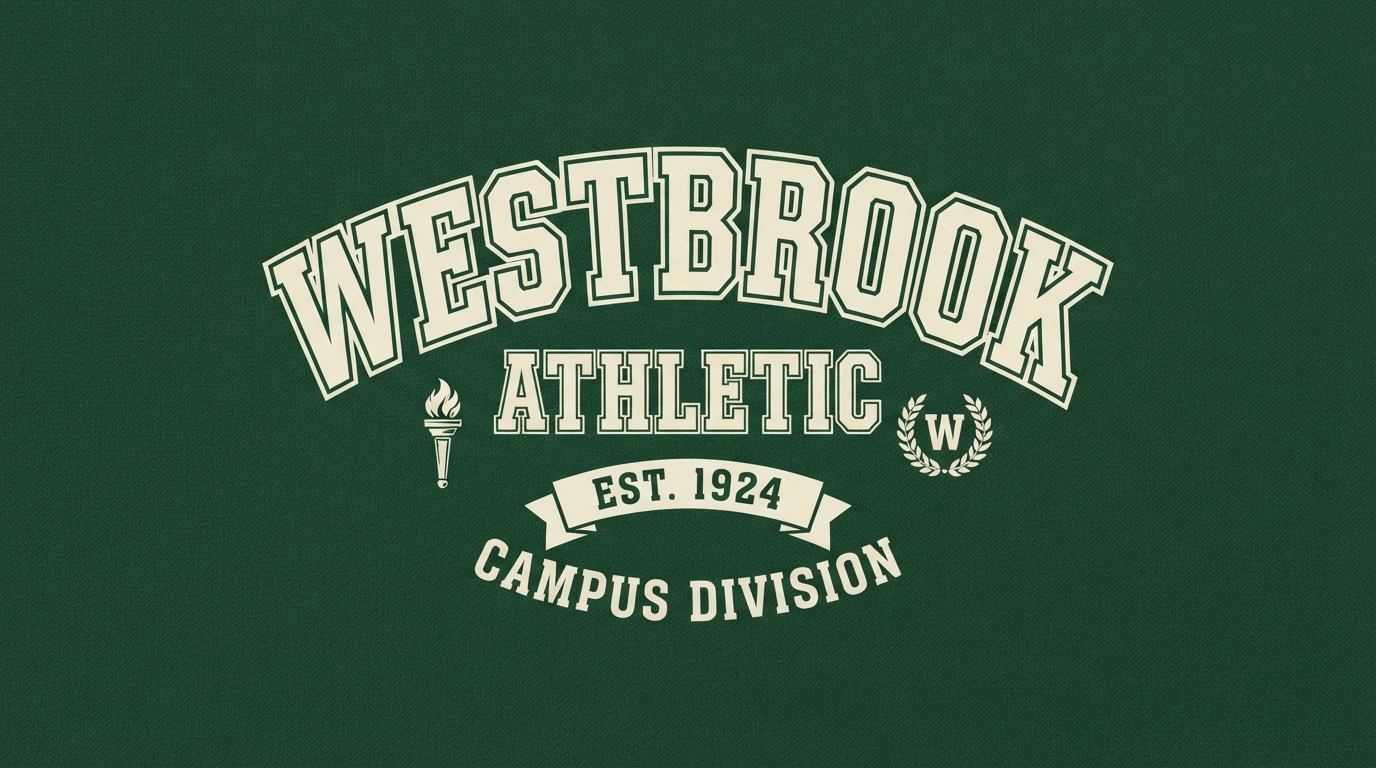
WESTBROOK ATHLETIC
Where it comes from: American collegiate athletics. Chenille patches on letterman jackets set the visual grammar that streetwear still uses unchanged.
Typography: Chunky varsity block serif with a contrasting outline. The outline is structural, not decorative, since it defines the letterform on any background.
Print notes: Outlines mean multiple screens. Two-colour varsity is the practical minimum, three is common, and each adds cost.
Watch out for: Registration drift. Multi-layer outlines misalign easily in screen printing, and a shifted outline ruins the whole mark.
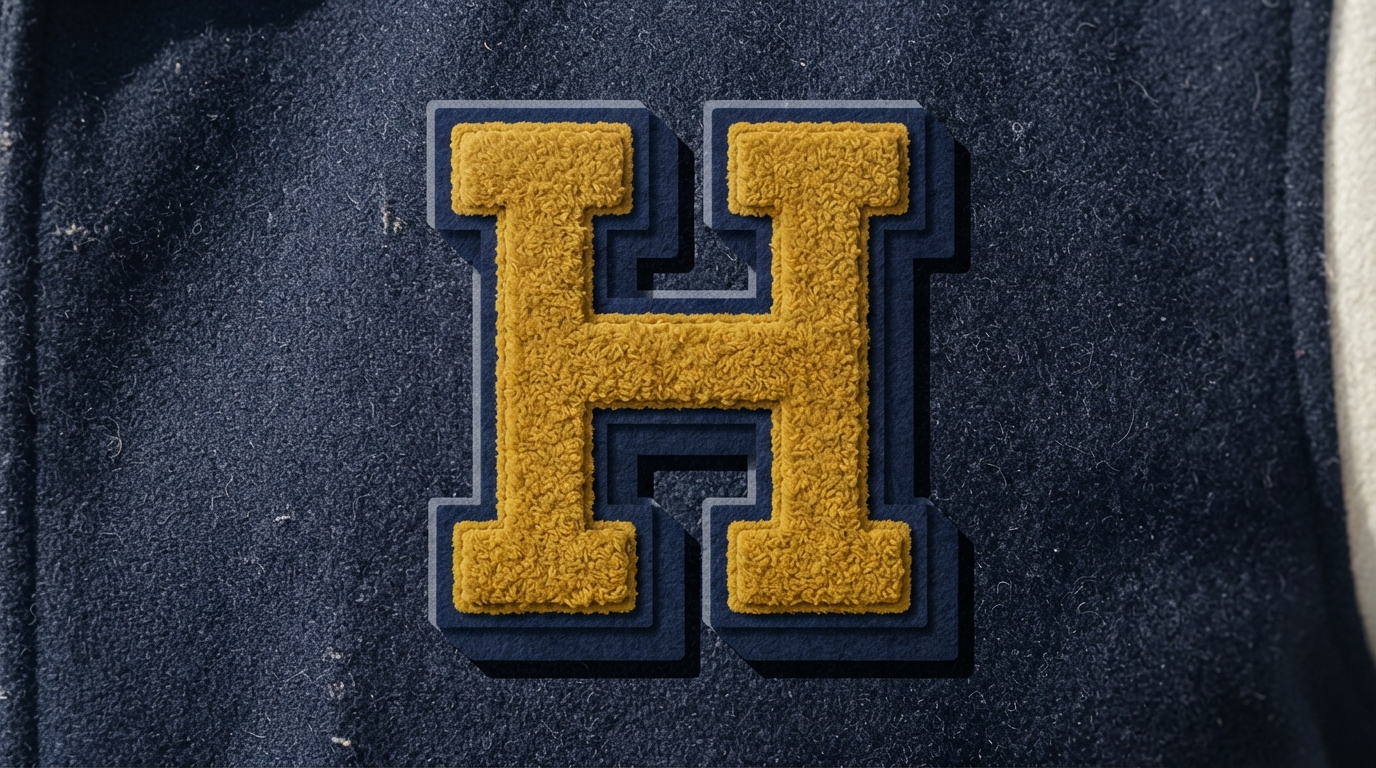
Varsity
Single varsity letter
Where it comes from: Direct descendant of the chenille letter patch awarded for athletic achievement.
Typography: Layered varsity serif with an offset drop shadow. The offset creates depth that reads even in flat colour.
Print notes: Ideal for actual chenille patches and embroidery, since the shapes are large and simple.
Watch out for: Letter choice. Some letters carry existing associations with universities and teams, which invites confusion.
Graffiti
Native streetwear visual language, with a legibility problem built in.
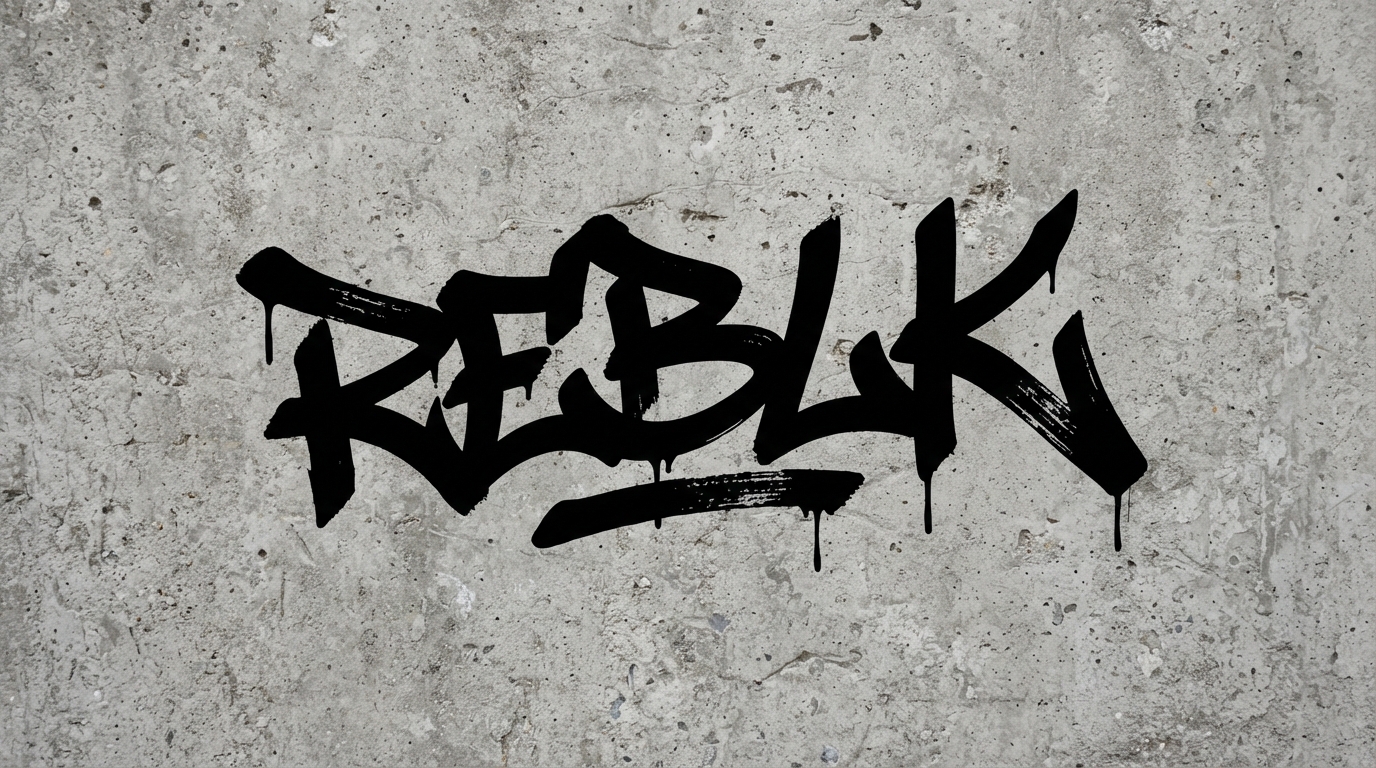
Graffiti
REBLK
Where it comes from: New York subway tagging. The lean and stroke weight variation come from the physical act of writing fast with a marker.
Typography: Hand-drawn tag-inspired wordmark. This cannot be a font, since the irregularity is the authenticity.
Print notes: Single colour, high contrast. Graffiti-derived marks lose their edge when they get too polished.
Watch out for: Legibility. Tags are designed for insiders, and a brand name nobody can read is a commercial problem.
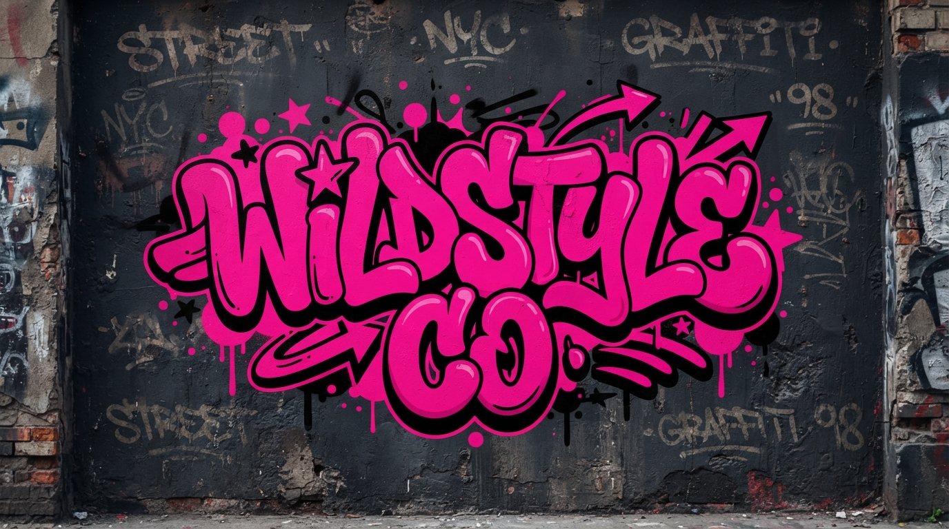
Graffiti
Wildstyle Co
Where it comes from: Bubble and throw-up lettering, the fast-execution style that sits between a tag and a full piece.
Typography: Chunky bubble letters with a defining outline. Rounded forms make it friendlier than a sharp tag.
Print notes: Bubble letters have large fill areas, which suits DTG printing well and screen printing even better.
Watch out for: Fill area on dark garments. Large solid fills need an underbase white layer, adding a screen and cost.
Techwear and Utility
Military and industrial signalling, usually at low contrast.
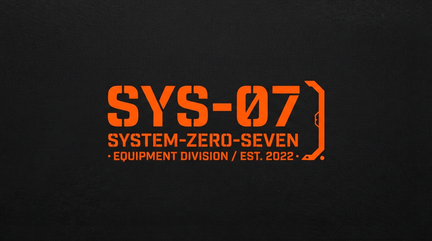
Techwear
SYS-07
Where it comes from: Military surplus and industrial signage. The stencil breaks exist because real stencils need bridges to hold together.
Typography: Stencil military sans with a technical bracket detail. The alphanumeric name is doing deliberate work here.
Print notes: Safety orange on matte black is maximum contrast, well suited to reflective and heat-transfer applications.
Watch out for: Stencil gaps at small sizes. Those breaks that read as intentional at large scale look like printing faults when small.
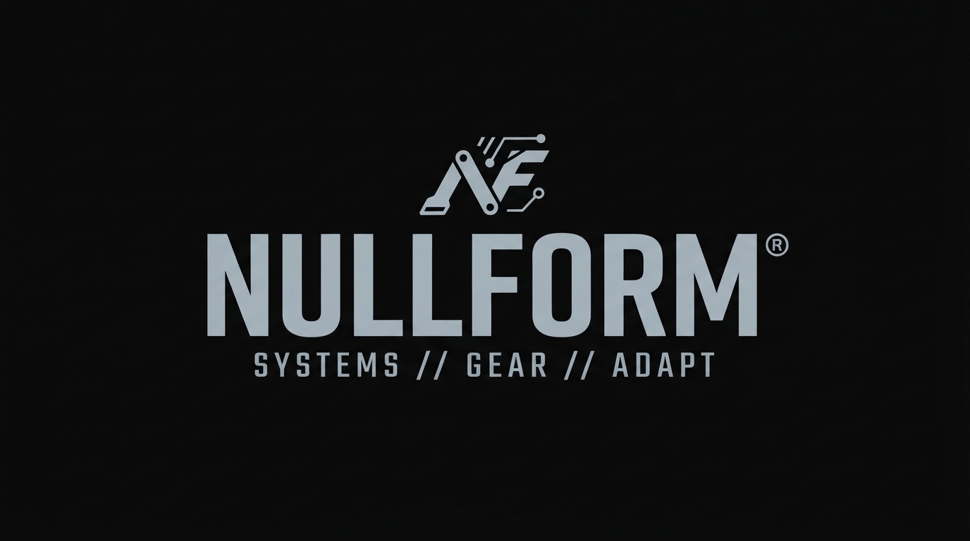
Techwear
NULLFORM
Where it comes from: Terminal interfaces and technical documentation. Monospace signals machine-generated rather than designed.
Typography: Condensed monospace with a registration mark. The uniform character widths are the entire aesthetic.
Print notes: Cool grey on black is very low contrast. Beautiful in photos, hard to read on a shop rail.
Watch out for: Contrast failing in retail. If shoppers cannot read the brand name from two metres away, it is not working commercially.
Skate
DIY roughness, where polish actively undermines the message.
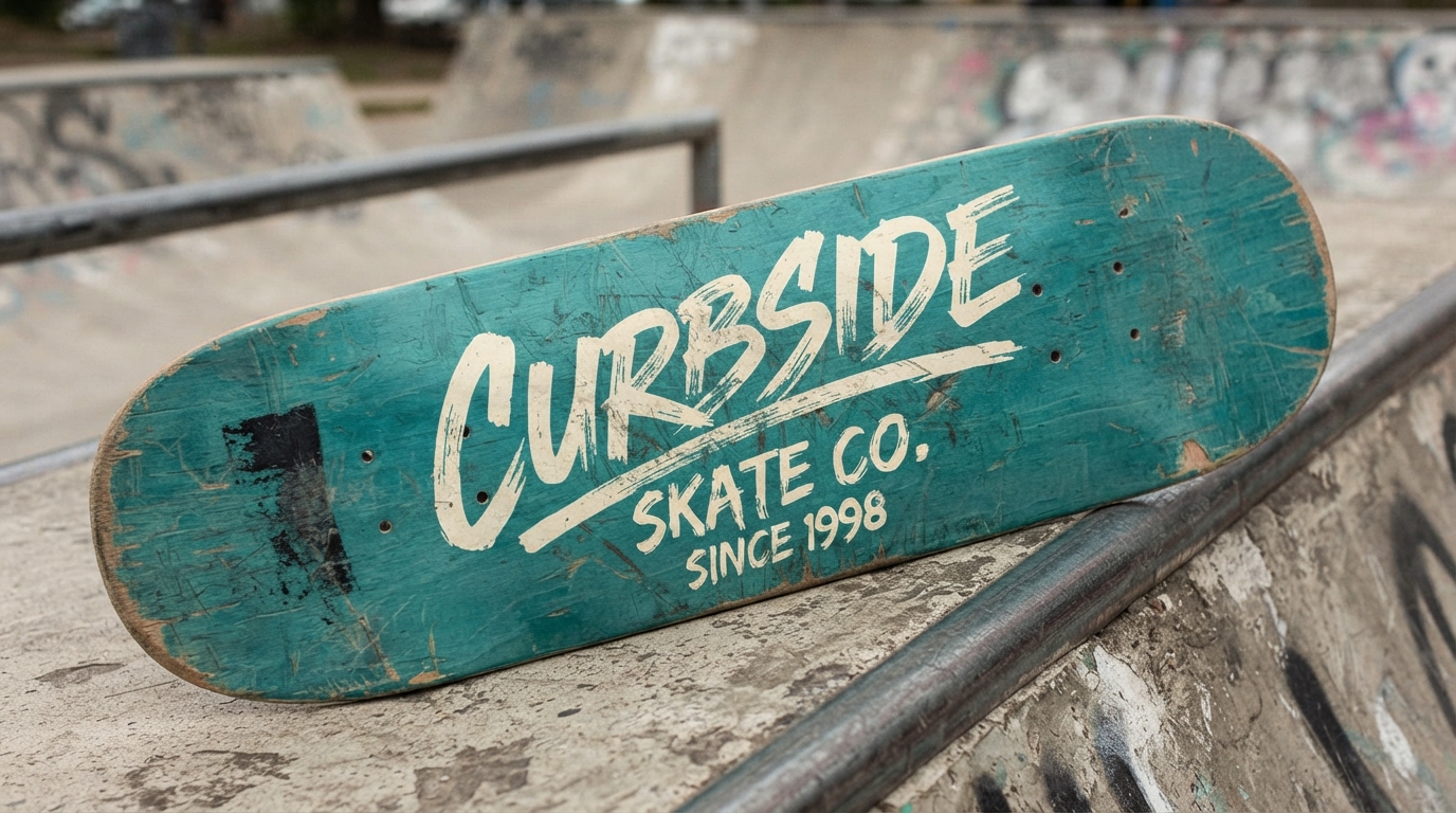
Skate
Curbside
Where it comes from: DIY deck graphics and hand-painted ramp signage. The roughness signals that the brand is made by skaters.
Typography: Rough hand-painted script with a slight tilt. Perfection would undermine the entire message.
Print notes: Off-white on faded teal. Distressed textures print well but need a real halftone rather than a fake grain overlay.
Watch out for: Manufactured authenticity. Skate audiences detect a brand imitating the culture from a distance.
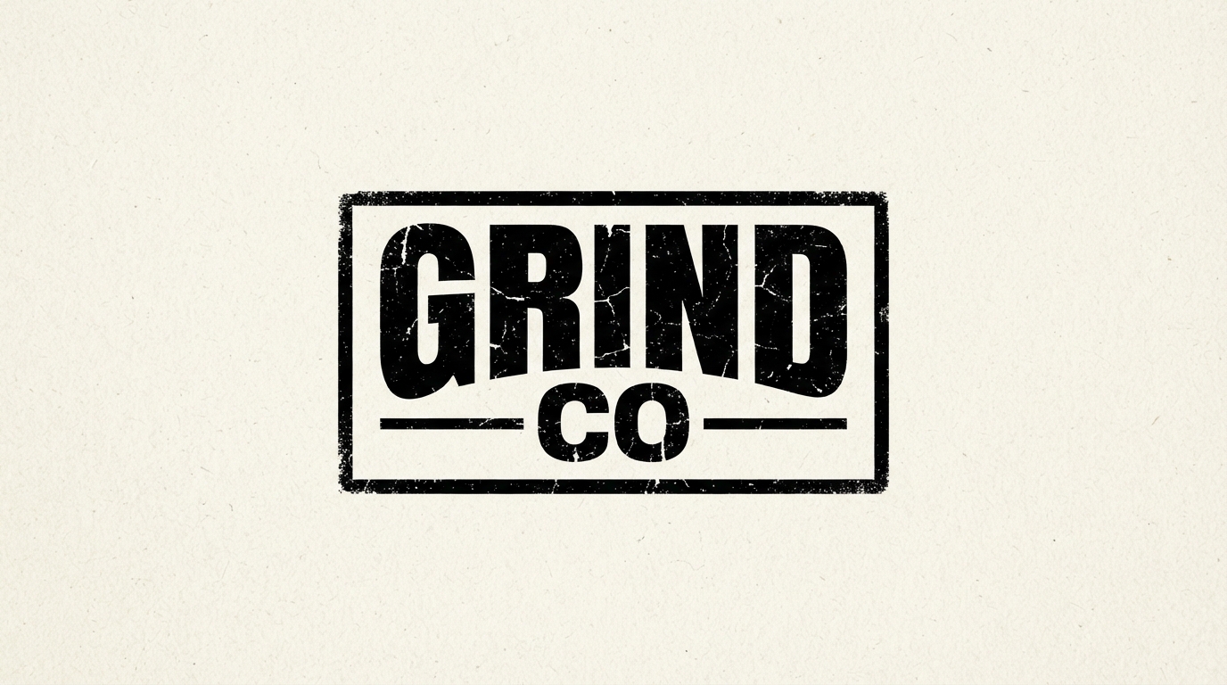
Skate
GRIND CO
Where it comes from: Hardware and industrial labelling, the utilitarian side of skate branding rather than the illustrative side.
Typography: Distressed condensed sans inside a plain rectangle. The frame does all the structural work.
Print notes: Grain texture needs care. A texture that reads on screen can turn into mud at 150 lines per inch.
Watch out for: Over-distressing. Heavy texture destroys legibility at small sizes, so keep a clean version for labels.
Japanese-Inspired and Y2K
Two directions that demand cultural care and technical care respectively.
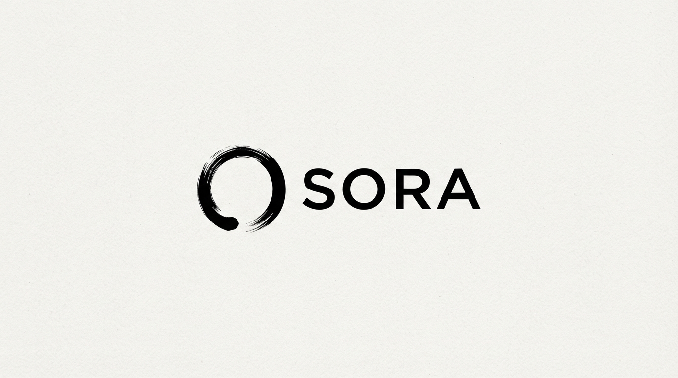
Japanese-inspired
SORA
Where it comes from: Japanese graphic design tradition, where the enso brush circle carries specific meaning in Zen practice.
Typography: Minimal geometric sans beside a brush mark. The contrast between mechanical type and gestural mark is the concept.
Print notes: Black on bone white, single colour. The brush mark needs high resolution to keep its edge quality.
Watch out for: Symbol misuse. The enso has religious significance, so borrowing it decoratively without understanding is a real risk.

Japanese-inspired
Kaze Studio
Where it comes from: Hanko seal conventions and vertical Japanese typesetting, reinterpreted into a Latin-alphabet lockup.
Typography: Light sans stacked above a vertical rule and a small square seal. The vertical element is the borrowed idea.
Print notes: Indigo on natural paper tone. Works especially well on uncoated and recycled stock.
Watch out for: Surface-level appropriation. If the only Japanese element is aesthetic, the mark reads as costume.
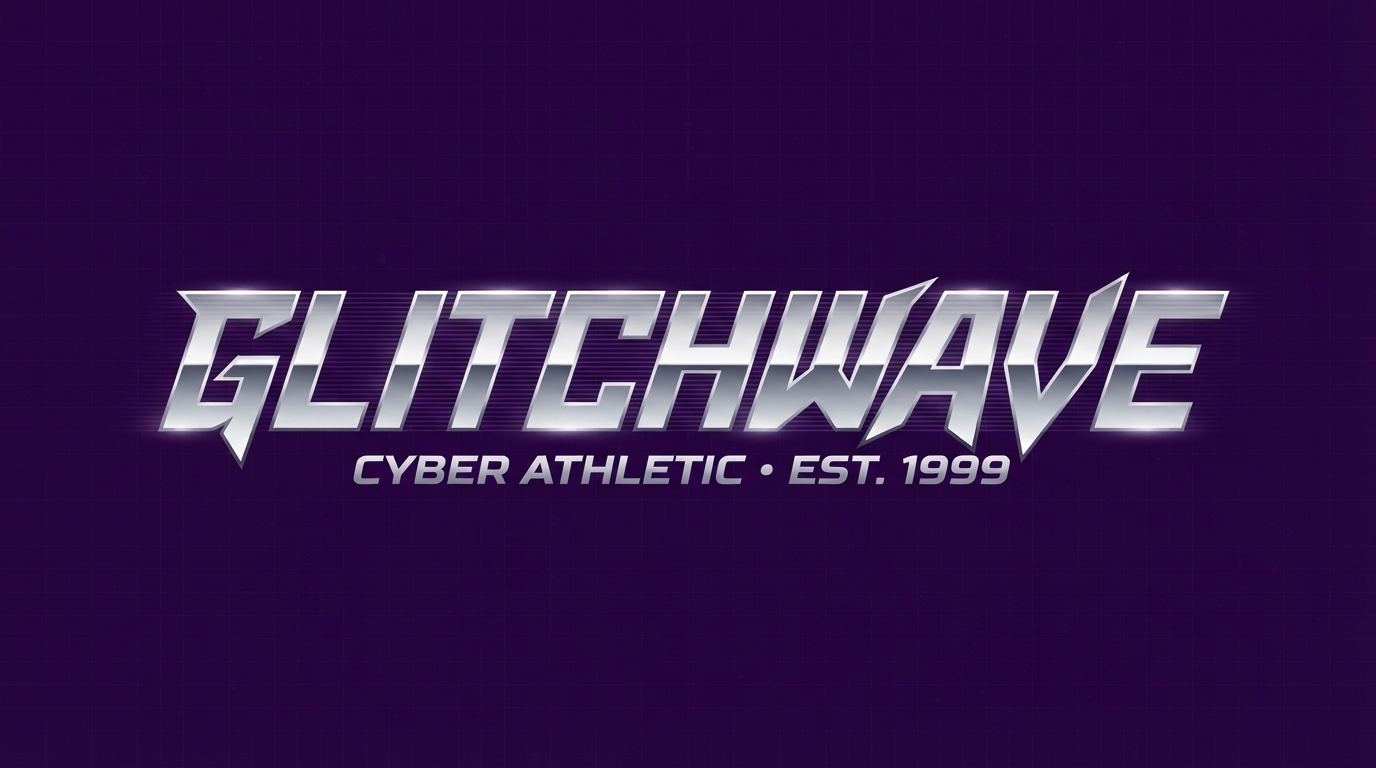
Y2K cyber
GLITCHWAVE
Where it comes from: Late nineties software packaging and early rave flyers, now recycled through a nostalgia lens.
Typography: Stretched techno face with a scanline effect. The horizontal distortion is a period-accurate signature.
Print notes: Chrome gradients need DTG or dye sublimation. They cannot be screen printed without separating into flat spot colours.
Watch out for: Reproduction outside digital. Build a flat one-colour version, because the gradient will not survive most production methods.
Workwear, Punk and Minimal
Three further directions covering the edges of the category.
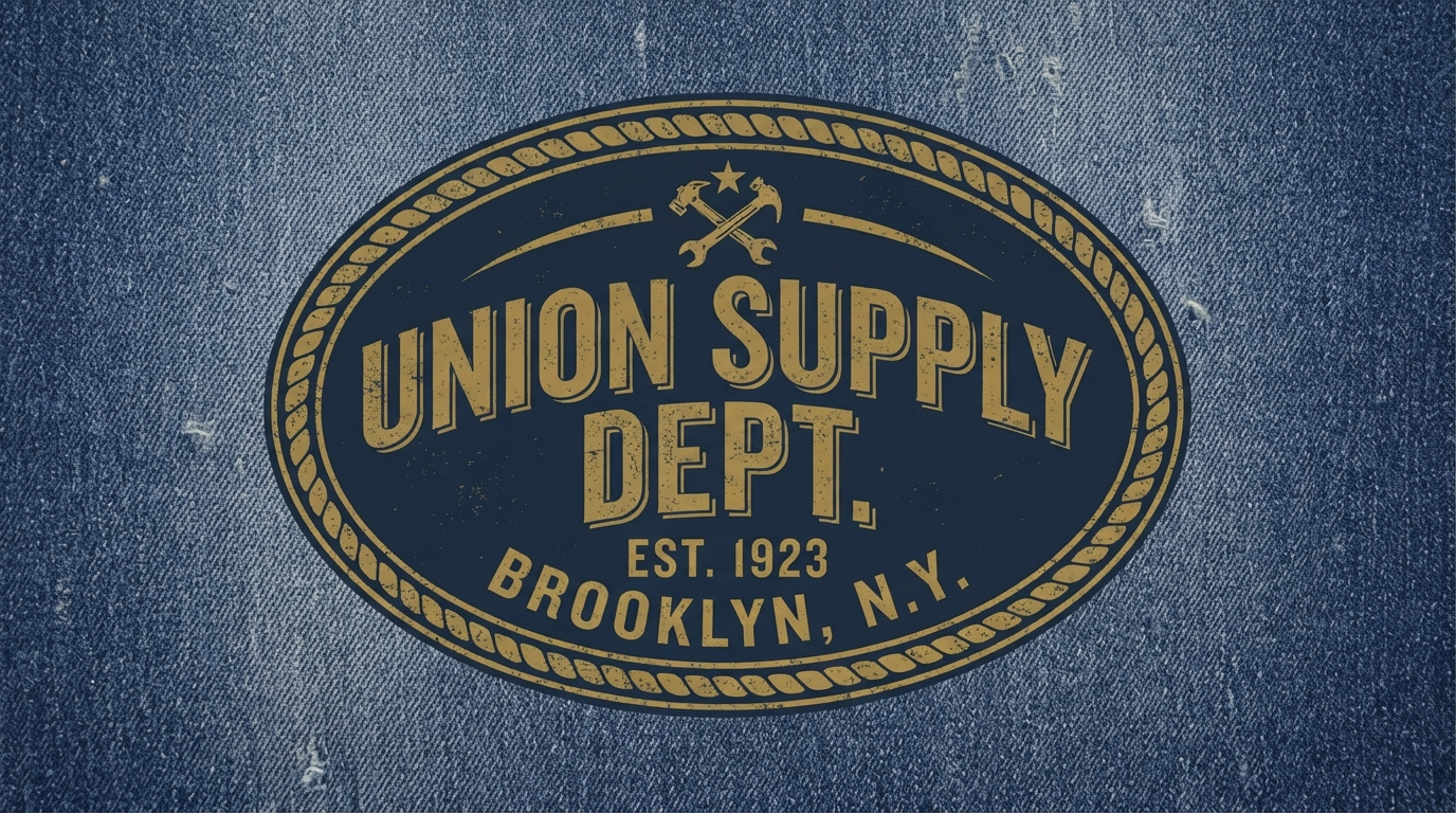
Workwear
UNION SUPPLY DEPT
Where it comes from: Industrial and union insignia, which streetwear adopted for the credibility of manufactured heritage.
Typography: Bold condensed slab serif in an oval badge. Slab serifs carry weight that survives distressing.
Print notes: Faded gold on washed indigo suits garment dyeing and enzyme washing, where the print ages with the fabric.
Watch out for: False provenance. An est date on a brand founded last year is a claim customers increasingly check.
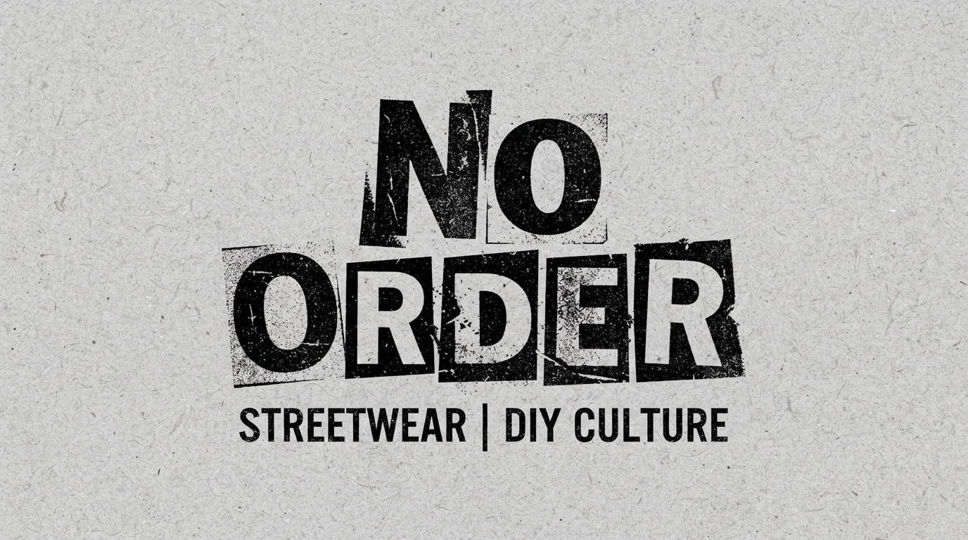
Punk DIY
NO ORDER
Where it comes from: Punk zine culture and ransom-note collage, originally a practical technique before it became a style.
Typography: Mixed-height letters at varying weights with photocopy texture. Deliberate inconsistency is the grammar.
Print notes: Newsprint grey on black. High-contrast one-colour printing, exactly as the original method demanded.
Watch out for: Legibility and reproduction. Photocopy texture can turn to noise, so test the actual print rather than the file.

Minimal luxury
ARC
Where it comes from: The crossover point where streetwear absorbed high-fashion restraint, a shift that reshaped the category.
Typography: Very thin sans, heavily tracked. Every quiet-luxury signal, applied to a streetwear product.
Print notes: Off-white on charcoal. Thin strokes on dark fabric are the hardest thing to print well, so this needs a fine mesh and skilled work.
Watch out for: Thin strokes on textured fabric. Fleece and heavyweight cotton will break a hairline stroke completely.
Production Reality
Four applications that decide whether any of the above actually works.
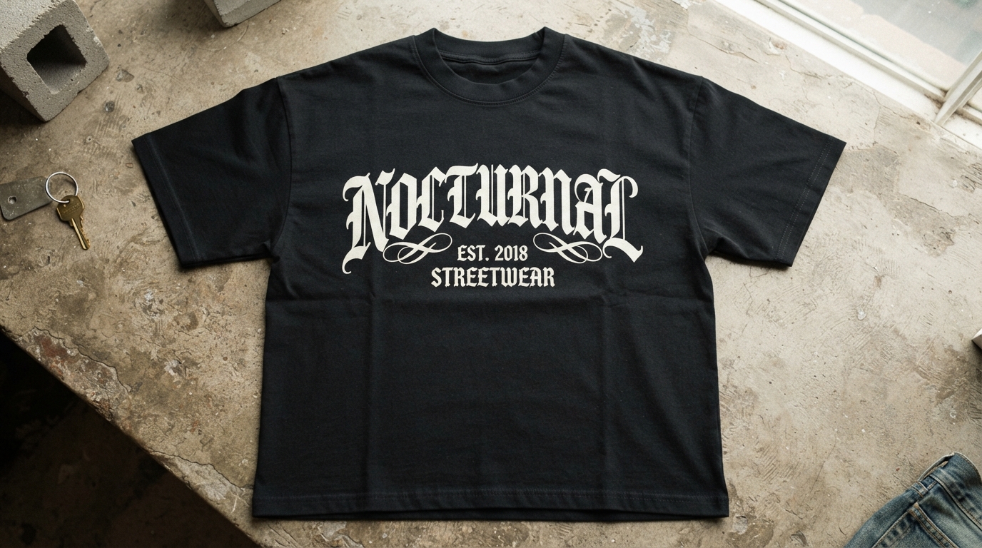
Application
The screen print
Where it comes from: Screen printing is still the backbone of streetwear because it is cheap at volume and the hand-feel is right.
Typography: Simplified. Every colour is a separate screen and a separate registration risk.
Print notes: Printing on dark fabric requires a white underbase, which adds a screen and thickens the print’s hand-feel.
Watch out for: Detail below about 2mm. Fine lines fail on textured cotton regardless of how good the file is.
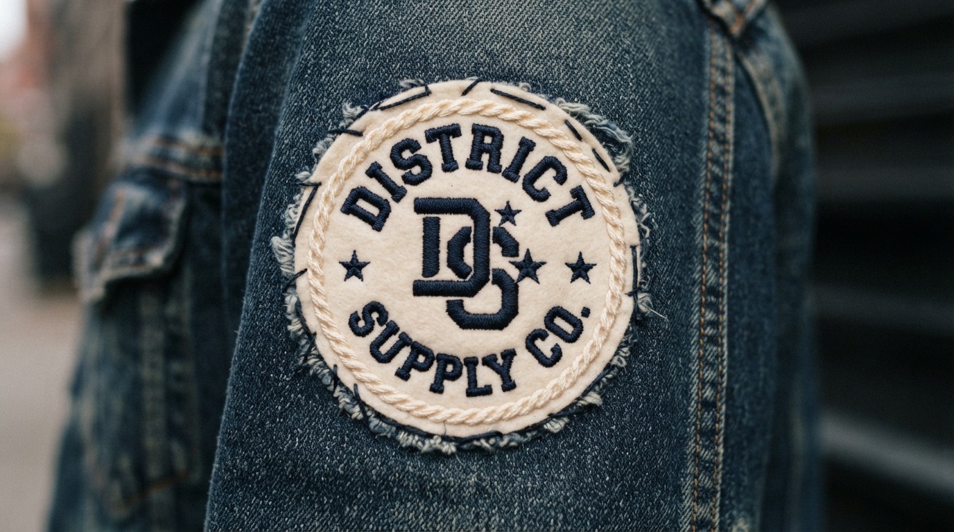
Application
The embroidered patch
Where it comes from: Military and varsity insignia. Patches let a brand appear on garments it did not manufacture.
Typography: Bold and simplified. Chain stitch has a hard minimum stroke width, typically around 1.5mm.
Print notes: Merrowed borders add cost but stop fraying. Iron-on backing is cheaper but fails on heavy denim.
Watch out for: Serifs and thin strokes. These disappear in stitch, so build a patch-specific version of the mark.
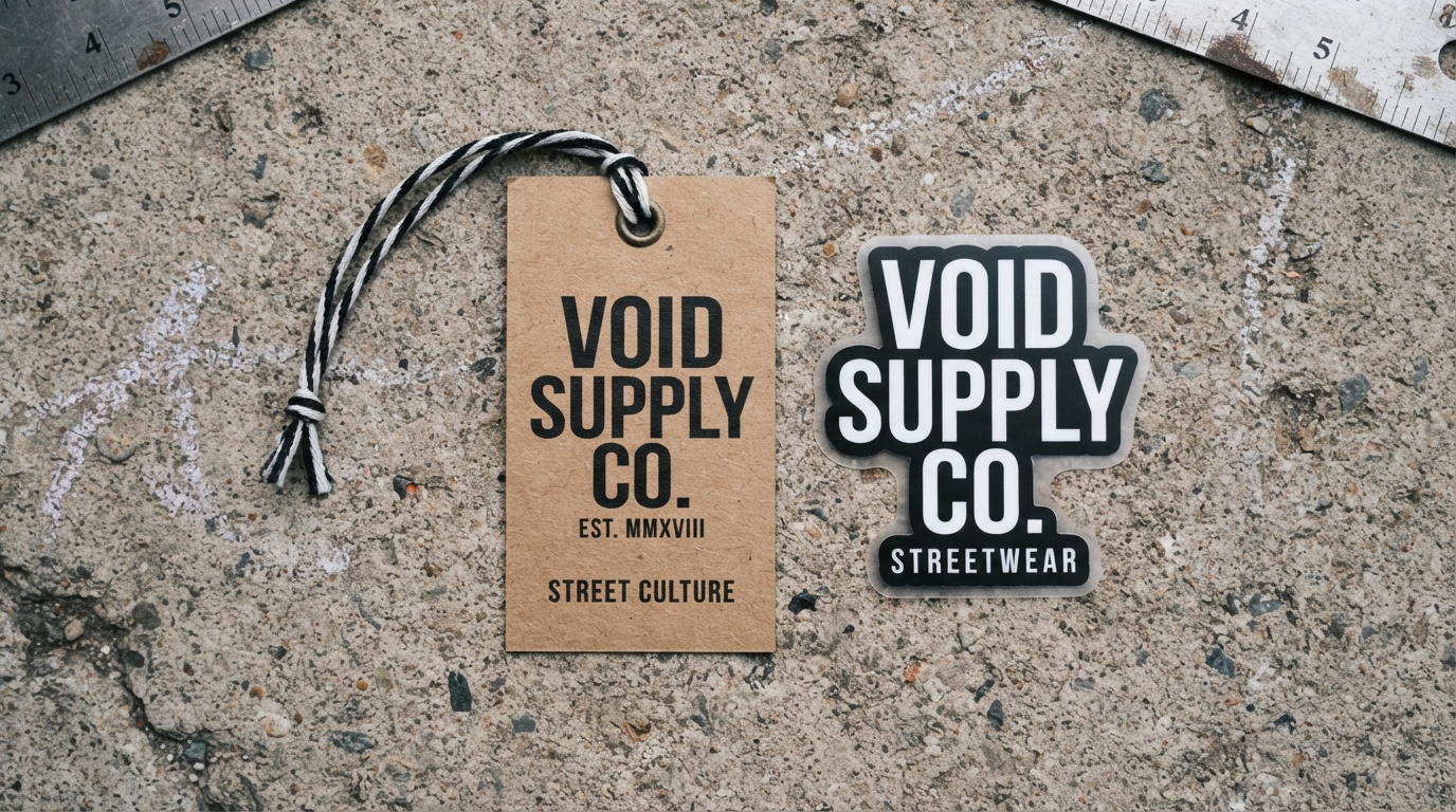
Application
Tags and stickers
Where it comes from: Sticker culture is native to skate and graffiti, and it remains the cheapest brand distribution that exists.
Typography: Must work small and be readable at a glance from a laptop lid or a lamp post.
Print notes: Vinyl stickers reproduce colour accurately, unlike fabric, so this is where a full-colour version earns its place.
Watch out for: Ignoring stickers. They are the highest-return, lowest-cost item in streetwear marketing.
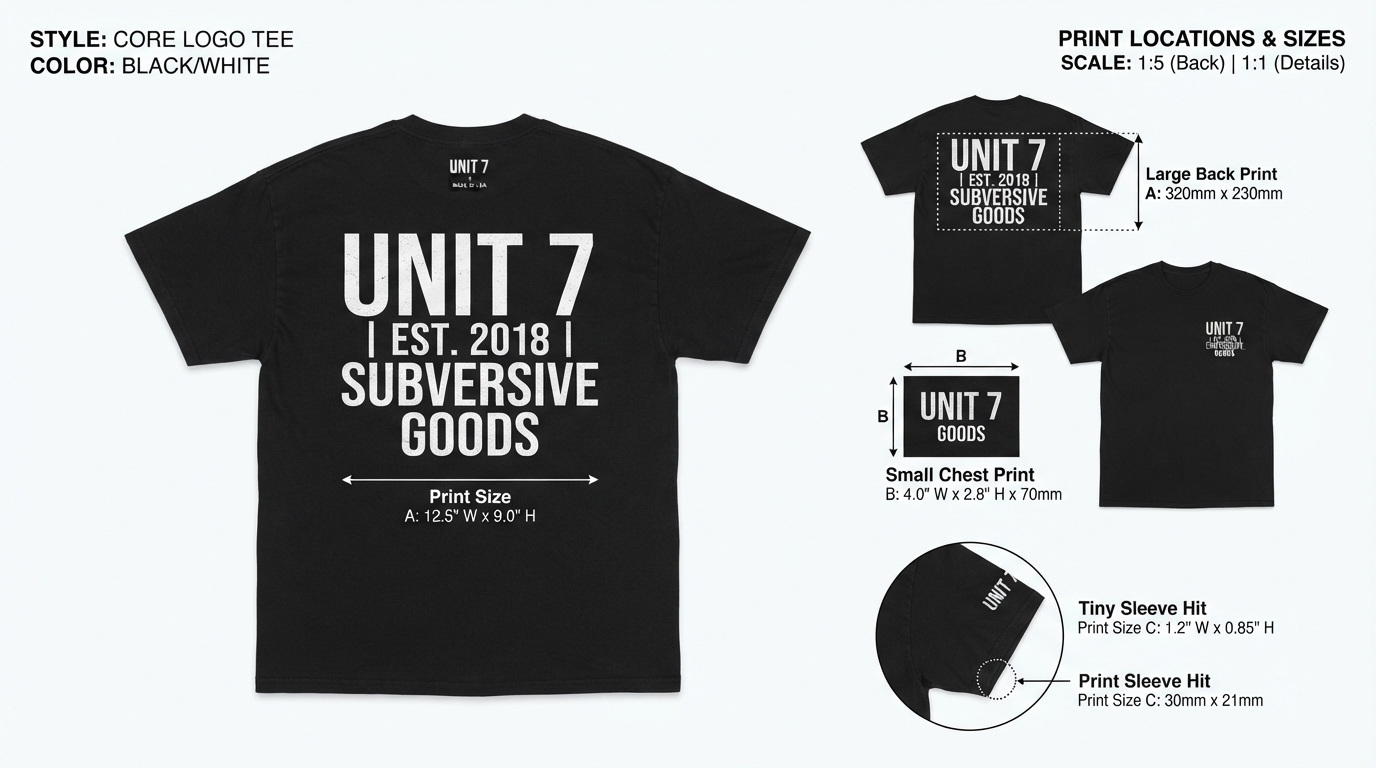
System
Print size system
Where it comes from: Standard placements exist because garment blanks and print platens are standard sizes.
Typography: The same mark simplified as the size drops. The sleeve version should not simply be a shrunken back print.
Print notes: Back prints typically run 280 to 300mm wide, chest prints 250 to 280mm, left chest 75 to 100mm, sleeve hits 50 to 75mm.
Watch out for: Supplying one file for all placements. The printer will scale it, and the small placements will suffer.
Production: What Actually Survives on Fabric
Most streetwear logo design ideas fall apart here rather than at the concept stage. Four production methods, and what each one demands of your artwork.
Screen printing
Cheapest at volume and the standard for streetwear. Each colour is a separate screen with its own setup cost and registration risk. Dark garments need a white underbase, which is an extra screen and a heavier hand-feel. Minimum reliable line weight is roughly 2mm on cotton.
DTG
Handles gradients and unlimited colours, which makes it the only realistic option for chrome Y2K marks. Per-unit cost stays flat, so it suits small runs, but the print sits into the fabric rather than on it and colours read softer.
Embroidery
Premium hand-feel, hard technical limits. Minimum stroke width around 1.5mm, no fine serifs, no delicate scripts. Every design needs a specific embroidery cut, and thread count drives the price.
Heat transfer and vinyl
Good for one-offs and small runs, weaker durability. Fine detail cuts poorly and small counters are difficult to weed, so simplify aggressively before sending artwork.
Choosing the Typeface
Because so many streetwear logo design ideas are pure lettering, the typeface is not a supporting choice, it is the mark itself.
Streetwear leans harder on typography than almost any other category, since so many marks are pure lettering. Directions and where to find the faces:
Licensing matters more here than almost anywhere. Selling printed garments is merchandise use, which many desktop font licences exclude outright. Read the terms before the first production run, since a licence dispute after a drop sells out is an expensive problem.
Questions People Ask
Why is blackletter so common in streetwear?
It arrived through heavy music and West Coast lowrider and Chicano lettering traditions, and it carries weight and seriousness that few other styles match. It also prints well, since the dense forms hold up on fabric.
What size should a streetwear logo be on a t-shirt?
Back prints usually run 280 to 300mm wide, full chest prints 250 to 280mm, left-chest hits 75 to 100mm, and sleeve hits 50 to 75mm. Print at actual size and hold it against a garment before approving.
Can I use a font as my streetwear logo without changing it?
Legally it depends on the licence, and many exclude merchandise use. Practically it is weak, since anyone can type the same word in the same font. Customise the letterforms so the mark is yours.
How many colours can I print on a streetwear tee?
Technically many, commercially one or two for small runs. Each colour adds a screen, a setup fee and a registration risk. Most successful streetwear marks are one-colour by design.
Which streetwear logo design ideas work best for a brand new label?
Anything legible and single-colour. New brands need customers able to read and repeat the name, and one-colour marks keep the first production run affordable.
Does my logo need to be readable?
More than the graffiti tradition suggests. Illegible marks work for brands with existing recognition, but a new label needs customers to be able to say its name, otherwise word of mouth stops dead.
Looking for typefaces to build your brand on? Browse the full Creative Fabrica font library →