Choosing tattoo fonts is not the same as choosing type for a poster. Skin moves, swells, tans and regenerates, and ink placed in the dermis spreads outward as the years pass. A font that looks razor sharp on a stencil can close up into an unreadable smudge within a decade, and the letters most likely to fail are exactly the ones people find prettiest. This guide covers seventeen placement ideas, each paired with the lettering style that actually suits it, then a set of tattoo fonts worth looking at once you have made those two decisions.
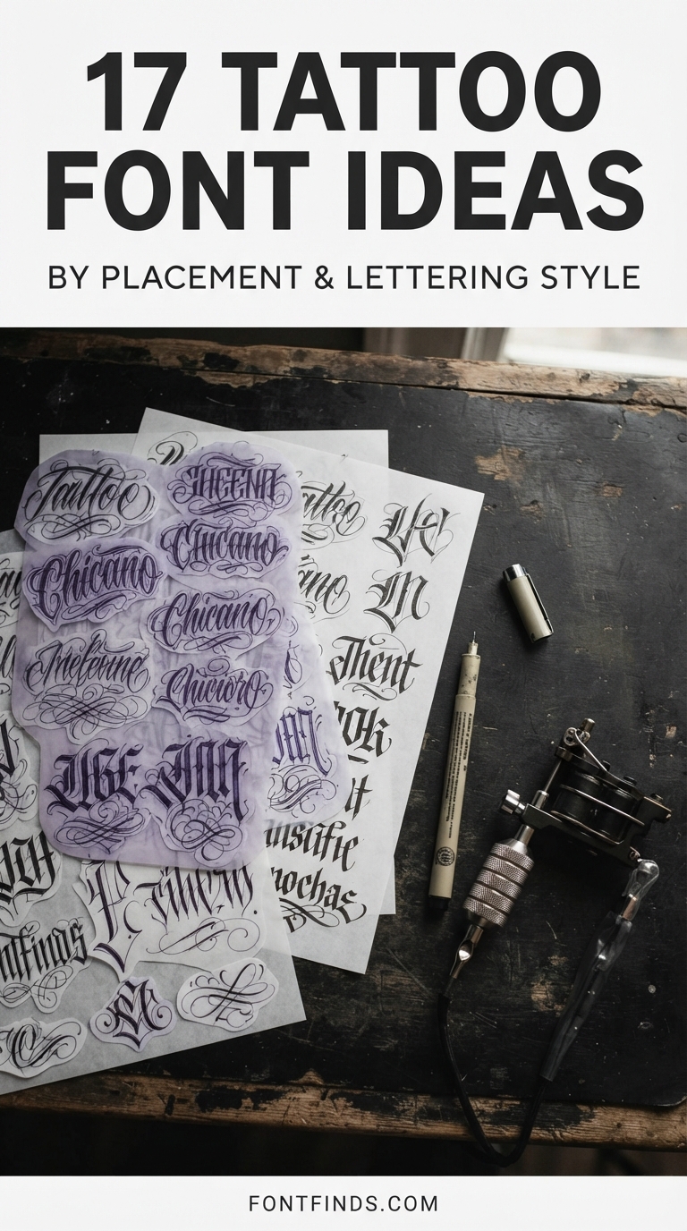
Why Tattoo Fonts Behave Differently on Skin
Tattoo ink sits roughly one to two millimetres below the surface, suspended in collagen. Your body treats that pigment as foreign material and slowly works on it, while the skin above turns over, stretches and takes UV damage. The practical result is that lines expand. Most artists put the first-year spread at somewhere between ten and twenty percent, after which softening continues at a slower rate for the rest of your life.
For solid shapes that barely matters. For tattoo fonts it is everything, because letters depend on small gaps to be readable at all. The enclosed spaces inside a, e, o and d are what distinguish them from black dots. When those counters are only a millimetre across on day one, time closes them. This is the single reason artists push back on tiny script, and it is not conservatism, it is the physics of pigment in living tissue.
The working numbers most lettering artists use: an x-height between roughly 2.8 and 4mm keeps script readable at arm’s length, and the lightest stroke in the design should heal to at least 0.3 to 0.4mm. Below that, you are relying on luck.
Read this before anything else. A font file is a reference, not a stencil. Every example below is an illustration of a style, not a design to hand over and have copied. A skilled lettering artist will redraw the letterforms for your specific body, thicken the strokes that need it, and adjust spacing for how the piece will age. That redrawing is most of what you are paying for, and it is the difference between a tattoo that still reads in twenty years and one that does not.
The 17 Ideas
Each placement paired with the lettering style that genuinely suits it, plus honest notes on size, ageing and pain.
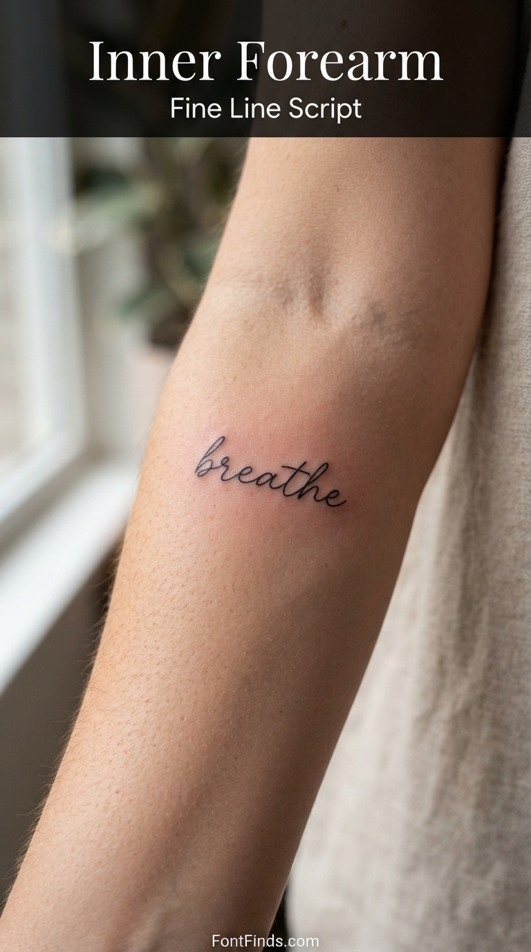
Fine Line Script
1. Inner Forearm
Why this style suits it: The inner forearm is flat, low-friction and rarely sun-exposed, which makes it one of the few places delicate script has a genuine chance of staying readable long term.
Size guidance: Give a single word an x-height of at least 3mm. For a full phrase, plan on 100mm or more of length rather than squeezing it.
How it ages here: Better than almost anywhere else on the body. Expect the crispness of years one to three to soften noticeably around year five, with visible line thickening by year ten.
Worth knowing: Skin here is thinner than the outer arm, so many people find it more tender than they expect despite the placement being popular with first-timers.
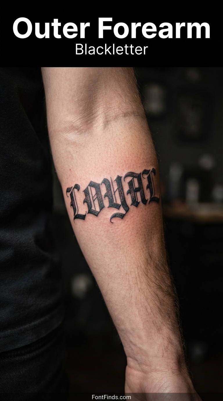
Blackletter
2. Outer Forearm
Why this style suits it: Blackletter’s thick, angular strokes are the most durable lettering style there is, and the outer forearm gives them the flat surface area they need to read properly.
Size guidance: Short words only. Blackletter capitals need roughly 15mm of height before the internal detail survives, so one word across the arm beats a sentence.
How it ages here: Excellent. The heavy strokes absorb ink spread rather than being destroyed by it, which is why blackletter has survived a century of tattooing.
Worth knowing: The outer forearm gets far more UV than the inner, so sunscreen matters more here than most people realise.
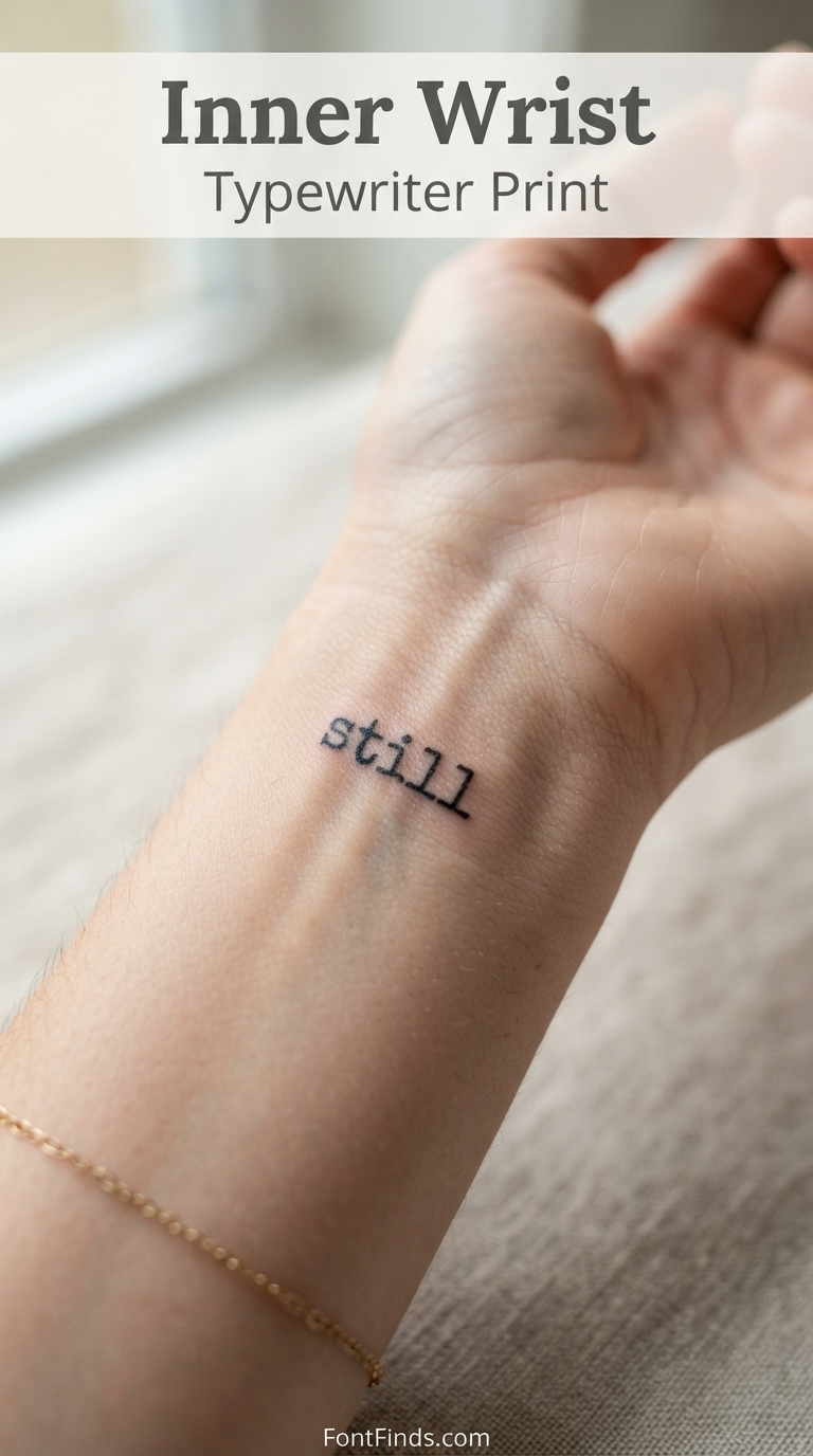
Typewriter Print
3. Inner Wrist
Why this style suits it: Typewriter faces have even stroke weights and generous letter spacing built in, which is exactly what a small, curved placement needs.
Size guidance: Keep it to one short word. The wrist curves significantly, and most artists cap designs here at 50 to 75mm.
How it ages here: Mixed. The uniform thin strokes of typewriter type blur faster than heavier styles, so go a size up from what looks right on the stencil.
Worth knowing: Wrists flex constantly and see daily sun. Both accelerate fading, so plan for a touch-up somewhere around the five-year mark.
Calligraphy Script
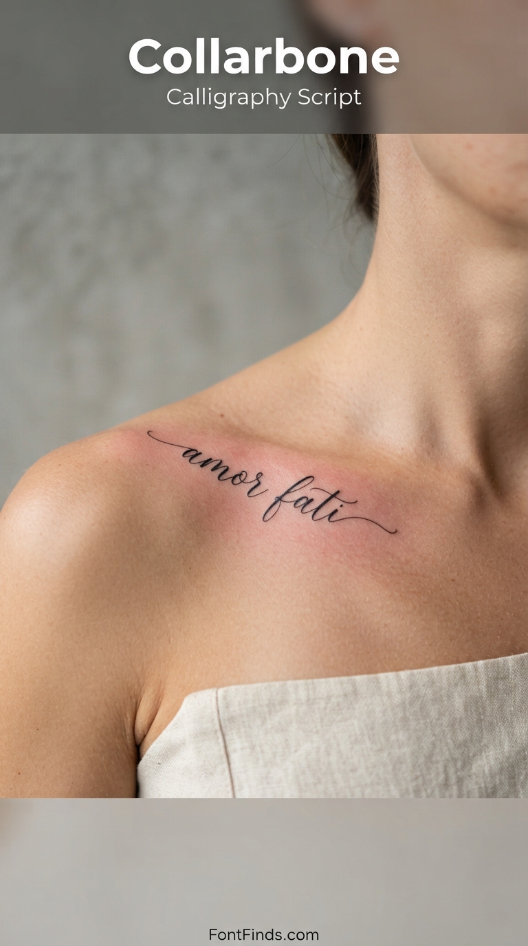
4. Collarbone
Why this style suits it: The collarbone gives a long horizontal run that suits flowing calligraphy, and the line of the bone itself provides a natural baseline to follow.
Size guidance: Calligraphy needs room. Aim for at least 4mm x-height so the thick-to-thin transitions survive, which usually means 120mm or more across.
How it ages here: Depends entirely on how thin the hairlines are. Copperplate-style scripts with extreme contrast need to be scaled up considerably or the fine strokes vanish.
Worth knowing: Skin over bone is thinner and generally reported as more painful. It is also an area many people cover for work, which is part of the appeal.
Vertical Serif
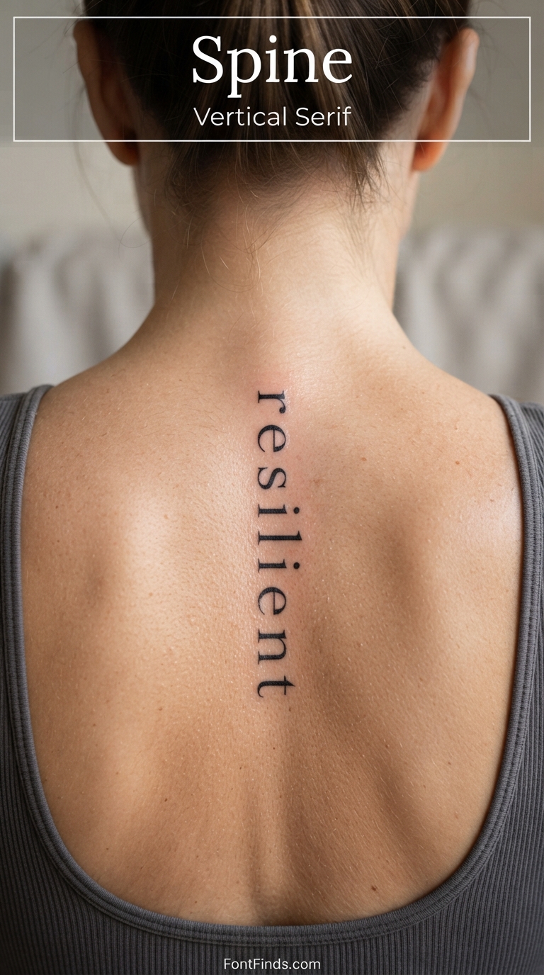
5. Spine
Why this style suits it: Running type vertically down the spine sidesteps the biggest problem with body lettering, which is that curved surfaces distort horizontal text.
Size guidance: Vertical stacking means each letter can be generous. Aim for 10mm or more per character and let the length of the spine carry the word.
How it ages here: Very well. Low friction, almost no sun exposure, and the skin here changes shape less than on limbs.
Worth knowing: Set vertically, letters are read one at a time rather than as a word shape, so legibility depends more on individual letterforms than on the script flowing.
Micro Script
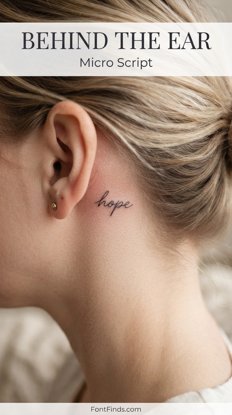
6. Behind the Ear
Why this style suits it: A naturally hidden spot that suits one short word, and the flat area behind the ear is one of the few small placements that stays relatively still.
Size guidance: This is the hardest placement to do well. Most artists will refuse anything under about 3mm x-height, and they are protecting you when they do.
How it ages here: Poorly, if you go too small. Micro-script here is the single most common regret in fine line work, because the counters inside letters close up within a few years.
Worth knowing: If you want something tiny, choose a word with open letterforms and avoid anything with e, a, or o crammed together at small size.
Minimal Sans
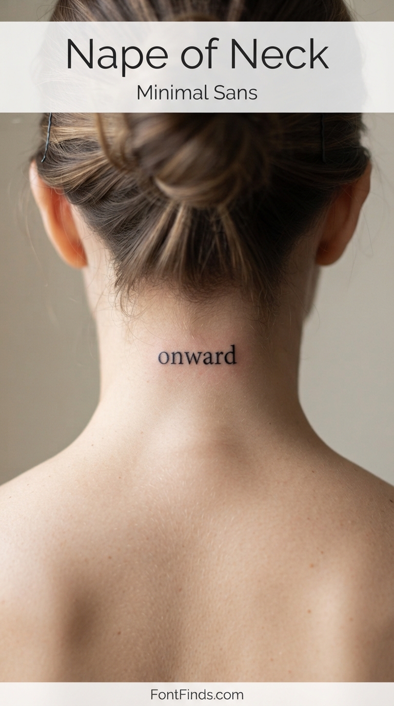
7. Nape of Neck
Why this style suits it: A clean sans serif with open counters holds up better on a small, softly curved surface than a script with connecting strokes would.
Size guidance: One word, roughly 40 to 70mm wide. The nape is smaller than it looks once hair is down.
How it ages here: Reasonably well, since it sits under hair for most people and gets limited UV. Friction from collars is the main wear factor.
Worth knowing: Easy to conceal, which makes it popular, but also awkward to see yourself without two mirrors.
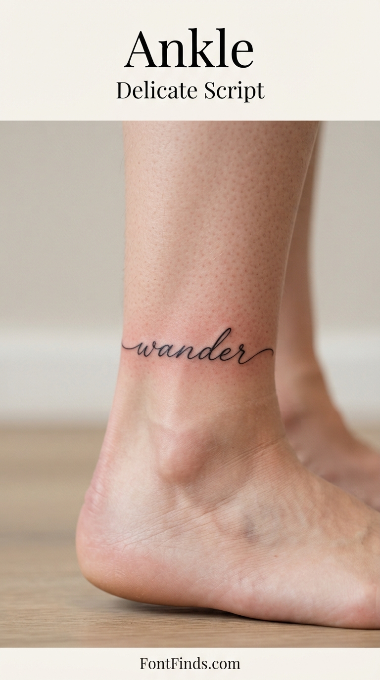
Delicate Script
8. Ankle
Why this style suits it: Script wrapping slightly around the ankle follows the body’s shape rather than fighting it, which is what makes the placement work.
Size guidance: Short words only, 40 to 70mm. Wrapping too far means part of the word is never visible from any single angle.
How it ages here: Below average. Ankles see constant sock friction, shoe rub and sun, all of which accelerate softening.
Worth knowing: Bone sits close to the surface here, and most people rate the ankle among the more painful common placements.
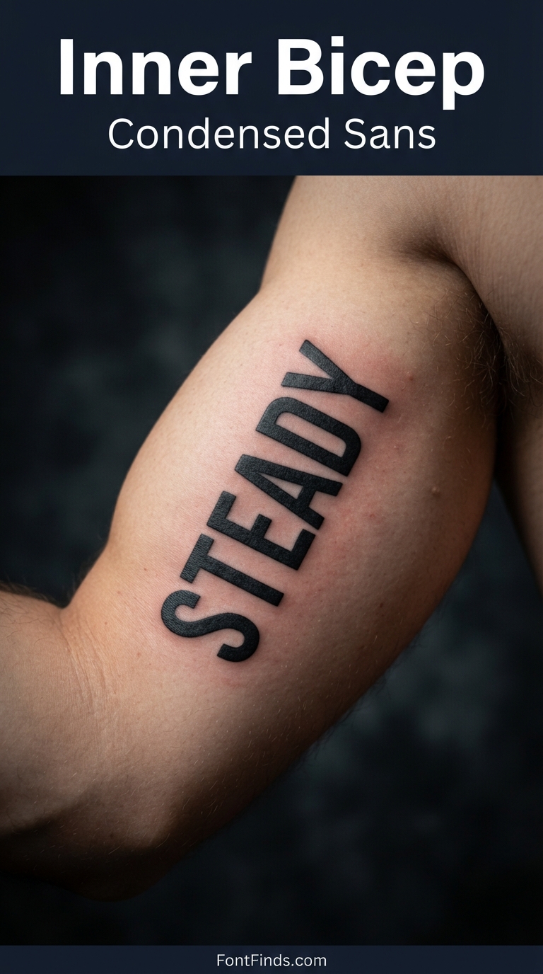
Condensed Sans
9. Inner Bicep
Why this style suits it: A heavy condensed sans is one of the safest choices in tattooing: thick even strokes, no hairlines, and it stays readable as the ink spreads.
Size guidance: Generous. The inner bicep is a large flat panel, so let letters run 20mm or taller.
How it ages here: Very well, provided the letters are not so condensed that their counters are already tight on day one.
Worth knowing: Muscle mass changes will shift the shape of anything placed here, so leave breathing room rather than filling the panel edge to edge.
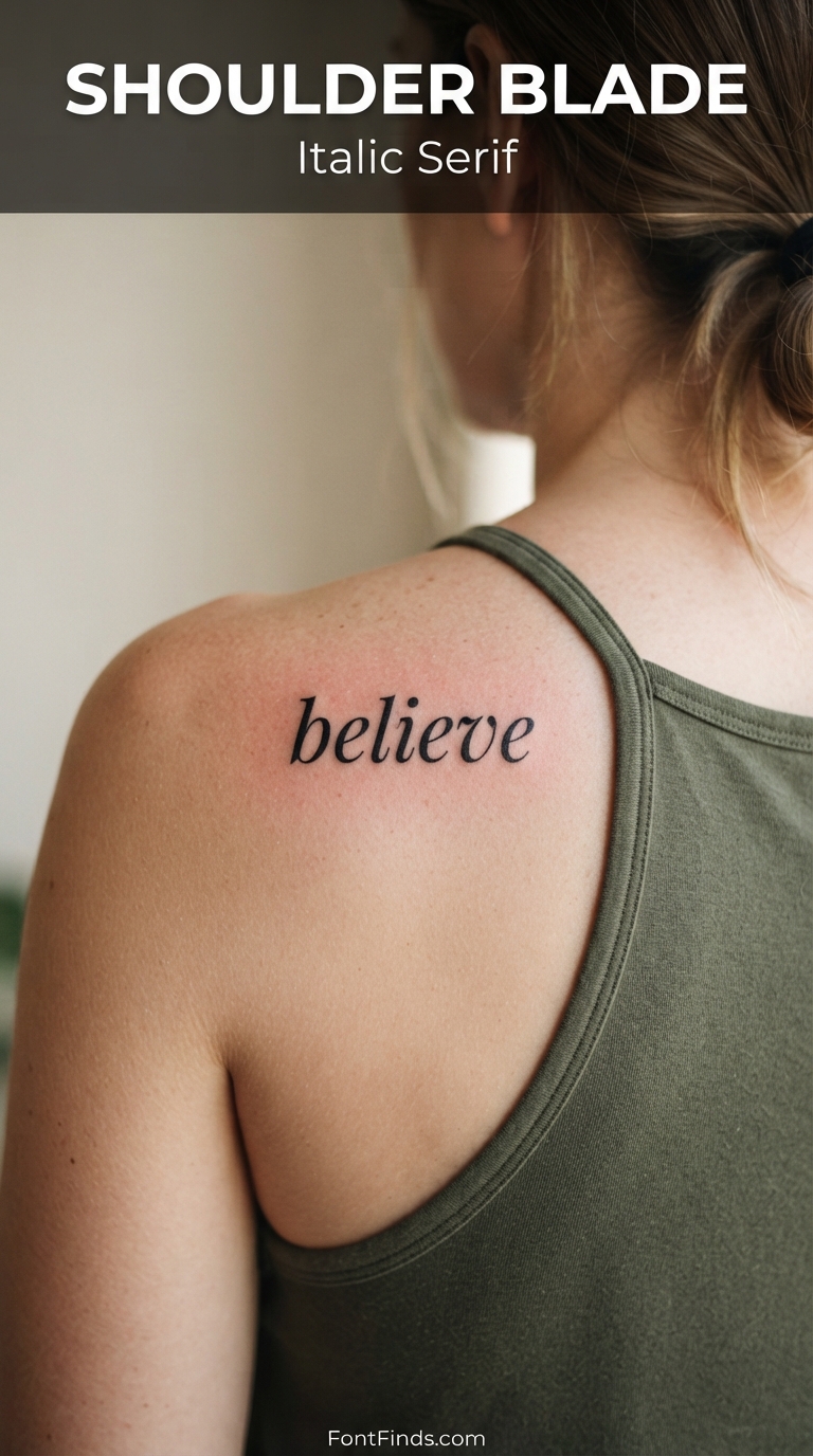
Italic Serif
10. Shoulder Blade
Why this style suits it: An italic serif adds movement without the connecting strokes that make script vulnerable, and the shoulder blade offers a broad, fairly flat canvas.
Size guidance: Comfortable room here. Aim for 8mm or more per letter and use the width of the blade.
How it ages here: Well. Low friction, limited sun for most people, and stable skin.
Worth knowing: Serifs are the first detail to soften as ink spreads, so avoid faces with very fine bracket detail unless you are going large.
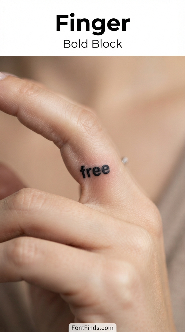
Bold Block
11. Finger
Why this style suits it: If you are getting a finger tattoo, bold block letters are the only style with a realistic chance. Anything delicate will not survive.
Size guidance: One very short word, and even then expect it to look chunky. There is simply not much surface to work with.
How it ages here: Worst on the body. Constant friction, frequent washing, and thin skin over joints mean finger tattoos commonly need touching up within a year or two.
Worth knowing: Many artists will only do fingers with a clear warning that patchy healing is normal rather than a mistake. Take that warning seriously.
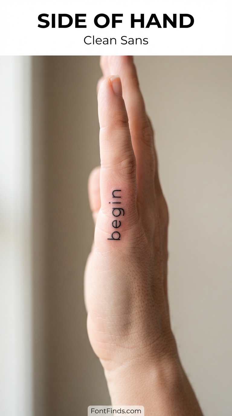
Clean Sans
12. Side of Hand
Why this style suits it: The blade of the hand is flatter and less flexed than the fingers, which makes it the most survivable hand placement for lettering.
Size guidance: Short. Roughly 40 to 60mm along the edge of the hand.
How it ages here: Below average but far better than fingers. Sun exposure is the main issue, since hands are almost never covered.
Worth knowing: Hand tattoos are still visible in most professional settings, which is worth thinking through separately from the design itself.
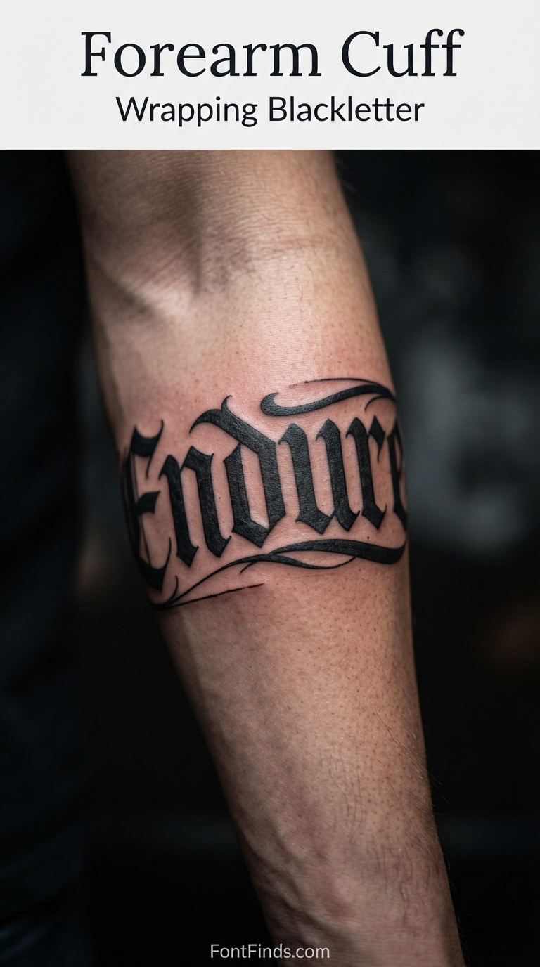
Wrapping Blackletter
13. Forearm Cuff
Why this style suits it: A band of blackletter wrapping the arm makes a feature of the curve rather than fighting it, and heavy letterforms hold their shape as they turn away from view.
Size guidance: Substantial. Cuff lettering typically runs 20 to 30mm tall so it reads from a distance as a band.
How it ages here: Excellent, for the same reason all blackletter does. Thick strokes tolerate spread.
Worth knowing: Only part of the word is visible from any single angle. Plan where the start and end of the wrap sit so the readable portion faces forward.
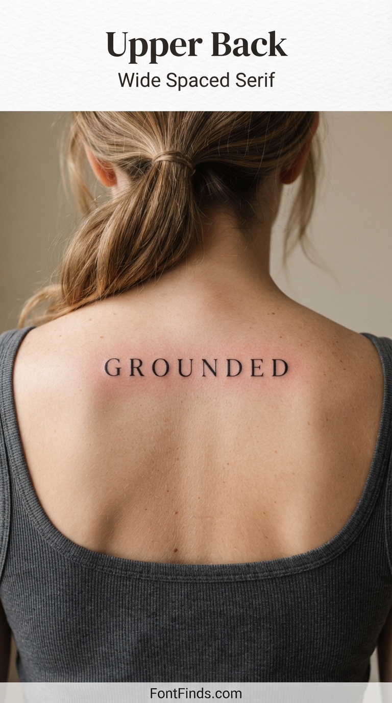
Wide Spaced Serif
14. Upper Back
Why this style suits it: Opening up the letter spacing is the single most effective way to protect a lettering tattoo, and the upper back has the width to allow it.
Size guidance: The largest canvas on this list. Letters can run 25mm or more, and the full width between shoulder blades is usable.
How it ages here: Among the best. Minimal friction, low sun exposure for most, and stable skin.
Worth knowing: Extra letter spacing is not just a style choice here. It leaves room for the ink to spread into over decades without letters merging.
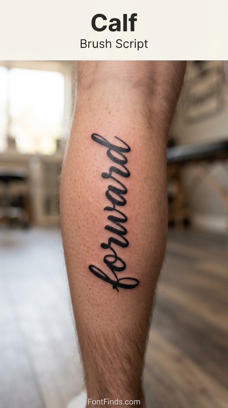
Brush Script
15. Calf
Why this style suits it: Brush lettering has natural stroke weight variation with no true hairlines, which makes it far more durable than pen-style calligraphy.
Size guidance: Plenty of room. 10mm or more per letter, running with the length of the muscle.
How it ages here: Well. The calf is a large muscle with stable skin, though sun exposure varies enormously by climate and wardrobe.
Worth knowing: Calf shape changes with fitness level more than most placements, so avoid designs that rely on precise proportions across the whole muscle.
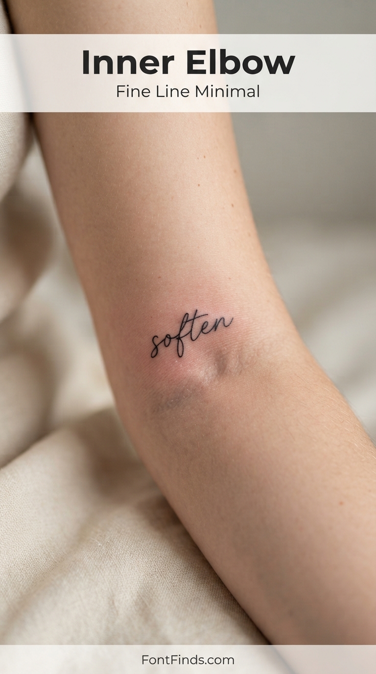
Fine Line Minimal
16. Inner Elbow
Why this style suits it: A short word in a simple fine line face sits neatly in the crease, and minimal letterforms avoid the detail that this awkward area would destroy.
Size guidance: Small and short. The usable flat area is narrower than it appears when the arm is extended.
How it ages here: Difficult. The crease folds constantly, and heavily flexed skin is notorious for patchy ink retention.
Worth knowing: Expect this one to need a touch-up. Many artists warn that the elbow ditch heals unevenly regardless of technique.
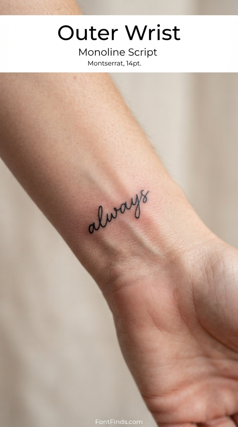
Monoline Script
17. Outer Wrist
Why this style suits it: Monoline script has one consistent stroke weight throughout, which removes the hairline problem that kills most delicate script tattoos.
Size guidance: One word, 40 to 70mm. Keep the loops open rather than tightly curled.
How it ages here: Better than contrast-heavy script, though the wrist’s sun exposure and movement still work against it.
Worth knowing: Monoline is the sensible compromise if you want script but have been warned off fine calligraphy. It reads as delicate while behaving like something sturdier.
Which Tattoo Fonts Age Best
If you take one thing from this guide, make it this table. Among tattoo fonts, stroke weight predicts longevity better than any other single factor.
| Style |
Ages |
Why |
| Blackletter |
Excellent |
Thick strokes absorb spread. Short words only. |
| Bold sans / slab |
Excellent |
Even weights, no hairlines to lose. |
| Varsity with outline |
Very good |
Outlines define the letter even as edges soften. |
| Brush script |
Good |
Weight variation without true hairlines. |
| Monoline script |
Good |
One consistent stroke weight throughout. |
| Serif |
Moderate |
Bracket detail softens first. Go larger. |
| Typewriter print |
Moderate |
Uniform thin strokes blur faster than they look. |
| Fine line script |
Poor at small size |
Needs generous scale or the counters close up. |
| Copperplate / Didone |
Poor unless large |
Extreme hairlines are the first casualty. |
Four rules that hold across every placement
1. If you cannot read it across a room today, you will not read it up close in five years. This is the oldest piece of advice in lettering tattooing and it is still the most useful test there is.
2. Open the letter spacing. Whatever spacing looks correct on screen, add to it. You are leaving room for the ink to spread into.
3. Overbuild the thinnest strokes. Experienced artists routinely fatten the lightest parts of a font for skin. Ask yours to do it rather than insisting on matching the file exactly.
4. When the artist says go bigger, go bigger. They are not overriding your taste, they are protecting the tattoo you will still have in twenty years.
Tattoo Fonts Worth Looking At
Once you have settled on a placement and a style, these are worth browsing for reference. Bring options to your consultation rather than a single locked decision, since your artist may see a problem with one and a better path with another.
Blackletter and Gothic
The most durable lettering style in tattooing, and the one that suits outer forearm, cuff and bold statement placements.
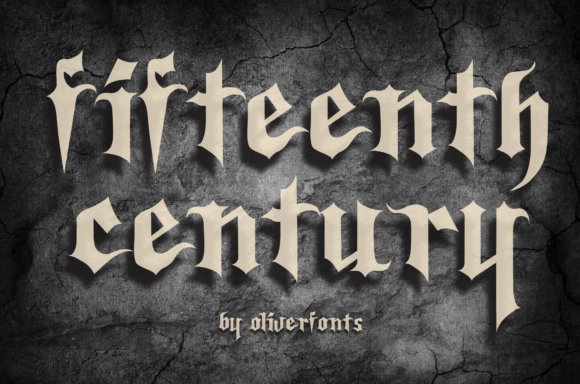
Fifteenth Century
Fifteenth Century is an incredibly authentic and bold blackletter font. Free download.
View This Font →
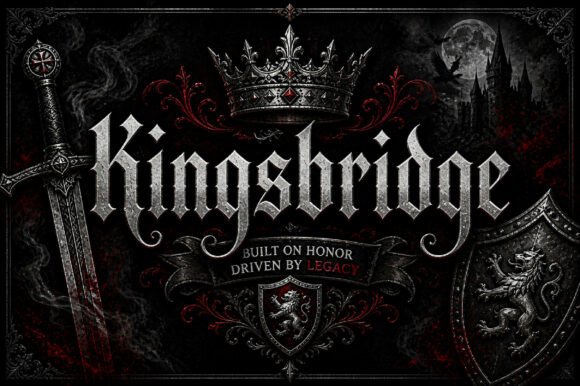
Kingsbridge
Kingsbridge is a refined blackletter display font designed to bring a bold, classic, and sophisticated look to your creative projects.
View This Font →
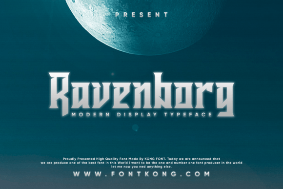
Ravenborg
Ravenborg is a modern and stunning blackletter font. It’s great for crafters and designers. Free download.
View This Font →
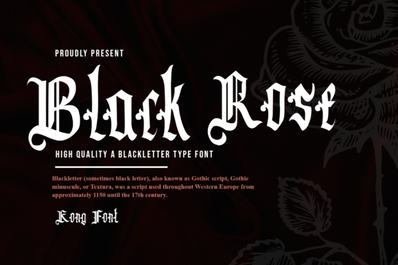
Black Rose
Black Rose is a classic and stylish blackletter font. It’s great for crafters and designers. Free download.
View This Font →
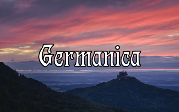
Germanica
Germanica is a stunning blackletter font that will impress you with its solemn characters. Free download.
View This Font →
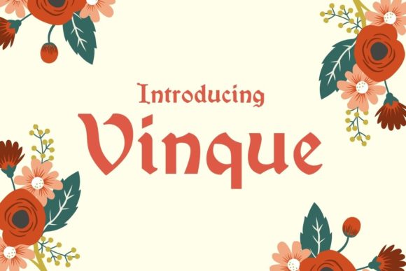
Vinque
Vinque is a blackletter font that is an interpretation of nineteenth-century medieval lettering. Free download.
View This Font →
Script and Signature
For collarbone, wrist and forearm placements. Scale these up beyond what looks right on screen, since fine strokes are the first thing to blur.
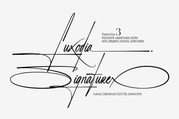
Luxodia Signature
Luxodia Signature is a luxury signature font designed to bring an elegant and distinctive touch to your creative projects.
View This Font →
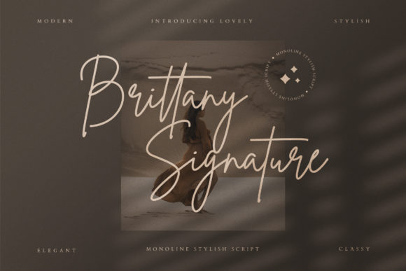
Brittany Signature Script
The Brittany Signature is an amazing script font. It has a fashionable, sophisticated signature style with its own unique curves and elegant inky flow.
View This Font →
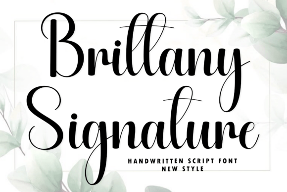
Brittany Signature
Infuse your next design canvas with timeless grace and effortless romance using Brittany Signature, a premium handwritten script font.
View This Font →
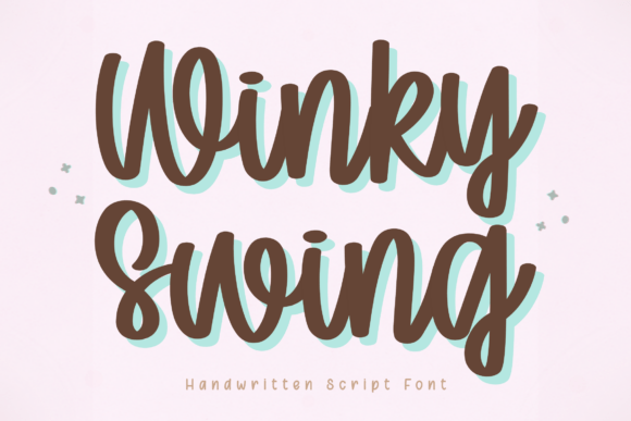
Winky Swing
Winky Swing is a playful and lively handwritten script font designed to bring a fun and friendly personality to your creative projects.
View This Font →
Bold Statement and Grunge
Heavy, even strokes that tolerate ink spread. Suited to inner bicep, upper back and calf.
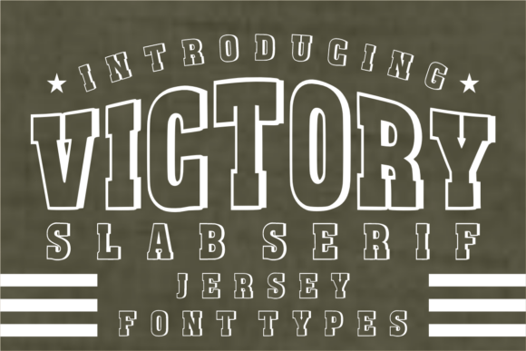
Victory
Victory is a powerful, blocky, and high-impact font designed to bring the spirit of the stadium to your creative projects. Free download.
View This Font →
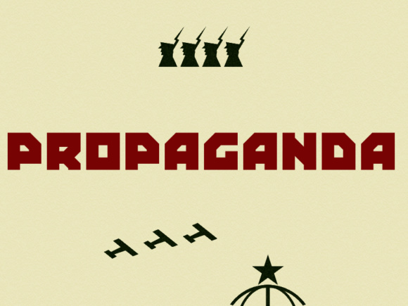
Propaganda
Propaganda is supposed to look like lettering that might appear on a soviet propaganda poster. Free download.
View This Font →
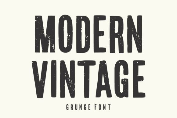
Modern Vintage
Modern Vintage Grunge Font is a bold and expressive display typeface that combines the timeless appeal of vintage typography with a rugged distressed texture.
View This Font →
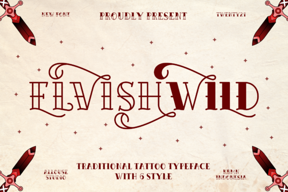
Elvishwild
Elvishwild is a superb traditional tattoo typeface design that stands out with its modern approach.You can find the rest of the family here. Free download.
View This Font →
Varsity and Athletic
Thick letterforms with built-in outlines, strong for larger placements that need to read at a distance.
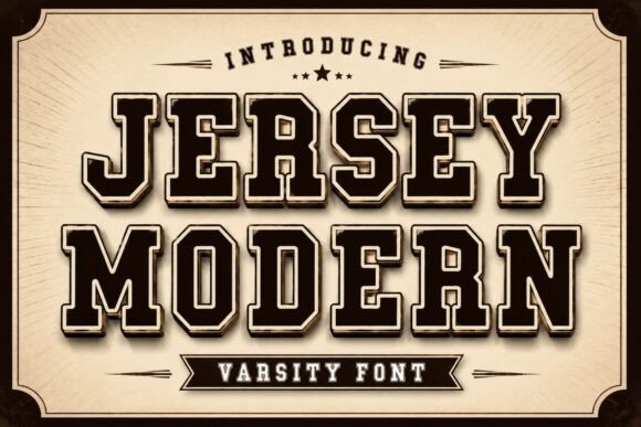
Jersey Modern
Jersey Modern is a bold varsity display font inspired by classic collegiate lettering, championship jerseys, and vintage American sports typography.
View This Font →
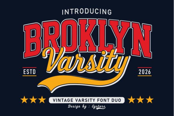
Broklyn Varsity
Hit a design home run with Brooklyn Varsity, a classic, high-energy vintage font duo.
View This Font →
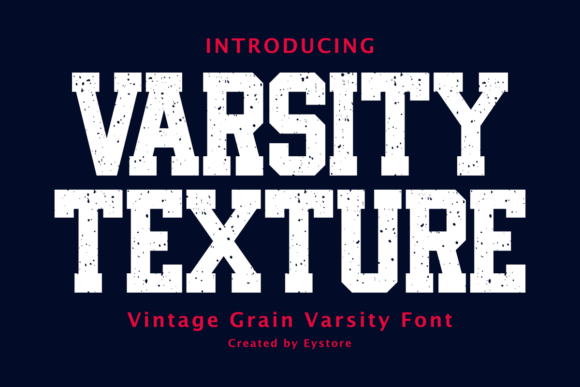
Varsity Texture
Varsity Texture is a bold vintage varsity font inspired by classic American college lettering and old-school athletic uniforms.
View This Font →
Graffiti and Street
High-energy lettering for people who want the mark to look drawn rather than typed.
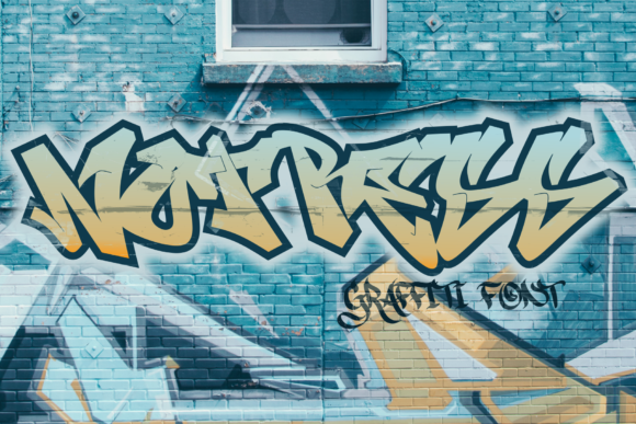
Notress
Notress is an awesome, graffiti-styled display font that has a street art vibe. Free download.
View This Font →
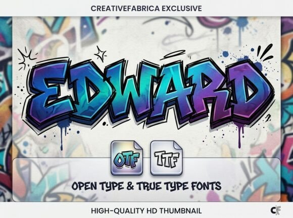
Edward
Edward | Stylish Graffiti Font Inject raw energy and urban edge into your work with Edward, a bold, hand-drawn graffiti typeface.
View This Font →
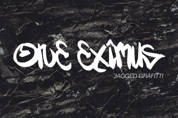
One Eximus
One Eximus is a stunning display font with a graffiti style. Free download.
View This Font →
Refined Serif
A quieter option for spine, shoulder blade and upper back lettering.

Goodfish
Goodfish is a vintage-style and elegant serif typeface. Use this serif font to add that special retro touch to any design idea you can think of! Free download.
View This Font →
Questions People Ask
What are the best tattoo fonts for longevity?
Blackletter, bold sans serif and slab styles, because thick even strokes absorb the ink spread that destroys thinner lettering. Fine line script and high-contrast calligraphy are the most vulnerable.
How small can a tattoo font be?
Most lettering artists work to a minimum x-height around 2.8 to 4mm, with the lightest strokes healing to at least 0.3 to 0.4mm. Single short words can go smaller than full sentences, but below those figures legibility becomes a gamble.
Where do most tattoo fonts go wrong?
Size, almost always. The style is rarely the problem on its own, but a well-chosen style set too small will still fail, while a plain bold face at a generous size will still read decades later.
Can I just bring a font file to my tattoo artist?
Bring it as a reference. Any competent lettering artist will redraw it for your body, adjusting stroke weight, spacing and flow. A font printed straight from a computer rarely sits well on a curved, moving surface.
Which placement is best for a script tattoo?
The inner forearm, upper back and spine, because all three are low friction, relatively low UV and offer enough room to size the lettering properly. Fingers are the worst by a wide margin.
Do I need a licence to use a font for a tattoo?
For a personal tattoo, generally no. If you are an artist selling lettering flash built on a commercial typeface, check the licence, since some designers restrict resale of artwork derived from their fonts.
Why do fine line tattoos blur?
Because the strokes start out barely wider than the spread itself. A hairline that expands by even a fraction of a millimetre loses a large proportion of its definition, whereas the same spread on a two-millimetre stroke is barely noticeable.
Browsing for more lettering? The full Creative Fabrica font library is here →