Serif fonts do most of the heavy lifting in brand identity, and free ones are usually dismissed without being tested. The dismissal is half fair. Many free serifs have incomplete character sets or spacing that needs manual correction, but a logo uses perhaps a dozen characters set once, which is exactly the situation where those weaknesses do not matter. These fifteen free serif fonts are assessed for logo and packaging work specifically.
Choosing Free Serif Fonts for a Logo, Not a Website
A body-text serif needs a complete character set, well-tuned spacing across thousands of letter pairs, and multiple weights. A logo serif needs about a dozen letters to look right together, once. Those are very different requirements, and the second one is far easier to satisfy.
This is why free serif fonts are more viable for logo work than their reputation suggests. You are not asking the font to perform across a whole system. You are asking it to render one word well, after which the artwork gets converted to outlines and the font file is no longer involved at all.
The qualities that matter shift accordingly. Distinctiveness matters more, because a logo has to be recognisable. Stroke contrast matters more, because it determines whether the mark survives small sizes. Character set completeness matters much less, because you only need the letters in your own name.
Licensing warning specific to logos. Some font licences permit commercial use but explicitly prohibit trademark registration of a logo built from the typeface. Since a logo is precisely the thing most businesses eventually want to register, read this clause before committing. It is easier to check now than to redraw a mark later.
15 Free Serif Fonts, Reviewed
Each entry is judged on logo and packaging performance rather than on how the alphabet looks in a specimen sheet.
Modern Serif
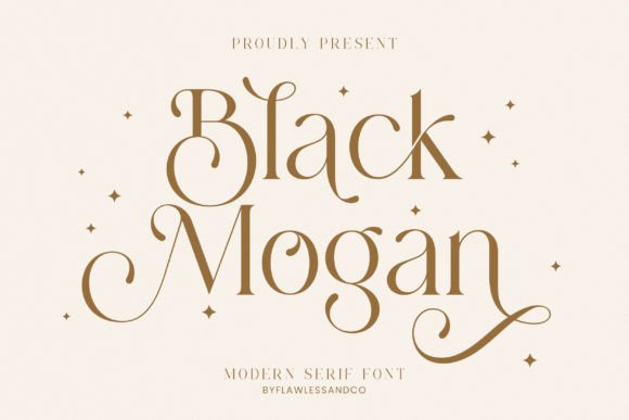
1. Black Mogan
Mogan is a modern serif with alternates and ligatures, and that combination is more useful than it sounds. Alternates let you fix the awkward letter pairs that appear in almost every brand name, and ligatures stop combinations like fi and fl from colliding.
For a logotype this matters enormously. A wordmark is a fixed piece of artwork that gets scrutinised more than any other type in a brand system, and the ability to swap a single problematic letter for a better-drawn alternative is often the difference between a mark that resolves and one that always looks slightly wrong.
My take: My first choice here for a wordmark. The alternates give you room to solve problems that plain fonts leave you stuck with.
View This Font → Free download.
Delicate Serif
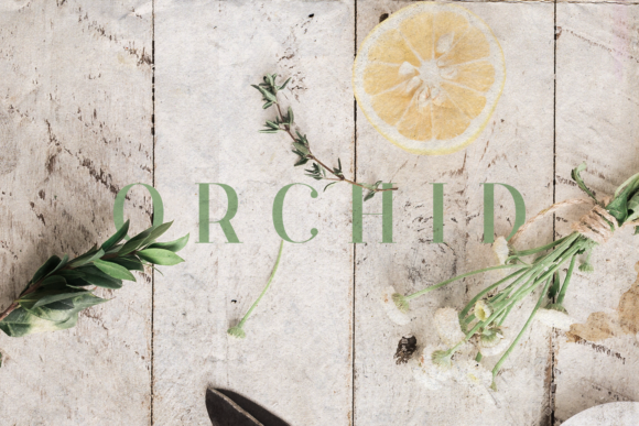
2. Orchid
Orchid is elegant and delicate, which places it in the high-contrast camp where thin strokes sit against thicker stems. That contrast is the fastest visual route to perceived luxury, and it is also the fastest route to a logo that disappears at small sizes.
Use it where the mark will be reproduced large and cleanly: shopfront signage, printed lookbooks, coated packaging. Avoid it for anything that ends up as a favicon or an embroidered label, because the hairlines will not survive either.
My take: Excellent for premium packaging, risky for a logo that needs to work everywhere. Check your smallest application before committing.
View This Font → Free download.
Classy Serif
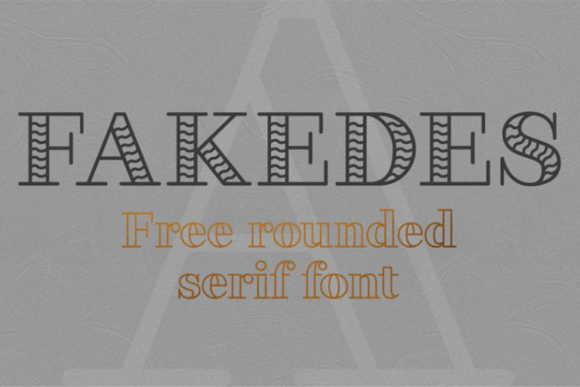
3. Fakedes
Fakedes is described as striking with a classy feel and unique letterforms, and unique is the operative word for logo work. Generic serifs make a brand invisible in a category where every competitor is also using a well-drawn but unremarkable typeface.
Distinctive letterforms carry a risk though. What reads as characterful in a wordmark can read as odd in a paragraph, so this is a display and logotype face rather than a system-wide brand serif. Pair it with something plainer for body text.
My take: Good when you need the brand name to be recognisable in silhouette. Distinctiveness is what a logo is buying.
View This Font → Free download.
Assertive Serif
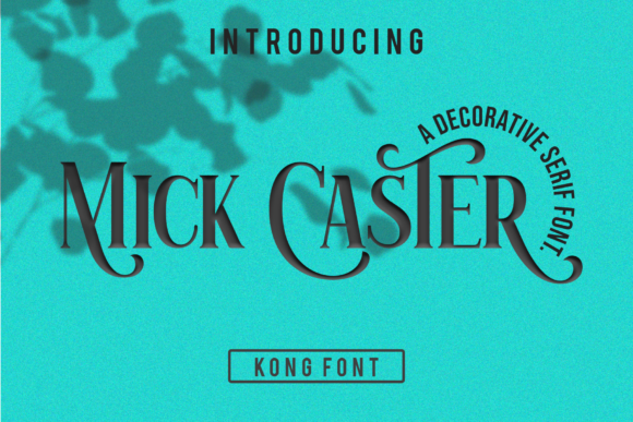
4. Mick Caster
Mick Caster is distinct, assertive and elegant, which in practice means it carries more weight than a delicate serif without tipping into slab territory. That middle weight is the most useful range for packaging.
Packaging type has to survive being printed on curved surfaces, viewed from an angle on a shelf, and reproduced in whatever colour the substrate allows. Medium-weight serifs handle all three better than either extreme, which is why so much premium food packaging sits in exactly this weight range.
My take: The practical choice for packaging. Delicate serifs look better in mockups and worse on an actual shelf.
View This Font → Free download.
Modern Serif
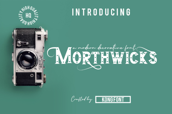
5. Morthwicks
Morthwicks is modern and assertive, aimed at crafters according to its description, which usually signals clean outlines with minimal overlapping strokes. That production-friendliness is worth more than it appears.
Clean outlines mean the font cuts reliably on a machine, prepares cleanly for foil, and does not produce unexpected artefacts when converted to paths. If you are producing physical goods rather than screen graphics, that reliability saves hours you would otherwise spend cleaning up vectors.
My take: Worth downloading if you produce physical products. Craft-oriented fonts are usually cleaner under the hood than decorative ones.
View This Font → Free download.
Simple Serif
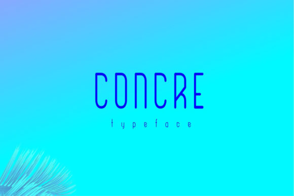
6. Concre
Concre is a simple, classy typeface with clean letter widths. Consistent widths are an underrated quality in a logo font because they make letter spacing predictable, which means a wordmark can be set and adjusted without every pair needing individual attention.
Plainness is the point here. Some brands need a distinctive typeface and some need one that stays out of the way while a symbol or a colour does the identifying work. If your logo has a strong mark, the wordmark beside it should be quiet.
My take: Pair this with a strong symbol. It is deliberately unremarkable and that is exactly what a combination mark needs.
View This Font → Free download.
Distinct Serif
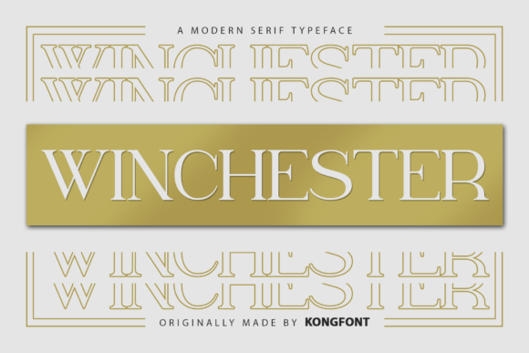
7. Winchester
Winchester is described as distinct and assertive, sitting alongside Mick Caster in the confident middle weight. The two are close enough that the choice between them comes down to the specific letterforms in your brand name rather than to any general quality difference.
That is a genuinely useful way to choose between similar fonts. Type your actual name in both, look at the two or three letters that give you most trouble, and pick whichever handles them better. Comparing full alphabets rarely produces a clear answer.
My take: Test it against Mick Caster with your real brand name. On paper they are similar and in practice one will handle your letters better.
View This Font → Free download.
Vintage Serif
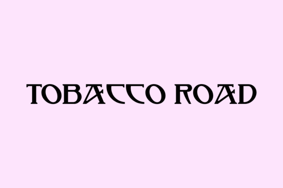
8. Tobacco Road
Tobacco Road is a retro vintage serif aimed at branding and logos, and vintage serifs carry a specific commercial advantage: they imply the business has history whether or not it does.
That works well for food, drink, barber shops, workwear and anything where craft tradition is part of the offer. It works badly for technology, healthcare or finance, where the same historical cue reads as outdated rather than established. Match the cue to the category.
My take: Strong for food and drink packaging. The heritage signal does real work in categories where craft matters.
View This Font → Free download.
Vintage Serif
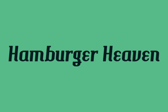
9. Hamburger Heaven
A vintage serif by Nick Curtis, a designer with a long catalogue of revivals based on historical American type specimens. Revival fonts differ from vintage-styled fonts in that the letterforms come from an actual historical source rather than from an approximation of one.
That authenticity shows in the details, particularly in how the serifs join the stems and in the proportions between capitals and lowercase. If you are working on anything genuinely period-referenced, a revival will look right in ways a modern pastiche does not.
My take: The more historically grounded choice on this list. Worth using where authenticity actually matters to the audience.
View This Font → Free download.
Charming Serif
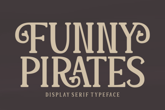
10. Funny Pirates
Funny Pirates is chic, charming and assertive, which is a lot of personality for a serif. High-personality serifs occupy an unusual niche: too characterful for body text, too structured to be a display face, but often exactly right for a logotype.
The reason is that a logo is read as a shape rather than as letters. Quirks that would irritate across a paragraph become memorable in a single word, which is why so many distinctive brand marks use typefaces that would be unusable anywhere else.
My take: Only ever for the wordmark. Do not let this anywhere near body copy, where the personality becomes fatigue.
View This Font → Free download.
Comic Serif
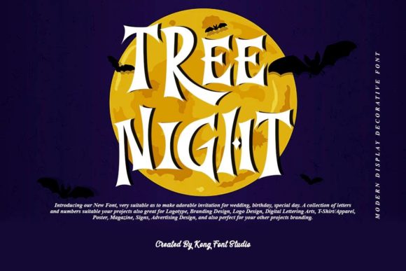
11. Tree Night
Tree Night is described as unique and comic, which places it well outside conventional serif territory. Comic-influenced serifs work in a narrow band of categories, mainly children’s products, casual food and anything deliberately unserious.
The limitation is real but so is the opportunity. Most brand serifs are competing for the same premium register, which means a category full of them is visually uniform. A serif with genuine humour stands out precisely because so few brands are willing to use one.
My take: Niche but genuinely differentiating. Worth considering for a kids’ or casual food brand tired of looking like everyone else.
View This Font → Free download.
Crafted Serif
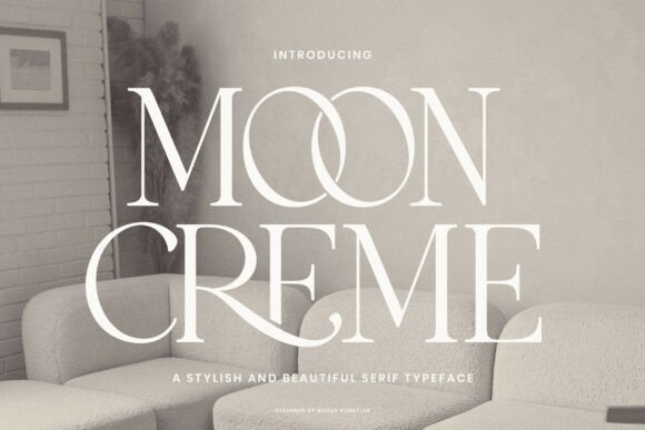
12. Moon Creme
Moon Creme is a crafted serif combining several qualities, and combination fonts of this kind usually mean a designer trying to make one typeface cover a range of moods. That can produce something versatile or something indecisive, and it is worth typing your own text to see which.
Versatility is valuable for a small brand that cannot afford multiple licences. If one serif can carry a logo, a label and a set of social graphics, that is a real saving in both money and visual consistency.
My take: Test it with your own words rather than the preview. Combination fonts vary more than most in how they read in real use.
View This Font →
Minimal Slab
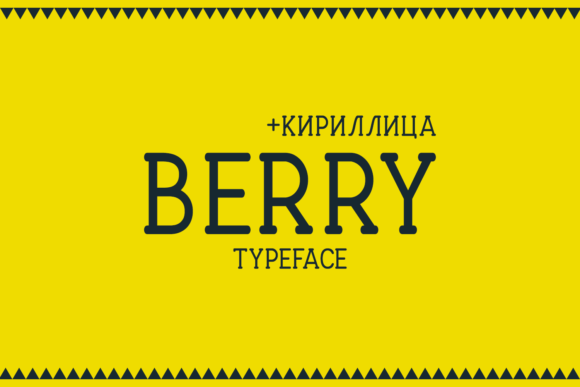
13. Berry
Berry is a minimalist slab serif, and slabs behave differently from conventional serifs in one important way: the serifs are thick enough to survive almost any reproduction method. There are no hairlines to lose.
That makes slab serifs the sensible choice for embroidery, vinyl, engraving and small-scale printing. They also read as sturdier and more modern than traditional serifs, which suits categories where heritage is not the message.
My take: The most production-proof serif on this list. If your logo is going onto physical products, start here.
View This Font → Free download.
Playful Slab
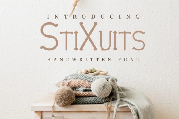
14. Stixuits
Stixuits is a modern and playful slab serif, taking the durability of the slab category and adding warmth. Playful slabs are common in food, children’s brands and casual retail because they manage to feel friendly without feeling flimsy.
The thick serifs mean it holds up at small sizes and in single colour, which is where friendlier display faces usually fail. That combination of approachable and robust is harder to find than it should be.
My take: Good for a food or kids’ brand that needs the logo on packaging as well as on screen.
View This Font → Free download.
Impact Slab
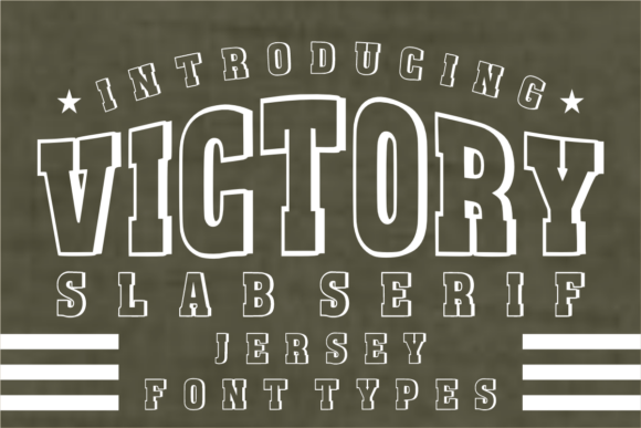
15. Victory
Victory is powerful, blocky and high impact, at the far end of the slab range where the letterforms become almost architectural. Fonts this heavy do one thing extremely well and everything else badly.
What they do well is dominate. On a poster, a shopfront, a tin or a t-shirt, a heavy slab reads from further away than anything else here. What they do badly is nuance, small sizes and long words, all of which turn a strong mark into a black rectangle.
My take: Short names only, set large. Anything over about eight characters and the impact turns into a wall.
View This Font → Free download.
Three Tests Before You Commit
1. Type your actual name
Not the preview text. Your name contains specific letter pairs, and the awkward ones will only appear when you type them. Most font decisions get made on a sample that never includes the customer’s actual word.
2. Shrink it to 16 pixels
The favicon test. High-contrast serifs lose their hairlines here and become unreadable. If the mark fails, you either need a heavier serif or a separate simplified logo variant.
3. Flatten it to pure black
Embroidery, engraving, stamps and single-colour printing all strip colour away. A logo that depends on colour to be legible is not finished.
Questions People Ask
Can free serif fonts really be used for a professional logo?
Yes, with one caveat about licensing. A logo uses a handful of characters set once, which avoids the spacing and character set weaknesses that make some free fonts unsuitable for body text. Check the trademark clause before registering.
What is the difference between a serif and a slab serif?
Serif thickness. Traditional serifs taper and are often much thinner than the main strokes. Slab serifs are thick rectangular blocks, roughly the same weight as the stems, which makes them far more durable in production.
Which free serif fonts work best on packaging?
Medium-weight options like Mick Caster and Winchester, or slabs like Berry. Packaging is viewed at an angle on a shelf, often on a curved surface, and delicate serifs lose definition in exactly those conditions.
Should I convert my logo to outlines?
Always, before sending artwork to a printer or manufacturer. Outlines remove any dependency on the font file, which prevents substitution errors and means the licence question never arises at production stage.
Are free serif fonts lower quality than paid ones?
Often in spacing and character coverage, rarely in letterform drawing. Since a logo needs perhaps twelve characters set once, those weaknesses mostly do not apply to logo work.
How many serif fonts does a brand need?
One, usually, plus a plain sans serif for supporting text. Two serifs in one identity tend to look like an accident rather than a decision.
Also worth a look: modern serif fonts for branding, vintage serif fonts for logos, or browse the full Creative Fabrica library →



One Comment