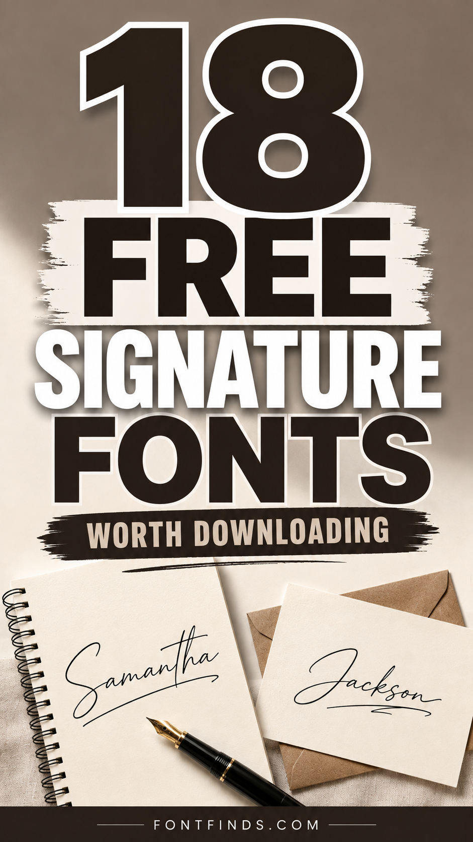
A signature font has one job that most script fonts do not: it has to look like a specific person wrote it, not like a computer approximated handwriting. That distinction is subtle and it comes down to a handful of details, mainly baseline variation, stroke speed and how the letters connect. This collection covers eighteen free signature fonts, with an honest note on where each one works and where it will let you down.
What Makes Free Signature Fonts Convincing
Three things, and none of them are how pretty the letters are.
Baseline variation. Real handwriting does not sit on a straight line. Letters rise and drop slightly, and a signature font that keeps every character at exactly the same height immediately reads as typed. Almost every font in this list has some baseline movement built in.
Connection quality. Where one letter joins the next is where cheap scripts give themselves away. Good connections vary in angle and thickness depending on which letters meet. Bad ones use the same join everywhere, which produces a visible repeating pattern across a word.
Stroke speed. Signatures are written fast. That shows up as a forward lean, longer exit strokes, and slightly ragged terminals. Scripts drawn slowly and carefully look like calligraphy rather than a signature, which is a different thing and suits different projects.
On licensing. Free signature fonts on Creative Fabrica generally include commercial rights, but terms vary by designer and some free versions are cut-down releases of paid families. Check the specific product page before building a brand identity on one, particularly if you plan to trademark the resulting logo.
18 Free Signature Fonts, Reviewed
Every entry below notes what the font does well and where it will let you down, because free signature fonts vary far more in usability than in appearance.
Fast, Confident
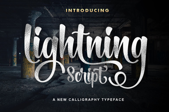
1. Lightning Script
Lightning Script is the most downloaded font in this collection by a very wide margin, and the reason becomes obvious the moment you type a name in it. The strokes move quickly, with the kind of forward lean you get from someone signing without thinking about it. That speed is what separates a convincing signature font from a script that merely looks handwritten.
Where it earns its place is on anything that needs a human name rather than a company name: a photographer’s watermark, an artist’s shop header, a personal blog logo. It struggles the moment you ask it to do a full sentence, because the connections that make single words look effortless become visually noisy across a line of text. Keep it to two or three words maximum and give it plenty of surrounding white space.
My take: Set this at a large size and let it overlap slightly with whatever sits behind it. Signature fonts look weakest when they are neatly boxed in, and Lightning Script in particular wants room to run.
Download This Font → Free download.
Delicate, Luxury
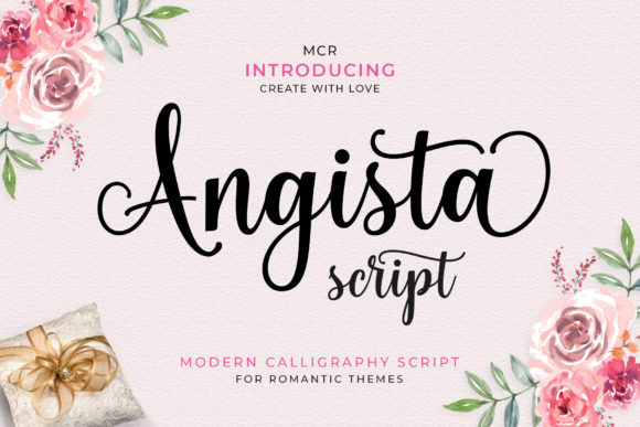
2. Angista Script
Angista Script belongs to the delicate end of the signature category, with characters that sit unevenly along the baseline rather than marching in a straight line. That bounce is deliberate and it is the single detail that stops a script reading as a font. Real handwriting never lands on a ruler.
The trade-off is fragility. Thin strokes and a bouncing baseline both suffer at small sizes, so this is a headline face rather than a caption face. It works beautifully across the top of a beauty brand’s packaging or a boutique’s shopfront, and it fails on a business card set at 9pt. If your design needs the same font at both scales, choose something sturdier.
My take: I would use Angista for the brand name only, then hand everything else to a plain sans serif. It has exactly one job and it does that job better than most paid alternatives.
Download This Font → Free download.
Elegant, Timeless
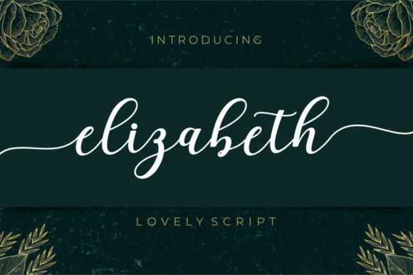
3. Elizabeth
Elizabeth is a more classical take on the elegant script, less about speed and more about poise. The letterforms are consistent, the connections are clean, and the overall rhythm feels considered rather than spontaneous. PUA encoding means the alternate characters are reachable without specialist software, which matters more than people realise when you want a particular letter to end with a flourish.
This is the script to reach for when the brand is trying to signal permanence. Jewellery, formal stationery, heritage food products, anything where the customer should feel the business has been around a while. It is markedly less suitable for anything youthful or fast-moving, where its formality reads as stiff.
My take: Pair Elizabeth with a high-contrast serif rather than a sans. The two share a formal register and the combination looks far more expensive than script plus sans usually does.
Download This Font → Free download.
Flowing, Romantic
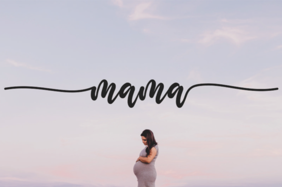
4. Mama
Mama flows more than it writes. The strokes are long and continuous, and the overall impression is closer to modern calligraphy than to a signature. Where a signature font suggests a person, this suggests an occasion.
That makes it a natural fit for wedding stationery, event invitations and anything celebratory, which is exactly where the CF description points it. The practical caution is the same as with all high-flow scripts: the long entry and exit strokes eat horizontal space, so a two-word name can end up wider than you planned. Lay it out early rather than dropping it in at the end.
My take: Worth downloading even if you have no immediate use for it. Flowing scripts of this quality are usually paid, and having one in the library saves you a purchase later.
Download This Font → Free download.
Stylish, Clean
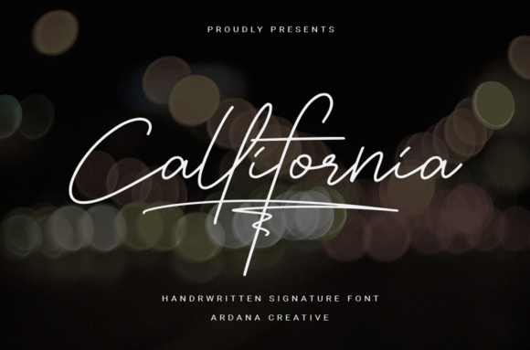
5. Callifornia
Callifornia sits in a useful middle ground. It is clearly handwritten but the strokes are cleaner and more controlled than most freebies in this category, which means it holds together at smaller sizes where more delicate scripts fall apart.
That resilience makes it one of the few signature fonts here you could reasonably use on a printed label or a small product tag, not just a headline. It has less personality than Lightning Script and less elegance than Elizabeth, but it is more useful across a range of sizes than either, and for a working brand that trade is usually worth making.
My take: This is my pick if you can only download one font from this list and you do not yet know what you will need it for. It is the most adaptable script here.
Download This Font → Free download.
Delicate, Classic
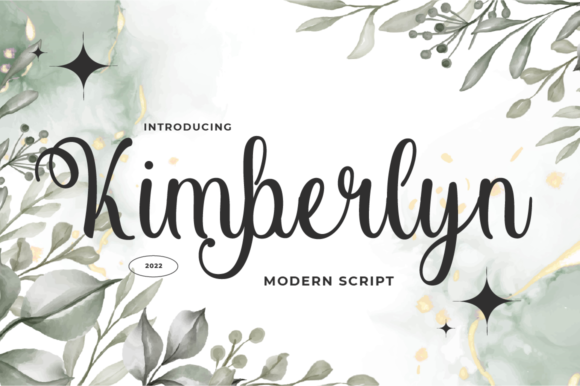
6. Kimberlyn
Kimberlyn leans toward classic elegance with delicate stroke work and a restrained approach to flourishes. It does not try to be dramatic, which is precisely its strength in a category where most fonts compete on how far they can extend a swash.
Restraint pays off in application. A subtle script sits comfortably alongside photography without fighting it, which makes Kimberlyn a good choice for a lifestyle brand or a portfolio site where images carry the visual weight and the type needs to stay out of the way.
My take: Use this when the photography is the hero. Loud scripts compete with strong images, and Kimberlyn is one of the few here that knows when to step back.
Download This Font → Free download.
Romantic, Calligraphic
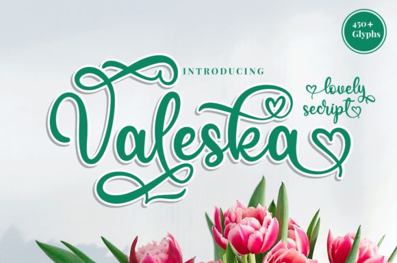
7. Valeska
Valeska is described as a romantic calligraphy typeface with dancing characters, and the dancing is the operative word. The baseline variation here is more pronounced than in Angista, giving it a looser, more hand-drawn feel.
The looser the baseline, the more the font depends on being set large. At headline size the variation reads as charm; at body size it reads as misalignment. Set it big, keep the word count low, and it delivers something most free scripts cannot, which is genuine warmth.
My take: Best on invitations and greeting cards where the word is short and the size is generous. Do not try to make this work as a logotype for a long company name.
Download This Font → Free download.
Stylish, Versatile
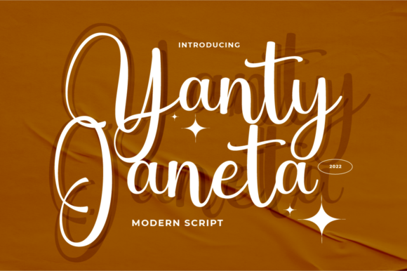
8. Yanty Janeta
Yanty Janeta is a straightforward stylish script without a strong gimmick, which is not a criticism. Most projects do not need a font with a distinctive quirk, they need something that looks good and gets out of the way.
What it offers is legibility. The letterforms are distinct from each other, the connections are clear, and a reader can decode an unfamiliar name at a glance. That sounds basic until you try to read a name set in a more decorative script and realise you cannot tell the a from the o.
My take: A safe default. When a client asks for something handwritten and gives you no other direction, this is a sensible starting point that rarely gets rejected.
Download This Font → Free download.
Fresh, Clean
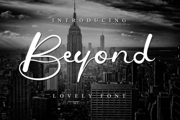
9. Beyond
Beyond is fresh and clean rather than ornate, sitting closer to neat handwriting than to calligraphy. There is very little stroke contrast, which is what gives it a modern feel where thick-to-thin scripts feel traditional.
Low contrast also means better durability. It survives being printed small, embroidered, or reversed out of a dark background, all situations where a delicate script would lose its thin strokes entirely. If your brand needs one script that has to work everywhere, this is a stronger candidate than most.
My take: The one I would choose for merchandise. Even stroke weights survive embroidery and vinyl in a way that traditional calligraphy simply does not.
Download This Font → Free download.
Delicate, Bouncing
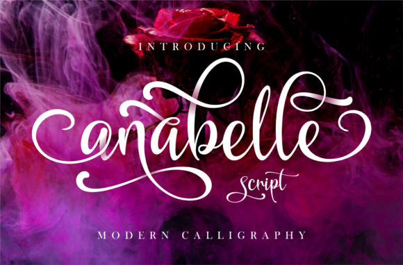
10. Anabelle Script
Anabelle Script uses the same dancing baseline approach as several fonts here, executed with a lighter touch. The letters vary in position without varying much in size, which keeps the overall line looking even while still feeling hand-placed.
That balance is harder to achieve than it looks and it is the reason Anabelle works on longer words where bouncier scripts start to look chaotic. If you have a brand name of three syllables or more, this handles it better than most of the delicate scripts in this collection.
My take: Good for longer names. Most bouncing scripts fall apart past about eight characters and this one holds its line.
Download This Font → Free download.
Elegant, Free
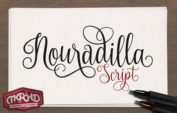
11. Nouradilla Script Free Version
Nouradilla Script is a free version of a paid family, which means you get the core alphabet without the full set of alternates. That is worth knowing before you build a brand around it, because the flourished variants shown in some previews may not be included in the free download.
What you do get is a clean elegant handwriting style that covers standard use. For a one-off project, a personal blog or a test layout, the free version is entirely sufficient. For a commercial identity you will likely want the complete family.
My take: Fine for personal projects and prototyping. If the design gets approved and goes commercial, budget for the full version rather than working around the missing glyphs.
Download This Font → Free download.
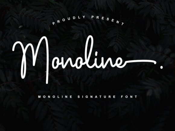
Signature, Modern
12. Monoline
Monoline does what its name promises: one consistent stroke weight throughout, with no thick-to-thin variation at all. In signature scripts this is the modern approach, and it solves the single biggest weakness of traditional calligraphy, which is that hairlines disappear when reproduced small.
Because the weight never varies, this font behaves predictably. It scales down without losing detail, cuts cleanly on vinyl, embroiders without collapsing, and reverses out of dark backgrounds without thinning. For anyone producing physical goods rather than screen graphics, that reliability is worth more than decorative flair.
My take: My recommendation for anything that will be manufactured rather than displayed. Monoline scripts are the sensible choice for products, and this is a good free one.
Download This Font → Free download.
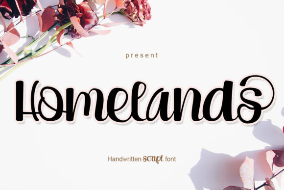
Romantic, Sweet
13. Homelands
Homelands is another romantic calligraphy face with a dancing baseline, positioned toward the sweeter end of the range. Compared to Valeska it is slightly tighter and slightly more controlled, which makes it a touch more usable and a touch less characterful.
The application is the same: short phrases at generous sizes, ideally on something being printed rather than viewed on a phone. Where it differs is in tone. Homelands reads warmer and less formal, which suits small independent brands better than luxury positioning.
My take: Better suited to a farm shop or a small bakery than to a jewellery brand. The warmth is genuine but it is not luxury warmth.
Download This Font → Free download.
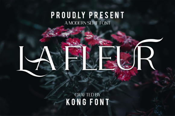
Playful, Modern
14. La Fleur
La Fleur is more playful than most of the scripts here, described as modern and handwritten with crafters in mind. The letterforms have a slight roundness that keeps it friendly rather than formal.
That craft orientation is a real signal. Fonts designed with crafters in mind tend to have cleaner outlines and fewer overlapping strokes, because overlaps cause problems when cutting vinyl or preparing files for a cutting machine. If you sell on Etsy or make physical products, that matters more than aesthetics.
My take: A practical choice for craft sellers. The clean outlines will save you time when preparing cut files, which is not something you can tell from a preview image.
Download This Font → Free download.
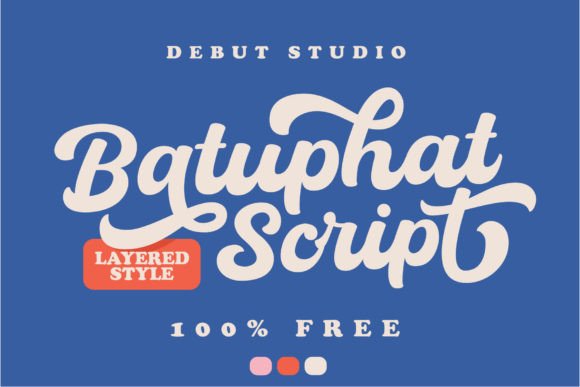
Bold, Signature
15. Batuphat
Batuphat is the bold outlier in a collection dominated by delicate scripts. Heavy strokes, strong forward lean, and enough weight to hold its own as a headline without support.
Bold scripts serve a completely different purpose to delicate ones. Where a fine script whispers luxury, a heavy script shouts personality, which suits sports brands, food trucks, streetwear and anything targeting a younger audience. It also survives small sizes and busy backgrounds far better than anything thin.
My take: The one to use when the design needs to compete with a photograph or a busy layout. Delicate scripts vanish in those conditions and this one does not.
Download This Font → Free download.
Stylish, Bold
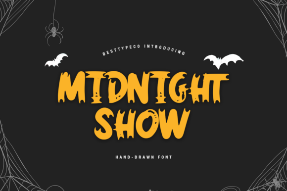
16. Midnight Show
Midnight Show splits the difference between the delicate and bold camps, offering a stylish handwritten face with enough weight to stay visible without becoming heavy. That middle position makes it one of the more flexible options here.
Flexibility matters more than it sounds. A font that only works at one weight and one size limits your layout choices, whereas something like Midnight Show can carry a headline, a subheading and a signature line without needing a second script alongside it.
My take: Worth downloading for the versatility alone. It is rare to find a free script that works across more than one role in the same layout.
Download This Font → Free download.
Trendy, Chic
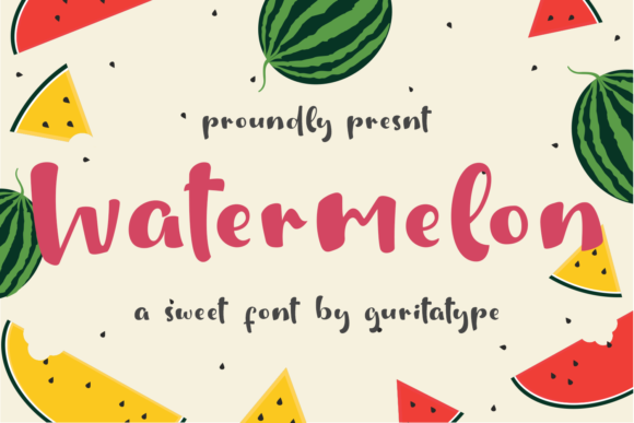
17. Watermelon
Watermelon is a trendy chic script, and trendy is worth taking seriously as a description. Fonts positioned this way tend to reflect whatever is currently popular on social platforms, which makes them effective right now and dated in three years.
That is not a reason to avoid it, but it is a reason to think about the project lifespan. For a social campaign, a seasonal product line or a launch graphic, current is exactly what you want. For a logo that needs to last a decade, choose something more classical from this list.
My take: Use it for campaigns, not for logos. Trend-driven scripts do their job brilliantly for eighteen months and then start ageing the brand.
Download This Font → Free download.
Spencerian, Historic
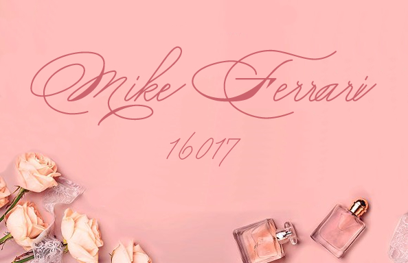
18. Mike Ferrari 16017
This one is different from everything else in the collection. It is based on Spencerian script, the formal American penmanship style taught in schools through the nineteenth century and the direct ancestor of several famous brand logotypes still in use today.
Spencerian has extreme stroke contrast and elaborate capitals, which means it is genuinely difficult to use well. Set it too small and the hairlines vanish. Set it alongside a modern sans and the pairing looks confused. But used properly, at size, in a period-appropriate context, it delivers an authenticity that no contemporary script imitation can match.
My take: A specialist tool rather than a general-purpose script. If you are working on anything heritage, vintage or Americana, this is the most historically accurate option in the collection.
Download This Font → Free download.
Using Them Without the Usual Mistakes
Do not set them in capitals
Script capitals are designed as initial letters, not as a full alphabet. A word set entirely in script caps loses all the connecting strokes and looks broken. This is the single most common misuse of signature fonts.
Do not use two scripts together
Pair a script with a plain sans serif or a quiet serif. Two handwritten faces in one layout compete for the same role and neither wins.
Do not set them small
Delicate scripts lose their thin strokes below roughly 18 pixels on screen and below about 10pt in print. If you need the same font at caption size, choose one of the monoline or bold options above instead.
Do check the alternates
PUA encoded fonts let you access swashes and alternate letterforms directly. Many free scripts look ordinary until you swap the first and last letters for their flourished versions, which takes about ten seconds and changes the whole feel.
Questions People Ask
Are free signature fonts really free for commercial use?
Usually, but not always. Creative Fabrica freebies generally include commercial rights, though some are limited versions of paid families with reduced glyph sets. Always read the licence on the individual product page before using one commercially.
What is the difference between a signature font and a calligraphy font?
Speed. Signature fonts imitate fast handwriting, with a forward lean and slightly irregular strokes. Calligraphy fonts imitate slow, deliberate pen work with controlled thick-to-thin contrast. They suit different projects and look wrong when swapped.
Which free signature fonts work best for logos?
The sturdier ones. Monoline, Beyond and Callifornia all survive being scaled down and reproduced in a single colour, which is what a logo actually has to do. The most delicate scripts here look beautiful in a preview and fail as working logotypes.
Do free signature fonts include full alphabets?
Most do, but some free releases are cut-down versions of paid families with reduced alternates. Check the character map before designing around a specific flourished letter.
Can I use these fonts on products I sell?
That depends on the specific licence rather than on the font being free. Merchandise and print on demand are sometimes treated separately from general commercial use, so check before listing anything.
Why do my script fonts look disconnected?
Almost always because letter spacing has been increased. Scripts rely on letters touching. If you have adjusted tracking, set it back to zero and the connections will return.
Looking for more? Signature fonts for logo design, free cursive fonts, or browse the full Creative Fabrica library →


One Comment