15 Best Gothic Fantasy Fonts for Map Heading Ideas
A fantasy map needs atmosphere without sacrificing navigation. Gothic fantasy fonts can make a kingdom feel ancient, but a dense blackletter alphabet becomes difficult when every mountain and village uses it. This selection considers which faces can carry the map title and which are better saved for a royal seal or chapter opener.
Gothic Fantasy Fonts: what to test first
Test ‘Northern Reach’ on a wide title and ‘Blackwater Ford’ on a smaller location label. Watch the letters with narrow internal spaces: they can merge on a textured parchment background. If a font works only when the reader already knows the name, use it for decoration and choose a clearer companion for the map itself.
Before you choose
- Set the real headline, not the sample word.
- Check a small preview and a one-color proof.
- Read the individual product page for available glyphs and license terms.
Kingdom titles and heraldic mood
1. Ravengrave
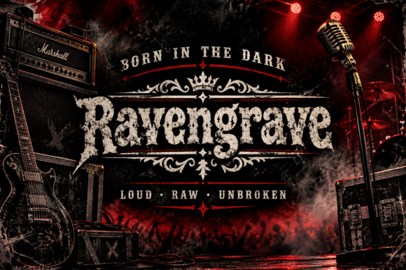
In this shortlist, Ravengrave is worth testing for a fictional kingdom title because of its angular blackletter structure. A second detail to notice is roughened edges. Set the actual copy in one color, use a restrained old-style serif for place names, and check how the spacing changes after a line break.
View Ravengrave and download options →
2. Evershore
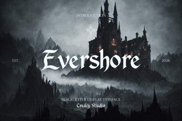
For a chapter opening, Evershore offers angular blackletter structure. Give it one clear task in the composition. Before choosing it, keep the inner spaces open at smaller sizes and compare the result with a plain companion face at actual size.
View Evershore and download options →
3. Kryvon
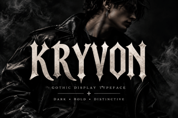
Consider Kryvon for a tabletop campaign map: angular blackletter structure gives the phrase a clear personality. A second detail to notice is thick-to-thin contrast. Leave breathing room around the letters and keep the inner spaces open at smaller sizes. Pair it with a restrained old-style serif for place names rather than another competing display style.
View Kryvon and download options →
4. Brackhold
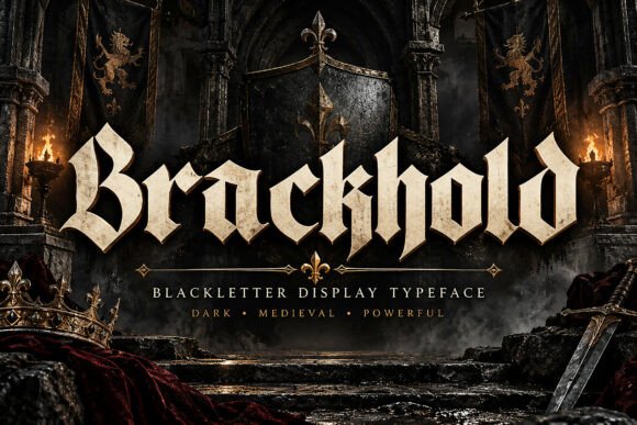
At first glance Brackhold reads through angular blackletter structure. A second detail to notice is geometric rhythm. Put it on a fantasy book endpaper, but keep the adjacent information quiet. The real proof comes at final size: keep the inner spaces open at smaller sizes.
View Brackhold and download options →
5. Thornryk
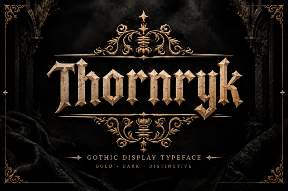
Thornryk brings angular blackletter structure to a heraldic seal. A second detail to notice is ornamental details. I would keep the inner spaces open at smaller sizes, then choose a restrained old-style serif for place names for the details. That division keeps the headline expressive and the information easy to scan.
View Thornryk and download options →
6. Grimvane
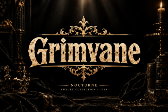
Grimvane is a blackletter option marked by angular blackletter structure. A second detail to notice is ornamental details. Its strongest role here may be a fictional kingdom title. Build a one-color proof and keep the inner spaces open at smaller sizes; the vendor mockup alone is too generous a test.
View Grimvane and download options →
7. Dravok
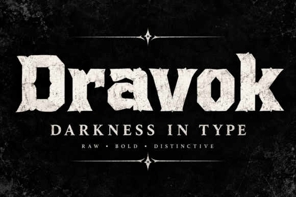
Dravok can give a chapter opening a different pace through angular blackletter structure. A second detail to notice is geometric rhythm. I would place it beside a restrained old-style serif for place names, then check the longest word and the smallest practical size before making a final choice.
View Dravok and download options →
8. Kryvane
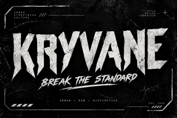
Kryvane leans on angular blackletter structure, a useful starting point for a tabletop campaign map. A second detail to notice is roughened edges. If the design has lots of tiny copy, let the expressive type stay large. For the main phrase, keep the inner spaces open at smaller sizes before you settle on the layout.
View Kryvane and download options →
Rugged names for chapters and landmarks
Give the map one dramatic level. Set a region heading in the gothic face, then use a quieter serif for towns, rivers and legend notes. This contrast makes the old-world mood feel intentional and keeps small information useful to the reader.
9. Westmar

The appeal of Westmar is angular blackletter structure. A second detail to notice is ornamental details. Try it first as a fantasy book endpaper, then shrink the artwork to a phone preview. If the word still lands immediately, it can lead; otherwise, use it for a single accent.
View Westmar and download options →
10. Onyx Rebel
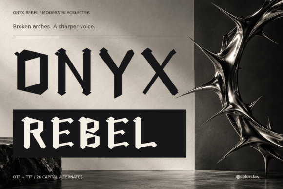
Try Onyx Rebel on a heraldic seal. It uses angular blackletter structure to set the mood. A second detail to notice is optional letterforms. Type your complete phrase, keep the inner spaces open at smaller sizes, and inspect a print-size draft before trusting the enlarged preview.
View Onyx Rebel and download options →
11. Corvellan
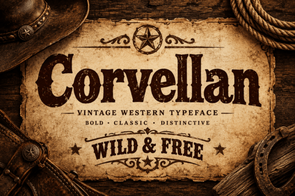
In this shortlist, Corvellan is worth testing for a fictional kingdom title because of its visible stroke contrast. A second detail to notice is thick-to-thin contrast. Set the actual copy in one color, use a restrained old-style serif for place names, and check how the spacing changes after a line break.
View Corvellan and download options →
12. Gravellion
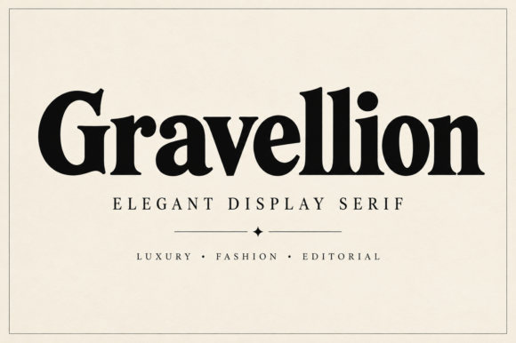
For a chapter opening, Gravellion offers visible stroke contrast. A second detail to notice is thick-to-thin contrast. Give it one clear task in the composition. Before choosing it, test the thin parts on your actual printing stock and compare the result with a plain companion face at actual size.
View Gravellion and download options →
13. Arib
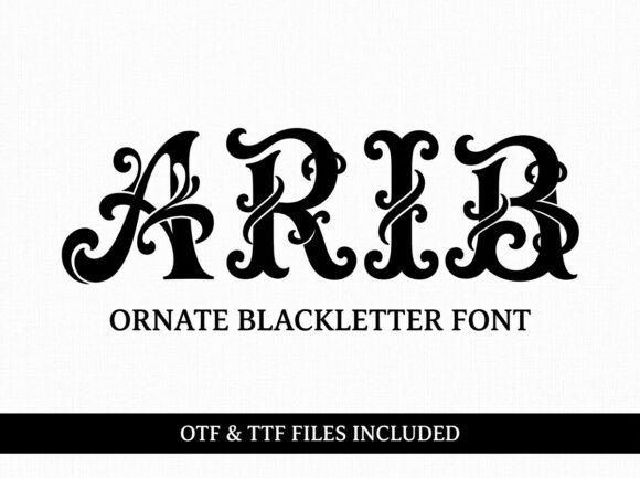
Consider Arib for a tabletop campaign map: angular blackletter structure gives the phrase a clear personality. A second detail to notice is thick-to-thin contrast. Leave breathing room around the letters and keep the inner spaces open at smaller sizes. Pair it with a simple text face for the smaller information rather than another competing display style.
View Arib and download options →
14. Rosa
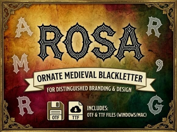
At first glance Rosa reads through angular blackletter structure. Put it on a fantasy book endpaper, but keep the adjacent information quiet. The real proof comes at final size: keep the inner spaces open at smaller sizes.
View Rosa and download options →
15. Yulia
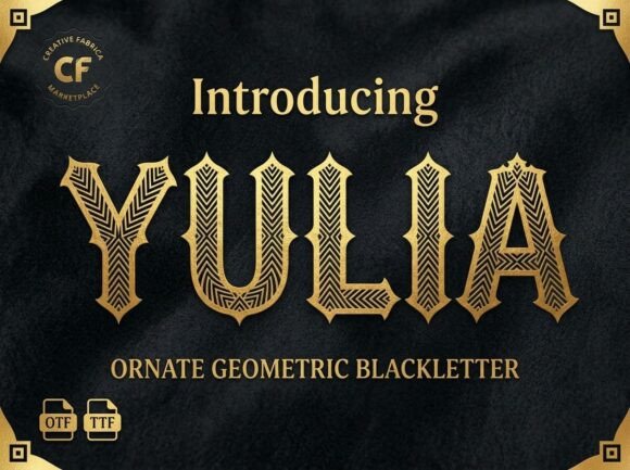
Yulia brings angular blackletter structure to a heraldic seal. A second detail to notice is thick-to-thin contrast. I would keep the inner spaces open at smaller sizes, then choose a simple text face for the smaller information for the details. That division keeps the headline expressive and the information easy to scan.
View Yulia and download options →
Frequently asked question
Can blackletter work on a detailed fantasy map?
Use it for large region titles or a single decorated initial. Small place names and the map key usually need a simpler face.
Want another direction? Compare this shortlist with a related FontFinds font guide. Open each typeface above to inspect the complete character set, current price and license before downloading it for your project.