Script fonts are the highest-selling category on every marketplace, which means new releases arrive constantly and most of them describe themselves in identical language. Elegant, fluid, sophisticated, modern. These fifteen recent script fonts are covered with attention to the details that actually differ between them: baseline bounce, stroke weight, capital design, and whether the font survives being embroidered or foil stamped.
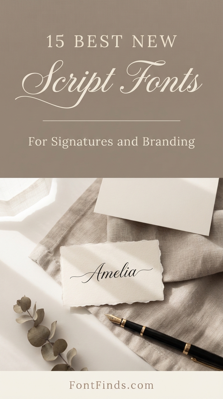
What Actually Differs Between Script Fonts
Baseline bounce. Real handwriting does not sit flat. Letters rise and fall slightly, and a script holding every character at the same height reads as typed no matter how decorative the forms are. This is the most reliable quality indicator.
Connection quality. Where letters join is where cheap scripts give themselves away. Good connections vary in angle and thickness depending on which letters meet. Bad ones use one join everywhere, producing a visible repeating pattern.
Capital design. Script lowercase varies less between designers than capitals do, and capitals are what a customer sees first in a name. When comparing similar releases, compare the capitals rather than the alphabet.
Stroke weight. This determines whether the font is usable in production. Bold scripts survive embroidery, vinyl and foil. Delicate ones survive none of them without being redrawn.
On names. Two fonts in this batch carry names describing something they are not. Marketplace font names are chosen for search visibility rather than for accuracy, so judge from the specimen image and ignore the title entirely.
15 New Script Fonts
Elegant Signature
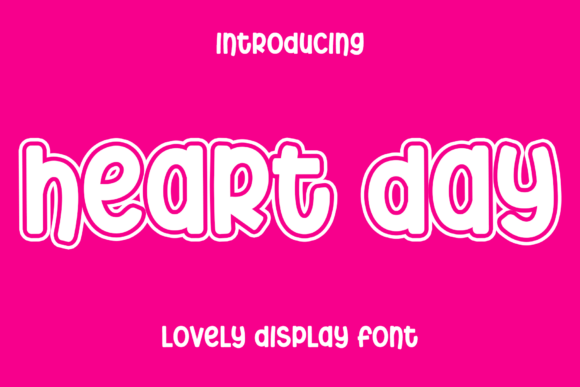
1. Heart Day
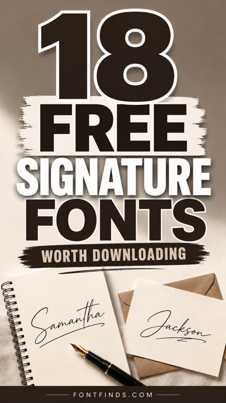
Heart Day is an elegant fluid handwritten script built around modern sophistication. Fluid is the operative word: the strokes maintain momentum through the connections rather than pausing at each junction.
That continuity is what separates a convincing signature script from one that reads as assembled letters. Real handwriting carries momentum, and fonts that fail to reproduce it show a visible stutter at every join.
My take: Look for momentum through the connections. That is the single detail that separates good signature scripts from ordinary ones.
View This Font →
Wedding Script
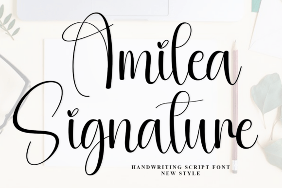
2. Amilea
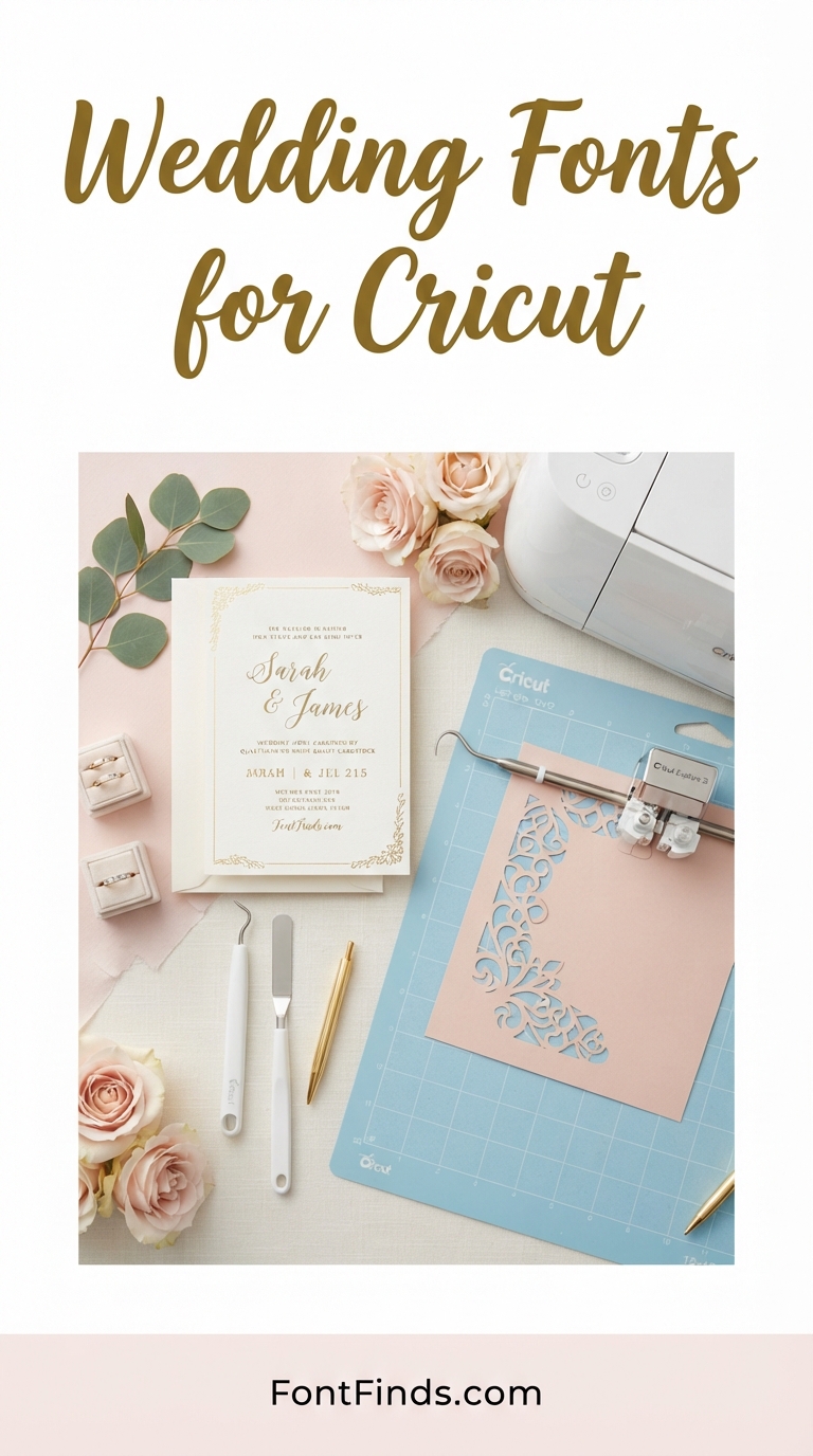
Amilea is a stylish elegant script positioned for wedding invitations and thank-you cards. Wedding stationery has a specific technical requirement most script fonts ignore.
Cards get printed on textured cotton stock, foil stamped, or letterpressed, and all three destroy fine hairlines. Before committing a delicate script to a wedding suite, find out how it is being reproduced, because the answer eliminates most of the options.
My take: Decide the printing method before the font. Foil and letterpress rule out most delicate scripts before you start.
View This Font →
Fluid Modern
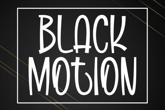
3. Black Motion
Black Motion is an elegant fluid handwritten script sharing a family resemblance with Heart Day. When several new releases describe themselves identically, the differences are in the details rather than the concept.
Compare the capitals specifically. Script lowercase varies less between designers than script capitals do, and the capital is what a customer sees first in a name or a logo.
My take: When new scripts describe themselves identically, compare the capitals. That is where designers actually differ.
View This Font →
Sophisticated Script
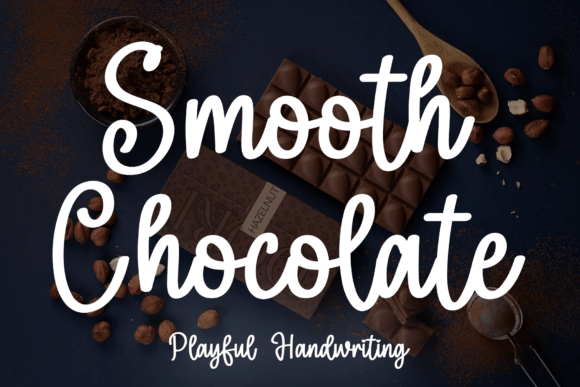
4. Smooth Chocolate
Smooth Chocolate is another elegant fluid script in the same release wave. The volume of near-identical script launches is worth understanding as a buyer.
Script is the highest-selling font category, which draws designers to it and produces a crowded market of competent but similar releases. That is good news for price and bad news for differentiation, so if your brand needs to look distinct, script may be the wrong category entirely.
My take: Script is the most crowded font category. If differentiation matters more than elegance, consider a serif instead.
View This Font →
Bold Script
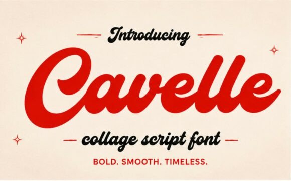
5. Cavelle
Cavelle is a bold stylish script with smooth flowing letterforms and confident handwriting. Bold scripts are considerably rarer than delicate ones and considerably more useful in production.
Weight is the single factor that determines whether a script survives embroidery, vinyl cutting, foil stamping and small-scale printing. A bold script does all four. A delicate one does none without redrawing.
My take: The most production-proof script in this batch. Bold weight is what lets a script survive manufacturing.
View This Font →
Coastal Elegance
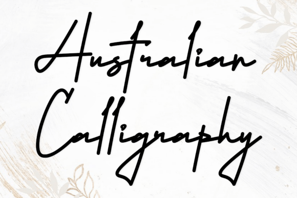
6. Australian
Australian captures coastal elegance with swift organic motion. Swift is a meaningful technical descriptor in scripts, indicating a forward lean and longer exit strokes.
Speed reads as personal where slowness reads as formal. A swift script suggests someone signing quickly, which suits personal brands and artists, while a slow deliberate script suggests calligraphy and suits ceremony.
My take: Swift scripts read as personal, slow ones as ceremonial. Match the speed to whether you are selling a person or an occasion.
View This Font →
Modern Signature
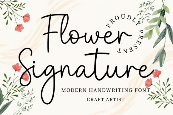
7. Flower
Flower Signature is an elegant modern handwritten script with smooth flowing strokes. Signature-positioned scripts differ from general scripts in one practical way worth knowing.
They are optimised for short strings, typically two or three words, which means the spacing is tuned for a name rather than for a sentence. Set a full line in a signature font and the spacing often looks slightly wrong without being obviously broken.
My take: Signature fonts are spaced for names, not sentences. A full line will look subtly off even when nothing is visibly wrong.
View This Font →
Elegant Script
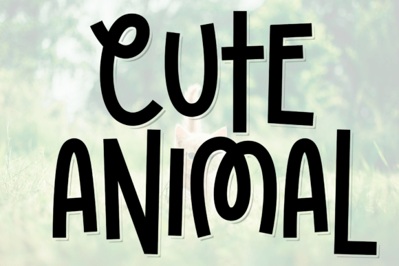
8. Cute Animal
Cute Animal is a stylish elegant script positioned for wedding invitations despite a name suggesting something entirely different. This is the second naming mismatch in this batch.
Font names are chosen for search visibility rather than for description, particularly on marketplaces where the name affects discoverability. Judge from the specimen image and ignore the title, which is a habit worth developing.
My take: Another name that describes nothing. Marketplace font names are chosen for search, not for accuracy.
View This Font →
Casual Summer
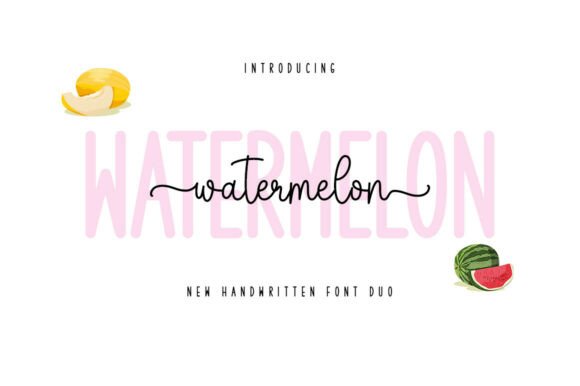
9. Watermelon
Watermelon brings breezy summer sweetness with casual hand-drawn charm. Casual scripts sit in a different register from elegant ones and serve a different market.
Elegant scripts sell to weddings and luxury. Casual scripts sell to small businesses, craft sellers and social content, which is a larger market at a lower price point. Neither is better, but confusing them puts your design in the wrong price bracket.
My take: Casual and elegant scripts serve different markets at different price points. Mixing them up is a positioning error.
View This Font →
Confident Handwriting
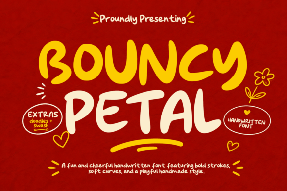
10. Bouncy Petal
Bouncy Petal is a vibrant display script with confident handwritten strokes. Bounce refers to baseline variation, where letters sit at slightly different heights.
That variation is the most reliable indicator that a script was drawn rather than constructed. Constructed scripts sit on a rigid baseline and read as typed no matter how decorative the letterforms are.
My take: Baseline bounce is the tell. A script sitting perfectly flat reads as typed regardless of how ornate it looks.
View This Font →
Warm Personal
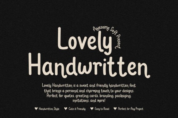
11. Lovely
Lovely is a charming handwritten font designed for a warm personal touch. Warmth in handwriting comes from irregularity rather than from decoration.
Slightly uneven stroke weights, imperfect connections and varying letter widths all read as human. Fonts that clean up those irregularities in pursuit of polish end up feeling manufactured, which defeats the purpose of choosing handwriting at all.
My take: Imperfection is the product. Over-polished handwriting fonts lose the exact quality they were bought for.
View This Font →
Distinctive Handwriting
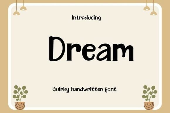
12. Dream
Dream is a handwriting font with distinctive character rather than a general-purpose script. Distinctive means specific letterform decisions that will either suit your name or fight it.
Test the actual word before committing. A script with an unusual lowercase g or a distinctive capital S is charming when those letters appear and irrelevant when they do not, and you cannot tell from an alphabet specimen.
My take: Distinctive scripts depend on which letters your name contains. Type it out before deciding.
View This Font →
Monogram Script
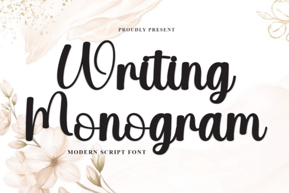
13. Writing Monogram Font
Writing Monogram adds soft calligraphy warmth with graceful personal charm, built specifically for monogram work. Monogram scripts differ from full scripts in an important way.
They optimise the capitals, since a monogram is capitals only. The lowercase in a monogram font is often an afterthought, which matters if you intended to use the same font for a full name elsewhere in the design.
My take: Check the lowercase before assuming a monogram font can carry a full name. It usually cannot.
View This Font →
Gothic Brush
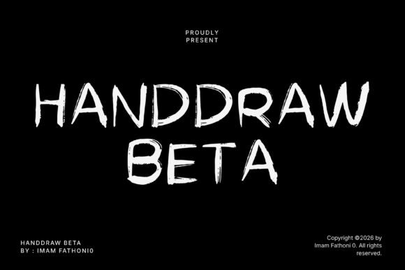
14. Handdraw Beta
Handdraw Beta is a raw hand-painted display face built for gothic and horror work. Brush scripts in the horror register behave differently from elegant brush scripts.
The strokes are irregular, the pressure varies unpredictably, and the terminals often break rather than taper. Those qualities read as unstable and hand-made in a way that suits horror, and they make the font unusable for anything requiring polish.
My take: Genre-specific rather than general purpose. Excellent in horror and unusable in anything that needs to look composed.
View This Font →
Decorative Romantic
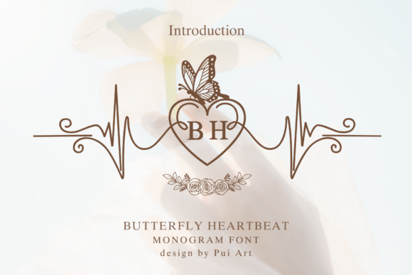
15. Butterfly Heartbeat
Butterfly Heartbeat captures romantic enchantment with delicate love motifs and handmade beauty. Decorative scripts with built-in motifs occupy a narrow but useful niche.
Matched motifs save you sourcing separate graphics that never quite share the font’s line weight and style. The limitation is that the motifs are fixed, so if hearts and butterflies do not suit the project, you are paying for characters you will never type.
My take: Matched motifs save real time when they fit the brief and are dead weight when they do not.
View This Font →
Production Limits
Embroidery
Minimum stroke width around 1.5mm. That rules out every delicate script here unless the artwork is redrawn with thickened strokes. Bold scripts work directly.
Foil stamping and letterpress
Both need a minimum stroke width to transfer cleanly. Hairlines either fail entirely or break up unevenly, which is the most common disappointment in wedding stationery.
Vinyl cutting
Connected scripts cut as one continuous piece, which is actually helpful. The problem is thin sections tearing during weeding, so apply a small outward offset first.
Uncoated and textured paper
Ink spreads into the fibres, thickening strokes and closing tight loops. Go a size larger than looks right on screen.
Questions People Ask
What is the difference between a script font and a signature font?
Signature fonts imitate fast handwriting with a forward lean and longer exit strokes, and are spaced for two or three words. Script is the broader category including formal calligraphy and casual handwriting.
Why do my script letters look disconnected?
Letter spacing has been increased. Scripts depend on letters touching, so set tracking back to zero and the connections return.
Which new script fonts work for logos?
The bolder ones. A logo has to reproduce in a single colour at small sizes and often gets embroidered or engraved, and delicate scripts fail all three tests.
Can I use script fonts in all capitals?
No. Script capitals are designed as initial letters, not as a full alphabet. Setting a word in script caps removes every connecting stroke and looks broken.
Are new script fonts better than established ones?
Usually cheaper at launch and less likely to appear on a competitor’s packaging, but established scripts have proven spacing and broader character coverage. For a logo, distinctiveness favours new releases.
Related: signature fonts for logo design, elegant script fonts for branding, or browse Creative Fabrica →