Display fonts arrive faster than any other category, and most of them are variations on whatever trended last season. These twenty are recent releases worth actually installing, covering everything from bubble graffiti and seventies revival through to industrial slabs and military stencils. Each entry notes what the font does technically, not just what it looks like, because that is what determines whether it survives your production method.
How to Judge a New Display Font
Check the counters at weight. As a typeface gets heavier the enclosed spaces inside a, e and o shrink. Well-drawn heavy faces widen the letters to compensate. Badly drawn ones let the counters close, which turns a word into a row of black blocks at small sizes.
Find out whether the outline is integral. Many display faces assume an outline as part of the design. If it is integral you cannot remove it, and every colour is a separate screen in printing and a separate layer in vinyl. That changes your production cost before you have designed anything.
Type a real word, not the sample. Designers choose specimen words that show their font at its best. Your brand name contains different letters, and the awkward pairs only appear when you type them.
Ignore the name. Several fonts in this batch carry botanical names and none of them look botanical. Font naming is marketing, and judging from the name wastes time.
On buying new releases. New display fonts are usually cheapest in their launch window, which is why browsing recent uploads regularly beats searching for a specific style when you need it. The trade-off is that trend-driven releases date fast, so weigh a launch discount against how long you actually need the font to look current.
20 New Display Fonts
Comic Energy
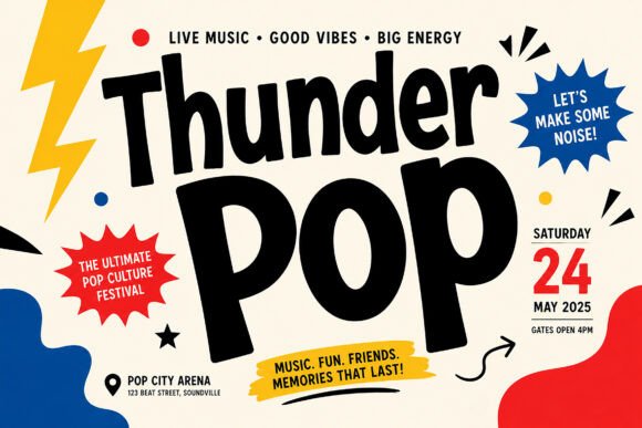
1. Thunder Pop
Thunder Pop leads with high-energy pop-culture styling and retro festival flair. Comic-derived display faces work through one specific mechanism: heavy outlines with strong colour separation, both inherited from cheap four-colour printing.
That heritage is why comic display fonts still reproduce so well on modern budget printing. The letterforms were designed to survive absorbent paper and imprecise registration, which describes most event flyers and t-shirt runs today.
My take: The best of the new arrivals for event graphics. Comic lettering was built for cheap printing and that still pays off.
View This Font →
Graffiti Bubble
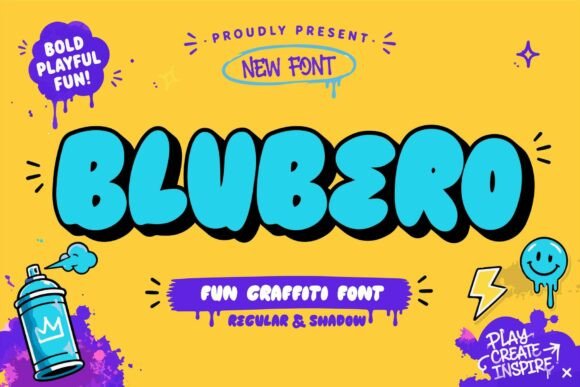
2. Blubero
Blubero combines street art energy with bubbly nineties nostalgia. Bubble graffiti is having a genuine revival driven by the same nostalgia cycle that brought back Y2K design, and new releases in the style are arriving faster than in any other display category.
The technical advantage of bubble letterforms is fill area. Large solid interiors weed easily in vinyl, print cleanly in DTG, and stay legible at small sizes where thinner display faces collapse.
My take: Riding a real trend rather than a manufactured one. Bubble graffiti demand has been climbing for two years.
View This Font →
70s Revival
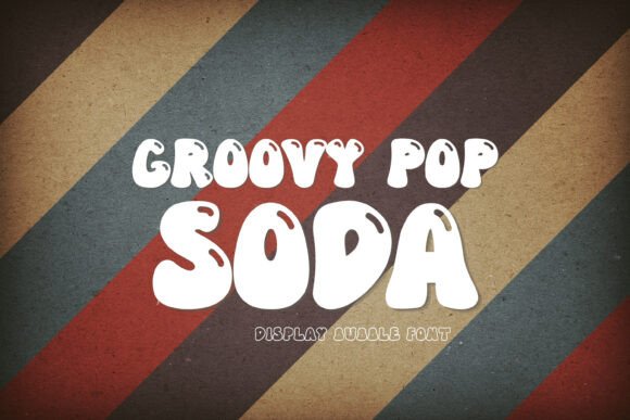
3. Groovy Pop Soda
Groovy Pop Soda brings seventies nostalgia with playful curves. Seventies revival has been the most persistent display trend of the decade, outlasting several styles that arrived after it.
Longevity matters when you are buying rather than browsing. A font in a two-year trend cycle will look dated before you have amortised the licence, whereas groovy type has stayed commercially viable long enough to be a safe purchase.
My take: Safer than most trend-driven display faces. Seventies revival has outlasted several styles that came after it.
View This Font →
Liquid Retro
4. Quivora
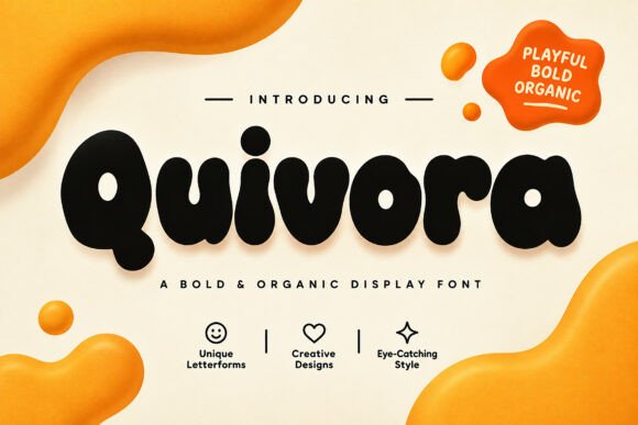
Quivora uses soft liquid curves with bubbly organic energy. Liquid letterforms are a distinct sub-style from bubble letters, distorting the whole character rather than simply inflating it.
That distortion is why liquid faces need size. Bubble letters stay readable small because the skeleton is intact, while liquid letters compromise the skeleton itself. Set these large and keep the words short.
My take: Liquid distortion needs generous sizing. Unlike bubble letters, the letter skeleton is compromised and small sizes fail.
View This Font →
Rounded Friendly
5. Rondapo
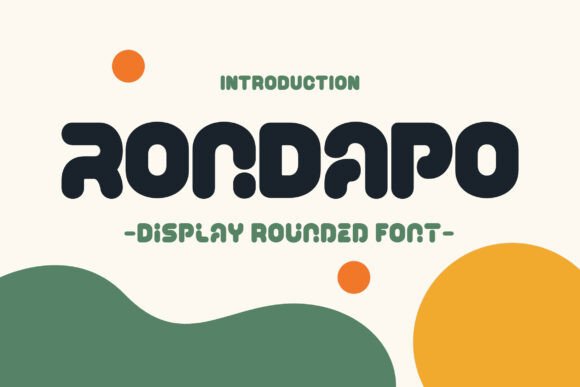
Rondapo is a bold rounded display typeface built for playful, expressive personality. Rounded terminals are the single most effective way to remove aggression from a heavy typeface.
That makes rounded display faces the default for family-facing work: children’s products, community events, casual food brands. A sharp-cornered face at the same weight reads as confrontational in exactly those contexts.
My take: The pick when a heavy font needs to stay friendly. Rounding does more tonal work than colour choice does.
View This Font →
Vivacious Rounded
6. Mugora Bold
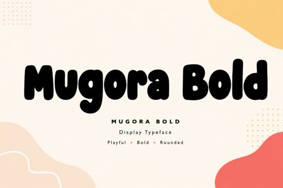
Mugora Bold sits alongside Rondapo in the rounded display category with slightly more energy in the letterforms. Two similar faces from different designers give you variation without tonal clash.
That is usually a safer pairing strategy than combining one rounded face with something from a completely different tradition, which tends to look unresolved rather than deliberate.
My take: Pairs naturally with Rondapo. Same register, different hand, so you get variety without a mismatch.
View This Font →
Handcrafted Bold
7. Handcut Groove
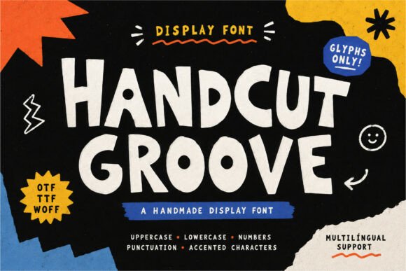
Handcut Groove is a bold handcrafted display face with strong artistic personality. Handcrafted means visible irregularity, and irregularity is what separates a font that looks made from one that looks generated.
The commercial value is authenticity signalling. Small-batch producers, craft brands and independent makers all need type that supports a handmade story, and a perfectly regular font quietly undercuts that message.
My take: Irregularity is the product here. If your brand story is handmade, regular type works against you.
View This Font →
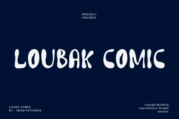
Bold Comic
8. Loubak Comic
Loubak Comic is a bold funky display face with plump rounded letterforms. Comic display and rounded display overlap heavily, and the distinction is mostly about outline treatment.
Comic faces assume an outline as part of the design. Rounded faces work as solid shapes. That difference determines production cost, because outlines mean an extra screen in printing and an extra layer in vinyl.
My take: Check whether the outline is integral or optional. Integral outlines double your screen printing cost.
View This Font →
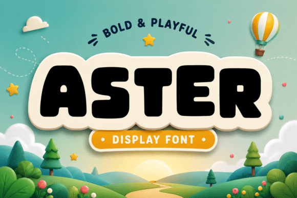
Cartoon Charm
9. Aster
Aster delivers joyful energy and heavy-hitting cartoon charm despite the botanical name. This is worth flagging because several fonts in this release series carry flower names that have nothing to do with their appearance.
Naming mismatches are common in font marketing and they cost you time. Always judge from the sample image rather than the name, particularly when browsing a designer’s full catalogue.
My take: Ignore the name entirely. Several fonts in this series are named after flowers and none of them look botanical.
View This Font →
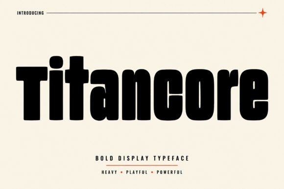
Massive Weight
10. Titancore
Titancore is engineered for massive visual weight and solid structural presence. Ultra-heavy display faces serve one purpose: dominating a layout from distance.
The technical constraint is counter size. As weight increases, the enclosed spaces inside letters shrink, and past a certain point they close entirely. Well-drawn heavy faces widen the letters to compensate, which is why extreme weights are almost always extended rather than condensed.
My take: Heavy faces have to get wider as they get heavier. If a font is both ultra-bold and condensed, check the counters.
View This Font →
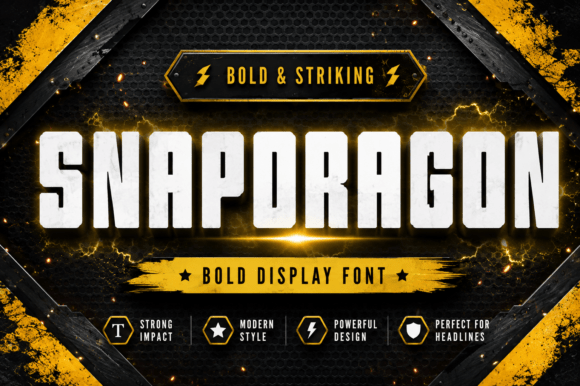
Industrial Strength
11. Snapdragon
Snapdragon is built as an ultra-heavy industrial face for instant dominance. Industrial styling differs from athletic styling in a way worth knowing when choosing between similar weights.
Industrial implies machinery, construction and utility, with squared terminals and mechanical proportions. Athletic implies sport and competition, with slightly softer geometry and often a built-in outline. They look similar in a thumbnail and signal quite differently in use.
My take: Industrial and athletic look alike at thumbnail size and mean different things. Check the terminals to tell them apart.
View This Font →
Heavy Athletic
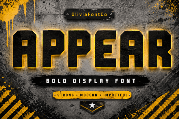
12. Appear
Appear establishes indestructible industrial strength with heavy athletic energy. Sitting beside Snapdragon, the two illustrate the overlap between those registers.
For apparel work specifically, heavy faces have a practical edge beyond appearance. Thick strokes survive screen printing on textured cotton, weed easily in vinyl, and stay legible after repeated washing, all of which finer display type does not.
My take: Heavy display faces are the safe choice for apparel. Thin display type looks better in a mockup and worse after ten washes.
View This Font →
Concrete Texture
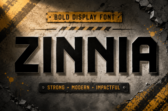
13. Zinnia
Zinnia brings raw structural authority with concrete texture and rugged athletic energy. Texture applied to a heavy face is a different proposition from texture applied to a light one.
Heavy letterforms have enough area to carry visible texture without losing their shape. Light faces do not, which is why distressed thin fonts so often read as damaged rather than as textured.
My take: Texture needs weight to sit on. Distressed light faces read as broken rather than worn.
View This Font →
Racing Industrial
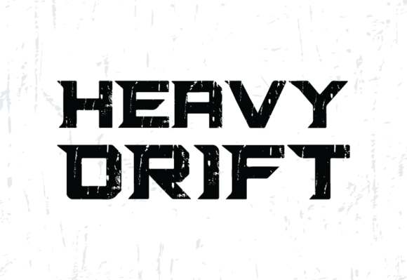
14. Heavy Drift
Heavy Drift injects high-octane racing energy with raw industrial grit. Motorsport typography is a specific tradition, drawing on decals, sponsor logos and technical panel lettering rather than on general industrial design.
The markers are extreme condensation, italic slant and squared-off terminals. Get all three and the reference reads clearly. Get only one and it reads as generic bold type.
My take: Motorsport type needs condensation, slant and squared terminals together. One or two of the three is not enough.
View This Font →
Military Stencil
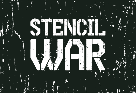
15. Stencil War
Stencil War is a rugged military display face inspired by army stencil lettering. Stencil breaks exist for a physical reason: a real stencil needs bridges to hold the centre of an O or an A in place.
That functional origin is why stencil type reads as authentically utilitarian. It also means the breaks must fall in the right places. Poorly drawn stencil fonts put gaps where no bridge would be needed, which looks wrong to anyone who has used a real stencil.
My take: Check where the gaps fall. Bridges belong where the counter would drop out, not at arbitrary intervals.
View This Font →
Wild West
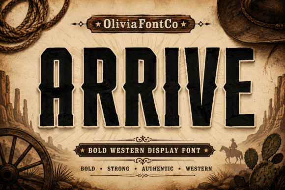
16. Arrive
Arrive brings rugged frontier strength and heavy-hitting vintage grit. Western display type derives from wood type, carved rather than cast, which favoured chunky forms that would not split along the grain.
That constraint produced the heavy slab serifs and vertical stress that define the style, and it is why a single word in western type can place a product geographically without any other cue.
My take: One word in western type does more positioning work than a paragraph of copy.
View This Font →
Hard Hitting
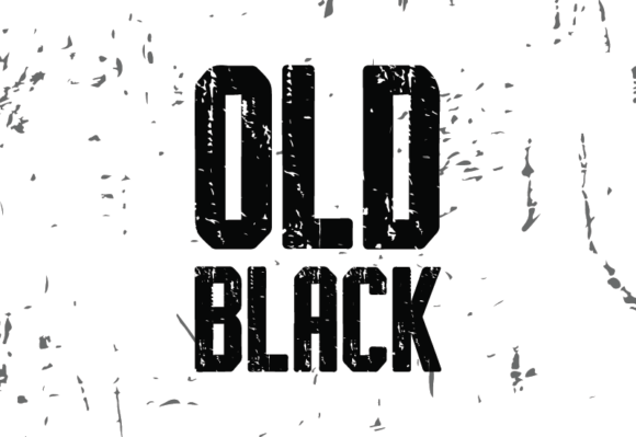
17. Old Black
Old Black offers hard-hitting boldness with a straightforward approach. Fonts without a strong stylistic gimmick are undervalued precisely because they are hard to market.
In practice most projects need type that reads clearly and gets out of the way while imagery carries the design. A competent unremarkable display face does that job better than a more characterful one that competes with the photograph.
My take: Plain heavy display is underrated. When you have strong imagery, the type should support rather than compete.
View This Font →
Tall Condensed
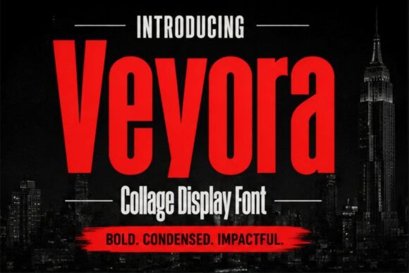
18. Veyora
Veyora is a bold condensed display face with tall proportions built for headlines and posters. Condensed proportions solve the problem that defeats most poster typography: long titles.
A wide face forces you to shrink a long headline until it loses impact. A condensed face keeps the height and therefore the presence while fitting the width, which is why so much film and event titling is condensed.
My take: Condensed is why long film titles still read big. The same trick works for any long headline.
View This Font →
Experimental
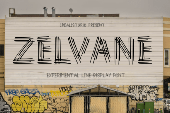
19. Zelvane
Zelvane combines refined linear forms with bold contemporary construction, positioning it as experimental display. Experimental type carries a specific risk that is worth naming.
Unusual letterform decisions age faster than conventional ones, because they are tied to whatever the current design conversation is. That is fine for a campaign and risky for a logo, where the mark has to survive a decade.
My take: Campaigns yes, logos no. Experimental letterforms date faster than conventional ones.
View This Font →
High Fashion
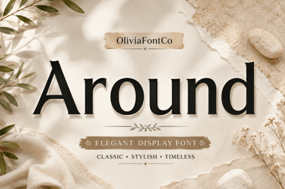
20. Around
Around exudes classic sophistication and high-fashion grace, sitting at the elegant end of the display range. Elegant display is a narrower category than bold display and correspondingly less crowded.
The register suits fashion, beauty and hospitality, where the type needs presence without aggression. Most display releases chase impact, which leaves genuine gaps at the refined end for anyone willing to look.
My take: Less competition at the elegant end. Most new display releases chase weight and leave this territory open.
View This Font →
Using Display Type Well
One per layout
Display faces are designed to dominate. Two in the same design compete and neither wins. Pair one display face with a plain sans serif for everything else.
Short phrases only
These are headline tools. Beyond about six words the personality that made you choose the font becomes tiring to read.
Test at final size
A face that looks resolved at 200 pixels on a monitor can fall apart at 30 millimetres on a printed label. Print at actual size before approving anything.
Match weight to production
Heavy display survives screen printing, embroidery and vinyl. Fine display survives none of them without modification.
Questions People Ask
What are display fonts used for?
Headlines, logos, posters, packaging and anywhere type needs to carry personality rather than simply be read. They are not built for body text and become tiring beyond a few words.
How do I know if a display font will work at small sizes?
Look at the counters, the enclosed spaces inside letters like a and e. If they are already tight in the specimen image, they will close completely once the font is scaled down or printed on absorbent stock.
Are new display fonts better than established ones?
Not inherently, but they are usually cheaper at launch and less likely to appear on a competitor’s packaging. Established faces have the advantage of proven spacing and wider character coverage.
How many display fonts should I own?
A handful covering different moods: one heavy, one rounded, one condensed and one elegant. That range covers most briefs without buying something new for every project.
Can I use display fonts for body text?
No. They are drawn for size and impact, not for sustained reading. Pair them with a plain serif or sans serif for anything longer than a headline.
Related: bold display fonts for posters, free display and decorative fonts, or browse Creative Fabrica →


One Comment