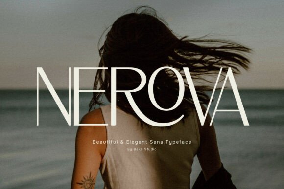
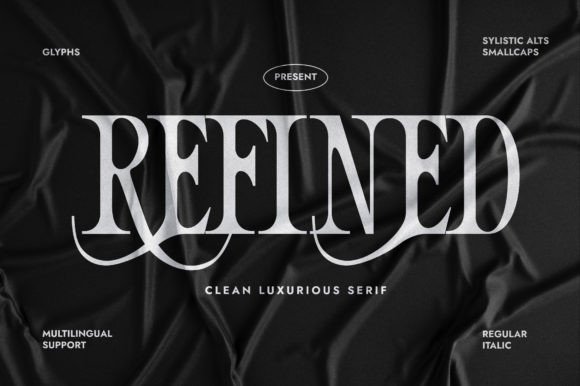
Serif and sans serif releases get far less attention than display and script, which is exactly why the best fonts in this category so often go unnoticed. These are the fonts that end up carrying a brand rather than decorating a poster, and a good one stays in use for years. Here are sixteen recent serif, sans serif and blackletter releases, assessed on the qualities that matter for actual brand work rather than on how they look in a specimen image.
What Makes the Best Fonts for Text Work
Weight range. A single-weight release limits you to one role. Brand systems need at least a regular and a bold, and preferably a light for large display use. Check what actually ships before buying.
Lowercase at caption size. Everyone judges fonts from capitals in a specimen image, and almost all real reading happens in lowercase at small sizes. Geometric sans in particular can blur o and c at caption scale.
Quirks. Unusual letterforms help display faces and hurt text faces. A distinctive terminal that makes a headline memorable will quietly slow readers down in a paragraph.
Stroke contrast versus production. High-contrast serifs and sans faces read as premium and fail in embroidery, foil and small print. Decide where the type ends up before deciding how fine it can be.
Why new releases are worth watching in this category. Display and script trends turn over fast, but a serif or sans chosen for a brand identity may stay in use for a decade. That makes launch pricing more valuable here than anywhere else, since you are buying something you will genuinely keep using.
16 of the Best Fonts Released Recently
Editorial Luxury
1. Maqena
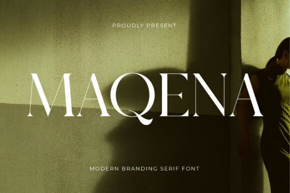
Maqena is designed for high-fashion poise and modern editorial luxury. Editorial serifs are a distinct sub-category with requirements most branding serifs ignore.
They have to work at both display and text size, because a magazine uses the same family for a headline and a caption. That demands a larger character set, multiple weights and spacing tuned for continuous reading, which is considerably more work than a display-only face.
My take: Editorial serifs have to do two jobs at once. If a serif only works large, it is a display face wearing an editorial label.
View This Font →
Airy Minimal
2. Rahena
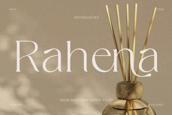
Rahena brings organic serenity with high-fashion grace and airy minimalism. Airy in typography means generous spacing and lighter weights, both of which have practical consequences.
Light serifs read as expensive and fail in production. They lose their thin strokes in embroidery, break in foil, and disappear on textured stock. They are screen and coated-print fonts, which is fine as long as you know it going in.
My take: Light serifs are screen and coated-print only. Beautiful in a lookbook and unusable on a woven label.
View This Font →
Timeless Serif
3. Moniqe
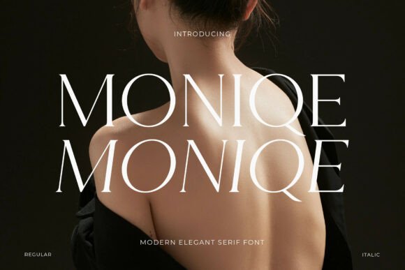
Moniqe defines timeless luxury with high-fashion sophistication and editorial refinement. Timeless is a claim worth testing rather than accepting.
The practical test is whether the letterforms contain any decision that identifies a decade. Unusual terminals, extreme contrast or fashionable proportions all date a face. Genuinely timeless serifs are slightly boring on purpose, which is exactly why they last.
My take: Timeless serifs are deliberately unremarkable. If a face has a memorable quirk, it will date.
View This Font →
Refined Craft
4. Murisa Giancarlo
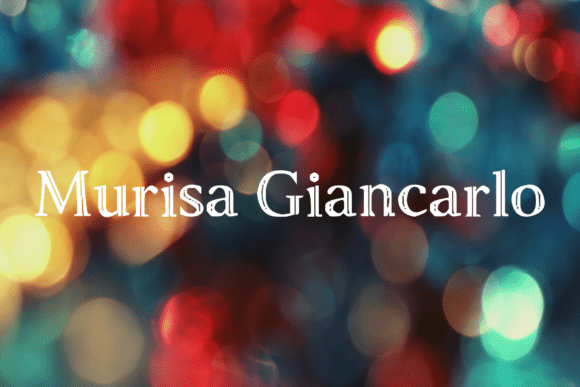
Murisa Giancarlo is a uniquely crafted typeface aimed at refined design work. Unique construction in a serif carries a different risk profile from unique construction in a display face.
Display faces are read as shapes, so quirks become memorable. Serifs are read as words, so quirks become distracting. A serif with an unusual letterform will slow readers down in a way they cannot articulate, which is why brand serifs tend toward convention.
My take: Quirks help display faces and hurt serifs. Readers notice unusual letterforms in text without knowing why.
View This Font →
Retro Display Serif
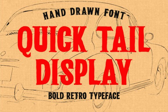
5. Quick Tail
Quick Tail is a bold retro display serif built for character rather than for reading. Display serifs sit between the two categories and inherit constraints from both.
They carry serif detail that fails at small sizes, and display weight that becomes tiring in text. The useful range is narrow: headlines, logos and short pull quotes, and nothing longer.
My take: Display serifs have a narrow useful range. Headlines and logos only, never paragraphs.
View This Font →
Festive Serif
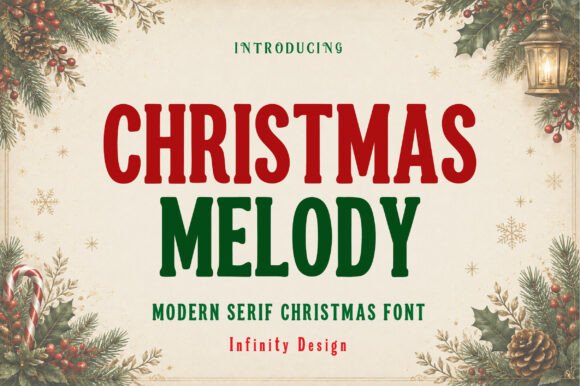
6. Christmas Melody
Christmas Melody is a bold festive modern serif with tall condensed letterforms. Seasonal serifs are unusual, since most Christmas type is script or display.
That scarcity is an opportunity. Premium seasonal packaging needs type that signals the season without abandoning a brand’s own register, and a festive serif does that where a novelty display face cannot.
My take: Seasonal serifs are scarce and premium brands need them. Novelty Christmas display type undercuts an upscale positioning.
View This Font →
Elegant Sans
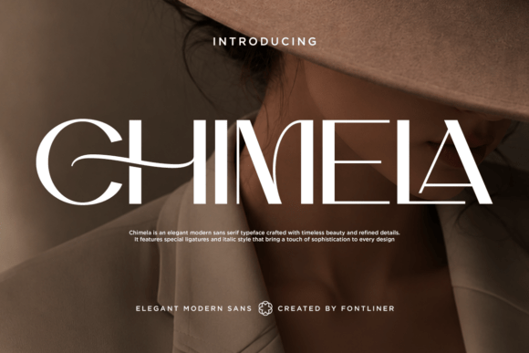
7. Chimela
Chimela is an elegant display sans serif built for refined contemporary work. Display sans is a growing category driven by fashion and beauty branding moving away from serifs.
The technical marker is high contrast in a sans, meaning noticeably thinner horizontals than verticals. That is unusual in sans design and it reads as premium, borrowing the contrast principle from serif type without the serifs.
My take: Contrast in a sans is the current premium signal. Fashion branding has been moving this direction for three years.
View This Font →
Urban Rounded
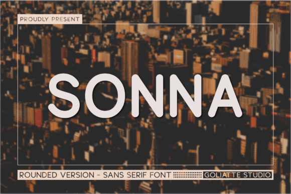
8. Sonna
Sonna defines smooth urban elegance with friendly contemporary poise. Rounded sans serifs are the safest choice in almost any brand system.
They read as approachable without being childish, work at every size, survive every production method, and pair with almost anything. That reliability is unglamorous and it is why rounded sans dominates app interfaces and consumer packaging.
My take: The most reliable category here. Rounded sans works everywhere and that is exactly its value.
View This Font →
Nordic Minimal
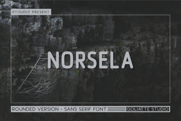
9. Norsela
Norsela captures Nordic simplicity with minimalist outdoor ruggedness and geometric construction. Nordic styling is a specific register with recognisable conventions.
It means generous spacing, minimal decoration, moderate weight and a slight coolness in the letterforms. The associations are outdoor, sustainable and functional, which is why so many technical apparel and homeware brands use it.
My take: Nordic minimal reads as functional and sustainable. Strong for outdoor and homeware, weak for anything that needs warmth.
View This Font →
Architectural Sans
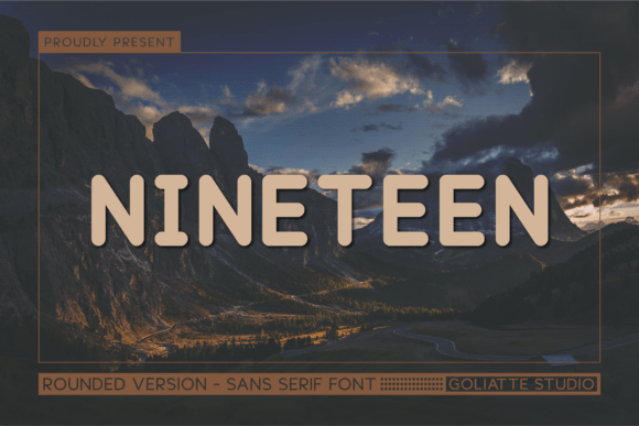
10. Nineteen
Nineteen establishes modern clarity with friendly structural strength and architectural balance. Architectural in a sans means geometric construction with visible underlying structure.
Geometric sans has one significant readability caveat: circular letters like o and c can be difficult to distinguish at small sizes because the geometry overrides the letterform differences. Check a lowercase specimen at caption size before committing to it for body text.
My take: Geometric sans can blur o and c at small sizes. Check the lowercase at caption size before using it for body copy.
View This Font →
Cozy Rounded
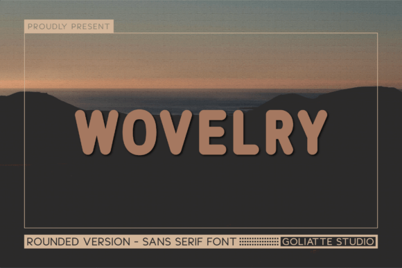
11. Wovelry
Wovelry brings cozy warmth with organic friendly appeal and modern balance. Cozy is a distinct register from friendly, and the difference is in the weight.
Friendly rounded sans sits at a normal weight. Cozy rounded sans sits heavier, with tighter apertures that make the letterforms feel enclosed and protective. That suits homeware, food and wellness where friendly geometric sans would feel too clinical.
My take: Cozy and friendly are different weights of the same idea. Heavier and tighter reads as protective rather than merely approachable.
View This Font →
Quiet Luxury
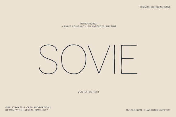
12. Sovie
Sovie embraces weightless simplicity with refined architectural poise and modern quiet luxury. Quiet luxury has been the dominant branding register for several years and shows no sign of fading.
The typographic markers are light weights, wide letter spacing and near-total absence of decoration. The risk is that quiet luxury is now so widespread that it no longer differentiates, which is a positioning problem rather than a typographic one.
My take: Quiet luxury is so widespread it has stopped differentiating. Excellent execution, crowded category.
View This Font →
Marketing Sans
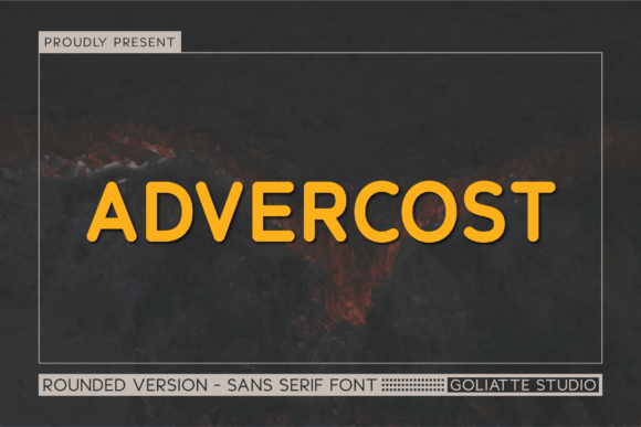
13. Advercost
Advercost injects high-energy friendliness with bold marketing punch and versatile clarity. Advertising-oriented sans is a distinct brief from branding sans.
Advertising type has to compete for attention in a crowded environment, which means heavier weights and tighter spacing than brand type would use. Applied to a brand identity it reads as loud, so match the font to the job rather than to the aesthetic.
My take: Advertising sans and branding sans have opposite requirements. This is built to shout, which is wrong for an identity.
View This Font →
Medieval Gothic
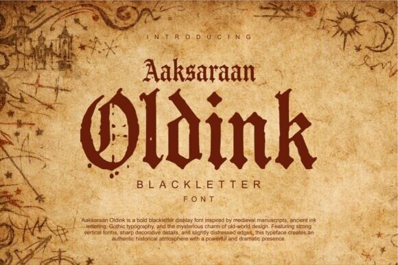
14. Oldink
Oldink draws on medieval mysticism and gothic calligraphy. Blackletter is the oldest continuously used display style in Western typography and the associations remain strong.
The practical caution is capital legibility. Gothic majuscules were decorative initials rather than everyday letters, and several are unrecognisable to modern readers. Type your specific initial and show it to someone cold before committing.
My take: Test your specific capital with someone unfamiliar. Gothic majuscules defeat readers more often than designers expect.
View This Font →
Bold Blackletter
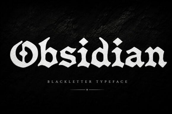
15. Obsidian
Obsidian is an audaciously bold blackletter steeped in gothic tradition. Weight is what makes blackletter usable in modern production.
Authentic manuscript revivals carry fine hairlines from broad-nib penwork, and those disappear in embroidery, vinyl and small print. Heavier reinterpretations survive all three, which is why bold blackletter dominates merchandise while faithful revivals stay in publishing.
My take: Bold blackletter survives merchandise where authentic revivals do not. Weight beats accuracy for production work.
View This Font →
Victorian Blackletter
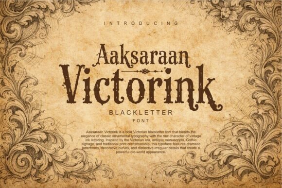
16. Victorink
Victorink blends Victorian ornamental typography with blackletter structure. Victorian is a different period from medieval, roughly the nineteenth century rather than the twelfth to fifteenth.
The distinction matters if your project references a specific era. Victorian type is more ornate and more symmetrical, with decorative flourishes that manuscript blackletter never had. Most audiences read both as simply old, so choose on appearance unless accuracy is part of the brief.
My take: Victorian and medieval are different centuries. Nobody outside a museum will notice, so choose on looks.
View This Font →
Building a Two-Font System
Contrast the category, not the mood
Pair a serif with a sans, not two serifs. Fonts from different categories complement each other, while fonts from the same category compete on the same axis and look accidental.
Match the x-height
Two fonts with very different x-heights look mismatched even at the same point size. Set both at the same size and compare the lowercase height before committing to a pairing.
Give the display font the personality
One font carries character and the other stays quiet. Two expressive faces in one system means neither is doing its job.
Check both in single colour
Every brand eventually needs a one-colour version for embroidery, stamps or fax-quality reproduction. Test early rather than discovering the problem at production.
Questions People Ask
What are the best fonts for a brand identity?
A serif or sans with multiple weights, moderate stroke contrast and no unusual letterform quirks. Distinctiveness matters less than durability, since the font has to work across every application for years.
What are the best fonts for a small business on a budget?
A single well-drawn sans with two or three weights. One versatile family covering regular, bold and light will carry a whole identity, and it costs less than assembling a display face plus a text face plus a script.
Should a brand use a serif or a sans serif?
Serifs read as established, traditional and premium. Sans serifs read as modern, clear and approachable. Neither is better, and the choice should follow the positioning rather than personal taste.
How do I compare the best fonts in a crowded category?
Set your own brand name in each at the same size and look at the lowercase, not the capitals. Specimen images always show capitals because that is where fonts look strongest.
How many weights does a brand font need?
Two minimum, a regular and a bold. Three is comfortable. A single-weight font forces you to create hierarchy through size alone, which is crude in anything beyond a poster.
Are blackletter fonts usable in modern branding?
In specific contexts, yes. They work for heritage, publishing, metal and subculture branding, and they carry political associations in some European markets that are worth being aware of before use.
Why do some serifs look wrong at small sizes?
Stroke contrast. High-contrast serifs have hairlines that disappear as size decreases, leaving a broken-looking letterform. Lower-contrast serifs hold up much better in text.
Related: modern serif fonts for branding, modern sans serif fonts for branding, or browse Creative Fabrica →