Sans serif fonts do the unglamorous work in a brand system. They carry the product descriptions, the navigation, the legal text and the packaging fine print, which means the choice matters far longer than a display face ever will. These sixteen recent releases are assessed on the qualities that decide whether a sans survives that role, rather than on how they look in a specimen image.
What Separates a Brand Sans From a Display Sans
Weight count. A single-weight release limits you to one role. Brand systems need a regular and a bold minimum, ideally a light for large display use. This is the fastest way to eliminate half the options.
Spacing. Display faces are spaced tightly, assuming large sizes. Set one at body size and the letters crowd visibly. Text faces are spaced for reading, which makes them look loose in a headline. Very few families do both well.
Character coverage. Accented characters, currency symbols and proper punctuation are expensive to draw and frequently missing from cheaper releases. If your brand operates in more than one language, check before buying.
Lowercase at small size. Everyone judges from capitals in a specimen image, and almost all real reading happens in lowercase. Geometric faces in particular can blur o, c and e at caption scale.
On the condensed trend. Three of the sixteen fonts below are bold condensed display faces, which reflects how thoroughly that style now dominates brand design. Widespread adoption means low differentiation, so if your brief is to stand out rather than to look current, consider a grotesk or an extended face instead.
16 New Sans Serif Fonts
Bold Condensed
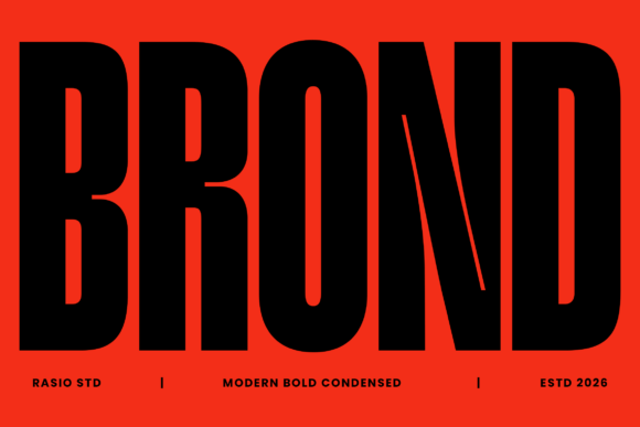
1. Brond
Brond is a modern bold condensed face built for total visual dominance. Condensed sans has become the default for contemporary brand identity, and there is a practical reason beyond fashion.
Narrow letterforms fit more characters per line at a given height, which matters enormously on packaging, app icons and mobile layouts where horizontal space is the constraint. A wide face forces you to reduce size, and reducing size is what makes a brand mark disappear.
My take: Condensed dominates modern branding because screens are narrow. Wide faces force you to shrink the name.
View This Font →
Contemporary Display
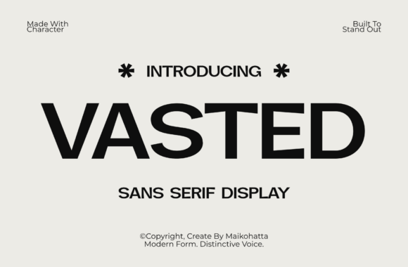
2. Vasted
Vasted is a bold contemporary sans display face aimed at designers wanting immediate impact. Display sans differs from text sans in one measurable way: the spacing.
Display faces are spaced tightly, assuming large sizes where gaps look generous. Set one at body size and the letters crowd. If you need a family that works across both, check whether the release includes separate display and text cuts rather than assuming one covers both.
My take: Display sans is spaced for large sizes. Using it for body copy makes the letters look crowded.
View This Font →
Tech Authority
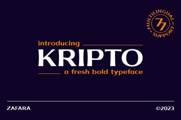
3. Kripto
Kripto commands modern tech confidence with crisp visual clarity. Tech-positioned sans faces share a specific set of decisions: squared terminals, tight apertures and geometric consistency.
Those choices read as engineered rather than drawn, which is exactly the association fintech, SaaS and hardware brands want. The trade-off is warmth. Geometric precision reads as competent and cold, so if your brand needs approachability this is the wrong direction.
My take: Geometric precision reads as competent and cold. Fine for fintech, wrong for anything that needs warmth.
View This Font →
High Impact Condensed
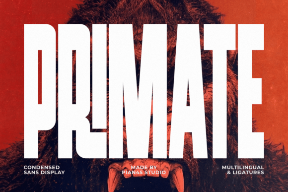
4. Primate
Primate is a raw high-impact condensed display sans engineered for maximum presence. Raw in this context usually means slightly irregular terminals or uneven optical weight, deliberately left in.
That roughness is what separates a display sans with character from a generic bold condensed face. The commercial risk is that irregularity reads as poor drawing to some clients, so it works better on self-directed projects than on conservative brand work.
My take: Deliberate roughness reads as character to designers and as sloppiness to conservative clients. Know your audience.
View This Font →
Corporate Editorial
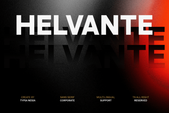
5. Helvante
Helvante is a modern corporate sans built for branding and editorial design. Corporate sans has requirements that display sans ignores entirely.
It needs multiple weights, a complete character set including currency symbols and accented characters, and spacing tuned for continuous reading. Those are expensive to produce, which is why genuinely usable corporate sans families cost more than display faces with a similar look.
My take: Corporate sans costs more because it needs weights, coverage and tuned spacing. Display faces skip all three.
View This Font →
Geometric Balance
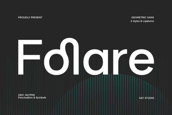
6. Folare
Folare is a modern geometric sans with clean forms and balanced proportions. Geometric sans carries one readability caveat worth checking before committing.
Circular letters like o, c and e can become difficult to distinguish at small sizes, because the underlying geometry overrides the shape differences that normally separate them. Set a lowercase paragraph at caption size and read it before using a geometric face for body text.
My take: Test geometric sans in lowercase at caption size. Circular letters blur together more than designers expect.
View This Font →
Extended Modern
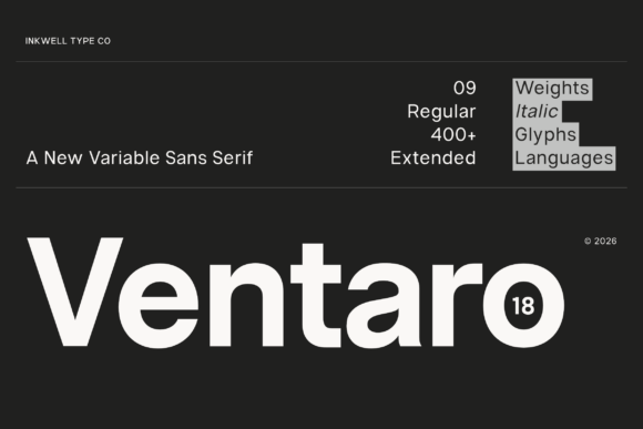
7. Ventaro
Ventaro is a contemporary extended sans, which is the opposite proposition from the condensed faces above. Extended proportions read as confident and expansive where condensed reads as urgent.
The practical constraint is space. An extended face needs horizontal room, which rules out narrow layouts, mobile headers and most packaging. Where it works is on wide formats: billboards, website heroes and landscape presentations.
My take: Extended needs width you may not have. Check your narrowest application before falling for the proportions.
View This Font →
Functional Character
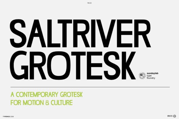
8. Saltriver Grotesk
Saltriver Grotesk combines clean functional grotesk structure with distinctive detailing. Grotesk refers to the nineteenth century sans tradition, more irregular and more characterful than later geometric designs.
That irregularity is currently fashionable precisely because geometric sans became so ubiquitous. Grotesk faces read as considered rather than default, which is a meaningful differentiator when every competitor is using the same neutral geometric family.
My take: Grotesk reads as chosen where geometric sans reads as default. Real differentiation in a crowded category.
View This Font →
Uppercase Geometric
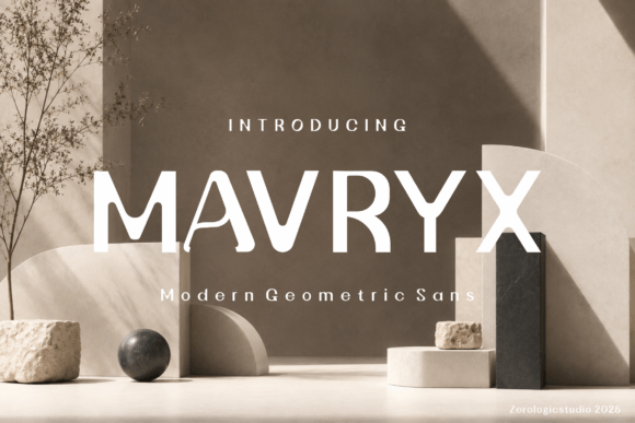
9. Mavryk
Mavryk is a contemporary uppercase display face with strong geometric foundations. Uppercase-only releases are a meaningful limitation and a meaningful simplification.
You lose the ability to set sentences, but you gain predictable spacing, since there is no risk of mismatched proportions between cases. For logos, signage and short headlines that trade is usually worth making.
My take: Uppercase-only removes a whole class of spacing problems. Fine for logos, useless for anything longer.
View This Font →
Bold Versatile
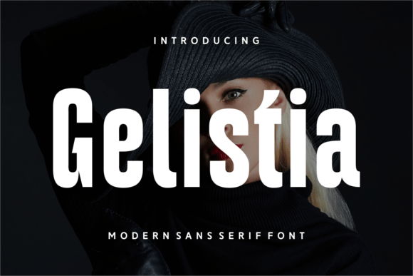
10. Gelistia
Gelistia is defined by bold character and versatility. Versatile is a claim worth testing rather than accepting at face value.
The practical test is weight range and character coverage. A genuinely versatile family ships multiple weights and handles accented characters, currency and punctuation properly. A font marketed as versatile with one weight and a Latin-only set is a display face with an optimistic description.
My take: Test versatility claims against weight count and character coverage, not against the marketing copy.
View This Font →
Editorial Sans
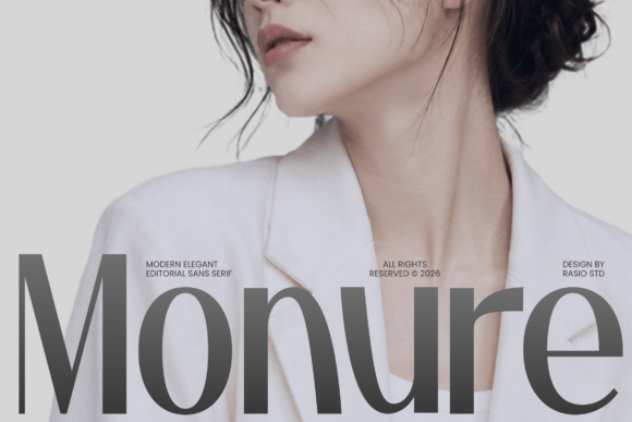
11. Monure
Monure is a modern elegant editorial sans built around quiet sophistication. Editorial sans is a distinct category from corporate sans, and the difference shows in the contrast.
Editorial faces often carry slight stroke contrast, meaning thinner horizontals than verticals. That borrowed serif principle reads as refined and premium, which is why fashion and beauty publications have been moving from serifs to high-contrast sans over the last few years.
My take: Contrast in a sans is the current premium signal. Fashion publishing has been moving this way for several years.
View This Font →
High Fashion
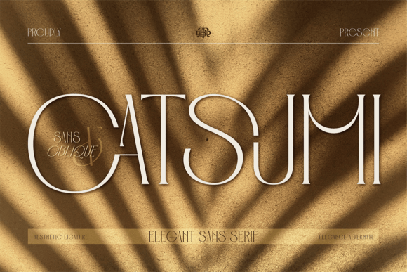
12. Catsumi
Catsumi exudes high-fashion editorial luxury with artistic drama. Fashion-positioned sans faces prioritise appearance over utility, and that is a legitimate choice rather than a flaw.
A lookbook headline needs to be striking, not readable across a paragraph. Problems arise when a fashion display face gets adopted as a brand’s primary typeface and then has to handle product descriptions and legal text, which it was never built for.
My take: Fashion display faces are for lookbooks, not for product pages. Pair one with a workhorse sans from the start.
View This Font →
Futuristic Tech
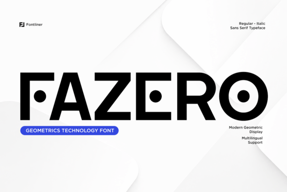
13. Fazero
Fazero is a futuristic tech sans with bold geometric construction. Futuristic styling dates faster than almost any other register, which is worth weighing before using it for an identity.
What reads as forward-looking now will read as a specific year later, because every era’s idea of the future is anchored to its own present. For campaigns that is fine. For a logo intended to last a decade it is a real risk.
My take: Futuristic type dates faster than anything else. Every era’s future looks like its own present in hindsight.
View This Font →
Inline Stationery
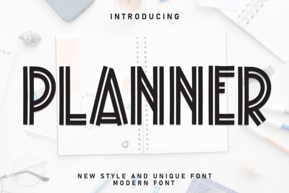
14. Planner
Planner is a modern inline sans built around clean geometric rhythm and stationery aesthetics. Inline means a thin line running through the middle of each stroke, which is a distinctive and technically demanding treatment.
The inline detail disappears first as size decreases, and it fills in when printed on absorbent stock. This is a large-format and screen font, and it needs a plain fallback for small applications.
My take: Inline detail vanishes at small sizes and fills in on uncoated stock. Keep a plain version for anything small.
View This Font →
Condensed Impact
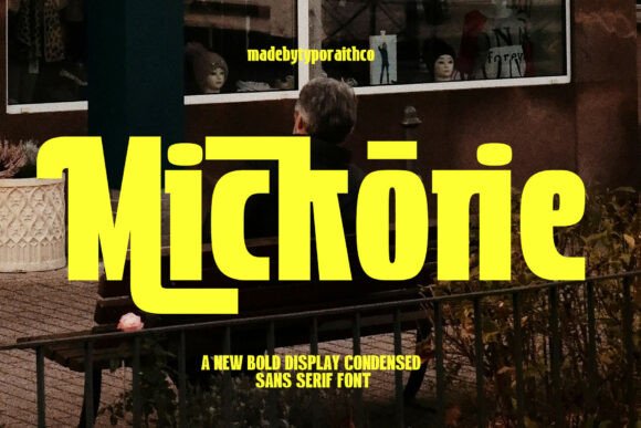
15. Mickorie
Mickorie is a bold condensed display sans designed for strong visual impact. Sitting alongside Brond and Primate, three condensed faces in one release wave shows how dominant the style has become.
Market saturation is worth factoring into a purchase. When a style is this widespread, choosing it means accepting that your brand will look like its competitors, which may be fine or may defeat the purpose of commissioning an identity at all.
My take: Condensed sans is now so widespread it no longer differentiates. Consider whether that matters for your brief.
View This Font →
Decorative Condensed
16. Novaret
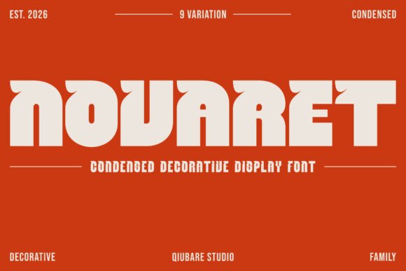
Novaret is a bold condensed decorative display face, adding ornamental detail to the condensed structure. Decoration is what separates it from the plainer condensed faces here.
Decorative detail on a condensed face is risky, because condensed letters already have tight internal spaces and decoration reduces them further. Check the counters at your intended size before committing, particularly if the design will be printed rather than displayed.
My take: Decoration plus condensed proportions closes the counters fast. Check at final size before committing.
View This Font →
Choosing Between Similar Releases
Type your own name, not the sample
Designers choose specimen words that flatter the font. Your brand name contains different letters, and the awkward pairs only appear when you type them.
Compare at the same optical size
Two fonts at the same point size can have very different x-heights, which makes one look larger. Match the lowercase height before judging which reads better.
Check the numerals
Almost nobody looks at numbers until they need them. Prices, dates and phone numbers are everywhere in commercial work, and badly drawn figures are common even in otherwise good faces.
Test in a single colour
Every brand eventually needs a one-colour version for embroidery, stamps or low-quality reproduction. Test early rather than at production.
Questions People Ask
What are the best sans serif fonts for a brand identity?
One with at least three weights, complete character coverage and spacing tuned for text rather than display. Distinctiveness matters less than durability, since the font has to work across every application for years.
Should I use a condensed or an extended sans?
Condensed suits narrow layouts, packaging and mobile, and reads as urgent. Extended needs horizontal room and reads as confident and expansive. Check your narrowest application before deciding.
What is the difference between a grotesk and a geometric sans?
Grotesk descends from nineteenth century designs and carries slight irregularities that read as characterful. Geometric sans is built from circles and straight lines, reading as clean and neutral but sometimes blurring similar letters at small sizes.
How many sans serif fonts should a brand use?
One family, used across multiple weights. Two unrelated sans faces in one system look like an accident rather than a decision.
Can I use a display sans for body text?
Not comfortably. Display faces are spaced tightly for large sizes, so at body size the letters crowd. If a family does not ship a separate text cut, assume it is display only.
Related: modern sans serif fonts for branding, modern minimalist fonts for logos, or browse Creative Fabrica →

4 Comments