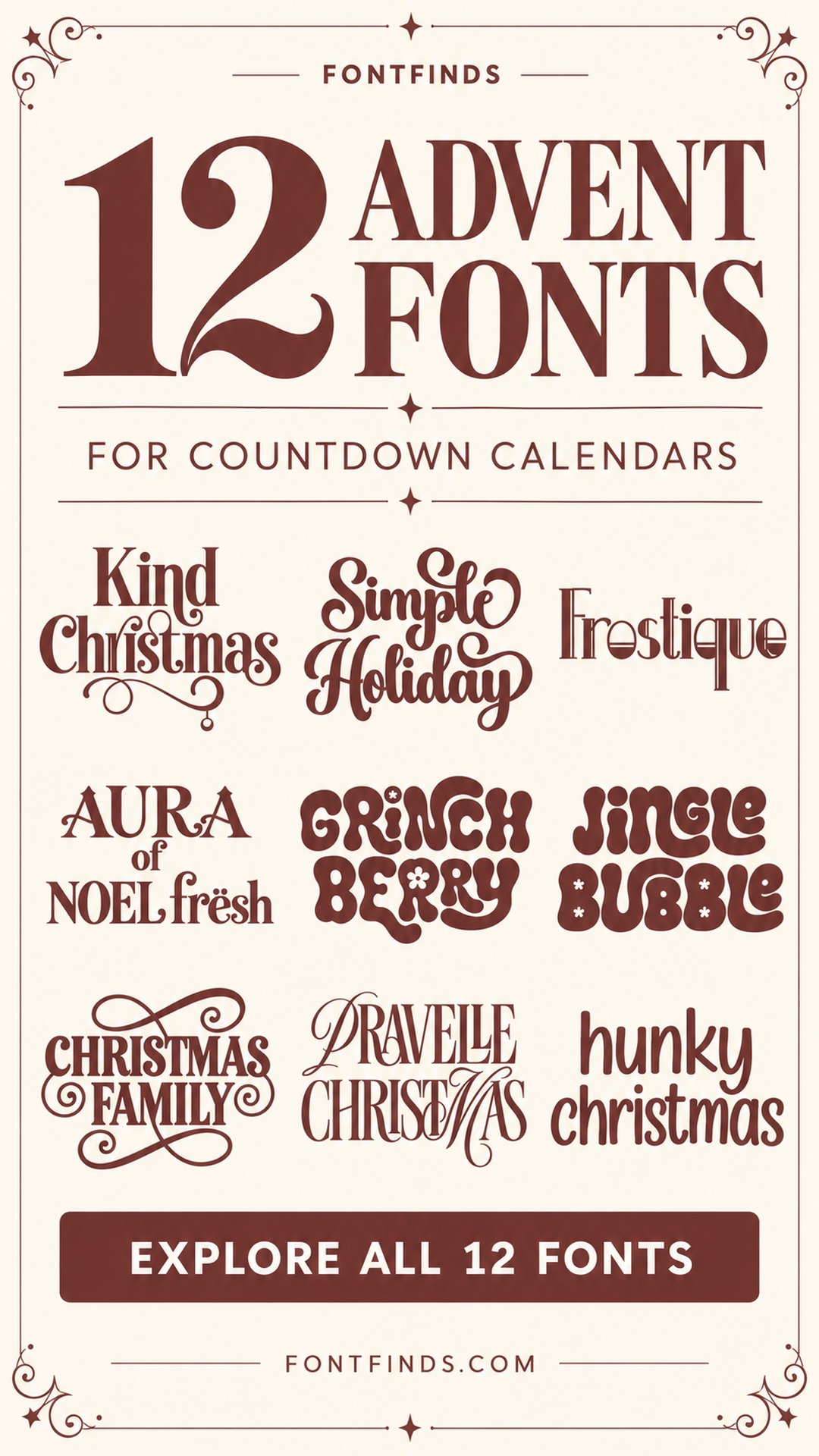
12 Advent Calendar Fonts for Festive Headers and Countdown Cards
This post contains affiliate links. If you buy through them, we may earn a commission at no extra cost to you.
An advent calendar needs both a festive heading and a clear way to find the next day. These advent calendar fonts focus on the decorative part of that system, with options for playful family displays, traditional paper envelopes and quieter modern countdowns.
A font's name or alphabet preview does not establish how its numbers will look. Use the collection to choose a visual direction, then check the exact digits and characters you need before building the full calendar.
Separate the festive heading from the daily numbers
Decide whether the calendar is a wall display, a box of cards or a row of small bags. The heading can be expressive, but the daily numbers should be easy to identify in the space available. Test the widest two-digit labels, not just a single number, and keep their placement consistent.
Use the same background and contrast rules across the set. If the envelopes have different colors, one dark ink can help the numbers feel connected. Decorative scripts and seasonal alphabets can stay in the header while a simpler numeric style handles navigation. Print a small sample before making every pocket or tag.
1. Kind Christmas: A classic countdown heading
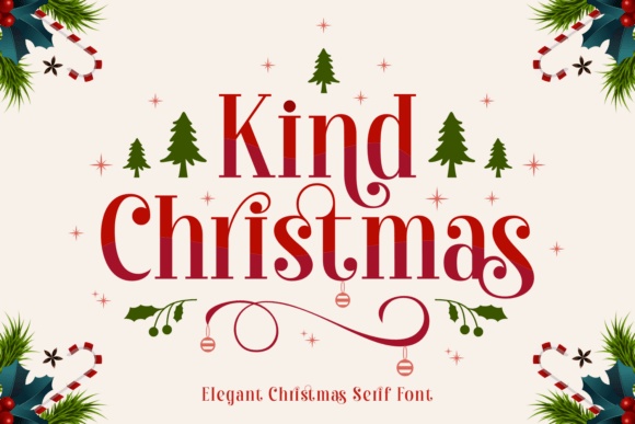
Kind Christmas has a refined serif structure and festive flourishes in its preview. It could make an elegant heading above a row of advent envelopes, especially with cream paper and one dark red or green ink.
Let the title establish the holiday mood. Choose the daily numbers only after checking their appearance separately; a beautiful alphabet preview does not show how every numeral will read.
View Font on Creative Fabrica →Preview • Download options • License details
2. Simple Holiday: A flowing festive title
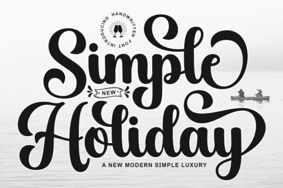
Simple Holiday has broad calligraphic curves and large looping capitals. I would use it for a prominent calendar heading or a short phrase on the box that holds the daily surprises.
Keep the script away from the numbered labels. The countdown should be easy to navigate, and a simple set of digits can sit comfortably beneath a more decorative main title.
View Font on Creative Fabrica →Preview • Download options • License details
3. Frostique: A modern winter calendar
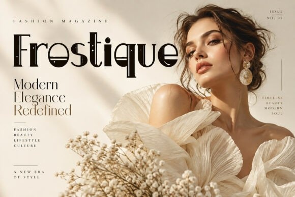
Frostique has a geometric, fashion-oriented display look rather than an overtly seasonal alphabet. It could suit a minimal advent calendar made from monochrome envelopes or small numbered boxes.
Use the setting and color palette to introduce the Christmas theme. A restrained heading can feel festive without adding snowflakes or ornaments to every letter on the calendar.
View Font on Creative Fabrica →Preview • Download options • License details
4. Aura of Noel Fresh: A traditional seasonal centerpiece
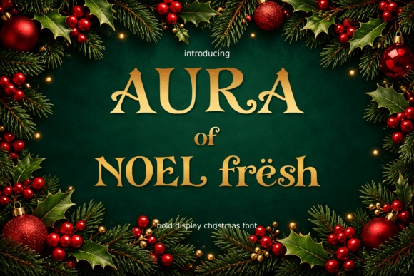
Aura of Noel Fresh shows decorative serif lettering with an old-fashioned holiday character. It could anchor a family advent display above kraft envelopes or a neatly arranged grid of small gift bags.
Keep the headline brief so the distinctive shapes remain visible. For the daily labels, test a quieter numeral style and leave enough room around each number to find it quickly.
View Font on Creative Fabrica →Preview • Download options • License details
5. Grinch Berry: A playful retro countdown
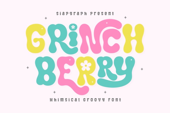
Grinch Berry has soft, irregular bubble forms with small decorative details. It could make a cheerful advent-calendar heading for a colorful family display or a set of illustrated activity cards.
Use the font's playful appearance as the design cue rather than adding a recognizable licensed character. A few simple stars and a restrained palette can create a complete holiday direction.
View Font on Creative Fabrica →Preview • Download options • License details
6. Jingle Bubble: A soft bubble-letter heading

Jingle Bubble uses broad rounded letters and small star-like details. It would suit an advent calendar with a friendly, playful mood, particularly when the title needs to hold its own above small envelopes.
Keep the headline in one dark color for clarity. If you want several envelope colors, the consistent lettering will help the whole display feel connected instead of visually scattered.
View Font on Creative Fabrica →Preview • Download options • License details
7. Christmas Family: A family tradition title
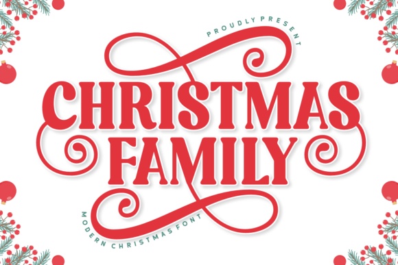
Christmas Family combines bold serif capitals with sweeping ornamental forms. It could make the main heading on a reusable family advent board feel ceremonial and personal.
Give the flourishes a dedicated area instead of letting them cross the daily pockets. The calendar still needs a clear visual path through its numbers, especially when viewed from across a room.
View Font on Creative Fabrica →Preview • Download options • License details
8. Pravelle Christmas: An elegant editorial countdown
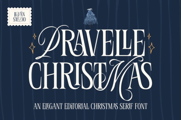
Pravelle Christmas has tall, high-contrast serif forms and graceful swashes. It is worth exploring for an adult-focused advent calendar, such as a set of handwritten notes or small wrapped gifts.
Keep the display lettering large enough to preserve the fine strokes. Plain numbered tags will provide a useful counterpoint to the elaborate heading without making the design feel unfinished.
View Font on Creative Fabrica →Preview • Download options • License details
9. Christmas Star: A decorative star accent
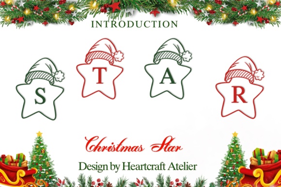
Christmas Star's preview shows letters placed inside star shapes topped with festive hats. It is better approached as a decorative alphabet accent than assumed to be a complete numbered-label solution.
Try it for a short word on the calendar header. Check the character set before planning daily tags, because the supplied sample alone does not establish whether all required numerals are available.
View Font on Creative Fabrica →Preview • Download options • License details
10. Hunky Christmas: A simple handwritten countdown
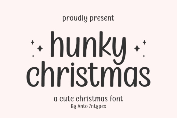
Hunky Christmas has relaxed, narrow letters with a friendly handwritten quality. It could suit a homemade advent display where the heading should feel approachable rather than formal or heavily ornamented.
A short title above a clean grid would be enough. Small illustrated stars can support the theme, but keep the daily numbers visually separate and consistent across the whole set.
View Font on Creative Fabrica →Preview • Download options • License details
11. Christmas Mallow: A snowy family-calendar title
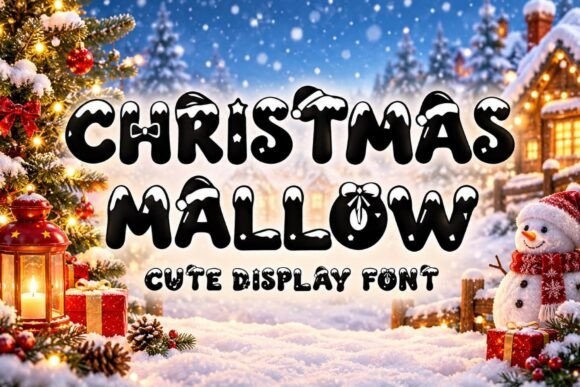
Christmas Mallow has chunky rounded forms with snowy and festive details. It would work as a playful focal point on an advent calendar for a family activity wall or a collection of small treat boxes.
The decorative texture needs size to remain clear. Use the font for the header and test a simpler numeric style for the individual doors, envelopes or pockets.
View Font on Creative Fabrica →Preview • Download options • License details
12. Christmas Reverie: A nostalgic Christmas heading
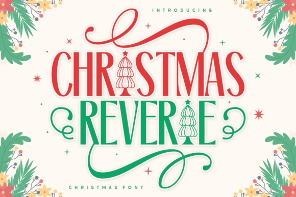
Christmas Reverie shows tall serif letters, sweeping ornaments and holiday details. It could create a traditional title above an advent calendar built around cream paper, ribbons and a restrained red-and-green palette.
Avoid matching every number to the most elaborate display treatment. A calm grid below the ornamental heading will make the calendar easier to use throughout the countdown.
View Font on Creative Fabrica →Preview • Download options • License details
Which font would I try first?
Kind Christmas or Christmas Family would suit a traditional heading. Jingle Bubble offers a softer family-friendly direction, while Frostique provides a less literal modern option. I would choose the heading first, then make the daily numbers a separate, practical decision.
Product images are supplied font previews. The cover is an illustrative lettering montage. Layout suggestions are editorial ideas; fonts have not been installed or production-tested for this guide. Check the linked listing for current files, supported characters and license details.
More font ideas
Frequently asked questions
Can I use these fonts for all the advent numbers?
Check the character set and actual numeral previews first. This collection was selected from alphabet-focused product artwork, so it does not guarantee that every font includes the digits or number style you need.
Should the heading and numbers match?
They can, but they do not have to. A decorative heading paired with clear, consistent numbers often creates a more usable calendar than applying the most elaborate style to every small label.
How do I keep a colorful advent calendar coherent?
Use a consistent label position, a restrained heading and one clear ink color for the numbers. Repeating those elements can connect envelopes or boxes even when their background colors vary.