18 Christmas Fonts for Bakery Packaging and Cookie Boxes
This post contains affiliate links. If you buy through them, we may earn a commission at no extra cost to you.
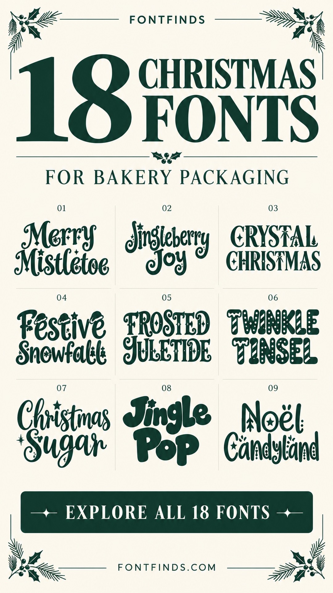
A cookie box can look festive before anyone opens the lid. The trick is choosing lettering that feels as considered as the ribbon, paper and treats inside. These Christmas fonts for bakery packaging offer 18 different starting points, from playful handwritten labels to decorative serif names for a more formal gift box.
I would choose the font after deciding which words matter most. A short collection name can carry stars and flourishes; the flavor list needs much quieter typography. The images below are the designers’ font previews. The packaging suggestions are ideas for your own layouts, rather than photographs of tested bakery packaging.
How to choose Christmas fonts for bakery packaging
Start with the smallest label in your range, not the largest box. Set a real product name, print it at its intended size and check whether ornaments still read as details rather than ink spots. Use the decorative font for one short line and a plain companion for flavors and quantities. On patterned wrapping paper, give the title a solid panel. On plain kraft stock, one dark color can be enough. Avoid shrinking a wide headline to fit a narrow sticker; change the line break or choose a shorter collection name instead.
1. Merry Mistletoe: A traditional cookie gift box
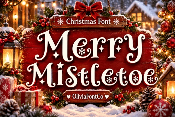
Merry Mistletoe combines prominent serifs with small seasonal details, giving a short collection name an established holiday feel. I would use it on a cream panel over dark green packaging, with the bakery name set quietly above.
Let the decorative letters be the main ornament. Adding a busy border would leave the snowflake-like details with less room to breathe.
View Font on Creative Fabrica →Preview • Download options • License details
2. Jingleberry Joy: A cheerful mixed-treat sticker
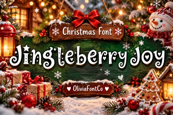
Jingleberry Joy brings hand-drawn strokes and playful flourishes to a more casual box of treats. Try it for a short phrase such as Sweet Wishes rather than a long list of flavors.
A round sticker can work if the words sit in two compact lines. Keep enough empty space around the edges so the title does not feel squeezed by the shape.
View Font on Creative Fabrica →Preview • Download options • License details
3. Crystal Christmas: A polished seasonal collection
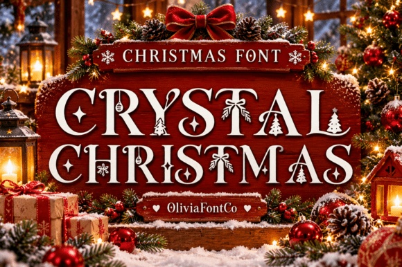
Crystal Christmas has the sharper contrast and decorative seasonal details that suit a more formal gift range. Imagine a centered title on a pale label, with the flavor information aligned neatly underneath.
I would keep the palette restrained here. The lettering already supplies the festive character, so the packaging does not need several competing illustrations.
View Font on Creative Fabrica →Preview • Download options • License details
4. Festive Snowfall: A playful family baking box
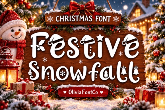
Festive Snowfall mixes holiday motifs into a lighthearted lettering style. It offers a lively direction for a family cookie kit or a small box of seasonal treats.
Use a generous title size so the ornaments remain visible. On the smaller side label, repeat the color palette with a plain font instead of trying to fit the same decorative headline everywhere.
View Font on Creative Fabrica →Preview • Download options • License details
5. Frosted Yuletide: A vintage-inspired biscuit tin
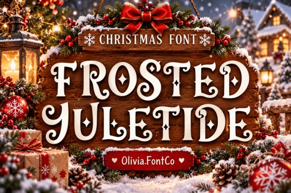
Frosted Yuletide leans into sweeping curves and Victorian-inspired flourishes. I would try it on a wide belly band around a tin, where a short name can spread out without becoming cramped.
Choose one focal line and leave the remaining information calm. The contrast between expressive lettering and simple supporting text makes the vintage mood feel more deliberate.
View Font on Creative Fabrica →Preview • Download options • License details
6. Twinkle Tinsel: Candy-striped lettering for a festive sleeve
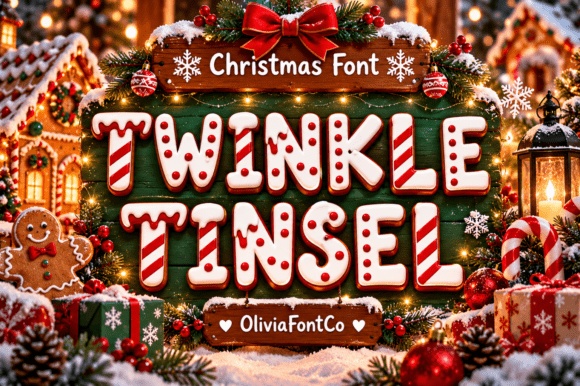
Twinkle Tinsel shows chunky capitals decorated with candy-like stripes and small dotted details. I would use it for a very short title on a flat sleeve, where the patterned letters can remain large enough to recognize.
Keep the surrounding paper plain. The letters already contain a pattern, so another busy print behind them would make the headline much harder to separate from the packaging.
View Font on Creative Fabrica →Preview • Download options • License details
7. Christmas Gift: A decorative gift-box initial
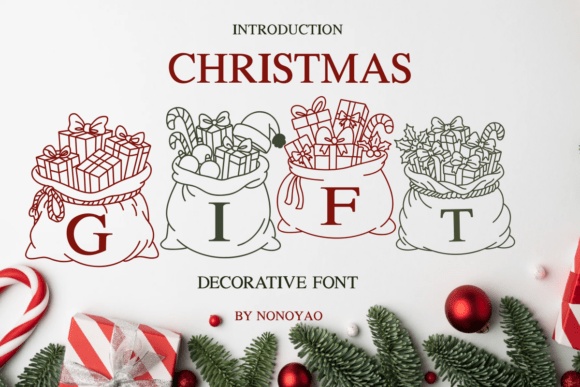
Christmas Gift puts letters inside illustrated present-filled sacks, making it closer to a decorative centerpiece than a quiet text face. I would use a single initial or a very short word on an oversized gift tag.
Keep the product name elsewhere in ordinary lettering. That division lets the novelty detail remain charming without turning the whole label into a row of tiny illustrations.
View Font on Creative Fabrica →Preview • Download options • License details
8. Christmas Sugar: A warm gingerbread label
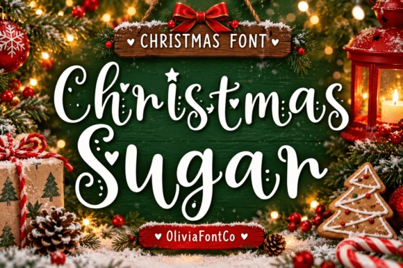
Christmas Sugar has bouncy handwritten strokes with small hearts and dotted accents. It is a natural direction for a friendly gingerbread collection or a baking gift assembled by hand.
Try warm brown lettering on pale cream rather than using every festive color. A simple rectangular label will give the irregular rhythm room to feel relaxed.
View Font on Creative Fabrica →Preview • Download options • License details
9. Peppermint Noel: A bold candy-themed treat sleeve
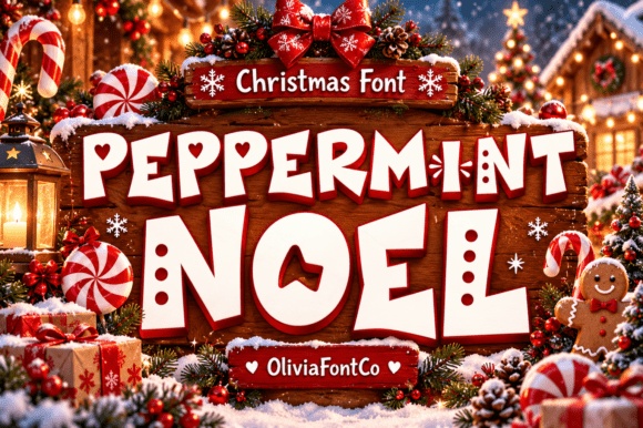
Peppermint Noel shows an energetic mix of angular and rounded display forms with seasonal cutouts. It would suit a short collection name on a wide cookie sleeve rather than a delicate handwritten tag.
Try the title over two lines and use a strong contrast. Small flavor names should sit in a plain companion so they do not have to compete with the festive headline.
View Font on Creative Fabrica →Preview • Download options • License details
10. Jingle Pop: A colorful cookie-kit title
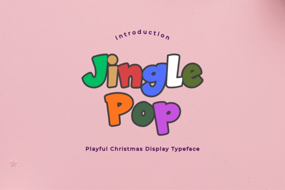
Jingle Pop’s chunky, irregular letters create a cheerful handmade mood. It would suit a cookie-decorating kit with a short, energetic title and a limited set of bright accents.
Give each word a clear line rather than compressing the letters. The bold shapes can carry a playful package without needing a separate cartoon character or crowded pattern.
View Font on Creative Fabrica →Preview • Download options • License details
11. Snowglobe Dreams: A decorative winter keepsake box
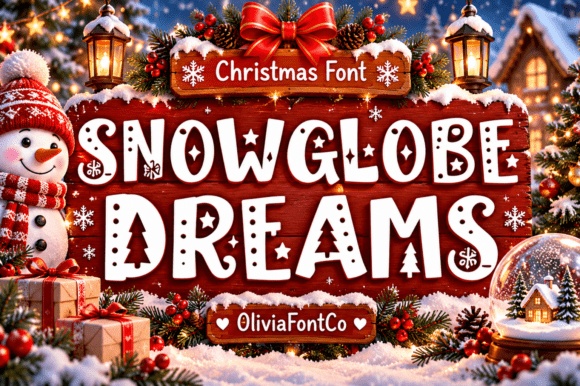
Snowglobe Dreams uses bold capitals filled with winter-themed details and cutouts. I would try it for the main name on a keepsake treat box, where the letters can be displayed at a generous size.
Use a short phrase and keep the supporting text simple. A small seal can repeat the same colors without trying to reproduce every decorative detail from the headline.
View Font on Creative Fabrica →Preview • Download options • License details
12. Retro Noel: A nostalgic bakery sleeve
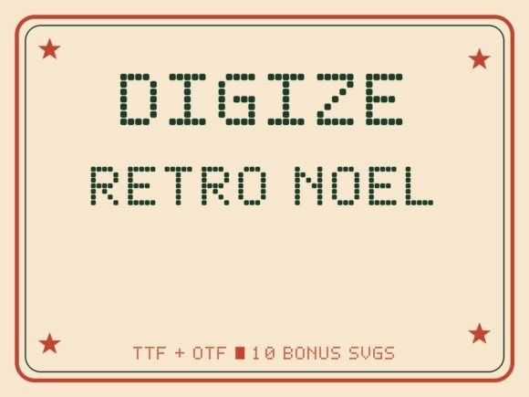
Retro Noel brings chunky marquee-style display lettering to the holiday theme. It is a useful direction for a bakery that wants a nostalgic shop-window feeling rather than delicate calligraphy.
Try a wide cream sleeve with a short red title. Keep supporting text straightforward, and check the product listing separately if you plan to use any included bonus artwork.
View Font on Creative Fabrica →Preview • Download options • License details
13. Noel Candyland: A candy-box collection
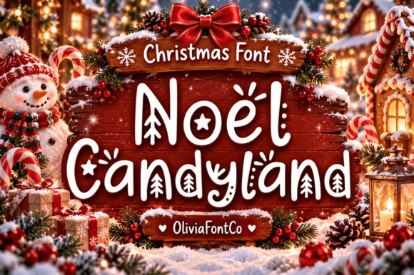
Noel Candyland combines playful letters with festive cutouts and small decorative accents. It suits an especially cheerful collection name, perhaps on a flat panel attached to a candy box.
The letters already have plenty happening inside them. I would use one main ink color and a clean outer shape so those details stay recognizable.
View Font on Creative Fabrica →Preview • Download options • License details
14. Frosty Garland: A snowy winter box top
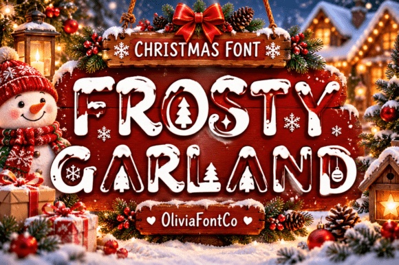
Frosty Garland uses heavy snow-cap forms and holiday ornaments for a strongly seasonal statement. It is most convincing as a large box-top headline, where the details can be seen clearly.
Avoid moving the same treatment directly onto a tiny seal. A smaller companion mark in plain type will connect the pieces without losing the snowy character in a blur.
View Font on Creative Fabrica →Preview • Download options • License details
15. Winter Wonderland: A welcoming family treat range
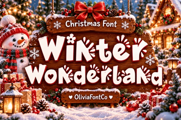
Winter Wonderland has chunky forms and playful seasonal cutouts that invite a softer, friendly presentation. Try it on a family-sized assortment with the collection name centered above a simple flavor list.
Give the letters a dark, solid color against a light label. This keeps the decorative shapes visible without asking the reader to work through a patterned background.
View Font on Creative Fabrica →Preview • Download options • License details
16. Merry Christmas: A handwritten holiday greeting
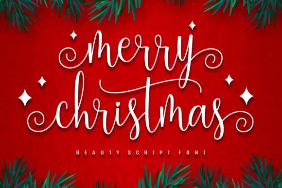
Merry Christmas offers a curving script direction for the greeting on a gift box. I would keep the bakery’s identity separate and use the script as a warm message across the top or front.
Watch where the script begins and ends. A little extra horizontal room can look more graceful than shrinking the entire greeting to fit a rigid centered box.
View Font on Creative Fabrica →Preview • Download options • License details
17. Merry Holly Christmas: A personalized Christmas monogram tag
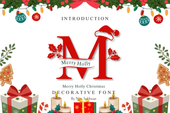
Merry Holly Christmas shows a decorative initial with festive details, making it a useful direction for a personalized gift tag. I would use one prominent letter with the recipient name or bakery greeting in a separate plain line.
Keep the monogram large enough to see its small ornaments. It should serve as a personal accent, not replace all the wording on the product label.
View Font on Creative Fabrica →Preview • Download options • License details
18. Holly Jolly: A simpler festive headline
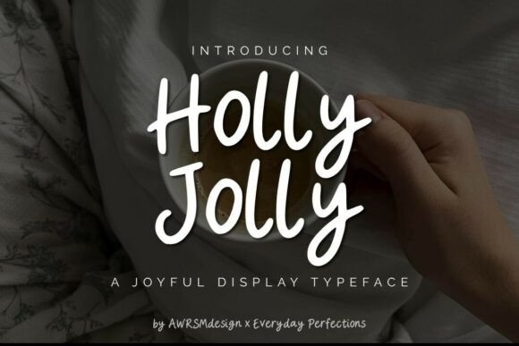
Holly Jolly provides a more minimal display direction within this seasonal group. It is worth testing when your wrapping paper or ribbon already carries most of the Christmas decoration.
Keep the collection name clear and use consistent spacing around it. A restrained headline can help a busy gift arrangement feel organized instead of adding another layer of ornament.
View Font on Creative Fabrica →Preview • Download options • License details
Which style would I start with?
For a playful cookie collection, I would start with Jingle Pop. For a more traditional gift box, compare Merry Mistletoe and Crystal Christmas. Build one sample label before committing to a whole packaging set, and keep the same quiet supporting type across every flavor.
Font previews are supplied product artwork. Layout suggestions are editorial ideas; fonts have not been installed or production-tested for this guide. Check the linked listing for the current files, supported characters and license.
More font ideas
Frequently asked questions
Should I use a decorative font for the whole cookie label?
Keep it for the product name or seasonal greeting. A simpler companion helps readers scan flavors, quantities and other small information without competing with the headline.
Can these fonts be used on commercial packaging?
Check the current license for the exact product and your intended use before buying or publishing. A preview image and a product description do not establish the license terms for every project.
Do the stars and gold effects come with the font?
Some decorative shapes may be part of the letters, while backgrounds, shadows and metallic effects may belong only to the preview artwork. Check the character preview and included files on the product page.