10 Baseball Birthday Invitation Fonts for a Ballpark Party
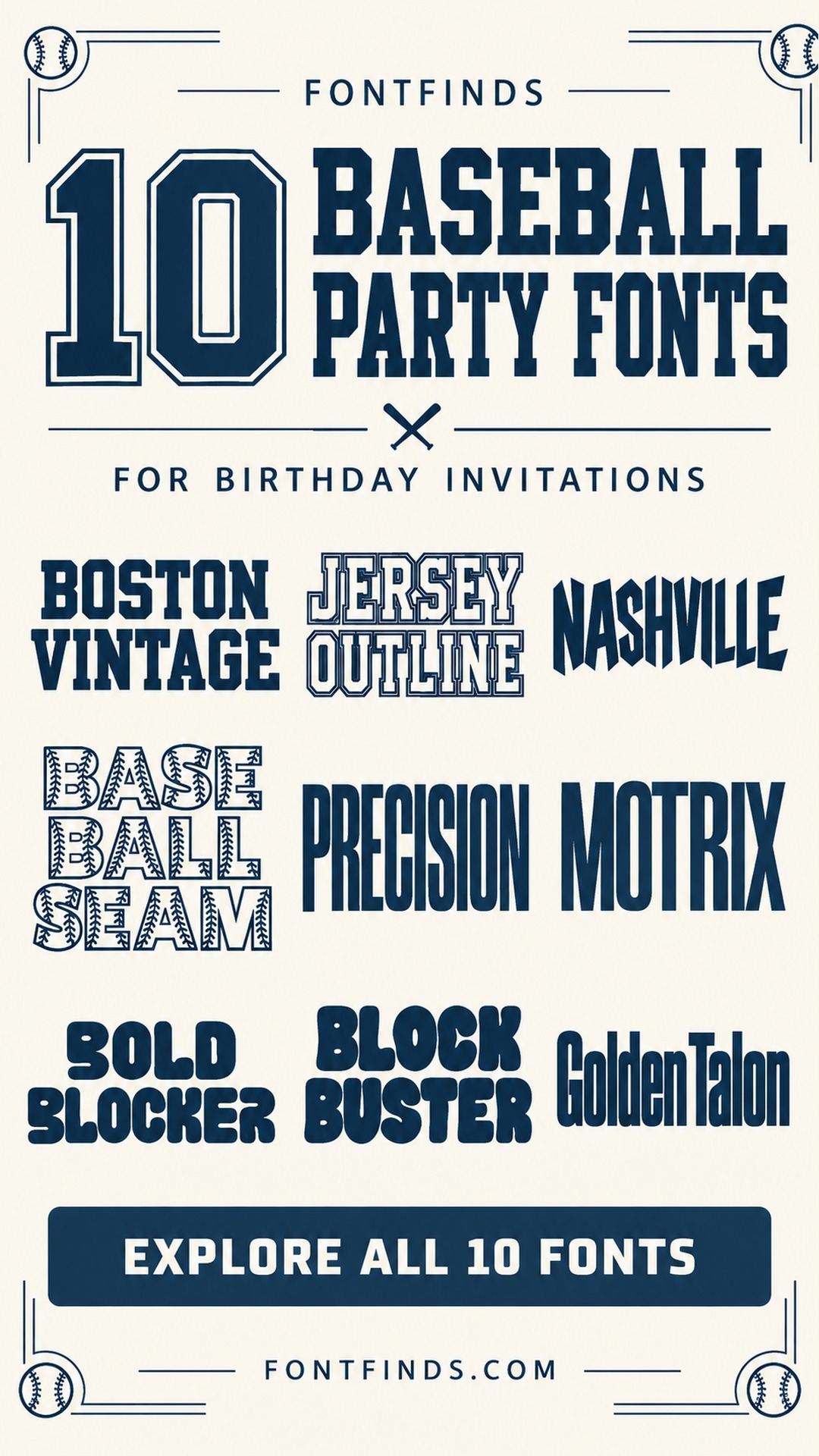
This post contains affiliate links. If you buy through them, we may earn a commission at no extra cost to you.
A baseball party invitation has two jobs: make the birthday feel exciting and tell guests exactly where to go. These baseball birthday invitation fonts offer ten different ways to build that first impression, from classic jersey lettering to softer shapes for a younger crowd.
The strongest design usually starts with one important line. Choose whether the child's name, a phrase such as Play Ball, or the birthday age should lead. Then make the date, address and RSVP details quieter and easier to scan. The product previews below show the lettering; the invitation layouts are ideas to try yourself.
How to choose a font for a baseball party invitation
Begin with the final wording rather than a decorative frame. A short first name may look good in a wide varsity style, while a longer name might need a condensed face or a two-line arrangement. Put the name into a rough layout before choosing a border or illustration.
For a printed invitation, make a proof at the intended size. For a digital invitation, view it as a small image on your phone. Check the age, time and address separately from the decorative headline. Keep any ticket-style layout clearly recognizable as a party invitation, with the venue and host information easy to locate.
1. Boston Vintage: A vintage ticket headline
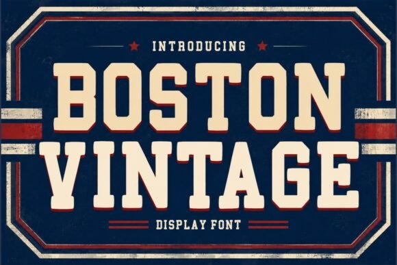
Boston Vintage brings squared collegiate capitals and a layered, old-ticket feel to a baseball birthday invitation. I would put the child's first name across the top, then use a restrained block of event details underneath.
Let the lettering suggest the ballpark without adding several team-style badges. A cream background, navy ink and one red rule are enough to make a homemade ticket feel intentional.
View Font on Creative Fabrica →Preview • Download options • License details
2. Jersey Outline: An outlined jersey name
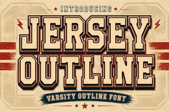
Jersey Outline has the familiar varsity structure, with strong outer edges and inset lines that make the word feel like a jersey graphic. It is a natural starting point for a short birthday name or a big party heading.
Keep the outlined lettering large. Fine internal lines can disappear in a small phone preview, so use a simpler companion for the address and RSVP information.
View Font on Creative Fabrica →Preview • Download options • License details
3. Nashville: A modern all-star invitation
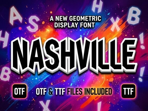
Nashville is much sharper and more geometric than its name might suggest. The preview shows angular, tall display lettering with an outlined dimensional treatment, which could suit an energetic all-star birthday theme.
Use it for one focal line rather than the entire invitation. A plain background will give the unusual shapes room, especially if you also include a large illustrated baseball.
View Font on Creative Fabrica →Preview • Download options • License details
4. Baseball Stitch: Stitched baseball lettering
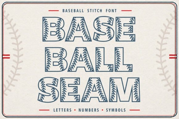
Baseball Stitch puts seam-like decoration directly inside the letterforms. The preview makes the baseball connection immediately, so you can create a themed headline without covering the invitation in equipment illustrations.
Try a short phrase such as Play Ball above the birthday information. Check the actual characters you need before committing, and keep the stitched letters away from patterned paper or tiny text.
View Font on Creative Fabrica →Preview • Download options • License details
5. Precision: A compact scoreboard heading
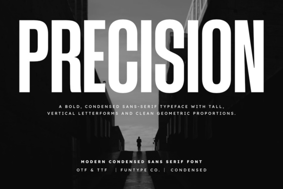
Precision uses tall, narrow sans-serif forms with a firm vertical rhythm. I would test it for a scoreboard-inspired invitation where the name and party headline need to occupy a compact column.
The narrow style creates space, but squeezing the letter spacing further can make the headline harder to scan. Give the date a separate block and check any numerals in the downloaded font.
View Font on Creative Fabrica →Preview • Download options • License details
6. Motrix: A clean game-day title
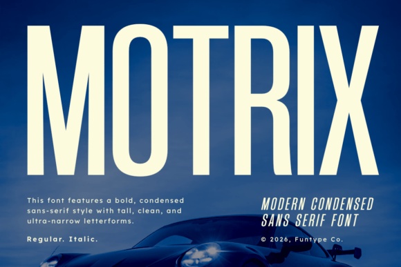
Motrix has long upright strokes and a condensed shape that feels orderly beside sports graphics. It would suit a birthday invitation built around a simple diamond outline, with the child's name above the field.
Keep the theme in the layout rather than decorating every letter. A short uppercase headline and quieter mixed-case event information create a useful distinction between celebration and logistics.
View Font on Creative Fabrica →Preview • Download options • License details
7. Bold Blocker: A playful little-league option
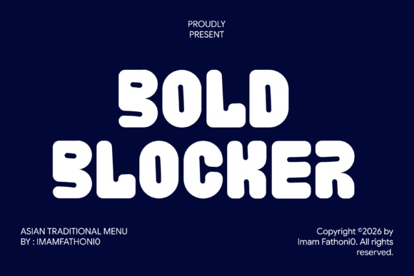
Bold Blocker uses soft, chunky, irregular forms instead of traditional varsity serifs. That friendly silhouette is worth considering for a younger child's party where you want the baseball theme to feel playful rather than competitive.
Pair the lettering with a single ball illustration and plenty of white space. A short name will work more comfortably than a long sentence inside a rounded badge.
View Font on Creative Fabrica →Preview • Download options • License details
8. Blockbuster: A rounded birthday chant
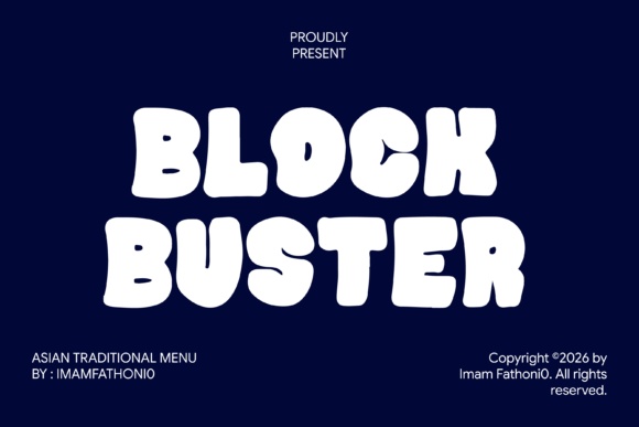
Blockbuster has heavy, bouncy letters that look almost like separate soft blocks. It could give a phrase such as Birthday MVP a cheerful presence on a bright, informal party invitation.
Use the font as a visual shout, then step down to a simple face for the rest. Avoid placing a thick drop shadow behind already substantial letters; the forms supply plenty of weight themselves.
View Font on Creative Fabrica →Preview • Download options • License details
9. Golden Talon: A bold home-run announcement
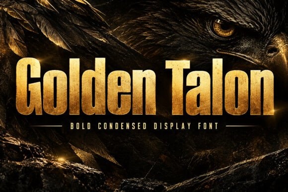
Golden Talon is a compressed, forceful display choice with a much more serious silhouette. I would use it for an older child's ballpark party or a baseball outing invitation with a strong headline.
The metallic finish belongs to the supplied preview artwork, so build your own color treatment around the font. A flat dark ink version would be easier to coordinate with ordinary home printing.
View Font on Creative Fabrica →Preview • Download options • License details
10. Dexvolt: A worn stadium-poster feel
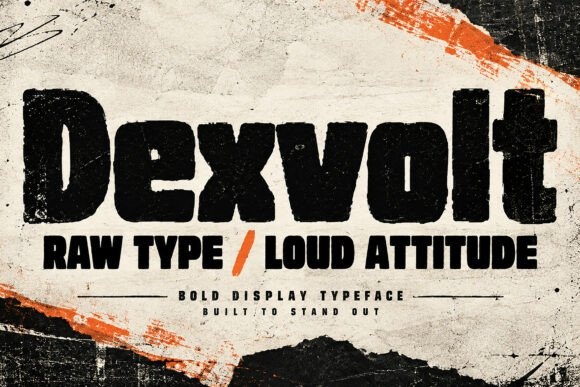
Dexvolt shows heavy irregular letters with a rough, worn surface. It is an option for a birthday invitation styled like an old stadium poster, particularly when the rest of the design stays simple.
Reserve the distressed face for the main name or headline. Clean supporting text prevents a textured invitation from looking blurry when it is shared as a small image in a family chat.
View Font on Creative Fabrica →Preview • Download options • License details
Which font would I try first?
I would start with Boston Vintage for a traditional ballpark ticket, Baseball Stitch for an unmistakable baseball detail, or Bold Blocker for a younger child's playful invitation. Pick the direction first, then compare the actual name in two or three fonts rather than collecting every possible sports motif.
Product images are supplied font previews. The cover is an illustrative lettering montage. Layout suggestions are editorial ideas; fonts have not been installed or production-tested for this guide. Check the linked listing for current files, supported characters and license details.
More font ideas
Frequently asked questions
Which font should I try for a classic baseball invitation?
Boston Vintage and Jersey Outline are useful starting points for a collegiate or jersey-inspired direction. Baseball Stitch is a more decorative alternative when the seam detail should be the main theme.
Should the whole invitation use a varsity font?
A varsity face is usually most effective for the name or headline. Keep the address, arrival time and RSVP information in a simpler companion so guests can find the details quickly.
What should I check before printing?
Check the exact name, the birthday number and the punctuation you need. Review the font listing for included files and characters, then print a proof to judge outlines, contrast and the smallest text.