19 Classroom Door Sign Fonts for a Friendlier Welcome
This article contains affiliate links. If you buy through them, I may earn a commission at no extra cost to you.
A classroom door can feel welcoming without becoming a wall of competing decorations. When I look at classroom door sign fonts, I want the teacher name or room message to be easy to find, with enough personality to make the entrance feel cared for.
I have included soft rounded letters, casual handwriting and a few more decorative accents. I would use the playful choices for a short welcome and keep essential identification clear. The best option depends on the actual words, the available space and who needs to read the sign.
My first comparison for a classroom entrance
- A friendly main name: Wk Otis — Rounded weight without too much ornament.
- Clear identification: Humble Teacher — A direct condensed heading for the teacher or class.
- A small themed accent: Wk Cloud — Cloud-like contours for a large welcome word.
The hallway test I would use
I would step back from a realistic printout and look for the teacher name first. If the decorative theme is obvious but the name is not, I would simplify the layout. A clear main line and one small illustration often make a stronger entrance than several equally large messages.
I would also compare the sign with any nearby room number and existing school labels. The design should help people navigate. For young readers, decorative lettering belongs in a heading; it should not replace the letterforms used for formal handwriting instruction.
1. Wk Sheep: A woolly welcome with texture
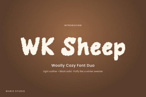
The softly textured edges of Wk Sheep make me think of a cozy reading corner. I would use it for a large welcome word where that detail can be appreciated.
Keep the teacher name separate if the texture becomes distracting. A simple solid companion will give the sign a clear practical anchor.
View This Classroom Font →Preview & download options
2. Wk Cloud: Cloud-like letters for a gentle entrance
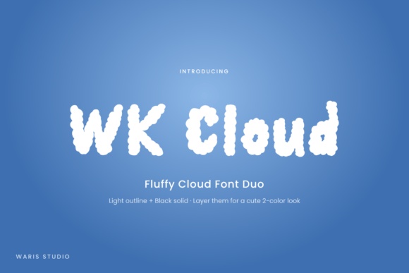
Wk Cloud has fluffy contours that could suit a sky-themed classroom door. I like the way it introduces a theme through the letters themselves.
A few simple cloud shapes would be enough around it. Before printing, check that the small edge details do not make the name look fuzzy from the hallway.
View This Classroom Font →Preview & download options
3. Wk Bubbly: Rounded lettering without a heavy mood
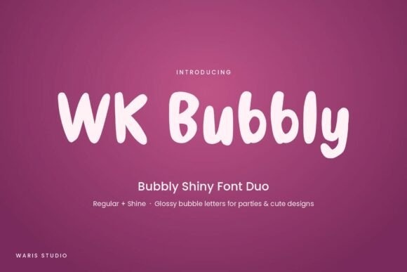
Wk Bubbly has soft, uneven forms with a relaxed handwritten feel. It is one of the directions I would compare for a friendly teacher name.
Give the letters a dark, consistent color and leave generous gaps around the heading. The welcoming character does not need a multicolor treatment to come through.
View This Classroom Font →Preview & download options
4. Wk Otis: A substantial name that stays friendly
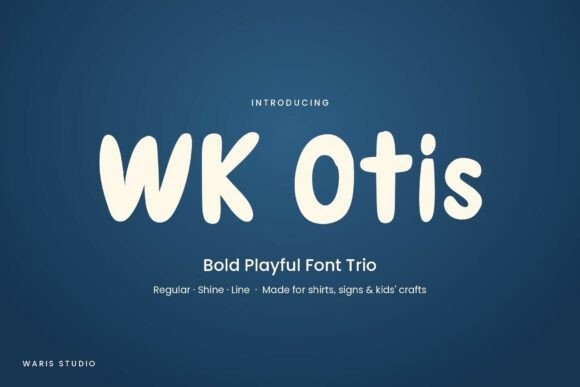
Wk Otis has fuller rounded strokes and an open, approachable silhouette. I would shortlist it for the main class name rather than only a small decorative phrase.
Try the exact name in a simple one-line arrangement first. If it grows too wide, a natural line break is better than compressing the letters.
View This Classroom Font →Preview & download options
5. Wk Packed: An outline accent for a large greeting
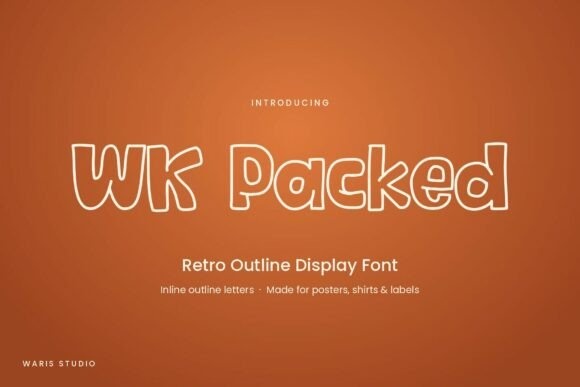
Wk Packed uses rounded outline forms with a retro flavor. I can see it on a large welcome message above a clearer teacher or room label.
The outline needs contrast, so I would keep it away from patterned paper. A small proof will reveal whether the interior spaces remain easy to distinguish.
View This Classroom Font →Preview & download options
6. Cozy Coloring: Tall letters for a narrow door panel
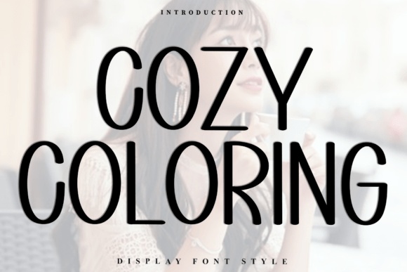
Cozy Coloring has slim, elongated printed forms. I would consider it when the sign needs a lighter heading and the available space is relatively narrow.
Use enough size for the strokes to stay visible. A short word works better here than a long sentence squeezed between decorations.
View This Classroom Font →Preview & download options
7. Family Gathering: A personal script accent
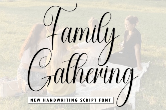
Family Gathering has fine, flowing script with long loops. I would reserve it for a brief welcome phrase on a large sign, not essential room identification.
Pair it with a clear printed teacher name. That combination can feel personal while keeping the information visitors need immediately accessible.
View This Classroom Font →Preview & download options
8. School Photography: A handwritten teacher signature
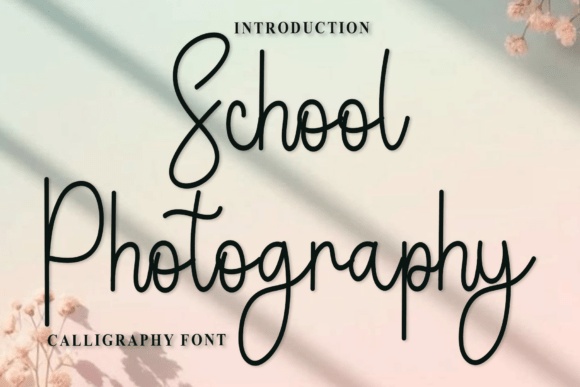
School Photography has a light, connected rhythm that could make a teacher name feel personally signed. I would test it only where the name can remain fairly large.
Keep long strokes clear of nearby illustrations. For younger readers or longer names, compare it with a straightforward printed option before making the final choice.
View This Classroom Font →Preview & download options
9. Amazing: A graceful welcome above the main name
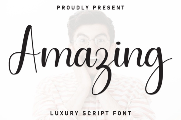
Amazing has a large initial and flowing script movement. I would use it for a short greeting that sits above a simpler class label.
The script should have a supporting role rather than carry every detail. Leaving the surrounding area quiet will make the decorative capital feel intentional.
View This Classroom Font →Preview & download options
10. Home Nearme: A light handmade classroom heading
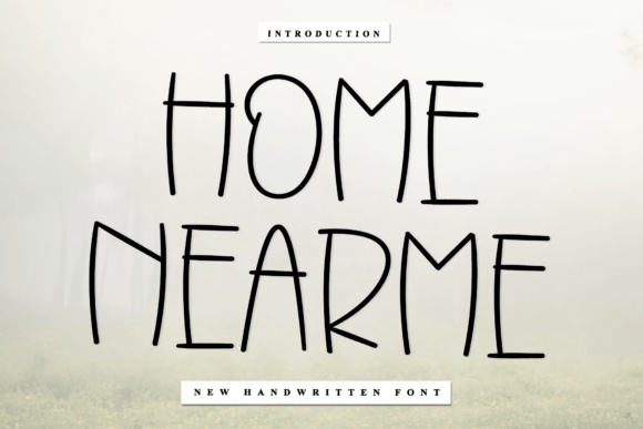
Home Nearme uses tall, slightly irregular printed letters. I like it for a relaxed classroom sign that should feel handmade without becoming heavily ornamental.
Keep the words short and the background plain. The thinner strokes need a practical distance check before the design is used as the main door label.
View This Classroom Font →Preview & download options
11. Simple Writing: A narrow printed name treatment
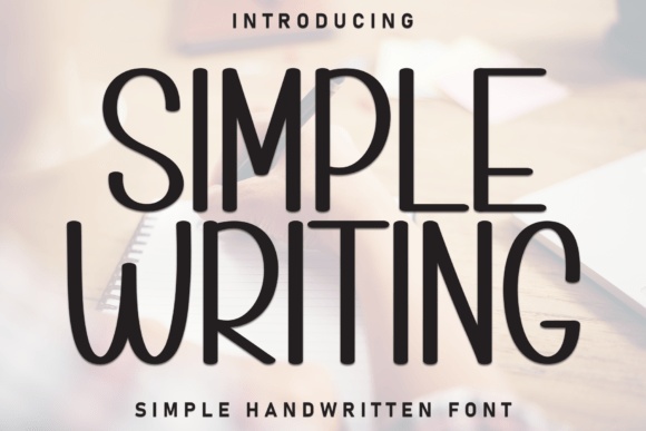
Simple Writing has elongated rounded forms and a tidy handmade rhythm. I would try it for a teacher name that needs more width than a chunky bubble font allows.
Preserve its natural proportions. A small room number in a clearer companion can give the overall sign a useful point of reference.
View This Classroom Font →Preview & download options
12. Nivella: A softer serif alternative
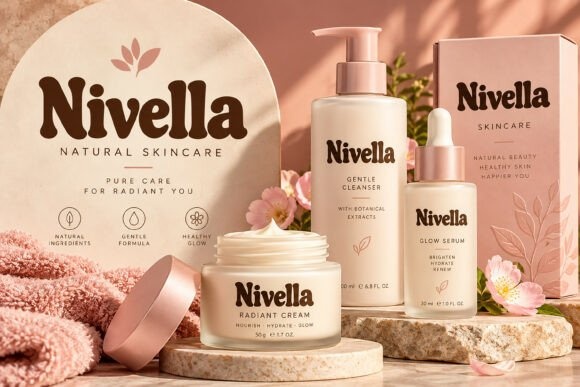
Nivella has substantial rounded serif shapes that offer a different voice from the usual classroom bubble letters. I would consider it for a warm, restrained entrance.
The skincare scene in the preview is only a presentation context. Set the actual class name on a plain background to judge how those shapes work for the sign.
View This Classroom Font →Preview & download options
13. Jumping: A lively short welcome
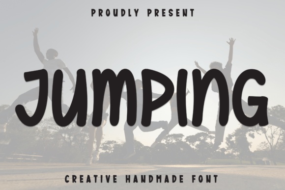
Jumping has heavy, irregular handwritten-looking forms with a playful bounce. I would use it for one energetic word rather than a detailed message.
Keep the class identifier on a stable baseline below. That gives the entrance personality without making every line compete for attention.
View This Classroom Font →Preview & download options
14. Happy Kids: Friendly capitals for a cheerful theme
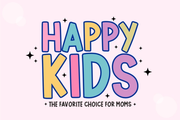
Happy Kids has tall, rounded display forms with an outline treatment. I would compare it for a short class name on a bright but orderly sign.
Use a consistent letter color or a restrained pair of colors. Too many competing decorations could make the message harder to pick out from the hallway.
View This Classroom Font →Preview & download options
15. Simply Cute: Soft shapes for an approachable name
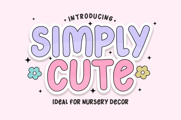
Simply Cute has rounded, gently irregular letters that feel welcoming. It is a useful option when I want a playful sign without an especially strong theme.
Leave the main name large and keep supporting text simple. A small icon can add context while the lettering remains the focal point.
View This Classroom Font →Preview & download options
16. Block Pop: A block-letter accent for a themed door

Block Pop places bold letters inside a graphic block-like treatment. I would use it for a short heading on a building-block or playful construction theme.
Check how the actual font characters are supplied before recreating the preview. The main room information can sit below in a simpler style.
View This Classroom Font →Preview & download options
17. Chubblix: A bold cheerful wordmark
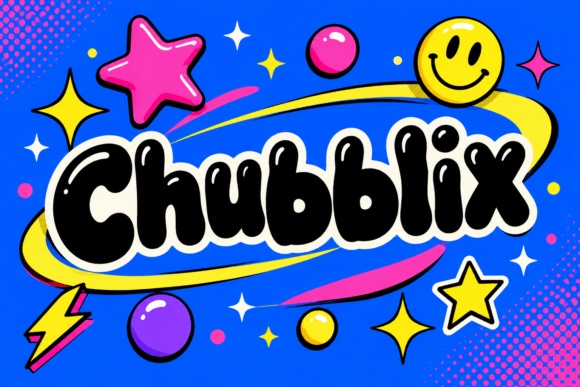
Chubblix has plump display forms with a strong silhouette. I would try it for a short class nickname or welcome title that needs to stand out.
A plain border can organize the lively letters. I would avoid adding several other bold fonts around it, especially on a small door panel.
View This Classroom Font →Preview & download options
18. Humble Teacher: A clear condensed heading
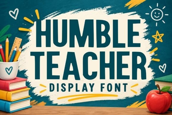
Humble Teacher shows tall, substantial capitals with a direct appearance. I would shortlist it when the teacher or class name needs to be easy to locate.
Keep the line spacing generous and let a smaller illustration add warmth. The sign can feel friendly without making the essential words decorative.
View This Classroom Font →Preview & download options
19. Kidsmart: A script for a personal greeting
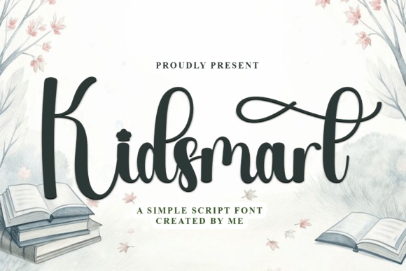
Kidsmart has connected strokes and an extended flourish in the preview. I would use it as a personal accent on a larger sign rather than a small room label.
Test the exact capitals and keep the flourish clear of the main information. A plain companion can make the overall entrance easier to navigate.
View This Classroom Font →Preview & download options
Where I would start the shortlist
I would choose a rounded solid option for the main name, then compare it with a lighter handwritten alternative. Highly decorative alphabets can become a small accent if they slow down reading. Open the options that match your classroom mood and test the exact name before preparing matching materials.
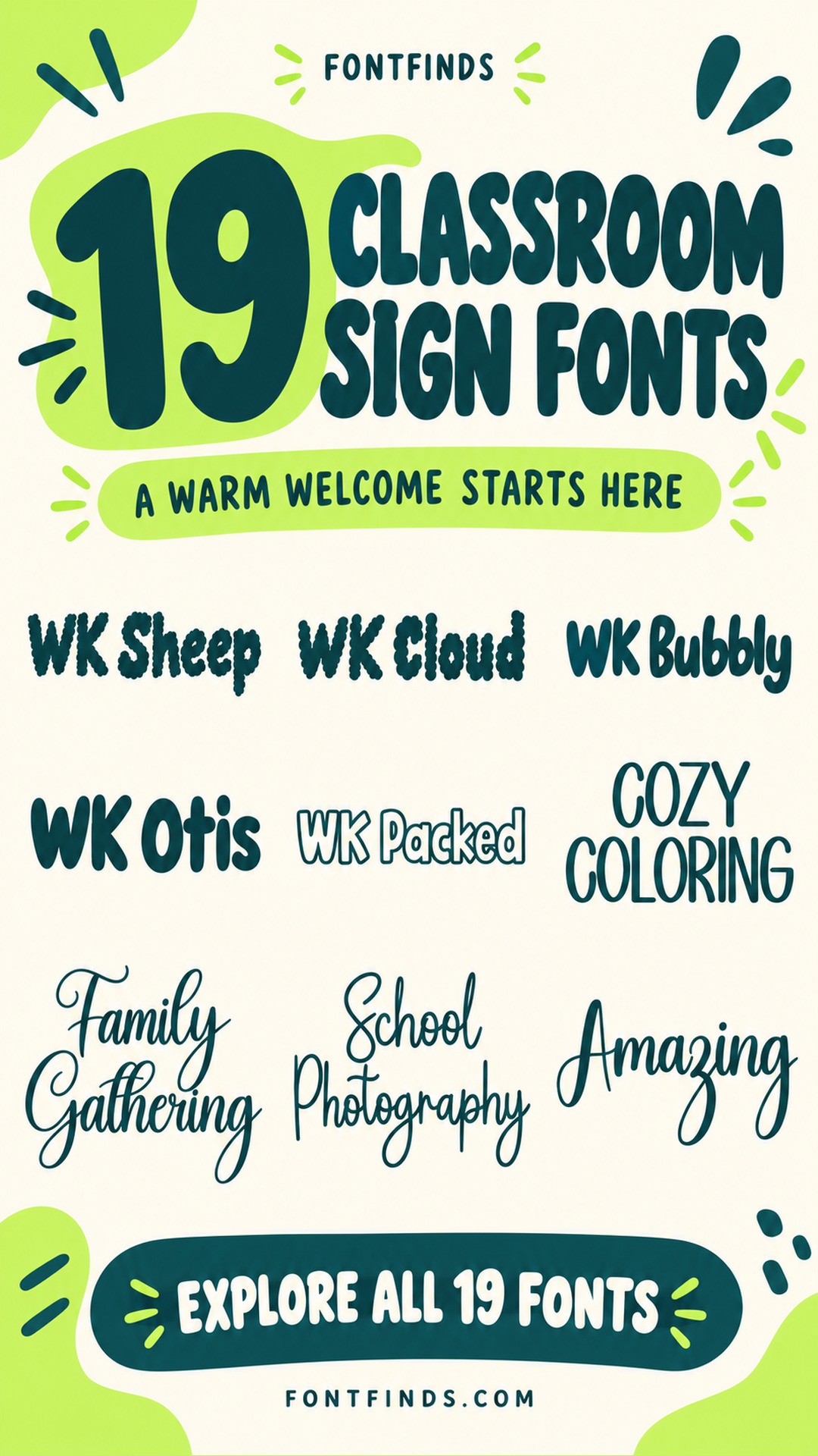
My recommendations are based on a visual review of the supplied product previews, not installation or production tests. The cover is an illustrative lettering montage. Open the linked listing to check the full character set, supplied files and current license before downloading.
More font ideas
Frequently asked questions
Are these fonts suitable for teaching letter formation?
This collection focuses on decorative signs. For handwriting instruction, use the letterforms and teaching materials appropriate to your curriculum rather than assuming a cute display alphabet is suitable.
What should be largest on the door sign?
Usually the teacher name, class name or room identifier that visitors need first. A welcome message can support it without competing for equal attention.
Can I make matching classroom labels?
Yes, but test the smallest label separately. A decorative font that works on the door may need a simpler companion for shelf names or small student labels.