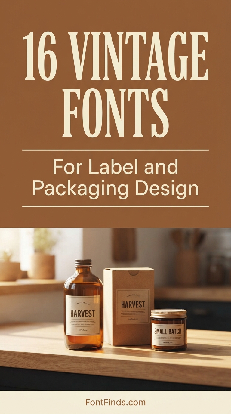
Vintage label design sells products through one specific mechanism: implied longevity. A customer comparing two similar jars will read the one with heritage-styled type as older, more established and more carefully made, regardless of whether the business launched last month. That effect is why so much craft food, drink and cosmetics packaging looks the way it does. These sixteen vintage fonts cover the range, with attention to how each behaves on an actual printed label rather than in a mockup.
Four Vintage Label Design Registers
Western and frontier. Heavy slab serifs from wood type. Signals American, rugged, small-batch. Dominant in craft spirits, hot sauce, barbecue and outdoor goods. Rough execution reads handmade, clean execution reads like a brand referencing the west.
Vintage advertising. Condensed serifs and bold display from early twentieth century print. Signals established, traditional, reliable. Common in coffee, beer and general grocery.
Elegant vintage. Refined serifs with higher contrast. Signals premium and long-established. Used in cosmetics, confectionery and anything at a higher price point.
Coastal and mid-century. Softer, warmer, more relaxed. Signals leisure and holiday rather than heritage. Strong in summer products and homeware.
These vintage label design registers correlate with price point more than with era. Rustic sits low, elegant sits high, and putting the wrong one on your packaging places the product in the wrong mental price bracket before anyone reads the label.
The mockup problem. Almost every font on this page will look excellent in a flat digital mockup and some will fail on an actual bottle. Labels are curved, viewed at an angle, and lit by supermarket fluorescents that flatten contrast. Print your artwork at final size, wrap it around the actual container, and look at it from two metres before approving anything.
16 Fonts for Vintage Label Design
Beer Label Condensed
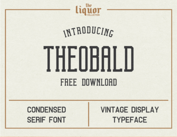
1. Theobald
Theobald is a vintage condensed typeface drawn from old beer labels, posters and advertising. Condensed proportions on labels are not a style choice, they are a space solution.
A bottle label is narrow and curved. Text has to fit within a width that is far less than it appears flat, because the curve hides the edges from any single viewing angle. Condensed type buys you characters without shrinking the height, which is why almost all historical bottle labelling is condensed.
My take: Condensed is standard on bottles for a physical reason. The curve steals width and condensed type buys it back.
View This Font → Free.
Retro Serif
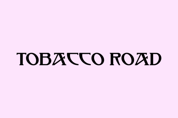
2. Tobacco Road
Tobacco Road is a retro vintage serif built for branding and headlines. Vintage serifs carry a commercial signal that is genuinely valuable: implied longevity.
A customer looking at two similar products will read the one with heritage-styled type as older and therefore more established, whether or not the business has any history at all. That is why so many new food and drink brands launch with vintage typography.
My take: Vintage serifs imply the business has been around, which is exactly why new brands use them. It works whether or not it is true.
View This Font → Free.
Western Shadow
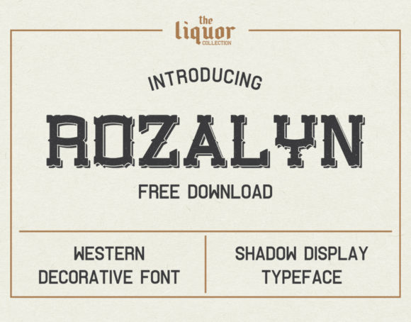
3. Rozalyn
Rozalyn is a western decorative face inspired by vintage liquor labels and advertising. The shadow treatment is the notable feature, and shadows on labels behave differently from shadows on screen.
A printed shadow is a second colour, which means a second plate and a second cost. Historically that expense is why shadowed lettering signalled a premium product: only brands who could afford multi-colour printing used it. The association survives even though the cost no longer applies.
My take: Shadowed type historically meant an expensive print job, which is why it still reads as premium on a label.
View This Font → Free.
Bold Western
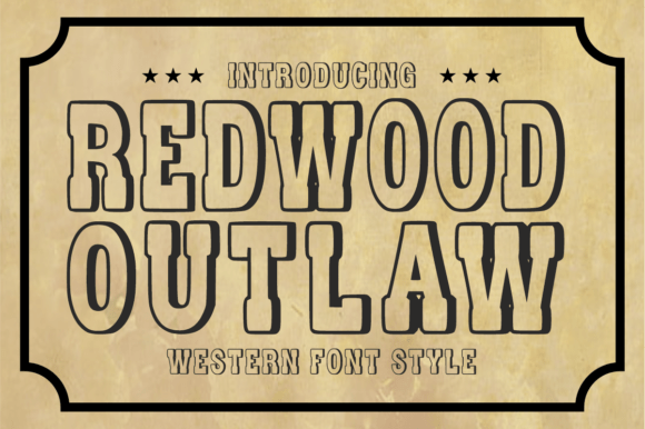
4. Redwood Outlaw
Redwood Outlaw is a bold western display face with classic frontier styling. Western lettering has one of the most rigid conventions in typography: the slab serif with heavy vertical stress.
That convention came from wood type, carved rather than cast, which favoured chunky simple forms that would not split along the grain. The resulting look is so strongly coded that a single word in western type places a product geographically and historically without any other cue.
My take: One word in western type does more geographic positioning than a whole paragraph of copy.
View This Font → Free.
Frontier Authentic
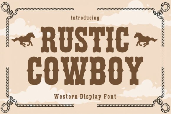
5. Rustic Cowboy
Rustic Cowboy brings American frontier styling with a rougher execution than Redwood Outlaw. The roughness is doing specific work on a label.
Clean western type reads as a modern brand referencing the west. Rough western type reads as something actually made in a small operation. For craft spirits, small-batch sauces and anything positioned as handmade, the rough version supports the story where the clean version undercuts it.
My take: Rough beats clean for small-batch positioning. Polished western type accidentally signals mass production.
View This Font →

Nick Curtis Revival
6. Hamburger Heaven
Hamburger Heaven is a vintage serif by Nick Curtis, a designer whose catalogue consists largely of revivals drawn from historical American type specimens rather than from imagination.
Revivals differ from vintage-styled fonts in a way that shows up in the details, particularly in how serifs meet stems and in the proportional relationship between capitals and lowercase. If your label references a specific American period, a revival will sit right where a modern pastiche subtly will not.
My take: Historically grounded rather than invented. Worth using where the audience might actually know the period.
View This Font → Free.
Assertive Serif
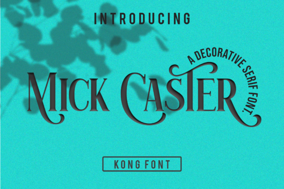
7. Mick Caster
Mick Caster is a distinct assertive serif with a middle weight that suits packaging particularly well. Packaging weight requirements differ from print requirements in a way worth understanding.
A label is viewed at an angle, on a curved surface, often under supermarket lighting that flattens contrast. Delicate type loses definition in all three conditions. Medium weight survives, which is why premium food packaging so consistently sits in this weight range rather than going finer.
My take: Medium weight is the packaging sweet spot. Fine serifs look better in a mockup and worse on a shelf.
View This Font → Free.

Elegant Vintage Serif
8. Goodfish
Goodfish is a vintage-style elegant serif aimed at adding retro character. Elegant vintage sits differently from rustic vintage, and the distinction maps directly onto price point.
Rustic vintage signals handmade and affordable. Elegant vintage signals established and expensive. Both are period-appropriate, and choosing the wrong one puts your product in the wrong mental price bracket before the customer reads the price.
My take: Rustic and elegant vintage sit at opposite price points. Pick the one matching what you actually charge.
View This Font → Free.
Classic Bold
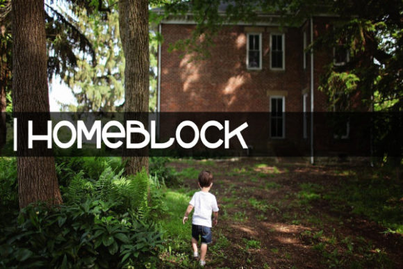
9. Homeblock
Homeblock is a classic display design with bold lines and a familiar appearance. Familiarity is an underrated quality in packaging typography.
Novel letterforms make a customer look at the type instead of reading the product name, which is exactly backwards for a label. A familiar face lets the name register instantly, which matters enormously in the two seconds a shopper spends scanning a shelf.
My take: Familiar type gets read faster. On a shelf you have about two seconds and novelty costs you one of them.
View This Font → Free.

Old School Display
10. Armalite Rifle
Armalite Rifle is a display face with old school looks, sitting in the general vintage advertising register rather than referencing a specific era.
General vintage is more flexible than period-specific vintage. It reads as old without committing to a decade, which suits brands who want heritage cues without claiming a particular history they would then need to support.
My take: Non-specific vintage is safer for a new brand. Claiming a decade invites questions about a history you do not have.
View This Font → Free.

Vintage European
11. Augsburger Schrift
Augsburger Schrift is a vintage-styled display face with European rather than American reference, which is a meaningfully different visual tradition.
European vintage labelling leans on ornament, symmetry and formal structure where American vintage leans on bold woodblock impact. For products positioned as continental, imported or traditional in a European sense, the reference matters and American western type would actively fight the positioning.
My take: European and American vintage traditions look different. Match the reference to where the product claims to come from.
View This Font → Free.
Retro Typography
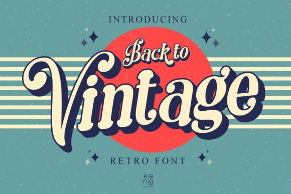
12. Back to Vintage
Back to Vintage is a retro-style face drawing broadly on vintage typography conventions. Broad reference fonts occupy a useful middle position between historical revival and modern reinterpretation.
They give you the vintage signal without the technical baggage of a faithful revival, which typically includes spacing tuned for metal type and character sets missing modern requirements like the euro symbol or extended punctuation.
My take: Faithful revivals often lack modern characters. Broad-reference fonts avoid that problem while keeping the look.
View This Font →
Beach Nostalgia
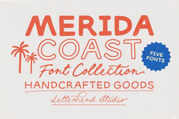
13. Merida Coast
Merida Coast captures sun-drenched nostalgia and laid-back beach town styling, which is a specific and commercially strong vintage sub-register.
Coastal vintage has a longer selling season than most themed styles, running from spring through to early autumn, and it applies across food, drink, apparel and homeware. That breadth makes it a better library investment than more narrowly themed vintage faces.
My take: Coastal vintage has a five month season and applies across categories. Better value than narrowly themed vintage.
View This Font →
Worn Texture
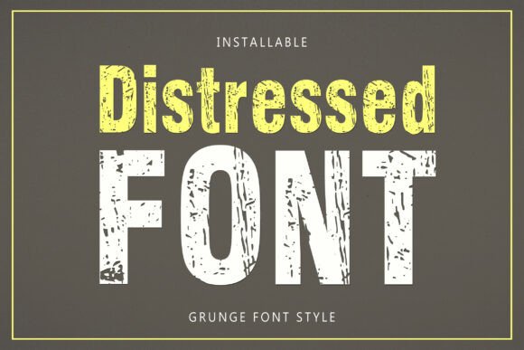
14. Distressed
Distressed is a bold vintage-inspired face with a worn textured finish. Texture on packaging behaves differently from texture on screen and it is worth understanding before committing.
Printed texture depends on halftone resolution. At the line screens used for label printing, fine distressing can either disappear entirely or turn to mud depending on the press. Ask your printer for their line screen and check your texture against it before approving artwork.
My take: Check your printer’s line screen before using texture. Fine distressing either vanishes or turns to mud in label printing.
View This Font →
Grunge Display
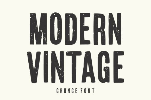
15. Modern Vintage
Modern Vintage combines timeless appeal with grunge treatment, which is a heavier texture approach than Distressed. Heavier texture is more robust in production.
Where fine distressing is vulnerable to press variation, bold grunge survives because the removed areas are large enough to hold at any reasonable line screen. If your label is being printed cheaply or on absorbent stock, heavier texture is the safer choice.
My take: Heavy grunge survives cheap printing where fine distressing does not. Match texture weight to print quality.
View This Font →
Timeless Serif
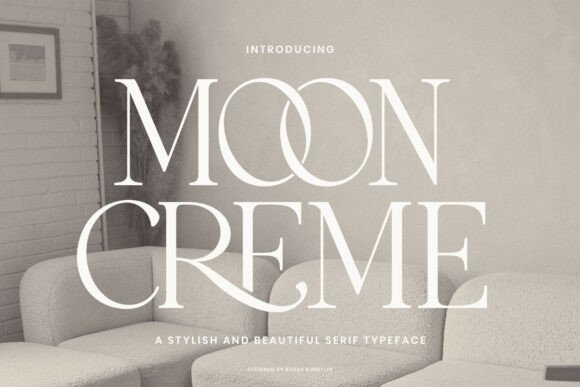
16. Moon Creme
Moon Creme is a crafted serif combining timeless elegance with vintage character. Fonts positioned as combining multiple qualities usually mean a designer aiming at versatility.
For a small brand that is genuinely valuable, because one typeface covering a logo, a label and marketing material keeps everything consistent while costing a single licence. The risk is that versatile fonts sometimes lack a distinctive quality worth remembering.
My take: Versatile fonts save money and risk being forgettable. Fine for a supporting role, riskier as the whole identity.
View This Font →
Seasonal Texture
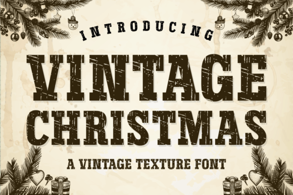
17. Vintage Christmas
Vintage Christmas is a texture face with nostalgic seasonal styling. Seasonal packaging type has a genuine commercial logic that year-round type does not.
Limited edition seasonal packaging drives urgency, and a visibly different typeface signals that limitation more clearly than a colour change alone. The purchase pays for itself across multiple years since the season returns, unlike a one-off campaign font.
My take: Seasonal packaging fonts get reused every year, which makes them better value than they first appear.
View This Font → Free.
Vintage Label Design Printing Realities
Curves steal width
A label wrapped around a bottle shows perhaps sixty percent of its width from any single angle. Condensed type is the standard answer, which is why so much historical bottle labelling uses it.
Uncoated stock spreads ink
Kraft and uncoated papers absorb ink, thickening strokes and closing small counters. Go a weight lighter than looks right on screen, which is the opposite of the usual advice.
Texture depends on line screen
Fine distressing can vanish or turn to mud depending on the press. Ask the printer for their line screen before designing rather than after proofing.
Every colour costs money
Shadowed and outlined vintage type needs multiple plates. That expense is historically why it signalled premium, and on a short print run it still adds meaningfully to unit cost.
Questions People Ask
What fonts are best for vintage label design?
Condensed serifs and medium-weight slabs. Condensed handles the width limits of curved containers, and medium weight survives being viewed at an angle under poor lighting where finer type loses definition.
Why does my label font look thinner in print?
It probably does not. Uncoated and kraft stocks absorb ink and thicken strokes, so type usually prints heavier than it appears on screen. If it looks thinner, check that the file is not being scaled down at output.
Does vintage label design have to look distressed?
No, and often it should not. Clean type with genuinely vintage letterforms reads as heritage without the printing risk that texture introduces.
Should vintage labels use distressed textures?
Only if the print method can hold them. Fine distressing is unreliable at typical label line screens. Heavier grunge survives better, and clean type with vintage letterforms is the safest option of all.
How many fonts should vintage label design use?
Two. One vintage display face for the product name and one plain face for ingredients, volume and legal text. Regulatory copy has legibility requirements that decorative type usually cannot meet.
Can I use these fonts on products I sell?
Check each licence. Packaging for a product you sell is commercial use, and some designers treat merchandise and packaging separately from general commercial rights.
Related: fonts for product packaging, vintage serif fonts for logos, or browse Creative Fabrica →



3 Comments