16 Best Halloween Party Fonts for Trick-or-Treat Ideas
A neighborhood trick-or-treat sign can be funny, eerie or theatrical, but it still has to tell people where to go. These Halloween party fonts offer that range, from friendly ghosts to darker dripping letters. Use the illustrated styles for a headline, then keep the party address and start time easy to read.
Halloween Party Fonts: what to test first
Print a sample sign with ‘Candy Here’ and your actual event details. View it from the sidewalk, then reduce the same graphic to a phone invitation. A spooky texture that looks excellent at poster size may turn into visual noise on a favor tag.
Editor’s test: place the longest phrase for a trick-or-treat bag in your mockup before comparing the individual specimens.
Playful scares for family events
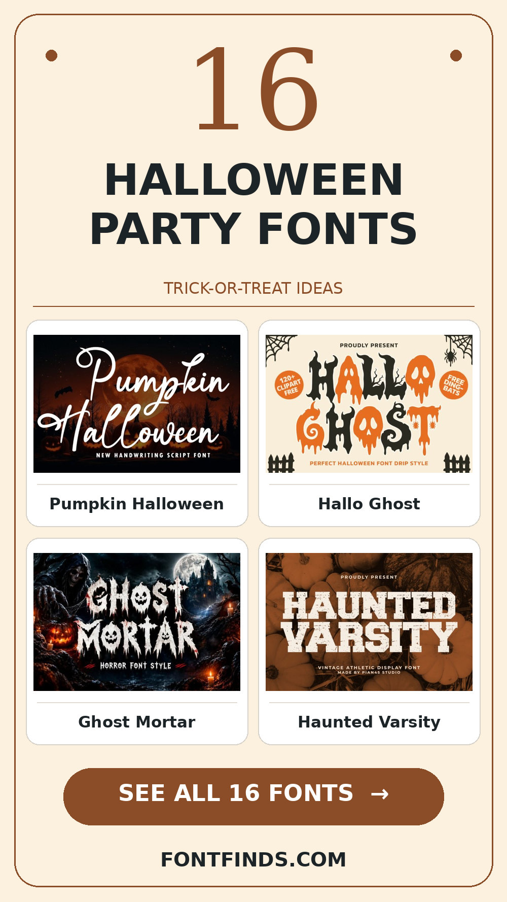
1. Pumpkin Halloween
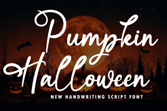
Pumpkin Halloween leans on an informal handwritten rhythm, a useful starting point for a trick-or-treat bag. A second detail to notice is human irregularity. If the design has lots of tiny copy, let the expressive type stay large. For the main phrase, check the exact capitals and punctuation you need before you settle on the layout.
View Pumpkin Halloween and download options →
2. Hallo Ghost
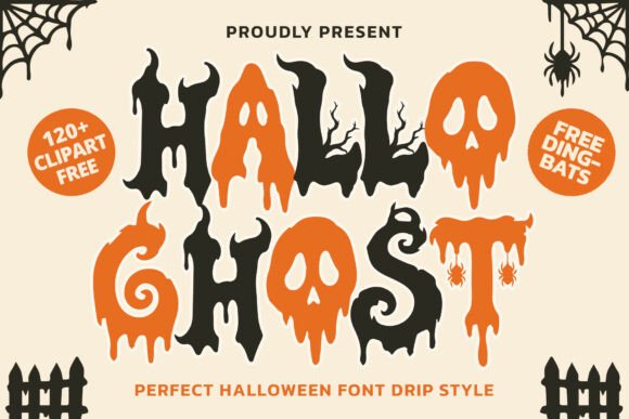
The appeal of Hallo Ghost is a distinct display silhouette. Try it first as a porch candy sign, then shrink the artwork to a phone preview. If the word still lands immediately, it can lead; otherwise, use it for a single accent.
View Hallo Ghost and download options →
3. Ghost Mortar
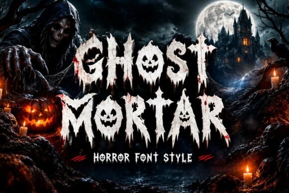
Try Ghost Mortar on a costume-party invite. It uses a textured, weathered finish to set the mood. A second detail to notice is roughened edges. Type your complete phrase, view the rough details at final print size, and inspect a print-size draft before trusting the enlarged preview.
View Ghost Mortar and download options →
4. Haunted Varsity
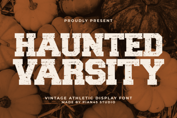
In this shortlist, Haunted Varsity is worth testing for a Halloween favor tag because of its compact letter proportions. A second detail to notice is roughened edges. Set the actual copy in one color, use a simple text face for the smaller information, and check how the spacing changes after a line break.
View Haunted Varsity and download options →
5. Creepy Again
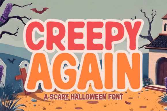
For a classroom celebration poster, Creepy Again offers a distinct display silhouette. Give it one clear task in the composition. Before choosing it, test its legibility away from the enlarged sample and compare the result with a plain companion face at actual size.
View Creepy Again and download options →
6. Ghostie
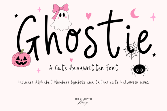
Consider Ghostie for a trick-or-treat bag: rounded contours gives the phrase a clear personality. A second detail to notice is generous curves. Leave breathing room around the letters and test the counters with a longer line of text. Pair it with a plain sans for practical details rather than another competing display style.
View Ghostie and download options →
7. Monster Mayhem
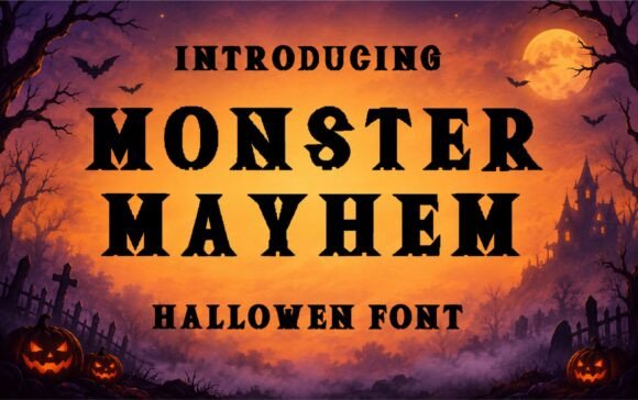
At first glance Monster Mayhem reads through a textured, weathered finish. A second detail to notice is roughened edges. Put it on a porch candy sign, but keep the adjacent information quiet. The real proof comes at final size: view the rough details at final print size.
View Monster Mayhem and download options →
8. Ghost Drip
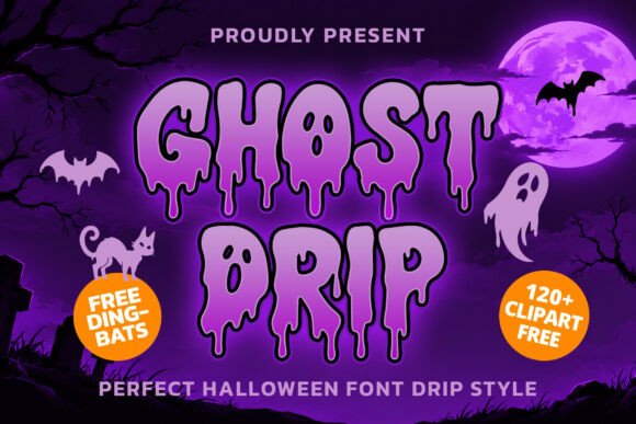
Ghost Drip brings rounded contours to a costume-party invite. A second detail to notice is generous curves. I would test the counters with a longer line of text, then choose a simple text face for the smaller information for the details. That division keeps the headline expressive and the information easy to scan.
View Ghost Drip and download options →
Darker headlines for evening parties
9. Spooky
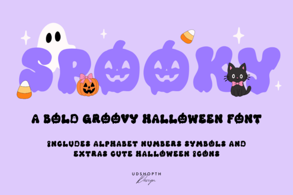
Spooky is a display option marked by rounded contours. A second detail to notice is generous curves. Its strongest role here may be a Halloween favor tag. Build a one-color proof and test the counters with a longer line of text; the vendor mockup alone is too generous a test.
View Spooky and download options →
10. Ghost Falky
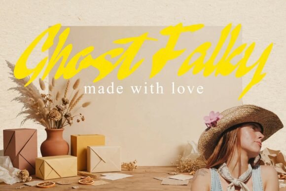
Ghost Falky can give a classroom celebration poster a different pace through connected script movement. I would place it beside a plain sans for practical details, then check the longest word and the smallest practical size before making a final choice.
View Ghost Falky and download options →
11. Hallo Horror
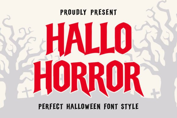
Hallo Horror leans on decorative details and flourishes, a useful starting point for a trick-or-treat bag. A second detail to notice is optional letterforms. If the design has lots of tiny copy, let the expressive type stay large. For the main phrase, reserve the largest alternates for a short heading before you settle on the layout.
View Hallo Horror and download options →
12. Midnight Creepy
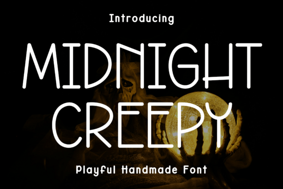
The appeal of Midnight Creepy is an informal handwritten rhythm. A second detail to notice is human irregularity. Try it first as a porch candy sign, then shrink the artwork to a phone preview. If the word still lands immediately, it can lead; otherwise, use it for a single accent.
View Midnight Creepy and download options →
13. Gurl Bones
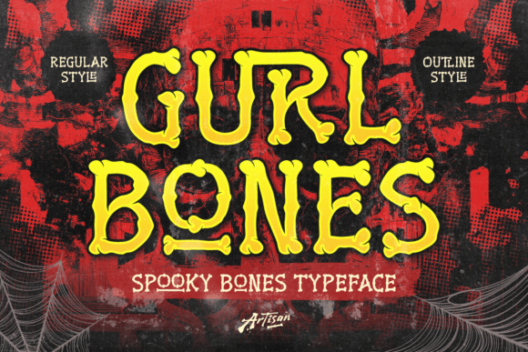
Try Gurl Bones on a costume-party invite. It uses angular blackletter structure to set the mood. A second detail to notice is optional letterforms. Type your complete phrase, keep the inner spaces open at smaller sizes, and inspect a print-size draft before trusting the enlarged preview.
View Gurl Bones and download options →
14. Drip Goul
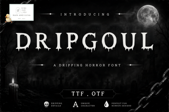
In this shortlist, Drip Goul is worth testing for a Halloween favor tag because of its a serif-led word shape. Set the actual copy in one color, use a simple text face for the smaller information, and check how the spacing changes after a line break.
View Drip Goul and download options →
15. Dread Night
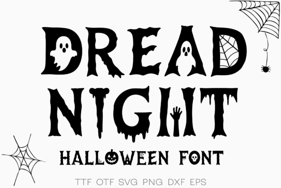
For a classroom celebration poster, Dread Night offers a distinct display silhouette. Give it one clear task in the composition. Before choosing it, test its legibility away from the enlarged sample and compare the result with a plain companion face at actual size.
View Dread Night and download options →
16. Ana
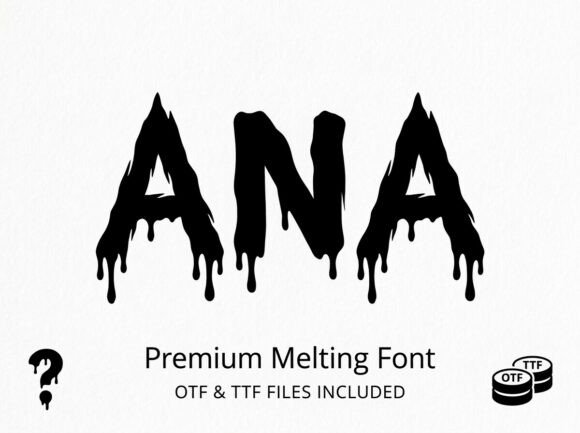
Consider Ana for a trick-or-treat bag: a distinct display silhouette gives the phrase a clear personality. Leave breathing room around the letters and test its legibility away from the enlarged sample. Pair it with a simple text face for the smaller information rather than another competing display style.
View Ana and download options →
From specimen to finished project
Choose the scare level before choosing the type. Skeletons and ghosts can suit younger guests; distressed black letterforms work for a more theatrical event. Keep accessibility in mind: provide the date, location and safety information in plain text no matter how dramatic the headline gets.
Frequently asked question
Which Halloween fonts suit a family party?
Friendly ghosts, rounded silhouettes and clear letter shapes usually communicate the theme without making the practical details hard to read.
Want another direction? Compare this shortlist with a related FontFinds font guide. Open each typeface above to inspect the complete character set, current price and license before downloading it for your project.