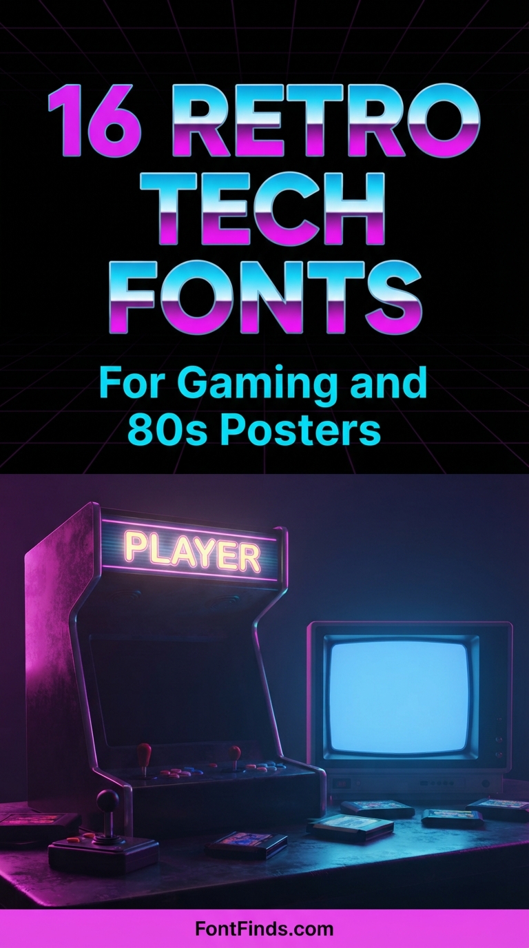
Designing a retro games poster is unusual among revival projects because almost every characteristic of it was dictated by hardware rather than by taste. Pixel fonts look like that because of an eight by eight grid. Seven-segment displays look like that because of seven physical bars. MICR type looks like that because a magnetic reader had to detect it. Understanding which constraint produced which look is what stops a retro games poster from feeling generic. The sixteen fonts below are grouped by the hardware era each one references.
Four Technical Eras and How They Differ
Seven-segment, roughly 1970 onward. Digital clocks, calculators, instrument panels. Every character built from the same seven bars, which makes numbers clear and letters ambiguous. Use for figures, not words.
Dot matrix, roughly 1970 onward. Printers, departure boards, industrial signage. Characters built from a grid of dots. Reads as informational and utilitarian rather than as entertainment.
Pixel and arcade, roughly 1978 to 1992. Early games and console interfaces. Fixed grid, usually eight by eight, with no diagonals or curves possible. The most recognisable retro tech style and the most overused.
Chrome and demoscene, roughly 1985 to 1995. Home computing culture, gradients, elaborate swash capitals, technical showing-off. More specific than general eighties styling and instantly recognisable to anyone who was there.
Mixing eras is the most common retro games poster mistake. A pixel font beside a chrome gradient covers fifteen years of rapid technological change and reads as confused to anyone who knows the period.
The scaling problem with pixel fonts. Pixel typefaces are built on a fixed grid. Scale one to a size that is not a whole multiple of that grid and the pixels render as uneven rectangles, which destroys the effect completely. Scale at 200 percent, 300 percent or 400 percent, never at 250 percent, and disable anti-aliasing wherever your software allows it.
16 Fonts for a Retro Games Poster
Pixel Era
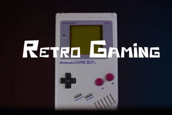
1. Retro Gaming
Retro Gaming recreates the old-school display type used in early arcade and console interfaces. That style exists because of a hard technical limit: early hardware rendered characters on a fixed pixel grid, usually eight by eight, which dictated every letterform decision.
Recreating it digitally introduces a problem the originals never had. Scale a pixel font to a size that is not a clean multiple of its grid and the pixels blur into uneven rectangles. Always scale in whole multiples, and turn off anti-aliasing if your software allows it.
My take: Scale pixel fonts in whole multiples only. Anything else produces uneven pixel edges that instantly break the effect.
View This Font → Free.
Digital Clock
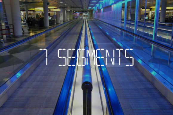
2. 7segments
7Segments recreates seven-segment display characters, the format used in digital clocks, calculators and early instrument panels. It is one of the most constrained letterforms ever used, since every character is built from the same seven bars.
That constraint means several letters are genuinely ambiguous. Certain characters simply cannot be rendered distinctly on seven segments, which is why digital clock displays historically avoided text. Use it for numbers, dates and timers rather than words.
My take: Numbers and times only. Seven-segment letterforms were never designed for words and several characters are ambiguous.
View This Font → Free.
Dot Matrix
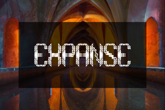
3. Expanse
Expanse builds characters from many small elements, recreating the dot matrix aesthetic of early printers and departure boards. Dot matrix carries a specific set of associations: transit, industry and utilitarian information rather than entertainment.
That makes it more versatile than pixel gaming type. Airport boards, train stations, industrial signage and data visualisation all use this vocabulary, which extends the font well beyond nostalgia projects into contemporary technical design.
My take: More versatile than arcade pixel type. Dot matrix reads as industrial and informational, not just nostalgic.
View This Font → Free.
Laserdisc Arcade
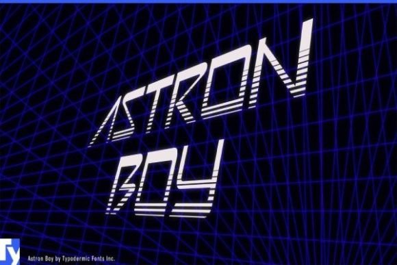
4. Astron Boy
Astron Boy is a rounded-square decorative face inspired by a specific early laserdisc arcade game. Rounded-square construction is the signature of late seventies and early eighties technology styling.
The reason is manufacturing again. Early plastic moulding and vacuum forming could not produce sharp corners reliably, so consumer electronics of the period had rounded rectangular forms everywhere. Type designed to match that hardware picked up the same geometry.
My take: Rounded squares are the period signature. Sharp-cornered geometry reads as nineties, not eighties.
View This Font → Free.
MICR Techno
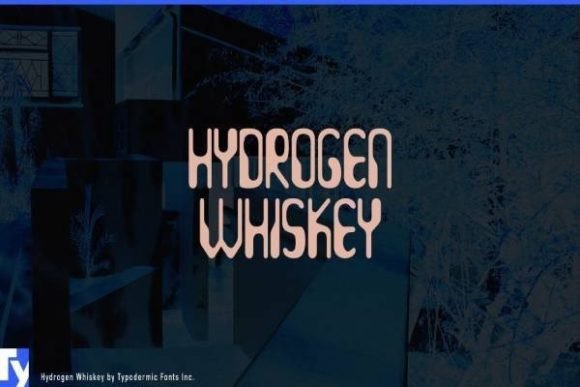
5. Hydrogen Whiskey
Hydrogen Whiskey is a capsule-shaped retro techno face inspired by MICR, the magnetic ink character recognition type printed along the bottom of bank cheques.
MICR is one of the most distinctive technical typefaces ever made, with thickened areas designed to be read magnetically rather than optically. Those thick sections look arbitrary and futuristic to modern eyes, which is exactly why designers keep borrowing the style for sci-fi work.
My take: The thick sections are functional in the original, decorative in this. Either way they read as convincingly technical.
View This Font → Free.
Demoscene 80s
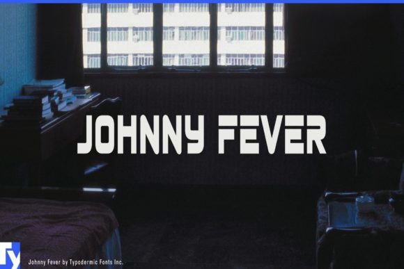
6. Johnny Fever
Johnny Fever is a 1980s swash cap retro face inspired by Amiga demoscene graphics. The demoscene was a subculture producing real-time animated graphics on limited hardware, with its own distinctive typographic conventions.
Those conventions leaned heavily on chrome, gradients and elaborate swash capitals, because showing off technical capability was the entire point. If your project references eighties computing culture specifically rather than eighties design generally, this is a more accurate reference than generic retro.
My take: A subculture-specific reference. If your audience knows the demoscene, this reads as authentic where generic eighties type does not.
View This Font → Free.
Digital Classic
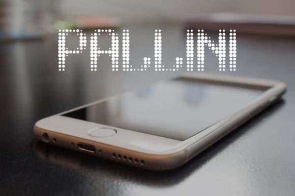
7. Pallini
Pallini gives a classic digital appearance while remaining more readable than strict pixel or segment faces. That middle position is commercially useful.
Strictly authentic digital type is often unusable for anything longer than a word, which limits it to headlines. A softened interpretation lets you set a subhead or a short paragraph while keeping the technical mood, which most projects actually need.
My take: The practical choice when you need more than one word of digital-styled text.
View This Font → Free.
Clean Retro
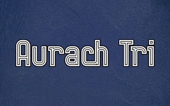
8. Aurach Tri
Aurach Tri is a cool clean retro display face aimed at branding. Clean retro is a distinct category from distressed retro, and the two suit different projects entirely.
Distressed retro implies age and wear. Clean retro implies the period as it looked when new, which is how eighties technology actually appeared: glossy, precise and futuristic. For gaming and tech references specifically, clean almost always reads more accurately than worn.
My take: Eighties tech looked new, not worn. Clean retro is more period-accurate than distressed for anything technology-related.
View This Font → Free.
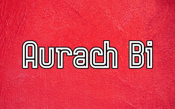
Clean Retro Variant
9. Aurach Bi
Aurach Bi is a companion to Aurach Tri, offering a variant within the same family. Family variants matter more in tech design than elsewhere because tech layouts are information-dense.
A gaming poster typically carries a title, a tagline, platform logos, a release date and credits. Handling that hierarchy with one weight is impossible and with five unrelated fonts is chaos. Family variants solve it cleanly.
My take: Buy both Aurach cuts if you are doing information-dense layouts. Game posters need more hierarchy levels than most designs.
View This Font → Free.

Adaptable Retro
10. Berlin Email
Berlin Email is a creative retro display face with adaptable characters. Adaptability in a display font usually means moderate proportions that do not force a specific layout.
Highly stylised display faces dictate the design around them, which is fine when you have one strong idea and limiting when you need flexibility. A moderate retro face lets the rest of the layout lead.
My take: Use it when the imagery is the hero. Some display faces demand to lead and this one is happy to support.
View This Font → Free.
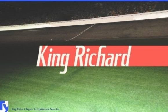
Automotive Flare
11. King Richard
King Richard is a 1960s American automotive display face with flare serifs. Automotive lettering of that era is a specific and underused reference, distinct from both gaming and general retro.
Car badging had to work in chrome, which meant letterforms with enough weight to catch light and enough separation to avoid visual merging when reflective. Flare serifs solved both, and the style still reads as confidently American in a way European automotive lettering does not.
My take: An underused reference. Automotive lettering is distinct from general retro and there is far less competition using it.
View This Font → Free.
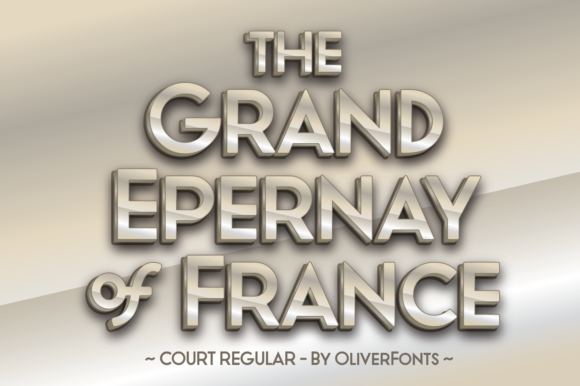
Retro Sans
12. Court
Court is a strong all-caps sans serif with a retro feel, described as easy to pair. Pairing quality is worth taking seriously in a category full of fonts that pair with nothing.
Highly stylised tech and gaming faces often clash with everything, forcing you to use them alone. A retro-flavoured sans that sits comfortably beside a stronger display face solves the supporting text problem that most tech posters run into.
My take: The supporting font this category badly needs. Most retro tech faces cannot carry body text and this can.
View This Font → Free.
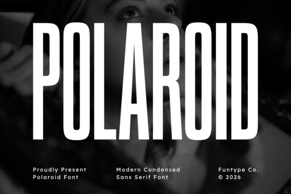
Condensed Sans
13. Polaroid
Polaroid is a tall robust condensed sans serif. Condensed proportions serve a specific function in poster work: they let long text fit at large sizes.
Game titles and film titles are frequently long, and a wide face forces you to shrink them until they lose impact. A condensed face keeps the height and therefore the presence while fitting the width, which is why so much film and game titling is condensed.
My take: Condensed is why film titles read big despite being long. Same trick works for game posters.
View This Font →
Tall Elegant Sans
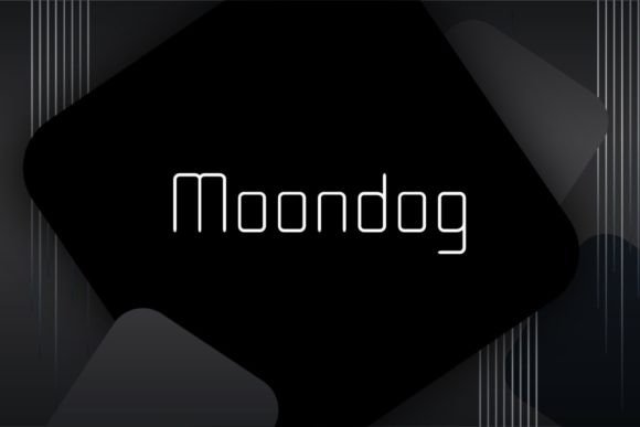
14. Moondog
Moondog is slim, elegant and tall, which is an unusual register for this category. Most retro tech type is heavy and technical, and a slim alternative opens different applications.
Slim tall sans serifs read as sophisticated and slightly futuristic, closer to seventies science fiction than to eighties arcade. If your reference is Kubrick rather than Pac-Man, this is much closer to the right vocabulary.
My take: Seventies science fiction rather than eighties arcade. A completely different register and worth knowing the distinction.
View This Font → Free.

Two-Style Sans
15. Primary Elector
Primary Elector is a classic sans serif shipping in two styles. Two-style releases in classic sans territory are useful because classic sans is the workhorse of any layout.
Every poster needs plain type somewhere, for dates, credits or fine print. Having two related styles means that plain type can have internal hierarchy without introducing a third typeface into the design.
My take: Workhorse rather than feature font. Every poster needs one of these and having two weights avoids a third font.
View This Font → Free.
Style Collection
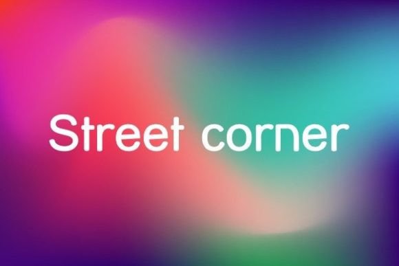
16. Street Corner
Street Corner is a collection of styles built around a fairly classic base. Style collections offer breadth from a single purchase, which suits anyone building a toolkit rather than solving one project.
The caution with collections is consistency of quality. A ten-style family usually has three excellent cuts and several that exist to pad the count. Test the specific styles you intend to use rather than buying on the total number.
My take: Judge collections on the styles you will actually use, not on how many are included.
View This Font → Free.
Getting a Retro Games Poster Right
Clean, not distressed
Eighties technology looked new and glossy, not worn. Distressing a tech poster is a common instinct and a period error. Save wear and grunge for analogue references.
Dark backgrounds
Screens emit light rather than reflecting it, so retro tech design assumes a dark ground with bright type. Inverting that to dark type on white immediately reads as print rather than as screen.
Limited palettes
Early hardware had strict colour limits, often sixteen colours or fewer. Those constraints produced the saturated cyan, magenta and green combinations we now recognise. Full colour freedom looks modern.
One era per design
Pick a technical period and stay in it. The gap between an arcade cabinet and an Amiga demo is fifteen years of very visible change.
Questions People Ask
What fonts are used on retro game posters?
It depends on the era being referenced. Arcade-era work uses pixel fonts, eighties home computing uses chrome and swash capitals, and instrument or utility references use seven-segment or dot matrix faces.
Why do pixel fonts look blurry when I scale them?
Because you scaled to a size that is not a whole multiple of the original grid, and because anti-aliasing is smoothing the edges. Scale in whole multiples and disable anti-aliasing.
Can I use seven-segment fonts for words?
Poorly. Several letters cannot be rendered distinctly on seven bars, which is why digital displays historically showed numbers rather than text. Use them for dates, times and figures.
What colours suit a retro games poster?
Saturated cyan, magenta, green and yellow on a dark or black ground, reflecting the limited palettes early hardware could produce. Muted or pastel colours read as contemporary.
Which era should a retro games poster reference?
Pick one and stay in it. Arcade pixel work, home computing chrome and instrument-panel styling are separated by fifteen years of visible change, and mixing them reads as confused.
Should retro tech designs look worn?
Usually not. The technology was new and glossy at the time, and distressing it applies an analogue convention to a digital reference. Keep tech clean and save the wear for print-era styles.
Related: bold display fonts for posters, modern minimalist fonts for logos, or browse Creative Fabrica →