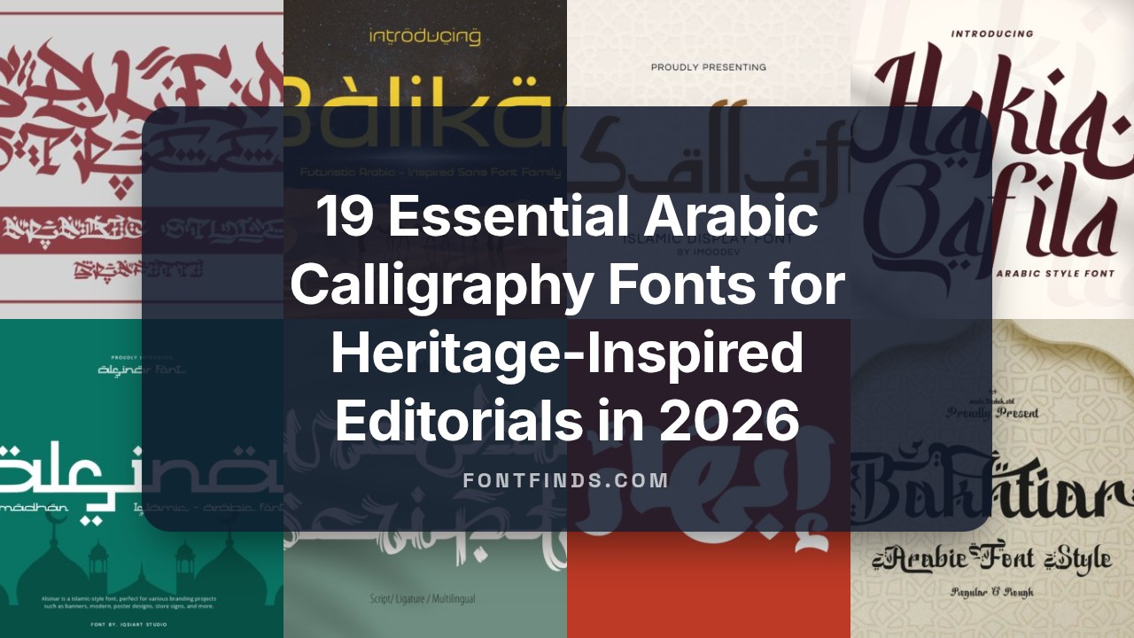
19 Essential Arabic Calligraphy Fonts for Heritage-Inspired Editorials in 2026
Arabic calligraphy fonts set the personality of Arabic-language design, whether for print, web, or environmental graphics. This collection of 19 carefully selected faces spans classical scripts like Kufi and Thuluth to contemporary calligraphic takes.
Each entry includes concise usage notes, suggested pairings with Latin type, and licensing pointers so you can match script style to a project’s tone. Short descriptions and visual cues help you pick the right face for editorial spreads, exhibitions, or branded publications.
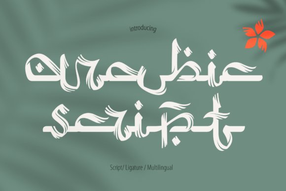
1. Nashir Nectar Font
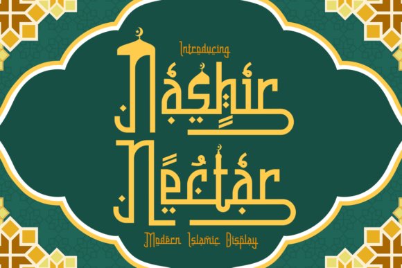
Nashir Nectar blends the flowing gestures of traditional Islamic scripts with a crisp contemporary finish, offering elongated terminals and fluid connectors that echo naskh and diwani influences. Designers familiar with Arabic typography will appreciate how this display face sits among well-crafted Arabic calligraphy fonts, delivering both ornament and clarity for headlines. Its letterforms read as cultural shorthand without sacrificing modern readability.
Technically the family includes contextual alternates, discretionary ligatures and careful kerning to preserve rhythm in tight layouts, and it works well across print, packaging, and digital mastheads. Use it for logos, invitations, magazine titles, and premium packaging where a measured reference to heritage matters. The result is a font that lends projects a refined, artisanal voice.
╰┈➤ Download Nashir Nectar Font
My Recommendation: I reach for Nashir Nectar when a project needs a graceful, culturally informed tone without becoming overly ornate. The alternates and ligatures let me fine-tune flourishes so branding stays legible across sizes. It’s ideal for boutique identities, event invitations, and editorial covers that benefit from a handcrafted, elegant presence.
2. Bullan Ramadhan Font
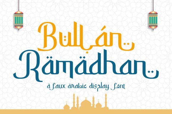
Bullan Ramadhan Font presents a clean, Latin-friendly display built to suggest Arabic script through simplified strokes and open counters. It captures the aesthetic of Arabic-inspired lettering while remaining legible at small sizes, making it practical for business cards, websites, and identity systems. The visual nod to Arabic forms works well for cultural festivals or seasonal campaigns.
Crafted with straightforward glyphs and restrained swashes, this face performs across print and web environments and scales without losing its character. Pair it with geometric sans-serifs or light serif text to create contrast, and rely on its clarity for signage, posters, and social graphics. A compact weight range helps maintain consistent voice across collateral.
╰┈➤ Download Bullan Ramadhan Font
My Recommendation: I use Bullan Ramadhan when a design needs a tasteful Arabic flavor but must remain functional and highly readable. It’s a smart pick for brand identities, promotional materials, and event graphics where clarity matters. Because it holds up well at small sizes, it’s dependable for digital banners and stationery.
3. Salem Street Font
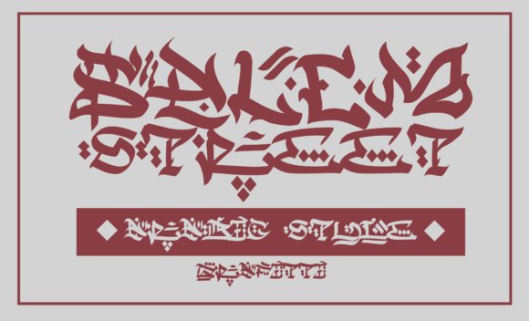
Salem Street Font channels graffiti energy into letterforms shaped by Arabic calligraphic influence, offering sharp strokes and irregular rhythms that feel immediate and handmade. Its brush-like shapes and staggered baselines give headlines a kinetic quality suited to posters, album art, and urban apparel. The overall effect is expressive without relying on excessive ornamentation.
OpenType alternates and decorative swashes extend creative control, allowing designers to construct typographic statements that read as contemporary calligraphic lettering. It performs best at large sizes and on bold backgrounds where texture and motion matter, and pairs well with restrained layouts that let the letters breathe. Use it when a design needs bold personality and streetwise character.
╰┈➤ Download Salem Street Font
My Recommendation: I pick Salem Street for projects that demand energy and a clear urban edge, such as music packaging, streetwear branding, and event posters. Its rough-hewn strokes add attitude while still feeling composed when used selectively. Treat it as a display tool to give campaigns a memorable, handcrafted punch.
4. Alsinar Font
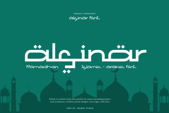
Alsinar is a display face that channels Islamic calligraphic forms into a clean, geometric Latin alphabet. The letter construction-noticeable dot motifs, broad terminals, and measured curves-evokes traditional Arabic scripts while remaining readable at headline sizes. Designers who work with Arabic calligraphy fonts will find the balance between ornament and clarity especially useful for cultural projects and modern identities.
In practical use, Alsinar’s heavier weights dominate banners and posters whereas the lighter cuts make refined subheads or logotypes. Its open counters and deliberate spacing simplify kerning and scaling for large-format graphics tied to Ramadan, Eid, or halal branding. Pair it with a neutral grotesque to keep focus on the display voice and to prevent visual competition.
My Recommendation: I’d pick Alsinar when a design needs a clear nod to Islamic visual language without ornate complexity. Its geometric approach and dotted terminals give projects a distinctive cultural signature that remains legible. It’s superb for festival posters, boutique halal packaging, and hospitality brands seeking a polished, contemporary identity.
5. Ahlan Wasahlan Font
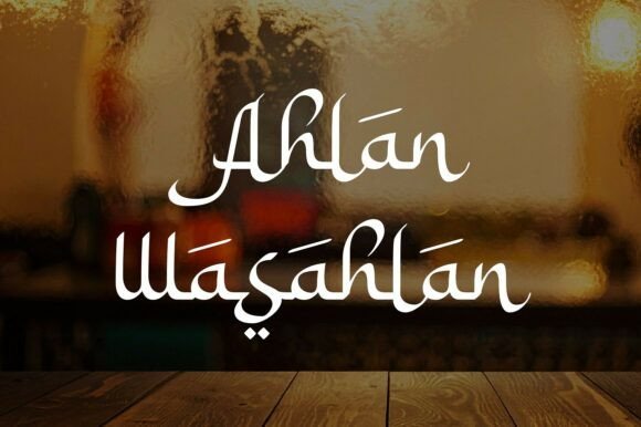
Ahlan Wasahlan presents a flowing, script-like display style that borrows the gestural movement of Arabic calligraphy and translates it into expressive Latin forms. Generous curves and a rich set of ligatures create an inviting, handcrafted tone that reads best at larger sizes. Alternate glyphs let you sculpt words for headlines, logos, or premium packaging where personality matters most.
Reserve this face for short phrases and visual statements rather than long passages; its decorative rhythm can overwhelm dense text. Combine Ahlan Wasahlan with a restrained serif or a clean sans to provide breathing room and contrast. It’s ideal for travel branding, upscale restaurant identities, and event collateral that needs a warm, high-end flourish.
╰┈➤ Download Ahlan Wasahlan Font
My Recommendation: I rely on Ahlan Wasahlan when a brief demands warmth and a handcrafted feel tied to Middle Eastern aesthetics. Its ligatures and alternates are perfect for custom wordmarks and boutique packaging. I avoid using it for body copy but love it for headlines, signage, and invitations that need an elegant, hospitable personality.
6. Rahmatillah Script Font
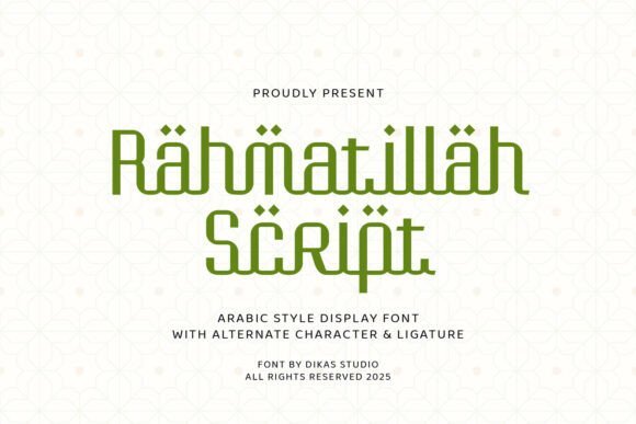
Rahmatillah Script reads as a restrained, modern script with subtle traces of Arabic calligraphic rhythm: thin strokes, steady terminals, and open counters give it a composed, contemplative character. The spacing and modest contrast make it well suited for quotations, ceremony titles, and short devotional text where clarity matters. Thoughtful stroke endings keep the typeface formal without becoming ornate.
OpenType alternates and contextual swashes allow designers to soften or tighten the voice depending on the brief, but sparing use of swashes maintains legibility in compact layouts. It pairs neatly with solid sans faces for contemporary stationery or with textured paper to heighten a ceremonial feel. Use Rahmatillah Script for invitations, book covers, and social graphics that need a calm, refined expression.
╰┈➤ Download Rahmatillah Script Font
My Recommendation: I choose Rahmatillah Script when a project calls for quiet elegance rather than flashy decoration. Its clean strokes and alternates provide measured flexibility for headlines and invitations. It performs especially well on printed pieces and formal digital graphics where a dignified, spiritual tone is required.
7. Balikan Font
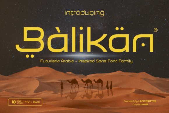
Balikan is a futuristic Arabic-inspired sans serif that pairs strict geometric forms with soft, calligraphic gestures. It comfortably sits at the intersection of Arabic calligraphy fonts and contemporary sans design, offering smooth curves, controlled terminals, and subtle nods to traditional stroke modulation. The face maintains a strong visual personality while delivering clear readability for both display and semi-body text.
Technical details like refined kerning, proportional figures, and OpenType alternates make Balikan flexible across branding, editorial layouts, tech UI, and luxury packaging. Its steadier stroke weights perform well in motion graphics and film titles, while decorative alternates let designers inject regional character without compromising hierarchies. Overall it feels modern yet respectful of the calligraphic source material.
My Recommendation: I would reach for Balikan when a project needs a contemporary, regionally informed voice-think tech brands, boutique packaging, or cinematic title work. Its clean geometry keeps interfaces readable, while alternates offer tasteful Middle Eastern accents for logos and headlines. For assignments that require a progressive look with legible text, Balikan strikes a rare balance between style and function.
8. Ebhaar Font
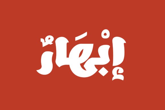
Ebhaar, whose name means ‘Dazzle’ in Arabic, channels the energy of swift brush-pen strokes into a spirited display face. Its forms emphasize motion: lively terminals, textured stroke contrasts, and angled joins give headlines a hand-rendered, expressive feel. Contextual alternates and stylistic sets let designers pick between a restrained rhythm or full-on flourish.
Because Ebhaar reads best at larger sizes, it excels on posters, album covers, signage, and festive packaging where dramatic letterforms matter most. The font rewards designers who pay attention to spacing and optical adjustment, producing highly readable, showy headlines without appearing cluttered. Use it when a project needs visible character and artisanal warmth in its typography.
My Recommendation: I use Ebhaar when a design calls for bold, handcrafted personality-particularly on posters, event identities, or packaging that benefit from expressive Arabic display work. Its alternates provide options to tweak tone from playful to formal. If you want a headline face with visible brush energy and strong silhouette, Ebhaar delivers that instantly.
9. Ghalib Font
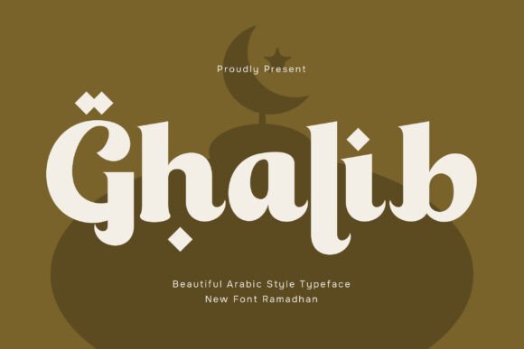
Ghalib blends classical Arabic calligraphic rhythm with contemporary type proportions to create a refined display face. Elegant stroke transitions, graceful curves, and considered terminals give it a poetic mood suitable for culturally sensitive content. Thoughtful diacritic placement and contextual ligatures ensure the script reads naturally across sizes.
This type performs well on book covers, museum labels, editorials, and formal invitations where quiet sophistication is required. Alternates and light ornamentation allow subtle decorative touches without overpowering layouts. For any project seeking an understated, traditional tone rendered with modern typographic discipline, Ghalib is a dependable choice.
My Recommendation: I recommend Ghalib for work that needs classy, heritage-driven typography-such as literary covers, cultural programs, and refined editorial spreads. Its balanced rhythm and ligature support preserve readability while conveying handcrafted beauty. When a design should feel dignified rather than showy, Ghalib consistently hits that mark.
10. Ballaghi Font – Arabic calligraphy fonts
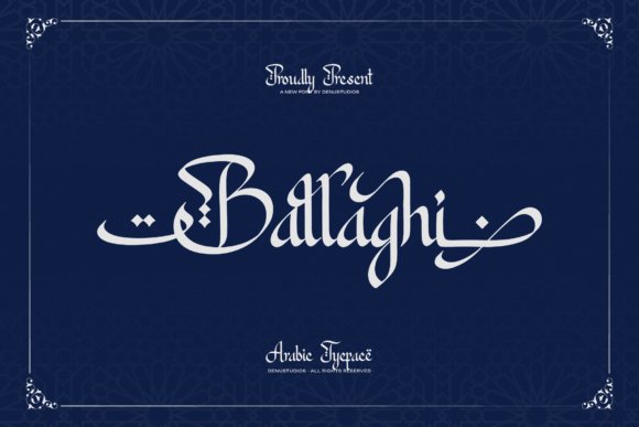
Ballaghi is a display typeface that channels the flowing proportions and ornate terminals of classical Arabic calligraphy into Latin letterforms. Ballaghi sits among the more expressive Arabic calligraphy fonts, with sweeping curves, pronounced swashes and rhythmic stroke contrast that read like brushwork on a marquee. The overall effect is richly decorative while still maintaining strong character recognition at display sizes.
The font ships with contextual alternates, extended swash sets and a generous collection of stylistic ligatures so you can craft layered wordmarks and ornamental headlines. It excels in cultural branding, signage, event posters and editorial covers where a bold, calligraphic voice is needed; pair it with a restrained sans for body copy to avoid visual clutter.
╰┈➤ Download Ballaghi Font – Arabic calligraphy fonts
My Recommendation: I reach for Ballaghi when a project needs an unmistakable, calligraphic personality-restaurant identities, festival posters and high-impact packaging are perfect fits. Its alternates give me control over ornamentation, so I can dial back or amplify flair depending on the application. Use it large and sparely for the best visual return; it reads as crafted art rather than a body text face.
11. Mahabbah Font
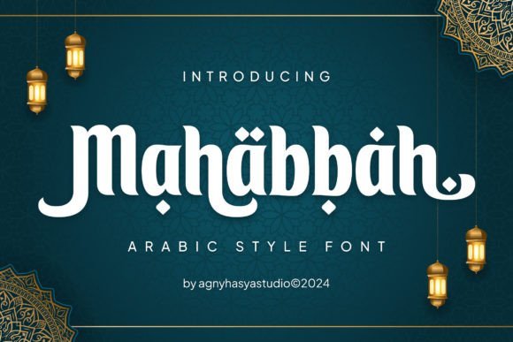
Mahabbah brings a soft, elegant calligraphic flavor to Latin typography, adopting delicate terminals and gently curved connectors reminiscent of Arabic letterforms. Its restrained swashes and measured proportions keep the expression graceful without overwhelming composition, which helps it perform well at medium display sizes. The overall tone reads intimate and refined, suited to projects that seek subtle cultural reference rather than overt ornamentation.
This family includes a useful set of alternates and decorative glyphs for invitations, boutique logos and editorial pull-quotes, while retaining legibility for short headlines. Pair Mahabbah with a clean sans or a light serif for contrast; use its alternates sparingly to maintain clarity in tight layouts.
My Recommendation: I choose Mahabbah when a design calls for gentle Arabic-inspired elegance rather than flamboyant decoration. It’s especially useful for wedding stationery, boutique branding and tasteful posters where warmth and legibility matter. I often pair it with a neutral sans to keep layouts modern while letting Mahabbah supply the character.
12. Fattah Font
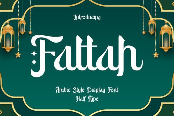
Fattah merges traditional Arabic stroke rhythm with a contemporary display sensibility, producing letters that feel both calligraphic and decidedly modern. The design emphasizes contrast between sweeping curves and sharp junctions, giving headlines a sculptural quality that reads well in large format. Decorative ligatures and alternate terminals add expressive options without undermining the typeface’s structural clarity.
Included OpenType features make it simple to swap in ornate glyphs for logos, packaging or poster headlines while keeping fallback shapes for tighter layouts. Fattah performs best as a focal element in identity work, cultural publications and premium product labels where an elevated, handcrafted voice is desirable.
My Recommendation: I use Fattah when a project needs both heritage and a contemporary edge-its bold strokes translate very well to signage and premium packaging. The ligatures let me craft bespoke wordmarks quickly, and the strong silhouette holds up on textured or embossed surfaces. For balanced results I reserve it for headlines and pair it with a minimalist body face to highlight the decorative details.
13. Syamsul Font
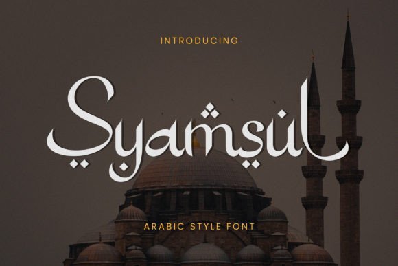
Syamsul is an exquisite Arabic-style display font that channels the flowing movement of traditional scripts while keeping a crisp modern silhouette. With ornate terminals, careful stroke contrast, and elegant swashes, it echoes hand-written calligraphic rhythms without sacrificing legibility. Among Arabic calligraphy fonts, Syamsul strikes a balance between decorative flair and practical typesetting, making it suitable for headlines and cultural branding.
OpenType features include contextual alternates and discretionary ligatures that recreate authentic joining behaviors across complex letter combinations. At large sizes the details sing in posters and covers, yet at moderate display sizes it preserves clarity thanks to generous counters and tuned kerning. Use it for event identities, premium packaging, or editorial spreads that need a sense of heritage without appearing antiquated.
My Recommendation: I reach for Syamsul when a project needs ornamental Arabic letterforms that still behave predictably in layout. Its ligatures and alternates save time when composing long headlines, and the refined curves add prestige to hospitality or cultural event branding. For invitations or limited-edition packaging it brings a handcrafted look with production-ready reliability.
14. Arabic Script
Arabic Script delivers a fluid, hand-drawn aesthetic that borrows proportions and rhythm from classical Arabic scripts. Letters flow into one another with natural ligations and a warm stroke modulation that suggests ink on paper. This personality makes the face ideal for Ramadan promotions, devotional posters, and artisanal labels that call for a personable, crafted voice.
Technically it favors medium display sizes where the contrast and texture read clearly, and diacritic placement has been adjusted for tight compositions. Pair it with a restrained Latin sans for bilingual layouts or use monochrome palettes to highlight the calligraphic movement. Expect to do light tracking adjustments for long lines; the font rewards careful typographic color with expressive results.
My Recommendation: I would pick Arabic Script when a brief, human touch is needed-think seasonal posters or boutique labels. It lends authenticity without heavy ornamentation, and pairs well with simple layouts. Use it where warmth and tradition should be visible at a glance.
15. Ramadan Dingbats
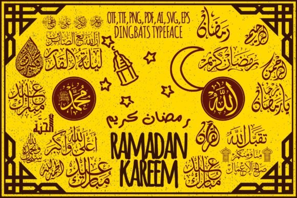
Ramadan is a dingbats collection of 62 glyphs inspired by Islamic ornament, stylized phrases, and calligraphic fragments. Rather than full letterforms, these marks function as decorative building blocks-emblems, separators, framed phrases, and repeatable motifs. They simplify the creation of cultural stationery and festive visuals while maintaining a handcrafted, calligraphic sensibility.
Installed as a font, glyphs map to keyboard slots and can be scaled or converted to outlines for print or laser work. Combine repeated symbols into patterns, overlay them on photographs, or use single marks as badges and emblems. A good workflow is to test combinations at the design stage to balance density and negative space for crisp reproduction.
My Recommendation: I use Ramadan dingbats when projects require quick, culturally resonant ornamentation without redrawing assets. The glyph set speeds up mockups for cards and posters, and converting symbols to vectors gives control for print production. It’s ideal for seasonal campaigns, packaging accents, and craft projects that need authentic-looking motifs.
16. Bakhtiar Font
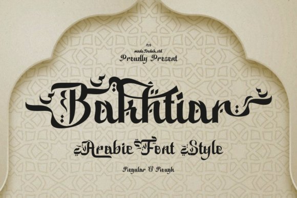
Bakhtiar channels Middle Eastern calligraphic heritage into a Latin display face, merging traits from Kufic and Naskh: measured angular terminals, flowing connectors, and diamond-shaped diacritics. The type leans on elongated horizontal swashes and decorative flourishes that read as regal without overwhelming legibility. As part of a suite of Arabic calligraphy fonts adaptations, Bakhtiar offers designers a bridge between historic scripts and contemporary branding.
It performs best at headline scale-think restaurant logotypes, museum posters, and destination branding-where its decorative details can breathe. Use bold sizes for logos and pair with a neutral sans for body copy to maintain contrast; kerning may need fine-tuning when combining swashes. The overall weight range and carefully tuned counters make Bakhtiar an excellent choice when a project calls for dignified cultural resonance.
My Recommendation: I reach for Bakhtiar when a headline must carry historical gravitas without losing modern clarity. Its dramatic swashes and measured ornaments emboss a brand with a sense of ceremony, ideal for luxury hospitality or cultural events. For packaging or identity work that benefits from heritage cues, this font gives immediate presence while staying readable.
17. Hakia Qafila Font
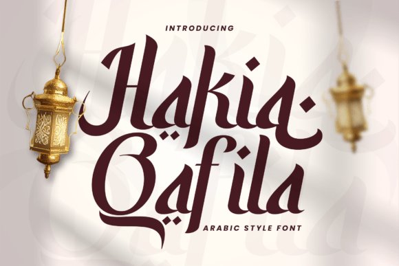
Hakia Qafila evokes the rhythmic motion of caravans through letterforms that balance carved serifs with fluid, calligraphic arches. The face blends authoritative strokes with ornamented counters, so it feels narrative without becoming ornate; alternates add subtle story-telling variations per word. The overall voice leans literary and historic, suited to projects that need a sense of movement and provenance.
The family ships in Regular and Italic, with stylistic alternates and extended diacritic support for multilingual Latin scripts; PUA encoding exposes decorative glyphs for easy access. Use Regular for clear headlines and reserve Italic for pull-quotes or captions where a more lyrical tone is desirable. It shines on book covers, cultural festival posters, and identity work that benefits from a charismatic serif voice.
╰┈➤ Download Hakia Qafila Font
My Recommendation: I choose Hakia Qafila when a design brief calls for narrative depth rather than mere ornament. The alternates and PUA glyphs let me craft headings with personality while keeping typesetting straightforward. This family fits editorial covers, themed events, and identities where typography should hint at long histories and well-traveled stories.
18. Sallafi Font
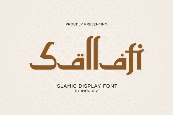
Sallafi fuses geometric precision with sweeping strokes drawn from Arabic calligraphic practice, yielding a display face that feels both disciplined and expressive. Strong, rhythmic terminals give it presence in short copy, while generous counters preserve clarity at larger sizes. The balance makes the type appropriate for celebrations and themed branding that require a respectful nod to Islamic design.
Designed for seasonal campaigns and product packaging, Sallafi performs well on posters, invitations, and social tiles; its bold weight reads across digital and print applications. Consider pairing it with a muted sans or a crisp serif to let the display letters dominate without visual competition. When you need a headline voice that signals ceremony rather than ornamentation, Sallafi stands ready.
My Recommendation: I pick Sallafi for festive or culturally centered projects because it feels modern without losing decorative soul. It excels on short-form headlines and packaging where legibility and character must coexist. When a project needs a respectful, celebratory tone, this font provides a confident voice that doesn’t overwhelm supporting copy.
19. Soraith Regular
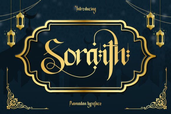
Soraith Regular is a bold blackletter face that draws its rhythm from Arabic script calligraphy and Islamic ornamentation, giving it a ceremonious, ornamental character. Counted among Arabic calligraphy fonts for its clear reference to Diwani and Thuluth motifs, it includes elegant alternates, razor ligatures, and multiple stylistic sets so headlines and logos can carry an artisanal flourish. The dense strokes and pronounced contrast hold up well at display sizes, where the design’s cultural cues read strongly without becoming decorative noise.
This typeface performs best on festival collateral, mosque signage, boutique packaging, and formal invitations where a dignified, culturally resonant voice is required. Pair Soraith with a restrained sans for body copy, add geometric or arabesque ornaments, and use metallic or textured finishes to enhance the letterforms; loosen tracking when you scale it up for banners or posters. Treat it as a display-only resource and test its OpenType alternates to assemble bespoke letter combinations that avoid repetition.
My Recommendation: I turn to Soraith when a project needs a bold, culturally anchored headline-its blackletter weight reads ceremonial without feeling clichéd. The alternates and ligatures make it easy to craft unique wordmarks and greeting-card headers that feel handcrafted. Use it for Eid or Ramadan campaigns, cultural event posters, mosque branding, and premium packaging where a strong, ornamental voice is desirable; avoid small-body text and low-resolution screens.
These 19 Arabic calligraphy fonts cover a wide range of moods, weights, and historical references suited to cultural publishing, signage, and editorial work. Keep the desired tone-formal, ornamental, or modern-in mind when narrowing options.
Test several faces in real layouts, check web rendering and licensing, and compare pairings with Latin scripts to confirm readability and character. Save this guide for quick reference whenever a project needs a clear Arabic script voice.