30 Elegant Arabic Typography Fonts to Evoke Contemporary Calligraphic Emotion in 2026
Arabic typography fonts are at the center of a creative resurgence in 2026, offering designers new ways to marry heritage and readability.
From refined Naskh and geometric Kufi families to expressive display and handwritten styles, these Arabic typefaces suit multilingual web interfaces, editorial systems, packaging, and branding that demands cultural authenticity and visual impact.
Below you’ll find concise notes on character voice, pairing tips, and recommended use-cases to help you choose the right Arabic typeface for your project.
1. Syahru Ramadan Font
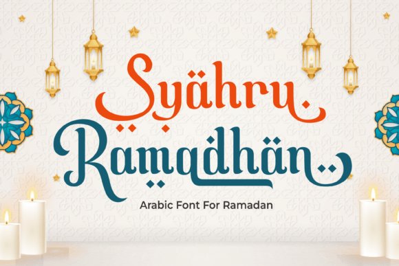
Syahru Ramadan is a handcrafted calligraphic font that marries traditional Islamic letterforms with a contemporary handwritten sensibility. Its flowing bowls and elegant terminals recreate the warmth of hand-brushed ink, while a library of over 100 alternates and contextual ligatures allows designers to build authentic, varied text rhythms for festive greetings and cultural artwork.
Among Arabic typography fonts, Syahru Ramadan stands out for capturing ceremonial tone without sacrificing legibility: it reads beautifully at large display sizes for posters and still maintains clarity in social media banners or mobile cards. The subtle contrast between stroke weights gives a regal yet accessible personality ideal for Ramadan, Eid, mosque events, and heritage branding.
On the technical side, the face includes OpenType features, robust kerning, and diacritic-friendly glyphs to support multilingual Islamic content. It pairs well with restrained sans-serifs for modern layouts or with textured paper and gold foil for premium print stationery, making it a flexible choice across digital and print campaigns.
╰┈➤ Download Syahru Ramadan Font
My Recommendation: I’d reach for Syahru Ramadan when crafting anything that needs a sincere, ceremonial feel-Ramadan campaigns, greeting cards, or mosque event branding. Its alternates let me create varied headlines that never look repetitive, and the calligraphic rhythm gives each piece an immediate cultural authenticity. Use it where emotional resonance and tasteful ornamentation matter most.
2. Malleknas Font
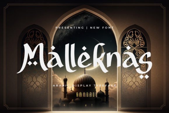
Malleknas is a display typeface inspired by the sculptural qualities of Arabic calligraphy, designed to command attention in large-format treatments. The letterforms show deliberate contrast: elongated strokes, refined terminals, and decorative flares that read as contemporary yet rooted in traditional script aesthetics, making it ideal for logos, exhibition signage, and editorial covers.
What distinguishes Malleknas is its ability to convey cultural richness without relying on heavy ornamentation-its internal rhythm creates texture on posters and packaging while remaining legible at varying distances. This makes it particularly effective for heritage brands, cultural magazines, and art direction that require a distinctive typographic voice.
Technically robust, the family is optimized for high-resolution printing and digital rendering, with careful spacing and multiple stylistic sets to customize visual tone. Pair Malleknas with a neutral geometric sans for contemporary compositions or with classic serifs for more formal, museum-grade presentations.
My Recommendation: I recommend Malleknas for identity work and display projects where you need a typeface that reads as both refined and culturally informed. It’s a strong choice for branding in galleries, cultural events, and high-end packaging because it commands attention without overpowering artwork. Use it as the typographic centerpiece and let simpler companion fonts handle body copy.
3. Ramadhan Tsania Font
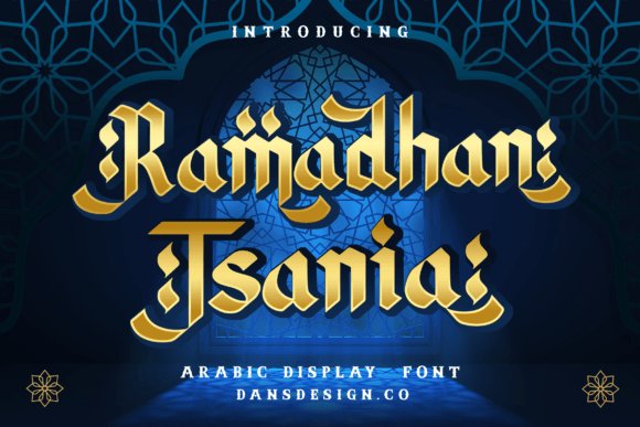
Ramadhan Tsania is an elegant display font fashioned with subtle nods to Arabic calligraphic traditions, emphasizing graceful curves and ornamental terminals. Its restrained stroke contrast and ornamental swashes make it an excellent choice for wedding invitations, luxury event signage, and decorative headlines that benefit from a refined, ceremonial air.
The design balances decoration with function: carefully tuned counters and a moderate x-height keep the face readable at display sizes, while available ligatures and alternates let designers add flourish without manual editing. These features make Ramadhan Tsania great for layered compositions where typography must harmonize with imagery and metallic finishes.
Support for diacritics and thoughtful spacing ensure the type works well in multilingual layouts and premium print runs. Pair this font with understated sans-serifs to avoid visual clutter, or use it alongside delicate ornaments to amplify ceremonial themes in editorial and invitation design.
╰┈➤ Download Ramadhan Tsania Font
My Recommendation: I’d choose Ramadhan Tsania for projects that need understated luxury-wedding suites, gala invitations, and boutique branding where decorative detail matters. Its ornamental features let me create memorable headlines while preserving elegance across printed and digital media. Use it when you want a graceful, ceremonial voice without heavy-handed decoration.
4. Alfazahra Font
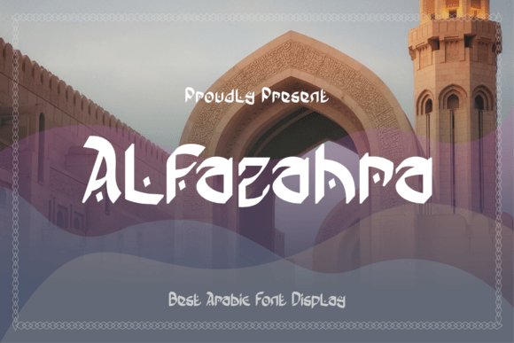
Alfazahra is a display typeface that channels classical Arabic calligraphy into ornamental letterforms. Its flowing strokes and delicate terminals create a sense of handcrafted luxury, making it immediately suitable for high-impact headlines, event posters, and premium packaging. The decorative flourishes feel rooted in historical scripts while being tailored for today’s visual language.
From a typographic perspective, Alfazahra performs best at larger sizes where its intricate details can breathe; at small scales those strokes risk visual clutter. When used in bilingual layouts, pairing Alfazahra with a restrained geometric sans balances its ornamentation and preserves hierarchy. Designers should also consider proper RTL composition and modern rendering to honor the script’s rhythm.
Because Alfazahra draws so strongly from calligraphic tradition, it sits comfortably within projects that celebrate cultural heritage-museum signage, artisanal labels, and heritage branding all benefit. It’s an excellent specimen among Arabic typography fonts for designers seeking a decorative yet authentic voice that reads as both ceremonial and contemporary.
My Recommendation: I’d reach for Alfazahra when I need a dramatic, culturally rich headline that reads like handcrafted calligraphy. Its ornate detail gives invitations, posters, and boutique branding a refined personality that generic scripts can’t match. Use it sparingly as a focal type to preserve its impact and pair it with a neutral sans to maintain clarity.
5. Jamillah Font
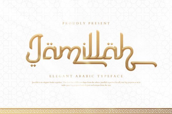
Jamillah is a graceful display font inspired by Arabic aesthetics yet designed for broad commercial use. Its flowing strokes and intentional ligatures lend a handwritten charm that works beautifully on wedding stationery, boutique product labels, and social media graphics. The font’s visual warmth makes it an excellent choice for projects seeking an elegant, approachable identity.
One practical advantage of Jamillah is its PUA encoding, which exposes swash alternates and stylistic ligatures without complex software-perfect for designers who want rich typographic variety fast. At display sizes the curves create soft, romantic shapes; avoid forcing it into long paragraphs where rhythm and spacing become tiring. It pairs particularly well with slim, modern sans-serifs to create contrast and legibility in multilingual layouts.
Because Jamillah evokes an ‘Oriental’ sensibility without heavy ornamentation, it adapts to branding, packaging, and editorial headers with equal ease. Use its alternates to craft custom wordmarks, subtle watermarks, or expressive headlines that feel handcrafted and polished.
My Recommendation: I’d recommend Jamillah when a project needs a refined, hand-lettered vibe that’s easy to compose. Its PUA-encoded extras make experimentation quick, and the font shines on invitations, logos, and social posts. For best results, use Jamillah as a display accent paired with minimalist text faces to preserve readability.
6. Journey Ramadhan Font
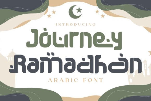
Journey Ramadhan blends geometric Kufic influences with modern display sensibilities to create a typeface that feels both ceremonial and contemporary. Its block-like construction and decorative terminals give headlines a grounded, architectural presence suited to festive campaigns and cultural programming. The stylized dots and softened corners evoke Islamic ornamental motifs without literal replication.
Technically, Journey Ramadhan is built for visibility: bold weights and high stroke contrast ensure strong performance on posters, banners, and product labels. PUA-encoded characters provide accessible decorative elements and alternate forms, making it easy to craft bespoke greetings or event titles without additional tooling. This makes the font particularly useful for seasonal marketing around Ramadhan and Eid.
Use Journey Ramadhan for logos, large-format signage, and packaging where a dignified, celebratory tone is desired. Its geometric voice pairs well with simple humanist text faces for body copy, helping designers maintain hierarchy while celebrating cultural motifs in a respectful, modern way.
╰┈➤ Download Journey Ramadhan Font
My Recommendation: I’d choose Journey Ramadhan for any project that needs a bold yet culturally resonant headline-festive posters, mosque event banners, or limited-edition packaging. Its strong geometric forms read clearly at scale and the decorative alternates let you tailor the look. Combine it with understated body text to keep the message focused and elegant.
7. Muqodimah Display Font
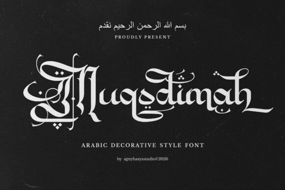
Muqodimah is a bold display font that reinterprets Arabic visual traditions through a Gothic and vintage calligraphic lens. Among Arabic typography fonts, it stakes out a singular niche by merging Old English ornamentation with the rhythmic flow of Arabic calligraphy. The overall effect is theatrical and ceremonial, designed to seize attention in headline-sized settings.
The letterforms display sharp contrast, sculpted terminals, and decorative flourishes that read like engraved script. Built-in alternates and PUA-encoded glyphs provide ready access to ornamental ligatures and stylistic marks without extra tools. Because of its dense personality and high contrast, Muqodimah is best used sparingly rather than in long runs of text.
Apply Muqodimah to posters, book covers, cultural events, and religious-themed campaigns where a sense of heritage and authority is required. Its heavy visual weight turns single words or short lines into focal points, especially when paired with a neutral supporting type. This font lifts compositions toward a sacred, historic atmosphere without needing elaborate treatment.
╰┈➤ Download Muqodimah Display Font
My Recommendation: I’d reach for Muqodimah whenever I need a headline to carry historical gravitas-festival posters, museum exhibits, or book jackets. Its ornate glyphs and PUA extras let me create bespoke logotypes and decorative motifs without custom illustration. Avoid using it for body copy; instead, pair it with a clean sans to let the display face sit as the design’s focal point.
8. Balikan Sans Serif Font
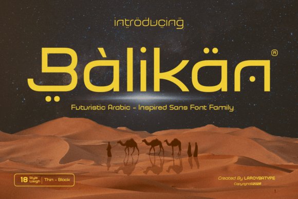
Balikan is a contemporary sans serif family that channels subtle Middle Eastern motifs into a clean geometric skeleton. Instead of quoting script forms, it absorbs calligraphic inflections-gentle arcs and tapered joins-that suggest regional identity while maintaining modern neutrality. This restrained fusion gives Balikan a premium, forward-looking voice suitable for a wide range of visual systems.
On close inspection you’ll find smooth curves, open counters, and careful spacing tuned for on-screen clarity and print reproduction alike. Multiple weights transition well between bold display and semi-body text, and contextual alternates add discreet nuance without undermining legibility. The family’s kerning and hinting make it reliable for interfaces and responsive layouts.
Balikan shines in branding, tech products, luxury packaging, and film titles where a refined, contemporary aesthetic is required. It pairs exceptionally well with Arabic-script companions to build cohesive bilingual identities. Use Balikan when you want a modern type voice that carries a quiet nod to regional calligraphic heritage without ornamental excess.
╰┈➤ Download Balikan Sans Serif Font
My Recommendation: I recommend Balikan when a brand needs modern clarity with cultural resonance-startups, app interfaces, or premium labels. Its geometric foundation makes layout work fast and predictable, while subtle regional cues prevent the design from feeling generic. For bilingual projects, pair it with a complementary Arabic script to achieve a seamless cross-script system.
9. Hakia Qafila Display Font
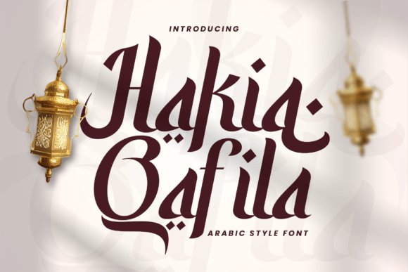
Hakia Qafila evokes the atmosphere of caravan routes and the layered histories of cities along historic trade paths. Each glyph suggests movement through its arched strokes and anchored serif terminals, creating a stately, narrative-driven voice. The typeface reads like a chronicle-rooted, traveled, and quietly ornate.
The family includes Regular and Italic styles where Regular provides a composed, masonry-like presence and Italic introduces graceful forward motion for emphasis. Designers will appreciate the stylistic alternates, carefully-drawn diacritics, and PUA-accessible decorative marks that support expressive headlines and typographic accents. Its serif construction strikes a balance between characterful display use and readable editorial settings.
Hakia Qafila is ideal for travel features, cultural events, book covers, and editorial spreads that want to suggest provenance and storytelling. It pairs well with textured imagery, cartographic elements, and photographic narratives to deepen context. Use the Italic sparingly to add narrative flow and reserve the Regular for powerful, composed headings.
╰┈➤ Download Hakia Qafila Display Font
My Recommendation: I’d choose Hakia Qafila for projects that require a storied, evocative typographic voice-documentary posters, museum brochures, or travel magazine covers. Its alternates and PUA glyphs let me craft bespoke headline treatments without commissioning custom lettering. The face performs best when treated as a focal element alongside restrained supporting typography.
10. Silaturahmi Font
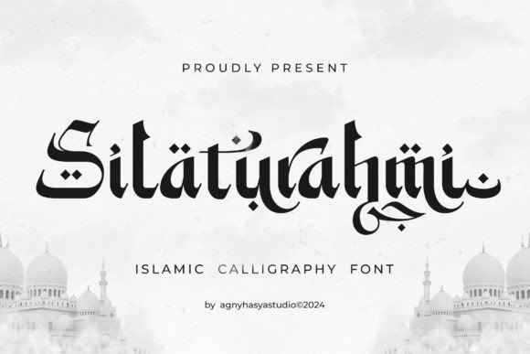
Silaturahmi is a modern Arabic-style display font that blends flowing script gestures with crisp geometric strokes, making it ideal for festive and religious visuals. As part of the wider family of Arabic typography fonts, it brings a contemporary voice to traditional letter shapes, so designs feel both authentic and current for Ramadan and community events.
The face ships with distinctive alternates and a rich set of ligatures, offering many stylistic swaps to customize word rhythm and terminal shapes. Designers can toggle contextual alternates and stylistic sets to craft greetings, posters, and hero headlines that feel handcrafted rather than templated.
At display sizes Silaturahmi reads with presence and personality; its balance between decorative flourishes and legible counters allows confident use in banners, invitations, and packaging. Pair it with a neutral sans for body copy to maintain hierarchy while letting the font’s ornamental forms lead the visual story.
My Recommendation: I would reach for Silaturahmi when I need a headline that reads as both contemporary and culturally resonant-especially for Ramadan campaigns, mosque events, or seasonal greeting cards. Its alternates and ligatures let me vary the look across applications without changing type families. Use it large and bold in posters or hero graphics, and pair it with a simple sans to keep layouts grounded.
11. Bulan Ramadhan Font
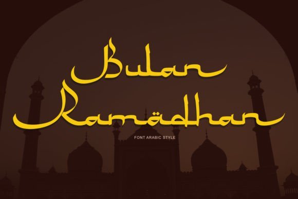
Bulan Ramadhan is a display font that playfully references Arabic letterforms while keeping an accessible, ornamental edge. Its design evokes the crescent and night-market energy often associated with Ramadan, lending a warm, festive tone to event or cultural projects.
The typeface excels at short headlines, greeting cards, and social banners where stylized letter rhythm can become a visual motif. With its exaggerated terminals and rhythmic stroke contrast, Bulan Ramadhan works best at display sizes where its character details can breathe.
For best results, pair this decorative face with a minimal sans-serif for body text and reserve it for focal elements to avoid visual clutter. It’s a strong choice for cultural festivals, restaurant promotions, and illustrative packaging that want an instantly recognizable, thematic look.
╰┈➤ Download Bulan Ramadhan Font
My Recommendation: I’d use Bulan Ramadhan for seasonal posters, social media heroes, and decorative titles that benefit from a festive Arabic-inspired aesthetic. It brings instant personality and cultural cues without needing complex ornamentation. Keep it large, let the details show, and combine it with clean supporting type for contrast.
12. Medina Font
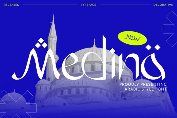
Medina is a decorative display font that channels the ornamental spirit of traditional Islamic calligraphy through expressive curves and pronounced terminals. Rather than copying historic scripts, it reinterprets ornamental strokes into a bold, contemporary display voice suitable for modern editorial and branding work.
The font’s pronounced terminals and ornamental details function like visual flourishes, creating rhythm when set in tight headlines or stacked logotypes. Use it where typography must carry cultural identity-festival promotions, artisanal product labels, and identity marks that want a handcrafted, heritage tone.
Because Medina has a strong visual personality, it performs best as an accent or headline partner to neutral text faces. Leave generous spacing and consider monochrome or metallic colorways to let its intricacies read clearly and avoid overwhelming supporting content.
My Recommendation: I recommend Medina for projects that need a culturally evocative, decorative headline-think boutique branding, event posters, and celebratory invitations. It has the kind of ornate character that gives instant authenticity, so I use it sparingly as a focal element. Pair it with understated body copy and ample whitespace to maximize impact.
13. Sabily Font
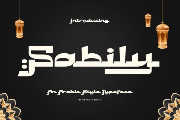
Sabily is a refined Arabic-style typeface that marries the flowing elegance of traditional calligraphy with the practical demands of modern typography. Its sinuous strokes and tapered terminals echo handwritten rhythms while maintaining consistent proportions for on-screen and print use. The result is a typeface that feels handcrafted without sacrificing technical polish.
Under the hood Sabily includes thoughtful OpenType features-contextual alternates, discretionary ligatures, and tuned diacritic positioning-that improve legibility and give designers nuanced control. These features make Sabily an excellent addition to any toolkit focused on Arabic typography fonts, especially when precise typographic behavior and typographic color are important. It adapts well from tight editorial columns to open, expressive display treatments.
Because Sabily balances ornament and clarity, it excels in branding, magazine mastheads, cultural projects, and packaging that call for a dignified yet approachable voice. Pair it with a restrained geometric sans for body copy to preserve hierarchy, or use the ornate alternates selectively for logos and event collateral. Sabily’s combination of aesthetic authenticity and modern features makes it a versatile choice for contemporary Arabic design work.
My Recommendation: I recommend Sabily when you need a typeface that feels both authentic and reliable. Its OpenType toolset and careful diacritic handling make it ideal for editorial layouts, upscale branding, and cultural identity projects. Use it when you want calligraphic character without compromising readability across mediums.
14. Labaniy Font
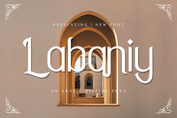
Labaniy is a display typeface that channels the expressive curves of Arabic calligraphy into bold, attention-grabbing letterforms. The design emphasizes sweeping bowls and ornamental terminals, creating a strong personality that reads beautifully at large sizes. Its visual rhythm and high contrast strokes make it especially effective for statement headlines.
Built for impact, Labaniy favors dramatic ligatures and tailored stroke endings rather than subtle text-level neutrality. This makes it an excellent choice for posters, album covers, event invitations, and packaging where aesthetic flair is paramount. Designers will appreciate how the font transforms a simple layout into something visually memorable.
To preserve legibility, reserve Labaniy for display contexts and pair it with a clean sans or neutral serif for supporting copy. It also responds well to textured backgrounds and layered color effects, so try it in experimental print or digital campaigns that lean into decorative typography. Labaniy shines when you need an Arabic-inspired display face with theatrical presence.
My Recommendation: I’d reach for Labaniy when a project needs dramatic Arabic-inspired display type that commands attention. It’s perfect for posters, event branding, and packaging where ornamentation enhances the message. Pair it with a minimalist body type to keep layouts balanced and let Labaniy do the expressive work.
15. Hamdalah Barakallah Font
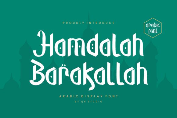
Hamdalah Barakallah is an elegant display font informed by refined Arabic calligraphic traditions. The letterforms exhibit delicate terminals and carefully moderated stroke contrasts, giving the typeface a sense of ceremonial grace rather than exuberant flourish. This restrained decoration lends itself particularly well to projects that require sophistication over showiness.
Technically, the design pays close attention to kerning and diacritic alignment so decorative settings still read cleanly. Stylistic sets and alternate characters allow subtle customization for logos and invitations without breaking visual harmony. The result is a font that feels handcrafted but remains production-friendly for print and high-resolution digital work.
Hamdalah Barakallah best serves luxury identity, wedding stationery, certificates, and editorial feature spreads where a tone of reverence is desired. Match it with textured papers, foil stamping, or elegant color palettes to amplify its refined character. The font’s controlled ornamentation and readable structure make it a dependable choice for upscale cultural communications.
╰┈➤ Download Hamdalah Barakallah Font
My Recommendation: I recommend Hamdalah Barakallah for projects that demand a dignified, premium look-wedding suites, premium packaging, and heritage branding are ideal uses. Its careful diacritic work and alternates let you craft bespoke headlines without sacrificing legibility. Use it when you want a classic Arabic aesthetic presented with contemporary precision.
16. Afitriyah – Arabic typography fonts
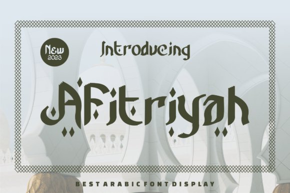
Afitriyah is a showpiece Arabic display typeface that balances ornate calligraphic strokes with contemporary layout-friendly metrics. As one of the more decorative Arabic typography fonts in this collection, it leans into pronounced ligatures and sweeping terminals to create a ceremonial, handcrafted voice. The proportions are tuned to preserve clarity at large sizes while celebrating traditional penmanship.
Its OpenType feature set includes contextual alternates, extended diacritics, and stylistic sets that let designers craft varied moods-from formal and restrained to exuberant and ornamental. Careful kerning pairs and a wealth of decorative glyphs make it ideal for identity systems that need a cultural flourish without becoming fussy. The forms render cleanly on high-resolution screens and in print, where the textured strokes read as intentional design rather than noise.
Best used for posters, wedding invitations, cultural branding, and hero headlines, Afitriyah is not intended for long passages of body text but excels at statement pieces. It also supports bilingual layouts with compatible Latin companions and precise diacritic alignment for accurate typesetting. If you need a headline voice that signals ceremony and heritage, Afitriyah gives you expressive control through alternates and ornamental options.
╰┈➤ Download Afitriyah – Arabic typography fonts
My Recommendation: I would reach for Afitriyah when I need a headline that reads like a crafted, cultural statement-weddings, festival branding, or heritage identities. The OpenType alternates let me tailor the tone from subtle to ornate without reworking the artwork. Use it at display sizes so the delicate strokes and ligatures can breathe and make an impact.
17. Miqdad Font
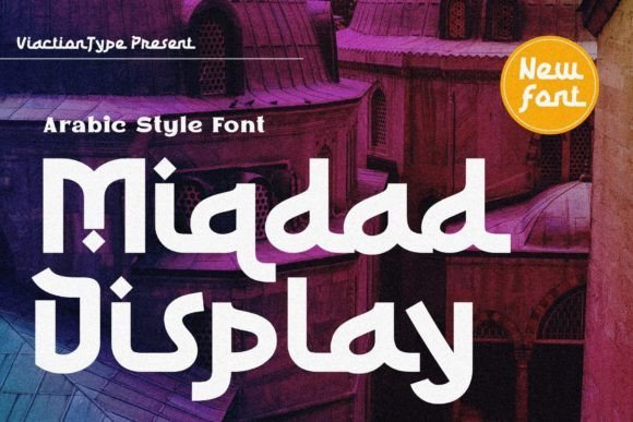
Miqdad is a refined Arabic display face that reinterprets classical letterforms through restrained geometry and modern spacing. The type retains calligraphic rhythm-subtle contrast between thick and thin strokes-while simplifying shapes for clearer reproduction on screens. Its balanced x-height and hinting make it particularly reliable for digital headlines and editorial covers.
Under the hood, Miqdad provides essential OpenType features such as contextual alternates and discretionary ligatures, along with robust diacritic placement for typographic fidelity across Arabic scripts. The restrained ornamentation and neutral terminals make it an excellent partner to contemporary Latin sans-serifs in bilingual branding. Precision in kerning and modular shapes also helps it scale cleanly from print to retina displays.
Choose Miqdad when you want the authority of traditional calligraphy without ornate decoration-corporate identities, boutique packaging, and magazine mastheads benefit from its poised demeanor. It’s engineered to preserve legibility at medium to large sizes and to perform in both web and print environments. For projects that require a marriage of heritage and restraint, Miqdad delivers a versatile, unobtrusive voice.
My Recommendation: I pick Miqdad for projects that need a dignified, contemporary Arabic display without decorative excess-editorial spreads, premium labels, and wayfinding. Its clean letterforms make bilingual composition straightforward and its OpenType tools simplify typesetting. It’s my go-to when I want cultural resonance delivered with modern clarity.
18. Sharma Font
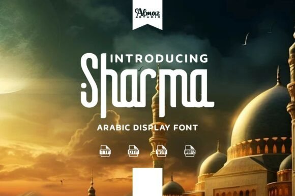
Sharma presents tall, elongated letterforms that combine Middle Eastern ornamentation with crisp, contemporary proportions. The smooth curves and slender terminals create an airy vertical rhythm that reads elegantly at headline sizes while remaining legible. Thoughtful negative-space treatment keeps the letter shapes distinct even when used in decorative compositions.
Feature-wise, Sharma includes alternate glyphs and contextual joining behaviors to produce harmonious word shapes and tasteful swashes for ornamental headlines. Diacritics are precisely aligned, which is particularly important for religious or culturally sensitive materials that demand typographic accuracy. It behaves predictably across print and digital formats, and pairs well with classic serif Latin faces for premium packaging and event identities.
Sharma excels on invitations, cultural program posters, and upscale product labels where a refined, regionally inspired look is required. Although striking at display sizes, its measured spacing prevents short blocks of copy from feeling crowded-it’s not intended for body text. When you need a polished and authentic headline voice with tunable ornamentation, Sharma strikes a confident balance.
My Recommendation: I reach for Sharma when designing upscale event collateral or artisan packaging because its vertical elegance immediately signals quality. The alternate glyphs let me add flair without overwhelming the layout, and the reliable diacritic work gives peace of mind in formal contexts. Use it for headlines and short inscriptions where beauty and legibility must coexist.
19. Almalik Font
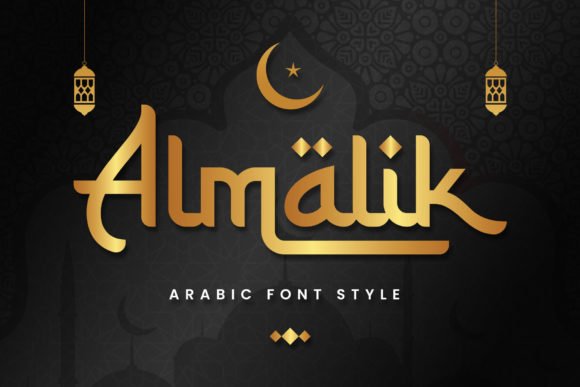
Almalik reimagines Arabic letterforms as a monoline display face that bridges Middle Eastern motifs and contemporary Latin typography. Its restrained calligraphic cues and playful swashes give headlines a distinct regional character without relying on heavy traditional flourishes; as part of broader Arabic typography fonts this design reads modern and approachable while retaining cultural resonance.
The font shines at large sizes where its dynamic swashes and stylized alternates can command attention-think fashion editorials, gourmet packaging, boutique logos, and striking poster headlines. Designers will appreciate that Almalik is PUA‑encoded, so accessing decorative glyphs, context‑sensitive swashes, and alternates is straightforward in most layout apps.
Technically, Almalik balances open counters and even stroke widths so it scales cleanly from print to web. For best results pair it with a neutral geometric sans for body text, reserve the ornate glyphs for display elements, and experiment with metallic inks or embossing to emphasize its ornamental strokes.
My Recommendation: I’d reach for Almalik when a project needs a contemporary Middle Eastern voice without heavy calligraphy-perfect for boutique brands, packaging, and lifestyle editorials. Its PUA glyphs make creative typographic treatments fast to deploy, and the monoline construction keeps it versatile across media. Use it as a headline instrument paired with a clean sans to balance ornamentation and readability.
20. Rahila Arabic Font
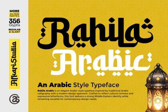
Rahila Arabic draws clear inspiration from classical calligraphy but reinterprets it for contemporary layout work, offering expressive letterforms that feel both ceremonial and fresh. The typeface emphasizes rhythm and cultural authenticity, giving designers a typographic voice that communicates heritage without feeling dated.
Its decorative shapes and elegant terminals make Rahila especially effective for high‑impact identity work-wedding stationery, book covers, cultural event posters, and artisanal product branding all benefit from its refined presence. The contrasted strokes create a tactile impression in print while translating well to web headings and hero imagery.
Accessible OpenType features and PUA encoding ensure the stylistic alternates and ornamental glyphs are easy to use in common design software. For composition, use Rahila at display sizes and pair it with a restrained serif or modern sans to maintain hierarchy and avoid visual clutter.
╰┈➤ Download Rahila Arabic Font
My Recommendation: I recommend Rahila Arabic when a project needs tasteful cultural expression-it’s a go‑to for invitations, editorial spreads, and boutique branding. The decorative alternatives add personality without sacrificing legibility, and PUA access speeds up production. Use it as the centerpiece of a visual identity and complement it with simple supporting type for balance.
21. Soraith Regular Font
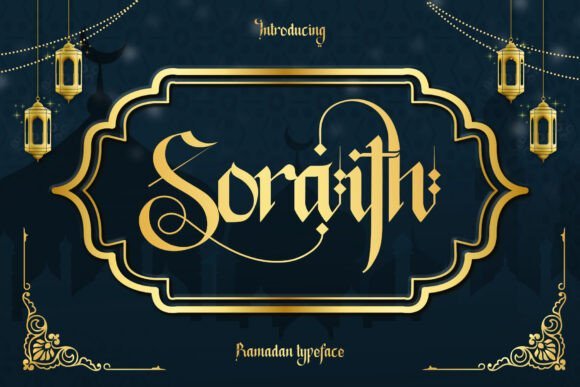
Soraith Regular is a bold blackletter interpretation informed by Arabic calligraphic forms and Islamic ornamentation, resulting in a dramatic, ceremonial display face. Its heavy strokes, angular terminals, and ornamental ligatures create a strong visual signature that immediately evokes festive and spiritual contexts.
Built with Ramadan and Eid applications in mind, Soraith offers alternates and rich stylistic sets that let you craft bespoke headlines, greeting cards, mosque signage, and heritage packaging. The intricate ligatures and decorative fills work best at large sizes where their complexity can be appreciated and not lost to compression or small-format reproduction.
For practical use, throttle the ornamental sets to preserve legibility and rely on high‑contrast colors or texture to enhance the blackletter aesthetic. Pair Soraith with a highly legible sans for supporting copy, and consider embossed printing or foil to amplify its handcrafted, ornamental quality.
╰┈➤ Download Soraith Regular Font
My Recommendation: I would choose Soraith Regular for projects that demand a bold, cultural statement-seasonal greetings, religious events, and premium packaging are ideal. Its alternates and ligatures let you customize typographic expressions while its weight ensures presence in any composition. Keep it large and spare in application, pairing it with a simple sans to preserve clarity.
22. Syafinela Font
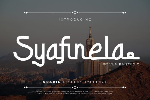
Syafinela is an elegant script that marries classical Arabic calligraphy with contemporary typographic rigour. Its graceful curves and refined terminals echo traditional pen-stroke movement while OpenType contextual alternates and ligature sets ensure a natural, flowing rhythm across words.
The face shows careful attention to diacritic placement and baseline flow, which improves legibility in both display and short editorial settings. Designers will appreciate the balanced contrast between thick and thin strokes, subtle counters, and thoughtful kerning that preserve the aesthetic even at smaller sizes.
Technically, Syafinela supports robust glyph coverage and modern layout features, making it a good candidate for webfont deployment and print reproduction. As part of a toolset of Arabic typography fonts, it brings a refined, high-end voice suitable for branding, invitations, and formal editorial compositions.
My Recommendation: I would reach for Syafinela when a project needs a dignified Arabic voice-luxury packaging, wedding invitations, or premium editorial headlines. Its calligraphic feel reads as traditional without feeling dated, and the OpenType niceties make composition fast and precise. Use it sparingly as a headline or logotype paired with a neutral sans for body copy.
23. Ramadhan Font
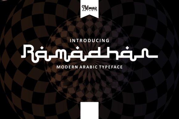
Ramadhan is a decorative display typeface inspired by Islamic aesthetics and the formal structure of Hijaiyah letterforms. Drawn with a digital flat-pen approach and gothic-influenced terminals, this font projects a bold, graphic identity built for posters, covers, and strong brand marks.
The design emphasizes geometric rhythm and dramatic strokes, creating high impact in large sizes while relying on distinctive letter shapes rather than subtle typographic nuance. It handles decorative ligatures and stylized endpoints well, but it’s not intended for continuous text – its power comes from display use where form and symbolism matter.
Practical considerations include pairing Ramadhan with a clean, low-contrast sans for body copy, and testing diacritic legibility on colored backgrounds. This typeface excels when you want cultural resonance and visual confidence for festival branding, editorial covers, or merchandise graphics.
My Recommendation: I’d choose Ramadhan for projects that require strong cultural character-event posters, Ramadan campaign visuals, or apparel graphics-where decorative form is more important than extended reading. It brings immediate presence and ceremonial tone, but pair it with simple text faces to preserve readability in longer copy. Use it at display sizes to maximize its ornamental strengths.
24. Sakinah Font
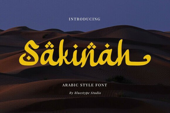
Sakinah is a calm, flowing Arabic-style script that translates the idea of serenity into letterforms. With long, smooth strokes and gentle terminals, the typeface evokes a sense of balance and ease, making it especially apt for lifestyle, wellness, and hospitality branding.
The font’s low contrast and generous spacing create an airy feeling on the page, while discretionary ligatures and swash options add subtle flourish where you want it. Attention to diacritic positioning and contextual forms ensures the script remains readable, even when used as a headline or on product labels.
Designed for contemporary typographic workflows, Sakinah adapts well to both print and screen, and pairs beautifully with understated serif or neutral sans companions. It’s a confident yet understated choice when the brief calls for elegance without ostentation.
My Recommendation: I would use Sakinah for brands that need a soothing, elegant tone-spa identities, boutique packaging, or lifestyle editorials. Its flowing forms convey warmth and approachability while still holding up in professional layouts. Pair it with minimal supporting type and let its swashes appear sparingly for the best effect.
25. Raisyar Font
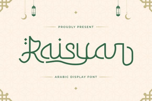
Raisyar is a refined Arabic display typeface that marries the fluidity of hand-lettered calligraphy with the precision of modern type design. As part of the conversation about Arabic typography fonts, Raisyar distinguishes itself through balanced counters and subtly tapered strokes that read beautifully at larger sizes.
Technically, Raisyar includes thoughtful OpenType features – contextual alternates, discretionary ligatures, and full diacritic support – so typographic nuance remains intact across headings, captions, and logos. Its moderate contrast and open joins keep letter shapes legible while preserving an artisanal personality.
Because of its expressive yet disciplined letterforms, Raisyar excels in identity work, luxury packaging, editorial mastheads, and event collateral where cultural resonance matters. It pairs well with clean geometric Latin sans for bilingual layouts, and its display-focused rhythm makes it ideal for impactful headline use.
My Recommendation: I’d reach for Raisyar when a project needs an elevated Arabic headline with authentic calligraphic flavor-particularly for premium brands, magazines, or hospitality signage. Its OpenType capabilities let you tune the voice of the type for varying formality, and the design scales well in print and large-format digital. Use Raisyar when you want cultural depth that still reads contemporary.
26. Haejrah Font
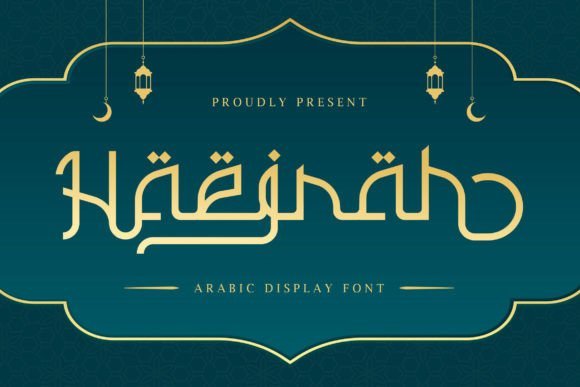
Haejrah presents a contemporary take on classical Arabic letterforms, balancing ornate strokes with deliberate whitespace. Its elegant calligraphic rhythm gives each word a sculptural quality, ideal for designs that require a ceremonious or literary tone without becoming ornate for ornament’s sake.
Built with practical typography in mind, Haejrah supports a wide range of diacritics and contextual shaping, and its set of ligatures produces smoother word connections at larger sizes. The stroke modulation is subtle rather than dramatic, which preserves legibility on posters and covers while retaining a handcrafted appearance.
Use Haejrah in editorial spreads, book covers, cultural branding, and exhibition signage where a refined script voice is needed. For bilingual layouts, consider pairing it with a minimal serif or humanist sans to let the Arabic script remain the visual anchor without competing textures.
My Recommendation: I recommend Haejrah for projects that demand a classical sensibility with modern restraint-think museum identities, poetic book covers, or boutique branding. Its controlled flourish works well in display roles where readability and dignity are both priorities. It’s a go-to when you want authenticity without excessive decoration.
27. The Ramadhan Font
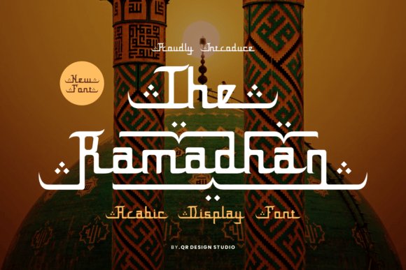
The Ramadhan is a decorative display font inspired by festive and ceremonial Arabic calligraphic traditions, featuring sweeping curves and ornamental terminals that evoke celebration and formality. Its silhouette leans into a warm, embellished aesthetic that makes headlines feel ritualistic and memorable.
On the technical side, The Ramadhan offers alternate glyphs and ornamental swashes to create varied compositions, plus robust diacritic placement for correct script rendering. Because its forms are highly stylized, the face performs best at display sizes where the decorative detail can be appreciated.
This design shines for wedding invitations, seasonal campaigns, mosque event posters, and packaging for artisanal goods where a decorative, cultural touch is needed. When combining with Latin text, use restrained, neutral typefaces to avoid visual competition and let The Ramadhan be the focal point.
╰┈➤ Download The Ramadhan Font
My Recommendation: I’d choose The Ramadhan for projects celebrating heritage or ritual-weddings, holiday promotions, or cultural festivals-where ornament and ceremony are part of the message. The ornamental alternates let you craft bespoke headlines, and the dramatic forms create instant recognition. Use it sparingly as a headline or logo element to maximize impact without overwhelming body copy.
28. Tawbah Font
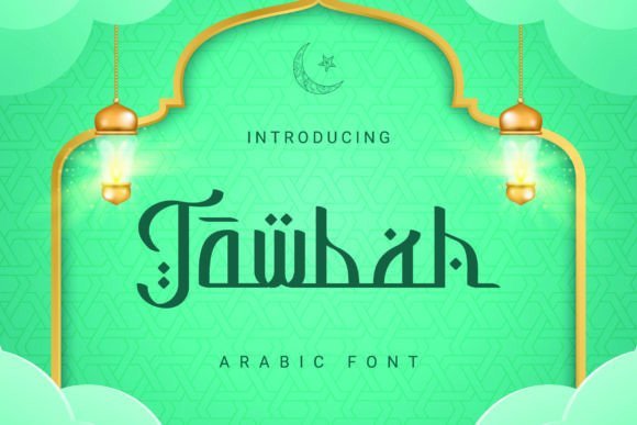
Tawbah is a refined display typeface that threads classical Arabic calligraphic gestures into a contemporary letterform system. Among contemporary Arabic typography fonts, Tawbah stands out for its elegant transitions between thick and thin strokes, carefully crafted terminals, and attention to contextual joins that give text a flowing, handwritten quality.
Under the hood, Tawbah delivers practical OpenType features – smart ligatures, contextual alternates, and well-tuned kerning – which make long words read naturally while preserving ornamental details. Its diacritic placement is thoughtful, so headlines and logotypes keep visual balance without sacrificing readability.
Visually, Tawbah feels at home on wedding invitations, premium packaging, and editorial mastheads where cultural authenticity matters as much as aesthetic clarity. Use it with a neutral sans for body copy to highlight its calligraphic character, or let it carry short brand names and signage where its sculpted forms can breathe.
My Recommendation: I recommend Tawbah when a project needs the gravitas of traditional Arabic calligraphy but also modern usability. It’s ideal for high-end branding, stationery, or cultural events where refined letter connections and elegant alternates elevate the design. I’d pair it with a simple sans serif for body text to keep layouts contemporary while letting Tawbah shine in headlines and logos.
29. Jasmine Script Font
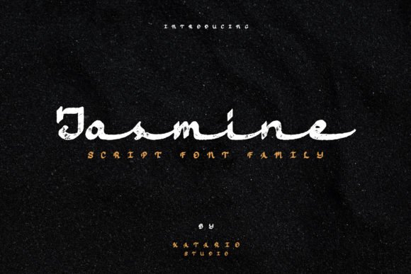
Jasmine Script is a graceful monoline script that channels the rhythmic movement of Arabic-inspired lettering without replicating historic forms. Its steady stroke width and airy counters create a friendly, approachable tone that reads beautifully at display sizes and in short wordmarks.
Designed for visual charm rather than heavy text setting, Jasmine Script excels in contexts like boutique logos, product labels, and greeting cards where personality matters. The smooth joins and playful swashes give designers quick access to a handcrafted feel while remaining versatile across print and digital outputs.
Because of its monoline nature, Jasmine performs well in embossing, foil, and laser-cut applications where clean, continuous strokes reproduce reliably. Pair it with a geometric sans for contrast or with minimal textures when you want the script to act as the primary visual motif in a composition.
╰┈➤ Download Jasmine Script Font
My Recommendation: I’d reach for Jasmine Script when a brand needs a warm, artisanal voice that hints at Arabic calligraphic influence without literal mimicry. It’s perfect for independent labels, invitation suites, and hero headlines that want charm and clarity. Use it sparingly as a display element to preserve legibility and impact.
30. Alami Font
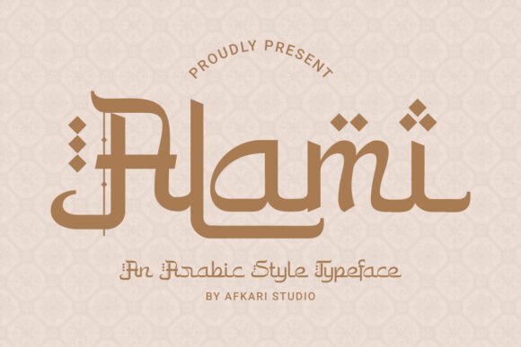
Alami is a contemporary Arabic display typeface that marries the soft rhythm of traditional scripts with streamlined modern proportions. Its letterforms retain classic calligraphic cues-subtle curves and tapered strokes-while adopting a cleaner axis and spacing suited for today’s visual systems.
Functionally, Alami adapts well to seasonal and cultural campaigns, from Ramadan and Eid graphics to halal food branding and boutique packaging. Its clarity at medium and large sizes makes it a go-to for posters, social posts, and product fronts where authenticity and legibility must coexist.
For bilingual identities, Alami pairs naturally with modern Latin sans-serifs; the combination keeps the tone warm and trustworthy without appearing decorative. The font’s balanced contrast and thoughtful diacritic handling also make it reliable for editorial headers and on-screen interfaces that demand cultural nuance with contemporary appeal.
My Recommendation: I’d choose Alami for projects that need a modern take on Arabic tradition-think seasonal branding, food packaging, or cultural event materials. It offers the right mix of readability and heritage, so it feels authentic without feeling old-fashioned. Pair it with a neutral sans for body text and let Alami lead in headlines and product names.
Choosing the right Arabic typeface transforms how content is perceived – improving legibility, tone, and cultural resonance across digital and print experiences.
Use the selection above as a starting point: try font pairings, test sizes and weights in context, and check licenses before committing to production.
With these 30 options, you’ll have a versatile toolkit to craft compelling Arabic-language designs throughout 2026 and beyond.