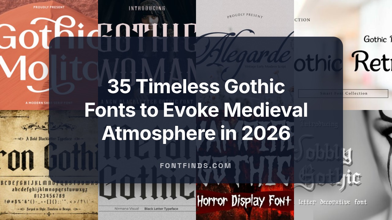
35 Timeless Gothic Fonts to Evoke Medieval Atmosphere in 2026
Gothic Fonts are more than decorative lettering – they bring centuries of texture and a distinct, brooding personality to contemporary design. Whether you’re exploring blackletter, Fraktur, or Old English variants, these typefaces can lend editorial spreads, posters, and specialty packaging an instantly immersive, period-infused feel.
In this guide you’ll find 35 carefully selected styles with notes on pairing, legibility, and licensing so you can pick the right gothic typeface for logos, headlines, or display work. Expect practical tips for modern use, from contrast and spacing to combining ornate capitals with clean sans serifs.
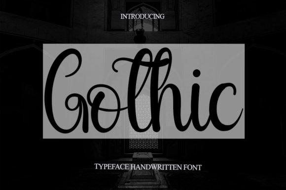
1. Wobbly Gothic Font
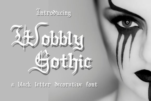
Wobbly Gothic arrives with a deliberately irregular silhouette that modernizes traditional blackletter forms. Wobbly strokes and slightly askew serifs give the face an artisanal, hand-forged personality that reads as both ceremonial and playful; it comfortably sits alongside other Gothic Fonts and instantly sets a dramatic tone for display work.
Despite its ornamental edge, the letterforms retain surprising clarity at headline sizes thanks to open counters and careful contrast. Kerning is tuned for bold words and logotypes, and the font’s distinctive shapes reward tight tracking and generous leading rather than long paragraphs.
Use Wobbly Gothic to craft album art, boutique branding, posters, and merchandise where character matters more than neutrality. Pair it with a neutral geometric sans for body copy and consider textured backgrounds or foil stamping to emphasize its handcrafted aesthetic; avoid small-body use where the details will be lost.
╰┈➤ Download Wobbly Gothic Font
My Recommendation: I’d reach for Wobbly Gothic when a project needs personality that feels handcrafted but still authoritative. Its quirky yet legible letterforms are perfect for boutique labels, statement posters, or apparel logos. I love it when a design needs drama without becoming unreadable-this font strikes that balance.
2. Highborne Font
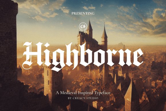
Highborne Font channels the grandeur of illuminated manuscripts with high-contrast strokes and ornate terminals that feel ceremonious rather than overwrought. The design leans into medieval heraldry-spiky arches and filigree-like alternates create a regal voice that commands attention on titles and short phrases.
Technically, Highborne is crafted for display: it includes a full uppercase and lowercase set, numerals, punctuation, and stylistic alternates to build layered typographic marks. OpenType features like swashes and contextual alternates let you sculpt words into badges or logotypes without composing each glyph manually.
Highborne shines on music covers, fantasy and historical book titles, boutique apparel, and event posters where atmosphere is the primary storytelling tool. I recommend pairing it with subtle textures, restrained color palettes, and minimal supporting typography to let its ornate contours remain the focal point.
My Recommendation: I would choose Highborne when I want an air of classic nobility and theatrical drama in headlines or logos. Its alternates make it flexible for bespoke marks, and its rich shapes translate well to print and large-format graphics. Use it for projects that benefit from a ceremonial, story-driven voice rather than clean, modern neutrality.
3. Ragnar Gothic Font
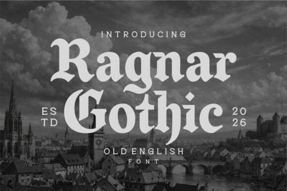
Ragnar Gothic blends Old English swagger with streamlined, contemporary proportions to deliver a typeface that feels both historic and current. The sturdy verticals and bold terminals give the face strong presence, while slightly softened strokes preserve readability for modern branding and packaging applications.
Built as a display-first design, Ragnar Gothic performs best at headline sizes and on merchandise where its weight can anchor a composition. It handles tight tracking well, and the consistent stroke contrast ensures it remains legible on dark backgrounds and textured surfaces common in streetwear and craft-beer labels.
Use Ragnar Gothic for identities that need a burly, timeless attitude-think heavy-metal album art, urban apparel, or brewery logos. Pair it with minimalist sans-serif bodies to avoid visual competition, and reserve its use for short words or initials rather than long copy to keep the message crisp and impactful.
╰┈➤ Download Ragnar Gothic Font
My Recommendation: I’d pick Ragnar Gothic for projects that demand toughness with a nod to heritage-perfect for streetwear brands, labels, and bold editorial headlines. Its modernized Old English forms give a memorable silhouette that reads well across print and apparel. It’s a go-to when you want a typeface with attitude but without sacrificing clarity.
4. Noctura Gothic Font
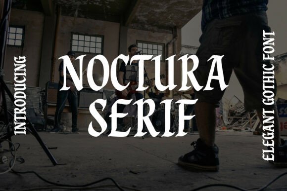
Noctura Gothic unfolds like a modern relic: high-contrast serifs and dramatic terminals give it the cathedral-scale presence of old blackletter but with contemporary proportions. The letterforms balance carved, medieval textures against clean counters, creating a display face that reads as both ornate and disciplined. Designers will notice its refined capitals and decorative tail ligatures that feel consciously historic without tipping into pastiche.
If you curate a set of Gothic Fonts , Noctura is the piece that anchors dark, cinematic compositions-its weight and stroke variation carry headlines, poster tags, and album covers with theatrical authority. At large sizes its ornamentation sings; at tighter tracking it still retains character thanks to careful spacing and robust shapes. OpenType alternates and stylistic sets let you dial the drama up or down depending on context.
Technically, Noctura performs best as a display face: crisp at print resolutions and forgiving on high-density screens, it pairs well with simple sans-serifs or restrained scripts to avoid visual competition. Use it for fashion editorials, craft labels, or fantasy cover art where you need an immediate, bold impression. Its decorative sensibility makes it ideal when a design must feel both luxurious and a touch foreboding.
╰┈➤ Download Noctura Gothic Font
My Recommendation: I’d reach for Noctura when a project needs theatrical gravitas-think limited-edition streetwear drops, dark fantasy covers, or boutique brewery labels. Its carved details and alternates give you expressive headline options while remaining surprisingly versatile. Use it sparingly as a focal display face and pair it with neutral body text to let its ornamentation breathe.
5. Demons Gothic Font
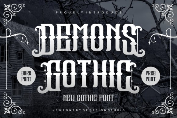
Demons Gothic is unapologetically bold: thick strokes, sharp angular terminals, and condensed blackletter forms deliver an aggressive visual voice suited to all things heavy and dramatic. The typeface leans into authenticity with textured edges and tightly packed letterspacing that recall traditional hand-cut wood type used in underground posters. Its overall silhouette reads instantly as classic blackletter yet engineered for modern compositions.
Beyond aesthetics, Demons Gothic’s PUA encoding unlocks an array of alternates and ligatures, making custom wordmarks and intricate headlines simple to compose. This accessibility of glyphs enables designers to craft unique logotypes or stacked poster headlines without manual glyph hunting. It excels for band artwork, sports emblems, and any branding that benefits from a raw, powerful identity.
Practically, the font adapts well to print and embroidery where bold shapes remain legible at distance; careful kerning and generous ink traps mean the forms stay decisive even when scaled. For balance, pair Demons Gothic with clean sans-serifs or subtle metallic textures to soften its intensity. It’s a go-to when a project needs visceral impact and unmistakable attitude.
╰┈➤ Download Demons Gothic Font
My Recommendation: I’d choose Demons Gothic for projects demanding punch and personality-album jackets, streetwear labels, or event posters where readability meets aggression. The PUA glyphs give me creative freedom to craft one-of-a-kind wordmarks without extra tooling. Use it as a headline or logo type and counterbalance with calm supporting type to avoid visual exhaustion.
6. Gothic Medium Font
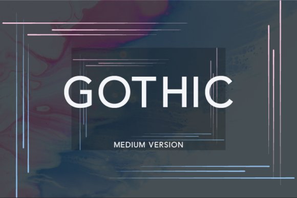
Gothic Medium is a modern sans serif built for clarity and compositional flexibility: its medium weight, balanced x-height, and unobtrusive terminals make it comfortable for both headings and denser body copy. The letterforms favor open counters and predictable shapes, which enhances legibility across screen sizes and print resolutions. This restraint gives the face a refined neutrality that still carries subtle character in its proportions.
Where Gothic Medium shines is in pairing: it provides a quiet backbone for expressive scripts or decorative display faces, allowing more ornate elements to shine without competing. Its consistent stroke width and even rhythm mean tight typographic hierarchies stay coherent, and the font responds well to letterspacing tweaks for typographic emphasis. Designers often use it in identity systems that require a dependable workhorse type.
Technically light on ornamentation but heavy on usability, this face performs well in UI text, editorial subheads, and product packaging where readability matters. If you need a single reliable weight for mockups or a neutral companion for more stylized typography, Gothic Medium covers those bases with minimal fuss and maximum clarity.
╰┈➤ Download Gothic Medium Font
My Recommendation: I recommend Gothic Medium when a project needs a calm, versatile sans that won’t steal attention from creative elements. It’s my pick for web interfaces, corporate branding, and editorial layouts where consistent legibility is paramount. Pair it with a decorative display or script to create contrast-Gothic Medium will keep the overall design readable and elegant.
7. Gothic Woman Font
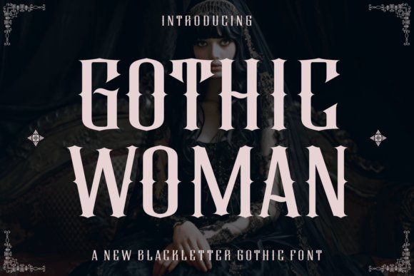
Gothic Woman is a tall, graceful blackletter that balances refined beauty with a hint of menace. Its elongated verticals and delicate serifs recall Victorian ornamentation, while the exaggerated contrast between thick strokes and filigreed terminals gives text a dramatic silhouette. Gothic Woman stands out among Gothic Fonts , bringing a couture sensibility to a traditionally rugged genre without losing the historical weight of blackletter forms.
Technically, this face benefits from thoughtful stroke modulation and carefully tuned kerning that keep tight letterforms readable at display sizes. Expect ornate alternates, swash capitals and discretionary ligatures that let you dial up decoration where needed; these OpenType features make it easy to craft bespoke headlines and logotypes. The attentive balance between heavy bows and hairline terminals preserves detail in foil, letterpress, and high-resolution print.
Use it where atmosphere matters: luxury goth brands, moody editorial spreads, theatrical posters, or mystical book covers that need refinement rather than pure shock value. Pair Gothic Woman with a restrained sans for body copy to avoid typographic competition, or set it against textured papers and metallic inks to accentuate its Victorian flair. Its presence is theatrical but controlled, ideal for projects that require both elegance and a darkly romantic edge.
╰┈➤ Download Gothic Woman Font
My Recommendation: I’d reach for Gothic Woman when a project needs high-fashion drama with historical depth-think boutique labels, limited-edition book jackets, or event posters. Its ornamental alternates let you create unique headlines without resorting to gimmicks, and the refined stroke contrast reads beautifully in print and high-res web. For any brief that wants gothic moodiness served with polish, this font is one of my first choices.
8. Gothic Garbage Font
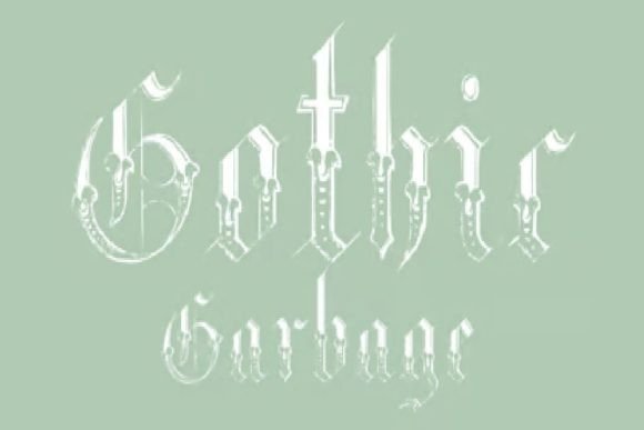
Gothic Garbage is a raw, grunge-inflected take on blackletter that deliberately embraces imperfection. Jagged terminals, fractured strokes and abrasive textures give each character a weathered, streetwise personality that feels immediacy-driven rather than archival. The result is a high-energy display face that reads as rebellious and visceral – perfect when you want type to feel lived-in and confrontational.
From a technical standpoint, this font shines at large scales where its distressed details matter; it sacrifices micro-legibility for visual attitude and should be treated as a headline-only choice. It often includes alternates and intentionally irregular baseline shapes to mimic hand-distressed lettering, so designers can vary phrases without repeating the same mark. The rough edges reproduce well on apparel prints, posters and album art, and can be enhanced with halftone textures, overlays, or photo backgrounds.
Pair Gothic Garbage with minimal, modern sans serifs to let its chaos take center stage, or combine it with gritty photographic elements for a DIY, punk aesthetic. Avoid using it for long copy or small UI elements; its power is in bold, uncivilized statements on merchandise, gig posters, zines, and streetwear branding. If you need attitude over polish, this design makes a loud, uncompromising impression.
╰┈➤ Download Gothic Garbage Font
My Recommendation: I’d use Gothic Garbage when a project calls for raw authenticity-album covers, punk flyers, or edgy streetwear labels-because it communicates rebellion instantly. Its distressed details give designs a tactile, hand-made feel that’s hard to fake with clean type. Just remember to reserve it for display work and pair it with calm, neutral elements so the overall layout doesn’t become visually noisy.
9. Gothic Regular Font
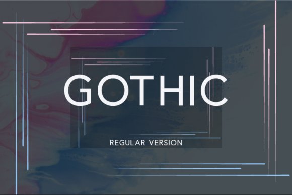
Gothic Regular is a clean, contemporary sans serif built for versatility. It blends neutral geometric shapes with slightly humanist proportions, making it comfortable for both headlines and compact body copy. The font’s unobtrusive character makes it an excellent workhorse for branding systems that need clarity without personality overload.
Technically, the face typically offers balanced x-height, consistent stroke widths and solid hinting, which improves readability on screens and small print sizes. Thoughtful spacing and reliable kerning pairs reduce micro-adjustments, so it’s efficient in editorial templates, UI components and signage. When paired with decorative scripts or historic blackletter accents, it provides a calm counterpoint that preserves hierarchy and legibility.
Use Gothic Regular for corporate identities, responsive web typography, and multipage documents where neutrality and performance are priorities. Its adaptability across mediums means you can trust it for packaging, presentation decks and interface text without fighting legibility. If you need a dependable sans that plays well with more expressive display faces, this is a pragmatic choice.
╰┈➤ Download Gothic Regular Font
My Recommendation: I recommend Gothic Regular whenever clarity and consistency are top priorities-brand systems, websites, and editorial layouts benefit most from its neutral tone. It pairs especially well with more dramatic display fonts because it won’t compete for attention. For projects needing a modern, readable sans that performs across print and digital, this font is a dependable go-to.
10. Gothic Retro Font
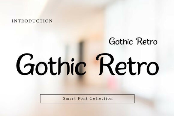
Gothic Retro is a bold retro-gothic display font that fuses classic blackletter curves with a warm, vintage bounce. Its chunky letterforms and pronounced contrast create an immediate presence on posters and packaging, while slightly whimsical terminals keep the mood approachable rather than austere. As a standout in any Gothic Fonts collection, this face balances nostalgic attitude with exceptional legibility at headline sizes.
For branding and album art, Gothic Retro excels where character matters: a tightly tracked logo, a dramatic poster header, or a tactile label on craft packaging. The type’s weighty silhouettes read well from a distance yet reveal subtle details up close, making it versatile for both print signage and scaled digital hero images. Pair it with a minimalist sans for body copy to maintain hierarchy and let the display letters breathe.
On the technical side, Gothic Retro is forgiving in typographic treatment: heavy stroke weight handles texture effects like distressing or foil without losing form, and its open counters avoid muddiness when reversed out of color blocks. Use oversized tracking and layered color to emphasize its retro charm, or keep it tight and monochrome for a more vintage press look. Overall, it’s a dramatic but friendly display type that carries both attitude and readability.
╰┈➤ Download Gothic Retro Font
My Recommendation: I’d reach for Gothic Retro when a project needs vintage personality without sacrificing clarity-think retro posters, boutique labels, or a memorable band logo. Its bold shapes make it ideal for large-format and attention-grabbing headers, while its warmth keeps designs from feeling too severe. Use it when you want old-school flair with modern usability.
11. Gothic Tea Party Dingbats Font
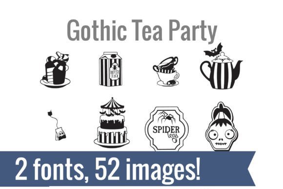
The Gothic Tea Party Dingbats bundle is a playful and eerie collection of hand-drawn glyphs that reads like a miniature illustrated set rather than a typical symbol font. Split into two complementary fonts, it offers 52 unique icons-from striped teapots and haunted teacups to bats and whimsical cake motifs-each drawn with a charmingly gothic sensibility. The artful irregularities give it a crafted, letterpress-friendly feel that works beautifully for tactile and sentimental projects.
This duo is especially handy for makers: drop a glyph into Cricut or Silhouette for vinyl cutting, stamp it in Procreate for surface pattern experiments, or layer it in Illustrator for packaging accents. Because the images are vector-friendly dingbats, they scale cleanly and stay consistent across stickers, invitations, and stationery sets. The immediate payoff is huge-install the font and type a character to produce a ready-made, cohesive icon.
Beyond Halloween, these dingbats lend themselves to any design that wants a quirky gothic twist, from boutique product labels to party collateral and planner stickers. The set saves time and asset costs by bundling dozens of matching illustrations in OTF and TTF formats, making it a practical choice for small studios and crafters. Use selective color, halftone textures, or cutline outlines to amplify the vintage-spooky aesthetic.
╰┈➤ Download Gothic Tea Party Dingbats Font
My Recommendation: I recommend this dingbat set if you need instant, cohesive gothic-themed graphics without hunting for separate clip art files. It’s perfect for Halloween stationery, quirky product packaging, or handmade craft projects where consistent iconography matters. The key-mapped format makes it fast to use across design and cutting apps, saving time while keeping your visuals unified.
12. Blackline Gothic Font
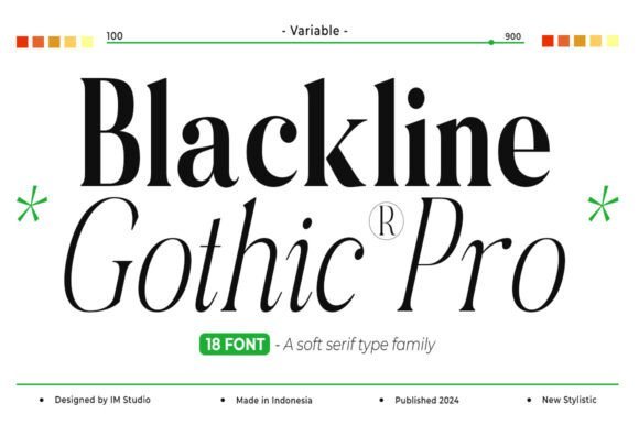
Blackline Gothic is a refined retro serif with pronounced contrast and a contemporary sensibility that elevates classic letterforms. Its sharp italics and clean hairlines give text an editorial polish suited to luxury branding and high-impact magazine layouts. Offered across a broad range of weights, this typeface provides designers with flexible typographic voice-from delicate subheads to commanding display headlines.
Where many revival serifs feel stiff, Blackline Gothic balances nostalgia with modern spacing and readable proportions, which makes it ideal for wedding suites, boutique identity systems, and posters that need an upscale edge. The face performs well in print applications that use foil, embossing, or spot varnish because its high-contrast strokes catch light and texture attractively. For extended copy, pair it with a neutral sans for comfortable reading while preserving the serif’s decorative role.
Technically, the family’s range of weights allows for nuanced hierarchy control-tight tracking and small caps for captions, heavier weights for logos and mastheads. Its crisp terminals and thoughtful kerning minimize optical collisions in all caps treatments, a plus for typographic logos. Blackline Gothic is a versatile, elegant choice when you want to fuse nostalgic charm with contemporary clarity.
╰┈➤ Download Blackline Gothic Font
My Recommendation: I’d choose Blackline Gothic for projects that demand a luxe, timeless look-editorial covers, premium packaging, or sophisticated brand systems. Its high contrast and range of weights let you craft nuanced hierarchies and tactile print effects. Use it when you want a serif that reads as both classic and modern, especially in upscale or nostalgia-leaning designs.
13. Vampire Gothic Font
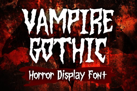
Vampire Gothic arrives as a theatrical, tongue-in-cheek display type that channels vintage horror posters, underground comics, and heavy metal album art. Its jagged terminals and exaggerated ink traps give headlines a sinister bite while retaining a playful energy, making it perfect for seasonal promos or brand moments that want a dramatic, tongue-in-cheek presence. In the context of Gothic Fonts , this design stands out because it balances legibility with theatrical ornament-letters remain readable at medium sizes while still feeling delightfully menacing.
The face includes alternate characters and exaggerated ligatures that let you dial the creep factor up or down; swap in decorative caps for logos and use the more restrained set for event listings or packaging. Kerning is tightened for headline use, and the heavy stems take color well on textured backgrounds like distressed paper or concrete-grit posters, so it photographs beautifully for merch mockups. Pair it with a neutral sans for body copy to avoid visual competition and let the display letters dominate the composition.
Practical use cases span from Halloween event posters and horror zines to band merch and themed greeting cards-any project that benefits from a bold, character-driven look. It’s not ideal for long blocks of text, but as a title or logotype it immediately communicates mood and subculture attitude. The font’s versatility in alternate forms and stark silhouettes gives designers a toolkit to craft both vintage horror vibes and modern, subversive statements.
╰┈➤ Download Vampire Gothic Font
My Recommendation: I’d reach for Vampire Gothic when I need an attention-grabbing headline that reads both eerie and fun-ideal for Halloween campaigns, band tees, or limited-edition packaging. Its alternates let me adjust tone quickly, and the strong silhouettes reproduce well on apparel and posters. Use it as the visual anchor and pair with a neutral body face to keep layouts clean.
14. Blacker Gothic Font
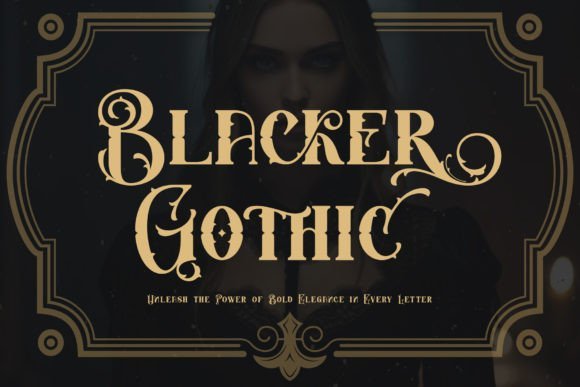
Blacker Gothic reinvents traditional blackletter with contemporary weight and purposeful contrast, offering a dramatic display face that feels both historic and fresh. The letterforms reference Fraktur and textura roots but are simplified in stroke endings and spacing to improve modern usability, which makes the family feel more forgiving in logo and packaging applications. Built-in swashes and contextual alternates-exposed through PUA encoding-give designers a rich palette of decorative options for headlines and badges without needing external ornament sets.
What separates this blackletter from crowded revivals is its attention to proportion: counters are opened just enough to keep short phrases legible at retail sizes, and its high-contrast stems produce striking silhouettes on labels and signage. It excels where heritage and attitude are desired-craft brews, boutique apparel, editorial mastheads, and boutique branding all benefit from its assertive rhythm. Use layered colors or foil to emphasize the letterform’s negative space for premium tactile effects.
For practical pairing, couple Blacker Gothic with a restrained serif or a neutral geometric sans for contrast and hierarchy. The PUA glyphs let you build marks and monograms quickly, and the overall design plays especially well when combined with textured papers or distressed printing techniques. It’s a robust choice when you need an ornate voice without sacrificing modern typesetting control.
╰┈➤ Download Blacker Gothic Font
My Recommendation: I’d pick Blacker Gothic for identity work where historical character must read as contemporary-think boutique packaging, editorial headers, or artisanal product labels. Its PUA extras save time and let you craft unique logotypes without custom lettering. Use it sparingly as a focal element and balance it with a simple supporting face to maintain clarity.
15. Alegarde Font
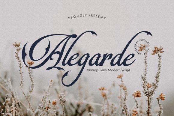
Alegarde Font is a refined script that merges copperplate elegance with subtle gothic-inspired spires at stroke terminals, producing a formal yet slightly edgy calligraphic voice. The graceful hairlines and controlled contrast make it well suited for invitations and identity touches where sophistication is key, while the small gothic flourishes add personality that keeps the style from feeling purely classical. Its rhythm and baseline flow produce convincing hand-lettered textures without the unpredictability of true handwriting fonts.
Opentype features like contextual alternates, discretionary ligatures, and swash capitals give designers the tools to create bespoke wordmarks and elegant nameplates, especially for wedding suites, stationery, and boutique branding. Because strokes remain legible at close viewing distances, Alegarde works for monograms and signage as well as printed invitations. The overall restraint in ornamentation means it pairs beautifully with minimalist layouts and soft color palettes.
When using Alegarde Font, allow generous leading to showcase its airy loops and avoid crowding the baseline with heavy decorative elements. It harmonizes particularly well with light serif bodies or clean sans serifs, letting the script act as the primary expressive accent. This font is a great option when you want formal charm with a touch of gothic personality without stepping into overtly dark or themed territory.
My Recommendation: I’d use Alegarde for premium stationery, wedding invitations, and boutique identity projects that need classic calligraphic grace with a subtle gothic edge. Its alternates and ligatures let me craft unique names or initials easily, and the restrained ornament keeps designs timeless. Pair it with simple supporting type and plenty of white space to let its details shine.
16. Iron Gothic Font
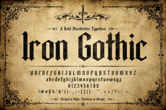
Iron Gothic is a commanding blackletter display that fuses hand-forged calligraphic gestures with contemporary structure. Iron Gothic sits among the finest Gothic Fonts in its ability to project authority without feeling overwrought: sharply cut terminals, strong vertical stems and a measured rhythm give each word a statuesque, crafted presence.
Technically, the face balances heavy weights with surprisingly open counters so it holds its texture at both large and medium display sizes; thoughtful kerning and alternate capitals make it flexible for headlines and logos. The design’s metallic austerity reads particularly well on textured stock, embossed labels, and engraved signage where its chiselled strokes can catch light and shadow.
For practical use, Iron Gothic pairs best with neutral sans-serifs or restrained serif text faces to avoid competing ornamentation, and it performs beautifully in one-color brand marks or monochrome editorial mastheads. Use it where you need a sense of artisanal heritage and modern precision: craft spirits, boutique packaging, tavern signage, or any identity that needs to feel robust and refined.
My Recommendation: I’d reach for Iron Gothic when a project demands both gravitas and clean execution-think small-batch whiskey labels, heritage restaurant signage, or bold editorial headers. Its crisp strokes and structured rhythm make it legible in display sizes while still conveying a handcrafted pedigree. Use it sparingly as a headline or logo element paired with a simple text face to let its character breathe.
17. Antique Gothic Font
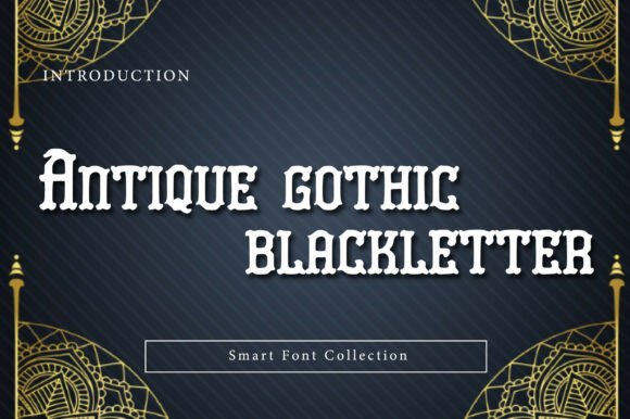
Antique Gothic is a decorative blackletter that leans into medieval ornamentation with confident, angular strokes and pronounced vertical rhythm. The type’s ornate terminals and lively contrast create a dramatic visual presence that immediately signals vintage authority and ceremonial flair.
This face shines in display roles-logos, posters, album covers and headline treatments-where its historical references can dominate the composition without losing personality. It offers stylistic alternates and flourishes that let designers tune the level of ornamentation from restrained to overtly baroque.
Because Antique Gothic is highly textured, it’s best used at larger sizes and in high-contrast settings; reduce complexity when reproducing on small-scale items or low-resolution screens. Pair with minimalist layouts, generous negative space, and muted palettes to let the type’s intricate forms read clearly while maintaining a retro or gothic aesthetic.
╰┈➤ Download Antique Gothic Font
My Recommendation: I recommend Antique Gothic for projects that want theatrical vintage energy-album art, event posters, craft beer labels, or fashion editorials. Its decorative details give instant period voice while alternates let you dial ornamentation up or down. Use it as the primary display type in bold, high-contrast compositions and avoid small-body text to preserve clarity.
18. Gothic Fonts Gothic Fiction Font
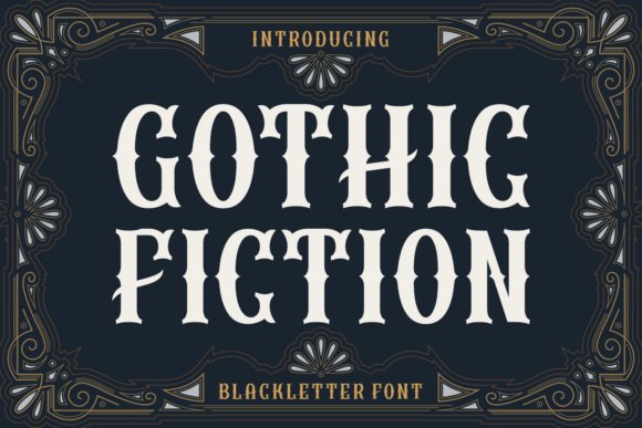
Gothic Fiction channels a romantic, storybook sensibility within a blackletter framework, offering elegant swashes and refined counters that evoke candlelit manuscripts and cinematic drama. The letterforms blend ornamental flourishes with tight vertical stress, giving a theatrical but readable silhouette that suits narrative-driven identities.
Designed for expressive applications, Gothic Fiction works beautifully on book covers, branding for boutique fashion lines, posters, and tattoo-inspired artwork where mood and atmosphere matter. Its alternates and discretionary ligatures let you tailor the tone from subtly historic to boldly ornate without redesigning the core alphabet.
In practical settings, use Gothic Fiction for focal headlines and decorative words rather than long paragraphs; it performs best in print and high-resolution digital artwork where its fine details can render faithfully. Combine it with subdued color palettes and modern sans type for contrast, and lean on generous spacing to ensure each ornamental gesture reads clearly.
╰┈➤ Download Gothic Fonts Gothic Fiction Font
My Recommendation: I’d pick Gothic Fiction when I need a typeface that tells a visual story-perfect for book covers, couture branding, or evocative poster work. Its mix of ornament and legibility makes it versatile for mood-driven projects, and the ligatures let you customize personality quickly. Use it as a display star and balance it with clean supporting typography.
19. Darkmode – Horror Gothic Typeface Font
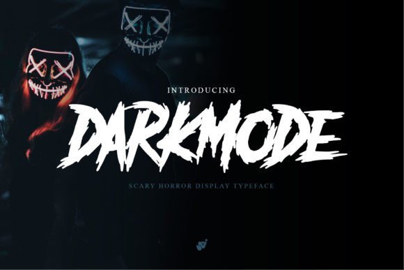
Darkmode channels the raw energy of protest posters and midnight horror cinema into a hand-brushed blackletter hybrid that feels immediate and volatile. Its rough brush textures and ragged terminals give letterforms a lived-in, spontaneous quality – perfect when you need typography that screams urgency and mood. If you’re curating a set of Gothic Fonts to evoke unease and visceral impact, Darkmode is an attention-grabbing choice that reads as both handmade and cinematic.
On a technical level, the face leans into heavy display treatment: exaggerated contrasts, irregular baselines, and some contextual alternates that mimic quick ink strokes. It performs best at headline scale where those bristled edges and ink splatters resolve crisply; at smaller sizes the distressed details can collapse, so plan for bold, short copy. Pair it with a minimal geometric sans to let the texture pop without competing for visual weight.
Use cases range from album art and horror movie titles to edgy apparel and event posters where atmosphere matters more than long-form readability. The font’s hand-drawn character reacts beautifully to duotone gradients, high-contrast black-and-white compositions, and gritty halftone overlays, turning ordinary layouts into instantly cinematic pieces. For printed merch or stickers, consider adding a subtle drop shadow or outline to preserve the emotion of the brush strokes.
╰┈➤ Download Darkmode – Horror Gothic Typeface Font
My Recommendation: I’d reach for Darkmode when I need typography that looks like it was painted in panic – excellent for horror promos, protest-themed artwork, and band identities. Its messy brush detail creates a strong emotional pull that’s hard to fake with clean letterforms. Use it for short headlines or covers where atmosphere outweighs legibility, and always pair it with a neutral sans to keep compositions grounded.
20. Gothic Vampire Font
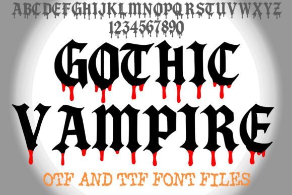
Gothic Vampire is a theatrical blackletter display designed to dramatize dark narratives. Its sharp, high-contrast strokes recall medieval calligraphy while stylized drips and tapered terminals inject a macabre, horror-oriented flourish that immediately sets a spooky tone. This font reads as costume jewelry for headlines – ornate, dramatic, and impossible to ignore.
The family ships in OTF and TTF, and it’s optimized for large format use: tightened kerning and bold counters make letters lock together into a cohesive, textured block when used at poster scale. Designers will appreciate how the dripped terminals act like built-in ornamentation, obviating the need for heavy graphical embellishments. For depth, layer the font over faint grunge textures or use a subtle bevel to suggest wet ink.
Best suited for seasonal campaigns, horror event posters, gothic apparel, and book covers that need an instant historical or supernatural vibe. Avoid long passages of text – this face shines in short headlines, logotypes, and merch where its decorative elements become the focal point. When color-testing, deep crimsons and desaturated blacks maximize the vampiric aesthetic.
╰┈➤ Download Gothic Vampire Font
My Recommendation: I recommend Gothic Vampire when you want a display font that reads like a scene-setter rather than supporting copy – it’s perfect for Halloween promotions, gothic branding, and band merch. Its dramatic ornamentation creates atmosphere without extra graphic work, saving time in layout. Use it sparingly for titles and logos where you need strong, thematic impact.
21. Gothic Font
Gothic is a bold, handwritten display typeface built to command attention. With heavy strokes, confident curves, and a sportive slant, it injects energetic personality into any headline or logo. The overall effect is athletic and modern – a great choice when you want typography that carries motion and attitude.
Technically, the glyphs favor wide counters and condensed spacing, which helps the font read as compact and powerful even at modest sizes. It supports dynamic ligatures and alternate forms to avoid repetitiveness in blocky headlines, and the clean edges make it versatile for both print and pixel environments. For optimal results, reserve it for titles, packaging, and branded elements rather than dense body copy.
Pair Gothic with a thin geometric sans or a muted slab serif to balance its visual force; use high-contrast color combinations for sportswear, movie posters, or game covers to amplify its energetic tone. It also performs well on jersey graphics and merchandise where bold presence and legibility from a distance matter. Avoid overly busy backgrounds to let its bold strokes remain legible and impactful.
My Recommendation: I’d pick Gothic for projects that need bold, athletic typography – think sports branding, poster headlines, and game or movie titles. Its confident strokes deliver instant visual hierarchy and work well on merchandise and signage. Use it for short bursts of copy and combine it with minimalist supporting fonts to keep layouts clear and powerful.
22. Gothic Light Font
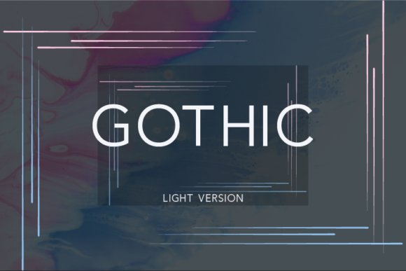
Within the broader family of Gothic Fonts , Gothic Light is a refined sans serif that marries modern minimalism with subtle humanist warmth. The letterforms show a tall x‑height, restrained stroke contrast, and generous counters that help it read crisply at both headline sizes and in compact body text. Its clean terminals and modest modulation make for a contemporary voice that won’t overpower companion scripts or decorative display faces.
Gothic Light thrives when you need neutral elegance with a dash of personality. It pairs beautifully with handwritten scripts and expressive swashes, providing visual hierarchy without competing for attention. Designers will appreciate how its even rhythm and predictable kerning simplify layout decisions across branding, editorial spreads, UI elements, and packaging.
From a technical standpoint the typeface balances style and function: spacing is tuned for legibility, and the open shapes resist clogging on small screens or print. Use it for identity systems where clarity is essential but a sterile geometric look is undesirable. In short, Gothic Light is a versatile, contemporary sans that reads as upscale yet approachable.
╰┈➤ Download Gothic Light Font
My Recommendation: I’d reach for Gothic Light when a project requires contemporary polish without being cold. Its legible forms and subtle warmth make it a go‑to for logos, informational brochures, and refined web interfaces. For me, it’s the safe but stylish choice when pairing with script headlines or textured backgrounds.
23. Cowboy Gothic Font
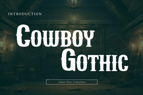
Cowboy Gothic is a bold display slab serif that channels frontier grit through heavy, blocky letterforms and decorative spurred terminals. The typeface leans into a nostalgic, Americana aesthetic by blending thick slab serifs with sharp, ornamental details that read as both rugged and refined. It’s designed to command attention on posters and signage where a strong, characterful presence is needed.
This font excels as a statement face rather than for continuous reading; its weight and ornamentation reward large-scale use in headlines, packaging, and event branding. Textures like distressed overlays, leather grain, or ink halftone work especially well to enhance its handcrafted feel. Think craft breweries, western-inspired apparel, or vintage product labels where authenticity and toughness are selling points.
Practical considerations: because of its dense forms, Cowboy Gothic benefits from increased tracking at very large sizes and careful color contrast to preserve detail. Use a neutral, simple body face alongside it to avoid visual competition. When treated with rugged color palettes and illustrative elements, it becomes a memorable anchor for heritage-driven identities.
╰┈➤ Download Cowboy Gothic Font
My Recommendation: I’d use Cowboy Gothic for projects that need bold personality and a sense of tradition-brewery labels, poster art, or a rustic shop identity. Its heavyweight forms deliver instant gravitas and work beautifully with distressed textures and illustration. Avoid overusing it in long copy; pair it with a clean sans for balance.
24. Gothic Molita Font
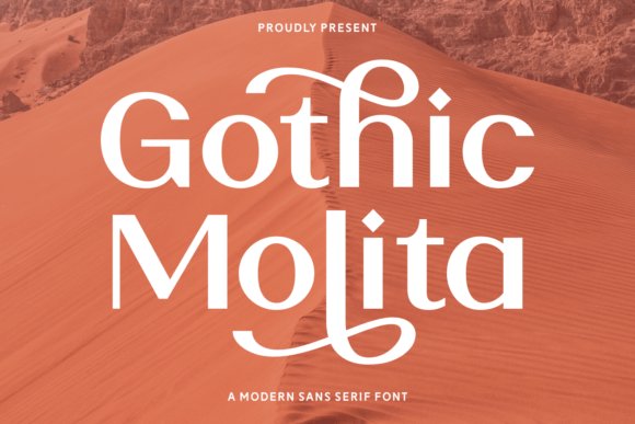
Gothic Molita is a decorative sans that stands out because of its elaborate ligatures and flowing swashes, lending a handcrafted, editorial flair to headlines. The typeface favors elegant connections and alternate characters, which makes it ideal for display treatments where ornamentation is part of the message. A warm, earthy color palette in its promotional art highlights how nicely it sits within late‑summer and autumnal branding.
Because of its abundant flourishes, Molita performs best in short-wordmark use or large display lines rather than dense paragraphs. The built-in alternates allow designers to craft bespoke combinations-perfect for seasonal packaging, event posters, or boutique identities that want an artisanal look. Pair it with a restrained, neutral body font to keep overall layouts readable and balanced.
On the technical side, expect a rich OpenType feature set: contextual alternates, discretionary ligatures, and stylistic sets that enable nuanced typographic control. When used sparingly, those features turn ordinary headlines into memorable, hand-tuned statements. It’s a strong choice when you want warmth and personality without abandoning modern sans proportions.
╰┈➤ Download Gothic Molita Font
My Recommendation: I’d recommend Gothic Molita for editorial covers, boutique packaging, or seasonal campaigns where ornamented type enhances storytelling. Its swashes and ligatures create bespoke moments that feel crafted rather than mass-produced. Use it selectively as a display face and pair it with a simple sans to let the decoration shine.
25. Gothic Byte Font
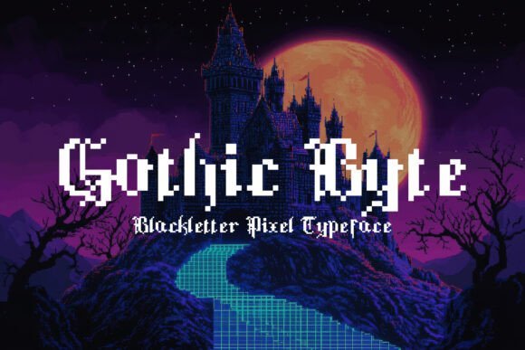
Gothic Byte reimagines classic blackletter calligraphy for pixel-era displays, merging the dramatic vertical strokes and pointed terminals of medieval scripts with rigid 8‑bit geometry. Each character is built from square blocks that preserve the feel of hand-cut letterforms while remaining legible on low-resolution screens. The result is a display typeface that reads simultaneously historic and digital, making it immediately eye-catching.
This font thrives in contexts that want retro flair with a gothic edge: indie video game titles, pixel-art UIs, posters, and themed website headers. Because it sits among other Gothic Fonts collections, it pairs well with neutral sans-serifs for body copy and with bitmap textures to amplify nostalgic authenticity. Kerning and hinting are optimized for pixel alignment so letters remain stable across screen sizes.
On the practical side, Gothic Byte often ships in multiple pixel-grid sizes and includes alternates for tighter compositions, so test at intended render sizes to retain its nib-like strokes in block form. Use duotone fills, subtle bevels, or metallic overlays to deepen the medieval mood without sacrificing clarity. It’s a niche, memorable choice when you want a headline that communicates both vintage gaming and historic gravitas.
My Recommendation: I recommend Gothic Byte when you want a headline that feels both archaic and arcade-ready-perfect for retro games, themed events, or nostalgic branding. Its pixel-grid construction gives logos and UI elements instant character while remaining legible at small sizes. Use it when the project needs playful historic gravitas rather than a literal manuscript reproduction.
26. Gothic Font
Gothic is a handwritten script that marries casual friendliness with refined letterform details, producing a warm, approachable voice. Gentle, tapered strokes and organic terminals give the typeface a hand-brushed texture rather than a mechanical finish, making text feel human and bespoke. Built-in alternates and ligatures add subtle variety that prevents repetition across longer lines.
This typeface excels on social media graphics, packaging for artisanal products, wedding invitations, and any project that benefits from a handcrafted tone. Its generous x-height improves readability in captions, and optional swashes let you dial up drama for headlines while keeping body text restrained. Though named Gothic, its spirit leans toward modern calligraphy rather than historic blackletter traditions.
Pair Gothic with clean sans-serifs to balance ornament and readability, or layer it over tactile paper textures to emphasize the artisanal aesthetic. The font supports common punctuation and accented characters, so it’s ready for web and print use without major fuss. For best results keep tracking light and line-height moderate to preserve the airy rhythm of the handwriting.
My Recommendation: I reach for Gothic when a design needs an authentic, hand-crafted voice-great for boutique brands, influencer content, and stationery. Its elegant but informal strokes add personality without overwhelming layouts. Reserve it mainly for titles and accent copy to preserve its charm and legibility.
27. Metal Gothic Font
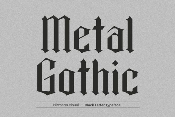
Metal Gothic is a forceful blackletter display typeface that fuses Old English forms with contemporary weight and presence. Bold verticals, pronounced serifs, and expressive ligatures produce a high-contrast silhouette that commands attention. The design balances ornamental heritage with a compact, modern footprint intended for large-format headlines.
It’s particularly effective for band identities, apparel graphics, brewery or distillery labels, and branding that wants a vintage-but-aggressive personality. Condensed capitals and dramatic terminals make it ideal for short text and logos, while distressing or metallic textures can intensify its rugged character. Designers should mind tight tracking to avoid overcrowding in dense wordmarks.
From a production perspective, Metal Gothic typically offers stylistic alternates and clean vector outlines for scalable reproduction on merchandise and posters. For contemporary applications, pair it with a muted geometric sans to anchor layouts and preserve legibility. This is a statement face-use it where attitude and heritage need to be immediately legible and unmistakable.
╰┈➤ Download Metal Gothic Font
My Recommendation: I would choose Metal Gothic when a project calls for uncompromising presence-think record art, streetwear labels, or event posters. Its heavy strokes and ornamental details make it perfect for logos and headlines that must read from a distance. Pair it with minimal layouts so the type can do the heavy lifting without competing visual noise.
28. Gothic Old English Font
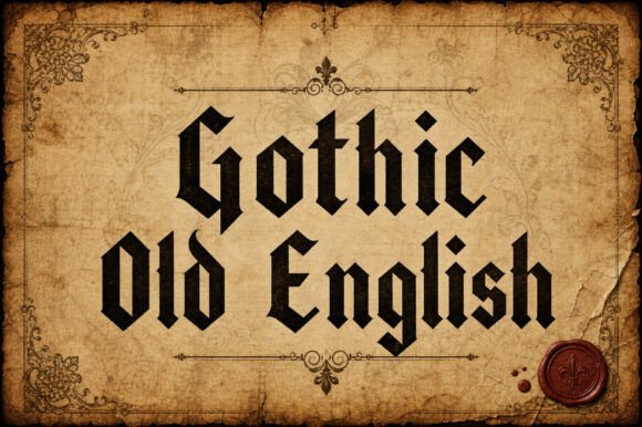
Gothic Old English Font channels the unmistakable drama of medieval calligraphy with a robust, sharply angled skeleton and pronounced serifs. Its letterforms balance heavy strokes with narrow counters, producing a compact silhouette that reads as ceremonial and authoritative at display sizes. The shapes feel hand-forged rather than machine-pure, giving headings and badges a handcrafted, archival presence.
Within the broader family of Gothic Fonts , this face translates traditional Old English motifs into a modern, usable display type-great for titles that need historical weight without sacrificing clarity. It performs best at large sizes where the ornamented terminals and thick verticals can breathe, but careful tracking also lets it work in short lines of copy on posters and certificates. Be mindful of small-size legibility: the dense forms call for higher resolution or generous spacing.
Technically, the font thrives as a single-weight display face: pair it with a neutral sans or a restrained serif for contrast, and use its capitals and alternates for emphasis. Its visual gravity makes it ideal for logos, tattoo lettering, album art, and packaging that seeks a heritage vibe. In short, Gothic Old English delivers a stately, historical voice for projects that need to look established and unmistakable.
╰┈➤ Download Gothic Old English Font
My Recommendation: I’d reach for Gothic Old English whenever a project needs historical gravitas-think artisanal beer labels, ceremonial certificates, or bold band logos. Its carved-in-stone character gives identity work immediate authority, and the ornamentation helps designs feel crafted rather than generic. Use it as a headline or logo treatment paired with a clean sans for balance.
29. Big Fat Gothic Font
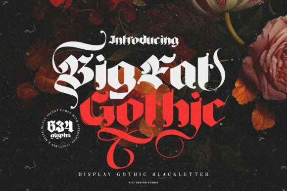
Big Fat Gothic Font is unapologetically heavy: thick strokes, wide counters, and compact spacing produce an in-your-face blackletter that arrests attention from the first glance. The exaggerated weight turns each glyph into a graphic object-perfect when the goal is instant impact on posters, signage, or hero banners. Its chunky forms read well at a distance and retain personality even in low-resolution environments.
Despite its name, Big Fat Gothic offers refinement through alternate glyphs, swashes, and ligatures that let designers introduce flair without losing mass. These OpenType features are useful for crafting custom wordmarks or decorative headlines that need both presence and nuance. The font pairs well with minimal layouts where typography is the visual focus rather than competing ornament.
Use this face where loudness is the brief: sports posters, festival branding, heavy-metal merchandise, or retro-inspired packaging. Because of its density, keep body text simple and let Big Fat Gothic dominate only one element per composition to avoid overwhelming the viewer. Thoughtful spacing and selective use of alternates will keep the design readable and expressive.
╰┈➤ Download Big Fat Gothic Font
My Recommendation: I’d pick Big Fat Gothic for projects that require maximum visual weight-think festival posters, product labels, or apparel graphics where legibility from afar matters. It’s a go-to when you want a bold, tactile blackletter that reads as both modern and muscular. Use it sparingly as a display element and balance it with clean supporting typography.
30. The Gothic Rite Font
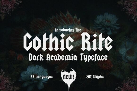
The Gothic Rite Font is a concept-driven blackletter that leans into dark-academic and architectural influences: angular terminals, controlled contrast, and geometry that evokes stone tracery. Its crafted outlines feel ritualistic and precise rather than ornate, giving it a contemporary edge suitable for editorial and fashion contexts. With a refined gothic tone, it carries a literary, enigmatic energy.
With 202 glyphs and coverage for 67 languages, The Gothic Rite is engineered for global projects and nuanced typographic treatments. The extended glyph set supports stylistic alternates and ligatures that let designers dial in moods from austere to theatrical. These features make it excellent for book covers, academic posters, and boutique branding where a sense of mystery and intellect is paramount.
On layout, The Gothic Rite shines at medium-to-large sizes where its geometry and spacing can be appreciated; it also works beautifully in logotypes and editorial mastheads. Pair it with understated sans-serifs to preserve readability and to let the gothic letterforms remain the focal point. Overall, it’s a versatile, artful blackletter for contemporary creative projects seeking an elevated, moody identity.
╰┈➤ Download The Gothic Rite Font
My Recommendation: I’d use The Gothic Rite when a project needs to blend scholarly gravitas with style-think book covers, fashion editorials, or boutique branding. Its extended language support and alternates provide flexibility for sophisticated typographic systems. It’s my pick when a design must feel both intellectual and slightly uncanny, without tipping into cliché.
31. Imperial Gothic Font
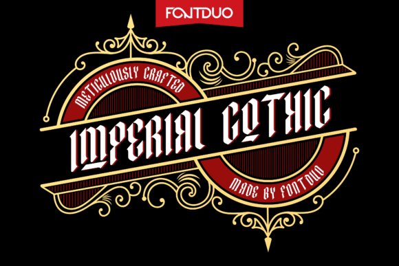
Imperial Gothic arrives as a theatrical blackletter with confident hairlines and dramatic terminals that read powerfully at display sizes. Its condensed forms and pronounced ascenders give headlines a regal cadence, while carefully adjusted spacing keeps blocks of text surprisingly legible for a decorative face.
As one of the Gothic Fonts offerings in this curated set, Imperial Gothic balances historic Fraktur influences with contemporary refinement-expect alternate capitals, refined ligatures, and ornamental swashes that let you dial the drama up or down depending on the layout. The overall texture feels handcrafted but engineered for modern production workflows.
Technically solid, Imperial Gothic ships in OTF with robust kerning and multilingual glyph coverage for Western European languages, and it scales cleanly for print packaging and large-format signage. Use it where you need a commanding typographic signature: luxury labels, craft beer branding, cinematic posters, or identity marks that must read both vintage and aggressively modern.
╰┈➤ Download Imperial Gothic Font
My Recommendation: I’d reach for Imperial Gothic when a project needs immediate gravitas without sacrificing contemporary clarity. Its ornamental alternates let me craft bespoke logotypes, and the strong vertical rhythm makes packaging and posters pop on the shelf. Use it when you want a historic mood rendered with modern polish-think premium spirits, boutique fashion, or film title sequences.
32. Black Gothic Font
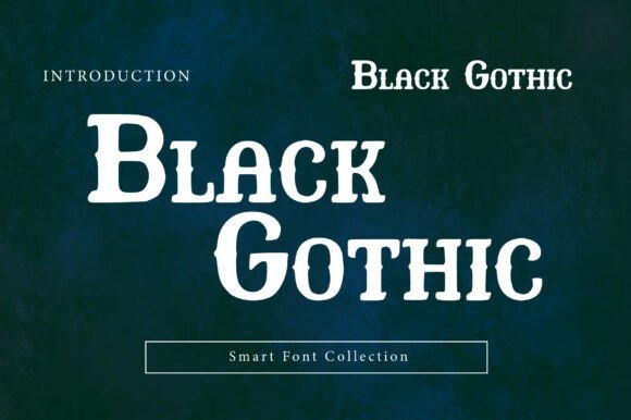
Black Gothic is a high-impact display serif that channels gothic sensibilities through a modern, vintage-informed lens. Tall capitals, generous x-height and softened corners create a stately yet approachable character that reads well at large sizes and in short editorial blocks.
This typeface thrives on contrast: weighty stems meet elegant curves to produce a cinematic presence ideal for posters, mastheads, and premium packaging. The family’s thoughtful spacing and refined terminals make it useful for logo work where a sense of authority and heritage is desired without sacrificing legibility.
Designed as part of a smart collection, Black Gothic includes purposeful alternates and tight kerning to support bold headlines and typographic lockups. Pair it with monochrome palettes and minimalist photography to emphasize its “quiet luxury” vibe, or combine with textured backgrounds for a vintage, tactile look.
╰┈➤ Download Black Gothic Font
My Recommendation: I recommend Black Gothic when a brand needs a timeless, assertive voice with a modern edge. Its readable forms and luxury feel make it ideal for high-end editorial work, boutique identity systems, and impactful poster campaigns. It’s my go-to for projects that require dramatic presence without resorting to ornament alone.
33. Old German Gothic Font
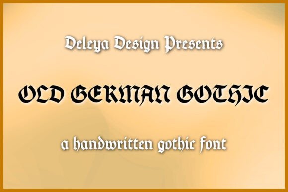
Old German Gothic is a handwritten blackletter that recreates calligraphic energy with contemporary flexibility, offering expressive strokes and a slightly irregular rhythm that reads as artisanal rather than academic. The letterforms balance decorative flourishes with enough restraint to remain useful in short blocks and display settings.
Notable for extensive glyph support, this face includes extra punctuation, diacritics, and alternates to cover English, German, Spanish, Italian, French, and Portuguese workflows, which makes it especially handy for multilingual packaging and event collateral. The included .otf file ensures crisp rendering and reliable OpenType behavior in both desktop and design-app environments.
Because of its handcrafted texture and readable contrasts, Old German Gothic excels on greeting cards, posters, boutique advertising, and branded merchandise where an authentic, historic accent is needed. It pairs beautifully with clean sans-serif text, letting the script-like blackletter act as focal decoration without overwhelming layouts.
╰┈➤ Download Old German Gothic Font
My Recommendation: I’d use Old German Gothic when a design needs handcrafted personality and multilingual support under one roof. Its authentic calligraphic feel makes it perfect for cultural events, artisanal packaging, and stationery where a historic voice is desirable. The font’s alternates and punctuation coverage let me tailor the tone precisely, from playful to solemn.
34. Ornate Gothic Font
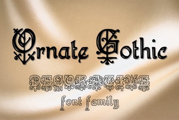
Ornate Gothic is a lavish blackletter display that blooms with filigree and high-contrast strokes, making it feel like printed metalwork from a medieval press. Collectors of Gothic Fonts are often attracted to its lush capitals and decorative terminals, which function as built-in ornaments for packaging, labels, and boutique logos. The letterforms strike a confident balance between dense texture and legibility when used at larger sizes, giving headlines a historic, tactile presence.
Technically, this face excels as a headline and product-mark type: generous kerning, pronounced ascenders, and intentional stroke modulation create dramatic vertical rhythm without collapsing into illegibility. Its ornamental alternates and contextual ligatures let designers compose bespoke words that read as crafted insignias rather than flat type. For tactile treatments-foil stamping, embossing, or letterpress-the font’s strokes hold up beautifully and translate into rich printed finishes.
Pair Ornate Gothic with a neutral sans or subdued serif to avoid competing for attention; use it sparingly as the hero element rather than body text. It’s ideal for artisanal goods, craft spirits, high-impact posters, or any project that needs a vintage-blackletter vibe with premium polish. If you need a statement display face that reads like heritage without feeling dated, Ornate Gothic brings both theatricality and usable structure.
╰┈➤ Download Ornate Gothic Font
My Recommendation: I’d reach for Ornate Gothic when I want a headline that reads like a handcrafted seal-its decorative capitals and robust strokes give packaging and brand marks instant gravitas. It’s fantastic for boutique labels, seasonal product drops, or event posters where you want a historic, artisanal look without sacrificing clarity. Use it large, pair it with clean modern elements, and let the ornaments do the storytelling.
35. Elegant Gothic Font
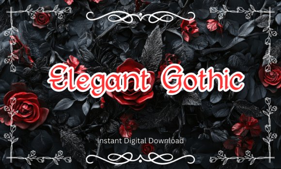
Elegant Gothic reinterprets gothic influence through a refined, script-inflected lens: the result is a typeface that feels both romantic and decisive. Its smooth curves and tapered strokes soften classic blackletter geometry, producing letterforms that move gracefully across a line while retaining a moody, dramatic character. This makes it a powerful choice for projects that need an emotive, couture-style voice rather than aggressive medieval heaviness.
The face works beautifully for editorial covers, wedding suites with a dark-romance bent, and boutique branding where a sense of mystery is desired. Small-cap alternates, subtle swashes, and carefully drawn numerals enhance typesetting options for titles and monograms without overwhelming adjacent typography. Because it skews toward display use, designers should reserve it for focal elements and pair it with simple, readable body type for balance.
Files are ready for modern workflow-OTF/TTF and support across major design apps-so integration is straightforward for print and digital work. Use Elegant Gothic to convey luxury that leans toward the dramatic: think boutique perfumery, nocturnal event invites, novel covers, and atmospheric posters. It’s a tasteful bridge between classical gloom and contemporary elegance.
╰┈➤ Download Elegant Gothic Font
My Recommendation: I often choose Elegant Gothic when a project needs romantic tension-its graceful strokes add sophistication without tipping into cliché. It’s perfect for moody book covers, refined Halloween-themed events, or luxury brands that want a slightly gothic flourish. Keep it as the visual focal point and counterbalance it with an airy, simple supporting typeface.
Choosing the right gothic typeface transforms a concept into an experience – from gritty noir posters to elegant, medieval-inspired branding. Use the collection to test blackletter, Fraktur, and Old English styles in context, paying attention to readability, contrast, and the emotional tone each face conveys.
Apply the pairing tips and licensing notes provided to ensure your chosen Gothic Fonts work legally and visually across print and digital outputs. With these 35 options and a few practical tweaks, you can confidently introduce historic depth and dramatic atmosphere into your 2026 projects.