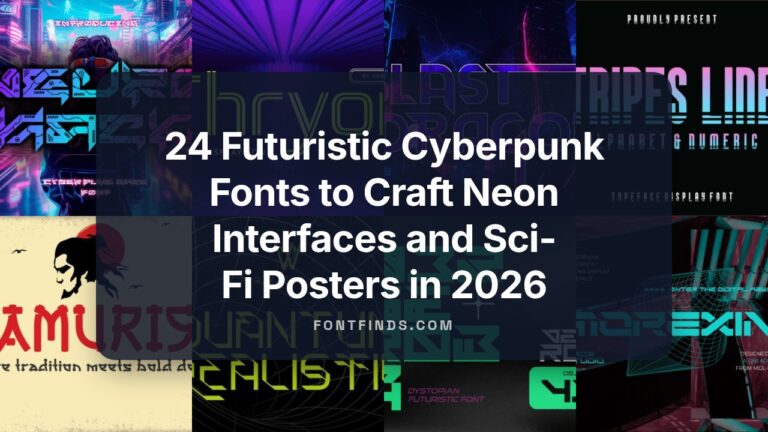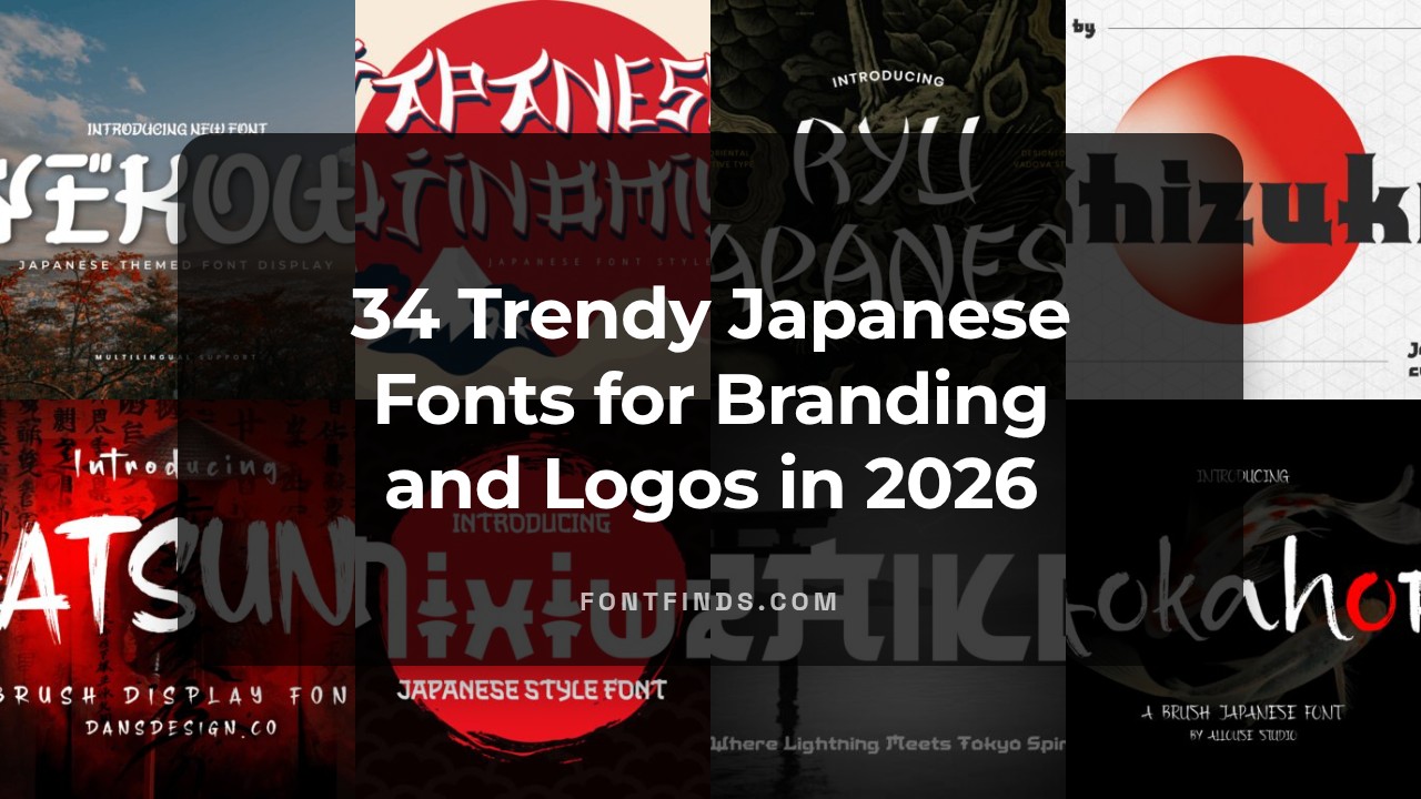
34 Trendy Japanese Fonts for Branding and Logos in 2026
japanese fonts are a vital choice for designers working with Japanese text or seeking an East Asian aesthetic in branding and UI. This collection spotlights 34 typefaces – from clean sans-serifs and elegant serifs to expressive brush and calligraphic styles – to help you select the right tone for any project.
Across these options you’ll find Kanji-optimized families, kana-friendly scripts, and web-ready typefaces that balance legibility with personality. We’ll cover use cases, pairing suggestions, and licensing considerations so you can confidently apply these typefaces in logos, packaging, websites, and editorial design.
1. Miradesu Font
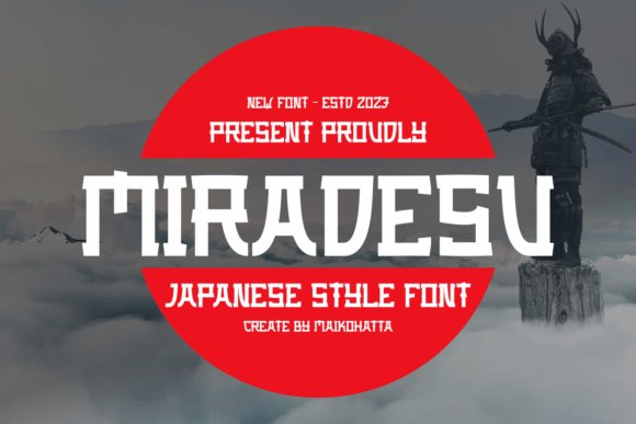
Miradesu channels a refined balance between traditional brush calligraphy and modern display sensibilities, giving headlines an elegant yet assertive presence. As a versatile headline typeface, it blends strong stroke contrast with fluid terminals, making it ideal for cultural branding, editorial covers, and high-impact web hero sections. Miradesu is particularly effective when you need the visual shorthand of japanese fonts-it evokes East Asian typographic heritage without sacrificing contemporary clarity.
The character shapes maintain legibility at large sizes while offering expressive details that reward close viewing. Subtle modulation in stroke width and slightly tapered endings create a hand-crafted texture that performs well in print and on high-resolution screens. Pair it with a neutral sans for body copy or a delicate serif for luxury packaging to emphasize contrast.
Technically, Miradesu ships with robust kerning and consistent weight distribution across glyphs, which simplifies layout work for posters and signage. Its presence reads as cultured and intentional, lending authenticity to projects that reference traditional motifs or modern interpretations of Asian typography. Use it where you want heritage cues without literal script forms.
My Recommendation: I’d reach for Miradesu when designing upscale restaurant identities, museum exhibition posters, or limited-edition packaging. Its calligraphic echoes give projects cultural depth while remaining readable at display sizes. It’s perfect for work that needs a respectful nod to Asian typography without using native scripts.
2. Xogura Font
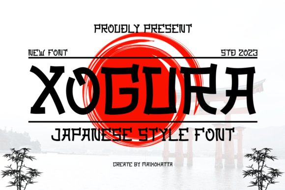
Xogura is a bold, geometric display face that leans into strong modular forms and compact letterspacing for a modern, urban aesthetic. The type’s chunky strokes and slightly condensed proportions make it an attention-grabbing choice for posters, signage, and logo marks where impact is more important than subtlety. Though inspired by East Asian lettering rhythms, Xogura reads as distinctly contemporary and industrial rather than traditional.
Its hard edges and simplified counters give it great performance on low-resolution screens and in high-contrast print. Designers will appreciate how well Xogura holds up in single-color applications, vinyl cutting, and large-format advertising. The font’s personality works especially well when paired with minimal layouts or neon-inflected palettes for a retro-futuristic vibe.
Practical features include tight kerning defaults and consistent baseline alignment, which reduce fiddly adjustments in headline treatments. Use Xogura where you want assertive branding that suggests a Japan-inspired visual language without literal script use-think tech start-ups, gaming interfaces, or music event posters. Its compact rhythm also helps conserve space in crowded layouts.
My Recommendation: I recommend Xogura for energetic, commercial projects-especially event posters, streetwear labels, and digital banner ads. Its geometric backbone gives instant visual authority and translates well to both print and screen. If you need a display face that feels modern with an urban nod to Asian typography, Xogura delivers.
3. Shizuko Font
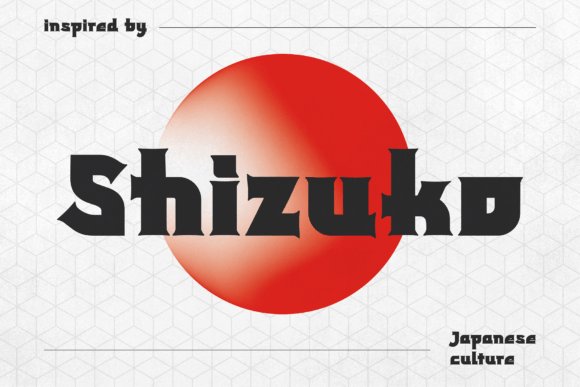
Shizuko is a stylized display typeface that borrows the visual cadence of kanji calligraphy while providing a purely Latin character set. The result is an expressive, high-contrast headline font with sharp terminals and dramatic stroke transitions, making it ideal for posters, stickers, and apparel graphics. Its distinctive silhouette injects an Asian-inspired temperament into designs without requiring any non-Latin glyphs.
Designed for immediacy, Shizuko comes fully kerned and ready for bold typographic statements; its heavy forms read powerfully across social media visuals and magazine covers. The font’s exaggerated shapes create strong brand marks and emblems that stand out on packaging and merchandise. Use it to convey energy and heritage-inflected style in contemporary layouts.
Because Shizuko emphasizes display use, it performs best at larger sizes where its characterful details can breathe. Combine it with simple sans serifs for balance or with textured backgrounds for a vintage street-culture look. Its compact character width also makes it useful for constrained logo lockups and badge-style designs.
My Recommendation: I’d pick Shizuko for projects that need bold cultural flavor-like band posters, streetwear labels, or limited-run product packaging. It gives designs a distinctive, handcrafted edge while remaining simple to deploy. If you want an attention-grabbing headline font with kanji-inspired energy without using Japanese characters, Shizuko is a great choice.
4. Japanese Fujinomiya Font
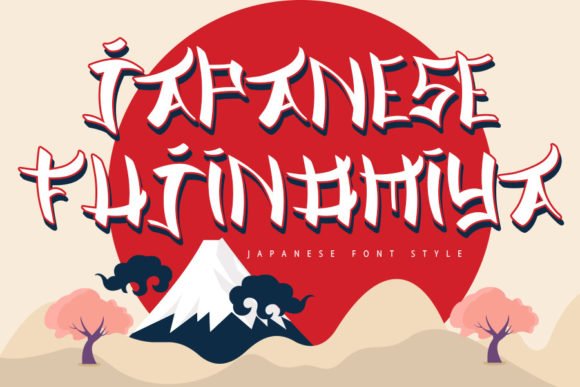
Japanese Fujinomiya projects a confident fusion of traditional brush rhythm and crisp display sensibilities. Its letterforms balance bold terminals with subtle flares, creating a look that reads both handcrafted and deliberately modern-perfect for headlines that need character without sacrificing clarity. The font’s visual tension between heavy strokes and open counters gives it great presence on posters, menus, and packaging where personality must register at a glance.
If you are assembling a toolkit of japanese fonts, Fujinomiya is a standout: it communicates culinary and cultural cues without relying on literal motifs. Use it for food menus, event posters, or artisanal product labels to evoke authenticity; its stance reads equally well in single-word logos or elongated display lines. Because the shapes are distinctive, careful tracking and size testing will help maintain legibility when used in long lines.
For pairing, let Fujinomiya be the focal type and combine it with a minimalist sans for body text or subdued script accents for specialty headings. Its expressive glyphs respond well to textured backgrounds, stamped effects, and modest color contrasts, so designers can push it toward rustic or refined directions. Overall, this font is a versatile tool for projects that need a modern nod to East Asian calligraphic aesthetics.
╰┈➤ Download Japanese Fujinomiya Font
My Recommendation: I’d reach for Fujinomiya when I want a display face that reads handcrafted but not traditionalist-ideal for restaurant branding, seasonal posters, or boutique packaging. It brings immediate atmosphere and performs well across print and large-format digital. Use it as the headline driver and pair it with a clean, neutral type for best results.
5. Japanese Font
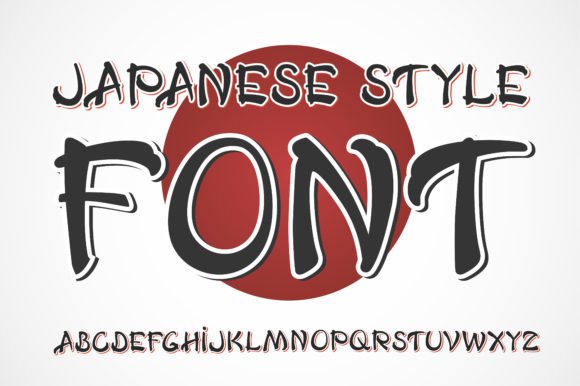
Japanese Font is a bold, adventurous display type that embraces dramatic silhouettes and strong visual personality. The shapes are unapologetically assertive-strokes often end in sharp, high-contrast terminals-and the result is a typeface that demands attention in any headline or title treatment. This makes it particularly useful when you need an unmistakable focal point for posters, album covers, or striking web hero banners.
Rather than mimicking historical scripts, this design leans into a stylized interpretation of East Asian typographic cues, creating a contemporary hybrid that feels both foreign and familiar. Its high-impact forms hold up at large sizes but benefit from generous letter-spacing when set in longer words to avoid crowding. For editorial spreads and branding systems, use it sparingly as the accent to preserve its punch.
When pairing, counterbalance the font’s intensity with a neutral geometric sans or a thin humanist serif to provide breathing room. Consider treating it with subtle texture or metallic inks in print to accentuate its bold strokes without losing definition. In short, this type is best deployed where statement-making and visual drama are the goals.
My Recommendation: I’d pick this font for projects that need strong visual intent-music posters, bold identity marks, or limited-edition packaging. It’s not for long paragraphs, but it excels at commanding attention in headlines and hero art. Pair it with a restrained body face to let its character shine without competing elements.
6. Japanese Brush Font
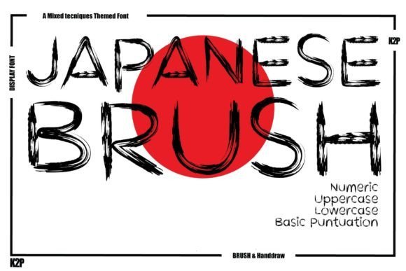
Japanese Brush Font channels the spontaneous energy of hand-brushed calligraphy into a display face with pronounced texture and motion. Its strokes vary wildly in weight and taper naturally, creating a sense of speed and authenticity that digital fonts often lack. Because of the ink-like irregularities, each word reads with immediacy-excellent for posters, festival branding, or any work that benefits from tactile, human qualities.
The font’s naturalistic brush marks make it particularly effective for cultural promotions, beverage labels, and expressive logos where an organic touch is desired. It reads best at larger sizes where the stroke dynamics can be appreciated; at smaller sizes the delicate contrasts may collapse, so reserve it for short phrases or single-line treatments. Consider layering it over muted textures or paper backgrounds to amplify the handcrafted impression.
For composition, balance the font’s liveliness with calm, minimal layouts or paired neutral sans serifs to avoid visual competition. If alternates are available, use them to vary repeated words and retain the illusion of hand lettering. This typeface is a go-to when you want expressive, ink-driven character without losing legibility in display contexts.
╰┈➤ Download Japanese Brush Font
My Recommendation: I’d use this brush font when a project needs the warmth and spontaneity of hand lettering-think seasonal posters, artisanal packaging, or cultural event identities. Its brushy personality brings emotion and movement that sterile geometric faces can’t achieve. Keep it big, keep it bold, and pair it with simple supporting type to let the brushwork take center stage.
7. Nesuka Faux Japanese Font
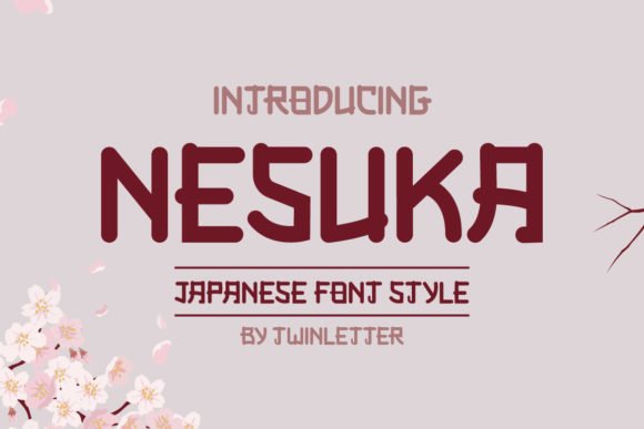
Nesuka Faux Japanese is a relaxed, hand-drawn display face that reads like a friendly signature on a busy poster. Its irregular stroke widths and slightly off-kilter terminals give each letter a handmade charm, making headlines feel less formal and more approachable. The design deliberately favors personality over rigid geometry, so it shines at large sizes where its characterful shapes can be appreciated.
Technically, Nesuka includes an array of alternate characters and playful terminal variations that let you tune the tone from whimsical to casual-craft. Spacing is generous, which helps maintain legibility when used on packaging, menus, or social graphics; the font’s built-in quirks create instant brand recognition in logotypes and display headlines. It pairs particularly well with neutral sans-serifs for body copy to keep layouts readable while preserving the font’s visual impact.
If you’re exploring japanese fonts for a Westernized, decorative treatment, Nesuka offers that faux-Japanese aesthetic without trying to mimic actual scripts. Use it for food branding, festival posters, children’s book titles, or any project that benefits from energetic, handcrafted display lettering. Be mindful of cultural context – Nesuka is a stylized interpretation best used for playful, illustrative projects rather than authentic language work.
╰┈➤ Download Nesuka Faux Japanese Font
My Recommendation: I’d reach for Nesuka when I want a headline that feels handcrafted and instantly likable-perfect for indie cafés, street-food pop-ups, and playful packaging. Its alternates let me customize mood without resorting to heavy editing. Use it with a clean sans for body text to keep layouts modern and readable.
8. Akisa Faux Japanese Font
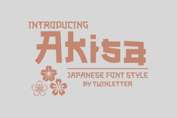
Akisa Faux Japanese brings a spirited, character-driven look to display typography with quirky counters and lively stroke endings. The letterforms are energetic and slightly condensed, which makes the face excellent for tight layouts like banners and poster mastheads where you need visual punch. Small decorative details-rounded joins and surprised curves-give it a memorable silhouette without overwhelming the overall composition.
The face works best at display sizes where its amusing shapes provide personality rather than at long paragraph lengths. Akisa offers thoughtful kerning for headline use and behaves well when layered over textured backgrounds or photography; its boldness holds up in print and web contexts. For design systems, treat it as an accent – pair it with neutral slab or humanist sans styles to balance play with structure.
Because Akisa leans on a Japanese-inspired visual vocabulary, it’s particularly suited to branding for ramen bars, lifestyle pop-ups, indie films, and festival identity. It creates instant thematic recognition while keeping the tone light and approachable – a solid choice when you want a fun, discerning display voice without resorting to clichés.
╰┈➤ Download Akisa Faux Japanese Font
My Recommendation: I’d choose Akisa for projects that need an upbeat, memorable headline-think event posters, restaurant menus, or youth-oriented packaging. Its expressive shapes make it a great focal point, while pairing it with a neutral typeface prevents the layout from feeling too busy. Use it sparingly for maximum effect.
9. Japanese Font
Japanese Font is a study in refined minimalism: a monoline, handwritten display whose tall, narrow forms read both modern and intimate. Soft curves at the terminals and consistent stroke weight produce a polished, editorial look that feels handcrafted yet very deliberate. This restrained personality makes it an excellent choice for premium branding where subtlety matters more than loud ornamentation.
The typeface’s airy proportions and open counters ensure it holds up on product packaging, photography overlays, and luxe stationery without competing with imagery. It performs beautifully as a signature-style watermark or nameplate, but also pairs well with a bold geometric sans to create striking contrast in magazine layouts or real estate branding. Kerning and tracking are tuned for display settings, so small adjustments will refine balance in tight compositions.
Because of its understated voice, this font is ideal for projects that need a human touch without sacrificing sophistication-luxury wedding suites, boutique interiors, and editorial features all benefit. Its clean forms help convey authenticity and calm, giving designers a versatile tool for contemporary, polished identities.
My Recommendation: I’d use this font when I need a quiet, elegant headline that complements photography and high-end layouts. It’s perfect for luxury stationery, photography watermarks, and lifestyle editorials where a human, refined touch matters. Pair it with a bold sans for contrast and you get a modern, sophisticated system that feels both personal and professional.
10. Dango Font
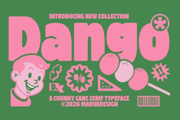
Dango brings a chunky, candy-coated personality to any headline. Its heavy, rounded letterforms minimize internal counters and emphasize silhouette over detail, producing instant legibility at large sizes while conveying a playful, tactile presence reminiscent of soft mochi or dumplings.
Despite its maximal weight, Dango handles spacing thoughtfully: widened proportions and generous letter-to-letter breathing reduce crowding and make the font surprisingly flexible for short lines of text. It performs exceptionally well in bright colorways, stamped textures, and layered drop shadows common in snack packaging and streetwear labels.
For projects that lean into retro-pop or kawaii aesthetics, Dango pairs neatly with thin geometric sans-serifs or clean script accents to provide contrast. If you’re exploring japanese fonts for bold display work-packaging, toy logos, and social headers-Dango delivers the instant, friendly impact those applications require.
My Recommendation: I’d reach for Dango when I need a headline that reads like a smiling mascot-big, welcoming, and impossible to ignore. Its weight and rounded shapes are perfect for food packaging, kids’ products, or bold poster work where personality trumps fine detail. Use it with bright palettes and simple secondary fonts to keep compositions readable and energetic.
11. Hatsune Font
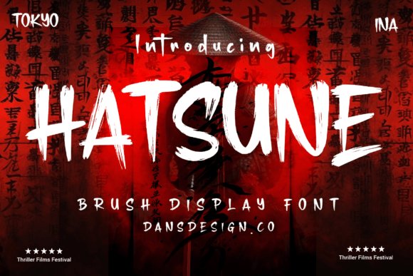
Hatsune channels the fluid energy of brush calligraphy into a Latin display face that feels handcrafted and expressive. Thick-to-thin stroke transitions and tapered terminals mimic wet-brush motion, giving each letterform a dynamic, slightly irregular rhythm that reads as both modern and traditional.
Small imperfections-subtle ink textures, alternate stroke endings, and occasional swash characters-make Hatsune ideal for one-word logos, posters, or packaging where a handcrafted look adds authenticity. It scales beautifully for large-format prints and performs well against textured paper or grainy halftones, where the brush detail enhances tactile perception.
For design systems that need an Eastern-flavored accent, pair Hatsune with a restrained sans for body copy to maintain hierarchy. It’s also a strong choice for festival posters, artisanal food brands, or creative studios seeking a bold, calligraphic voice without sacrificing legibility at display sizes.
My Recommendation: I love using Hatsune when a project needs the spontaneity of hand-brushed letters-logos, event posters, and premium packaging are perfect matches. It injects warmth and movement where geometric fonts feel sterile, and its alternates allow for subtle customization. Pair it with neutral supporting type to keep the composition balanced.
12. Katsuha Font
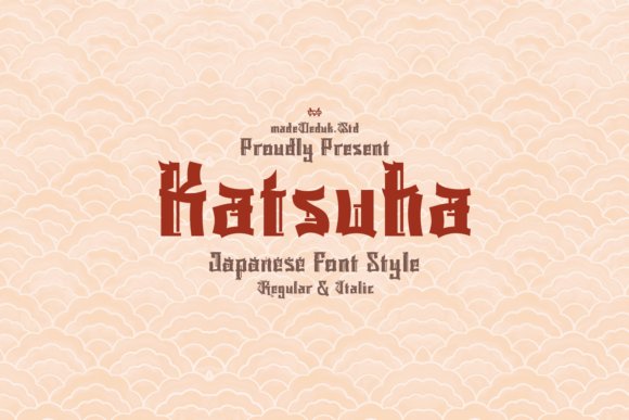
Katsuha is a decorative display face that borrows the striking angles and vertical rhythm of kanji calligraphy while remaining a stylized Latin execution. Its sharply pointed terminals and dramatic strokes create a theatrical silhouette, lending a sense of age-old mystery and ceremonial gravitas to any headline.
The font’s built-in contrast and ornamental edges make it a showpiece for fantasy book covers, martial arts branding, or retro samurai-inspired posters. Because of its high visual contrast, Katsuha works best at display sizes where its carved details and inter-letter spacing can breathe and be appreciated.
Use Katsuha sparingly as a focal element; when combined with understated serif or slab fonts it anchors compositions with a dramatic focal point. It responds beautifully to metallic treatments, embossing, and high-contrast color palettes that emphasize its chiselled forms and sculptural presence.
My Recommendation: I’d pick Katsuha when a design needs ritualistic drama-think fantasy covers, film posters, or signature headlines. Its pointed geometry creates an unmistakable atmosphere that supports storytelling and themed identities. Because it’s visually dominant, I recommend using it as a focal display face paired with simple body typography to preserve legibility.
13. Raiko Font
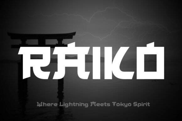
Raiko punches hard as a bold, Japan-inspired display typeface built around sharp angles and a tense geometric skeleton. It blends Neo-Tokyo aesthetics with cinematic energy, producing letterforms that feel like lightning frozen in motion-perfect where high contrast and aggressive visual voice are required. As one of the stronger japanese fonts for headline work, Raiko reads best at large sizes where its angular terminals and exaggerated counters create instant attitude.
The face includes distinct uppercase and lowercase shapes, numerals, and punctuation tuned for dramatic poster composition and tight logotypes. Its heavy weight and precise stroke joins make it ideal for gaming titles, esports branding, and urban streetwear where clarity meets attitude. Designers will appreciate how its spacing handles layered treatments-glow, bevel, and halftone textures amplify its Neo-Tokyo character without sacrificing legibility.
Use Raiko as a headline cornerstone and pair it with a soft geometric or humanist sans for body copy to balance its intensity. It performs equally well on packaging, cinematic trailers, and restaurant signage when you need modern Japanese influence with a futuristic edge. With thoughtful color and motion, Raiko transforms static layouts into charged, memorable compositions.
My Recommendation: I reach for Raiko when I need forceful, contemporary Japanese-inspired headlines-its sharp geometry gives immediate personality and reads powerfully on posters and game covers. The typeface shines in projects that require a futuristic or urban edge, such as esports identities, streetwear labels, and cinematic promos. Pair it with a neutral sans for long copy to let Raiko own the visual hierarchy without overwhelming the layout.
14. Misuke Font
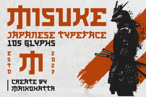
Misuke channels traditional brushcraft into a refined display type that balances calligraphic warmth with modern restraint. Strokes echo the rhythm of sumi ink, offering subtle stroke contrast and slightly tapered terminals that suggest handwritten authenticity without sacrificing design control. This makes Misuke ideal for conveying cultural depth in elegant editorial spreads or boutique branding contexts.
The font’s rhythm and flow create pleasing word shapes suited to logos, book covers, and menus where character and legibility must coexist. Alternates and ligatures introduce organic variation, helping headlines avoid a mechanical repetition and instead feel bespoke. When combined with textured paper or muted palettes, Misuke radiates handcrafted credibility and timelessness.
Because it evokes artisanal craft, I recommend using Misuke for artisanal product labels, tea house identities, and cultural events where a gentle, human touch matters. It pairs beautifully with restrained serif bodies or minimal sans faces, allowing the display copy to carry narrative weight. Thoughtful spacing and generous tracking enhance its calligraphic quality for both print and high-resolution digital uses.
My Recommendation: I’d choose Misuke for projects that need an authentic, hand-crafted voice-think boutique packaging, cultural publications, and premium restaurant menus. Its brush-like details add warmth and heritage without feeling old-fashioned, making it versatile across print and digital. For best results, pair Misuke with a clean sans for body text so its expressive headline quality remains the focal point.
15. Youkera Font
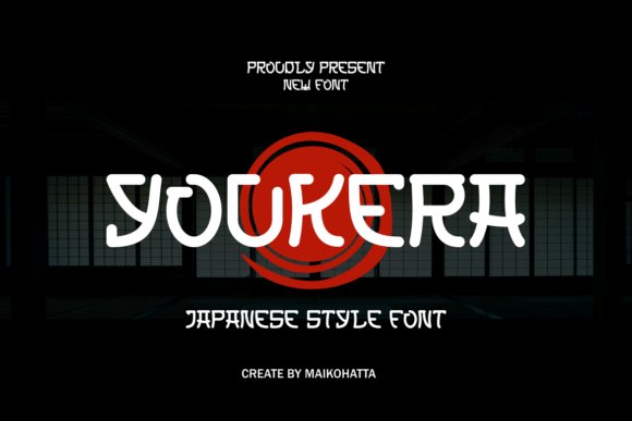
Youkera is a playful, rounded display type designed to read friendly and approachable at first glance. Its softened terminals and generous counters give it a convivial personality that works exceptionally well in kid-focused branding, café signage, and pop-culture posters. The overall silhouette nods to retro neon signage and kawaii aesthetics, creating an inviting tone without relying on literal iconography.
The family’s smooth curves and even stroke weight make it highly legible in short bursts of copy-headlines, labels, and social media graphic text all benefit from its clear forms. Subtle quirks in selected glyphs add charm for marquee words, while tight letterspacing can produce compact, emblematic lockups. Youkera adapts effortlessly to bright color palettes and playful textures, enhancing its energetic vibe.
For application, Youkera excels on merchandise, sticker sheets, and friendly brand systems that want to feel modern and cheerful. It pairs particularly well with condensed sans weights or rounded icons to build cohesive identity systems. Use motion-simple bounces or scale shifts-to bring its buoyant character to life in UI and animated promos.
My Recommendation: I use Youkera when a project needs to feel upbeat and accessible-it’s perfect for children’s products, cafés, and lifestyle brands that want a friendly, modern look. The rounded forms stay legible at display sizes and work wonderfully with bright colorways or playful illustrations. If you want a headline face that feels warm and contemporary, Youkera will give your designs immediate personality without fuss.
16. Yekow Font
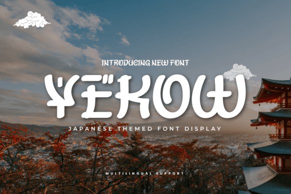
Yekow is a display typeface that channels Japan-style motifs into a contemporary headline face. Yekow joins the family of modern japanese fonts by balancing culturally inspired brush cues with clear letterforms, making it suitable for branding and signage that need a tasteful East-Asian accent. The overall silhouette feels elegant without tipping into caricature.
Letter shapes subtly reference calligraphic terminals and kanji-influenced angles while prioritizing readable counters and consistent rhythm. The family includes alternates and extended punctuation so designers can craft cohesive posters, menus, and hero web banners. Modest contrast and open apertures help the glyphs stay legible at display sizes while retaining ornamentation.
In practical use, Yekow excels as a headline or logo type when you want cultural nuance rather than a literal translation of script. It performs well on textured paper, bold color blocks, and packaging where the decorative details can be appreciated. Pair it with a neutral sans for body copy to preserve hierarchy and let the type sing.
My Recommendation: I reach for Yekow when a project needs an authentic nod to Japanese visual culture-restaurant identities, boutique packaging, and travel posters are natural fits. It’s distinctive enough to anchor a look yet refined enough to avoid cliché. Pairing it with minimal sans serifs lets Yekow take center stage while maintaining clean readability.
17. Kaze Japanese Font
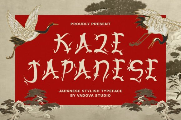
Kaze Japanese Font evokes traditional brushwork with an energetic, rhythmic voice that suits bold headlines and identity marks. Its strokes feature sharp terminals and flowing transitions, mirroring the momentum of calligraphic movement while remaining engineered for modern layout systems. The strong structural weight gives presence on signage, posters, and logos.
Although inspired by hand-brushed forms, Kaze includes disciplined spacing and baseline consistency so text reads crisply at display sizes and in motion. Designer-friendly features like stylistic alternates and a comprehensive punctuation set let you refine wordmarks for menus, dojo signs, or travel promotions. The texture of its strokes also adapts well to layered treatments and animated headers.
For pairing, choose a low-contrast sans or a subtle serif to avoid visual clash and let Kaze carry the headline. Its personality is assertive and cultural but flexible enough to support contemporary branding without feeling dated. Use it when you want handcrafted energy that reads loud and clear.
╰┈➤ Download Kaze Japanese Font
My Recommendation: I’d use Kaze Japanese Font for high-impact identities-sushi restaurants, martial-arts studios, festival posters, and heritage-driven campaigns. The brush-like dynamics provide instant authenticity, while alternates let you tune the look. Keep it as a headline tool and balance it with calm supporting type for best results.
18. Japanese Tourist Font – japanese fonts inspired
Japanese Tourist Font channels the retro lettering seen on travel posters and signage across Japan, delivering a nostalgic, stamp-like charm that reads clearly at headline sizes. Its condensed proportions and gently rounded terminals replicate the feel of ticket kiosks and vintage wayfinding. The aesthetic is evocative of mid-century travel culture rather than formal script.
The design favors a high x-height and tight letterspacing so copy compacts into memorable blocks-perfect for posters, souvenir packaging, and editorial covers. Many implementations include alternates that simulate imperfect ink and slight distressing to enhance authenticity. On-screen it shines at larger scales where those handcrafted quirks are visible.
Use Japanese Tourist as a display accent alongside clean grotesques or slab serifs to balance nostalgia with contemporary structure. The type reads playful and approachable, making it ideal for museum exhibits, retro cafés, tour maps, and themed campaigns. It adds travel‑centric personality without relying on cliché symbols.
╰┈➤ Download Japanese Tourist Font – japanese fonts inspired
My Recommendation: I recommend Japanese Tourist Font when you want to evoke vintage travel vibes-posters, visitor guides, packaging, and themed web pages all benefit. It injects immediate warmth and storytelling potential, especially when alternates simulate wear. Use it as the primary display face and support it with a neutral body font for clarity.
19. Japanese Emperor Font
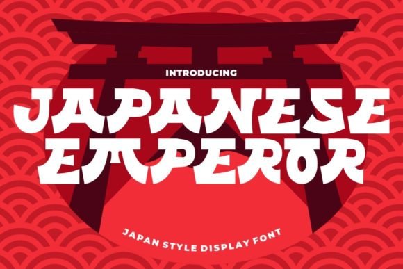
Japanese Emperor is a display typeface that channels traditional brushwork into a contemporary, readable form. Its strokes balance weight and openness, giving headlines and logos a strong presence without sacrificing legibility-a rare trait among stylized display faces. Among contemporary japanese fonts, this design stands out for marrying ornamented swashes with clear letterforms, making it suitable for both print and digital applications.
The font ships PUA encoded, so every alternate and decorative glyph is accessible in most design apps without extra mapping. That makes building ornate invitations, greeting cards, or textured apparel mockups straightforward: you can swap in swashes and ligatures freely. The character set leans toward display use rather than long blocks of body text, so keep it large and bold where it shines.
Japanese Emperor works well in branding, posters, and landing pages where a distinct cultural nod is desired but readability remains crucial. It pairs especially well with neutral geometric sans-serifs for supporting copy, allowing the display face to carry the visual identity. If you need a typographic voice with ceremonial flair and practical usability, this font is a strong candidate.
╰┈➤ Download Japanese Emperor Font
My Recommendation: I’d reach for Japanese Emperor when a project needs an elegant, ceremonial touch without becoming unreadable-think boutique restaurants, wedding suites, or theatrical posters. The PUA encoding makes accessing ornaments effortless, which speeds up creative iterations. Use it large for titles and logos, and pair it with a clean sans for supporting text to keep designs balanced.
20. Bamida Faux Japanese Font
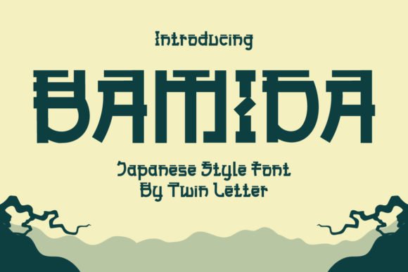
Bamida Faux Japanese interprets East Asian visual cues through a refined display alphabet that feels both organic and crafted. The letterforms emphasize rounded terminals and gentle stroke modulation, producing a friendly, approachable aesthetic that reads well at poster size. Rather than overtly imitating kanji shapes, it borrows rhythmic brush textures to suggest authenticity without sacrificing Western typographic structure.
This typeface excels in food and hospitality branding where warmth and heritage are desired; its soft contrasts translate beautifully to menus, banners, and packaging. Designers will appreciate how Bamida creates memorable logotypes thanks to its distinctive terminals and balanced proportions. It also holds up in editorial headlines and cover treatments where a touch of exoticism boosts visual appeal.
Because Bamida reads comfortably at large sizes, it’s ideal for environments that demand instant recognition-restaurant signage, event posters, or book titles. Pair it with understated serif or humanist sans faces to avoid visual competition, and reserve decorative alternates for accents to preserve clarity. The result is a polished, culturally inspired look without gimmickry.
╰┈➤ Download Bamida Faux Japanese Font
My Recommendation: I recommend Bamida Faux Japanese for projects that want a soft, stylized East-Asian influence-especially food brands, boutique packaging, and posters. It gives designs distinct character while remaining legible in headline contexts. Use it sparingly as the visual focal point and support it with neutral body typography for best results.
21. Mixiwa Faux Japanese Font
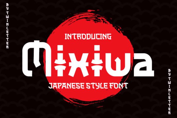
Mixiwa Faux Japanese is a bold display face built for drama: heavy strokes, sharp contrasts, and kinetic terminals give it a kinetic, cinematic vibe. The design reads like an energetic brush strike translated into a compact Western alphabet, making it a standout choice for movie titles, posters, and attention-grabbing headlines. Its personality leans theatrical-expect strong impact at large sizes.
The type’s high-impact shapes perform well on promotional materials and packaging that need to cut through visual noise; the aggressive rhythm of its letters creates instant recognition. Mixiwa also works for editorial spreads that benefit from a headline with attitude, but it’s less suited for dense copy. Designers can use alternates or layered color treatments to amplify its hand-crafted look without losing legibility.
When pairing, choose calm, neutral text faces so Mixiwa can act as the visual anchor. It pairs especially well with narrow sans-serifs or simple humanist bodies to maintain hierarchy. For projects that require theatrical flair-music posters, film campaigns, or bold brand identities-this font delivers punch and personality.
╰┈➤ Download Mixiwa Faux Japanese Font
My Recommendation: I’d pick Mixiwa Faux Japanese when I need an unapologetically bold headline that commands attention-great for posters, album covers, and trailers. Its brush-like energy brings theatrical character, but reserve it for display roles and pair it with calm body text to avoid visual clash. Use strong color contrasts or layering to maximize its dramatic effect.
22. Japanese Neotokyo Font
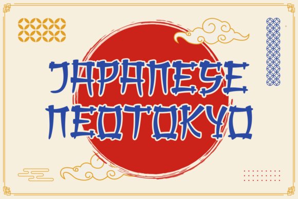
Among modern japanese fonts, Japanese Neotokyo stands out as a theatrical fusion of hand-brushed calligraphic energy and neo-futuristic geometry. Its exaggerated vertical proportions and textured terminals read like a traditional inkbrush rendered through a neon-lit lens, giving headlines an immediate, arresting personality without sacrificing legibility.
The face includes a full set of upper- and lowercase letters, numerals and punctuation, with carefully balanced counters and stroke contrast that hold up in large-format uses. Stylized brush textures and dynamic terminals make it especially effective for posters, film titles, menus, and merchandise that need cultural resonance plus contemporary attitude.
Pair Japanese Neotokyo with simple sans-serifs or minimalist grids to let its dramatic forms breathe; alternatively, layer it over photographic textures to amplify a cyber-Asia vibe. Its visual versatility means it performs equally well in print signage, packaging for artisanal eateries, and branding for entertainment projects that draw on both heritage and futurism.
╰┈➤ Download Japanese Neotokyo Font
My Recommendation: I’d reach for Japanese Neotokyo when I want a headline that reads like an expressive performance-perfect for ramen shop branding, anime posters, or cyberpunk-themed events. It delivers a strong cultural signal without feeling clichéd, and it pairs beautifully with clean supporting type to maintain hierarchy. Use it at large sizes to enjoy the brush details and neon-era attitude.
23. Choki Kighiro Font
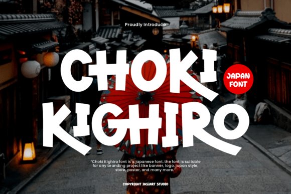
Choki Kighiro is a playful display typeface that channels bold brush energy into warm, rounded letterforms that feel hand-cut and approachable. Thick strokes, generous counters, and quirky terminals create a lively rhythm that reads clearly from a distance while conveying a handcrafted, street-sign personality.
This font ships with uppercase and lowercase letters, numerals and punctuation, and is PUA-encoded so alternates and decorative swashes are easily accessible in most design apps. The irregularities in each glyph give campaigns an energetic, spontaneous feel-ideal for festival posters, youth-oriented packaging, and social media graphics that need motion and charm.
For best results, combine Choki Kighiro with a neutral geometric sans to stabilize layouts, or use it alone in large display sizes to emphasize its friendly motion. Adjust tracking and leading to tune the voice from compact, punchy headlines to airy cinematic wordmarks depending on your creative brief.
╰┈➤ Download Choki Kighiro Font
My Recommendation: I’d pick Choki Kighiro when a project needs upbeat, handcrafted character-think pop-up food stalls, travel vlogs, or event flyers aimed at younger audiences. Its PUA encoding makes stylistic touches effortless, and the font’s bold presence keeps messages readable even at a glance. Use it for titles and logos where personality matters more than formality.
24. Aokahori Font
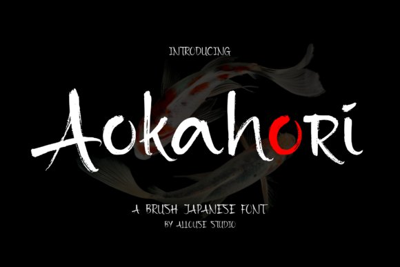
Aokahori is a brush-style display font that evokes the fluid motion of hand-painted lettering while keeping forms tidy enough for commercial use. Its strokes retain natural ink variation and lively terminals, offering a tactile, handmade texture that enriches packaging, editorial spreads, and wedding stationery.
The typeface works well at display sizes where its brush details can be appreciated, and it sits comfortably alongside modern sans-serifs to create striking contrast. Use Aokahori to introduce an organic, artisanal voice to brands, or to add visual warmth to social posts and magazine covers that seek a personal touch.
Because of its expressive brush marks, Aokahori excels in settings where mood and authenticity are primary-artisan food labels, boutique product lines, and event invites. It’s an effective way to suggest traditional craftsmanship without resorting to literal historical motifs.
My Recommendation: I recommend Aokahori when you want an authentic brush feel that still reads well in contemporary layouts-great for packaging, editorial headlines, and invitations. Its handmade texture brings warmth and character without overpowering supporting elements. Use it for projects that benefit from an approachable, craft-driven aesthetic.
25. Tatsukaze Font
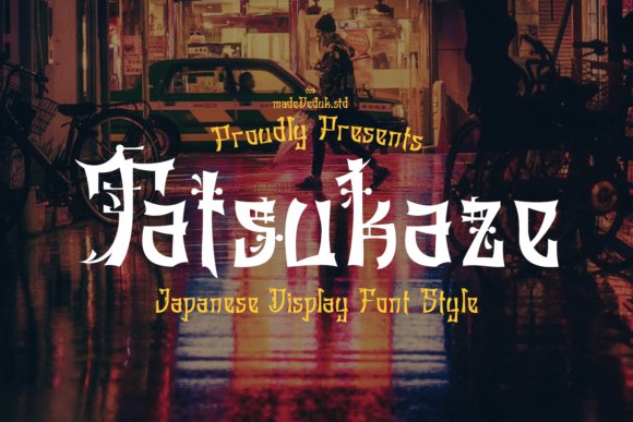
Tatsukaze is an expressive display typeface that channels traditional calligraphic energy into contemporary design. Its sharp serifs and ornamental terminals read like hand-brushed strokes, giving each Latin letter the motion and rhythm of classic Japanese calligraphy. The font’s decorative detailing creates strong focal points, making it ideal where dramatic, characterful typography is needed.
Technically, Tatsukaze balances flair with legibility: generous counters and purposeful spacing keep headline copy readable even at larger sizes. Designers will appreciate the layered textures in the strokes-subtle stress shifts and tapered curves that mimic brush pressure without becoming cluttered. These qualities make it versatile across posters, editorial spreads, and brand identities that lean into visual storytelling.
Tatsukaze plays especially well in cultural or fantasy-themed projects that reference East Asian aesthetics, and it pairs smoothly with clean sans-serifs to avoid visual competition. As one of the more theatrical japanese fonts in this collection, it can serve as a primary logotype or a display headline that demands attention. Its inherent theatricality also works beautifully in packaging and event promotion where mood and atmosphere are prime.
My Recommendation: I’d reach for Tatsukaze when a project needs dramatic, calligraphic personality-think festival posters, boutique restaurant logos, or limited-edition packaging. It brings ornate, brushlike detail without sacrificing headline clarity, and pairs well with neutral sans-serifs for balance. Use it where you want typography to read as art as much as information.
26. Kyoto World Font
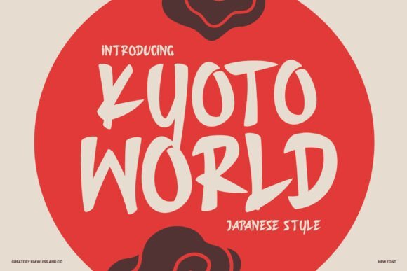
Kyoto World is a bold, streetwise display typeface inspired by urban signage and casual hand-painted shopfronts. Its brush-inflected strokes and slightly irregular terminals convey motion and a handcrafted spirit, giving words a lively, conversational tone. The typeface emphasizes presence over subtlety, so it’s perfect when you need to cut through visual noise with confident lettering.
The strength of Kyoto World lies in its personality: wide proportions and heavy stroke contrast create strong silhouettes that perform well on posters, storefront graphics, and merchandise. Designers can exploit its energetic feel for food packaging, menu headers, and lifestyle branding that references Japan’s vibrant street culture. It’s especially effective when paired with gritty textures or candid photography to amplify urban authenticity.
Open, accessible shapes mean headings remain readable at a distance while retaining a handcrafted warmth up close. Alternate glyphs and roughened edges (if included) add variety, allowing designers to craft distinctive display treatments without custom brushwork. Use Kyoto World when you want type that feels alive, spontaneous, and rooted in everyday city aesthetics.
My Recommendation: I recommend Kyoto World for projects needing bold, approachable character-restaurants, streetwear labels, and event posters benefit most. Its lively brush aesthetic grabs attention while maintaining legibility at scale. If you’re designing packaging or signage that wants to evoke urban Japanese flair without appearing overly traditional, this is a top choice.
27. Saniro Font
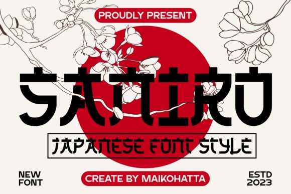
Saniro offers a refined blend of historical reference and contemporary restraint, producing a display face that’s versatile across print and digital contexts. The letterforms favor balanced strokes and clear counters, giving the typeface a poised, readable demeanor even when used at larger sizes. This measured aesthetic makes Saniro suitable for editorial headings, identity work, and lifestyle branding that requires subtle cultural nods.
Rather than dramatic brush gestures, Saniro emphasizes structure-consistent stroke widths and tidy terminals create a calm, dependable rhythm across lines of text. That precision lends itself well to packaging and signage where clarity matters, while still carrying a distinctive personality rooted in regional typographic traditions. Designers will find it easy to pair with minimalist layouts or rich photographic backgrounds.
Saniro’s strength is adaptability: it complements both modern and heritage-forward visuals, and its neutral temperament supports longer headlines without overwhelming the composition. For projects seeking a tasteful reference to Japan’s typographic legacy without overt ornamentation, Saniro strikes an elegant balance between cultural resonance and contemporary utility.
My Recommendation: I’d choose Saniro when a project needs subtlety and versatility-magazine mastheads, premium packaging, and corporate branding are ideal. It brings a quiet nod to traditional forms while remaining clean and modern, so it pairs well with restrained color palettes and sophisticated imagery. Use Saniro when clarity and understated cultural reference are priorities.
28. Jaypong Font
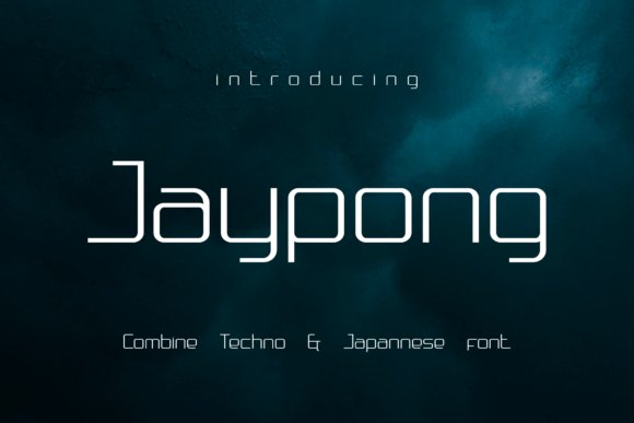
Jaypong is a futuristic display face that fuses techno minimalism with an East‑Asian sensibility, and it deliberately nods to japanese fonts while avoiding cliché samurai tropes. The letterforms favor narrow counters, geometric terminals, and a light structural skeleton that reads like circuitry rendered as type. This hybrid look evokes neon-lit cityscapes and retro arcade interfaces without losing typographic polish.
At display sizes Jaypong’s rhythm becomes its strength: tight tracking and consistent stroke contrast create a compact, machine‑age voice that still retains human warmth. Thin joins and occasional angular flares give headlines a kinetic energy ideal for short phrases, taglines, and logotypes. It’s not built for body copy, but it excels where personality and bite matter.
Use Jaypong to brand electronic music events, tech startups, gaming covers, or packaging that wants a modern Tokyo‑noir vibe. Pair it with a neutral grotesque or monospaced face to balance its decorative edge and ensure legibility. When layered over photographic textures or neon gradients it becomes a strong focal element that reads across digital and print media.
My Recommendation: I reach for Jaypong when a project needs a crisp, futuristic accent that still hints at East Asian typographic heritage. Its compact, techno driven shapes add instant attitude to posters, album art, and UI headers. I recommend it for bold visual identities where short, punchy wording must carry the design.
29. Japanese Sumi Font
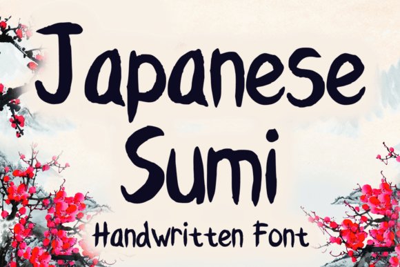
Japanese Sumi captures the looseness and spontaneity of brush script with a casual, handcrafted tone reminiscent of sumi‑e calligraphy. The strokes vary in pressure and texture, producing organic edges and ink‑bleed effects that feel intimate and tactile. It’s designed as a display brush face that reads as both playful and authentic.
Technically, the glyphs exhibit uneven terminals and dynamic stroke width, which make each character feel painted rather than plotted. That textural quality makes this font perfect for apparel graphics, greeting cards, stickers, and packaging where a handmade aesthetic is desired. It performs best at larger sizes where the grain and brush details remain visible.
For best results, combine Japanese Sumi with clean, understated sans serifs to prevent visual competition and preserve readability. Apply textured backgrounds, letterpress effects, or subtle grain overlays to amplify its artisanal charm. This font thrives in projects that want to communicate warmth, craft, and an approachable expressive voice.
╰┈➤ Download Japanese Sumi Font
My Recommendation: I use Japanese Sumi when a design needs the immediacy of hand‑painted calligraphy-think indie apparel, boutique packaging, or greeting cards. Its raw brush texture brings personality that digital type often lacks, and it pairs beautifully with minimalist layouts to keep designs modern. Reach for it when you want a friendly, handcrafted headline that feels personal.
30. Ryu Japanese Font
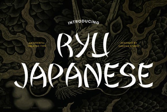
Ryu Japanese draws inspiration from traditional brush lettering, delivering dramatic strokes and a muscular presence well suited to display use. The letterforms combine sweeping curves with pointed terminals to produce an expressive, high‑contrast silhouette that reads as both energetic and authoritative. It conveys a handcrafted, artistic temperament without sacrificing compositional balance.
The type’s dynamic rhythm and roughly textured edges give headlines a dramatic stage presence, making it ideal for posters, album art, and cinematic titles. Ryu’s boldness ensures legibility at large sizes while its irregularities provide visual interest that holds attention. It’s best used sparingly-titles, logotypes, and key graphics-where impact matters most.
Pair Ryu with restrained, modern sans serifs or simple serif text to let its brush character take center stage, and consider monochrome or limited palettes to reinforce its theatricality. It suits cultural branding, restaurant signage, game covers, and fashion graphics that require a strong, handcrafted identity. Use it with respect for cultural context to enhance authenticity.
╰┈➤ Download Ryu Japanese Font
My Recommendation: I recommend Ryu Japanese when a project demands a bold, brush‑driven voice-think film posters, restaurant brands, or streetwear labels. Its expressive strokes create memorable headlines and logos that stand out in visual marketplaces. I turn to Ryu when I want an authentic, handcrafted energy that reads confidently at display sizes.
31. Japanese Foods Font
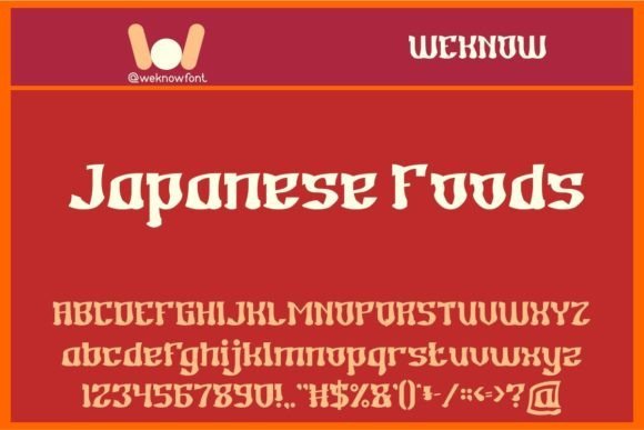
Japanese Foods is a decorative display type that channels pan-Asian visual cues into a playful, gourmet-ready aesthetic. As part of the broader japanese fonts conversation, this face blends abrupt stroke terminals and rounded counters to evoke signage, food packaging, and casual restaurant menus without relying on authentic syllabaries.
Its letterforms sit heavy on contrast and ornamentation, making them ideal for headlines, logos, posters, and apparel where personality must read at a glance. The type’s exuberant silhouettes work well at large sizes and in tight compositions, where each glyph’s quirks become a focal point rather than a distraction.
Because of its stylized heritage feel, Japanese Foods pairs best with neutral sans-serifs or restrained serifs that temper its expressiveness. Use it sparingly for brand marks, event posters, or social media headers to add an exoticized, hand-crafted atmosphere without sacrificing legibility.
╰┈➤ Download Japanese Foods Font
My Recommendation: I’d reach for Japanese Foods when designing menus, foodie brands, or event posters that need instant character and a kitschy Asian-inspired look. It brings bold personality and works beautifully at display sizes, but I’d avoid body text and pair it with simpler typefaces for balance. This is a go-to for playful branding and product packaging where mood matters more than strict cultural authenticity.
32. Japanese 3017 Font
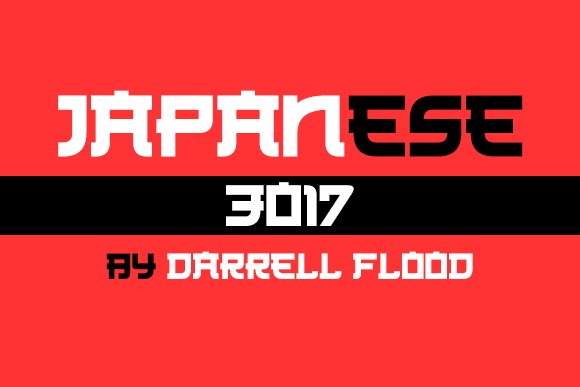
Japanese 3017 reinterprets East Asian calligraphic motifs through a clean, geometric lens, combining the visual rhythm of Hiragana and Kanji with modern sans proportions. The designer emphasized consistent stroke widths and open counters, which improves readability for headlines, signage, and UI elements while retaining an unmistakable nod to Japanese letterform aesthetics.
Its restrained structure makes it versatile: use compact weights for tight web headers or expanded cuts for impactful print posters. The restrained terminals and regular spacing also make it a good partner for multilingual layouts where Latin text must harmonize with an Asian-inspired display face.
Pair Japanese 3017 with a humanist sans or a neutral slab to create engaging contrast without visual clutter. For editorial covers, tech branding, and minimalist packaging, this font offers a contemporary take on cultural referencing that feels deliberate rather than decorative.
╰┈➤ Download Japanese 3017 Font
My Recommendation: I recommend Japanese 3017 for projects that need the spirit of East Asian lettering but require modern clarity-think tech brands, magazine covers, and wayfinding systems. Its balanced strokes make it forgiving at different sizes, so it’s reliable across print and digital applications. I’d combine it with a simple body font to maintain hierarchy and avoid visual competition.
33. Samuri Faux Japanese Font
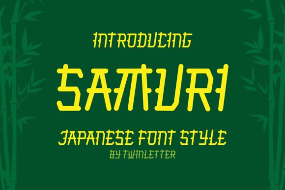
Samuri Faux Japanese is an ornamental display font that borrows aesthetic motifs from traditional Japanese calligraphy while presenting them in a relaxed, contemporary form. Its sweeping curves and slightly irregular terminations give text a handcrafted, cinematic quality, ideal for titles, posters, and evocative branding that seeks an exoticized flair.
The face excels when used at large sizes where its distinctive shapes and decorative strokes can register clearly. It’s particularly effective for logotypes, movie titles, and food banners where visual drama is required; lighter usage on packaging or social art can create an upscale yet approachable mood.
Because Samuri leans into stylization, pair it with a neutral sans or a minimalist serif to keep layouts readable and sophisticated. Use it to inject personality into a design – its charm is its ability to feel unique and memorable without becoming illegible.
╰┈➤ Download Samuri Faux Japanese Font
My Recommendation: I’d choose Samuri Faux Japanese for projects that demand expressive headlines or stylized branding-think indie films, boutique restaurants, and limited-edition apparel. It gives instant character and draws the eye, so use it as a focal point rather than continuous text. Pairing it with clean supporting type ensures the design stays polished and purposeful.
34. Jinkay Faux Japanese Font
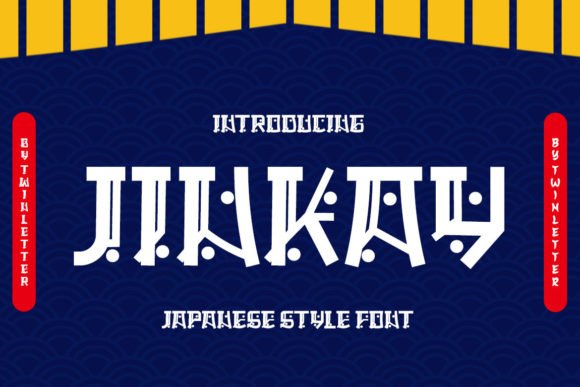
Jinkay Faux Japanese is a bold display typeface that channels the raw energy of hand-brushed calligraphy into a modern headline face. As part of the wider world of japanese fonts, it captures sweeping brush strokes, uneven ink textures, and abrupt terminals that read as both handcrafted and deliberately stylized. The result is a highly expressive look that immediately signals an East-Asian-inspired aesthetic while remaining a Latin alphabet display design.
At large sizes Jinkay becomes a powerful focal point – excellent for logotypes, posters, and cinematic titles where drama and personality matter more than continuous readability. Its irregular stroke rhythm makes short words and single-line headlines feel kinetic; for multi-line treatments or body copy you’ll want to rely on neutral companions to preserve hierarchy. Pairing suggestions include a restrained geometric sans or a clean humanist to balance the exuberance of the brush forms.
Practical use is straightforward: treat Jinkay as a decorative headline tool and give it breathing room with generous tracking and ample margins so the ink textures can read cleanly. Because the design leans heavily on visual texture, colors and backgrounds will change its perceived weight – light backgrounds reveal ink detail while dark or textured surfaces push it into silhouette. Use it for food branding, boutique packaging, movie posters, and editorial covers when you need an immediate cultural nod without using actual kana or kanji.
╰┈➤ Download Jinkay Faux Japanese Font
My Recommendation: I’d reach for Jinkay when a project needs instant personality – a restaurant identity, a festival poster, or a gritty film title are perfect fits. Its faux-calligraphic strokes give a handcrafted authenticity that draws the eye, and when paired with a simple sans it keeps layouts readable. Use sparingly for maximum impact: one strong headline will outperform repeated overuse.
Whether you need neutral system-friendly typefaces or bold display faces, the 34 fonts in this guide provide a broad toolkit for Japanese typography needs. Apply the pairing tips and check webfont support and licensing to ensure the selected fonts work technically and legally in your projects.
Try several candidates in real mockups, note which styles match your brand voice, and keep a shortlist for future work – good typography speeds design decisions and improves user experience.