33 Ultimate Font Combinations for Brand Identity Systems 2026
The right font combinations make a logo readable and memorable. This guide presents 33 pairings aimed at Brand Identity Systems in 2026, with clear notes on contrast, mood, and legibility.
Each example pairs a display face with a supporting body type, shows suggested weights and sizes, and explains why the match works. You’ll also find quick tips on spacing, color, and when to swap styles across touchpoints.
1. Rosmerta Font
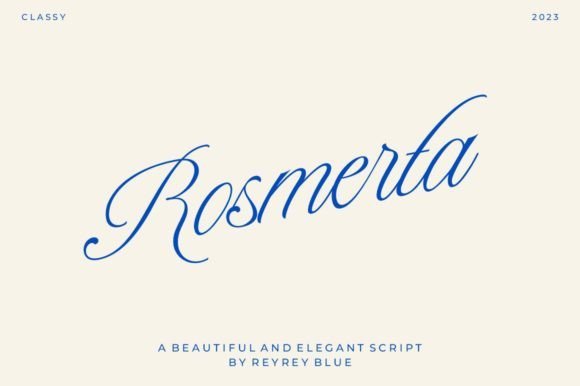
Rosmerta Font – Rosmerta is a refined vintage script with thin, graceful strokes that call to mind engraved stationery and period signage. The letterforms balance ornament and restraint: long ascenders and tidy terminals keep the text readable even when flourishes are present. It reads as nostalgic without feeling overly ornate, making it suited to premium printed pieces.For practical work I pair Rosmerta with a clean geometric sans or a chunky slab to create contrast; those font combinations allow the script to function as a display accent while the companion handles body copy. Watch tracking and the scale of swashes so lines don’t feel cramped, and exploit alternates sparingly to keep repeated words from looking identical.
My Recommendation: I reach for Rosmerta when a project needs old-world charm without losing modern clarity. Its slender strokes are perfect for wedding stationery, boutique labels, and mastheads where a decorative script can be the focal point. Pair it with a neutral sans for readable text and give the script room to breathe so the fine details remain crisp.
2. Amdeira Font
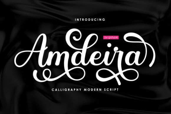
Amdeira Font – Amdeira is a confident, brush-style script with a slightly retro attitude and a bold presence ideal for display use. It includes advanced typographic bits – ligatures, stylistic sets, and alternate endings – so common letter joins can be smoothed out and flourishes adjusted for each context. The designer-friendly PUA encoding and multilingual glyphs make accessing decorative characters straightforward in most layout tools.Because of its weight and motion, Amdeira works best as a headline, logotype, or short phrase rather than body text; it reads strongly at larger sizes. Consider pairing it with a narrow sans or a soft serif to steady layouts, and invest a little manual kerning around linked letters when you tighten tracking. Reserve long swashes for one or two words to avoid visual clutter.
My Recommendation: I’d use Amdeira when a brand, poster, or cover needs bold personality with a vintage flavor. The alternative glyphs let me craft custom endings and unique wordmarks quickly, and PUA access saves time during production. It shines on packaging, magazine covers, and menus where a lively script can anchor the design.
3. Love Future Font
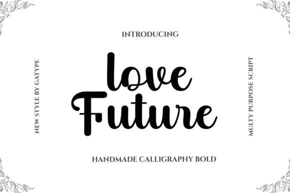
Love Future Font – Love Future is a bold script with chunky strokes and open counters that give it a retro, upbeat character suited to short, punchy headlines. The PUA-encoded set includes swashes and alternate capitals that slide into layouts without extra font tools, so decorative choices are immediate. Its confident forms read youthful and assertive while staying readable at display sizes.Use Love Future at headline scale and pair it with a restrained serif or a compact grotesque to keep hierarchy clear and legibility intact. Limit swashes to single words or initials so the eye has a place to rest, and tighten cap-to-cap spacing slightly to lock word shapes together. It works especially well on posters, album art, and labels where strong personality is required.
My Recommendation: I reach for Love Future when a project needs bold retro character and instant recognition. The built-in swashes and alternates let me add flair without overworking the layout, and PUA encoding keeps the workflow simple. This face is great for posters, social graphics, and packaging where a loud, memorable display type is desired.
4. Beach Night Font
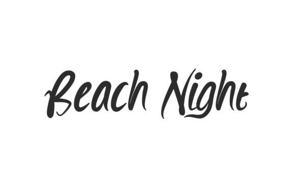
Beach Night Font is a swirl handwriting face that balances bold strokes with elegant loops, giving headings a confident, handcrafted flavor. It includes alternate forms and flowing ligatures that prevent repetition and add personality to short phrases. Because of its weight and rhythm, Beach Night pairs easily in font combinations with a neutral sans or a restrained serif to anchor longer text.Best deployed at display sizes, this script works for album covers, posters, logos, and invitations where you need character more than continuous paragraph text. Kerning is tight by design, so allow breathing space around words and avoid setting it in dense blocks; the letterforms shine when given room. If you need a signature-style headline with informal sophistication, this font is a solid option.
My Recommendation: I reach for Beach Night when a project needs warm, handwritten personality-product labels, boutique logos, and social graphics all benefit. Its bold strokes read well in photos and on packaging, while alternates keep repeated words fresh. Pair it with a clean sans for body text to preserve legibility while letting the script carry the mood.
5. Clagwa Font
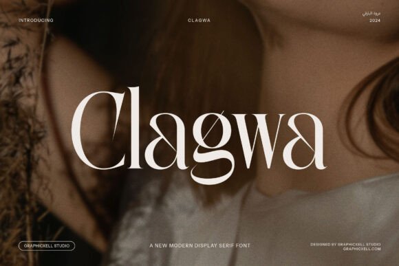
Clagwa Font brings strong display serif shapes with refined terminals and a slightly condensed profile that suggests luxury without being fussy. Its high-contrast strokes and open counters sustain legibility across print and screen, making it suitable for mastheads and premium labels. The design includes stylistic alternates and small caps that help craft distinctive wordmarks.Combine Clagwa with a geometric sans when you want a modern editorial mix, or pair it with a neutral humanist for soft contrast in body copy. Scale the serif for headlines and drop to regular or book weights for subheads to maintain hierarchy and rhythm. It performs well in packaging, boutique branding, and magazine spreads where a poised tone is required.
My Recommendation: I choose Clagwa for projects that require a refined, slightly vintage voice-luxury packaging, fashion editorials, and boutique signage are ideal. The alternates speed up logo explorations and the condensed proportions make strong headlines without crowding layouts. Its balance of presence and clarity keeps high-end designs readable and distinctive.
6. Tropica Gardens Font
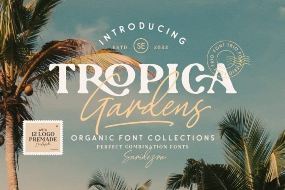
Tropica Gardens Font is a curated trio: a bold serif for attention-grabbing headlines, a rounded sans for readable body text, and an authentic signature script for accents and logos. The three styles are pre-paired to remove guesswork, so you can assemble headings, subheads, and signatures with consistent contrast and rhythm. Each face maintains consistent x-height and stroke color to ensure visual harmony across layouts.Use the serif to crown packages or posters, the rounded sans for UI and captions, and the signature sparingly for logotypes and social headlines; this distribution keeps reading smooth while adding decorative flair. Files typically include OTF/TTF and webfont formats with kerning and ligature support; check for multilingual glyphs if you need extended character sets. For responsive design, rely on the sans at small sizes and reserve the serif and script for medium to large display work.
╰┈➤ Download Tropica Gardens Font
My Recommendation: I like Tropica Gardens when a brand needs a compact system that already works together-fast-turn identity builds, seasonal packaging, and small editorial projects benefit most. The pre-paired trio cuts decision time and prevents mismatched tones between headline and body. In practice, it saves rounds of trial-and-error while keeping layouts coherent and polished.
7. Miogina Font
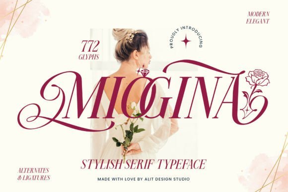
Miogina Font – Miogina is a modern serif that threads refined bookish letterforms with sweeping swashes, producing a voice that reads poised yet ornamental. Alit Design Studio supplies an extensive set of alternates and integrated ornaments-roses, diamonds and hearts-so headlines can feel decorated without layering extra graphics. The typeface maintains measured contrast and generous counters, which helps the swashes stay readable in tight editorial or luxury packaging layouts.When planning page hierarchies I often lean on strong sans or a restrained slab as a partner, and those font combinations let Miogina act as the decorative headline without competing for attention. It excels in wedding suites, premium ID systems and magazine mastheads where high-resolution output preserves fine details. Watch tracking and line-height when using ornate glyphs so text retains clarity and the ornaments have breathing room.
My Recommendation: I pick Miogina when a brief asks for refined romance with real typographic substance. Its built-in ornaments speed up production of monograms and premium packaging, and the swash alternates let me dial personality from subtle to expressive. Use it for high-end print pieces, boutique branding and editorial covers where typography must read luxurious and handcrafted.
8. First Marigold Duo Font
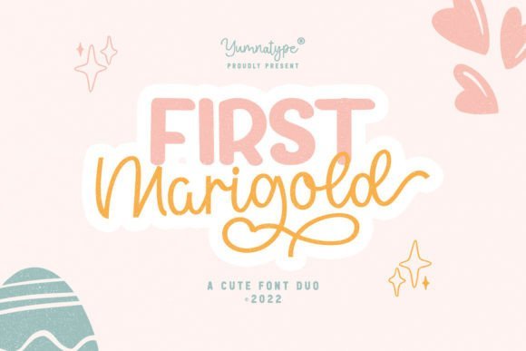
First Marigold Duo Font – First Marigold Duo pairs a relaxed geometric sans with a bouncy, slightly irregular handwritten script to create an instantly approachable voice. The sans provides clean, stable copy behavior while the script supplies bursts of personality suitable for badges, labels and short headlines. Contextual alternates in the script keep letter combinations from feeling repetitive and maintain a convincing hand-written rhythm.Treat the duo as a micro-system: reserve the sans for body text, navigation and small captions, and let the script punctuate calls-to-action, hero lines and packaging accents. Scale, color and background texture will shift the duo’s mood-bright palettes skew playful, muted tones feel artisanal-so test contrasts across real assets. It’s especially effective for social posts, kid-focused merchandise and indie product branding where warmth and immediacy matter.
╰┈➤ Download First Marigold Duo Font
My Recommendation: I reach for First Marigold Duo when a brand needs friendly personality without losing functional clarity. The sans anchors layouts while the script adds handcrafted charm, which makes art direction decisions straightforward. Ideal for children’s goods, lifestyle packaging and social-first marketing where a human touch sells.
9. Lindsay Font
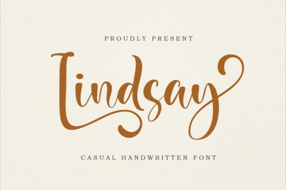
Lindsay Font – Lindsay is a slender, feminine handwritten font that balances graceful flourishes with disciplined spacing to preserve legibility. Its suite of alternates and stylistic sets allows subtle variation across repeated words, making it useful for logos, monograms and invitation lines where variety prevents monotony. The light strokes read delicate at display sizes but remain usable with careful contrast control and generous leading.For reliable layouts pair Lindsay with a geometric sans or a modest, low-contrast serif to provide readable body text and a visual anchor for the script. Avoid busy textures and tight columns; the script performs best on clean fields where ligatures and swashes can be appreciated. Typical applications include wedding suites, boutique fashion branding and editorial accents that require an upscale, personal signature.
My Recommendation: I use Lindsay when a project needs a refined handwritten signature that still behaves across scales and media. The alternate characters are a practical luxury-small variations that prevent repetition and add character to logotypes and invites. It’s perfect for wedding stationery, boutique identities and fashion editorials where a chic, personable script elevates the design.
10. Morthano Font
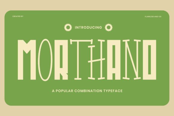
Morthano Font – Morthano reads like a hand-inked headline: chunky terminals, playful counters, and a collection of quirky alternates give it a confident, energetic voice that performs best at display sizes. When used in font combinations, Morthano acts as a clear focal point-its bold letterforms cut through busy layouts and create an immediate identity for packaging, posters, or social graphics. The irregular shapes feel intentional rather than messy, so you get personality without losing legibility.Treat Morthano as the loud member of a type stack and pair it with a calm humanist sans for reading matter or a restrained slab serif to hint at retro styling. Bright colors or hand-drawn illustrations amplify its youthful vibe, while careful tracking controls keep headlines tight and readable. It thrives where visibility and character are priorities.
My Recommendation: I reach for Morthano when a project calls for high-spirited type that still reads at a glance. Its alternates and ligature set let you craft unique logotypes and headlines without heavy custom lettering. Use it for children’s brands, playful packaging, posters, and any application that benefits from a bold, handcrafted attitude.
11. Best Friend Forever Font
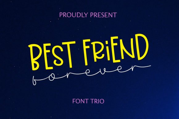
Best Friend Forever Font – Best Friend Forever bundles a handwritten script, a display cut, and a clean sans in one coherent family so you can mix textures without fighting proportions. The script brings spontaneous, human strokes while the display style adds personality at large sizes, and the sans handles longer passages with calm neutrality. Together they create rhythmic typographic layers that read friendly and intentional.Because the three styles are built to work together, swapping weight and style between logotype, callouts, and captions is simple and visually consistent. This makes the family ideal for greeting cards, boutique branding, and event collateral where warmth matters. Small alternates and ligatures help avoid repetition and keep text feeling handcrafted across formats.
╰┈➤ Download Best Friend Forever Font
My Recommendation: I pick Best Friend Forever when a design needs a personable voice across many touchpoints without endless pairing tests. The coordinated trio speeds layout work while preserving an artisanal feel. It fits perfectly for boutique product labels, stationery, invitations, and lifestyle marques that want a friendly, handcrafted look.
12. Cravelo Font
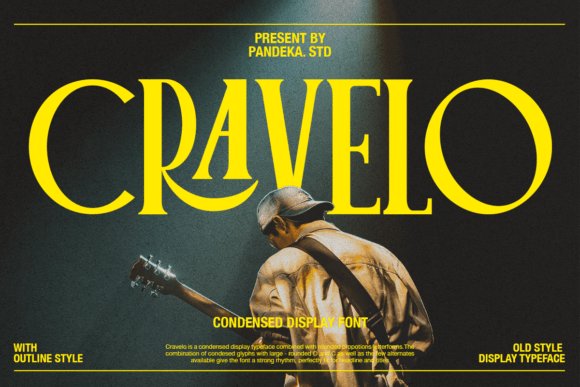
Cravelo Font – Cravelo is a condensed serif display with retro proportions: narrow stems meet wide, rounded counters to create a strong headline cadence that reads confidently at scale. Large O and C shapes soften the condensed fit and the alternate glyphs let you tune spacing and rhythm for shorter or longer titles. The result is a typeface that channels vintage poster energy without feeling decorative for its own sake.With over 300 glyphs and PUA encoding, Cravelo hands designers stylistic alternates and extended language support in a single file, which speeds production for editorial and packaging. Pair it with a neutral grotesque for comfortable body copy or let it run alone on labels and signage where space is limited. Its compact voice works especially well on covers, posters, and retro-inspired identity work.
My Recommendation: I use Cravelo when a headline must occupy minimal horizontal space but still carry character. The alternates and wide glyph set make it flexible for multilingual projects and fine-tuning logo wordmarks. It’s particularly well suited to magazine covers, product labels, and campaigns that call for a condensed vintage attitude.
13. Gomy Font
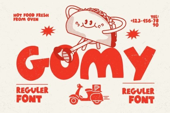
Gomy Font – Gomy is a bold, chubby script-styled display that reads like a marker drawn with confident pressure. Its thick letterforms and rounded terminals make it highly legible at close range and ideal for playful brand identities and packaging that need instant appeal. Using Gomy in headline roles establishes a cheerful voice while remaining readable across labels and social creative, and for stronger typographic systems you can pair it with restrained sans or neutral serif to create balanced font combinations.Try combining Gomy with a geometric sans such as Montserrat or a narrow grotesque to provide contrast, or pair it with a crisp humanist serif for editorial packaging. Use it large for emphasis and switch to lighter, more neutral faces for supporting copy to preserve hierarchy. Its chunky forms also work well with bold iconography and flat color blocks on children’s products, snack packaging, and festival posters.
My Recommendation: I reach for Gomy when a project needs bold, friendly personality that reads from a distance. It’s perfect for kids’ packaging, casual café signage and event posters where warmth and instant recognition matter. The font pairs neatly with delicate serifs or neutral sans, making it easy to build a lively yet readable identity.
14. Bospore Font
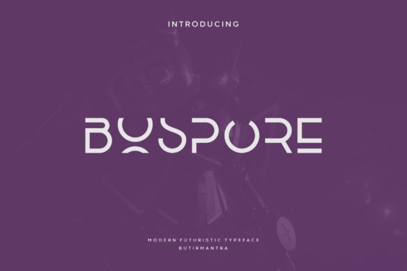
Bospore Font – Bospore is a minimal geometric sans with a polished tone and two stylistic variants that introduce personality through angled terminals and clipped counters. The letterforms balance clean neutrality with subtle character, making the family well suited to brand identity, editorial layouts and premium packaging. Carefully matched uppercase and lowercase shapes maintain legibility in long headlines while offering distinct forms for logotypes.For body text, pair Bospore with a warm humanist serif or a soft book serif to add tactile contrast without stealing focus. Use the more assertive alternate for signage or logomarks and the cleaner style for brochure panels or UI, where clarity matters most. With tight kerning and generous margins, Bospore rewards precise typesetting and gives projects a refined, modern voice.
My Recommendation: I choose Bospore when a design needs modern restraint with a hint of personality. Its two styles make it flexible for logos, brochures and product packaging where clarity is critical. I value how minor letter quirks lift a layout while keeping the overall tone understated and professional.
15. Teenage Wanker Font
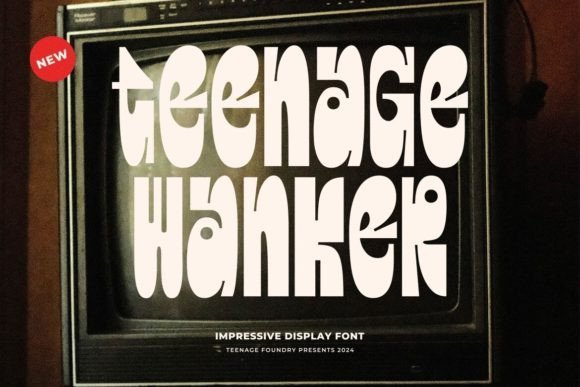
Teenage Wanker Font – Teenage Wanker is a display serif that mixes retro quirks with uneven case treatment, producing an offbeat, analogue-era character. Random alternates and varied stroke endings deliver a handcrafted, slightly rebellious voice that reads strongly on posters, album art and apparel. This face favors statements over neutrality, making it a compelling choice for expressive headlines and logos that need attitude.Balance its personality with a spare grotesque or neutral geometric sans for long-form copy so the display face keeps its punch without overwhelming readers. Use bold sizes, tight tracking and restrained color palettes to let the letter shapes dominate, or pair with textured photography to emphasize vintage leanings. It performs especially well on indie publications, event posters and limited-run packaging where distinctiveness is the main message.
╰┈➤ Download Teenage Wanker Font
My Recommendation: I pick Teenage Wanker for projects that require personality with attitude-band posters, zines and apparel labels are ideal. Its imperfect, tactile shapes feel handmade and play well with textured print stocks and gritty photography. In short, it’s a go-to when you want a design to read as intentionally rough and unmistakably individual.
16. Warbiazah Font
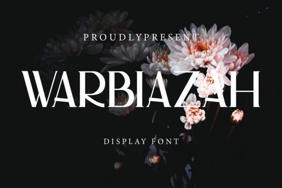
Warbiazah Font – Warbiazah is a serif display with sculpted terminals and gentle flares that give each character a hand-finished feeling. The face performs best at headline scale where its pronounced contrast and unique ligatures become focal points for logos, posters, and quote graphics. Its shapes read as crafted rather than mechanical, so a little whitespace and considered tracking reveal the detail without crowding the forms.When building font combinations, pair Warbiazah with a neutral geometric or humanist sans to anchor body copy and preserve hierarchy; the contrast highlights key words while keeping long passages comfortable to read. Pay attention to matching x-heights and letterspacing so the display doesn’t overpower small text, and test inverted colorways to keep counters clear against textured backgrounds.
My Recommendation: I often reach for Warbiazah when a brand needs personality without becoming fussy. It brings handcrafted flair to headlines and logotypes while a clean sans keeps supporting text readable. Use it for boutique packaging, editorial covers, and any project that benefits from charismatic letterforms.
17. Yesterday Font – font combinations
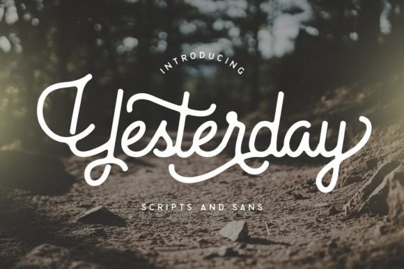
Yesterday Font – font combinations – Yesterday is a friendly script with slightly irregular strokes that preserve legibility while feeling handcrafted; its joins and alternate characters make words look like natural handwriting. The family was designed to work alongside a complementary sans so designers can mix script swashes with reliable straight forms to create contrast without clutter. That adaptability makes it a strong choice for social posts, invitations, and lifestyle branding where tone matters as much as readability.Use the script sparingly for emphasis and pair it with a restrained sans for body copy, captions, or buttons to maintain visual order. Mind the spacing where script terminals meet sans letters-tightening or loosening tracking often improves rhythm. The mix-and-match approach also lets you swap in decorative alternates for words that need extra personality without adding new typefaces.
╰┈➤ Download Yesterday Font – font combinations
My Recommendation: I use Yesterday when I want warmth and approachability in headlines or event graphics. The script’s alternates let you craft unique wordmarks while the bundled sans keeps longer text tidy. It’s ideal for wedding stationery, boutique social campaigns, and small business identities where a handwritten touch matters.
18. Holiday Season Font
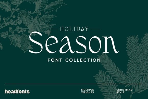
Holiday Season Font – Holiday Season pairs a decorative festive display with a restrained sans to create a clear contrast suited to seasonal work. The decorative face includes swashes and ornamented capitals that read as festive accents when set at headline sizes, while the simpler partner offers clean paragraph text and practical labeling. Together they grant a sense of celebration without making layouts feel overloaded.Apply the decorative font sparingly for focal phrases, offers, or greeting lines, and keep the sans for dates, disclaimers, and multi-line copy to preserve legibility across print and screens. Small color shifts, letterpress textures, or metallic foils increase the festive feel without adding extra typefaces. The set’s alternates let you vary the look across cards and packaging while staying within a single cohesive pair.
╰┈➤ Download Holiday Season Font
My Recommendation: I recommend this pair for any holiday marketing where you want shimmer without sacrificing clarity. The decorative face gives instant seasonal character while the sans keeps long copy readable. Use it for greeting cards, retail tags, packaging, and limited-run seasonal promos to achieve a polished festive look.
19. Cenko Font
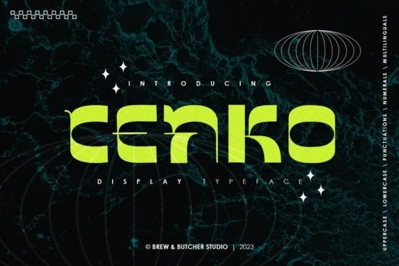
Cenko Font – Cenko’s letterforms feel intentionally uneven: strokes vary in width and endpoints while the overall silhouette remains balanced. That tension – blocky shapes fused with fine line accents – gives headlines a tactile, modern presence. When combined with neutral body faces, Cenko is one of those display choices that improves font combinations by adding personality without sacrificing readability.On large-format work like posters, packaging, or store signage, Cenko rewards careful kerning and selective tracking so its irregularities read as deliberate design moves rather than noise. It performs best at headline sizes where the block-and-line contrast can be appreciated, and pairs naturally with a simple geometric sans or a calm serif to anchor content. Use heavier weights for wordmarks and lighter styles for subheads to build clear typographic hierarchy.
My Recommendation: I reach for Cenko when a brand needs bold character without feeling gimmicky. Its mix of solidity and hand-drawn edges works particularly well for craft packaging, edgy editorial spreads, and attention-grabbing posters. For best results pair it with restrained text faces and pay careful attention to spacing and weight contrast.
20. Ordinary Boys Font Duo
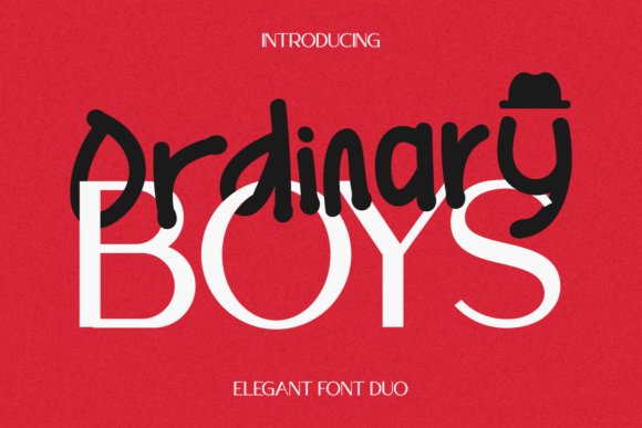
Ordinary Boys Font Duo – Ordinary Boys pairs a modern sans with a lively handwriting face to create a pleasant contrast between structure and personality. The sans carries information cleanly while the script adds warmth and emphasis without overwhelming the layout. Because the handwriting has a slightly irregular baseline and playful terminals, it brightens invitations, children’s materials, and friendly brand identities.Practical use means reserving the sans for body copy and navigation while using the script for headers, signatures, or badges to preserve legibility. Increase the script’s size slightly and loosen tracking when you want it to breathe; keep the sans tighter for compact layouts. This pairing thrives with muted palettes and generous white space so the handwriting can act as a deliberate accent.
╰┈➤ Download Ordinary Boys Font Duo
My Recommendation: I pick Ordinary Boys for small brands, event stationery, and kid-focused projects because it balances professional clarity with a human touch. The duo makes it easy to create hierarchy: stable sans for information, handwritten style for charm. Use it on greeting cards, social graphics, and boutique identities where personality matters.
21. Prospac Font
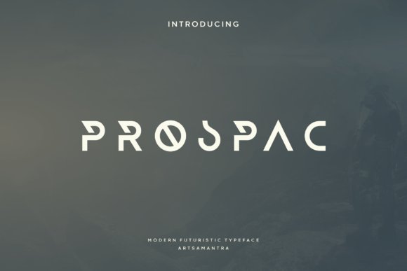
Prospac Font – Prospac is a geometric sans with a restrained personality: clean letterforms, sharp terminals, and two distinct styles that shift the tone from austere to expressive. Its pared-back shapes work well in headlines while remaining readable across sizes thanks to a balanced x-height and open counters. Subtle unfinished edges give it an industrial hint without becoming abrasive.Because of its neutral voice, Prospac pairs effectively with a warm serif for editorial projects or with a condensed industrial face when you need more visual punch. Careful tracking and baseline consistency will maintain its minimalist rhythm and prevent uneven color across copy. It’s a solid candidate for corporate identity, posters, and websites that require a calm, decisive typographic presence.
My Recommendation: I choose Prospac when a project needs clean, modern typography that supports content rather than shouting for attention. It reads very well on signage and in brand systems because its different styles create hierarchy without fuss. For a softer outcome, combine Prospac with a humanist text face to add warmth while keeping its clarity.
22. Wild Orange Font
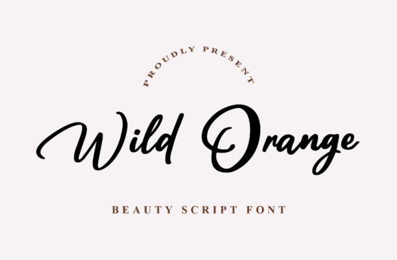
Wild Orange Font – Wild Orange is a contemporary script with loose, calligraphic strokes that read well at both headline and smaller sizes. Its letterforms balance flourish with clarity, thanks to restrained terminals and a generous x-height. The rhythm of its swashes makes it well suited to boutique branding, invitations, and editorial pull quotes.Pair it with a compact sans or a clean transitional serif to create high-contrast font combinations that establish clear hierarchy without visual clutter. Because spacing and legibility are strong, Wild Orange works as a display headline while a neutral body type carries long-form text. The alternates let you dial personality up or down without breaking harmony.
My Recommendation: I reach for Wild Orange when a project needs handwritten warmth that still reads cleanly. The alternates are handy for dialing between playful and poised tones, and the consistent stroke handling keeps headings legible on both web and print. Use it for wedding suites, boutique identities, and editorial spots where a handcrafted voice is desirable.
23. Quito Font
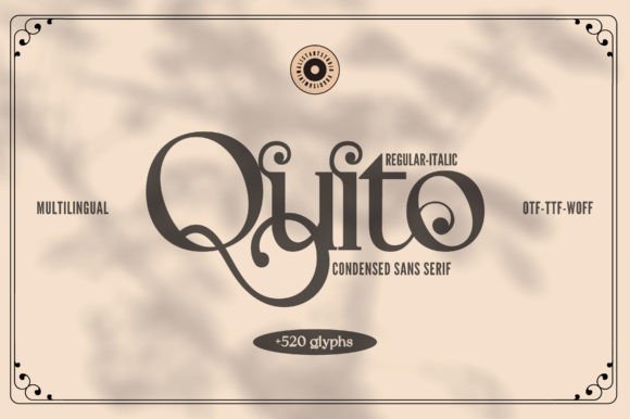
Quito Font – Quito is a refined serif with gentle contrast between thick and thin strokes and slightly flared terminals that lend text a quiet authority. Letter spacing is tuned for comfortable reading, making it a reliable choice for body copy in magazines, longform web articles, and print. Small caps and expanded diacritic support broaden its utility across languages and editorial contexts.For display applications, Quito’s subtler details pair well with a humanist or geometric sans to form a clear typographic hierarchy without feeling overly formal. The warmth in its shapes suits book interiors, high-end packaging, and identity work where readability and character are both important. Regular and italic styles behave predictably across sizes, which keeps layout decisions straightforward.
My Recommendation: I choose Quito when a design needs a readable serif that still carries personality. It handles long passages gracefully while offering just enough character for covers and labels. Ideal for magazines, book design, and premium product systems where clarity and refined tone are required.
24. Robesta Font
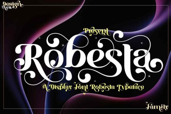
Robesta Font – Robesta is a high-impact display font with bold, sculpted letterforms and a generous set of alternates that invite stylistic experimentation. PUA-encoded glyphs provide quick access to swashes, ligatures, and unique alternates in common design tools, which speeds up headline and logotype exploration. The included italics are weighted to match display styles so slanted forms maintain their presence.Used sparingly, Robesta commands attention on posters, packaging, and luxury-brand materials where attitude matters as much as legibility. Pair its strong uppercase forms with a narrow geometric sans or a restrained slab to create striking contrast and tighter compositions. Alternate sets make it easy to craft distinct wordmarks without reworking letter spacing from scratch.
My Recommendation: Robesta is my go-to when a headline needs personality and theatricality. The PUA features let me test alternate glyphs quickly, which is a huge time-saver during identity rounds. Best for posters, product packaging, and bold brand statements where distinctive letter shapes drive recognition.
25. Merry Christmas Font
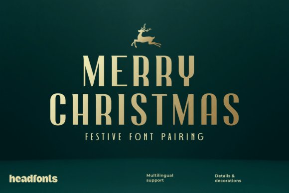
Merry Christmas Font – Merry Christmas pairs an ornamental display (think Nailhead Nova) with a crisp geometric sans (Decohead), creating a contrast that reads well at headline scale and keeps supporting text tidy. The decorative face brings festive strokes and hairline details, while the geometric sans anchors blocks of information; this is one of my favorite font combinations for holiday projects because it balances flair with readability. Use the display sparingly for titles and monograms, and let the sans carry captions, dates and small-print.Practical tips: tighten the display slightly at large sizes then increase tracking for small caps to avoid collisions; choose a palette of jewel tones or metallics to amplify the ornament without muddying shapes. Pair weights deliberately-large, ornamented headings at 36–72pt with 10–16pt sans body keeps visual order across print and web. Works especially well for gift tags, premium packaging, posters and social headers where festive character must remain legible.
╰┈➤ Download Merry Christmas Font
My Recommendation: I reach for this pairing when I need a holiday look that feels celebratory yet readable. The ornamental headline gives instant personality while the geometric sans preserves clear communication in smaller text. Ideal for upscale greeting cards, limited-edition labels, event posters and seasonal branding where ornament and clarity must coexist.
26. Merry Christmas Font Duo
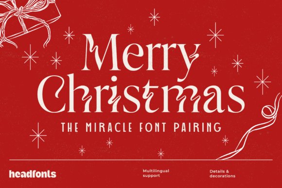
The Merry Christmas Font Duo teams a decorative display with an elegant Art Deco–inspired sans to produce high-contrast typographic drama suitable for cards and signage. The display includes flamboyant ligatures and decorative terminals that draw the eye; the sans supplies steady support for venue details, dates and secondary copy. Keep the decorative face for headlines and hero text while reserving the sans for any running information.For printed pieces, combine the duo with foil stamping or textured paper to emphasize those ornamental strokes; on screen, simplify decoration or use subtle shadows to avoid visual clutter. Try small caps or all-caps in the sans to reinforce the Deco rhythm without competing with the display, and always test at the final output size to preserve legibility. This pair shines when you want bold seasonal character without sacrificing the reader’s ability to find essential details.
╰┈➤ Download Merry Christmas Font Duo
My Recommendation: I’d pick this duo for projects that need theatrical holiday expression-think boutique shop windows, event posters, and premium greeting cards. The ornate display gives immediate identity while the sans makes logistical copy easy to scan. Use it when you want striking typography that still reads cleanly across printed and digital formats.
27. Advent Font Pairing
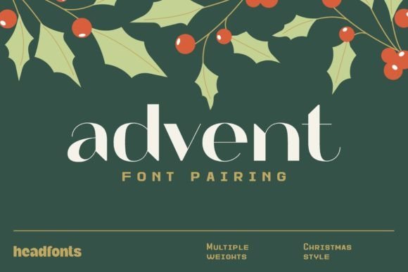
Advent Font Pairing places Arthead’s ornate letterforms alongside Retrohead’s industrial sans, offering four stylistic flavors that let you dial mood from vintage charm to modern restraint. The set is useful for creating clear typographic hierarchy: decorative headers for emphasis, and the sans for sequences of information like dates or ingredient lists. This makes it particularly effective for advent calendars, countdowns and multi-panel packaging where clarity and ornament must coexist.Design tips: scale the decorative face up and give it generous leading to display swashes fully, then use lighter weights of the sans to introduce secondary emphasis without bringing in extra typefaces. Stick to a limited palette-muted greens, warm neutrals, or charcoal-to keep ornamentation readable and avoid visual noise. The collection is well suited to editorial spreads, seasonal catalogs and brand identities that need consistent but flexible holiday typography.
╰┈➤ Download Advent Font Pairing
My Recommendation: I use Advent when a project needs a distinct seasonal voice that can swing between nostalgic and contemporary. The multiple styles allow quick tone-matching-ornate for covers, pared-back for interior pages-while maintaining a unified look. Great for calendars, seasonal magazines, product lines and any application where consistent typographic personality matters.
28. Golden Compass Font
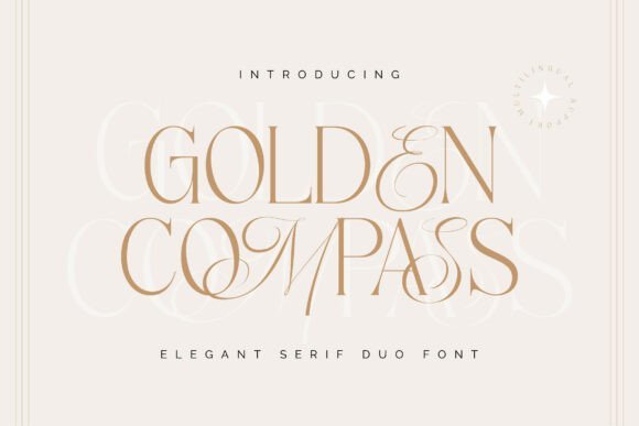
Golden Compass Font – Golden Compass pairs a restrained serif with a lively script to create contrast that reads both elegant and intentional. The serif establishes a clear hierarchy and comfortable legibility for headlines, while the script supplies ornaments and signature-style swashes that work as decorative accents; this balance makes it one of the more flexible font combinations for wedding stationery, premium packaging, and editorial mastheads.The family ships with alternates, ligatures, numerals and multilingual support, so you can build consistent typographic systems across print and web. For best results, use the serif for structured elements like subheads and captions, reserve the script for featured names or logos, and tune tracking and pairing sizes so the two voices never fight for attention.
╰┈➤ Download Golden Compass Font
My Recommendation: I’d reach for Golden Compass when a project needs both order and a crafted flourish-brand identities, product labels, and invitations are natural fits. The script gives personality without overpowering the serif, and the included alternates let you customize letterforms for unique marks. It’s especially useful when you want a refined, slightly romantic tone without resorting to ornate overuse.
29. Briliant Calligraph Font
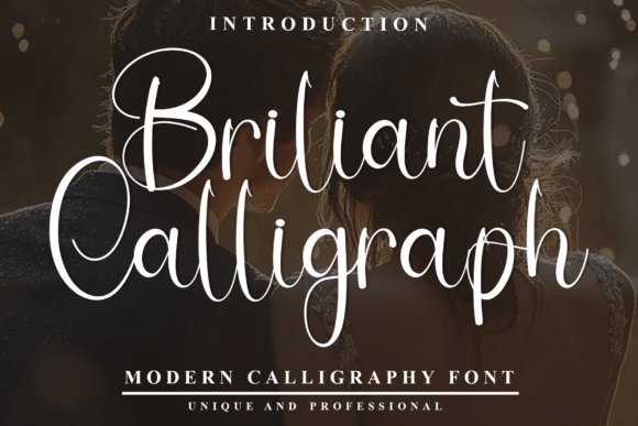
Briliant Calligraph Font – Briliant Calligraph is a modern calligraphy face defined by long swashes, delicate terminals, and high-contrast strokes that read like hand-lettered signage. It performs best at larger sizes where its flourishes and alternate glyphs become visible details, making it ideal for ceremony invitations, hero banners, and logo wordmarks that need a graceful, handcrafted feel.Because of its expressive shapes, treat it as a display asset rather than body text: pair it with a light or hairline serif for visual breathing room and limit decorative weights to single words or short phrases. When preparing files for print, convert swashes to outlines or embed fonts to preserve intricate ligatures and avoid rendering surprises on unfamiliar systems.
╰┈➤ Download Briliant Calligraph Font
My Recommendation: I use this typeface when a design must feel bespoke-especially for luxury events, boutique packaging, and editorial covers. Its swashes provide memorable focal points and the alternates let you tailor word endings for perfect spacing. Keep it sparing and paired with a neutral companion to maintain readability and impact.
30. Handpack Font Family
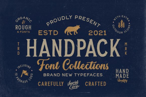
Handpack Font Family – Handpack is a multi-style family that bundles script, serif, sans, and dingbats into a unified handmade aesthetic. That unified structure makes it easy to build cohesive layouts where every element-from headline to ornament-feels like it was drawn from the same toolkit, which is especially handy for craft brands, artisanal packaging, and social graphics that benefit from consistent handcrafted texture.The fonts are PUA encoded, so swashes and alternate glyphs are accessible through the glyph panel without special software, and the dingbats offer quick decorative separators and icons. To create clear hierarchy, use the sans for supporting copy, the serif for emphasized mid-size text, and the script or dingbats for accents and branding touches.
╰┈➤ Download Handpack Font Family
My Recommendation: I’d pick Handpack when a project needs a cohesive, handmade look across multiple touchpoints-labels, shop collateral, and product inserts come to mind. The family approach reduces hunting for matching styles and the PUA encoding makes decorative glyphs easy to use. It’s a practical choice for small teams producing brand assets with a handcrafted personality.
31. Eachtra Font
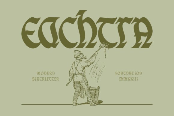
Eachtra Font – Eachtra is a blackletter display that borrows Celtic and Gaelic calligraphic gestures to produce sharp, knot-like terminals and dramatic contrast between thick strokes and hairlines. The interplay of exaggerated ascenders and compressed counters gives it a ceremonial, almost heraldic presence while remaining surprisingly legible at headline sizes.Mixing upper- and lowercase forms creates inventive ligature-like pairings that read as custom lettering, which makes it a strong choice for logotypes, posters, and apparel where a singular typographic voice is needed. For designers focused on font combinations, Eachtra provides a weighty, cultural flavor that pairs well with simple sans or restrained serifs to manage visual density and maintain hierarchy.
My Recommendation: I use Eachtra when a project needs a bold, historic personality-think craft brews, concert posters, or artisan apparel labels. Its case-mixing tricks let me suggest hand-drawn wordmarks without extra illustration work. Pair it with a neutral text face to keep multi-line layouts readable while preserving that dramatic headline presence.
32. Offaly Font
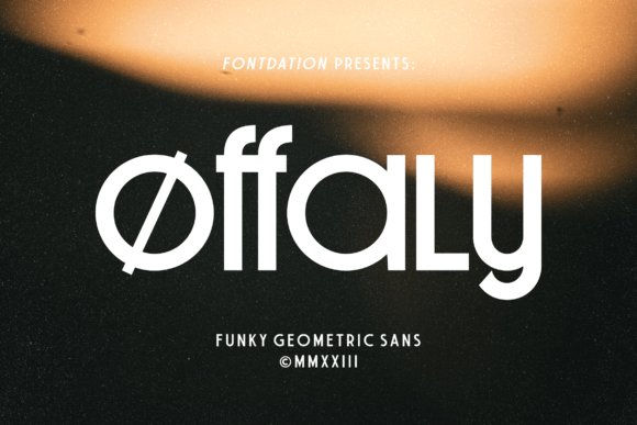
Offaly Font – Offaly is a geometric sans that blends strict construction with playful eccentricities: rounded x-heights, offbeat crossbars and stylized terminals give text a jaunty rhythm. The type maintains a clean skeleton, so those decorative decisions read as personality rather than clutter when set at display sizes.Upper- and lowercase mixes produce lively letterforms and unexpected negative-space interactions that work especially well in logos, posters and packaging. For balance, pair Offaly with a narrow serif or plain humanist text face to anchor long copy and create clear visual order across headings and body text.
My Recommendation: I reach for Offaly when a brand needs a friendly yet confident look-it’s perfect for product labels, event posters and bold headlines. Its geometric backbone keeps things readable while the quirky details add character. I usually combine it with a calm text face to avoid visual exhaustion in longer layouts.
33. Darelove Font
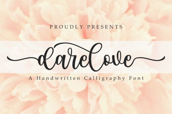
Darelove Font – Darelove is a modern calligraphy face built on flowing strokes and a wealth of ligatures, swashes and alternates that simulate natural pen pressure. The letterforms have a relaxed rhythm that makes multi-word phrases feel handcrafted, and OpenType features automate variations so text avoids a mechanical, repeated look.Because it includes extensive alternates and multilingual support, Darelove fits wedding stationery, boutique branding and editorial accents where warmth and personality matter most. Pair it sparingly with a clean sans or neutral serif to provide contrast and keep typographic hierarchy clear while enjoying the variety its alternates offer.
My Recommendation: I pick Darelove when a design calls for genuine cursive charm-wedding invites, premium product labels and heartfelt editorial pull-quotes are ideal. The swashes and alternates let me compose expressive headlines without manually redrawing connections. I value it for projects that need a handcrafted feel but also demand precise typographic control.
Use these 33 font combinations as starting points when building Brand Identity Systems. Test each pairing in real layouts and adjust weight, size, and tracking to match the brand voice and scale.
Keep a shortlist of reliable combos and document the chosen pairings in your style guide to ensure consistent application across logos, websites, and print materials.