
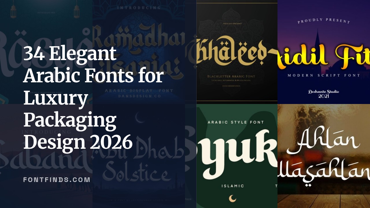
34 Elegant Arabic Fonts for Luxury Packaging Design 2026
Arabic Fonts matter on packaging in ways Latin faces often do not: kerning, ligatures, and diacritic placement affect readability and brand tone. Choosing the right typeface can change how a product reads on shelf and in photos.
This collection of 34 options spans classic Naskh and Kufi families to decorative Diwani and Thuluth styles. For each font you’ll find usage notes, pairing suggestions, and license details to help with luxury packaging projects.
1. Salamah Font
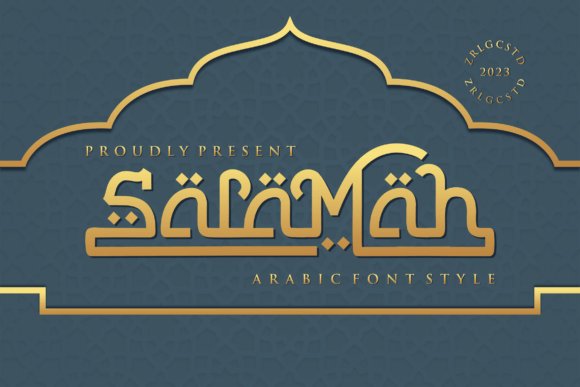
Salamah Font – Salamah is a modern, luxury-influenced display that gives headlines a decisive, geometric edge and sits confidently among arabic fonts used for editorial and premium packaging work. Its letterforms feature sharp terminals and firm stroke contrast, so large-format copy reads as sculpted typography rather than ornament. When deployed on posters or magazine covers the tight counters and crisp joins create a compact, high-impact presence.On the technical side Salamah offers useful OpenType alternates, careful kerning and generous language support that handle diacritics and numerals cleanly. The family’s weight range and distinct caps make pairing with neutral sans-serifs straightforward for extended layouts and web hero panels. For designers focused on upscale branding, the face holds detail well at large sizes and reproduces cleanly across print and digital outputs.
My Recommendation: I pick Salamah when a project needs a headline that reads as premium and confident rather than decorative. Its sharp, architectural strokes are perfect for fashion editorials, luxury packaging and upscale web banners. Pair it with a clean body face to let the display forms dominate without competing for attention.
2. Rowit Font
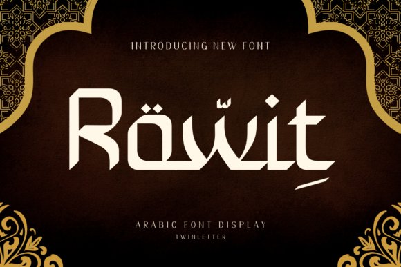
Rowit Font – Rowit channels calligraphic gestures into a bold, friendly display that reads clearly on product packaging and social posts. The forms combine rounded terminals and playful swashes to inject personality while remaining legible at a glance, which makes it suitable for magazine covers, branding and celebratory stationery. The overall feel leans contemporary with visible nods to traditional pen movement.Built with alternate glyphs and contextual ligatures, Rowit gives designers control over tightening logos or loosening long headlines without redrawing letters. It pairs well with compact sans families for body copy and holds up nicely on textured substrates or photographic backgrounds. The consistent counters and open apertures make it resilient across small digital thumbnails and large printed panels alike.
My Recommendation: I reach for Rowit when a brief calls for characterful lettering that still needs to perform across formats-boutique labels, wedding invites and lifestyle branding are natural fits. The alternates let me craft distinct wordmarks quickly, and the friendly rhythm reads well on-screen. Use it at display sizes and balance it with a restrained body typeface.
3. Aidil Fitri Font
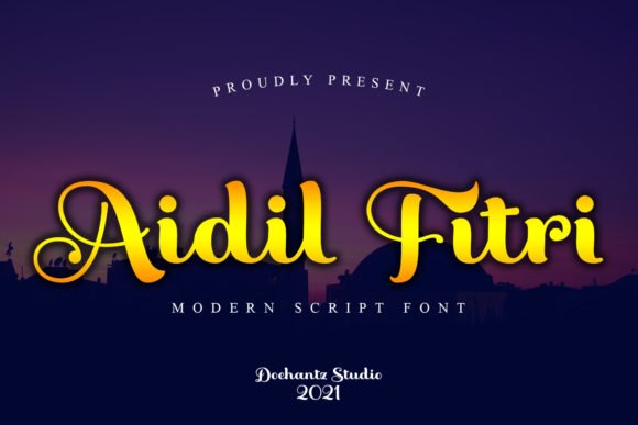
Aidil Fitri Font – Aidil Fitri reads as a contemporary script shaped by Arabic calligraphic principles, with flowing joins and varied stroke widths that feel hand-drawn. Because the font is PUA-encoded, stylistic alternates and discretionary ligatures are available directly from font menus, so accessing swashes and special forms is straightforward. The tapered terminals and subtle baseline shifts give it a warm, celebratory tone that suits short, expressive copy.Best used at display sizes, Aidil Fitri excels on greeting cards, wedding credentials and boutique labels where ornamentation enhances meaning rather than obscures it. Combine it with a neutral sans or light serif to keep longer content readable and to let the script act as an accent. The included alternate sets let you adjust the rhythm of connections to match different compositions and languages.
My Recommendation: I use Aidil Fitri when a project needs an intimate, calligraphic voice-seasonal greetings, premium packaging and wedding suites benefit most. The PUA features save time by exposing swashes and ligatures without extra software steps. Keep it as a focal accent and pair it with clean text faces for best results.
4. Khaleed Font
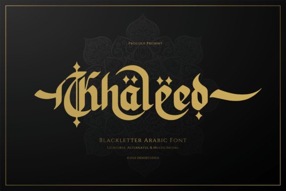
Khaleed Font – Khaleed is a blackletter-inspired Arabic display font that pairs gothic weight with calligraphic flow. Among contemporary arabic fonts, Khaleed commands attention through thick, sharp strokes, high-contrast terminals, and sweeping swashes that mimic carved stone and brush motion. Intricate ligatures and interlocking circular motifs give each word an ornamental, almost heraldic presence.It ships with extended Latin and Arabic glyph sets, multiple alternates, and contextual substitutions that suit large-format titles, film credits, luxury labels, and spiritual editions. When used for posters or packaging, Khaleed’s heavy forms demand generous tracking and large sizes to preserve legibility while accentuating drama. Its character works best when paired with a clean sans for body text to avoid typographic clutter.
My Recommendation: I reach for Khaleed when a project needs a monumental headline with cultural references; it reads like a carved title rather than mere text. Its ornate ligatures are ideal for cinematic posters, heritage product labels, and book covers that need a narrative voice. Use it sparingly at large sizes and pair with neutral type for maximum impact.
5. Bakhtiar Font
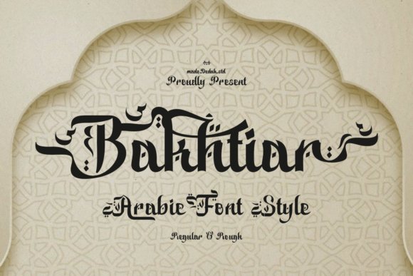
Bakhtiar Font – Bakhtiar is a display font informed by classical Arabic scripts-its DNA borrows the measured horizontals of Kufic and the rhythmic curves of Naskh. The Latin adaptation introduces elongated swashes, diamond-like diacritics, and generous terminal flourishes that suggest regal calligraphy without sacrificing readability. Subtle contrast and open counters make it suited to decorative headlines where cultural reference and clarity must coexist.For logos, menus, or event identity work, Bakhtiar brings a ceremonial mood and crafts a refined presence at medium to large point sizes. It includes stylistic alternates and carefully tuned kerning so designers can dial in ornamentation without manual tweaks. Try pairing it with a light geometric sans or a neutral serif to balance its ornate caps and avoid visual competition.
My Recommendation: I use Bakhtiar when a brand needs a cultured, classical voice-hospitality, cultural festivals, and editorial covers benefit most. The font’s alternates let me introduce subtle ornamentation without redrawing letters, which saves production time. It performs best in headline roles and on print materials where its details can be appreciated.
6. Jasmina Font
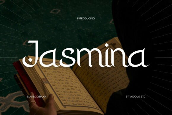
Jasmina Font – Jasmina reads like a contemporary Islamic display font built from graceful curves and restrained calligraphic cues. Decorative serif elements merge with soft terminals and modest contrast to produce a composed, spiritual tone suited to invitations, packaging, and editorial headers. The family ships in web-ready and print formats with clear diacritic support so text remains readable across platforms.At smaller sizes Jasmina retains character thanks to open counters and tidy spacing, while larger settings reveal its delicate flourishes and alternate glyphs. It’s a comfortable choice for Ramadan or Eid campaigns, mosque signage, and premium lifestyle branding that wants a gentle, expressive identity. Pair it with a neutral sans for contemporary projects or a simple serif for a traditional feel.
My Recommendation: I rely on Jasmina for projects that demand understated elegance-event invitations, seasonal campaigns, and high-end packaging where tone matters. Its readable construction makes it a safe headline choice across digital and print work. Combine with minimal layouts to let its subtle calligraphic details register without clutter.
7. Zafira Font
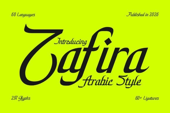
Zafira Font – Zafira channels refined Arabic calligraphy into a display typeface that balances flowing strokes with measured typographic spacing. It offers contextual alternates, discretionary ligatures and carefully drawn diacritics that keep legibility intact while preserving the ornamental rhythm of traditional scripts; this makes it one of the more expressive arabic fonts for high-end print and digital headlines.The face performs best at larger sizes where its contrast and swash-like terminals sing, yet its kerning and baseline consistency make it comfortable across editorial spreads, luxury packaging, and wedding stationery. Subtle OpenType features and a warm stroke modulation let designers pair it with neutral sans or restrained serif companions to create an upscale, culturally respectful visual voice.
My Recommendation: I reach for Zafira when a project needs handcrafted calligraphic character without sacrificing typographic control. Its alternates and ligatures give invitations and boutique brands an artisanal feel, while reliable metrics save time during layout. For me it’s ideal for luxury print work, wedding identities, and editorial covers that require a distinct Middle Eastern flavor.
8. Syukr Font
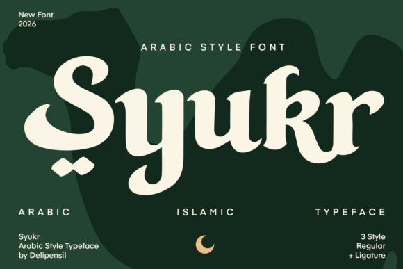
Syukr Font – Syukr reads as a refined display serif with gentle Arabic-inspired curves, designed to carry ceremonial and seasonal messaging with quiet dignity. The letterforms include decorative terminals and selective swashes that suggest a calligrapher’s hand, while PUA-encoded glyphs make special characters and ornamental shapes easy to access without extra software.This face excels in headline roles for religious festivals, premium halal packaging, and celebratory invites where typography must communicate warmth and reverence. Thoughtful spacing and pronounced contrast give Syukr presence on posters and social graphics; designers will appreciate the available stylistic sets for crafting typographic compositions that feel both historic and contemporary.
My Recommendation: I recommend Syukr for projects tied to Ramadan, Eid, and heritage-driven branding where a diplomatic balance between tradition and modern readability is needed. The PUA set speeds production of decorative marks, and the serif influences make it perform well in print and large-format digital art. Use it for posters, luxury labels, and event announcements to convey respectful elegance.
9. Abu Dhabi Solstice Font

Abu Dhabi Solstice Font – Abu Dhabi Solstice translates the motion of Arabic pen strokes into Latin letterforms, featuring jewel-like interior ornaments and jewel-dot details that read like architectural accents. The design favors headline-scale work: high contrast, deliberate terminals, and tight letter apertures give it a strong identity that resembles gold-ink manuscripts reinterpreted for modern branding.Because of its decorative density, the font shines in brand marks, perfume labels, editorial covers, and music packaging where a dramatic first impression is required. Careful use of OpenType alternates and considered pairing-typically a muted sans-keeps compositions from feeling overloaded and secures its role as a focal display face rather than body text.
╰┈➤ Download Abu Dhabi Solstice Font
My Recommendation: I use Abu Dhabi Solstice when a project needs an opulent, culturally textured headline that stops viewers in their tracks. Its ornamental details suit luxury goods, boutique hotels, and artist visuals where the type acts as a signature element. Apply it sparingly at large sizes and combine with restrained supporting fonts to let its distinctive shapes breathe.
10. Dzakiyah Font
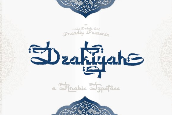
Dzakiyah Font – Dzakiyah pairs sweeping calligraphic strokes with precise decorative terminals to form a display face that reads like crafted signage. Among contemporary arabic fonts, it stands out for a broad horizontal tension and theatrical swashes that command attention in large headlines and premium packaging. The letterforms reference Diwani and other classical models while keeping controlled contrast, giving a ceremonial impression without sacrificing clarity at display sizes.OpenType features include discretionary ligatures and alternate endings so you can dial ornamentation up or down to suit a brief. Best deployed at headline scale, it pairs naturally with a neutral sans for supporting copy to avoid visual competition. For hospitality identity or artisanal food labels I recommend heavier cuts and tightened tracking to accentuate the luxurious personality of the swashes.
My Recommendation: I choose Dzakiyah when a project needs a distinct Middle Eastern character with dramatic headline presence. Its ornamental terminals and swash options create memorable logos, menus, festival posters, and boutique packaging while staying readable at large sizes. Use it sparingly for display and pair it with a restrained sans to provide balance and functional body text.
11. Balikan Font
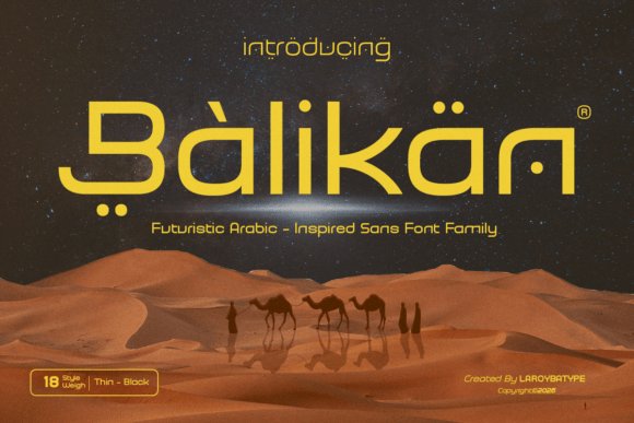
Balikan Font – Balikan is a geometric sans family that borrows Arabic calligraphic gestures yet preserves modern, disciplined proportions. Rounded terminals and subtle pen-flare hints suggest Arabic script influence without resorting to ornate flourishes, producing a confident, legible headline face. Its character makes it suitable for branding, editorial layouts, tech interfaces, and film title work where a contemporary nod to Middle Eastern forms is desired.A broad weight range and consistent metrics mean Balikan adapts well to responsive interfaces and multilingual compositions that mix Latin and Arabic-inspired shapes. Kerning and hinting are optimized for on-screen clarity, and stylistic alternates let you soften or sharpen the calligraphic reference. Use bold cuts for wordmarks and lighter cuts for longer mastheads to keep hierarchy intact while retaining personality.
My Recommendation: I reach for Balikan when a client wants a subtle Arabic influence without ornate decoration-ideal for tech brands, cultural startups, or modern editorial projects. Its screen-friendly hinting and weight spectrum make layout work predictable across devices. Pair it with a neutral serif or simple grotesque to create clear contrast and preserve legibility in longer reads.
12. Haliya Font
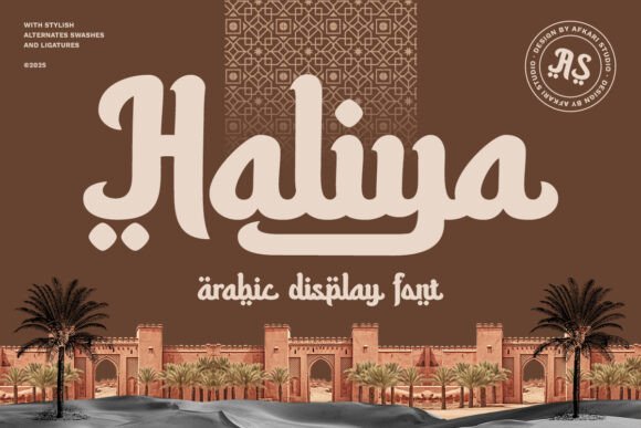
Haliya Font – Haliya reads as a refined reinterpretation of classical scripts, featuring fluid strokes and a calm rhythm that suggests hand-written calligraphy. Decorative ligatures and finely crafted terminals add a formal, elegant voice suitable for invitations, religious observance campaigns, and premium product identity. Unlike some heavier display faces, Haliya preserves open counters so its delicate curves stay legible at moderate sizes.OpenType sets provide contextual alternates so designers can pick more cursive joins or simplified forms depending on the application. It excels in print and digital assets when given generous negative space to showcase its detail, and responds well to textured papers or subtle color palettes. For packaging and social graphics, richer materials or soft backgrounds help the type’s handcrafted character read as intended.
My Recommendation: I use Haliya when a project needs an understated, classic calligraphic tone-wedding stationery, Ramadan campaigns, and artisanal product labels are perfect matches. The alternates and ligatures allow expressive wordmarks while its open construction protects legibility. Keep layouts airy and choose muted colorways or tactile substrates to highlight the font’s refined details.
13. Ramadhan Tsania Font
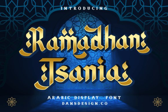
Ramadhan Tsania Font channels classical Arabic calligraphic forms into a refined display face, notable for its elongated ascenders, teardrop terminals, and carefully drawn contextual ligatures. Its OpenType features provide alternate letterforms and precise diacritic placement, which gives designers more control over letter joins and spacing-a strong choice among arabic fonts for ceremonial headlines and premium stationery.The design reads best at larger sizes where the carved counters and fine stroke contrasts can breathe; avoid forcing it into tiny body text. Included stylistic sets and expanded language coverage make it suitable for wedding invitations, upscale packaging, and editorial covers that need a handcrafted, culturally rooted tone.
╰┈➤ Download Ramadhan Tsania Font
My Recommendation: I reach for Ramadhan Tsania when a project calls for a formal Arabic identity, such as bridal suites, luxury labels, or event posters. The wealth of ligatures and alternates lets me shape headlines with a decidedly artisanal feel. For best results use generous tracking, pair it with a restrained Latin serif, and keep it at display scale so the details remain legible.
14. Hamdalah Barakallah Font
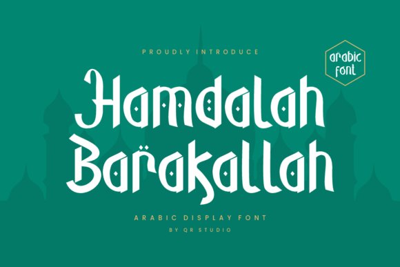
Hamdalah Barakallah Font strikes a balance between calligraphic ornament and disciplined geometry, offering letters that feel decorative yet controlled. Moderate stroke contrast and pared-back swashes preserve clarity at headline sizes while contextual substitutions and alternates add personality without cluttering the wordforms.Its stable baseline and predictable joins make the face perform well in applied uses such as packaging, shopfront signage, and poster headlines; the strokes tolerate embossing and metallic finishes with good fidelity. Designers will appreciate that the default spacing reduces the need for aggressive manual kerning in display compositions.
╰┈➤ Download Hamdalah Barakallah Font
My Recommendation: I use Hamdalah Barakallah when a project needs elegance without excessive flourish-brand marks, premium labels, and editorial headlines are ideal. Its sturdy shapes survive production techniques like foil and emboss, which is a practical advantage. Pair it with a minimal sans for body copy to keep layouts clean and focused.
15. The Ramadhan Font
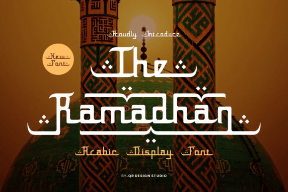
The Ramadhan Font delivers an expressive, festive take on traditional scripts, with looping connections and extended terminal swashes that impart motion and warmth. It includes a range of decorative alternates and contextual forms so designers can craft headline treatments that feel celebratory but remain legible.Ideal for posters, greeting cards, and social banners tied to cultural and seasonal occasions, the typeface thrives at display scale where its rhythm and ornamentation can carry a message. For everyday editorial text, pair it with a neutral sans-serif to preserve readability while letting the display face provide the visual character.
╰┈➤ Download The Ramadhan Font
My Recommendation: I pick The Ramadhan for campaigns and seasonal graphics that need a lively, authentic voice-event posters, festival promos, and greeting cards work especially well. The alternates let me compose decorative wordmarks without extra illustration work. Keep it large and spare around supporting text so the flourishes remain the focal point.
16. Arabinta Font
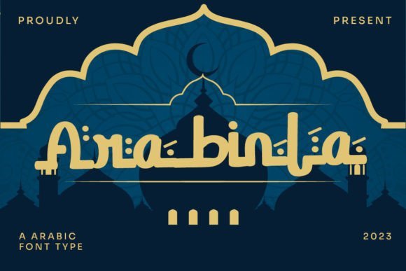
Arabinta Font – Arabinta draws directly from classical calligraphic forms, merging long flowing strokes with sharply inked terminals to create an elegant display face. Among arabic fonts it balances ornamental swashes with structural clarity, so headlines feel ceremonial without losing legibility. Dot shapes and elongated bowls introduce a vertical cadence that performs well in large-format applications and upscale packaging.OpenType features include contextual alternates, discretionary ligatures and multiple swash sets that let designers shape bespoke wordmarks and invitations. Spacing and kerning are tuned for display sizes, and the contrast between heavy and fine strokes reads beautifully on textured paper, foil, and premium web banners. Pair Arabinta with a restrained Latin serif to support bilingual identity work while keeping typographic focus on the Arabic wordforms.
My Recommendation: I reach for Arabinta when a project needs authentic calligraphic presence without ornamental excess. The alternates and ligatures give me precise control for logos and wedding stationery, and the high-contrast strokes reproduce well on textured stocks and metallic finishes. Use it for premium identities, invitation suites, and any design that benefits from ceremonial Arabic letterforms.
17. Qitaro Font
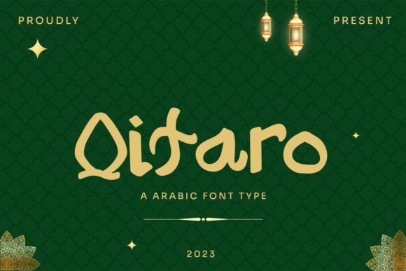
Qitaro Font – Qitaro reinterprets display lettering with a modern attitude that hints at classical scripts while keeping forms compact and bold. Its stroke rhythm favors concise connections and squared terminals, producing strong silhouettes that read from a distance on posters and storefront graphics. Integrated numerals and punctuation help maintain typographic coherence across campaigns and wayfinding panels.Built for headlines and large-scale typography, Qitaro ships with tight kerning and several stylistic alternates that allow subtle customization without cluttering layouts. It scales crisply for digital billboards and print hoardings, and pairs effectively with a light geometric Latin type for clean bilingual compositions. Reach for Qitaro when you need a confident display face that holds up to bold color and textured backgrounds.
My Recommendation: I use Qitaro for signage, editorial covers, and fashion campaigns where a compact yet assertive headline is required. Its alternates let me tweak word shapes for distinction, and the tight spacing keeps logotypes compact. It performs strongly in urban brand identities and high-impact posters.
18. Koweti Font – arabic fonts
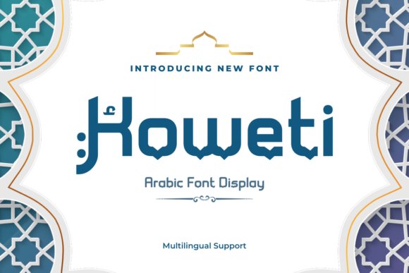
Koweti Font – arabic fonts – Koweti was shaped to feel both regal and contemporary, with upright stems and gently flared terminals that lend a stately presence to any headline. The compact letterspacing produces dense, badge-like wordmarks ideal for seals, monograms, and embossed stationery. Small decorative touches-tapered swashes and refined dotforms-add personality while preserving a clean silhouette.On the technical side, Koweti offers multiple stylistic sets and careful kerning that simplify the construction of initials and logotypes for premium brands. It responds well to foil stamping, debossing, and high-resolution screens used in curated web showcases. Apply Koweti where refined tradition must meet minimalist execution, such as boutique hospitality identities and luxury product labels.
╰┈➤ Download Koweti Font – arabic fonts
My Recommendation: When I need a dignified headline with character, I turn to Koweti for its compact proportions and ornamental restraint. The available alternates let me craft distinctive initials quickly, and it holds up under close cropping and metallic finishes. I recommend it for hotel branding, premium packaging, and curated editorial spreads.
19. Jiwez Font
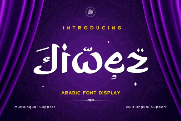
Jiwez Font blends classical Arabic calligraphic rhythm with contemporary display proportions, producing headlines that feel both dignified and modern. As one of the arabic fonts that favors measured stroke contrast and open counters, it reads cleanly at large sizes while retaining decorative character in its terminals. Thoughtful OpenType features and refined kerning make it reliable for print covers and editorial mastheads.The face performs well against heavy treatments like foil stamping or spot varnish thanks to crisp outlines and balanced glyph shapes, and its alternate forms give designers control over logo idiosyncrasies. A complete diacritic set and discretionary ligatures expand typographic expression for branding or packaging. If you need an Arabic display type that pairs smoothly with contemporary Latin sans, Jiwez offers restrained elegance without sacrificing clarity.
My Recommendation: I would reach for Jiwez when a project requires formal presence without overwrought ornamentation. Its neat diacritics and ligature set make it a strong candidate for magazine covers, luxury packaging, or identity work where Arabic needs to stand confidently alongside Latin type. The font’s clean structure also simplifies production for print finishes and large-format applications.
20. Zekat Font
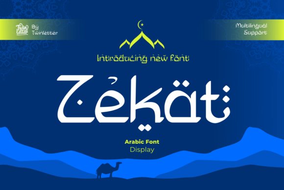
Zekat Font is a display family built to serve branding and editorial needs with a range that spans restrained traditional forms to more expressive, contemporary cuts. The glyphs emphasize legibility in logotypes and headlines while offering stylistic alternates for decorative uses, so it adapts to both clean corporate marks and textured magazine art. Technical features such as kerning pairs and contextual substitutions help maintain visual rhythm across wordmarks.Designed with branding in mind, the set includes weights and stylistic sets that work well on packaging and web headers where presence matters. Its letterforms carry subtle calligraphic cues without becoming ornate, which keeps typesetting efficient and repeatable. For projects that require a dependable display Arabic option with strong brand personality, Zekat is a pragmatic choice.
My Recommendation: I’d pick Zekat for identity systems and packaging projects where a recognizable Arabic headline is required. It balances decorative choices and readability, so it suits magazines, product labels, and site headers alike. The included alternates make it easy to craft distinctive wordmarks without custom lettering.
21. Layalina Font
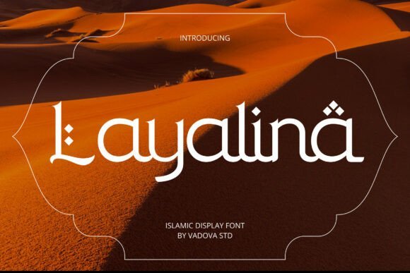
Layalina Font interprets classical Middle Eastern calligraphy through a geometric lens, producing high-contrast strokes and angular diacritics that read as decorative yet disciplined. Its design language borrows from formal scripts while introducing diamond-shaped marks and rhythmic spacing that make headlines feel ceremonious and deliberate. The result is a display face suited to cultural occasions and refined editorial compositions.Practical in application, Layalina supports event branding, restaurant identities, and curated product lines where a touch of regional heritage is desirable. The type’s distinct silhouette pairs well with minimal Latin faces to create bilingual layouts that remain readable and expressive. For designers aiming to signal cultural specificity with a modern voice, this font provides a clear visual statement.
My Recommendation: I recommend Layalina when a project calls for culturally informed styling without resorting to cliché motifs. It shines on invitations, seasonal campaigns, and upscale hospitality branding where tone and atmosphere matter. The geometric diacritics and strong headline presence make it particularly effective for posters and identity treatments that need a refined Middle Eastern character.
22. Zamrani Font
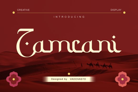
Zamrani Font channels Kufic-inspired geometry into a contemporary display face, where sharp angles meet fluid baselines to produce a sculptural silhouette. Within the wider field of arabic fonts it distinguishes itself through bold counterforms and confident stroke contrast that read clearly at large sizes while retaining calligraphic references. The type’s carved terminals and measured proportions give headlines a monument-like presence without feeling overly ornamental.This face works well across premium food labels, cinematic titles, travel branding, and heritage packaging where visual authority is required. Pair Zamrani with a light, neutral sans for contrast or with delicate scripts for artisanal accents; its heavy weight also responds well to embossing and metallic foils on tactile stock. Use tight tracking and generous display sizes to let the geometry breathe and the angular details register.
My Recommendation: I use Zamrani when a project needs a strong, culturally informed display voice that reads as both contemporary and rooted in traditional letterforms. Its geometric emphasis makes it ideal for logo work and packaging where bold presence matters. For luxury food brands, travel identities, or film titles that require an assertive yet refined Arabic type, Zamrani delivers clarity and character.
23. Bazirah Font
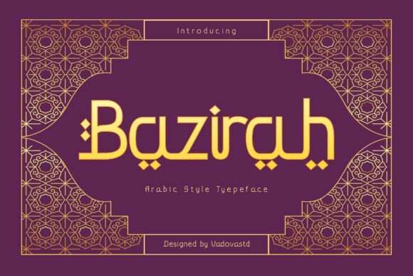
Bazirah Font marries ornamental calligraphic rhythm with disciplined geometric structure to create a refined display option for texts that require elegance. Its terminals are carefully shaped and many glyphs include subtle ligatures and decorative strokes that evoke Middle Eastern manuscript traditions without overwhelming modern layouts. The result is a typeface that feels ceremonial yet readable for short headlines and brand marks.Ideal applications include festive campaigns, boutique product packaging, magazine mastheads, and hospitality branding where cultural resonance adds value. For best results, pair Bazirah with a restrained sans for body copy, use generous margins to showcase its decorative features, and reserve swash forms for focal words or logotypes. It adapts nicely to metallic treatments and embossed labels to emphasize its handcrafted warmth.
My Recommendation: I reach for Bazirah when a client asks for a graceful Arabic display that carries ceremonial weight but must remain usable in modern layouts. Its ornamental touches bring a handcrafted feel that enhances luxury packaging and festival promotions. I would choose it for perfume labels, Eid campaign logos, boutique restaurant menus, or editorial covers that need visual refinement without losing readability.
24. Sadira Craft Font
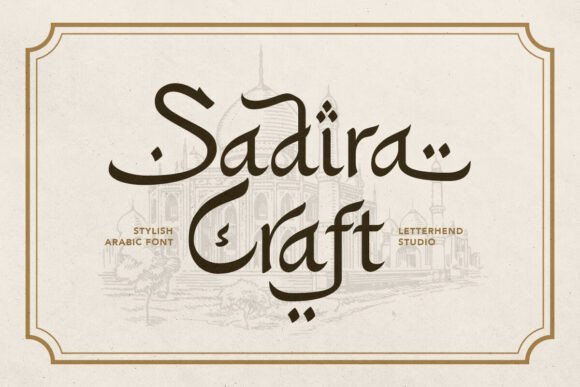
Sadira Craft Font reads like inked calligraphy given a modern editorial treatment: sweeping strokes, sculpted curves, and expressive swashes form a voice that feels handcrafted and theatrical. Its letterforms include several stylistic alternates and terminal flourishes that mimic brushed penwork, making headlines and invitations feel personal and expressive. The overall rhythm favors display use, where the motion of each character can be appreciated.Use Sadira Craft for event identities, book covers, upscale packaging, and posters that benefit from a poetic, handcrafted aesthetic. Pair it with simple sans serifs to ground busy shapes, and exploit its alternates and swashes for logos or pull quotes to avoid repetition. When set large, the textured details invite tactile treatments like letterpress or soft-touch coatings to amplify the artisanal impression.
╰┈➤ Download Sadira Craft Font
My Recommendation: I pick Sadira Craft when a brief asks for expressive, hand-influenced Arabic lettering that still reads professionally in print and digital formats. Its swashes and alternates are perfect for luxury invitations, boutique hotel branding, or editorial spreads that need emotional depth. For projects aiming to highlight craft and tradition-while remaining contemporary-this font adds warmth and distinctive personality.
25. Hilalian Font
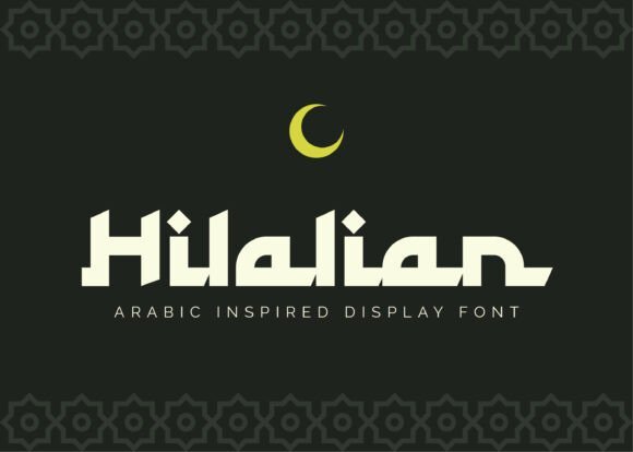
Hilalian Font channels classical calligraphic movement into a pared-back, modern display face. As one of the refined arabic fonts suited for high-end identity work, it balances rhythmic strokes with bold counters to command attention without ornament. The measured contrasts and repeating stroke patterns give headlines and posters a composed, worldly voice that reads confidently at large scale.Designers will value the font’s contextual alternates and controlled ligatures, which preserve legibility while allowing subtle stylistic shifts. Hilalian pairs effectively with a slender Latin sans or geometric serif and performs beautifully in metallic print finishes, gallery signage, and ceremonial programs. Use it where a composed, contemporary nod to tradition is desired rather than heavily decorative script.
My Recommendation: I reach for Hilalian when a brief calls for a refined, contemporary reference to Arabic script-its rhythmic strokes read exceptionally well at display sizes and take foil or embossing with poise. The alternates let me introduce subtle personality without clutter, which is great for logos and event identities. Ideal for luxury branding, cultural program posters, and premium editorial covers.
26. Al Faris Font
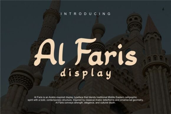
Al Faris Font channels classical Middle Eastern calligraphic spirit into a bold, contemporary display typeface with ornamental geometry and assertive terminals. Its confident strokes and distinctive curves create a headline voice that feels noble and crafted, making it a strong choice for logos and mastheads seeking presence. The design manages to read clearly while projecting an air of tradition and strength.Because Al Faris emphasizes form over gratuitous flourish, it scales cleanly across print and digital uses-particularly hospitality identity, luxury packaging, and editorial headlines. Pair it with restrained color palettes and expansive negative space to amplify its architectural qualities; in tight copy situations, pay careful attention to kerning to maintain balance. The free licensing also makes it practical for cultural projects and emerging brands requiring a dignified Arabic-inspired display face.
My Recommendation: I choose Al Faris when a project needs a headline face that feels noble and handcrafted without becoming ornate. Its strong terminals and geometric touches give logos and signage instant recognition, while the clarity keeps type usable in both print and screen contexts. Best for boutique hotels, upscale product branding, cultural identity work, and editorial covers on a budget.
27. Rasyad Font
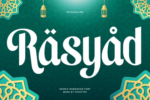
Rasyad Font is a condensed Arabic-inspired family that emphasizes refinement and quiet dignity in compact settings. Graceful curves, balanced proportions, and delicate stroke modulation lend it a warm, human character even as the condensed forms preserve visual economy. Multilingual support plus a full set of punctuation and alternates makes it practical for global branding and ceremonial invitations.The narrow footprint excels in columned editorial layouts, vertical packaging, and stacked logotypes where space is limited but presence is required. Rasyad’s uppercase and lowercase options provide typographic flexibility uncommon in many display faces, and its OTF/TTF builds include standard ligatures for smoother typesetting. Consider it for Ramadan and Eid campaigns, boutique product labels, and refined promotional materials that demand a composed, ritual tone.
My Recommendation: I pick Rasyad when projects need an elegant, space-conscious Arabic-inspired look that still feels approachable. Its condensed proportions deliver strong impact on posters, labels, and narrow signage without overwhelming surrounding elements. Excellent for seasonal campaigns, premium packaging, and editorial spreads that require a dignified, efficient typographic voice.
28. Ahlan Wasahlan Font
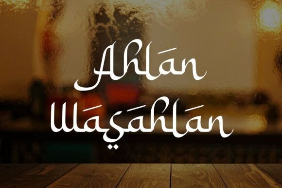
This Ahlan Wasahlan Font threads classic Arabic calligraphic gestures into a modern display face and sits confidently among the most expressive arabic fonts for hospitality and cultural branding. Ornate ligatures and sweeping terminals create a warm, ceremonial tone that reads best at headline scale while keeping diacritics and contextual alternates intact for accurate RTL typesetting. The type’s rhythmic spacing preserves calligraphic flow across posters, packaging, and identity marks without collapsing into clutter.Apply the family to menus, boutique travel collateral, and luxury restaurant identities, balancing its ornament with a neutral serif or pared-back sans to maintain hierarchy. OpenType features include stylistic sets and contextual forms that reduce manual fixes and speed headline composition. For readability keep it reserved for display use, increase leading for longer lines, and use alternates sparingly to retain impact.
╰┈➤ Download Ahlan Wasahlan Font
My Recommendation: I would reach for Ahlan Wasahlan when a project needs a warm, hospitable voice with refined calligraphic details. Its robust set of ligatures and OpenType alternates lets me craft unique headlines without heavy manual adjustments. Best uses are high-end hospitality branding, cultural events, and premium packaging where display typography carries the story.
29. Ar-rihala Font
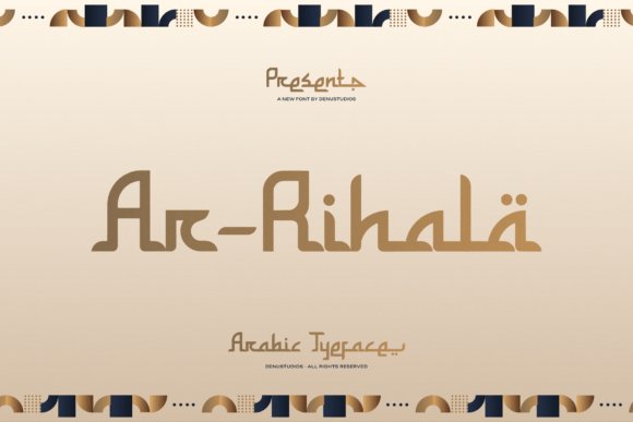
Ar-rihala Font blends organic, flowing joins with a geometric skeleton, giving text a steady, rhythmic cadence suited to bold display work. Arabesque-inspired terminals and repeating counters create decorative patterns when set large, while a disciplined baseline keeps letterforms instantly legible. Contextual alternates and careful diacritic placement make it reliable for RTL typesetting and mixed-script layouts.This family shines on covers, festival posters and seasonal packaging where decorative character is required without losing compositional control. Combine it with a restrained serif or neutral sans to avoid visual noise and let the arabesque motifs command attention. For best results use generous tracking, a limited palette, and sparing application of OpenType swashes to preserve clarity.
My Recommendation: I choose Ar-rihala when a design needs rhythmic ornamentation that still behaves predictably across layouts. The alternates and diacritic care make it dependable for Arabic display work on posters and premium packaging. I reserve it for headline and hero graphics rather than small text to keep its decorative energy legible.
30. Nouriyah Font
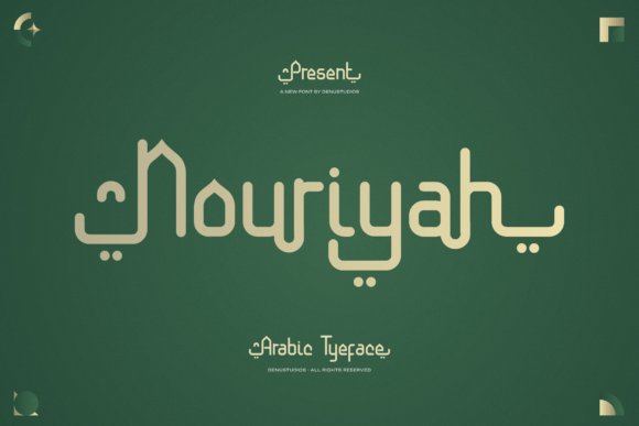
Nouriyah Font presents a modern Arabic voice with monoline strokes and an intelligent geometric skeleton that reads clean and contemporary. Generous counters, balanced terminals, and thoughtfully spaced diacritics give it a refined feel suitable for brand systems and long-form editorial. Consistent stroke weight across sizes ensures clarity in both print and screen contexts while retaining character.Use Nouriyah for corporate identities, upscale packaging, and multilingual layouts where a professional Arabic typographic tone is required alongside Latin companions. Pair it with a minimalist sans to emphasize its geometry and use OpenType alternates to fine-tune rhythm for logotypes. Its legibility also makes it a safe choice for signage and UI where elegance must meet functionality.
My Recommendation: I rely on Nouriyah when a client wants a polished, modern Arabic type that performs well across branding and editorial work. Its balanced spacing and consistent strokes make it straightforward to set across print and digital environments. Pick it for corporate identity, packaging, and interface typography when clarity and a contemporary aesthetic are priorities.
31. Al Mughir Font
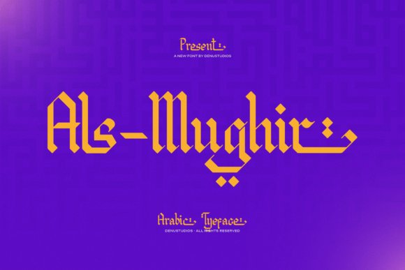
Al Mughir Font – Al-Mughir is a display typeface that marries centuries-old calligraphic gestures with precise geometric construction. Among arabic fonts, it stands out for angular, chiseled strokes and a blocky, ribbon-like skeleton that reads as architectural lettering. The family includes PUA-encoded ornamental glyphs so decorative swashes and special characters are reachable without extra tools.Designed to grab attention, Al-Mughir performs strongly at large sizes across posters, luxury packaging, and album art where a commanding headline is needed. Use tight tracking sparingly; its heavy terminals benefit from generous spacing and high-contrast finishes to amplify the regal impression. Reserve it for display-only applications rather than long paragraphs to keep legibility crisp.
My Recommendation: I reach for Al-Mughir when a project needs bold cultural presence and a contemporary regal tone. The PUA ornaments make it simple to craft custom-looking logos and embellished headlines without drawing on extra assets. It suits high-end branding, storefront signage, and limited-edition packaging where type must act like built form.
32. Sabana Font
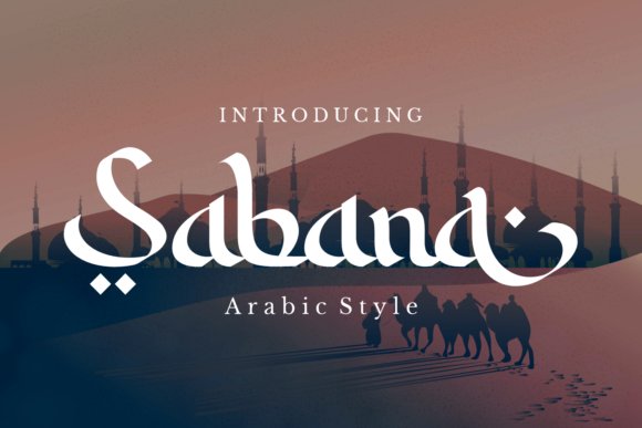
Sabana Font feels like a refined hand-script with soft connections and rhythmic strokes that suggest pen pressure and human touch. The letterforms carry a festive warmth, making it a natural choice for Ramadan greetings, event invites, and seasonal social assets. Its moderate contrast keeps the script readable while retaining expressive character.At display sizes Sabana brings an upscale sparkle to invitations, product labels, and digital banners while tighter tracking will soften its handwritten personality. Designers should check kerning when mixing scripts or pairing with Latin text to preserve flow across lines. Use it where a personal, celebratory voice is required without heavy ornamentation.
My Recommendation: I would use Sabana for greeting cards, boutique packaging, and social campaigns that need a handcrafted, celebratory tone. It works beautifully on textured stock and embossed finishes, and pairs well with clean sans serifs for body copy. Keep it prominent in headlines and accents rather than running text.
33. Thalabul Ilmi Font
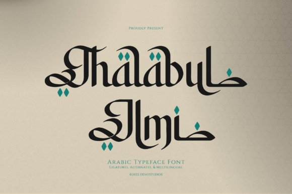
Thalabul Ilmi Font channels the rhythmic sweep of Arabic calligraphy into a display family that keeps Latin readability in mind. Character shapes emphasize extended horizontals and lofty swashes, while diacritics are treated as decorative diamond marks that lend a distinct identity to titles. The contrast between open extensions and tighter counters gives it strong presence on premium surfaces.This face is ideal when bilingual branding needs a single expressive voice that gestures toward Arabic letterforms without sacrificing Latin clarity. Pay attention to tracking in long headlines, as its horizontal features can dominate narrow columns. Consider it for upscale restaurant menus, fragrance packaging, and editorial covers where headline character matters most.
╰┈➤ Download Thalabul Ilmi Font
My Recommendation: I pick Thalabul Ilmi for projects that require cultural reference and visual refinement in equal measure. Its extended swashes perform especially well on wide-format prints and premium packaging where ornamentation becomes part of the identity. Use it to headline and define tone, and avoid setting dense paragraph text with it.
34. Arabian Mandala Font
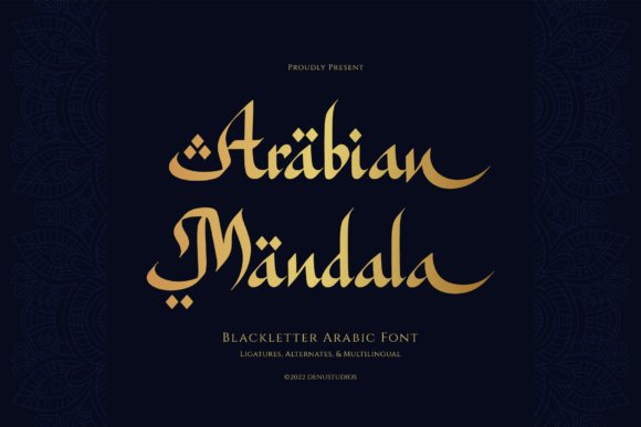
Arabian Mandala Font – Arabian Mandala is a faux‑Arabic display face that merges the dense vertical cadence of European blackletter with the flowing terminals and diacritic flourishes of Arabic calligraphy. The design packs an abundant set of decorative alternates, discretionary ligatures, and stylistic sets so you can assemble ornate headlines and bespoke wordmarks without manual vector tweaks. At large sizes the high-contrast strokes and condensed counters deliver theatrical presence, making it a headline-first choice rather than a body-text solution.This font shines in projects that need a pronounced Middle Eastern character-Ramadan and Eid campaign art, premium restaurant menus, spice and tea packaging, exotic book covers, and beauty or cosmetic logos sit well alongside other arabic fonts in region-focused branding. OpenType features, careful kerning, and mark positioning help bilingual compositions stay balanced between Latin and faux‑Arabic glyphs. Use it sparingly and at display scale to preserve the decorative details and avoid legibility loss in dense copy.
╰┈➤ Download Arabian Mandala Font
My Recommendation: I use Arabian Mandala when a brief calls for an opulent, culturally resonant headline that reads like a crafted emblem rather than a generic display face. The rich ligature set and alternates let me compose dramatic titles quickly, and the Latin pairing keeps bilingual layouts tidy. I avoid it for long reads and reserve it for hero banners, premium packaging panels, posters, and identity marks where the ornamentation can breathe.
These 34 Arabic Fonts provide a focused selection for luxury packaging design, from restrained text faces to expressive display options. Try fonts in real mockups, test OpenType alternates and kerning, and confirm commercial licensing before finalizing art.
Use the notes and pairing tips in this list to narrow choices quickly and make type decisions that support legibility and brand character on premium packaging.
One Comment