44 Playful Cartoon Fonts to Elevate Childrens Book Illustrations in 2026
cartoon fonts are the fastest way to give any project instant charm and readability-perfect for children’s books, comic panels, educational apps, and whimsical packaging. In this handpicked set of 44 faces you’ll find comic-style, hand-drawn, and rounded display type that reads well and boosts personality.
Whether you’re an author, indie game creator, teacher, or packaging designer, these playful typefaces and kids’ fonts show how to set tone quickly. Ahead you’ll get pairing tips, legibility advice, licensing notes, and sample use-cases to help you pick the right style for your project.
1. Whacky Cartoon Font
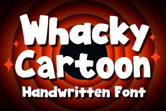
Whacky Cartoon channels the buoyant energy of vintage animation with exaggerated curves and punchy terminals that immediately read as joyful and informal. As part of the wider family of cartoon fonts, its thick strokes and playful counter shapes make letters feel as if they’re mid-bounce, which gives any headline instant personality without needing heavy ornamentation. The style reads best at display sizes, where the quirks in each glyph-uneven baselines, elastic joins, and oversized bowls-become design assets rather than distractions.
This typeface shines on tactile and visual products: stickers, playful logos, children’s apparel, and comic-panel captions benefit from its loud, friendly voice. It pairs well with simple geometric sans-serifs for body copy, or with soft script accents when you want a sweeter tone; avoid pairing it with other highly detailed display faces to keep the message clear. Color and texture amplify its character-bright palettes and subtle halftone or paper textures push it toward nostalgic, printable aesthetics ideal for merchandise.
From a practical standpoint, Whacky Cartoon holds up in short bursts of text and wordmarks where legibility is still critical despite its whimsical form. The font’s strong silhouette ensures it reads across social media thumbnails, poster headers, and embroidered patches, while its irregularity gives each word an illustrative quality. Designers who need a confident, childlike voice without sacrificing readability will find this display face extremely effective.
╰┈➤ Download Whacky Cartoon Font
My Recommendation: I’d reach for Whacky Cartoon when a project needs immediate warmth and personality-think birthday invites, children’s book covers, playful brand marks, or novelty tees. Its bold, bouncy letterforms make it a go-to for anything that must read clearly from a distance while staying approachable. Use it in short headlines paired with a clean body font to balance fun with function.
2. Boom Years Font
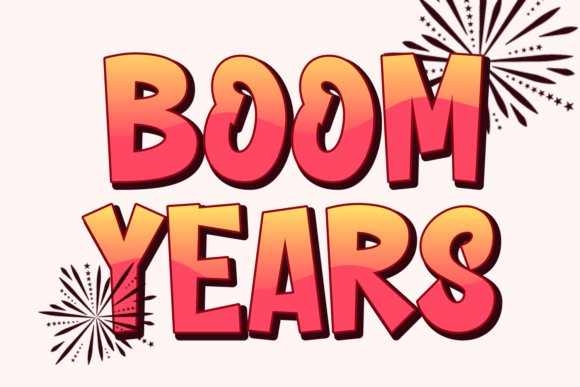
Boom Years is a display typeface that straddles graffiti attitude and graphic pop, presenting heavy weight, energetic strokes, and an expressive baseline that captures street-level movement. The letterforms feel hand-rendered-there’s purposeful roughness and spring to the curves-making it ideal for projects that require bold personality rather than neutral polish. Its temperament reads as urban and youthful, suited to designs that demand visual punch and immediacy.
Practically, Boom Years works well for posters, album covers, apparel branding, and comic-inspired headers where dramatic typographic presence is needed. It includes regular styles that improve versatility for print and merchandise applications, and the font’s compact spacing helps when you must maximize impact in tight layouts. Because of its strong personality, pairing it with a restrained sans or minimal geometric type keeps compositions grounded and avoids typographic conflict.
Design techniques that amplify Boom Years include color blocking, distressed overlays, and neon-inspired gradients that emphasize its streetwise character. Its graffiti-influenced contours lend themselves to layered compositions-think stickers over posters, stamped logos on denim, or punchy packaging labels. If the brief calls for attitude, boldness, and a handcrafted spirit, this typeface answers with authenticity and flair.
My Recommendation: I’d use Boom Years for youth-focused brands, event posters, and streetwear labels when I want a raw, energetic voice that reads loud and clear. It’s particularly strong on merchandise and packaging where hand-rendered grit becomes an asset. Pair it with clean body copy and let the typeface carry the attitude-no heavy ornamentation needed.
3. Hugs My Angel Font
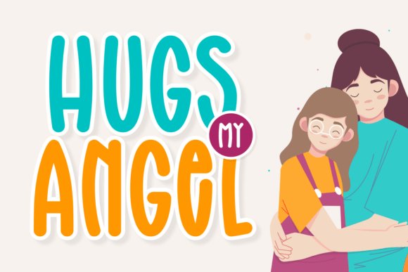
Hugs My Angel is presented as a multi-style collection that blends delicate scripts, playful display cuts, and hand-drawn accents to create a highly flexible toolkit for creative designers. The family covers everything from cursive and fashion-forward headline styles to rounded display forms that feel cozy and approachable. This breadth makes it easy to craft unified visual systems across diverse touchpoints-social posts, packaging, and apparel-without cobbling together multiple unrelated typefaces.
The collection’s strengths lie in its adaptability: neat cursive weights lend themselves to greeting cards and wedding stationery, while chunkier, rounded designs suit t-shirt prints, children’s product labels, and sublimation projects. Designers will appreciate the mix of clean, modern options and whimsical hand-lettered feels that can be combined to create logotypes, quote graphics, or decorative headlines. Subtle variations in stroke contrast and baseline treatment provide plenty of expressive range while keeping overall harmony.
From a workflow perspective, Hugs My Angel speeds up branding and content production by offering coordinated styles that work as a family rather than disparate one-offs. Multilingual support and carefully considered spacing mean fewer tweaks during layout, and the set’s decorative elements can double as badges or pattern motifs. For anyone building charming, fashion-forward or sentimental designs, this collection is a practical and stylish asset.
╰┈➤ Download Hugs My Angel Font
My Recommendation: I’d reach for Hugs My Angel when a project needs versatility with a soft, fashionable personality-think boutique branding, greeting cards, or sweet apparel ranges. Its mix of scripts and display shapes reduces the need for extra decorative elements, making design systems faster to assemble. Use it to create cohesive, lovable visuals that feel handmade yet polished.
4. Image Halloween Font
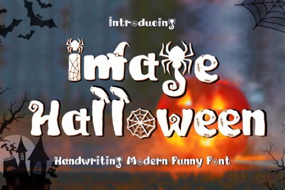
Image Halloween marries spooky motifs with playful letterforms, giving designers a spirited display face that leans into seasonal fun. It channels the charm of vintage Halloween signage while nodding to modern comic styling, so it feels familiar yet refreshingly original for seasonal work and themed branding. As one of the more expressive cartoon fonts, it immediately reads as festive and whimsical without losing personality.
Technically this font shines at headline sizes: its high-contrast silhouettes and decorative terminals render crisply on posters and hero banners, and the included alternates and stylistic sets let you dial up creepiness or cuteness as needed. It also offers solid punctuation and numeral treatment so event dates and price points look intentional and integrated. The balance between ornament and legibility keeps the type usable for both print flyers and animated social posts.
Pair Image Halloween with a clean geometric sans for balance or layer it over textured backgrounds and muted palettes to emphasize its carved, hand-crafted vibe. It works wonderfully for party invitations, seasonal packaging, title cards, and themed merchandise where an immediate, memorable feeling is required. Avoid using it for large bodies of text; its characterful shapes are best when shown boldly and sparingly.
╰┈➤ Download Image Halloween Font
My Recommendation: I’d reach for Image Halloween when I need a headline that reads festive the moment someone glances at it. Its mix of spooky ornamentation and playful shapes makes event posters, seasonal product labels, and social banners pop. Use it big, pair it with simple sans serifs, and lean into moody color palettes for best effect.
5. Transformer Font
Transformer is a buoyant, comic-inspired display font whose rounded strokes and bouncy baseline convey youthful energy at a glance. It has an approachable, hand-crafted quality that suits kid-centric projects and playful branding where friendliness is essential. The overall construction favors large, open counters and exaggerated terminals that read well on thumbnails and printed goods alike.
From a practical standpoint, Transformer performs beautifully in short bursts of text like titles, badges, and callouts thanks to heavy weighting and clear letterforms. It’s forgiving with color overlays and drop shadows, making it a great choice for YouTube thumbnails, children’s book covers, and packaging labels. The glyph set feels complete for most Latin-based uses and displays consistently across screen and print workflows.
For maximum impact, combine Transformer with a restrained sans or a simple geometric slab to avoid visual competition; let it own the headline while the companion face handles body copy. Bright, saturated palettes amplify its cheerful tone, while subtle textures can give it an artisanal feel. This is a go-to when you want a design to feel tactile, fun, and instantly relatable.
My Recommendation: I’d pick Transformer for any project aimed at kids or casual audiences – think game UIs, classroom materials, or playful branding. Its lively shapes draw attention without being gimmicky, and it adapts well to both digital thumbnails and printed merchandise. Use bold color and generous spacing to let its personality shine.
6. Extra Power Font
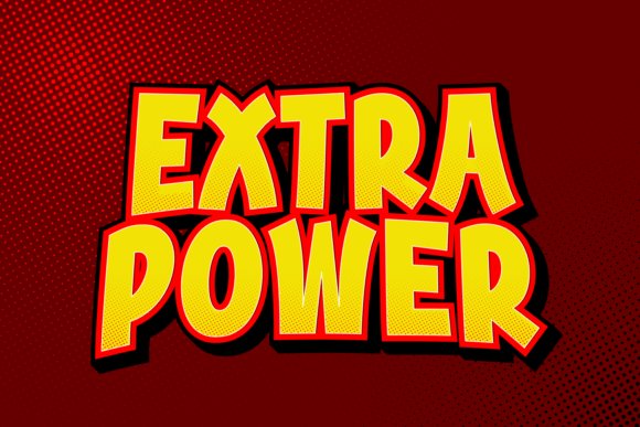
Extra Power is a bold, chunky display font built for maximum presence. Its thick strokes and compact letterforms give a friendly yet commanding voice that’s excellent for punchy headlines and logo marks. The typeface reads with a comic-like robustness that still manages to feel modern and clean.
Structurally, the font boasts strong contrast between solid shapes and internal counters, which helps it remain legible at a distance and on apparel. It excels in signage, poster work, and T-shirt printing where simple, impactful messages are required. Because of its weight, it is best used at display sizes rather than in paragraph text to avoid visual heaviness.
Pair Extra Power with narrow sans serifs or light scripts to create an attractive hierarchy and prevent the layout from feeling top-heavy. It responds well to bold color blocks, outline treatments, or layered fills for dynamic branding and retro-inspired packaging. Treat it as your headline workhorse when you need designs that are playful, direct, and hard to ignore.
My Recommendation: I’d use Extra Power whenever a design needs instant visual authority but with a playful twist – think brand logos, posters, and merch. Its chunky forms read from far away and reproduce cleanly on print and fabric. Pair it with a simpler support face to keep compositions balanced and let the type do the heavy lifting.
7. Welcome Spring Font
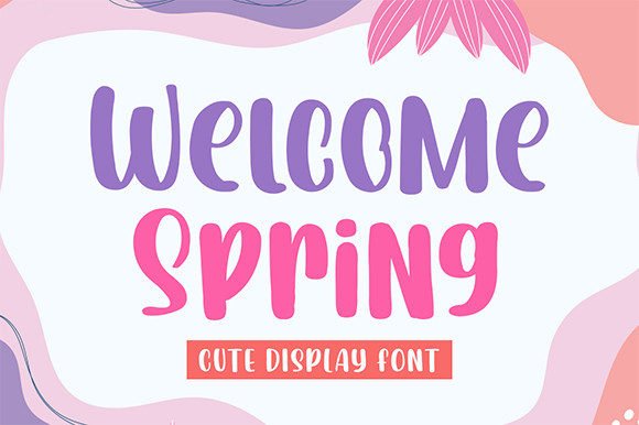
Welcome Spring arrives as a bold, contemporary display face with buoyant shapes and generous stroke widths that immediately read as confident and fun. The letterforms favor rounded terminals and slightly irregular baselines, giving headlines a handcrafted, energetic personality that stands out on posters and packaging alike. If you’re building a youthful identity or headlines for kids’ events, it pairs naturally with playful graphic elements and bright palettes – and it works especially well next to hand-lettered scripts.
For designers searching for type that can shoulder big, attention-grabbing phrases, Welcome Spring is a strong candidate among cartoon fonts thanks to its strong silhouette and open counters. It keeps readability at larger sizes while preserving a lively, illustrative quality that helps text feel like part of the artwork. Use it where you want copy to act as a visual focal point rather than a subtle supporting element.
Practical tip: treat this face as a display-only hero – use tight tracking and bold color contrasts or subtle textures to amplify its character. It pairs beautifully with delicate script accents or narrow sans-serifs for subheads, and tolerates heavy effects like outlines and shadows without losing charm. Overall, it’s a versatile choice when you need a confident, contemporary look with a handcrafted twist.
╰┈➤ Download Welcome Spring Font
My Recommendation: I’d reach for Welcome Spring when I need headlines that demand attention without feeling aggressive. Its bold, rounded shapes give projects a friendly, modern tone perfect for event posters, toy packaging, or seasonal greetings. It’s especially useful when you want text to read as part of the illustration rather than separate from it.
8. Dirty Cartoon Font
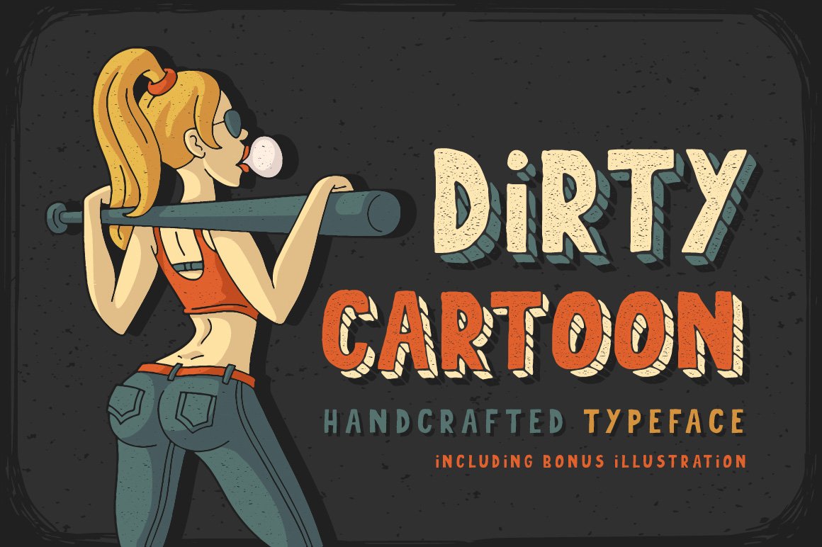
Dirty Cartoon is a family of four hand-drawn faces, each with an intentionally imperfect, rough-hewn aesthetic that reads as exuberant and artisanal. The set offers complementary styles – from chunky, ink-splotched caps to lighter, sketchy versions – giving designers flexibility to mix moods while keeping a consistent voice. The irregular edges and playful proportions make every word feel handcrafted and expressive.
Because these fonts mimic marker and pen textures, they excel in projects that benefit from an offbeat, tactile look: indie comic covers, zines, sticker art, and quirky packaging all gain personality from the set. The variety within the family means you can layer a heavy weight for a title and a lighter variant as a supporting label, retaining visual unity without monotony.
Designers should embrace generous spacing and layered textures when using Dirty Cartoon; the charm comes from the organic imperfections, so avoid heavy smoothing or too-small sizes that erase detail. Pair with simple geometric shapes or flat-color backgrounds to keep the focus on the lettering’s character – it’s a great pick for youthful, scrappy brands and playful editorial work.
╰┈➤ Download Dirty Cartoon Font
My Recommendation: I’d pick Dirty Cartoon when I want a lively, hand-crafted look that feels instantly personal. The four complementary styles let me create hierarchy while maintaining a cohesive, playful tone-ideal for indie comics, kids’ product labels, or event posters. It’s a go-to when I want type that looks drawn, not manufactured.
9. Xmas Story Font
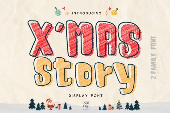
Xmas Story is a high-impact cartoon-style display face built to command attention: thick stems, pronounced counters, and bold silhouettes give text an animated, heroic quality. The design reads instantly familiar in comic and game worlds, lending itself to dynamic titles and adventurous branding. Its assertive shapes make short phrases pop even from a distance, which is why it’s a favorite for banners and marquee-style treatments.
This font thrives in energetic, youth-oriented contexts such as online game art, comic book covers, novelty tees, and seasonal cards where a spirited visual voice is required. Designers can lean into its boldness by using contrasting outlines, halftone textures, or drop shadows to enhance depth and amplify the dramatic feel. It’s particularly effective when paired with bright palettes or stamped effects.
For best results, reserve Xmas Story for headlines and display sizes rather than body text; its personality is strongest in short bursts. Consider combining it with clean, neutral subheads to maintain hierarchy and legibility. When you need typographic impact that feels both playful and cinematic, this face delivers abundant presence.
My Recommendation: I recommend Xmas Story when the brief calls for something theatrical, fun, and unmistakable. It’s perfect for hero headlines on posters, game UI headers, or novelty apparel where you want text to carry attitude and visibility. Use it in short phrases and amplify it with color and texture for maximal effect.
10. Boozley Cartoon Display Font
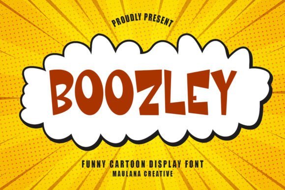
Boozley arrives as a buoyant display face with exuberant curves and chunky strokes that immediately read as friendly and accessible. It sits confidently among the best cartoon fonts thanks to its generous x-height, rounded terminals, and slightly elastic letterforms that give headlines a lively bounce without sacrificing legibility.
What makes Boozley stand out is its balance between personality and practicality: the bold letter shapes scale well for signage and posters, while the tighter internal counters hold up at smaller sizes for captions or toy packaging. Careful kerning and clear uppercase/lowercase distinctions mean it works for both playful logos and punchy typographic posters.
Design-wise, Boozley pairs beautifully with a restrained geometric sans for body copy or a thin script for accent details; try a subtle outline or drop shadow to amplify its cartoon energy. For motion projects it translates well into animated titles because each glyph has a distinct silhouette that’s easy to read in motion.
╰┈➤ Download Boozley Cartoon Display Font
My Recommendation: I’d reach for Boozley when I need instant charm-kids’ book covers, comic headers, toy packaging, or playful branding all benefit from its smiley character. Its readable proportions make it practical for both print and screen, and the bold shapes are perfect for colorful treatments or simple animations. If you want a display face that feels handmade but professionally executed, Boozley is a go-to.
11. Cinema Cartoon Font
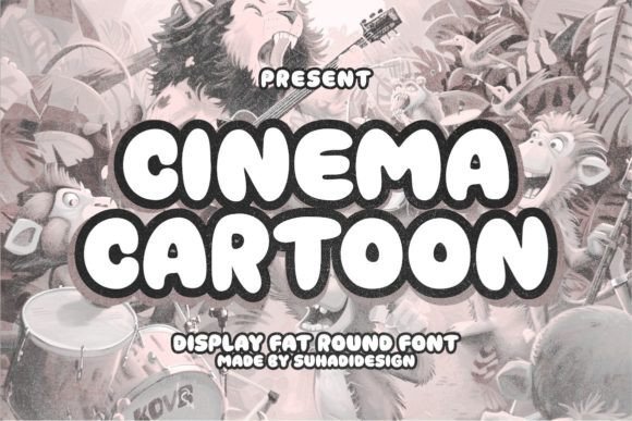
Cinema Cartoon is a rounded, fat display typeface built to make a strong visual impression with minimal fuss. Its smooth, full-bodied letters create a warm, approachable aesthetic that works especially well for family-oriented films, snack packaging, and playful brand marks.
The font’s weight and gentle curves make it ideal for short headlines, product names, or poster headlines where impact is more important than fine detail; avoid using it for long blocks of text. Designers will appreciate how the even stroke contrast keeps forms legible against busy imagery and how the silhouette translates across print, web banners, and social assets.
Stylistically, Cinema Cartoon benefits from high-contrast color palettes, simple drop shadows, or subtle outlines to lift it off backgrounds; pair it with a narrow sans or a soft script for variety. Use it when you want instant, friendly recognition-especially for children’s products, candy branding, or promotional graphics with a nostalgic vibe.
╰┈➤ Download Cinema Cartoon Font
My Recommendation: I’d pick Cinema Cartoon for projects needing a bold, friendly headline voice-think movie posters for kids, candy packaging, or playful product labels. It gives brands instant warmth and legibility at scale, and it’s especially effective when combined with bright colors or graphic shapes. For me, its greatest strength is creating memorable, approachable identities with minimal styling.
12. Cartoon Splash Font
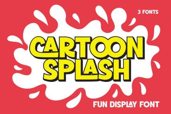
Cartoon Splash is a dynamic display face that injects a fast-moving, joyful rhythm into text through exaggerated forms and playful ligatures. The type’s lively character makes it ideal for party invites, children’s posters, and any layout that needs visual exuberance and a sense of movement.
The included ligatures and alternates allow words to take on custom shapes, producing natural-looking overlaps and bouncy baselines that read as hand-drawn studio lettering. Because of its expressive nature, it shines in short bursts-titles, badges, stickers, and packaging-rather than dense paragraphs.
To maximize impact, pair Cartoon Splash with muted plains or restrained geometric type for supporting copy, and experiment with layered color fills or textured backgrounds to emphasize its energetic feel. It also adapts well to animation where each glyph’s personality can be played up with subtle shifts and pops.
╰┈➤ Download Cartoon Splash Font
My Recommendation: I’d use Cartoon Splash when I want to convey pure fun-birthday materials, event posters, children’s merchandise, or comic-style packaging all benefit from its vibrant personality. The ligatures give designers creative control to craft unique wordmarks and playful headlines. If your project thrives on movement and color, this font brings instant sparkle and charm.
13. Find Cartoon Font
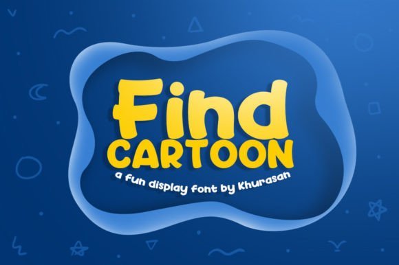
Find Cartoon is a polished display face that balances playful curves with modern structure. Its rounded terminals and slightly exaggerated counters give headlines a friendly, energetic presence while retaining crisp legibility at poster sizes. The letterforms feel intentionally contemporary-clean enough for editorial layouts yet expressive enough to carry character-driven branding.
Where this design truly shines is its versatility: it adapts easily from bright, kid-focused packaging to sleek lifestyle logos. If you need cartoon fonts that read well across print banners, magazine covers, and social media art, this family works particularly well thanks to its bold weight and wide letter spacing. Subtle alternates and consistent stroke contrast make it simple to pair with neutral sans-serifs or thin scripts for balance.
Small technical touches-well-kerned pairs and generous x-height-mean Find Cartoon holds up in tight spaces and large-format work alike. Use color and texture to amplify its personality: flat color blocks emphasize modernity, while light grain textures lend a handmade touch. Overall, it’s a dependable display choice when you want fun without sacrificing professionalism.
╰┈➤ Download Find Cartoon Font
My Recommendation: I’d reach for Find Cartoon when a project needs upbeat personality but also professional readability-think playful branding, children’s book covers, and bold poster headlines. Its clean curves make it easy to pair with neutral type while still standing out on packaging or editorial spreads. It’s my go-to when a project needs cheer and clarity at once.
14. Tropica Jungles Font
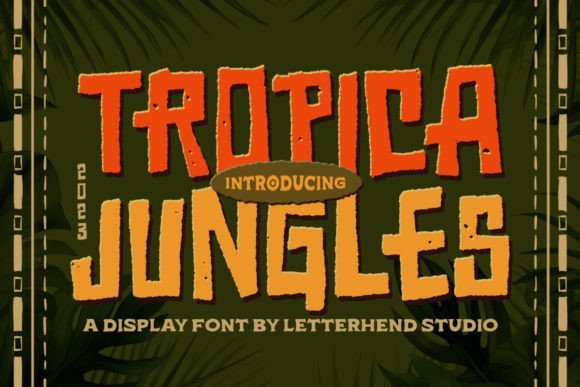
Tropica Jungles delivers a textured, hand-crafted aesthetic with a lively, organic rhythm in each character. The rough edges and subtle ink-like speckles create instant vintage charm, evoking tropical signage or rustic packaging without feeling overdone. Its forms lean playful and slightly irregular, offering a friendly, approachable voice for headlines and logos.
Technically pleasing for designers, this family is PUA-encoded so every glyph, stylistic alternate, and playful ligature is easy to access within standard design software. That accessibility makes it ideal for logo lockups, greeting cards, and festival posters where quick access to alternates speeds creative iteration. The typeface’s texture also translates beautifully to simulated letterpress or screen-printed merchandise.
Pair Tropica Jungles with clean geometric sans-serifs to prevent visual clutter, or with minimal photographic layouts to let the type do the storytelling. It’s especially effective on product labels, travel-themed posters, and boutique packaging where tactile character and a hand-made look are assets rather than liabilities.
╰┈➤ Download Tropica Jungles Font
My Recommendation: I recommend Tropica Jungles when you want a warm, tactile headline that reads like it was hand-printed-great for artisanal food labels, summer festival posters, or boutique packaging. The PUA glyphs are a big time-saver for rapid experimentation, and the textured finish gives printed goods a crafted, memorable feel.
15. Thick Antique Font
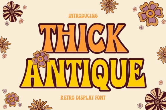
Thick Antique channels a retro, 1970s-inspired display voice with generously weighted strokes and soft, rounded counters. Its bold presence is engineered for impact: large titles, T-shirt graphics, and nostalgic branding all benefit from its confident, sturdy shapes. The overall silhouette blends warmth with authority, making it versatile across lifestyle and editorial projects.
Beyond headline power, the design includes subtle vintage touches-slight tapering at terminals and optional swash-like alternates-that add personality without sacrificing readability. These features make it easy to create eye-catching logotypes or album covers where expressive letterforms need to communicate character at a glance. The family holds up well when layered with color or texture for packaging applications.
For harmonious layouts, pair Thick Antique with narrow sans-serifs or light script accents to avoid visual heaviness. It excels where nostalgia and modern utility meet: retro-inspired posters, brand identities seeking a friendly-yet-solid voice, and apparel prints that demand legibility from a distance.
╰┈➤ Download Thick Antique Font
My Recommendation: I’d choose Thick Antique for projects that want a vintage flair with strong headline presence-think retro posters, apparel branding, or album artwork. Its weight and classic forms ensure visibility, while the optional alternates let you inject personality. It’s a great pick when you need boldness tempered by charm.
16. Extreme Event Font
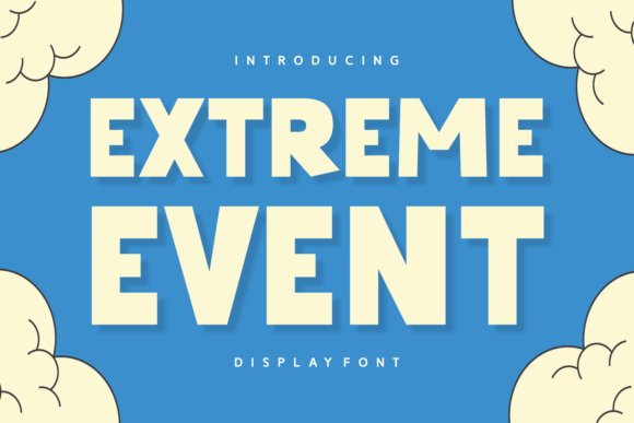
Extreme Event is a hand-drawn display font that blends headline energy with a playful, handcrafted personality. It nods to seasonal and cute type trends while fitting neatly into the world of cartoon fonts and whimsical display typography-making it a natural choice when you want designs that read like a joyful announcement rather than a neutral label.
The letterforms balance smooth, flowing strokes with confident weight, which gives this face strong presence on apparel, sublimation prints, and editorial covers alike. Its clean edges and moderate contrast allow it to scale well for large-format packaging, T-shirt art, and social-post hero graphics while retaining that handlettered warmth.
Think of Extreme Event as a headline engine: it elevates quotes, logotypes, and greeting cards while remaining flexible for branding or photographic overlays. For best results, pair it with a restrained sans-serif for body copy, and experiment with outlines, soft shadows, or layered color fills to amplify its friendly, on-trend charm.
╰┈➤ Download Extreme Event Font
My Recommendation: I reach for Extreme Event when a project needs an energetic, hand-crafted headline that feels both modern and approachable. It’s especially useful for social media covers, seasonal packaging, and apparel prints where personality must read instantly. Use it when you want bold, upbeat typography that still feels artisanal and human.
17. Almond Fornt Font
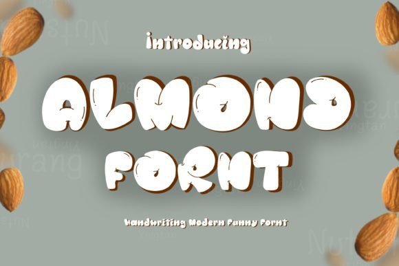
Almond Fornt arrives with round, bubbly characters that read as joyful and approachable at a glance. Its youthful rhythm and slightly inflated terminals give designs a sunny, informal tone-perfect for party invites, poolside event graphics, and any application seeking a carefree, friendly voice.
Because of its exaggerated curves and wide counters, this display style performs best at headline sizes where its personality can shine. It translates beautifully to stickers, posters, and kid-centric packaging, and it holds up to bright colors and playful textures like confetti or watercolor washes.
For composition, pair Almond Fornt with a minimal serif or geometric sans to avoid visual clutter and to let the bubbly letterforms remain the focal point. Use generous tracking and bold color contrasts to maintain legibility and amplify the exuberant mood.
╰┈➤ Download Almond Fornt Font
My Recommendation: I’d use Almond Fornt for youth-oriented branding, seasonal party materials, or any visual where a cheerful, uncomplicated tone is required. It’s ideal for bright, decorative headlines and tactile prints like stickers or enamel pins. If your project needs to feel instantly fun and inviting, this font makes that happen quickly.
18. Nihert Comic Font
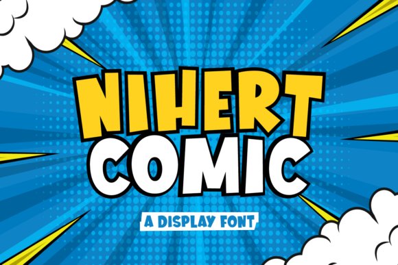
Nihert Comic is a chunky, upbeat display type that channels classic comic lettering with a modern twist. Its robust strokes and rounded counters make for immediate readability and a friendly, animated feeling that works well across playful editorial and product graphics.
The font’s generous weight and clear shapes are optimized for medium-to-large display use: think posters, game UI, children’s book covers, and product labels where strong contrast and impact are required. It responds exceptionally well to color fills, outlines, and speech-bubble treatments, giving designers straightforward ways to create lively typographic hierarchies.
When composing with Nihert Comic, restrain decorative elements in body text and let this face command attention in titles or badges. Pair it with a subtle sans-serif for supporting copy, and use high-contrast palettes to make the rounded forms pop in both print and digital environments.
╰┈➤ Download Nihert Comic Font
My Recommendation: I recommend Nihert Comic when you need bold, friendly type that reads easily and conveys energy-especially for children’s products, playful packaging, or game interfaces. It’s a dependable choice for headlines that must cut through visual noise. Use it for any creative that benefits from a cheerful, unmistakable voice.
19. Real Super Font
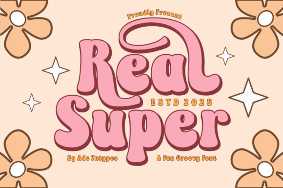
Real Super is a retro-inspired display family that channels the energy of the 1970s while feeling fresh and usable today. The character set leans into bold, rounded counters and generous x-heights, making headlines sing on posters, signage, and packaging. Its personality reads as both nostalgic and contemporary, so designs get immediate recognition without feeling dated.
The collection spans elegant serifs, playful sans shapes, dingbats, and layered script options so you can mix-and-match styles for seasonal campaigns or craft projects. It even includes playful cartoon fonts that bring a whimsical touch to children’s products, party invites, and sticker sheets-plus the kind of SVG/Cricut-friendly outlines crafters need for sublimation and vinyl work.
Technically, Real Super performs well at display sizes: crisp vector outlines, thoughtful spacing, and alternate glyphs give you flexibility for logotypes and wordmarks. I especially like pairing a chunky Real Super headline with a fine geometric sans for body copy-this contrast preserves legibility while keeping the retro charm intact.
My Recommendation: I’d reach for Real Super when a project needs bold personality with craft-friendly versatility. Its range-from dingbats to layered scripts-makes it ideal for apparel, party assets, and nostalgic branding. Use it when you want a modern take on vintage that also cuts cleanly for vinyl, sublimation, and social artwork.
20. Juliette Font
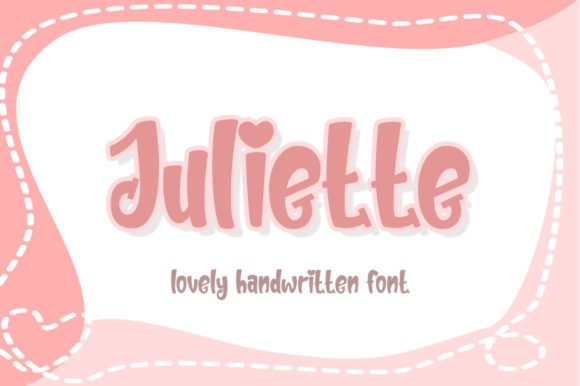
Juliette is a confident, contemporary display face built to command attention in headlines and hero graphics. Its strong strokes and slightly condensed proportions make it a natural for magazine covers, product packaging, and large-format posters where impact matters. The design reads trendy without being gimmicky, which helps it serve both fashion-forward and mainstream brands.
Despite a bold presence, Juliette pairs gracefully with elegant scripts or light humanist sans for more nuanced layouts-think logo wordmarks supported by a delicate secondary type. Designers will appreciate that the letterforms sustain clarity at scale, so whether it’s a store window or an Instagram carousel the type stays legible and characterful. Juliette also adapts well to DIY craft workflows and print projects.
Under the hood it behaves like a professional display family with consistent spacing and clean terminals, which speeds up layout work and kerning tweaks. Use stylistic alternates and tightly tracked all-caps for a fashion-magazine vibe, or loosen letterspacing for friendly, poster-oriented copy that invites closer reading.
My Recommendation: I’d use Juliette when a project needs a bold yet refined headline that won’t overpower supporting elements. It’s particularly strong for fashion branding, packaging, and posters where trend-awareness matters. Juliette’s clean mechanics make it an easy choice when you want modern flair without sacrificing readability.
21. Rabbit Night Font
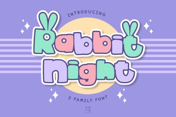
Rabbit Night is a spirited, cartoon-style display font with a punchy attitude that’s built to stand out. The letterforms favor exaggerated curves and lively terminals, giving text an animated, hand-drawn energy perfect for comic-inspired projects. It immediately communicates playfulness and boldness, ideal for grabbing attention on posters, thumbnails, and game headers.
Its personality suits a wide range of youth-focused applications: children’s apparel, social-media stickers, indie game titles, and movie posters that need a daring look. The font handles layered color effects and heavy outlines well, so you can push dramatic treatments like shadows, strokes, or halftone textures without losing character clarity.
From a practical standpoint, Rabbit Night scales beautifully at display sizes and responds well to vector cutting and screen printing. Pair it with a neutral sans for longer copy to keep things readable, or use it alone for short punchlines, logos, and badge designs that demand immediacy and attitude.
╰┈➤ Download Rabbit Night Font
My Recommendation: I’d reach for Rabbit Night when I need exuberant, attention-grabbing typography for youth-facing or entertainment projects. Its comic-inspired shapes are perfect for t-shirts, game art, and playful posters. Use it when you want type that feels fearless and fun while remaining versatile enough for various print and digital workflows.
22. Simple Biscuits Font
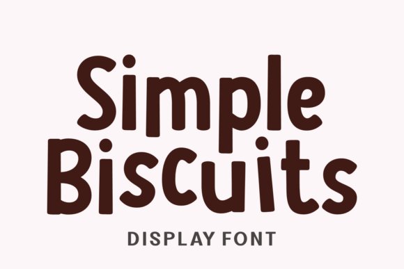
Simple Biscuits is a chunky, joy-filled display face built to read like a friendly comic headline. Its thick strokes and rounded terminals give headlines immediate warmth and approachability, making it ideal for children’s products, posters, and seasonal apparel. Because it was crafted with bold shapes, it holds up at large sizes and reproduces cleanly on textiles and packaging without losing personality.
This font leans into playful rhythm: oversized counters, slightly irregular baselines, and open letterforms that make every word feel hand-delivered. It pairs beautifully with neutral sans-serifs for body copy, or with delicate script accents for greeting cards and event invites. The Easter-inspired quirks and subtle Eastern European accents help it feel both cute and globally usable.
For designers after a statement display face, Simple Biscuits sits squarely among modern cartoon fonts while retaining a distinct, lovable voice. Use generous tracking for small sizes and tighten slightly for headlines to preserve its chunky charm. It’s especially effective on kid-focused identity work, T-shirt graphics, and any project that needs a confident, whimsical title treatment.
╰┈➤ Download Simple Biscuits Font
My Recommendation: I reach for Simple Biscuits when I need an exuberant headline that feels handmade but professional. Its bold forms print reliably on apparel and packaging, and the cheerful character set works brilliantly for children’s books, holiday cards, and playful branding. Use it where you want instant emotional connection-school events, product labels, and family-focused campaigns are perfect fits.
23. Cartoon Motion Font – cartoon fonts
Cartoon Motion is a high-energy display typeface designed to suggest movement and informal handwriting without sacrificing legibility. The letterforms lean and stretch in ways that convey motion, making it an excellent choice for poster headlines, social media graphics, and dynamic packaging. Its lively personality works especially well where you want the text to feel like part of the artwork.
Technically, the package arrives as an OTF file compatible with PC and Mac and playable across Illustrator, Photoshop, InDesign, and Word, so integration into creative workflows is straightforward. The encoded PUA characters mean you can access special glyphs without additional font tools, which simplifies using alternate characters for added flair. The seller also notes ongoing support and updates, a nice plus for long-term projects.
Because of its spirited shapes, Cartoon Motion shines for display-only uses rather than long-form copy; use it for logos, titles, captions, invitations and watermarking photography to add instant character. Try pairing it with a restrained sans for balance, and reserve its more extreme weights for short bursts to maintain impact without overwhelming the layout.
╰┈➤ Download Cartoon Motion Font – cartoon fonts
My Recommendation: I’d use Cartoon Motion when a project demands kinetic personality-think event posters, playful logos, or animated social posts. Its compatibility and PUA-encoded alternates make it designer-friendly, while the slanted, hand-drawn energy helps headlines pop. For best results, limit it to short copy and combine with neutral bodies to keep layouts readable.
24. Cobemat Cartoon Font
Cobemat Cartoon begins with the intimacy of a doodle: irregular strokes and conversational proportions that read as authentic and handcrafted. The OpenType-driven system includes around 100 ligatures and alternates so text never feels repetitive-letters swap and adapt as you type, creating a lively, almost animated texture in headings and titles. This makes it especially compelling for packaging, children’s books, and playful branding.
The font’s breadth-numbers, punctuation, and language support-means it can be used across international projects while keeping its handmade charm. Designers will appreciate how the alternates let you tune voice and rhythm: choose tighter forms for compact logos or looser, airier alternates for whimsical posters. Its quirky ligatures are perfect for wordmarks that need personality without custom lettering.
When using Cobemat Cartoon, pay attention to line length and spacing so the lively alternates don’t create visual noise; short lines and generous leading let the character of each glyph shine. It’s a fantastic choice when you want type that reads as personal and creative rather than clinical-great for indie brands, activity books, and event promos that aim to feel handcrafted.
╰┈➤ Download Cobemat Cartoon Font
My Recommendation: I recommend Cobemat Cartoon for projects that want a hand-drawn, unpredictable look without hiring a lettering artist. The wealth of alternates gives natural variation that keeps repeat words interesting-excellent for children’s packaging, playful logos, and editorial spots. Use it when you need typography that reads like personality rather than perfection.
25. Cartoon Stories Font
Cartoon Stories arrives as a buoyant, character-driven display face whose rounded terminals and slightly irregular baseline feel handcrafted rather than mechanically produced. The letterforms are generous – large x-height, open counters and broad strokes – which give headlines and short blocks of text a warm, playful energy that instantly reads as kid-friendly. cartoon fonts shine in this style because the shapes balance readability with exaggerated personality.
Under the surface, Cartoon Stories performs well across print and digital workflows: it holds up at large sizes for posters and signage yet retains clarity on apparel and stickers when rasterized for sublimation or plotted with cutting machines. Subtle alternates and cheerful ligatures (when available) make repeated words feel lively instead of monotonous, and its heavier weights anchor compositions without overpowering illustrated elements.
For designers, this font is a toolbox piece – pair it with a simple geometric sans for body copy or layer it over textured backgrounds to evoke hand-drawn storybooks. Use bright, saturated color palettes and simple iconography to amplify its friendly tone; avoid using it for dense paragraphs, but embrace it for covers, chapter headers, packaging for kids, and class materials where an optimistic voice is essential.
╰┈➤ Download Cartoon Stories Font
My Recommendation: I reach for Cartoon Stories when a project needs unabashed warmth and clarity – children’s book chapter headers, playful event posters, and cute apparel graphics benefit most from its bouncy shapes. Its legibility at display sizes and expressive alternates let me create layouts that feel handcrafted without sacrificing professionalism. If you want typography that feels like a smile, this font is an easy, joyful choice.
26. Cartoon 1980s Font
Cartoon 1980s Font channels retro-fun aesthetics with a punchy, neon-era attitude: think chunky counters, playful curves and an energetic slant reminiscent of vintage cartoons and arcade signage. The overall personality is bold and theatrical, lending itself to single-line headlines, party invites and nostalgic packaging where a dose of exuberance is required. Its visual shorthand reads instantly as cheerful and slightly kitsch, perfect for projects that lean into decade-driven themes.
Technically, this display type is optimized for standout graphics rather than long-form copy – it works well at large sizes for posters, social banners and craft-cut applications like SVGs for Cricut users. Designers will appreciate strong baseline consistency and distinctive terminals that remain legible when layered over busy imagery or used with heavy outline effects. Consider combining it with a neutral sans or condensed serif for secondary text to keep layouts balanced.
Stylistically, use bright duotones, grid overlays and retro textures to amplify its 80s vibe; it also performs nicely on greeting cards, stickers and themed presentations. Avoid dense paragraphs and tiny caption work, but embrace this font when you want an unmistakable throwback mood that demands attention and sparks nostalgia.
╰┈➤ Download Cartoon 1980s Font
My Recommendation: I’d pick Cartoon 1980s Font for projects that need instant retro flair – themed party graphics, band posters, and craft-driven merch are ideal playgrounds for its bold shapes. It’s particularly effective when paired with neon colorways or grainy halftone textures to accentuate that vintage energy. Use it sparingly as a hero display face to keep compositions exciting without overwhelming the message.
27. Retro Crab Font
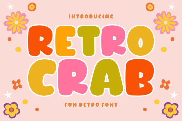
Retro Crab Font is a groovy, 70s-inspired display face that melds chunky serif weights with whimsical curvature, producing a look that feels both vintage and contemporary. The design favors wide letterspacing and distinctive terminals that are evocative of disco-era posters and surf-culture graphics, making it particularly well-suited to expressive branding and eye-catching headers. Its warmth comes from rounded edges and subtly uneven stroke contrasts that read as hand-tuned rather than mechanical.
Built with versatility in mind, Retro Crab performs exceptionally across apparel printing, sticker art and digital social cards; the heavier forms render nicely in sublimation and vinyl cutting workflows like Cricut or Silhouette. Many of its variants include decorative dingbats and seasonal avatars – floral motifs, holiday icons and festive shapes – which make it straightforward to create themed collections without adding extra artwork. The font also plays well with layered color fills and outline styles common in T-shirt and poster design.
For practical use, pair Retro Crab with a thin geometric sans for body copy to maintain hierarchy, or combine it with script accents for boutique packaging. Use wide leading and generous tracking to let the characterful glyphs breathe; the result is an approachable, retro personality that adapts from storefront signage to social-media promos with equal charm.
My Recommendation: I recommend Retro Crab Font when you want retro soul without cliché – it’s a strong choice for apparel lines, seasonal promo art and boutique branding that benefits from nostalgic warmth. The included decorative sets and robust display weights speed up creative iterations, especially for designers working with cut files and print-on-demand. Use it as a primary headline face to give projects a friendly, memorable identity.
28. Chinese New Year Font
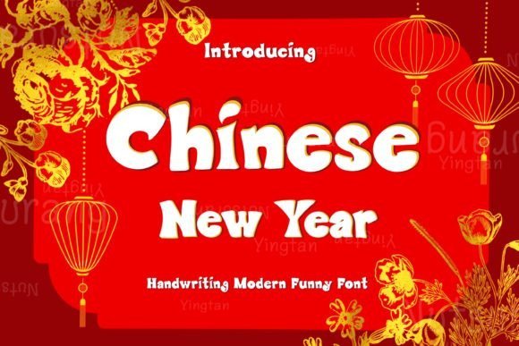
Chinese New Year presents a festive decorative display with rounded strokes, playful ballooned counters, and ornamental accents inspired by lanterns and paper-cut motifs. Its joyful letterforms sit comfortably alongside whimsical iconography, making it a nice companion to cartoon fonts or other kid-friendly type treatments when you want a celebratory, upbeat tone without losing cultural flair. The overall voice is decorative but legible at headline sizes, so it reads clearly on posters and social posts while still feeling hand-crafted.
Technically the bundle ships as standard .otf and .ttf files, which makes it straightforward to install on macOS, Windows, and many design apps that accept desktop fonts; .otf is recommended for best features. There’s explicit Procreate compatibility noted, so creators working on iPad can drop the font into lettering projects and shape sticker art or printable envelopes with consistent results. Expect solid spacing and lively glyph alternates suited for headline work and simple wordmarks.
Licensing covers personal and commercial projects with a single-download model and immediate access after purchase, so you can use it for seasonal campaigns, greeting cards, packaging, and social media templates right away. A few practical caveats are called out: no physical product, no refunds, and ensure you know how to install fonts on iPad/iPhone if that’s your workflow. For best results pair it with a simple sans or a restrained serif to let the decorative shapes take center stage without visual clutter.
╰┈➤ Download Chinese New Year Font
My Recommendation: I’d reach for Chinese New Year when crafting seasonal promotions, children’s event invites, or festive packaging. Its decorative motifs give instant holiday character while remaining readable at display sizes, and Procreate support is a real time-saver for sticker and social media artwork. Use it when you want bold seasonal personality without sacrificing technical reliability.
29. Birthday Party Font
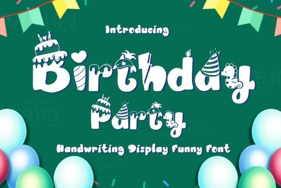
Birthday Party is a bubbly, quirky display font designed to bring an unmistakable sense of fun to celebratory designs. Its rounded terminals and irregular baseline create a hand-drawn, childlike energy that works beautifully on invitations, party banners, and children’s product packaging. The friendly shapes maintain legibility while conveying a joyful, carefree mood that reads instantly as festive.
Where this font shines is in composition: large headlines, poster copy, and packaging labels benefit from its playful rhythm, while alternate glyphs (if included) let you vary letter endings to avoid visual repetition. It pairs especially well with clean geometric sans-serifs for contrast or lightly textured backgrounds for a tactile feel. The font’s informal personality also makes it an excellent choice for illustrated scenes, mascot logos, and children’s activity sheets.
Because of its whimsical voice, Birthday Party performs best at display sizes rather than dense blocks of body copy. Designers can lean into bright palettes, confetti patterns, and balloon graphics to emphasize the theme without complex typographic hierarchies. It’s an ideal pick when you want instant celebration and charm without overcomplicating your layout choices.
╰┈➤ Download Birthday Party Font
My Recommendation: I recommend Birthday Party for event invitations, kids’ product labels, and playful branding projects. Its instantly joyful forms add personality and warmth, and it’s especially effective when paired with bold colors and simple supporting type. Use it when you want designs that are immediately approachable and celebratory.
30. Machine Font
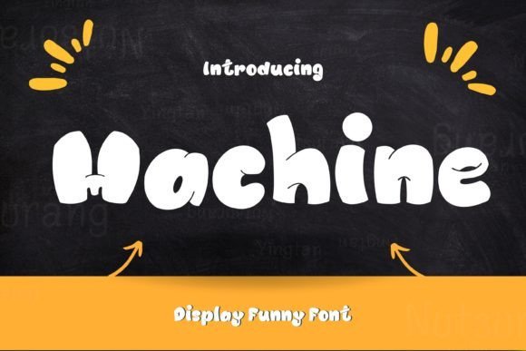
Machine Font is a bold, attention-grabbing display face that blends industrial heft with a playful twist in its weight distribution and rounded counters. The design reads as strong and confident on signage and apparel, yet it carries a touch of friendliness that prevents it from feeling overly mechanical. Its presence is particularly effective for titles, logos, and headline-driven layouts where commanding clarity is required.
At larger scales the font’s robust strokes deliver excellent readability and visual impact, while tighter tracking yields compact wordmarks and badge-style treatments. Consider pairing Machine with a subtle hand-script or a narrow sans for contrast; the font’s solidity anchors your composition while softer accents provide visual relief. Because of its bold nature, it’s best used sparingly-reserve it for primary messaging rather than body text.
From a production standpoint, Machine adapts well to print and screen, holding up in screen-printed tees, product labels, and outdoor signage. It also responds well to color blocking and textured overlays, which can lend extra depth without obscuring letterforms. Use it when you need a loud, reliable typographic voice that still allows room for playful or illustrative elements around it.
My Recommendation: I’d use Machine Font for bold identity projects, poster headlines, or apparel graphics where strong visual presence matters. It balances ruggedness with a friendly edge, making it versatile for lifestyle brands and event promotion. Choose it when you want unmistakable, headline-level impact that still plays nicely with fun visual elements.
31. Comic Helix Font
Comic Helix is a thick, exuberant display typeface that channels the energy of vintage comic lettering while feeling fresh and modern. This design leans into playful weight and exaggerated curves, making it an immediate attention-grabber – especially effective when you want a headline to pop in playful compositions or on children’s products and posters. Comic Helix embraces the spirit of classic cartoon fonts with a contemporary twist that reads clearly at large sizes and maintains personality in tight layouts.
The letterforms favor rounded terminals and a generous x-height, which boosts legibility and delivers a friendly, hand-drawn vibe. Subtle irregularities in stroke width give the font an animated rhythm; kerned pairs stay balanced, and alternate glyphs (where provided) add variety for repeated words. It performs beautifully on printed T‑shirts, stickers, signage, and large-format posters where boldness and charm are required.
Pair Comic Helix with a neutral sans for body text to avoid visual competition, or layer it over soft textures and halftones for retro-comic effects. It’s ideal for children’s book covers, event posters, toy packaging, and playful branding that needs warmth and immediacy. If you need a headline face that reads as both joyful and authoritative, Comic Helix delivers presence without sacrificing readability.
My Recommendation: I’d reach for Comic Helix whenever a project needs instant, enthusiastic personality – think kids’ apparel, festival posters, or playful packaging. Its bold shapes hold up to print and vinyl cutting, and the alternates let you avoid repetition in repeated headlines. Use it to create friendly, high-impact visuals where legibility at large sizes matters more than subtlety.
32. Baby Boss Font
Baby Boss is a bold, contemporary display font built for modern, on-trend headlines that read with confidence and charm. Its rounded contours and slightly condensed forms give it a compact, billboard-ready look while retaining softness that feels approachable rather than aggressive. Whether used for a logo, title, or a DIY project, Baby Boss makes copy feel lively and current without leaning into gimmickry.
The design balances thick strokes with open counters, so it maintains clarity on both digital screens and printed materials. Lowercase characters possess friendly shapes that suit short bursts of copy, while uppercase works as a robust attention-grabber. The font often pairs well with thin, neutral sans-serifs for supporting text or with delicate script accents for product packaging and social banners.
Baby Boss excels on brand identity for contemporary kid-focused labels, lifestyle product tags, and bold social media banners. It’s equally useful for signage, editorial headers, and posters that need a confident presence. If you’re crafting stickers or DIY apparel, its solid forms cut cleanly for print and vinyl applications, making it a practical choice for makers as well as designers.
My Recommendation: I recommend Baby Boss when you want a headline that’s both fashionable and friendly – it’s perfect for trendy kids’ brands, merch drops, and bold social graphics. The solid, rounded letterforms cut well for physical production, and its modern attitude elevates simple layouts quickly. Use it when a project needs confidence without feeling stern.
33. Super Strong Font
Super Strong is presented as a comprehensive display family that blends playful and structured personalities, offering styles ranging from cute and childlike to sleek and fashionable. The collection is intentionally broad: it supplies decorative headline faces, hand-drawn children’s options, and refined weights suitable for sophisticated packaging. This variety makes it a one-stop resource for designers who switch between whimsical and polished aesthetics often.
Technically, the family typically includes multiple weights, decorative alternates, and language support, plus cut-friendly outlines for craft machines like Cricut. Those features make the set particularly useful for makers producing vinyl decals, T‑shirts, and scrapbooking assets, while the web-ready formats ensure consistent rendering online. OpenType features such as swashes and stylistic sets let you customize word shapes for logos or thematic headers.
Use Super Strong for school event posters, seasonal campaigns, editorial covers, and merchandise where personality matters. Its silhouette styles are excellent for mascots and badges, while lighter, elegant cuts handle quote overlays and invitations. For creative teams juggling editorial, product, and craft needs, this family reduces the friction of switching type voices between projects.
╰┈➤ Download Super Strong Font
My Recommendation: I’d use Super Strong when a project calls for a versatile typographic toolkit – especially if you need both playful headline faces and refined display cuts in one purchase. It’s ideal for small studios, crafters, and educators who produce posters, merch, and seasonal materials. The built-in alternates and craft-ready outlines save time and help deliver polished, on-brand assets quickly.
34. Ballpoint Strokes Font
Ballpoint Strokes arrives like a confident hand-sketched note: lively, slightly irregular, and full of personality. As a pen-styled display face it borrows the warmth of doodles and the punch of comic lettering, making it a smart addition to any toolbox of cartoon fonts and hand-drawn typefaces. The ink-like terminals and varied stroke widths give it an authentic, analog feel that reads as approachable rather than gimmicky.
Practicality is where Ballpoint Strokes shines – it remains legible on stickers, apparel prints, and small labels while still holding character at poster sizes. The friendly shapes work especially well for comic book captions, informal logos, and editorial callouts where you want a human touch rather than a polished corporate voice. Because it scales cleanly, you can repurpose the same art across social assets, packaging, and merch without remaking the word art.
For designers, the font invites playful treatments: stack it against a subtle outline, pair it with a geometric sans for contrast, or apply a layered halftone for retro-comic vibes. Its rough-but-readable rhythm means you can tighten tracking for headlines or loosen it for whimsical signage; color choices like saturated cyan or warm orange intensify its handwritten energy. Overall, Ballpoint Strokes gives you the spontaneity of a sketchbook with the consistency needed for production work.
╰┈➤ Download Ballpoint Strokes Font
My Recommendation: I reach for Ballpoint Strokes when a project needs hand-crafted warmth without sacrificing clarity. It’s my go-to for sticker sheets, comic-style headers, and youth apparel because it reads well at varied sizes and adds instant personality. If you want joyful, human lettering that still looks professional in production, this typeface is a reliable pick.
35. Layla Font
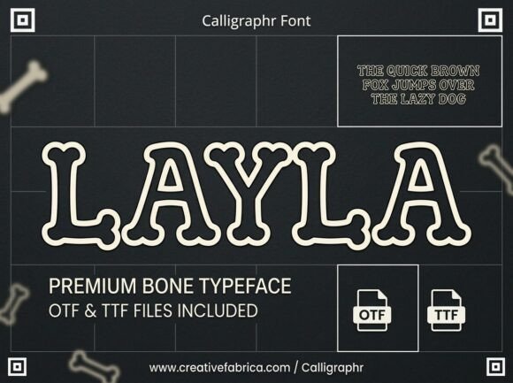
Layla is a novelty display typeface built from stylized bone motifs, creating a distinct balance between playful and thematic. The letters feature rounded joint shapes and smooth outlining that steer the design away from gritty horror clichés toward a polished, illustrative aesthetic. That cleanliness makes Layla feel whimsical rather than menacing, which broadens its appeal beyond strictly spooky use.
This bone-inspired letterform works beautifully for seasonal graphics, museum signage, classroom materials, and boutique pet-shop branding that want a wink of the macabre without alienating families. Because the shapes are deliberate and open, the font maintains readability in medium-to-large display settings, lending itself to posters, party invites, and themed packaging. It also adapts well to monochrome engraving or embossed treatments.
Designers can exploit the motif by creating repeating bone patterns, custom ligatures for logos, or overlaying subtle shadows to enhance dimensionality. Pairing Layla with a neutral sans helps keep body copy legible while letting the decorative letters dominate headlines. In short, Layla is a well-considered novelty font that delivers character without compromising clarity.
My Recommendation: I’d pick Layla when a project needs a clever theme-driven headline that won’t read as cheesy or unreadable. Its bone-based construction is ideal for Halloween campaigns, vet or pet-focused promotions, and educational exhibits with playful science themes. Use it sparingly for maximum impact-one headline or logo treatment goes a long way.
36. Diamond Cartoon Font
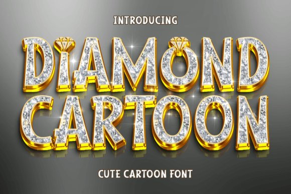
Diamond Cartoon is a bold, kid-friendly display face that blends comic book energy with contemporary charm. Its rounded, substantial letterforms read as confident and approachable, making it an effective choice for signage, posters, and any application where you want to capture attention instantly. The type’s visual weight gives it presence on products while retaining a soft, friendly demeanor.
Though inherently playful, the font’s strong silhouette allows it to perform in commercial contexts like apparel branding, product packaging, and boutique collateral where you want youthful character without losing perceived value. It translates particularly well to t-shirt graphics and product labels, where clarity at a glance is essential. The design also lends itself to mascots, badges, and headline treatments that need to pop on crowded shelves.
For best results, use Diamond Cartoon in bold display sizes and pair with a restrained serif or thin sans for supporting text to create hierarchy. Consider subtle texture overlays or metallic inks for premium merchandise to juxtapose the font’s whimsical nature with upscale finishes. This blend of playful form and commanding presence makes it a versatile asset in a designer’s kit.
╰┈➤ Download Diamond Cartoon Font
My Recommendation: I recommend Diamond Cartoon when you need a statement-making yet friendly headline that appeals to kids and adults alike. It’s perfect for product-driven campaigns, teen apparel, and playful packaging where bold visibility matters. I often use it for mockups and brand explorations because it quickly communicates energy while staying surprisingly adaptable.
37. Cartoon Saturday Font
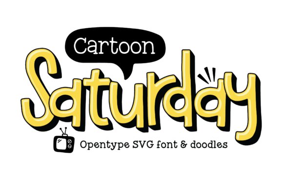
Cartoon Saturday is an undeniably warm, hand-drawn display with soft, bouncy letterforms that instantly convey joy. The package’s OpenType-SVG color font (delivered in a sunny yellow treatment) gives instant multi-color texture and makes it one of the most expressive cartoon fonts for playful branding and kid-focused headlines.
Beyond the color SVG, the family includes dedicated filler and shadow layers designed to stack precisely; combine the outline, fill, and shadow files to build lively 3D-style titles without complex effects. This layered system is perfect for poster headlines, party invites, and whimsical packaging where dimensional type lifts the composition.
A small set of doodles-speech bubbles, stars, and quirky scribbles-comes with the font and slots in naturally with the letters, saving time when you need accents or mascots. For best results, try slight color-offsets and minimal grain on the shadow layer to sell a handmade look; the clean spacing and alternates make it easy to adapt at different scales.
╰┈➤ Download Cartoon Saturday Font
My Recommendation: I reach for Cartoon Saturday when a project needs instant friendliness-children’s books, birthday invitations, and playful product labels all benefit from its warm personality. The OpenType-SVG color option plus stackable shadow and fill layers lets me create polished, print-ready artwork quickly. Use it when you want a handcrafted, cheerful headline without commissioning custom lettering.
38. Cartoon Heroes Font
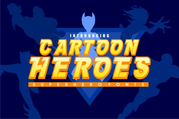
Cartoon Heroes is a sturdy, thick-lettered display built for big, attention-grabbing headlines. Its exaggerated strokes and compact counters create a bold presence that reads clearly at large sizes, giving designs an energetic, heroic attitude ideal for posters and banners.
Though it nods to comic-inspired aesthetics, the typeface preserves legibility through balanced shapes and open apertures, so it performs well on sports apparel, game titles, and event signage. The heavy weights are especially useful when you need type to dominate competing imagery or busy backgrounds.
Pair Cartoon Heroes with narrow sans-serifs or subtle scripts to add hierarchy without softening the core impact; small kerning tweaks and a couple of alternate glyphs will make it sing in logo use. Consider adding subtle halftone textures or drop-shadows to reference classic comic shading while keeping modern proportions intact.
╰┈➤ Download Cartoon Heroes Font
My Recommendation: I pick Cartoon Heroes when a design must project strength and excitement-think team jerseys, festival posters, and mobile game headers. Its bold mass tolerates heavy color contrasts and small production shifts, making it reliable across print and screens. If you need a display face that commands attention, this one consistently delivers.
39. Cartoon Animals Font
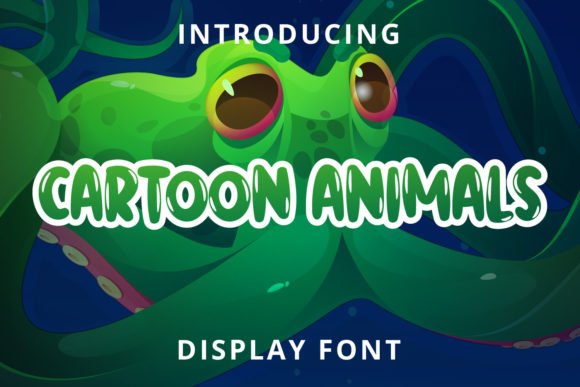
Cartoon Animals is a fresh, cheerful display built around rounded terminals and playful proportions that suggest creature-like charm without literal illustration. The overall vibe is approachable and upbeat, so it instantly brightens covers, seasonal posters, and kid-oriented marketing pieces.
Technically the font is PUA-encoded, which means every decorative glyph and ligature is immediately accessible in most editors-no digging through character maps required. Use the alternates and ornaments to introduce subtle animal cues (a curled tail, ear-like flourish) that enrich storytelling without overwhelming the main message.
The soft shapes keep the face legible at small sizes, making it great for stickers, labels, and social tiles, while the included glyphs let you build cohesive graphics without extra art assets. For a modern nursery or woodland-themed campaign, pair it with muted earthy tones; for fair or festival work, choose brighter palettes to amplify the joyful energy.
╰┈➤ Download Cartoon Animals Font
My Recommendation: I recommend Cartoon Animals for projects that need warmth and personality-children’s packaging, classroom materials, and playful branding all gain from its friendly letterforms. The PUA extras speed up production by giving expressive alternatives right at your fingertips. It’s a smart choice when you want characterful display type without adding illustration overhead.
40. Peace Road Font
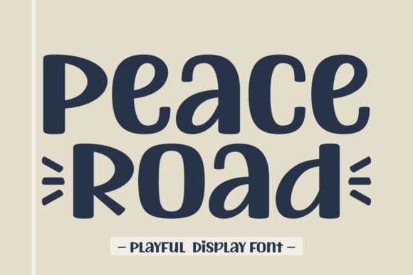
Peace Road is a hand-drawn display font family that balances simplicity and refined charm. Its letterforms show careful stroke endings and subtle curves, making it feel both artisanal and modern – ideal when you want typography that reads like a crafted signature rather than a factory preset. The set includes multiple weights and stylistic alternates so you can dial in the mood from casual to elegant without losing cohesion.
What sets this collection apart is its breadth: alongside clean cursive and rounded headline styles, it ships with seasonal and cartoon fonts that bring playful contrast to the more sophisticated cuts. Multilingual support and school-style variants widen its usefulness for packaging, educational materials, and global branding projects. Because the fonts were designed with print-friendly spacing and high-resolution glyphs, they perform beautifully on everything from sublimation prints to large-format wallpapers.
Use Peace Road when you want typography that confers personality without clutter. Its rounded accents and thoughtful ligatures make it a strong pick for logotypes, magazine mastheads, apparel prints, and social media visuals that need a handcrafted touch. In short, it’s an elegant, versatile toolkit for designers who want to mix refined script with friendly display options.
My Recommendation: I’d reach for Peace Road when a project needs warmth and polish at once – think boutique branding, book covers, or lifestyle packaging. Its hand-drawn details add authenticity to logos while the display weights hold up in large-scale layouts. For designers making seasonal campaigns or kid-friendly collateral, the included whimsical styles are a fast way to add charm without creating new assets.
41. Gaming Font
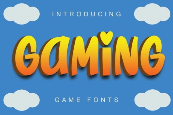
Gaming is a bold, energetic display font inspired by comic lettering and playful type traditions. Its rounded, chunky shapes and generous counters give it that boyish, upbeat personality typical of comic-inspired and cartoon-style typography, while retaining clear readability at thumbnail sizes. The font reads instantly as fun and approachable, making it a natural choice for youth-oriented designs.
What makes Gaming versatile is how it translates across mediums: it feels at home on YouTube thumbnails, game covers, and social headers, but it also scales down well for stationery or stickers. The typeface’s lively rhythm and friendly letter proportions pair nicely with bright color palettes and illustrated art, giving designers a ready-made voice for character-driven projects.
If you need a typeface that communicates excitement without sacrificing legibility, Gaming delivers. Use it for poster titles, children’s book covers, or merchandise where a cheeky, spirited tone is the main communication tool. Its expressive nature helps visual narratives come alive quickly and memorably.
My Recommendation: I recommend Gaming when you want bold, youthful typography that feels immediate and fun – perfect for online games, kids’ media, or playful branding. It’s especially handy for thumbnails and posters where strong, readable headlines are crucial. Pair it with vibrant illustrations to amplify its energetic charm.
42. Hat Character Font
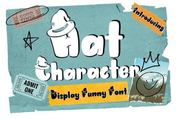
Hat Character is a quirky display typeface designed to inject joy and personality into short headlines and identity work. Its irregular strokes and slightly off-kilter letterforms create a handcrafted, cheerful voice that reads as both approachable and memorable. The font’s compact rhythm makes it effective in tight layouts where space is limited but expressiveness is required.
Because of its playful construction, Hat Character excels on product labels, greeting cards, and children’s packaging where warmth and character are priorities. The type’s whimsical silhouette complements hand-illustrated graphics and sticker-style treatments, enabling designers to build cohesive, character-led visuals without additional embellishment.
Hat Character shines when you need a friendly, distinctive headline that feels artisanal rather than overly polished. It’s a great tool for boutique stationery, event invitations, and any layout that benefits from a human touch and a wink of personality.
╰┈➤ Download Hat Character Font
My Recommendation: I’d pick Hat Character for boutique or craft projects that need personality above polish – think handmade greeting cards, kids’ product labels, or playful logos. Its lively forms work well alongside illustrations and textured backgrounds. Use it when you want typography that feels personable and hand-crafted rather than corporate.
43. Mummies Font
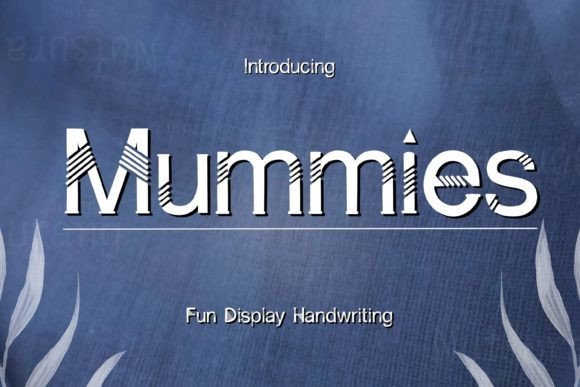
Mummies is a modern display face that blends crisp geometry with a mischievous spirit, making it a standout choice among cartoon fonts for projects that need both character and clarity. Its letterforms feature measured angles and rounded terminals that feel deliberate rather than overly whimsical, so it reads strongly at large sizes while still conveying a lighthearted tone. The overall rhythm is balanced-generous x-height with compact counters-so headlines retain impact without feeling bulky.
On a technical level, Mummies offers consistent stroke widths and careful spacing that minimize ugly collisions even with tight tracking, which is a huge advantage for logo work and packaging copy. The family tends to favor a single robust weight with optional stylistic alternates for quirky letter endings; kerning pairs are thoughtfully tuned for display use. It also handles numerals and punctuation cleanly, so typographic hierarchies stay readable across print and screen.
For pairing, use Mummies alongside a neutral humanist sans or a restrained slab to let its geometric quirks sing without overpowering body copy. It excels for brand headlines, cereal boxes, playful signage, and hero banners where you want a professional finish that still feels approachable. If you need a typeface with personality but don’t want to sacrifice legibility, Mummies is worth testing in both vector art and responsive web layouts.
My Recommendation: I’d reach for Mummies when a brief calls for something lively yet polished-think boutique children’s brands, modern toy packaging, or event posters where clarity matters. Its geometric backbone keeps designs feeling current while stylistic alternates inject friendliness. Use it as a headline anchor paired with a restrained body font to strike the right balance between fun and professional.
44. Yeah Comic Font
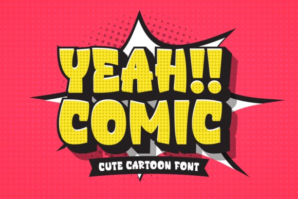
Yeah Comic captures the handmade charm of classic comic lettering with a bright, approachable personality that’s ideal for youth-oriented designs. Strokes vary subtly and endpoints have a slightly irregular finish that reads as deliberately casual rather than sloppy, giving each word warmth and immediacy. The character shapes are broad and open, which boosts readability and helps the type retain its cheerfulness even at medium sizes.
Technically, the set includes full upper- and lowercase alphabets plus a useful set of punctuation and numerals tailored for display headlines. Kerning is pre-adjusted for playful layouts, and the font renders faithfully in common web formats (TTF/OTF/WOFF), which makes it easy to drop into apparel mockups, ebook covers, or craft templates. It performs best when used as a prominent display face rather than for long passages of text.
Design-wise, Yeah Comic pairs beautifully with a simple geometric sans for body text or with a thin script for invitations and greeting cards; avoid pairing it with another loud display face. Its exuberant tone suits children’s book covers, sticker art, T-shirt slogans, and handmade product labels. Keep contrast high and line lengths short to preserve legibility and visual punch.
My Recommendation: I’d use Yeah Comic whenever a project needs instant friendliness-school posters, playful packaging, or DIY craft templates are perfect fits. Its hand-drawn feel brings personality without compromising clarity, and it’s especially useful for designs aimed at kids and family audiences. For best results, reserve it for headlines and accent text while supporting it with a neutral body font.
From bouncy, hand-lettered scripts to sturdy comic-style display faces, these 44 cartoon fonts give you a toolkit for projects aimed at kids and nostalgic audiences alike. Use the examples and pairing suggestions above to choose fonts that balance character with clarity.
Test a few on real mockups, verify licensing for your intended use, and save favorites for future briefs. If this roundup helped, subscribe for more practical type guides and creative resources throughout 2026.