14 Best Bold Christmas Fonts for Festive Poster Ideas
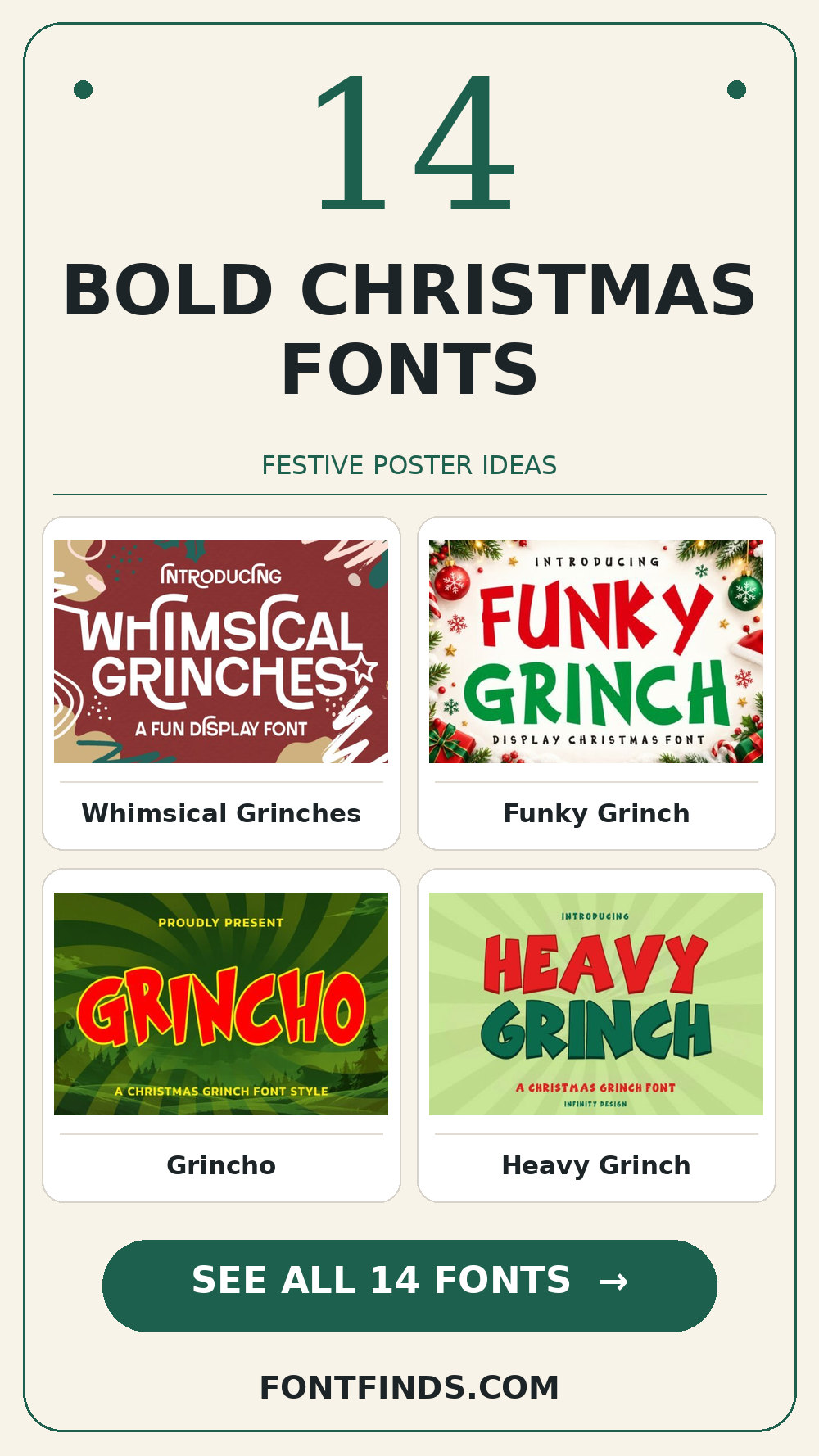
Christmas posters compete with decorations, photos and a crowded calendar. Bold Christmas fonts give the headline a job: announce the event from across the room, then let a quieter typeface handle the address, price and time. The picks here run from playful chunky letters to pictorial seasonal characters.
Bold Christmas Fonts: what to test first
Start by printing the event title at A4 and stepping back. The silhouette should register before anyone studies ornaments inside the letters. Then preview it as a phone thumbnail. If snow or tree shapes take over the counters, reserve that font for a single large word.
Three places to start
| Font | Try it on |
|---|---|
| Whimsical Grinches | a holiday market poster |
| Funky Grinch | a festive sale header |
| Grincho | a classroom Christmas flyer |
Big playful headlines
1. Whimsical Grinches
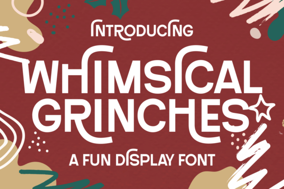
At first glance Whimsical Grinches reads through a serif-led word shape. Put it on a holiday market poster, but keep the adjacent information quiet. The real proof comes at final size: compare the same title in upper and lower case.
View Whimsical Grinches and download options →
2. Funky Grinch
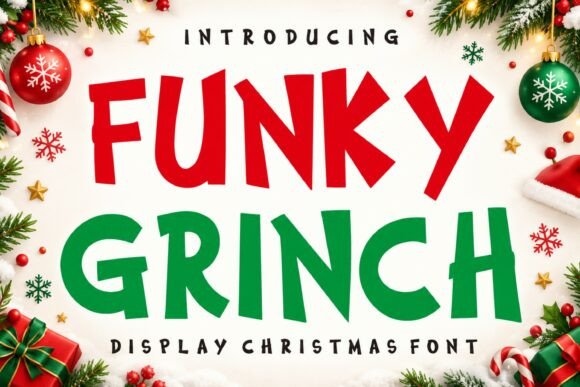
Funky Grinch brings an informal handwritten rhythm to a festive sale header. A second detail to notice is human irregularity. I would check the exact capitals and punctuation you need, then choose a simple text face for the smaller information for the details. That division keeps the headline expressive and the information easy to scan.
View Funky Grinch and download options →
3. Grincho
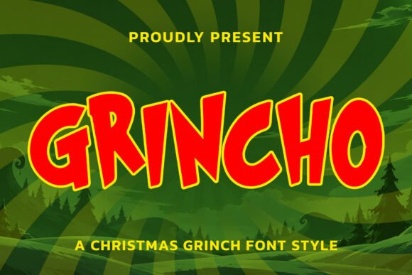
Grincho is a display option marked by a distinct display silhouette. Its strongest role here may be a classroom Christmas flyer. Build a one-color proof and test its legibility away from the enlarged sample; the vendor mockup alone is too generous a test.
View Grincho and download options →
4. Heavy Grinch
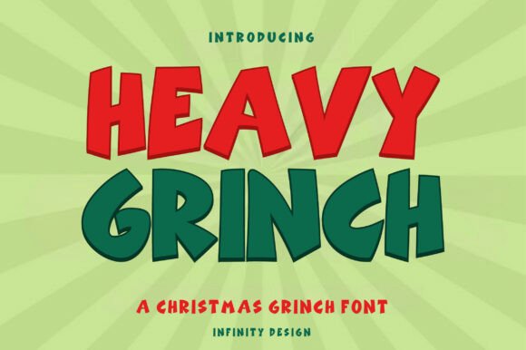
Heavy Grinch can give a gift guide cover a different pace through an informal handwritten rhythm. A second detail to notice is human irregularity. I would place it beside a simple text face for the smaller information, then check the longest word and the smallest practical size before making a final choice.
View Heavy Grinch and download options →
5. Christmas Serenity
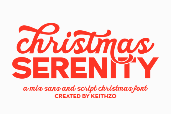
Christmas Serenity leans on decorative details and flourishes, a useful starting point for a seasonal storefront sign. A second detail to notice is optional letterforms. If the design has lots of tiny copy, let the expressive type stay large. For the main phrase, reserve the largest alternates for a short heading before you settle on the layout.
View Christmas Serenity and download options →
6. Christmas Trees
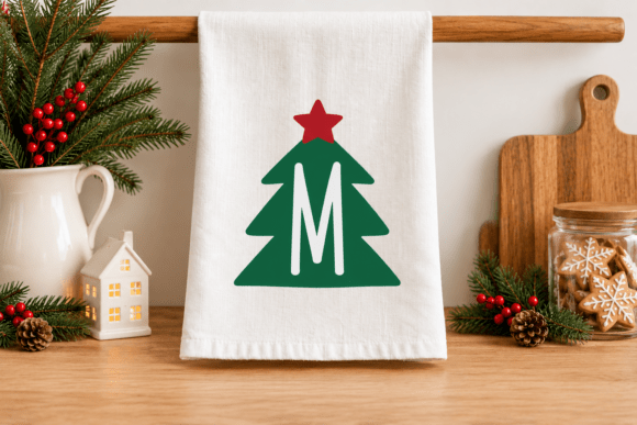
The appeal of Christmas Trees is decorative details and flourishes. A second detail to notice is ornamental details. Try it first as a holiday market poster, then shrink the artwork to a phone preview. If the word still lands immediately, it can lead; otherwise, use it for a single accent.
View Christmas Trees and download options →
7. Unique Grinch
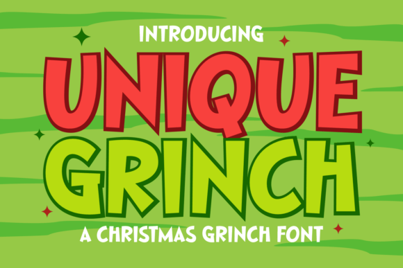
Try Unique Grinch on a festive sale header. It uses a distinct display silhouette to set the mood. Type your complete phrase, test its legibility away from the enlarged sample, and inspect a print-size draft before trusting the enlarged preview.
View Unique Grinch and download options →
Decorative accents with a clearer second line
8. Christmas Holly
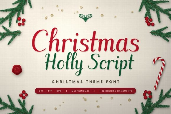
In this shortlist, Christmas Holly is worth testing for a classroom Christmas flyer because of its brushlike changes in stroke weight. A second detail to notice is generous curves. Set the actual copy in one color, use a simple text face for the smaller information, and check how the spacing changes after a line break.
View Christmas Holly and download options →
9. Handmade Christmas
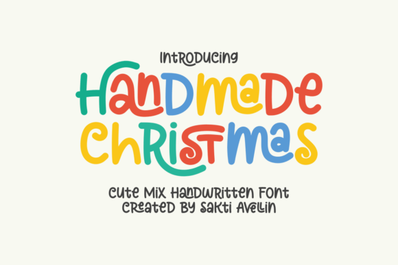
For a gift guide cover, Handmade Christmas offers decorative details and flourishes. A second detail to notice is optional letterforms. Give it one clear task in the composition. Before choosing it, reserve the largest alternates for a short heading and compare the result with a plain companion face at actual size.
View Handmade Christmas and download options →
10. Sparkle Christmas
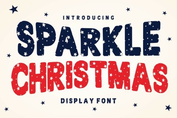
Consider Sparkle Christmas for a seasonal storefront sign: decorative details and flourishes gives the phrase a clear personality. A second detail to notice is ornamental details. Leave breathing room around the letters and reserve the largest alternates for a short heading. Pair it with a simple text face for the smaller information rather than another competing display style.
View Sparkle Christmas and download options →
11. Happy Holiday
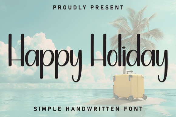
At first glance Happy Holiday reads through an informal handwritten rhythm. A second detail to notice is human irregularity. Put it on a holiday market poster, but keep the adjacent information quiet. The real proof comes at final size: check the exact capitals and punctuation you need.
View Happy Holiday and download options →
12. Holiday
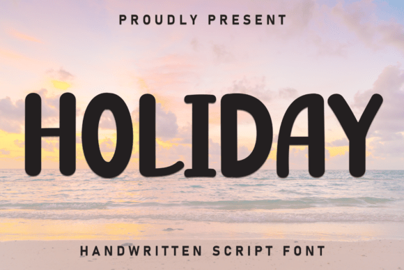
Holiday brings a distinct display silhouette to a festive sale header. I would test its legibility away from the enlarged sample, then choose a simple text face for the smaller information for the details. That division keeps the headline expressive and the information easy to scan.
View Holiday and download options →
13. Jolly Wobble
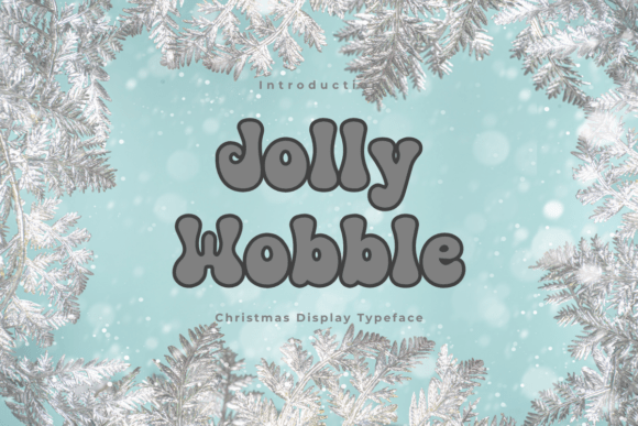
Jolly Wobble is a display option marked by rounded contours. A second detail to notice is generous curves. Its strongest role here may be a classroom Christmas flyer. Build a one-color proof and test the counters with a longer line of text; the vendor mockup alone is too generous a test.
View Jolly Wobble and download options →
14. Snow Berries
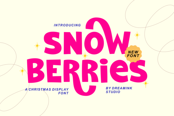
Snow Berries can give a gift guide cover a different pace through a distinct display silhouette. I would place it beside a simple text face for the smaller information, then check the longest word and the smallest practical size before making a final choice.
View Snow Berries and download options →
From specimen to finished project
A bold Christmas heading needs a quiet information hierarchy underneath. Use one font for the event name, one text face for the date and location, and no more than two festive colors. Pictorial alphabets can decorate a corner or initial while practical text stays easily scannable.
Frequently asked question
What makes a Christmas poster font effective?
Strong word shapes, clear counters and enough contrast at viewing distance. Festive decoration helps when it supports the message rather than replacing it.
Want another direction? Compare this shortlist with a related FontFinds font guide. Open each typeface above to inspect the complete character set, current price and license before downloading it for your project.