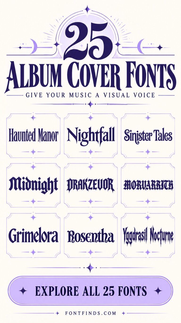
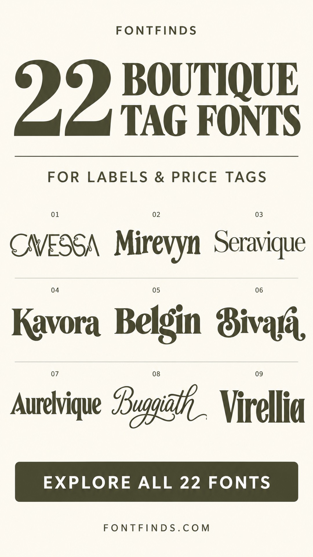
22 Boutique Price Tag Fonts for Stylish Labels
This post contains affiliate links. If you buy through them, we may earn a commission at no extra cost to you.
These boutique price tag fonts focus on the brand-facing side of a label: the shop name, collection title or small wordmark that makes packaging feel coordinated. The selection includes refined serifs, delicate decorative lettering and a few friendlier bold alternatives.
A price tag also carries information customers need immediately. The brand treatment can be expressive, while price, size and product codes should remain straightforward. Think of the font choice as part of a small information system rather than a decoration added at the end.
Test the smallest physical label
Lay out the actual tag dimensions, including the punch hole, margins and any barcode area. A flourish that looks attractive on screen may collide with the string or disappear at a small size. Print the most detailed version on a similar stock before approving a full set.
Keep the front and back consistent without forcing them to use identical typography. A display face can lead the front, with a practical companion handling the reverse. Check numerals, currency symbols and product codes as carefully as the brand name.
1. Cavessa: Delicate geometry for a boutique wordmark
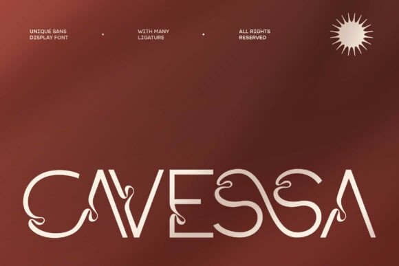
Cavessa combines fine strokes with distinctive decorative curves. It could give a small boutique a memorable wordmark, especially when the front of the tag has plenty of empty space.
Reserve the back for price and product information in a practical font. Print the smallest tag before approving the fine lines.
View Font on Creative Fabrica →Preview • Download options • License details
2. Mirevyn: A grounded serif for understated tags
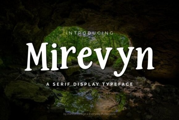
Mirevyn has a sturdy serif structure with a restrained character. It offers a less ornate direction for clothing tags that need to feel considered and dependable.
Use it for the store name and keep the product code separate. A generous margin can make a simple type treatment feel more polished than added decoration.
View Font on Creative Fabrica →Preview • Download options • License details
3. Seravique: Fine contrast for an elegant front face

Seravique presents high-contrast serif lettering with a refined rhythm. It is a candidate for the brand side of a tag, where the text can remain large and uncluttered.
Avoid using its thinnest details for tiny care information. Test the chosen stock and printing method before committing to a very pale ink.
View Font on Creative Fabrica →Preview • Download options • License details
4. Kavora: A confident serif for shop identity
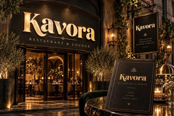
Kavora has substantial serif forms that carry a strong storefront character in its preview. The same direction could translate into a clear boutique name on a hanging tag.
Keep the logo area simple and pair it with plain product details. The architectural mockup is inspiration; judge the lettering separately on your actual tag dimensions.
View Font on Creative Fabrica →Preview • Download options • License details
5. Belgin: Editorial weight for fashion labels
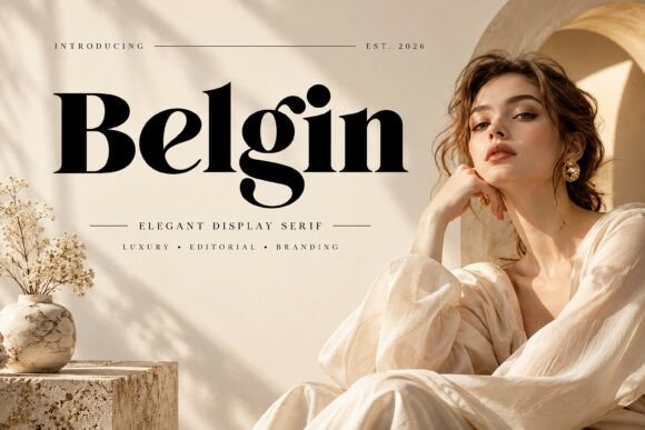
Belgin combines bold serif shapes with contrasting thin strokes. It can make a boutique name feel prominent on a small label without requiring a large decorative border.
Use a short wordmark and leave space around its distinctive letters. Set the price in a simpler style so the customer can locate it immediately.
View Font on Creative Fabrica →Preview • Download options • License details
6. Bivara: Decorative warmth for jewelry tags
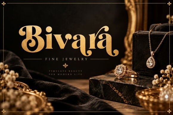
Bivara has rounded serif details and a more ornamental personality. It could suit a jewelry or accessories boutique where the tag is part of the presentation.
Keep embellishment to the brand name. On very small tags, compare a plain letter setting with any decorative alternates and choose the clearer version.
View Font on Creative Fabrica →Preview • Download options • License details
7. Aurelvique: A classic serif for a coordinated set
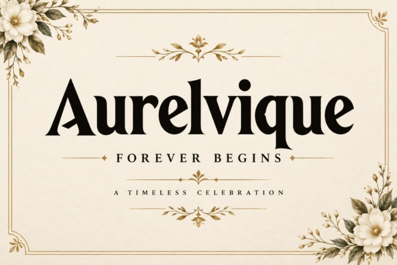
Aurelvique offers a traditional-looking serif direction with a strong headline presence. It can help coordinate hang tags, thank-you cards and packaging labels.
Use consistent spacing and alignment across the set. A straightforward sans serif for sizes, prices and codes will keep the decorative brand treatment from becoming repetitive.
View Font on Creative Fabrica →Preview • Download options • License details
8. Buggiath: A personal script for handmade goods
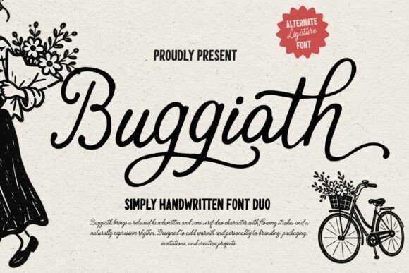
Buggiath has flowing handwritten forms with long, relaxed strokes. It could suit a boutique selling handmade accessories or items with a personal maker story.
Place it on the brand side of the tag with generous clear space. Keep the transactional information separate, especially when the script includes long entrance or exit strokes.
View Font on Creative Fabrica →Preview • Download options • License details
9. Virellia: Tall serifs for a narrow tag
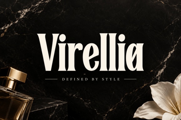
Virellia has elongated serif forms and a strong vertical presence. It is worth exploring when the tag itself is narrow and the brand name needs to feel prominent.
Avoid narrowing the type further through scaling. Test a natural line break or a slightly smaller size to preserve the proportions of the letters.
View Font on Creative Fabrica →Preview • Download options • License details
10. Quickly Charm: A warmer alternative to severe luxury type
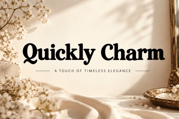
Quickly Charm has rounded serif details and a welcoming display character. It can suit a boutique that wants polish without feeling distant or overly formal.
Try it with warm paper and a simple layout. Keep the price line clearly separated so the brand personality does not interfere with practical information.
View Font on Creative Fabrica →Preview • Download options • License details
11. Zevyork: Editorial height for a fashion-led brand

Zevyork presents tall, high-contrast display lettering with an editorial mood. It could make a short boutique name feel like a magazine masthead on the front of a tag.
Give the thin strokes a clean background. Use a companion font with stronger small-size readability for the reverse side and any barcode caption.
View Font on Creative Fabrica →Preview • Download options • License details
12. Dravique: A composed serif for minimal packaging
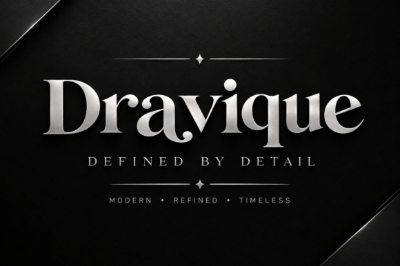
Dravique has refined serif forms and an orderly appearance. It can support a minimal tag design where spacing and paper quality provide most of the visual interest.
Try a centered wordmark with a small collection name beneath it. Keep decorative rules thin but clearly printable on the chosen stock.
View Font on Creative Fabrica →Preview • Download options • License details
13. Ft Zeux: Rounded boldness for a casual boutique

Ft Zeux offers a chunky, rounded direction that differs from the collection's elegant serifs. It could suit casual clothing, playful accessories or a brand with a friendly voice.
Use the bold form for the shop name and a quiet companion for prices. Check that the dense letters remain distinct on the smallest tag size.
View Font on Creative Fabrica →Preview • Download options • License details
14. Roken: Fine flourishes for a display label
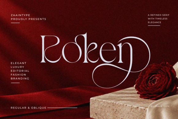
Roken has delicate strokes and large decorative curves. It is best explored as a prominent brand treatment on a generous tag, rather than as a font for every detail.
Leave room around the flourishes and inspect a printed proof. If the design needs to shrink, simplify the wordmark before sacrificing legibility.
View Font on Creative Fabrica →Preview • Download options • License details
15. Delivora: A coordinated serif for packaging sets
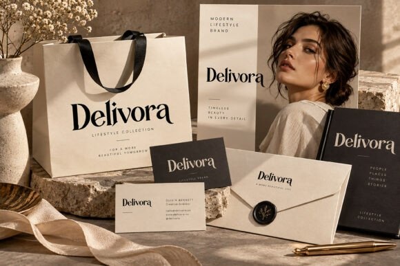
Delivora appears in a coordinated stationery-style preview with clean serif branding. It is a useful direction for a boutique seeking continuity between bags, cards and product tags.
Keep the brand name consistent across formats. Adjust spacing for each physical size instead of assuming the largest packaging layout will scale down perfectly.
View Font on Creative Fabrica →Preview • Download options • License details
16. Elesthin Bloom: Airy lettering for statement tags

Elesthin Bloom uses fine, elongated forms and sweeping decorative details. It could create an airy front face for a larger boutique tag or a special collection label.
Give it generous margins and avoid placing a punch hole close to a flourish. Use a sturdier companion for product details on the reverse.
View Font on Creative Fabrica →Preview • Download options • License details
17. Kenna: A dramatic capital for a short name

Kenna combines high-contrast serif forms with a prominent decorative capital in its preview. It is a direction to explore for a short boutique name that can stand alone.
Preview the actual initial and word shape. Keep the price and size information away from the large capital so the tag remains easy to scan.
View Font on Creative Fabrica →Preview • Download options • License details
18. Mermare: Soft modern curves for everyday labels

Mermare has a smooth, modern display character with rounded details. It offers a less traditional option for boutique labels while retaining a composed appearance.
Try it in a simple single-color wordmark. Let consistent alignment and a clear information hierarchy do the work rather than adding multiple decorative frames.
View Font on Creative Fabrica →Preview • Download options • License details
19. Qudone: Expressive serifs for collection branding
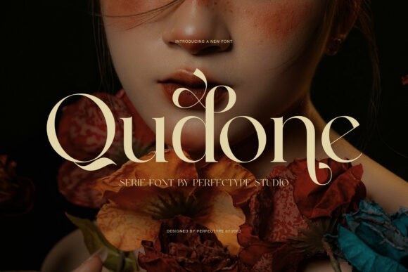
Qudone has contrasting serif strokes and decorative curves that can make a collection name distinctive. It could suit a special line of accessories or a limited seasonal label.
Use it sparingly beside the main shop identity. Check the exact letters in the collection name, because the visible flourishes may depend on particular characters or alternates.
View Font on Creative Fabrica →Preview • Download options • License details
20. Rinda: Curved display lettering for a signature tag
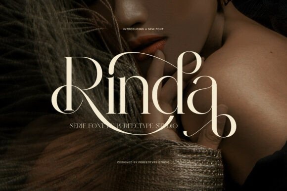
Rinda presents elegant serif forms with extended curves. It can create a memorable brand side when the tag has enough room for the lettering to remain large.
Keep the edge clearance generous and place the punch hole deliberately. A plain price block on the back can balance the expressive front.
View Font on Creative Fabrica →Preview • Download options • License details
21. Gomiro: Decorative capitals for a statement wordmark
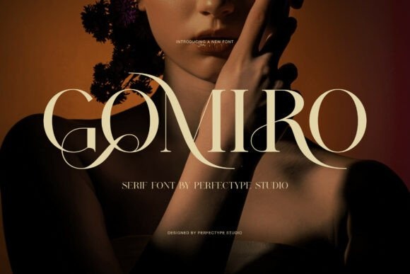
Gomiro uses high-contrast capitals with sweeping ornamental details. It is an option for a boutique identity that needs a more dramatic, fashion-oriented presence.
Test a restrained setting before using every available flourish. The tag should still communicate the name clearly when seen beside the garment or accessory.
View Font on Creative Fabrica →Preview • Download options • License details
22. Thamara Classic: A substantial classic for warm branding
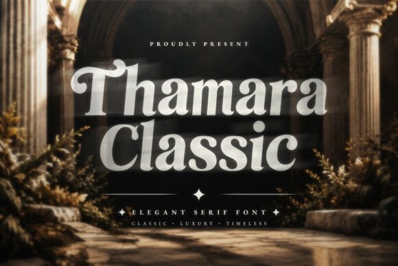
Thamara Classic has a fuller serif character with a traditional mood. It can suit a boutique that wants an established, welcoming identity rather than a very delicate luxury treatment.
Try it with simple borders and generous spacing. Keep the practical details in a smaller companion font with clearly distinguishable numerals.
View Font on Creative Fabrica →Preview • Download options • License details
Which font would I try first?
Mirevyn and Dravique offer relatively restrained starting points. Belgin brings more editorial weight, while Buggiath adds a personal script direction. I would reserve the most delicate options, such as Elesthin Bloom, for larger brand areas where their fine details have enough room.
Product images are supplied font previews. The cover is an illustrative lettering montage. Layout suggestions are editorial ideas; fonts have not been installed or production-tested for this guide. Check the linked listing for current files, supported characters and license details.
More font ideas
Frequently asked questions
Should the price use the decorative brand font?
Not automatically. Use clear numerals and a predictable position for the price. The brand font can remain on the front or in the logo while a simpler companion handles practical details.
How do I check delicate lettering before printing?
Print the smallest tag at actual size on similar paper. Inspect thin strokes, counters and flourishes, including the area near the punch hole and trim edges.
Can one typeface coordinate all boutique packaging?
A single main typeface can create continuity, but the layout and spacing should be adjusted for each format. Bags, cards and small tags have different size constraints.