25 Powerful Album Cover Fonts with a Distinctive Voice
This article contains affiliate links. If you buy through them, I may earn a commission at no extra cost to you.
Album cover fonts can say something about the sound before a listener presses play. I would use that opportunity deliberately. A jagged title suggests a different energy from a restrained wordmark, and a rough handwritten line can make a polished photograph feel more personal or more unsettled.
This is a deliberately expressive selection, with many dark and experimental choices. It is not a universal list for every genre. I would start with the emotional world of the release, then decide whether the artist name or the album title should be the first thing someone reads.
How I give album cover fonts room to work
I would write three words that describe the record’s mood before opening a font menu. Restless, intimate and confrontational point toward different shapes. Use those words to eliminate choices, not to justify every interesting specimen. A font can be excellent and still tell the wrong story for this release.
The relationship with the artwork matters as much as the lettering itself. A detailed photograph may need a quieter title area; a nearly empty cover can support a more complicated wordmark. I would test the title alone in black and white first, then introduce the image. That makes it easier to see whether the font is contributing a distinct shape or simply hiding in the texture.
Dark lettering does not have to be unreadable. Check the first and last letters, the space between repeated verticals and any ornament crossing the word. A little ambiguity may suit a particular artistic direction, but it should be a conscious choice. I would keep essential release information clearer wherever it appears outside the cover.
Build a second, simpler treatment for a small thumbnail or social announcement. This might use the same font at a more generous size, a shorter line break or fewer surrounding effects. The objective is a coherent identity, not identical artwork forced into every format. Check the final artwork requirements with the distributor you actually use.
Let the music’s mood guide the title treatment
For a sparse, intimate release, I would compare a restrained title with generous space around it. A more abrasive or high-energy record might justify an angular or distressed face. The important comparison is with the actual artwork and title, not a genre label alone. A font can suggest a mood, but the image, color and spacing determine how that suggestion lands.
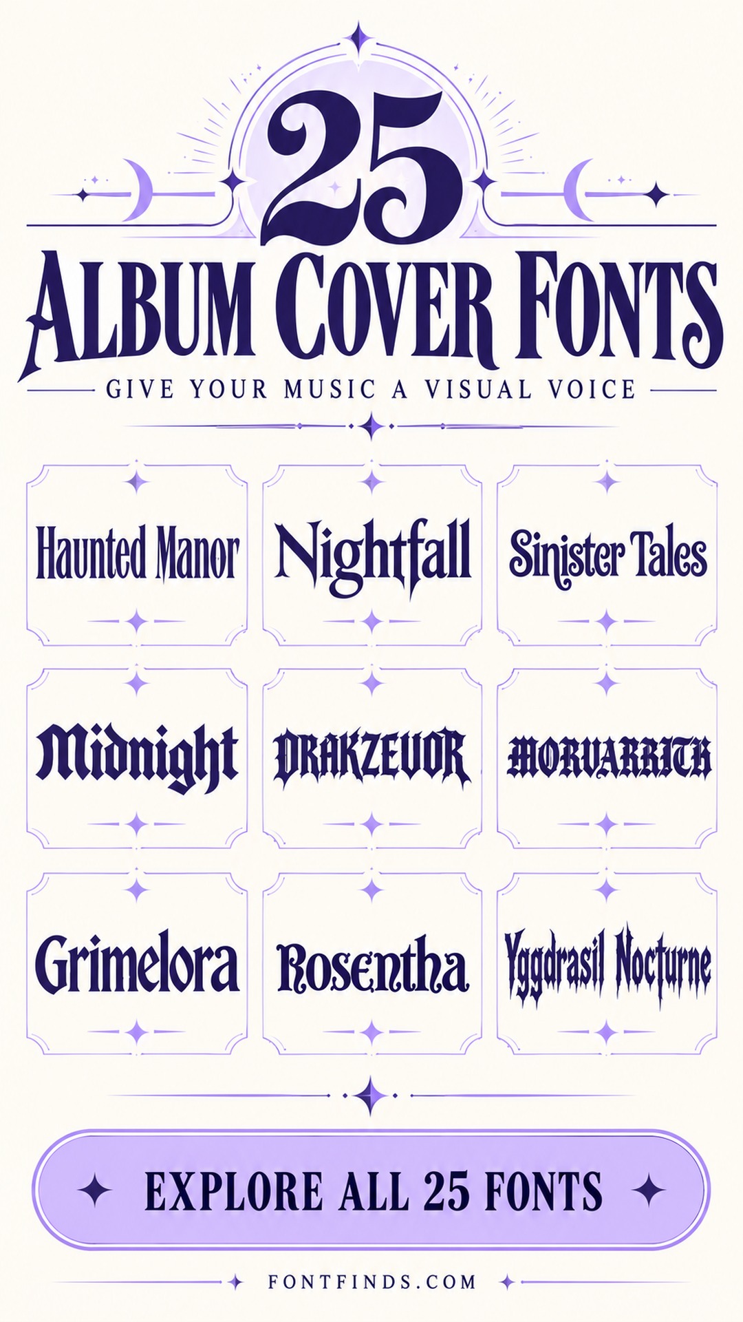
Try one version where the artist name dominates and another where the album title leads. Keep everything else consistent while comparing them. If a textured face competes with a detailed photograph, move it onto a quieter area or reduce the surrounding visual noise. I would also view the cover as a small square. The vertical collection cover in this article is a browsing graphic, not a release-ready album artwork template.
25 album cover fonts to compare
1. Haunted Manor: A dark, cinematic opening
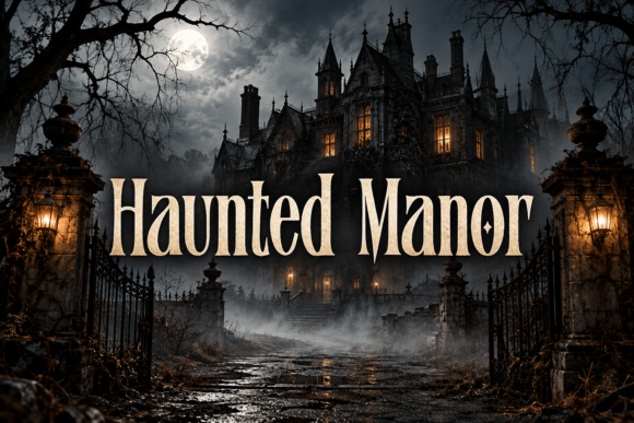
Haunted Manor’s narrow, dramatic forms suggest a gothic narrative. I would compare it for an atmospheric release with a short title and a quiet section of artwork behind the word. The lettering already carries a strong storybook mood, so extra ornamental frames may be unnecessary.
Preview This Lettering →Preview & download options
2. Nightfall: A dramatic serif with a clearer silhouette

Nightfall feels more open and readable than the densest blackletter options. I would try it for an atmospheric album that needs a strong title without losing the word in ornament. Keep the title on a calm part of the image and let the contrast between strokes provide the drama.
Preview This Lettering →Preview & download options
3. Sinister Tales: A storybook voice with curling details
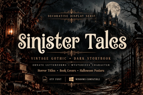
Sinister Tales brings decorative curls and a vintage gothic mood. I would compare it for a concept album or a release with a narrative world. Use it for a short title and keep the artist name simpler, so the cover has one expressive focal point instead of two competing ornaments.
Preview This Lettering →Preview & download options
4. Midnight: A substantial blackletter wordmark

Midnight’s heavy blackletter construction offers a confident, old-world silhouette. I would use it for a short artist name or title where the letters can remain large. Check similar vertical strokes carefully, and give the word enough spacing that its structure remains recognizable in a small cover image.
Preview This Lettering →Preview & download options
5. Drakzevor: A sharp, ornate dark identity
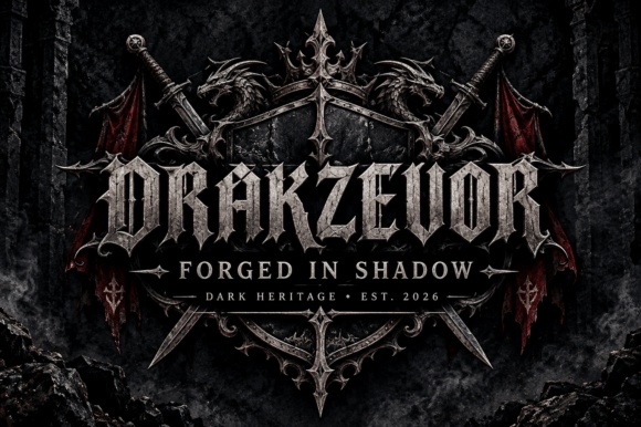
Drakzevor has an aggressive, intricately shaped blackletter appearance. I would shortlist it for a deliberately intense release rather than a general-purpose title. Let the wordmark occupy a clear area, and compare a simplified one-color treatment before adding metallic textures or other effects around the letters.
Preview This Lettering →Preview & download options
6. Morvakrith: A dense, dramatic title texture
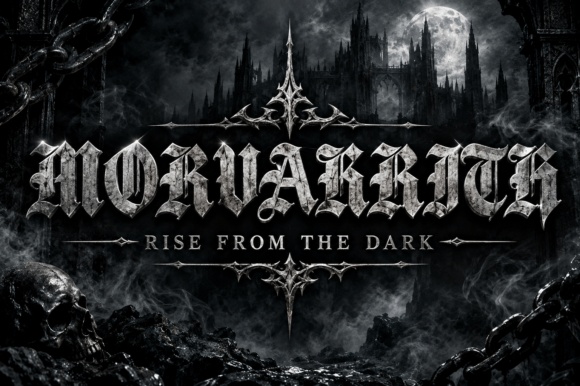
Morvakrith’s angular blackletter forms create a heavy visual rhythm. I would compare it for a short title on a dark, forceful record, with the important supporting information set more plainly elsewhere. Inspect the actual word at thumbnail size so the mood does not completely replace recognition.
Preview This Lettering →Preview & download options
7. Grimelora: A gothic shape with room to read
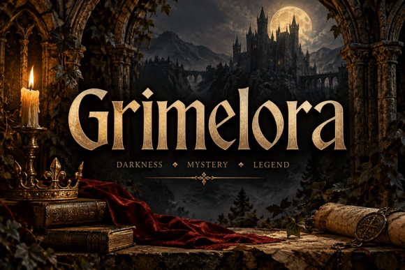
Grimelora combines pointed details with a relatively open word silhouette. I would try it for an atmospheric or fantasy-led release where the title needs to stay understandable. A plain high-contrast treatment can reveal the letterforms more clearly than a complex metallic effect over a busy image.
Preview This Lettering →Preview & download options
8. Rosentha: An ornamental serif for a softer darkness

Rosentha feels decorative without the same density as the sharpest blackletter faces. I would compare it for a gothic folk or theatrical direction with a restrained cover layout. Keep the title short and leave space around the shaped terminals so the ornament feels deliberate rather than crowded.
Preview This Lettering →Preview & download options
9. Yggdrasil Nocturne: A narrow, pointed fantasy voice
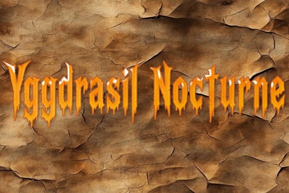
Yggdrasil Nocturne has tall, sharply tapered forms that suggest a mythic atmosphere. I would use it for a concise title or a prominent artist name with generous vertical space. Test a flat treatment first; the underlying shapes should work before any texture or dimensional effect is introduced.
Preview This Lettering →Preview & download options
10. Hillvorn: A sturdy, old-world wordmark
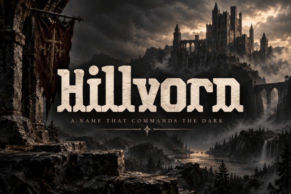
Hillvorn’s substantial, squared forms feel grounded and assertive. I would compare it for a dark folk or heavy release that wants a strong name rather than delicate filigree. Keep the title block simple and check the spacing between repeated verticals, especially in a longer word.
Preview This Lettering →Preview & download options
11. Migraven: A tall blackletter statement

Migraven’s narrow, pointed rhythm can give a short title a formal, dramatic stance. I would use it with a restrained artist-name line and a clear margin around the word. The lettering should have a dedicated area in the composition rather than sit over the most detailed part of the artwork.
Preview This Lettering →Preview & download options
12. Thurvane: A sharper serif with a gothic edge
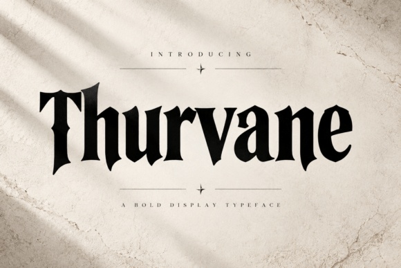
Thurvane offers pointed terminals and a strong vertical rhythm without the densest ornament. I would compare it for an atmospheric release where the title needs a clear silhouette. It could work with a quiet photographic cover, provided the finer details remain visible against the chosen background.
Preview This Lettering →Preview & download options
13. Tattergrave: A worn, narrative mood
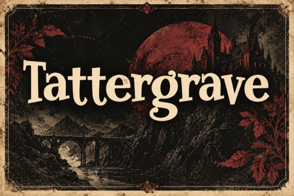
Tattergrave has a vintage serif character that feels more literary than mechanical. I would try it for a release with a dark storytelling quality and a short, memorable title. Keep the texture of the surrounding artwork controlled so the letters do not dissolve into another layer of visual noise.
Preview This Lettering →Preview & download options
14. Spellbound: A warm counterpoint to darker artwork
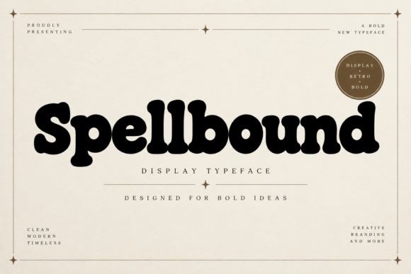
Spellbound’s rounded, substantial forms provide an unexpectedly softer direction. I would compare it for psychedelic, folk or offbeat music rather than assume every atmospheric cover needs sharp blackletter. The contrast between friendly lettering and restrained imagery can be more distinctive than matching darkness with more darkness.
Preview This Lettering →Preview & download options
15. Graveborn: A classic gothic title shape

Graveborn’s angular blackletter rhythm feels direct and traditional. I would use it for a compact title with strong contrast and little surrounding ornament. Check the full word carefully; the typeface’s repeated vertical forms need enough breathing room to remain readable when the cover is reduced.
Preview This Lettering →Preview & download options
16. Strange Whimsy: A playful alternative for an offbeat record

Strange Whimsy’s rounded, lively letters create a much lighter mood than the gothic options. I would compare it for an eccentric pop or playful indie release. Keep the design intentional and simple so the change in tone feels like a choice, not an accidental mismatch with the artwork.
Preview This Lettering →Preview & download options
17. Dravenholt: A tall, vintage display statement
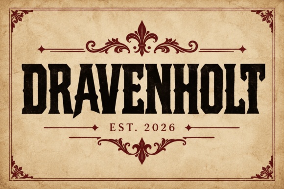
Dravenholt’s narrow, substantial forms suggest an old poster or label. I would try it for a roots-oriented or cinematic release with a strong title block. Let the lettering remain plain at first, then decide whether the cover genuinely needs an additional border or decorative emblem.
Preview This Lettering →Preview & download options
18. Ebon Reign: An intense, condensed blackletter direction
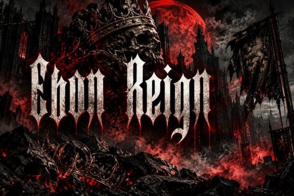
Ebon Reign has a sharp, towering silhouette that can make a short name feel imposing. I would compare it for a deliberately heavy visual identity. Give it a quiet background and check the actual word at small size; the narrow structure can become dense very quickly.
Preview This Lettering →Preview & download options
19. Northen Rune: A carved, mythic character
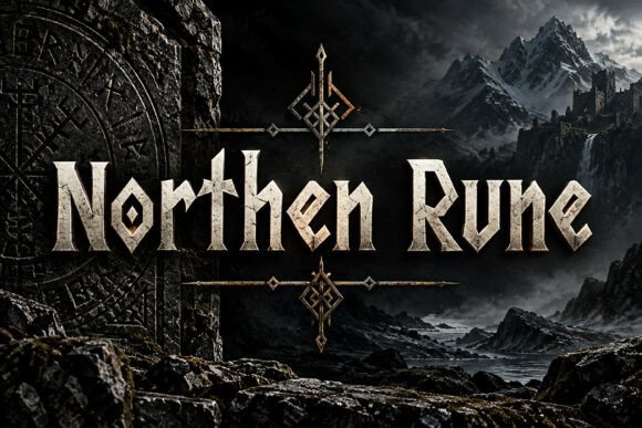
Northen Rune’s angular forms suggest a rugged, old-world atmosphere. I would use it for a short title with a clear outline and enough space around each letter. The cover should support that mood without covering the word in so much texture that the letter construction becomes difficult to follow.
Preview This Lettering →Preview & download options
20. Crowthorn: A refined gothic serif
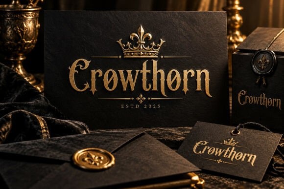
Crowthorn has a dark, elegant character that feels less aggressive than the most jagged choices. I would compare it for an atmospheric record with a restrained title treatment. A simple light-on-dark arrangement may be enough; the shaped details do not need several competing effects to feel distinctive.
Preview This Lettering →Preview & download options
21. Vampire: A forceful blackletter headline
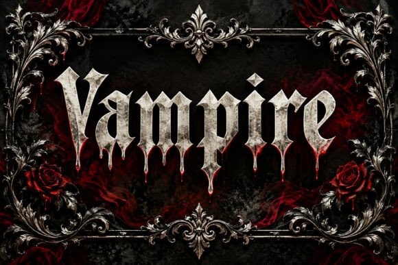
Vampire’s pointed, heavy forms create a direct gothic statement. I would use it for a short title that can remain large on the cover. Keep the artist name clearly separated, and compare a flat one-color version to make sure the lettering itself provides the intended impact.
Preview This Lettering →Preview & download options
22. Grunge Retro: A distressed collage direction

Grunge Retro’s rough, badge-like letter treatment offers a different kind of energy from blackletter. I would try it for an indie or alternative release with a handmade visual language. Keep the title concise and make sure the texture remains intentional rather than looking like poor image quality at small sizes.
Preview This Lettering →Preview & download options
23. Demonic Scrawl: A rough brush title with urgency
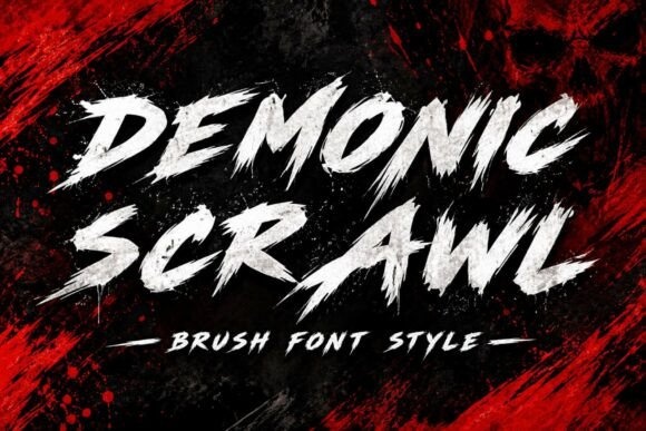
Demonic Scrawl’s aggressive brush strokes feel immediate and restless. I would compare it for a title that should look almost shouted across the artwork. Leave a clear area around the letters, and keep essential supporting information in a simpler treatment so the overall release identity remains usable.
Preview This Lettering →Preview & download options
24. Bold Brush: A broader, less severe brush mood
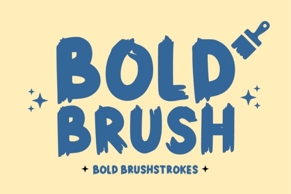
Bold Brush has a lively, substantial shape that could suit a more upbeat or expressive release. I would compare it when a handwritten feeling is useful but a harsh scratchy texture would be too much. Let a short title dominate and keep the rest of the cover visually quieter.
Preview This Lettering →Preview & download options
25. Ransom Wave: A loose, handmade alternative
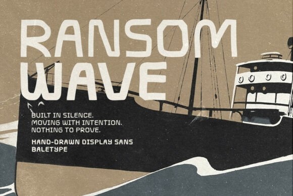
Ransom Wave’s uneven handwritten capitals offer an informal, independent mood. I would try it for a personal or stripped-back record with simple artwork. The slightly irregular rhythm can be the character of the cover, provided the spacing stays deliberate and the title is still recognizable when reduced.
Preview This Lettering →Preview & download options
Find the typography that sounds like the record
I would compare one highly ornate option with one more direct option using the same artwork. The difference often clarifies how much visual intensity the cover can carry. Open the full preview of the finalist and inspect the exact letters before making the title part of the release identity.
My recommendations are based on a visual review of the supplied product previews, not installation or production tests. The cover is an illustrative lettering montage. Open the linked listing to check the full character set, supplied files and current license before downloading.
More font ideas
Frequently asked questions
What makes a good font for an album cover?
It should fit the music’s mood and work with the artwork. I would decide whether the title needs to be instantly readable or intentionally more expressive, then test the cover at a small size.
Should the artist name and album title use the same font?
They can, but they do not have to. Use size and spacing to establish hierarchy first. If you add a second face, give it a distinct role rather than letting two decorative styles compete.
Can a highly decorative album title still work online?
Yes, if the composition preserves a recognizable shape and the important wording remains usable at the sizes you need. I would prepare a clearer companion treatment for promotional text and check each destination’s artwork requirements.
For another perspective on the design principles behind this selection, see general typography guidance informing editorial questions.