16 Candle Label Fonts I Would Shortlist for a Small Brand

This article contains affiliate links. If you buy through them, I may earn a commission at no extra cost to you.
A candle can smell like cedar, linen or a winter kitchen before anyone lights it—at least in the story its label tells. When I choose candle label fonts, I look for a believable relationship between that story and the lettering. A fine, airy serif suggests something different from a dense, confident wordmark.
I have gathered 16 directions I would consider for the brand name or scent title. This is a visual shortlist, with my reasoning beside each preview. Pick the mood that matches your collection, then open the product page to examine the actual characters and download options.
The three label moods I would compare first
- Quiet and refined: Lunavere — Tall serif forms for a restrained scent name.
- Bold and established: Chervault — More weight when the brand needs a stronger shelf presence.
- Personal and handmade: Aurelia Queen — A fuller script when the maker story should lead.
My starting point: the scent name, not the decoration
I would set the longest scent name first. If that name fits comfortably, shorter labels become much easier to organize. I would also decide whether the brand or the scent deserves the largest type; giving both equal emphasis usually makes a small label feel crowded.
For a first comparison, I would use dark lettering on a pale rectangle at the actual label size. That removes the distraction of beautiful jar photography. Once the words work, I would bring in the jar color, paper texture and a restrained accent. Small product details need their own clear type treatment.
1. Lunavere: For a tall, quiet scent name
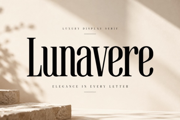
Lunavere catches my eye because its tall serif forms create presence without much ornament. I would try it for a restrained linen or botanical collection.
I would keep the name on a pale label and let generous margins reinforce that calm, rather than surrounding the letters with a heavy frame.
Preview This Label Font →Preview & download options
2. Nocthaven: For a warmer literary mood

Nocthaven has rounded serif details that feel more characterful than a severe fashion face. I would shortlist it for a candle with a library, wood or evening story.
A short scent name and a small plain brand line would let those curves do the work. The dark preview scene is optional inspiration.
Preview This Label Font →Preview & download options
3. Chervault: For a brand that needs more weight
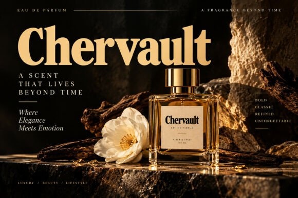
Chervault gives me a substantial serif silhouette with enough contrast to feel polished. I would consider it when the brand name needs to hold its own on a busy shelf.
I would keep the scent descriptor smaller and simpler. That creates a clear hierarchy without asking the same bold lettering to carry every detail.
Preview This Label Font →Preview & download options
4. Soul Veyra: For an editorial scent collection
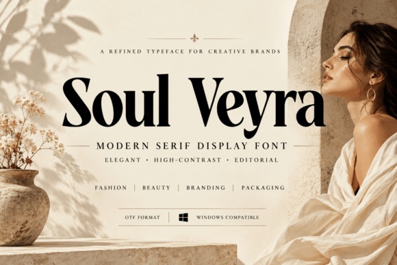
Soul Veyra combines broad serif shapes with fine contrasting strokes. I would try it on a collection with short, evocative names and a clean photographic identity.
My first proof would use a flat background. That would show whether the thinner details remain clear on the actual label rather than only in the styled preview.
Preview This Label Font →Preview & download options
5. Aurevessa: For a composed all-capital label

Aurevessa has balanced serif capitals that suggest a formal, orderly label. I would explore it for a collection where several scent names need to feel related.
I would keep the spacing consistent and avoid stretching shorter names to match longer ones. The shared alignment can provide continuity without forcing identical word widths.
Preview This Label Font →Preview & download options
6. Vantique: For a bold heritage direction
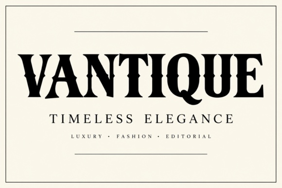
The Vantique listing shows strong, high-contrast capitals with a distinctive cut through some forms. I would try that direction for a candle brand with a confident, traditional voice.
I would preview the exact brand name before choosing it. The unusual details should make the word memorable without making it harder to recognize.
Preview This Label Font →Preview & download options
7. Maison Salome: For a more artistic label
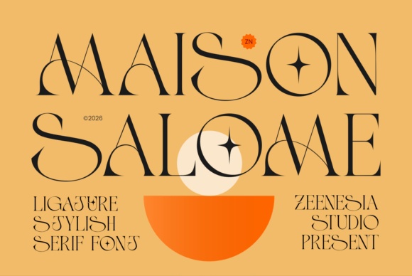
Maison Salome has fine geometric curves and decorative connections that make the lettering itself feel designed. I would consider it for a larger statement label rather than tiny product text.
I would leave the rest of the label almost empty. One expressive wordmark can be enough, especially when the jar already has a strong color.
Preview This Label Font →Preview & download options
8. Viserelle: For a softly ornamental collection

Viserelle adds curling serif details without becoming a full script. I like it as a direction for romantic or floral scent names that need a little ceremony.
I would keep any botanical illustration small and separate. The letter curves already provide decoration, so a second ornate border would be unnecessary.
Preview This Label Font →Preview & download options
9. Aurelia Queen: For a personal small-batch signature
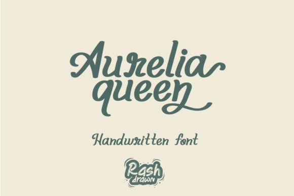
Aurelia Queen offers a fuller handwritten script with a friendly rhythm. I would try it when the maker identity matters as much as the scent name.
I would give the finishing strokes room and use a clear printed companion below. That keeps the personal tone while making the practical label easy to navigate.
Preview This Label Font →Preview & download options
10. Vanielst Elegant Serif Display Stylistic: For a short name with a flourish

Vanielst shows a slanted serif treatment with a sweeping decorative accent. I would consider it for a short collection name that has room to sit prominently on the label.
I would compare the plain and more decorative characters first. A flourish should support the name rather than becoming the only thing a customer notices.
Preview This Label Font →Preview & download options
11. Aurelisse: For a confident fashion-inspired label
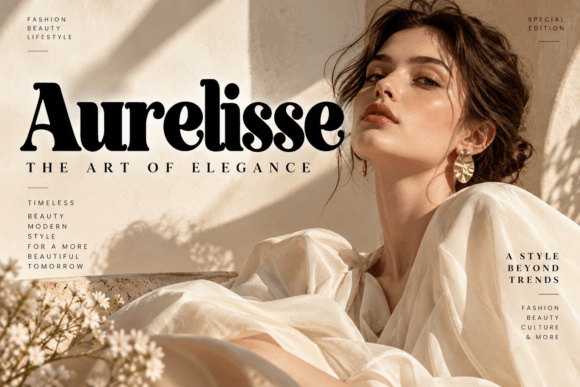
Aurelisse has strong serif weight and crisp contrast. I would shortlist it for a candle range whose packaging leans toward editorial styling rather than rustic craft.
I would try a simple centered name with a narrow information line beneath. A good contrast between the two sizes can create polish without extra graphics.
Preview This Label Font →Preview & download options
12. Auretha: For a quieter system across several scents
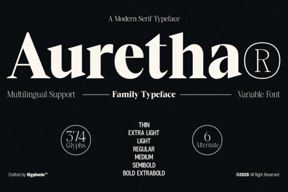
Auretha presents a comparatively restrained serif direction. I would explore it when the brand needs a consistent typographic voice across many labels, not one dramatic hero word.
I would check the supplied styles on the listing and test the longest name. Any variation should improve hierarchy rather than introduce unnecessary visual changes.
Preview This Label Font →Preview & download options
13. Cervelique: For a compact, substantial scent title
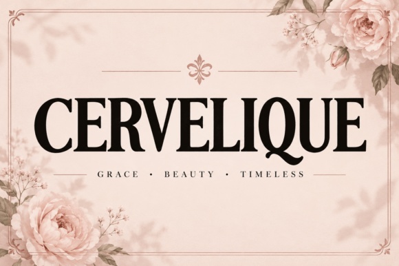
Cervelique has tall, weighty serif capitals that can make a short title feel important. I would try it for a label with a defined central text area.
I would preserve the natural proportions and adjust line breaks instead of compressing the letters. Small supporting details can sit below in a more open companion.
Preview This Label Font →Preview & download options
14. Orvelissa: For a spacious minimalist label
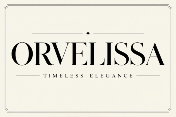
Orvelissa has fine, high-contrast capitals with an airy appearance. I would consider it for a larger pale label where the word can breathe.
I would avoid pale ink until the black-on-white proof works. The elegance depends on those thin strokes staying visible, not simply on adding more empty space.
Preview This Label Font →Preview & download options
15. Aurevane: For a vintage accent without a busy frame

Aurevane combines rounded forms with an ornamental capital and gentle curves. I would use it to give a short scent name a warmer vintage personality.
I would pair it with very plain information text. The contrast lets the decorative name remain special while keeping the label useful.
Preview This Label Font →Preview & download options
16. Jade Eclipse Didone: For a celestial collection title
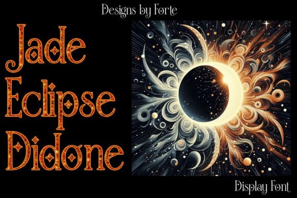
Jade Eclipse Didone has fine serif structure and decorative interior detail in its preview. I would explore it for a larger celestial or evening-themed label.
I would inspect the actual font presentation before planning a small print. The intricate treatment needs enough space, and the surrounding illustration is not the lettering itself.
Preview This Label Font →Preview & download options
Which direction would I open first?
I would start with the quietest serif that still gives the scent a personality, then compare it with one more expressive alternative. The deciding test is the same scent name at the same size. Open the previews that fit your brand mood and check the full alphabet before building the whole collection.
My recommendations are based on a visual review of the supplied product previews, not installation or production tests. The cover is an illustrative lettering montage. Open the linked listing to check the full character set, supplied files and current license before downloading.
More font ideas
Frequently asked questions
Should the scent name and brand use the same font?
They can, provided size and spacing make their roles clear. I would introduce a second font only when it solves a specific problem, such as small product information.
What is the first label proof I should make?
Use the longest scent name, the real label dimensions and the intended paper color. Check the fine strokes and the clear space around every edge.
Does the product preview include the jar mockup?
Not necessarily. The linked listing explains the supplied files. Treat the preview as a way to judge the lettering unless the mockup is explicitly included.