21 Beautiful Chinese Calligraphy Fonts for Branding & Logos in 2026
chinese calligraphy fonts bring centuries of expressive brushwork and cultural nuance to contemporary design. Whether you’re crafting a logo, packaging, or editorial layout, the right calligraphic type can convey authenticity and emotion.
In this guide we showcase 21 standout options – from traditional kaishu and xingshu styles to bold ink-brush and modern handwritten faces – plus practical tips on pairing, licensing, and using these fonts across print and web projects.
1. Chinese Dragon Font
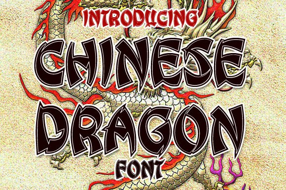
Chinese Dragon is a heavyweight display face that channels the sweep and energy of brush work without sacrificing contemporary clarity. The characters feature dramatic thick-to-thin transitions and tapered terminals that read like preserved ink strokes; this fidelity to brush anatomy places it squarely among high-impact chinese calligraphy fonts for headlines and cultural branding.
At large sizes the font sings: letterforms retain texture and personality while carefully tuned spacing prevents crowding. OpenType features and alternate glyphs give you flexible stroke endings and ligatures so you can craft single-word logos or poster headlines with nuanced variation rather than repeating the same mark.
Use Chinese Dragon when you need visual authority-festival posters, product packaging, restaurant signage and editorial covers all benefit from its assertive presence. Pair it with a neutral geometric sans for body copy, and favor strong contrast palettes (deep ink tones, gold or red accents) to let the brush-like strokes take center stage.
╰┈➤ Download Chinese Dragon Font
My Recommendation: I reach for Chinese Dragon when a project needs immediate cultural gravitas and bold legibility-it’s perfect for festival banners, premium packaging, and logos where a handcrafted brush look should read cleanly at scale. The alternates let me add variety without relettering. I pair it with a calm sans to keep layouts balanced and modern.
2. Nougat Font
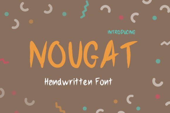
Nougat Font refines calligraphic gesture into a minimal, emotive display type that reads as a distilled brush impression rather than literal script. The strokes are pared back to expressive arcs and abrupt terminals, making each character feel intentionally unfinished and candid-an approach that gives designs an immediacy often used to convey raw emotion like surprise or delight.
Technically light on ornament, Nougat performs well in both print stationery and fast-moving social posts because its reduced forms maintain recognition across sizes. The controlled irregularities-slight stroke jitter and asymmetric counters-create a handcrafted warmth without sacrificing compositional control.
Deploy Nougat for wedding invites, valentines, boutique packaging or mood-driven headlines where a subtle handwritten quality is desired. It pairs beautifully with refined serifs or ultra-clean grotesques when you want the type to read personal yet polished.
My Recommendation: I use Nougat when I want a human touch that’s not overdone-its minimal brush cues add emotion without crowding a layout. It’s ideal for intimate stationery and expressive social graphics, and it meshes well with understated body type to maintain elegance. For quick, heartfelt campaigns this font delivers personality with restraint.
3. Gong Xi Fa Cai Font
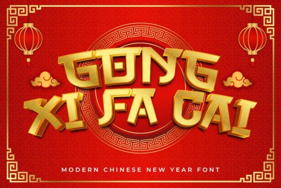
Gong Xi Fa Cai is sculpted to embody celebration: bold, festive strokes combine with decorative terminals and ornamental swashes to produce an instantly recognizable festive display type. The typeface emphasizes rhythm and flourish, making it an excellent choice for Lunar New Year greetings, event posters, and seasonal packaging that require an exuberant, culturally resonant voice.
One practical advantage is PUA encoding, which unlocks a rich set of alternates, decorative glyphs, and swash characters accessible from your glyph palette-no special software required. Those alternates let you vary word forms for repetitive layouts, producing handcrafted flair across banners, signage, and greeting cards.
Because the design is visually busy, use Gong Xi Fa Cai in short phrases, mastheads, or focal graphics; balance it with flat color blocks and simple sans serif text to avoid visual competition. It excels in red-and-gold palettes and pairs well with restrained layouts that let the decorative letterforms dominate.
╰┈➤ Download Gong Xi Fa Cai Font
My Recommendation: I’d choose Gong Xi Fa Cai for festival campaigns and cultural celebrations because its built-in swashes and PUA glyphs let me create unique, joyful compositions quickly. It shines in headline roles and ceremonial packaging where ornamentation is welcome. To keep projects readable, I combine it with clean supporting type and generous spacing.
4. Dynasty Dash Font
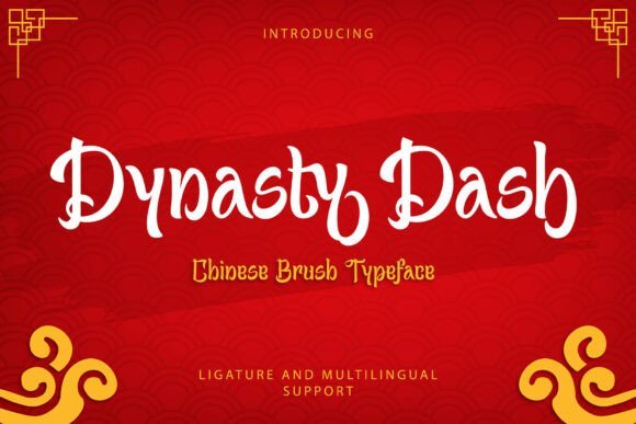
Dynasty Dash channels the energy of traditional brush calligraphy into a bold display face designed for celebration. Its lively strokes and sweeping tails recall festive signage and red-ink aesthetics common in Lunar New Year art, making it a go-to among chinese calligraphy fonts for projects that need cultural authenticity. The overall rhythm feels handcrafted yet controlled, striking a balance between ornament and clarity.
The family ships with uppercase and lowercase characters, numerals, punctuation, stylistic alternates and ligatures, plus robust multilingual support. OpenType features make it effortless to swap in alternate letterforms for typographic variety, and its thick-to-thin stroke contrast retains legibility at large sizes. Textured brush terminals give the typeface a tactile quality that reads well both in print and on-screen.
Dynasty Dash excels on festival posters, red-envelope packaging, restaurant branding, lantern festival artwork and seasonal merchandise where an assertive traditional voice is required. For best results pair it with a restrained sans or plenty of negative space so the decorative strokes remain the focal point. When used for signage, convert to outlines and consider slightly increased tracking to preserve clarity between heavy brush strokes.
Because the face is visually dominant, reserve it for headlines, emblems or short taglines rather than long bodies of text; its power is most effective when used sparingly. It converts cleanly to vectors and handles CMYK and spot color jobs without losing the ink-brush texture. Licensing options typically support seasonal campaigns and product packaging, which makes it a practical choice for cultural events and retail promotions.
╰┈➤ Download Dynasty Dash Font
My Recommendation: I reach for Dynasty Dash when I need an expressive, celebratory voice with authentic brush energy-especially for Lunar New Year, festival posters, or restaurant signage. Its alternates and ligatures let me craft unique headlines without extensive hand-drawing, and the tactile terminals give printed pieces a traditional feel. Use it as a focal display face paired with clean sans-serifs to keep layouts balanced and elegant.
5. Asian Hiro Font
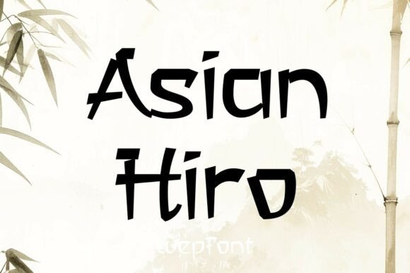
Asian Hiro interprets East Asian calligraphic and woodblock traditions through a contemporary, geometric lens. Its angular strokes and subtle modulation create a hand-cut, textured appearance that remains remarkably legible at headline sizes. The design avoids cliché ornament while still evoking a clear regional aesthetic.
Spacing and stroke endings are tuned for tight display compositions, making the font ideal for bold logos, banners and editorial headers. The set includes both uppercase and lowercase letters plus numerals and punctuation so layouts remain cohesive across media. Because the forms are slightly condensed, they deliver strong visual presence without overpowering supporting elements.
Use Asian Hiro for restaurant menus, travel and tourism branding, martial arts signage, apparel prints and themed packaging where an evocative East-Asian character is desired. It pairs excellently with minimal sans-serifs or soft paper textures, and responds beautifully to metallic foils or letterpress effects. The font is compatible with major design tools and covers the typical multilingual needs for international projects.
My Recommendation: I would choose Asian Hiro for projects that need a clear East-Asian atmosphere without feeling dated-think boutique restaurant menus, event posters, or apparel branding. Its angular, woodblock-like forms read strongly at large sizes and hold up in print or digital campaigns. For a polished look, pair it with a neutral sans and use subtle textures or metallic accents to enhance its handcrafted vibe.
6. Neo China Font
Neo China fuses classic brushstroke cues with contemporary proportions to create a refined Chinese-inspired display face. Thin hairlines meet solid terminals in a way that suggests calligraphic movement while keeping letterforms disciplined and modern. The result is a tasteful aesthetic suited to upscale cultural design work.
What distinguishes Neo China is its measured stroke rhythm and restraint: the type looks handcrafted but maintains consistent metrics for tight editorial or packaging layouts. It lends itself to premium branding, invitations, and posters where an elegant Eastern reference is required without heavy ornamentation. Designers can tweak spacing and pair it with minimalist serifs to achieve a sophisticated contrast.
Neo China supports extended Latin characters and exports cleanly for embossing, foil-stamping, and large-format signage. Its vector outlines are production-friendly, which makes the family useful for boutique packaging, museum exhibits, and wedding stationery. Overall, the face is best applied as a refined accent that adds cultural nuance while preserving modern clarity.
My Recommendation: I pick Neo China when I want an understated, elegant nod to East-Asian calligraphic tradition-perfect for boutique packaging, high-end invitations, or museum graphics. Its disciplined stroke rhythm keeps layouts sophisticated rather than decorative, and it converts well to print finishes like embossing or foil. Use it as a headline or logo face paired with clean supporting typography to maintain a premium, contemporary look.
7. Beth Pao Font
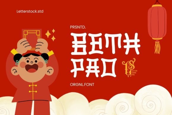
Beth Pao is a hand-drawn display typeface that channels the measured energy of traditional brushwork into a modern lettering style. Strokes feel deliberately textured, with subtle ink variation and slight wobble that give each glyph the warmth of a live pen; this is not a sterile digital script but a tactile, human-forward design.
Designed for impact at large sizes, Beth Pao balances decorative flourish with surprisingly clear counters and rhythm. If you need a font that evokes East Asian typographic heritage without copying historical scripts, Beth Pao slots in gracefully alongside minimalist layouts and layered photographic backgrounds-especially useful when you want the feel of authentic chinese calligraphy fonts without sacrificing contemporary readability.
Use Beth Pao for posters, boutique branding, invitation covers, and editorial covers where brushy personality is the hero. It pairs well with neutral sans-serifs to maintain hierarchy and works best when given breathing room so the hand-drawn details and ink-like terminals can read cleanly from a distance.
My Recommendation: I’d reach for Beth Pao when a project needs handcrafted character with cultural resonance-think gallery posters, artisanal food labels, or luxury event invites. Its brushlike texture brings warmth and authenticity that’s ideal for expressive headlines. I especially like pairing it with a clean geometric sans to keep layouts modern while the font supplies the soul.
8. Dragons Gravity Font
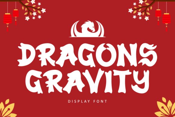
Dragons Gravity is a theatrical display face that borrows the sinuous motion of dragon imagery and the gestural cadence of East Asian brushwork to create letters that seem to coil and strike. The letterforms are sculpted with exaggerated terminals and sweeping tails, producing a dramatic silhouette that reads as both mythical and contemporary.
This font excels where bold identity and narrative energy are required: festival posters, martial arts cinema titles, bespoke packaging, and themed merchandise. Because each character reads like an emblem, it’s perfect for short headlines, logo marks, and any composition where you want typography to behave like ornamentation rather than background text.
When using Dragons Gravity, favor high-contrast layouts and sparse backgrounds so the elaborate strokes remain legible. It pairs well with restrained typefaces and metallic or red palettes for an intense, celebratory effect that draws attention without feeling clichéd.
╰┈➤ Download Dragons Gravity Font
My Recommendation: I would use Dragons Gravity for projects that demand theatricality-movie posters, limited-edition labels, or event posters celebrating Asian mythology. Its dramatic movement makes every headline feel like a visual narrative, so it’s great for short, bold copy. For best results, treat it as a focal display element and avoid heavy body copy in the same style.
9. Cinthang Font
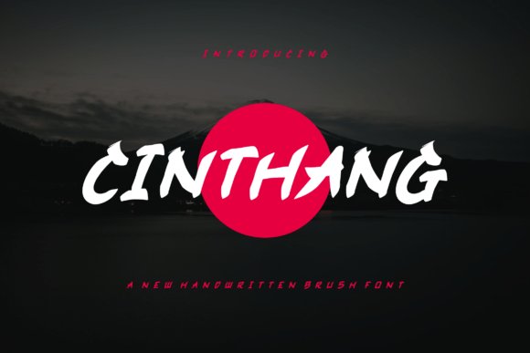
Cinthang is a flowing handwritten script that subtly hints at calligraphic brush technique while remaining distinctly contemporary. Its strokes are elongated and elegant, with soft junctions that emulate a practiced hand rather than rigid mechanical curves; the result is approachable refinement suitable for intimate, upscale designs.
Because Cinthang feels personal and ornamental, it’s particularly effective for wedding stationery, boutique branding, and packaging where a handcrafted signature elevates the product. The font’s rhythm makes short lines of copy feel lyrical, so it shines in titles, logotypes, and quoted phrases rather than long paragraphs.
Designers will appreciate Cinthang’s versatility when paired with restrained serifs or clean sans fonts to balance its flourish. Use generous tracking for longer words and keep contrast moderate so the graceful terminals remain readable across print and screen applications.
My Recommendation: I recommend Cinthang when you want a script with personality-ideal for invitations, artisan labels, and logos that need a human touch. It brings delicate movement without overwhelming a layout, making it a reliable choice for brands seeking warmth and elegance. I typically pair it with neutral sans-serifs to let the script breathe while keeping overall compositions contemporary.
10. Fall Calligraphy Font
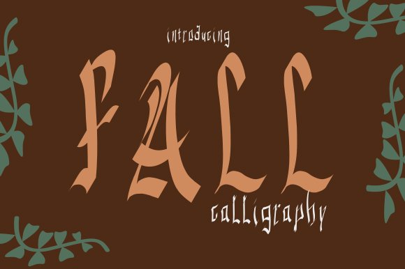
Fall Calligraphy is a lively, hand-crafted script that channels playful brush marks into a modern crafting typeface. The letterforms bend and bounce with an informal rhythm, giving headlines and DIY packaging a friendly, artisan feel without losing readability.
Designed with influences drawn from traditional East Asian brushwork, this design sits comfortably among chinese calligraphy fonts while remaining distinctly approachable for contemporary projects. Its irregular terminals and soft pressure contrasts mimic real ink flow and translate well at display sizes.
Practically, Fall Calligraphy offers generous spacing and clear curves that make it easy to layer over textures, pair with geometric sans-serifs, or use on stationery, greeting cards, and social-media art. The font’s organic energy is best deployed where warmth and personality matter more than strict formality.
╰┈➤ Download Fall Calligraphy Font
My Recommendation: I’d reach for Fall Calligraphy when I want a handmade, joyful voice in a design-think craft fairs, seasonal greeting cards, or boutique packaging. Its brushy quirks add human presence without sacrificing legibility, making it great for short headlines and logo marks. Use it with clean, neutral backgrounds to let the lively strokes shine.
11. Fangmei Regular – chinese calligraphy fonts

Fangmei Regular is a powerful display face that borrows the intensity of traditional brush strokes and translates them into bold, contemporary letterforms. Sharp, expressive curves and dynamic stroke tapering give the font a sense of motion, ideal for creating eye-catching headlines and cinematic titles.
Unlike fragile script fonts, Fangmei maintains strong legibility at large sizes through its confident stroke widths and carefully balanced counters. Its slightly exaggerated terminals and angular flares evoke carved inscriptions and martial arts posters, lending designs a dramatic, heritage-rich tone.
Use Fangmei for posters, film credits, or product packaging where you want an assertive East-Asian inspired aesthetic paired with modern graphic sensibilities. It pairs well with compact sans-serifs or muted serif bodies to let the display face dominate without visual clutter.
╰┈➤ Download Fangmei Regular – chinese calligraphy fonts
My Recommendation: I recommend Fangmei Regular for high-impact branding and entertainment work that needs a bold, cultural accent-think movie posters, restaurant signage, or heritage product labels. Its brush-like energy reads well at scale and helps projects stand out with theatrical flair. For balance, pair it with neutral typography and restrained color palettes.
12. Eastern Echoes Font
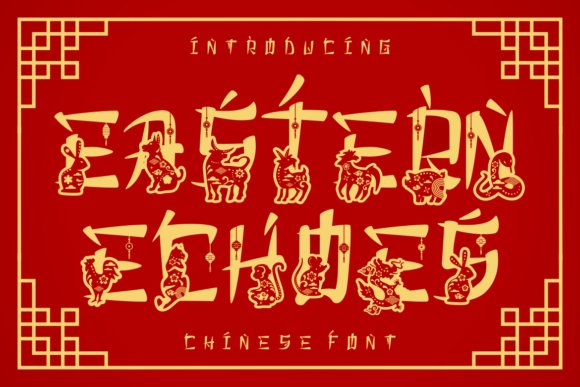
Eastern Echoes is a whimsical display font that blends handcrafted brush textures with playful illustrative details, giving each glyph a storybook character. The typeface channels traditional Chinese calligraphic gestures while incorporating charming idiosyncrasies, such as animal-inspired alternates and decorative terminals.
What makes this face distinctive is its modular ornamentation: a set of themed glyphs and zodiac motifs that can be mixed into words to create lively, bespoke compositions. Designers can craft invitations, packaging, and children’s branding with a sense of narrative and cultural warmth.
Technically, Eastern Echoes performs best at larger sizes where its decorative elements are visible; it shines in headers, badge work, and themed posters. Pair it with simple body text and clear layouts to let the font’s storytelling details remain the focal point.
╰┈➤ Download Eastern Echoes Font
My Recommendation: I’d choose Eastern Echoes for projects that need charm and cultural whimsy-festival posters, kids’ books, or artisanal food labels are perfect fits. Its illustrative alternates give designers playful options for one-of-a-kind layouts. Use it sparingly as a hero display face to preserve its visual impact.
13. Zamota Cazlo Font
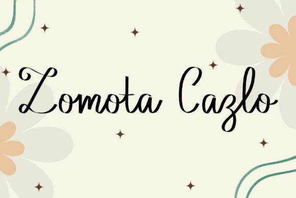
Zamota Cazlo reads like a personal brush note – delicate but deliberately lively. It blends airy, hairline strokes with playful terminal curls, creating a handwritten personality that feels both artisanal and contemporary. If you’re scanning chinese calligraphy fonts for something that leans more sweet and intimate than ceremonial, Zamota Cazlo brings that soft, approachable energy without losing craftsmanship.
Under the hood this face offers finely tuned alternate characters and subtle ligatures that mimic natural brush hesitation and lift. The thin-to-medium stroke contrast keeps the letters legible at small scales while preserving that hand-painted rhythm at larger sizes. Kerning is thoughtfully adjusted so romantic words, brandmarks, and invitations read like real handwriting rather than a mechanical script.
For practical use, it’s a go-to for boutique branding, wedding stationery, and any project wanting a handcrafted touch. Pair it with a neutral sans for body copy or pair with textured paper or subtle watercolor backgrounds to amplify its brush-like texture. Overall, it’s a charming choice when you want calligraphic warmth without heavy formality.
╰┈➤ Download Zamota Cazlo Font
My Recommendation: I’d reach for Zamota Cazlo when a project needs an intimate, handcrafted voice – think artisanal packaging, bespoke event invites, or soft lifestyle branding. Its playful strokes add personality without overwhelming layouts, and the alternates let you tune the tone from casual to elegant. Use it with muted palettes and tactile materials to make the brush details sing.
14. Dragon Wave Font
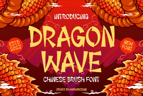
Dragon Wave channels the long, sweeping gestures of East-Asian ink brush work into a confident display face. Each character moves with a sense of propulsion – thick downstrokes, tapered hook endings, and dynamic counters that suggest movement and elemental force. The overall effect reads theatrical and modern: traditional inspiration handled with contemporary polish.
Technically, Dragon Wave is designed for impact rather than micro-readability: generous stroke contrast and bold terminals ensure strong presence on posters, headlines, and signage. Stylistic alternates and contextual forms give designers the ability to modulate intensity – choose simplified forms for clarity or ornate variants for decorative headlines. It also handles layered textures well, taking on ink-splatter and gradient treatments without losing personality.
Use Dragon Wave for restaurant identities, event posters, film titles, or packaging that wants an Eastern-inspired flourish. It pairs especially well with restrained geometric sans-serifs to balance its expressive curves. When you need typography that feels kinetic and ceremonial at once, this font makes a dramatic statement.
My Recommendation: I recommend Dragon Wave when a design needs theatrical movement and bold cultural cues – think movie posters, festival branding, or exotic product packaging. Its strong strokes hold up at large sizes and take treatments-like foil or distressing-beautifully. Pair it with simple sans text to keep layouts balanced and let the type be the focal point.
15. Gekkai Font
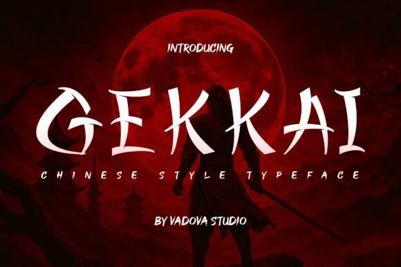
Gekkai is a forceful display type that leans hard into traditional East Asian calligraphic vigor while remaining entirely contemporary. Its exaggerated contrast and emphatic brush terminals convey authority and ritual, making each word read like a ceremonial proclamation. The type’s visual weight and rhythmic stroke patterns immediately draw attention and establish cultural gravitas.
Beyond aesthetics, Gekkai is engineered for versatility: bold headline work, dramatic poster art, and refined packaging. The letterforms include roughened edge options and layered textures to simulate ink-on-paper or fossilized brushwork, which designers can toggle for different levels of authenticity. Tight spacing and pronounced vertical strokes give it outstanding presence on stacked headlines and mastheads.
Practically, this face excels where identity needs history and drama – museums, album covers, theatrical posters, or specialty food branding. It complements ornate imagery and can be toned down when paired with light, neutral body copy. In short, Gekkai is a powerful tool when you want a bold, culturally resonant typographic voice.
My Recommendation: I’d pick Gekkai for projects that demand dramatic cultural resonance – exhibition identities, bold editorial covers, or gaming and music artwork that needs theatrical impact. Its textured alternates let you move between pristine and hand-inked looks, giving great creative control. Use it at large scales and pair with minimal supporting typography so the bold strokes remain the star.
16. Hangzhou Regular Font
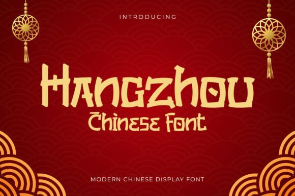
Hangzhou Regular is a bold display face that channels traditional brush techniques into a contemporary graphic silhouette. As part of the broader family of chinese calligraphy fonts, it translates sweeping ink gestures into clear, angular terminals that read strongly at headline sizes while retaining the fluidity of hand-drawn strokes.
The type’s sharp contrasts and compact proportions make it especially effective for festival posters, restaurant identity, and packaging where cultural resonance is required without sacrificing modernity. Open counters and deliberate stroke breaks help maintain legibility across print and large-format digital signage.
Pair Hangzhou Regular with a neutral sans for body copy to create a distinctive hierarchy, or use it solo for logos and menu headers to immediately signal heritage and celebration. Its assertive personality works best where a bold cultural voice is needed-Lunar New Year campaigns, specialty tea and noodle brands, or event branding that demands both warmth and authority.
╰┈➤ Download Hangzhou Regular Font
My Recommendation: I’d reach for Hangzhou Regular when a design needs the warmth of brush calligraphy but with contemporary clarity-perfect for festive branding and restaurant menus. It balances ornamental flair with strong legibility, making it reliable for both print and large-scale displays. Use it to anchor projects that require an unmistakable cultural identity without feeling dated.
17. Chinese Shangai Font
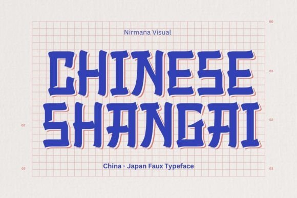
Chinese Shangai Font captures the bold energy of traditional brush lettering while streamlining forms for modern display work. Its generous stroke weight and confident terminals create a powerful visual rhythm that reads well in headlines, posters, and packaging campaigns where a striking, cultural aesthetic is desired.
Designed with clean curves and decisive brush marks, this face emphasizes verticality and strong contrast, which lends itself to high-impact logos and print layouts. The restrained ornamentation keeps the design readable at a distance while preserving the raw character of hand-brushed strokes.
Because of its assertive presence, Chinese Shangai is ideal for projects that need a dramatic focal point-think book covers, signage for Asian-fusion restaurants, or promotional graphics. It pairs nicely with thin, geometric sans-serifs to soften the overall look and provide a modern supporting voice.
╰┈➤ Download Chinese Shangai Font
My Recommendation: I recommend Chinese Shangai Font when you want a headline type that delivers instant cultural impact with minimal fuss. Its bold brush qualities make it excellent for logos and signage where visibility and attitude matter. Use it alongside a neutral sans to balance its intensity and keep layouts contemporary.
18. Sugo Gekai Font
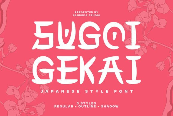
Sugo Gekai is a decorative family inspired by East Asian calligraphic traditions, offering Regular, Shadow, and Outline styles for layered typographic play. The Regular style provides an elegant base with slightly rounded terminals, while Shadow and Outline allow designers to build depth or create cut-friendly graphics for stickers and apparel.
Each style maintains consistent stroke rhythm so that mixes between weights feel intentional rather than patchy, which makes Sugo Gekai particularly useful for branding systems and poster series. The type’s hybrid feel-drawing subtly from both Japanese and Chinese visual cues-gives it a broad cultural nod without relying on literal script reproduction.
Use the shadow variant to suggest dimensionality in display headlines, the outline for minimalist packaging or vinyl cuts, and the regular for cleaner logotypes. Its versatility shines in motion graphics, festival posters, and product labels where ornamental detail and modular layering elevate the composition.
My Recommendation: I’d choose Sugo Gekai when a project needs a decorative, culturally flavored type family with built-in layering options. The three styles let you experiment with depth and texture while maintaining visual harmony across applications. It’s especially effective for posters, merchandise, and packaging that benefit from a handcrafted, stylish look.
19. Baby Oxen Font
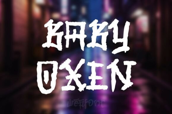
Baby Oxen Font is a bold display face that fuses raw graffiti energy with the fluid motion of East Asian brushwork. The characters feel hand-painted: heavy, textured strokes with deliberate imperfections that still retain a rhythmic calligraphic balance. This juxtaposition gives the typeface a streetwise attitude while nodding to traditional brush-lettering techniques.
Technically, Baby Oxen reads well at large sizes because of its pronounced stroke contrast and strong silhouette, making it ideal for posters and album covers. Designers who work with chinese calligraphy fonts will appreciate how Baby Oxen captures ink-brush dynamics without sacrificing Western letterform familiarity. It also pairs beautifully with minimal sans-serifs or distressed backgrounds to highlight its textured personality.
Use Baby Oxen for urban apparel, festival posters, comics with cross-cultural themes, or game titles that need an aggressive, handcrafted voice. Its rugged brush textures hold up in print and high-resolution digital art, and the font scales cleanly for headline use. For projects aiming to bridge Eastern and Western visual cultures, this design offers an immediate, memorable statement.
My Recommendation: I reach for Baby Oxen when I want a headline that feels both gritty and artful-perfect for streetwear labels, music posters, and edgy restaurant branding. Its brush-stroke texture gives projects a handcrafted authenticity that photo filters can’t mimic. I recommend pairing it with a restrained sans to let its raw energy remain the focal point.
20. Bao Buns Font
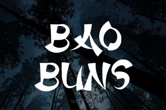
Bao Buns Font channels an aged, ceremonial aesthetic with brush-like letterforms that appear weathered by time. The strokes suggest carved or inked inscriptions: slightly eroded edges, varied pressure, and organic terminals that evoke scrolls, temples, and antique seals. It’s a refined display face that leans into historical texture without feeling clichéd.
The font excels at creating a sense of heritage and quiet luxury; its organic flow and subtle distressing read as cultured and ceremonial rather than rustic. Designers can exploit its tactile look for high-end packaging, cultural event posters, or boutique restaurant identities that need a narrative of tradition. Pair Bao Buns with warm paper textures or muted color palettes to amplify its antiquarian charm.
Because of its detailed stroke work, Bao Buns performs best at display sizes where its carved-in quality is visible. It’s an excellent choice for documentary titles, luxury tea packaging, museum signage, and book covers that require an evocative, historical voice. Its restrained elegance makes it suitable for projects that value depth and cultural resonance over trendy ornamentation.
My Recommendation: I’d use Bao Buns when I want sophistication with a touch of antiquity-ideal for upscale Asian restaurants, museum exhibits, or premium product labels. The font’s weathered brush texture instantly communicates legacy and craft. It pairs wonderfully with earthy materials and subdued layouts to create a considered, immersive brand experience.
21. Jingjou Font
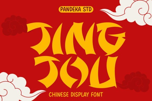
Jingjou Font is a high-energy display face inspired by the geometric angles of Katakana, translated into Latin letterforms with razor-sharp cuts. The design emphasizes speed and modernity: angular strokes, condensed proportions, and a forward-leaning momentum give text an aerodynamic presence. It comes in Regular and Outline styles that let you dial intensity up or down without changing type scale.
Visually, Jingjou suits bold headlines, game interfaces, and motion-driven layouts where impact matters more than long-form readability. Its aesthetic sits at the intersection of retro-futurism and street signage, making it versatile for posters, fast-food branding, and electronic music artwork. For designers seeking East Asian display typefaces with a contemporary twist, this font captures kinetic character while remaining unmistakably modern.
Use the Outline variant for layered compositions or neon-inspired treatments; the solid weight reads crisply on merchandise and video titles. Jingjou pairs well with simple geometric sans-serifs to keep attention on its dynamic cuts. If you need a typeface that conveys speed, youth, and urban flair, Jingjou is a compact, punchy solution.
My Recommendation: I choose Jingjou when a project needs bold momentum-perfect for game logos, sports promotions, and edgy posters. The two styles let me create contrast without introducing another family, and its angular forms give layouts a strong directional pull. It’s a go-to when I want a contemporary, kinetic headline that reads aggressively across print and screen.
Choosing the right chinese calligraphy fonts can transform a project by adding personality, historical depth, and visual rhythm. Test a few styles in your actual layouts to evaluate legibility, contrast, and how well they match your brand voice.
Use this curated list as a starting point for logos, packaging, and digital designs, and revisit these picks as your projects evolve – the right brush or seal-style script can make all the difference.