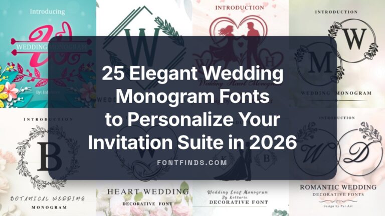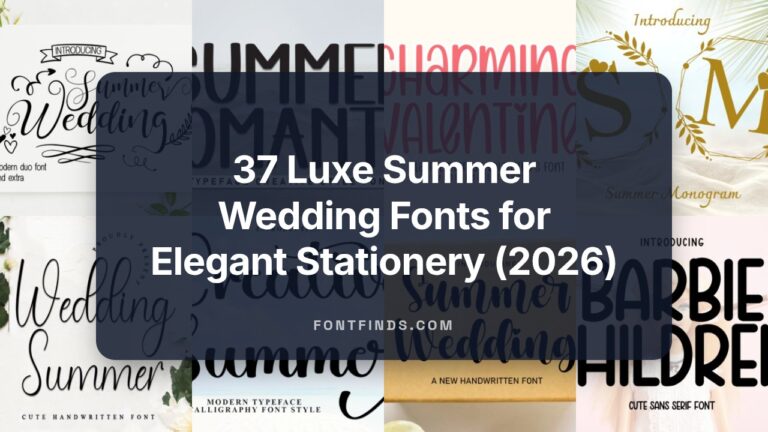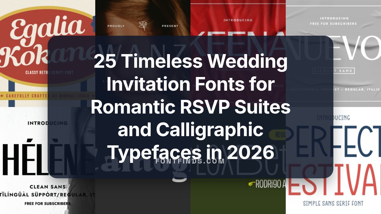
25 Timeless Wedding Invitation Fonts for Romantic RSVP Suites and Calligraphic Typefaces in 2026
Wedding invitation fonts are the first visual cue guests receive about your event, signaling formality, vibe, and theme before any other detail. Choosing the right face helps set expectations for dress code, venue, and overall mood.
Below you’ll find 25 curated typefaces spanning script calligraphy, elegant serifs, clean sans-serifs, and hand-lettered styles that work across invites, RSVP cards, and envelope liners. Each entry includes pairing suggestions, spacing and weight notes, and the situations where the font looks strongest so you can match type to stationery concept.
1. Perfect Festival
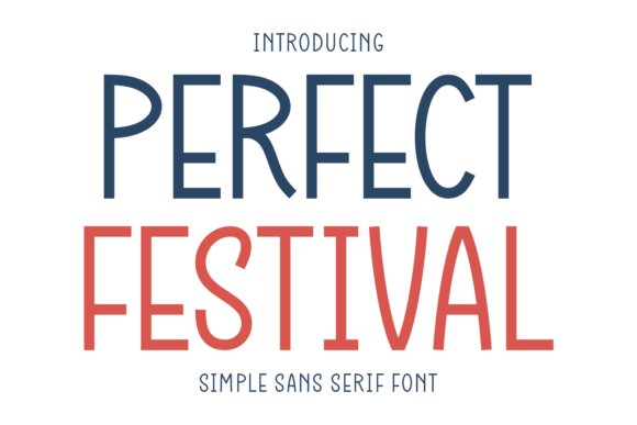
Perfect Festival is a minimalist sans-serif built around a tall x-height, monolinear strokes and softly rounded terminals that read as friendly rather than mechanical. Its neutral geometry makes it a strong candidate among Wedding invitation fonts when you want a contemporary, legible tone that won’t overpower decorative elements. Open counters and generous spacing keep small text crisp, so names and RSVP details remain clear across digital proofs and print samples.
On paper this face holds fine detail for letterpress and thermography, while on-screen hinting preserves consistent color across resolutions. Try it for headers, envelope addressing and information blocks where clarity matters; pair it with a flowing script to introduce contrast and hierarchy without losing readability.
My Recommendation: I reach for Perfect Festival when a client asks for modern, readable wedding stationery with a warm personality. Its tall letters keep small details legible and it pairs beautifully with calligraphic companions to balance formality and friendliness. For minimal save-the-dates, festival-themed celebrations, or contemporary invitation suites, it delivers a crisp, reliable presence.
2. Dreamer
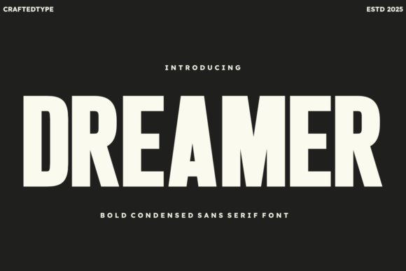
Dreamer is a bold, condensed sans designed for high-impact display work: thick verticals, tight counters and simplified terminals make headlines impossible to ignore. The compact proportions are efficient for short, authoritative lines in posters, editorial covers and brand marks where space is at a premium. Its pared-back detailing helps maintain legibility at distance and when reproduced on merchandise.
Because the strokes print cleanly on apparel and vinyl, Dreamer performs well in print-on-demand applications and crafting workflows like vinyl cutting. Use a light sans or an elegant script alongside it to soften the composition, or deploy it alone for logos, packaging and strong title treatments that demand presence without ornament.
My Recommendation: I choose Dreamer when a project needs confident visual weight-festival posters, merch collections, or bold identity work are ideal. Its condensed form saves horizontal space while remaining readable on tees and stickers, and it holds up in both screen printing and heat transfer. For balanced layouts I pair it with a delicate script or thin sans to introduce contrast.
3. Plex Beta Regular
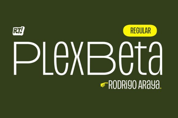
Plex Beta Regular provides evenly spaced, geometric letterforms that sit comfortably in both body text and branding contexts, offering a measured, modern voice without fuss. The type’s consistent rhythm and moderate contrast support long reading blocks on web pages and printed manuals, while hinting keeps small sizes crisp on screens. Its restrained personality makes it a reliable choice when clarity and order are priorities.
Pairing options include a humanist sans or a soft script when a touch of warmth is required, and its spacing adapts well to modular grid systems and editorial layouts. Use Plex Beta for user interfaces, documentation, and identity work where predictable typographic behavior matters and the typography should support content rather than call attention to itself.
╰┈➤ Download Plex Beta Regular
My Recommendation: I recommend Plex Beta Regular for projects that need steady, readable typography-corporate sites, product docs and long-form editorial are perfect fits. It won’t compete with imagery and it keeps typographic color uniform across pages. When I want personality, I combine it with a rounded display or a subtle script for contrast while preserving overall calm.
4. Serambie Font
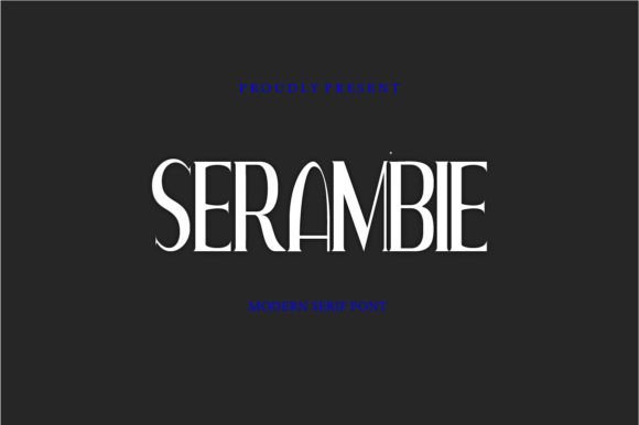
Serambie is a modern serif with refined, slightly condensed letterforms and graceful terminals that reference classic types while feeling current. Its moderate stroke contrast and open counters keep blocks of text readable and give headlines a poised presence. Subtle ligatures and alternate capitals introduce personality without pulling focus from the message.
Serambie performs well at display sizes and in small print, making it a strong option for stationery, editorial layouts, and web headers; it ranks among Wedding invitation fonts that lend formality without excess flourish. Pair it with a clean sans for extended copy or a delicate script for RSVP lines to balance ornament and clarity. A modest weight range and italics let you nudge tone from solemn to celebratory as needed.
My Recommendation: I’d choose Serambie when a project needs a dignified, dressy voice that still reads comfortably across print and screens. It’s especially useful for suites-invites, menus, programs-because it holds up in both small type and large headings. I enjoy pairing it with a light script for accents so the main wording stays crisp and legible.
5. Keena Font
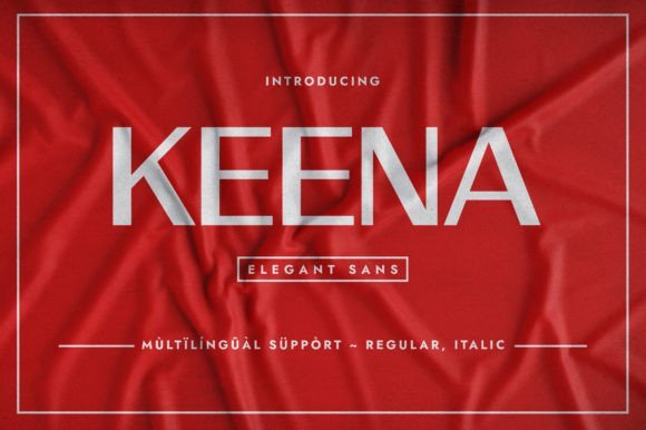
Keena is a stripped-back sans serif that relies on clear geometry and careful spacing to feel modern yet approachable. A subtle contrast in strokes and slightly tapered terminals give the letters a handcrafted hint while preserving consistent typographic color. Its uppercase characters are assertive, which helps headlines and wordmarks read with distinct presence.
Keena adapts well to packaging, beauty labels, editorial layouts, and social graphics where clarity and minimalist styling matter. It pairs neatly with ornate scripts for product names or with warmer serifs when you want a gentler tone. Tight tracking and small caps can sharpen logos and headlines without adding ornament.
My Recommendation: I reach for Keena when cleaner, modern typography is required but the design still needs a human touch. Its geometry supports strong identity work-logos and packaging-while remaining friendly on social and editorial pieces. Use it to give brands a chic, uncluttered voice that reads well at a glance.
6. Nuevo Font
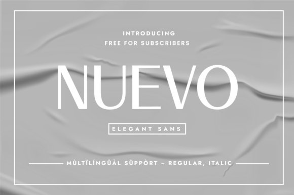
Nuevo brings calm proportions and steady rhythm to both body copy and short display lines; its italics are designed for subtle emphasis rather than flourish. Generous x-height and open counters improve legibility on screens and printed tags alike, while the family’s restraint lets supporting graphics take the spotlight. The overall voice is neutral but personable, supporting text without competing for attention.
Nuevo is suited to invitations, packaging, quotes, and branding where a polished yet understated sans is required. Combine it with a flowing script or a botanical motif to create handcrafted-feeling layouts that remain readable. The simple italic style makes it easy to mark emphasis in copy without changing the visual weight dramatically.
My Recommendation: I use Nuevo when I want a dependable, readable sans that works across print and digital touchpoints. Its italics give emphasis without drama, so it’s ideal for invites, labels, and editorial snippets where tone should stay calm. Pairing it with decorative elements yields a handcrafted look while keeping text straightforward and scannable.
7. Hélène Font
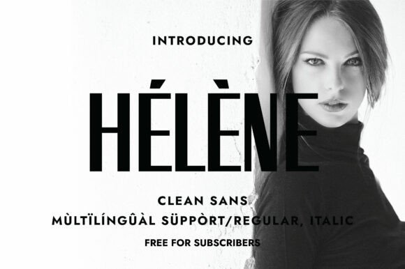
Hélène is a tall, minimalist sans serif built around narrow, graceful letterforms that give print and digital layouts an airy, modern rhythm. Its elongated ascenders and open counters deliver clarity at display sizes and remain legible in compact blocks of text. Hélène sits naturally among Wedding invitation fonts when couples want a clean, contemporary look with quiet refinement.
Pair this face with a delicate script or a fine-lined monogram to add character without cluttering the page, which keeps suites elegant and readable. It performs well across RSVP cards, ceremony programs, and suite headers where space is limited but typographic presence matters. The font’s restraint makes it a dependable choice for minimalist branding and editorial spreads seeking a refined sans serif voice.
My Recommendation: I reach for Hélène when I want invitations that read modern while remaining quietly elegant. Its tall proportions give stationery a luxury posture on narrow cards and digital headers without sacrificing legibility. Use it for minimalist wedding suites, save-the-dates, and brands that want a restrained, premium typographic voice.
8. Swizzer Font
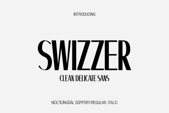
Swizzer channels Swiss typographic principles through a tall, condensed structure and geometric letter shapes that feel disciplined and assertive. High contrast in the glyph skeleton-fine stems beside fuller terminals-creates a striking rhythm that pulls attention to headlines and display text. The overall effect is a bold sans serif that reads memorable on posters, menus, and identity work.
Its narrow set makes Swizzer ideal for layouts where impactful typography is needed without expanding horizontal space. Combine it with a soft script or a light serif to soften its architectural edge, or let it stand alone for signage and modern editorial headings. Designers who favor structured letterforms will find this family reliable for long-term branding and compact layouts.
My Recommendation: I pick Swizzer when a design needs a crisp, engineered headline that remains legible in tight columns. It’s especially useful for tall posters, product labels, and editorial covers where space is limited. For invitation work, pair it with a flowing script for contrast or use it to give modern suites a clean, structured backbone.
9. Sleek Font
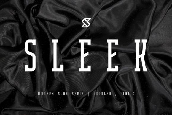
Sleek is a condensed slab serif with crisp, truncated serifs and a decisive vertical presence that suits large-format use. Its compact proportions let it live comfortably in narrow columns while preserving a bold, readable silhouette for magazine covers and packaging. Clean geometric shapes in the letterforms create an arresting display that stands up to high-contrast backgrounds and textured papers.
Treat Sleek as a headline instrument: slightly increase tracking at very large sizes and experiment with color blocks to make the characters pop. It works beautifully on perfume labels, editorial mastheads, and social creatives where a slab serif introduces personality without ornament. For denser copy, reserve heavier weights to avoid overpowering nearby elements and maintain a clear typographic hierarchy.
My Recommendation: I choose Sleek when a project demands a strong typographic identity that still reads refined. It excels on premium packaging, advertising, and magazine covers where a slab serif brings character and weight. Use it for bold headlines and compact layouts where a commanding yet elegant type voice is required.
10. Notique Font
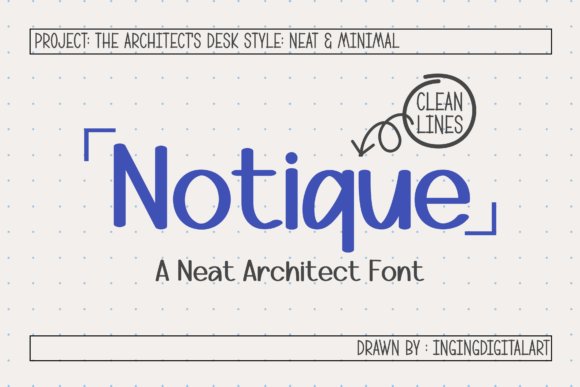
Notique channels the measured geometry of architectural lettering with thin, steady strokes, precise joins, and open counters that make extended copy surprisingly legible. It ships with 218 glyphs-upper and lowercase, numerals, punctuation and broad multilingual support-so international projects keep a consistent voice. Neutral proportions help the face hold shape across sizes and render crisply on both screen and print.
Because of that restraint, Notique pairs beautifully with ornate scripts, a combination that suits modern Wedding invitation fonts where names call for flourish but information must remain readable. Beyond stationery, it feels at home in editorial grids, minimalist product labels and digital planners that need tidy, ordered typography. Tweak weight and tracking to build hierarchy while preserving the font’s drafting-like precision.
My Recommendation: I reach for Notique when a design needs disciplined, draft-inspired typography rather than decorative flourishes. Its extensive glyph set and even stroke work make it efficient for multilingual layouts and complex grids. Use it for contemporary wedding suites, studio identities, or product labels that benefit from a crisp, architectural voice.
11. Swanza Font
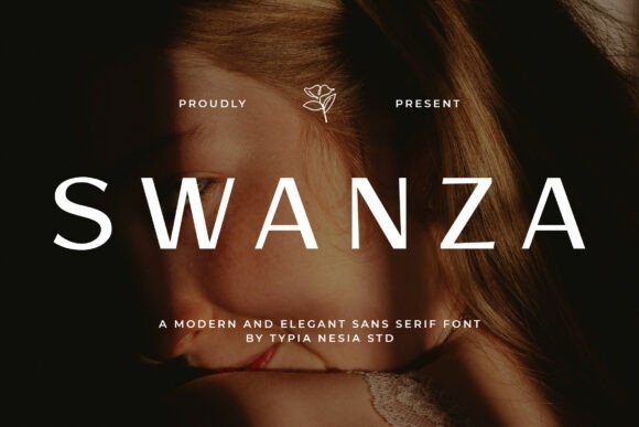
Swanza is a minimalist sans with soft curves and refined proportions that read as discreet luxury. Smooth terminals and even stroke contrast give headlines and logos a poised, modern presence without ornament. A modest but useful range of weights helps designers establish hierarchy while keeping forms clean and legible.
This face excels on packaging, magazine mastheads and high-end branding; pair it with a delicate script to add warmth on wedding stationery or boutique labels. It responds especially well to embossing and foil, which emphasize its clean lines on tactile media. On screen Swanza performs reliably at large display sizes and sustains brand marks across digital channels.
My Recommendation: I use Swanza when a project calls for quiet sophistication and clarity. It photographs and prints beautifully, making it a strong choice for luxury packaging and promotional assets. Ideal for fashion lookbooks, cosmetic brands and refined wedding suites that prefer modern understatement over ornate detailing.
12. Sqindra Font
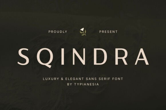
Sqindra blends luxury sans restraint with subtle humanist details-slightly flared terminals and a generous x-height keep text lively at display sizes. Optical spacing is tuned to prevent collisions in tight layouts, producing compact headlines that breathe. The type family reads fresh in editorial spreads, premium packaging and identity work where personality matters.
For brand systems and wedding suites that need a confident typographic voice, Sqindra offers weights that work well both alone and in combination with decorative elements. Use heavier cuts for monograms and lighter ones for information panels to preserve hierarchy without overpowering ornament. It also adapts cleanly to web use thanks to careful hinting and consistent stroke joins.
My Recommendation: I pick Sqindra when I want a refined sans with distinctive character. Its spacing and weight range speed up the process of building cohesive editorial pages and brand systems. It’s especially fitting for boutique labels, premium packaging and wedding stationery that need tasteful typographic presence.
13. Megans Font – Wedding invitation fonts
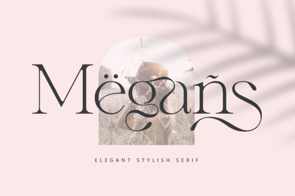
Megans is a modern serif that balances refined strokes with a clean, measured rhythm; slightly tapered serifs and open counters create a poised, readable appearance. The restrained ornamentation makes it an excellent member of Wedding invitation fonts, where formal tone and understated personality need to coexist, and it reproduces crisply on textured stock and digital proofs alike.
At display sizes Megans gives names and headings a dignified voice, while its moderate contrast keeps body copy comfortable for longer reads. Pair it with a flowing script for name lines or a geometric sans for contemporary suites; it also responds well to foil stamping, letterpress, and tactile finishing techniques.
╰┈➤ Download Megans Font – Wedding invitation fonts
My Recommendation: I reach for Megans when a suite needs classical dignity with a modern edge. It prints beautifully on heavyweight paper and pairs naturally with cursive namelines, making it ideal for invitations, menus, and editorial covers. Use it when you want readable typography that still feels carefully composed.
14. Wide Letters Font
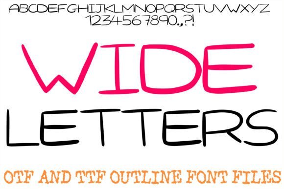
Wide Letters presents an airy display voice built from generous letter spacing and relaxed, hand-drawn terminals that read clearly at large sizes. Its minimalist, open shapes suit headlines, quote overlays, and lifestyle branding where an approachable, slow-paced aesthetic is desired, and it performs predictably across screens and print mockups.
The typeface plays nicely with condensed sans accents and subtle scripts, giving designers room to emphasize names or taglines without crowding. It’s especially effective on Instagram graphics, clean packaging, and modern stationery where ample leading preserves the calm, readable personality that defines the face.
╰┈➤ Download Wide Letters Font
My Recommendation: I’d use Wide Letters for projects that need a calm, human presence-personal blogs, boutique labels, or minimalist social feeds. Its wide proportions reduce visual clutter and make headings feel intentional. Try it when you want a relaxed, modern look with a handcrafted touch.
15. Blush Pearl Font
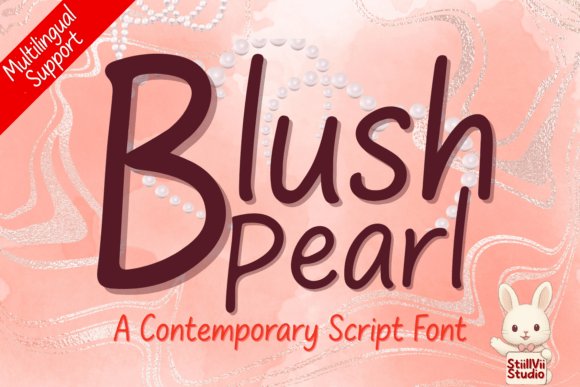
Blush Pearl is a contemporary script with smooth connecting strokes and controlled contrast that favors clarity over excess flourish. The glyphs remain legible at smaller sizes, which is a real benefit for luxury logos, product packaging, and bridal stationery where a refined signature must still read cleanly.
Contextual alternates and ligatures offer subtle variation without disrupting consistency, so the face adapts well to repeat elements like labels and RSVP cards. It responds particularly well to foil, embossing, and other tactile finishes; pair it with a neutral serif to anchor layouts or a simple sans for a modern, upscale look.
My Recommendation: I reach for Blush Pearl when a design needs a quiet, luxurious signature-think boutique perfume labels or intimate wedding stationery. Its neat letterforms print well in foil and hold up in digital headers. Use it when you want an elevated, feminine voice without heavy ornamentation.
16. Aulora
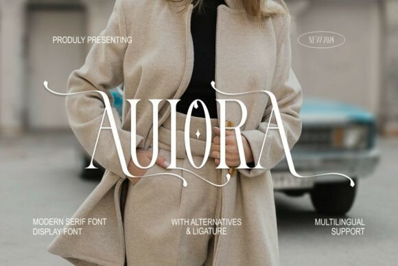
Aulora is a modern serif display whose high-contrast strokes and long, sweeping flourishes give every heading a theatrical, editorial feel. Those elongated terminals and diamond-shaped decorative elements make it particularly striking among Wedding invitation fonts, where ornamented capitals and extended swashes set a formal tone. It reads like custom lettering at large sizes, immediately attracting attention on covers, perfume labels, or luxury menus.
The family includes many alternates and ligatures so you can finesse letter pairs into almost calligraphic compositions without hand-drawing. Support for PUA encoding makes stylistic sets and decorative glyphs available inside standard layout apps. I find it works best when balanced with a restrained sans for body text, or as a standalone display face for cinematic titles and boutique identity work.
My Recommendation: I reach for Aulora when I want headlines with theatrical flair-wedding suite nameplates, fashion covers, or premium packaging where ornate capitals do the talking. Its alternates let me shape letter pairs into bespoke lockups quickly, and PUA support speeds delivery to clients. Pair it with a narrow sans for balance and reserve the longest swashes for names and titles rather than paragraph copy.
17. Lovitta
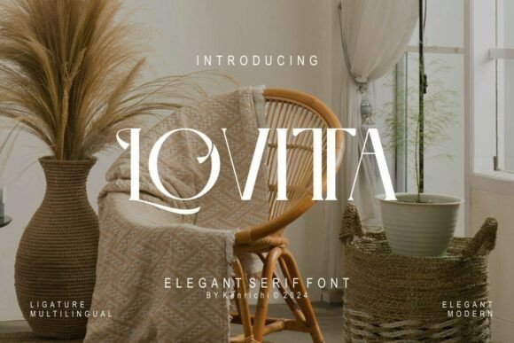
Lovitta blends classical serif proportions with pronounced contrast and flowing ligatures to produce a poised, upscale voice. Its serifs are crisp yet warm, which helps headlines feel formal but inviting-an attractive choice for boutique logos and premium labels. Multilingual characters broaden its reach for projects that need type to work across languages and markets.
PUA-encoded ornaments and alternate caps let you create monogram-like marks without hand lettering, and the decorative sets are easy to pick from within common design tools. Pair Lovitta with a geometric sans to keep layouts airy, or place it front-and-center for invitation suites and product tags where a refined serif should dominate. The face retains clarity at display sizes and gives packaging a polished, editorial edge.
My Recommendation: I use Lovitta on projects that call for an understated luxury-boutique branding, upscale product hang tags, and invitational materials that benefit from graceful ligatures. The accessible ornaments save time when crafting initials or seals, and its language support reduces the hassle for international work. It’s best when the serif handles the visual lead and a simple sans fills supporting roles.
18. Camogli
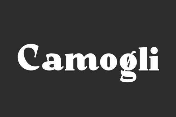
Camogli arrives as a matched serif and sans family, which opens thoughtful options for typographic hierarchy across print and web. The serif voice has a bold character softened by smooth curves, producing an air of classic elegance, while the sans provides a clear, modern counterpoint for captions and navigation. That balance makes it suitable for applications from wedding invitations to magazine covers and boutique signage.
Use the serif for logotypes, cover lines, or ceremony stationery where personality matters, then switch to the sans for body copy and small-format pieces to maintain legibility. The range of weights and open counters keeps letterforms readable at both large and small scales, so RSVP cards, labels, and posters all render cleanly. Mixing the two within a single system creates cohesion without feeling overly formal.
My Recommendation: Camogli is my pick when a unified identity needs both character and clarity-think editorial systems, venue signage, or coordinated wedding suites. Its matched serif-and-sans approach simplifies decisions about hierarchy and keeps visual tone consistent across print and digital. I usually use the serif for prominent names and the sans for supporting text so pieces feel related but not identical.
19. Cadera Font
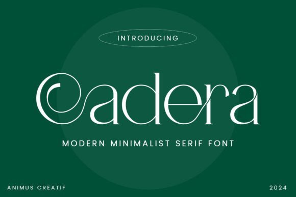
Cadera Font marries refined Roman proportions with bold modern gestures, offering a striking contrast between needle-thin hairlines and weighty stems that demands attention at display sizes. Its sweeping curves and liquid-like ligatures give letterforms a sculptural presence that works beautifully on textured paper and luxury print finishes. Among Wedding invitation fonts, Cadera provides a restrained glamour that reads editorial and personal at once, making names and venues feel deliberately styled.
Use Cadera for magazine covers, perfume labels, architectural marks, or minimalist wedding suites where long descenders and sharp serifs can frame photography and negative space. Pair it with a geometric sans for extended copy to preserve readability while the serif carries the personality; PUA encoding keeps alternates and decorative glyphs easily available for fine typographic control. Because of its high contrast, the type also performs well on high-resolution screens, so digital headers and invite PDFs retain the tactile drama of print.
My Recommendation: I reach for Cadera when I need a serif that reads luxurious without feeling historic. Its dramatic contrast and expressive ligatures let me craft arresting headlines and refined identity marks that register as premium at a glance. Ideal for jewelry, boutique hotels, editorial covers, and upscale wedding stationery where typographic character should take center stage.
20. Rough Stamp Display
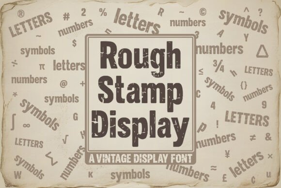
Rough Stamp Display channels the authentic imperfections of hand-stamped ink through intentional texture: ragged edges, tiny hairline cracks, and subtle ink-bleed that make each letter feel tactile and used. The distressing is carefully tuned so the font reads as handcrafted rather than sloppy, giving logos, posters, and badges a lived-in personality that suggests craft and provenance. These surface details reward larger display sizes where each blemish becomes a visible feature.
Pair Rough Stamp Display with a clean grotesque or humanist sans for menus, product labels, and rustic wedding invitations to create contrast between texture and clarity. In production, layered comps and multiply blending modes let paper or photographic backgrounds peek through the letterforms, while duotone color choices emphasize grit without sacrificing legibility. It’s also effective for apparel graphics and outdoor signage where a weathered aesthetic supports the story of the brand.
╰┈➤ Download Rough Stamp Display
My Recommendation: I pick Rough Stamp Display when a project needs honest, artisanal texture-think craft breweries, farmer’s markets, or small-batch packaging. The built-in weathering saves time in mockups and reads convincingly on textured stock or digital simulations. Use it when you want a brand voice that feels handmade rather than polished.
21. Deandra Font
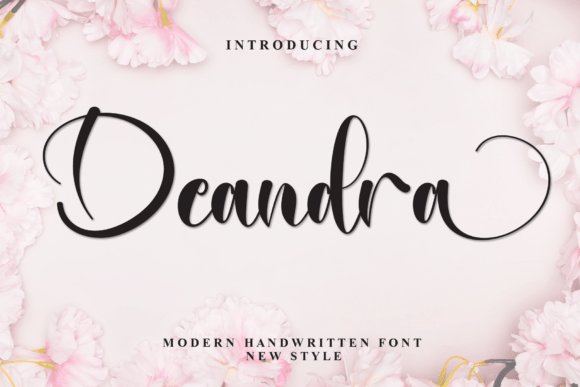
Deandra Font is a modern script with elongated connectors and a steady, rhythmic pen flow that balances elegance with legibility. Its measured stroke contrast and tasteful swashes allow for expressive headline work without collapsing into illegibility, making names and short phrases sing on stationery and hero imagery. The overall tone is refined and intimate, suitable for brands that want a handcrafted voice with editorial poise.
Combine Deandra with a restrained serif for ceremony programs, product tags, or romantic stationery to preserve hierarchy while adding a human touch. PUA-encoded alternates and swashes give quick access to stylistic variety, which helps when building bespoke nameplates or layered layouts. Wider tracking flatters title lines, while tightened spacing works well for compact labels and packaging accents.
My Recommendation: I choose Deandra when a project needs handwriting that feels intentional and readable across print and web. The swashes add personality without taking over, so I can craft boutique logos, bridal suites, and beauty packaging that feel bespoke. It’s especially useful for designers creating romantic stationery, boutique identity systems, or editorial accents that benefit from a warm, crafted script.
22. Monoright
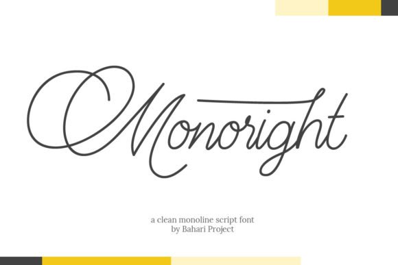
Monoright is a clean, delicate script that reads like a carefully penned signature, with thin hairlines and restrained terminals that keep the style refined rather than fussy. It suits short lines and display use particularly well and, as a benefit for designers working on Wedding invitation fonts, the PUA-encoded glyph set exposes plenty of swashes and alternates without hunting through feature panels. The overall rhythm is airy but deliberate, so names and headings maintain legibility even at reduced sizes.
This face works beautifully across foil, letterpress, and crisp digital printing; its straight-forward forms respond well to tactile finishes. Combine Monoright with a narrow sans or a modest serif to create contrast, and treat decorative alternates as accents – watch ascenders and swashes when setting stacked names so nothing collides. Test on your chosen paper stock to confirm how the fine strokes reproduce before committing to final printing.
My Recommendation: I reach for Monoright when a design needs a minimalist handwritten voice without heavy ornament. The PUA glyphs let me swap in elegant swashes fast, which is a huge time-saver when assembling invitation suites. Use it for contemporary wedding names, RSVP headers, and refined logo work where clarity matters.
23. Handwriting Font
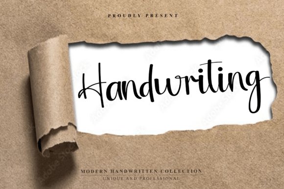
Handwriting captures the cadence of a refined pen stroke, blending organic rhythm with a composed, editorial feel that reads as both intimate and deliberate. The typeface carries subtle irregularities and ligatures that suggest a live hand without sacrificing clarity, making it ideal for signature-style logos and personalized stationery. Its temperate contrast sits comfortably across screen and print, retaining character at a variety of sizes.
Use this font where a human touch is desirable – fashion editorials, boutique branding, and social posts that need personality without clutter. Pair it with a compact serif or a simple grotesque to build hierarchy; reserve the script for names, accents, and short headlines so body copy remains readable. Test on textured papers and label stocks to see how the strokes interact with surface grain.
My Recommendation: I pick this Handwriting font when a project needs warmth and personality-think boutique branding, product hang tags, or intimate editorial covers. Its ligatures and slight stroke shifts create believable signatures that still work at scale. I usually use it sparingly for names and accents and pair it with a clean companion face for body text.
24. Junelys Ridge
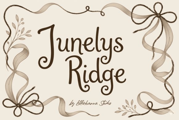
Junelys Ridge is a flowing script that mimics ink on paper, full of graceful spirals and balanced contrast that read like a practiced signature. The glyph set includes decorative swashes designed to frame names and invite lines rather than overwhelm them, so the face feels ornamental but controlled. Its letter spacing and stroke rhythm make it well suited to display use across printed suites and large-format work.
Reserve Junelys Ridge for wedding suites, boutique packaging, and premium collateral where flourish is part of the concept; pair it with a low-contrast serif or a quiet sans to keep long text readable. Make selective use of OpenType alternates to craft unique monograms, and avoid setting extended passages in the script-use it for headings, nameplates, and pull quotes where the form can breathe.
My Recommendation: I choose Junelys Ridge when a design calls for romantic, calligraphic flair without losing compositional control. Its swashes and alternates let me craft bespoke wordmarks and monograms that feel hand-made. It shines on ceremony programs, luxe invitations, and boutique branding where dramatic script can be given room to breathe.
25. Egalia Kokane Font
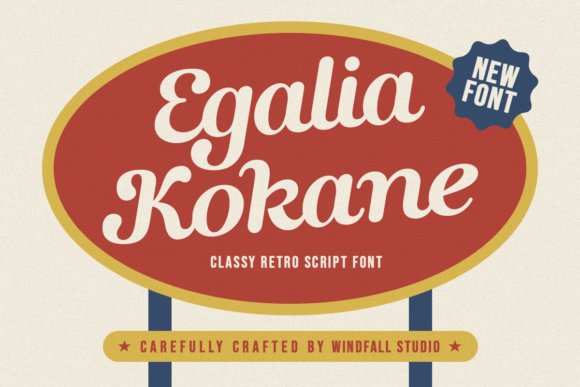
Egalia Kokane Font is a retro-inspired script that channels mid-century signage with hand-drawn flourishes and a confident slant. Its alternate characters, generous swashes, and discreet ligatures give headlines and monograms an expressive, crafted feel, ideal for vintage branding or romantic stationery. The typeface balances ornament with readability, making it a strong choice among Wedding invitation fonts when you want bespoke lettering that still reads clearly. Small caps and varied stroke endings add personality for RSVP cards, labels, and logo wordmarks.
On the technical side, Egalia Kokane ships as OpenType with stylistic sets, contextual alternates, and web-ready formats to manage kerning and letterspacing cleanly in print and online. It pairs well with a clean sans or a light serif to provide contrast, and holds up under specialty finishes like letterpress, foil stamping, and embossing because of its confident stroke weight. Best used at display sizes, the script’s vintage charm reads quickly while its handcrafted details remain visible. Designers will like how it injects character into minimalist layouts without overpowering supporting typography.
╰┈➤ Download Egalia Kokane Font
My Recommendation: I reach for Egalia Kokane when a brief calls for retro elegance and readable script. The built-in swashes and alternates let me craft distinctive monograms and invitation headers without tedious manual tweaks. I’d use it for vintage-themed weddings, boutique branding, and packaging where a nostalgic, hand-lettered voice makes the project feel personal and memorable.
These 25 selections cover a wide range of sensibilities-from intimate handwritten scripts to refined formal faces-so you can pick fonts that feel true to your celebration. Testing a few options in mockups or with a print sample will reveal how letterforms read at different sizes and on textured paper.
Use the pairing tips and usage notes here to finalize a cohesive stationery set, then run a small print proof before ordering full runs. Good typography is a subtle way to make the day feel intentional and well considered.