36 Elegant Simple Wedding Sans Serif Fonts to Create Clean Modern Invitations in 2026
Simple Wedding Sans Serif Fonts are the fastest way to give your stationery a clean, contemporary look without sacrificing warmth. This collection of 36 handpicked typefaces includes geometric, humanist, and rounded styles suited to invitations, programs, menus, and signage.
Whether you’re planning a minimalist ceremony, a modern city celebration, or a relaxed outdoor wedding, these sans typefaces offer readability and quiet sophistication. You’ll find pairing tips, weight recommendations, and usage notes to help combine them with scripts, serifs, or textured accents.
1. Simple Wedding Font
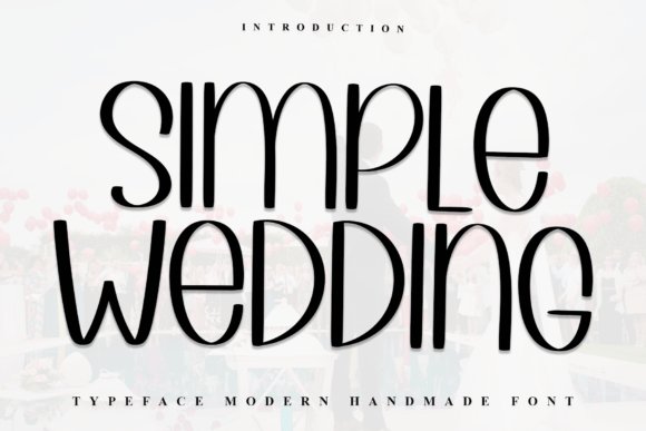
Simple Wedding feels modern yet approachable, its fluid strokes and gently rounded terminals giving a fresh, casual elegance that reads beautifully at display sizes. As one of the Simple Wedding Sans Serif Fonts, it conveys a warm, human touch without resorting to ornate flourishes, making it ideal for contemporary invitation suites, save-the-dates, and understated wedding collateral. The letterforms strike a calm balance between airy spacing and compact counters, producing excellent legibility across print and digital wedding assets.
Technically, Simple Wedding performs well in pairings: use a soft scripted nameplate or a delicate serif for accent, then let Simple Wedding handle addresses, timelines, and social tags for clarity. Its informal sophistication suits minimal wedding websites, signage, and RSVP cards where readability and personality both matter. Overall it’s a dependable, versatile sans that brings a relaxed but polished tone to small-format and large-format wedding design alike.
╰┈➤ Download Simple Wedding Font
My Recommendation: I’d reach for Simple Wedding when I want a wedding identity that feels friendly but refined-perfect for couples seeking a modern, intimate look. It’s especially useful for invitation suites and wedding websites where you need clear hierarchy without losing warmth. Use it alongside a light script for names to create a balanced, contemporary stationery system.
2. Cavier Dream Font
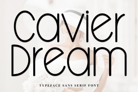
Cavier Dream is a sleek sans serif that leans into tall, narrow proportions and softly rounded terminals for a luxury-oriented aesthetic. Its slender stems and generous x-height produce a refined silhouette that reads like high-fashion typography, making it particularly effective for editorial spreads, couture branding, and upscale wedding materials. The overall effect is modern and poised, with an air of minimalist sophistication that elevates simple layouts.
In practice, Cavier Dream excels as a display face for headings, monograms, and chic venue signage where elegance is paramount. Pair it with textured paper or metallic foils to reinforce its premium quality, or use it in digital invites against muted photography to maintain legibility while projecting style. Its restrained personality makes it a go-to for designers aiming for polished, editorial wedding visuals.
╰┈➤ Download Cavier Dream Font
My Recommendation: I recommend Cavier Dream when you want a refined, fashion-forward voice for wedding branding or high-end invitations. It’s outstanding for headers, logos, and monochrome layouts where elegance matters more than whimsical charm. Combine it with a delicate script or soft serif to soften the formality and create a romantic, editorial feel.
3. Simple Handmade Font
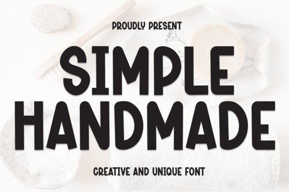
Simple Handmade brings a handcrafted, approachable energy to the sans serif world with slightly irregular strokes and rounded terminals that feel intentionally human. Its warm, informal character works wonderfully for intimate wedding elements-think escort cards, favor tags, and casual ceremony programs-where an artisanal vibe enhances the guest experience. Despite its hand-drawn spirit, the forms remain tidy enough for short passages and captioning on printed pieces.
Use Simple Handmade to inject personality into rustic, boho, or DIY wedding designs; it prints beautifully on textured stocks like kraft or cotton and marries well with botanical illustrations or stamped motifs. For hierarchy, reserve it for body text and small headers while pairing with a cleaner geometric sans for primary headlines to maintain clarity. The font’s charm makes it ideal for couples who want warmth and authenticity over formality.
╰┈➤ Download Simple Handmade Font
My Recommendation: I’d choose Simple Handmade for weddings that emphasize craft, intimacy, and tactile details-perfect for backyard celebrations or stationery made by hand. It adds character to menus, place cards, and thank-you notes without sacrificing readability. Pair it with neutral paper and natural embellishments for an inviting, personal aesthetic.
4. Simple Monoline Font
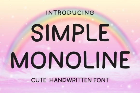
Simple Monoline presents a playful, friendly handwritten sans with even strokes and rounded terminals that lend a casual elegance to stationery. Its monoline construction keeps letterforms consistent and approachable, making it ideal for invitation design, planners, children’s projects, and – notably – it becomes a top choice among Simple Wedding Sans Serif Fonts because of its ability to feel intimate without being ornate.
Technically, Simple Monoline reads well at small sizes and remains crisp in print or on-screen; generous spacing and open counters improve legibility while alternates and soft ligatures add personality. Use it for DIY signage, social posts, RSVP cards or mood boards, and pair it with a delicate script or a neutral serif to create layered, modern layouts.
╰┈➤ Download Simple Monoline Font
My Recommendation: I’d reach for Simple Monoline when I want a relaxed, handcrafted look that still reads clearly across physical and digital pieces. It’s perfect for informal weddings, party stationery, and lifestyle blogs because it injects warmth without cluttering the design. I especially like pairing it with a thin serif or calligraphic script for contrast in invitations or mood imagery.
5. Simple Creative Font
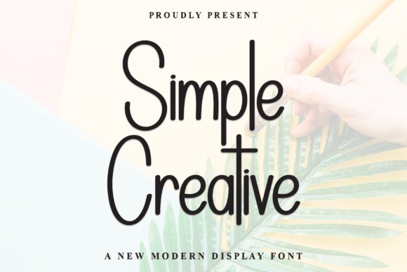
Simple Creative is a charming sans-serif that balances whimsical curves with tidy proportions, giving copy an approachable yet polished voice. Its friendly terminals and subtle quirks add hand-drawn warmth suited to celebratory cards, wedding suites, boutique branding, and social graphics that need personality without over-embellishment.
On the technical side, the letterforms maintain consistent x-height and comfortable kerning, so headlines feel airy and body text remains readable in digital and print formats. Designers will appreciate its versatility: it pairs elegantly with flowing scripts for invitations or with minimalist geometric shapes for modern identity work, and it adapts well as a webfont for cohesive cross-platform presence.
╰┈➤ Download Simple Creative Font
My Recommendation: I recommend Simple Creative when you want typography that feels bespoke but dependable – ideal for small brands, intimate stationery, and event collateral. It brings a handcrafted sensibility that’s still tidy enough for body copy and web use. Use it to soften modern layouts or to give handmade projects a refined, friendly voice.
6. Simple Chunky Font
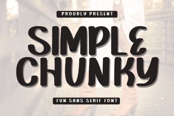
Simple Chunky is a minimalist, rounded sans with a bold, compact stance that commands attention without fuss. Its thick strokes and open counters make headlines and labels instantly legible, lending a contemporary, playful energy to greeting cards, packaging, merchandise, and modern invitation suites.
Because its forms are geometric and stable, Simple Chunky excels in tactile processes like letterpress or embossing and scales cleanly across signage and apparel. Pair it with a delicate script or light serif to introduce contrast, or use it solo for clean monograms, bold logos, and on-brand retail displays that need a friendly, modern voice.
╰┈➤ Download Simple Chunky Font
My Recommendation: I’d choose Simple Chunky when a design needs bold clarity and approachability – great for product labels, wedding signage with a modern edge, or standout social visuals. Its chunky proportions hold up in print and on fabric, making it practical for merchandise. It works best when balanced with a finer companion typeface to soften its strong personality.
7. Simple Flowers Font
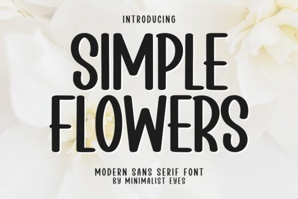
Simple Flowers Font is a cheerful, rounded sans serif with soft terminals and compact letterforms that feel both modern and friendly. Its playful rhythm and subtle irregularities make it perfect for casual wedding stationery, seasonal party invites, and lifestyle branding that needs a warm touch. Simple Flowers sits comfortably among Simple Wedding Sans Serif Fonts as a warm, approachable option for couples seeking an informal, charming typographic voice.
Despite its decorative name, the family remains remarkably legible at small sizes and reproduces cleanly across print and digital surfaces, making it ideal for RSVPs, place cards, and social graphics. Pair it with a delicate script for ornate headings or a neutral geometric sans for body copy to balance whimsy with clarity. I particularly like using its bouncy lowercase for kids’ events, floral-themed announcements, and any project that benefits from approachable personality.
╰┈➤ Download Simple Flowers Font
My Recommendation: I recommend Simple Flowers when you want typography that reads as intimate and playful instead of formal; its soft shapes add immediate warmth to invitations and event collateral. It shines for garden weddings, bridal showers, greeting cards, and seasonal promotions where friendliness matters as much as legibility. Use it to give small-scale projects and boutique brands an inviting, handcrafted mood without sacrificing clarity.
8. Sunday Morning Font
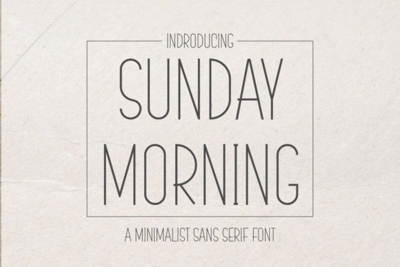
Sunday Morning Font embraces restraint with a clean, low-contrast sans serif designed for calm, minimalist compositions. The tall x-height and open counters deliver excellent legibility for wedding menus, modern invitation suites, and pared-back branding that favors generous negative space. Its neutral geometry projects quiet elegance while remaining unobtrusive alongside other decorative elements.
Offered in a straightforward range of weights, the typeface scales smoothly from small address blocks to large signage and merchandise imprinting like mugs and labels. Designers will appreciate pairing it with refined scripts or subtle serifs when a hint of warmth is needed. Use it in editorial layouts, product packaging, and online portfolios where clarity and a timeless aesthetic are essential.
╰┈➤ Download Sunday Morning Font
My Recommendation: I reach for Sunday Morning when a project requires minimal, timeless typography that won’t compete with imagery or ornate layouts. It’s a dependable choice for modern wedding suites, product labels, and lifestyle branding that needs a neutral, sophisticated voice. The font is especially useful for designers who want a versatile workhorse that performs reliably in both print and web contexts.
9. Luckywish Font
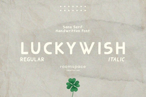
Luckywish Font blends the spontaneity of handwriting with the straightforward structure of a sans-serif to create a friendly, handcrafted voice. Its gently irregular terminals and subtle stroke modulation add character without compromising readability, which makes it well suited for boutique logos, intimate invitations, and heartfelt social posts. Alternate glyphs and ligatures provide creative flexibility while keeping word color consistent and polished.
Because Luckywish balances personality with functionality, it works equally well for posters, packaging, and short body text like captions and quotes. It prints crisply at display sizes and holds up on-screen for digital invites or branding sites. Designers seeking to infuse warmth and individuality into wedding suites or artisanal product identities will find its nuances especially valuable.
My Recommendation: I’d choose Luckywish when a project needs handcrafted charm without the intricacy of formal scripts; it brings approachable personality to logos, packaging, and intimate stationery. The available alternates and ligatures let you tailor the tone from playful to refined, ideal for small wedding brands or boutique product lines. It’s a versatile pick that reads clearly across print and digital, making it a reliable favorite for designer-driven briefs.
10. Altaria Miguel Font
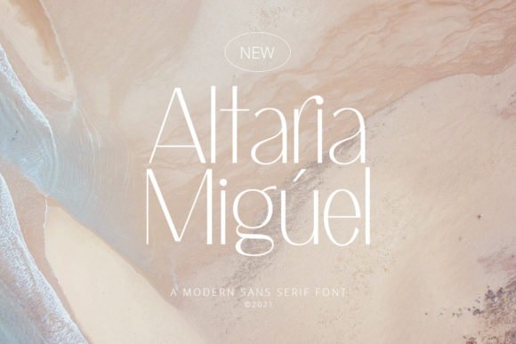
Altaria Miguel is a slender, thin-lined sans serif that reads as both delicate and contemporary; its fine strokes and lightly rounded terminals give typesetting a soft, intimate presence suited to ceremony stationery. Because of its understated charm and airy spacing, it makes an excellent pick among Simple Wedding Sans Serif Fonts for couples who want minimalist romance without ornate flourishes. The restrained forms look elegant on textured paper and vellum overlays, and they pair beautifully with soft metallic foils.
Technically, Altaria Miguel offers open counters and consistent stroke contrast that preserve legibility at invitation sizes, though the finest weights need careful printing to avoid ink gain. Use it with a flowing script for names or a heavier sans for section headings to build hierarchy; slight tracking increases enhance its dainty personality while tighter kerning suits initials and monograms. It’s a graceful choice for RSVP cards, programs, and delicate envelope addressing where a tender, modern mood is desired.
╰┈➤ Download Altaria Miguel Font
My Recommendation: I’d reach for Altaria Miguel when I want a wedding suite that feels intimate yet modern-its thin, joyful letterforms deliver romance without cliché. It’s ideal for minimalist or botanical themes and works especially well with foil, embossing, or translucent paper. Pairing it with a soft script for names and a bolder sans for headings yields a refined, balanced design.
11. Tresmone Font
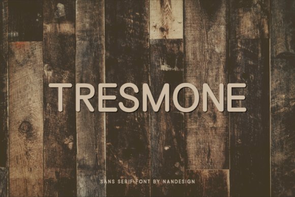
Tresmone is a crisp, neutral sans serif defined by balanced proportions and a clear x-height, designed to perform across logos, signage, and printed materials without calling attention to itself. Its even stroke weight and polite terminals give it a contemporary, approachable tone that suits modern wedding collateral-from menus and programs to event signage and web invites. Small details in the letterforms add personality, allowing Tresmone to feel bespoke while remaining highly versatile.
In practical use, Tresmone excels at creating consistent typographic systems: it’s sturdy at large display sizes and holds fine detail on textured stocks, while medium weights keep body copy readable. Consider pairing it with a hand-lettered script for guest names or using condensed styles for tight layout needs; adjusting tracking slightly improves long lines on rustic papers. For couples pursuing minimalist, Scandinavian, or modern-vintage aesthetics, Tresmone provides dependable clarity and elegance throughout a suite.
My Recommendation: I pick Tresmone when a wedding project needs dependable, unobtrusive typography that reads well across formats. Its neutrality makes it a great backbone for identity work, signage, and printed programs. Use it with hand-lettered accents or subtle color palettes when you want the type to support imagery rather than compete with it.
12. Reverie Font
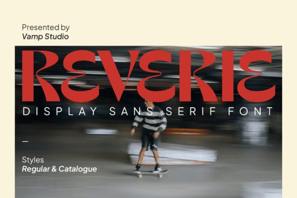
Reverie is a modern elegant sans serif that blends geometric structure with humanist warmth, yielding a refined voice for upscale wedding branding and stationery. Its generous counters and moderate stroke contrast give copy an approachable, polished feel that elevates save-the-dates, invitations, and packaging without relying on decorative motifs. The typeface’s subtle character distinctions – slightly tapered strokes and open apertures – communicate sophistication while remaining remarkably readable.
When applied, Reverie creates strong typographic hierarchy: use heavier weights for names and lighter cuts for event details to craft a calm, luxurious layout; pair with a slender script for signatures or accents to introduce softness. It reproduces cleanly in foil, emboss, and digital proofs, and supports extended language sets for destination invitations. For boutique stationery projects and premium monogram systems, Reverie offers a modern, polished alternative to more ornate choices.
My Recommendation: I would use Reverie for high-end wedding collateral where contemporary refinement matters-its balance of structure and warmth suits luxury invitations, monograms, and packaging. It pairs exceptionally well with tactile finishes like foil stamping and textured stocks. Choose Reverie when you want typography that feels both modern and gracious.
13. Monogram Font
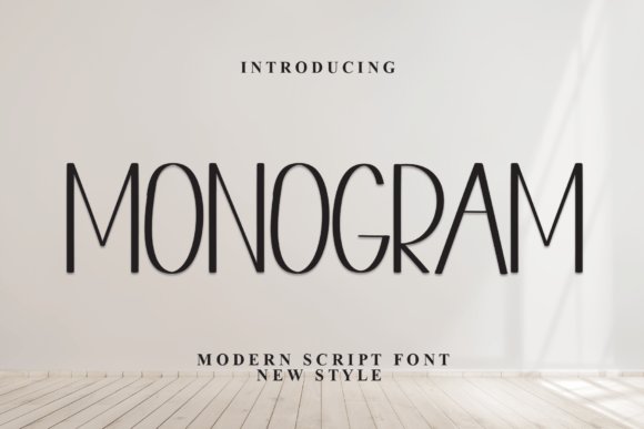
Monogram Font’s rounded terminals and gentle proportions make it feel both playful and refined, lending stationery an intimate, handcrafted warmth. Its open counters and moderate x-height keep text airy on invitations, escort cards, and small-format RSVP cards. Because of its approachable personality, Monogram sits well alongside cursive scripts or delicate floral ornaments to create balanced, romantic layouts. For editors curating Simple Wedding Sans Serif Fonts, Monogram stands out when couples want an unfussy modern-meets-vintage voice.
Beyond paper goods, Monogram scales cleanly for signage and web announcements, preserving legibility at tiny sizes while retaining character when used large. Try it in soft pastels, matte inks, or metallic foils on textured cotton stock to emphasize its cozy charm and tactile appeal. Its versatility makes it a dependable choice when you want understated friendliness without sacrificing elegance.
My Recommendation: I’d reach for Monogram when designing casual or rustic-chic wedding suites because its warm, approachable shapes read beautifully on natural papers and chalkboard signs. It pairs especially well with flowing scripts or thin serifs to add contrast without clutter. Use it for save-the-dates, ceremony programs, and table numbers when you want something personable and highly readable.
14. Dextrous Font
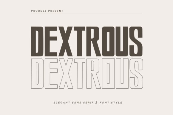
Dextrous Font presents a poised, minimalist aesthetic with crisp strokes and generous spacing-ideal for couples aiming for contemporary elegance. Its geometric structure gives headlines and logo marks a high-end feel while remaining remarkably legible for envelope addressing and invitation bodies. Subtle terminal tapering injects a touch of warmth so the overall tone stays modern rather than clinical. Lean on Dextrous to craft a cohesive wedding identity that reads clean and editorial across print and online touchpoints.
Use Dextrous in uppercase pairings for bold save-the-date banners or in mixed weights for layered signage that reads clearly from a distance. It harmonizes particularly well with neutral palettes, ample white space, and high-contrast photography to evoke a minimalist luxury sensibility. This font is a strong choice when typography must convey refinement without ornamentation.
My Recommendation: I recommend Dextrous for refined, modern wedding branding because its clarity and restraint elevate simple layouts into luxe statements. It’s perfect for city venues, boutique events, or editorial-style stationery where type carries the visual weight. I often pair it with a soft script or a delicate serif to introduce personality while maintaining a clean aesthetic.
15. Simple Days Font
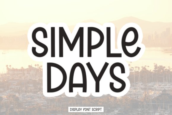
Simple Days Font blends a casual handwritten spirit with the structure of a sans serif, producing designs that feel intimate yet tidy. Slight irregularities in stroke width and gentle ascenders give it a human touch that suits thank-you cards, quote prints, and boutique logos without appearing messy. On invitations it creates an approachable tone that complements garden ceremonies, intimate elopements, and lifestyle-focused stationery. The face shines when combined with organic textures like cotton paper, watercolor washes, or kraft envelopes.
Because Simple Days balances playfulness with restraint, it reads well at display sizes and holds up for short blocks of copy such as venue details or taglines. Try pairing it with a minimal serif for contrast or layering it over soft photography to enhance its artisanal vibe. Choose this font when you want typography that feels handcrafted while remaining neat and organized.
My Recommendation: I’d choose Simple Days for projects that need a personable, down-to-earth look-think handmade favors, casual celebration invites, or boutique stationery lines. Its handcrafted aura works best on tactile papers and informal layouts, lending designs an intimate, editorial quality. I often use it when clients want warmth and authenticity without sacrificing clarity.
16. Simple Water Melon Font
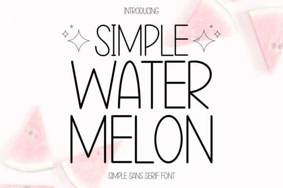
Simple Water Melon is a warm, handwritten-style sans serif that balances playful charm with clear readability-rounded terminals, a generous x‑height, and slightly irregular strokes give it a handcrafted personality without sacrificing polish. As a natural pick among Simple Wedding Sans Serif Fonts, it brings a personal, joyful tone to RSVP cards, casual invitations and signage for seasonal events and intimate celebrations. The character set feels hand-lettered yet stable, performing well at headline sizes and in small digital UI elements thanks to thoughtful spacing and moderate kerning.
Use it as a title face paired with a slender script or a classic serif to create lively contrast; its alternates and subtle quirks lend themselves to craft-style stationery, diary planners, and kids’ projects. It adapts beautifully to textured papers and matte finishes but is best used sparingly for body text to preserve its airy, friendly vibe. Ideal for party decor, social posts, and any project that needs a charming, personable sans look.
╰┈➤ Download Simple Water Melon Font
My Recommendation: I reach for Simple Water Melon when I want designs to feel hand-crafted and welcoming-its friendly letterforms make wedding invites, holiday cards, and kids’ products pop with personality. It’s especially useful for small-scale print where warmth matters more than rigid formality. Pairing it with a thin script or muted serif gives instant contrast and keeps layouts feeling intentional.
17. Simple Notes Font
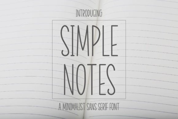
Simple Notes is a tidy, minimalist sans serif built for clarity and understated style-clean strokes, open counters, and regular proportions deliver a neutral, modern voice that supports imagery without competing. The compact rhythm and unobtrusive letter shapes make it excellent for punchy headlines, gift tags, and short-form text on mugs or packaging where instant legibility is key. Its restrained geometry reads contemporary while remaining approachable, lending a subtle personality to everyday designs.
Because of its calm letterforms, Simple Notes pairs effortlessly with expressive scripts or textured backgrounds to add warmth for wedding stationery, greeting cards, and social media graphics. It shines in narrow layouts, product labels, and digital mockups and scales gracefully from print to web. Choose it when you need a dependable, elegant base that lets photography and ornamentation take center stage.
╰┈➤ Download Simple Notes Font
My Recommendation: I use Simple Notes when a project needs quiet confidence-labels, gift cards, and branded merch gain clarity without typographic fuss. Its neutrality makes it perfect for wedding programs or minimalist packaging where the type should support rather than shout. For restrained, modern work that values readability, it’s a go-to option.
18. Simple Tumbler Font
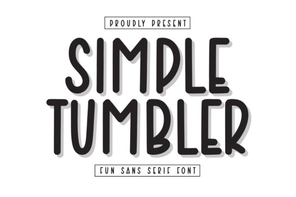
Simple Tumbler is a crisp, monoline sans serif designed with small-format reproduction in mind; slightly condensed proportions and consistent stroke weight maximize legibility on curved surfaces and compact labels. The subtle rounded corners and steady spacing make it especially reliable for laser engraving, tumbler decals, and apparel tags where clarity at reduced sizes is crucial. Its contemporary, utilitarian aesthetic reads professional while still feeling uncluttered.
Deploy it alone for minimalist packaging and modern identity work, or combine it with a flowing script for refined invitation suites and product badges. It performs well in single-color print and on textured substrates, and its predictable rhythm simplifies alignment in tight layouts. Opt for Simple Tumbler when you need a practical sans with a clean, stylish presence for merchandise and collateral.
╰┈➤ Download Simple Tumbler Font
My Recommendation: Simple Tumbler is my first choice for merchandise and packaging mockups because it prints and engraves cleanly at tiny sizes and on curved items. It brings a sleek, modern look to tumbler decals, labels, and streamlined invitation suites while solving space constraints. Use it when functionality and contemporary style must go hand in hand.
19. Simple Antumn Font – Simple Wedding Sans Serif Fonts
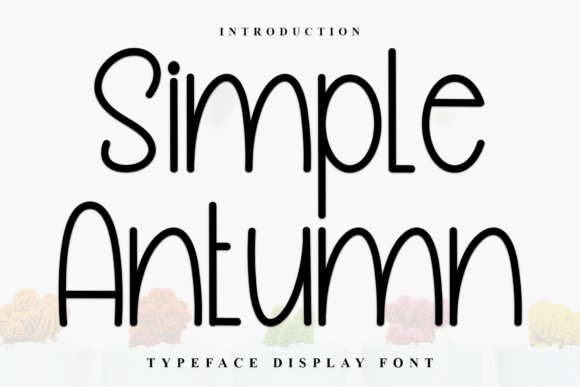
Simple Antumn is a handcrafted sans serif with soft terminals and refined strokes that create an inviting, natural presence on both screen and paper. Its measured letterforms and gentle contrast make it exceptionally readable at invitation sizes while retaining an artisanal, modern simplicity that pairs well with minimalist wedding layouts and luxury branding. Simple Wedding Sans Serif Fonts enthusiasts will appreciate how this design balances warmth and restraint for elegant, contemporary stationery.
The font’s versatility shines across banners, YouTube thumbnails, logos, clothing mockups and especially wedding stationery where clean typography is key; subtle alternates and tidy spacing allow crisp foil-stamping and embossing. For best results, pair Simple Antumn with a flowing script for names or with a thin geometric sans for RSVP details to preserve hierarchy and keep designs feeling fresh yet timeless.
╰┈➤ Download Simple Antumn Font – Simple Wedding Sans Serif Fonts
My Recommendation: I’d reach for Simple Antumn when I want a wedding piece that feels handcrafted without looking fussy. Its smooth strokes give a comforting, modern look that prints beautifully and photographs cleanly for socials. Use it on invites, menus, or brand monograms where a restrained, approachable sans serif is needed.
20. Broadway Flower Font
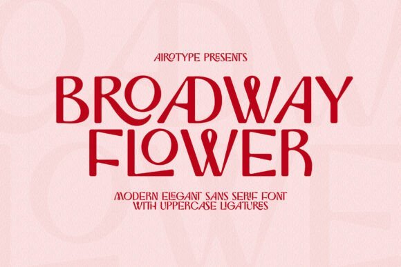
Broadway Flower blends contemporary luxury with playful detail, offering a bright, streamlined sans serif voice enlivened by selective ligatures in the uppercase set. Those stylistic options let designers craft bespoke letter combinations-perfect for monograms, boutique logos, and chic wedding headers that need personality without ornament overload. The font’s clean rhythm keeps headlines legible while adding just enough flair to feel premium.
Built with modern projects in mind, Broadway Flower adapts smoothly from posters and branding to photography overlays and sticker art; its simple, stylish presence complements both minimalist and decorative templates. Try pairing it with textured papers or subtle metallics to amplify its upscale vibe, or use the uppercase ligatures to form distinctive wordmarks for editorial and event identity work.
╰┈➤ Download Broadway Flower Font
My Recommendation: I’d choose Broadway Flower when a project calls for a contemporary, upscale sans serif that still has character. Its uppercase ligatures are a creative edge for logos and wedding headers, making branding feel bespoke. Use it when you want clean readability plus a hint of decorative attitude-ideal for boutique stationery and lifestyle brands.
21. Normies Font
Normies is a textured sans serif that brings an organic, lived-in texture to otherwise minimal layouts, creating warmth without sacrificing clarity. The grainy surface of each glyph reads as authentic and tactile, making it an excellent choice for watermarks on photography, rustic wedding signage, and packaging where an artisanal impression is desired. Its balanced proportions preserve legibility even when texture is present, so headings remain crisp across print and digital uses.
Because of its distinctive surface, Normies works best as a display face-think labels, invitations, and event collateral where personality matters more than long paragraphs. Match it with simple iconography or clean geometric shapes to emphasize contrast, and favor single-color runs or subtle spot inks to let the texture communicate craft rather than clutter the layout.
My Recommendation: I recommend Normies when a project needs hand-crafted authenticity-especially for boho weddings, craft product packaging, or photo overlays. Its textured strokes give designs a tactile feeling that feels personal and handmade. Use it in titles and badges where the texture can shine without compromising readability.
22. Christmas Lolipop Font
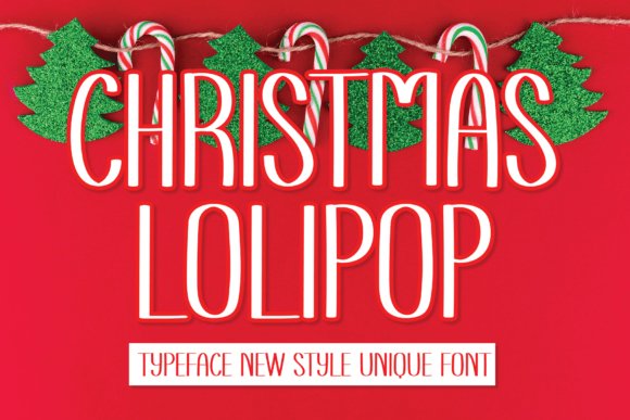
Christmas Lolipop is a pared-back, modern sans serif with open counters and a friendly geometric rhythm that suits refined wedding stationery. As part of a curated group of Simple Wedding Sans Serif Fonts, its clean letterforms make it ideal for contemporary invitation suites, elegant signage, and crisp social media announcements where legibility and a subtle festive personality are both required.
The typeface reads reliably at small sizes and scales well for large-format displays, thanks to balanced spacing and clear stroke contrast; it pairs beautifully with thin scripts or light serifs to create contrast without clutter. Use it for place cards, product packaging, or minimalist save-the-date layouts when you want modern typography that feels approachable yet polished.
╰┈➤ Download Christmas Lolipop Font
My Recommendation: I’d reach for Christmas Lolipop when creating modern wedding invitations that need a dash of cheer without fuss. Its readability and unobtrusive character shapes make it perfect for multitext applications-from RSVP cards to on-site signage. It’s especially good when you want a clean, contemporary look that still feels personable and warm.
23. Matthesia Font
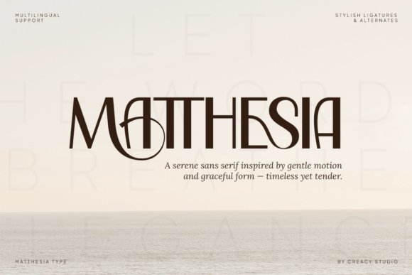
Matthesia blends tall, elegant proportions with a collection of decorative alternates and inventive ligatures that add flair to display typography. Its nuanced glyph set and PUA-encoded swashes offer designers the freedom to craft bespoke headings, logos, and editorial covers where a touch of couture-like personality is desirable.
This face excels as a focal type for branding, fashion packaging, or wedding signage that needs to feel curated rather than generic; use its alternates sparingly to highlight initials or title words. Pair Matthesia with a simple, neutral body font to maintain readability while showcasing its artisanal letterforms in headlines and logotypes.
My Recommendation: I recommend Matthesia for projects that demand a refined, fashion-forward voice-boutique brands, luxury stationery, and upscale wedding collateral. Its swashes and ligatures let you create distinctive wordmarks and title treatments without custom lettering work. Use it where personality and craftsmanship are priorities, keeping long text in a plainer companion face.
24. January Font
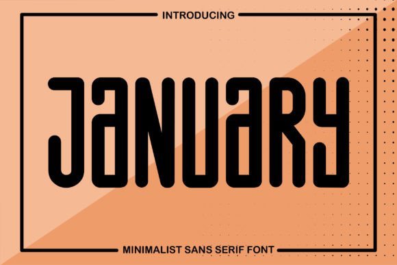
January is a minimalist sans serif built around clean strokes and generous spacing, giving designs a calm, contemporary presence. Its restrained forms lend themselves to modern wedding typography and stationery where a quiet, polished tone is required, balancing charming simplicity with dependable readability.
The font works especially well for RSVP cards, menus, and bridal websites, translating smoothly between print and digital formats without losing clarity. Combine January with a flowing script for contrast or use it solo for an ultra-modern invitation suite that emphasizes whitespace and understated elegance.
My Recommendation: I’d choose January when the brief calls for a minimal, sophisticated aesthetic-think Scandinavian-inspired weddings or clean brand identities. Its subtle character makes it flexible across applications, from tiny gift tags to website headers. It’s ideal for designers seeking a no-nonsense, elegant sans that won’t compete with other decorative elements.
25. Reverie Font

Reverie arrives as a modern, elegant sans serif with an airy, understated voice that reads beautifully at display sizes and on printed invitation stock. Its generous x‑height and soft terminals create calm, approachable letterforms that sit harmoniously alongside delicate scripts and minimal ornamentation-making it one of the strongest choices among Simple Wedding Sans Serif Fonts for couples who want a contemporary yet timeless suite.
The typeface’s even stroke contrast and careful kerning give it reliable legibility across RSVP cards, envelopes, signage and website headers; subtle alternate characters help prevent visual monotony in long names or venue details. Use Reverie in medium to bold weights for headlines and pair with a light script or calligraphic flourish to balance structure with romance in branding, packaging and stationery systems.
My Recommendation: I’d reach for Reverie when I need a refined, modern backbone for a wedding identity-its neutrality lets decorative scripts shine while still carrying the main text with confidence. It’s especially useful for couples aiming for a minimalist-chic invitation suite, signage, or photographer watermarks where clarity and style must coexist. The font’s restrained personality makes it adaptable across print and digital wedding materials without feeling trendy.
26. Bulgare Font
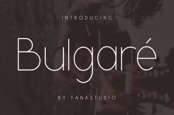
Bulgare channels the clarity of iconic logotypes into a simple, measured sans serif designed for high-impact headlines and signature marks. Its crisp geometry and confident proportions give headline copy a refined, editorial feel that translates well to wedding invitations, labels, and hospitality branding where a polished, modern impression matters.
Distinctive terminals and deliberate letterspacing make Bulgare a strong candidate for monogram-style logos and nameplates, while its minimal ornamentation keeps printed stationery clean and readable. Try using tight tracking for single-line logos and wider spacing for invitation headers to exploit its architectural rhythm across suites and product packaging.
My Recommendation: I recommend Bulgare when you want a font that evokes luxury without fuss-perfect for couples and boutique wedding vendors seeking a contemporary, logo-forward identity. It shines on signage, custom stamps, and minimalist invitations where strong typographic presence is key. Use it when you need a typeface that reads as intentional and upscale but remains versatile for both digital and printed materials.
27. Ellement Font
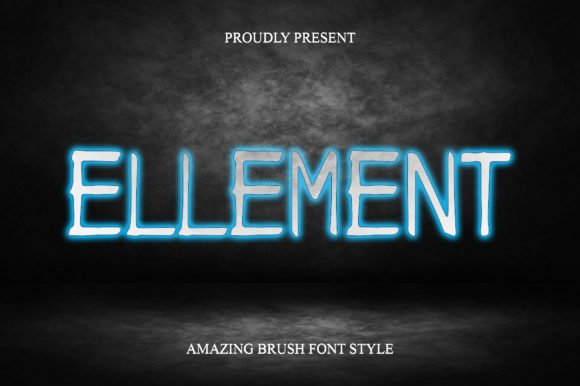
Ellement is a clean, pared-back sans serif that emphasizes open counters and a friendly rhythm, making it highly legible for long names and event details on wedding stationery. Its neutral temperament blends seamlessly with decorative elements and photo-led layouts, offering a quietly modern option for designers creating cohesive invitation suites and event collateral.
The font’s balanced weight distribution and simple terminals support consistent hierarchy across banners, save‑the‑dates, and program pages; it also adapts well to on-screen RSVP forms where clarity is essential. Pair Ellement with a soft calligraphic accent or a thin geometric rule to add warmth without compromising its minimalist aesthetic.
My Recommendation: I’d choose Ellement for projects that demand clarity and ease of use-its simplicity makes it a reliable workhorse across both print invitations and wedding websites. It’s ideal for designers building modular invitation systems or vendors creating templated stationery because it scales cleanly and pairs beautifully with more ornate scripts. Use Ellement when the goal is understated elegance and consistent readability.
28. Easy Font
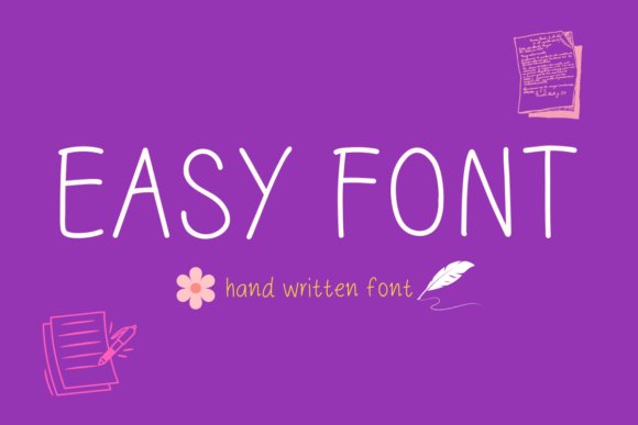
Easy is a playful, friendly handwritten sans serif with rounded terminals and an open, high x‑height that keeps letterforms legible even at small sizes. Its organic strokes feel handcrafted without losing the clean spacing of a sans family, making it a versatile pick for kids’ products, casual branding, planners, and cheerful social media graphics.
For wedding stationery it brings a relaxed, intimate mood that balances modern minimalism and hand-lettered charm; it sits comfortably among Simple Wedding Sans Serif Fonts when you want something approachable rather than formal. Pair Easy with a fine-lined serif or delicate script for RSVP cards and table signs to create contrast while maintaining a DIY, modern wedding aesthetic.
My Recommendation: I’d reach for Easy when the brief calls for warmth and personality – think backyard weddings, kids’ parties, and lifestyle brands that need a human touch. Its legible handwritten shapes print beautifully on textured stock and stay readable on screens, so it’s a reliable choice across formats. Use it when you want invitations or packaging that feel handmade but still composed.
29. Simple Unique Font
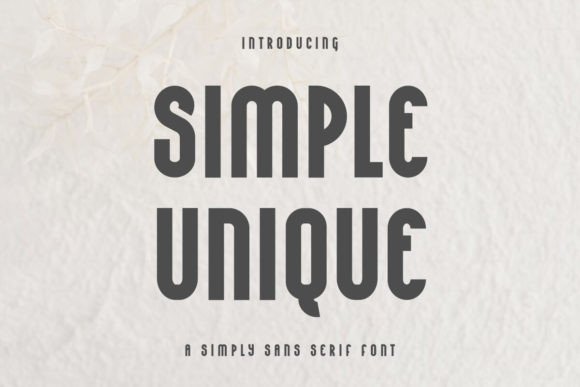
Simple Unique is a restrained modern sans serif built around geometric proportions and subtle humanist details, giving it a clean, contemporary voice. The even stroke contrast and neutral terminals make it highly legible for labels, packaging, and body copy while its refined shapes work well at larger display sizes for headlines and signage.
Because of its understated personality it’s a smart choice for minimalist wedding stationery and boutique branding where clarity is key; use it for ceremony programs, signage, or digital invites alongside a delicate script accent to add warmth. The font’s adaptability across print and web makes it a dependable workhorse for designers who want a single typeface to carry a brand coherently from tags to large-format prints.
╰┈➤ Download Simple Unique Font
My Recommendation: I recommend Simple Unique when you need a multipurpose sans that reads cleanly across sizes and media – perfect for modern wedding suites, product labels, and editorial projects. Its neutral tone supports accents like calligraphy or metallic foils without competing for attention. Pick this for contemporary, minimalist designs where simplicity equals sophistication.
30. Simple Work Font
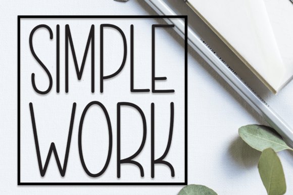
Simple Work refines contemporary sans tendencies into a sleek display family with crisp terminals, tall proportions, and a steady rhythm that excels in signage and editorial layouts. The letterforms feel purposeful and architectural, offering strong presence for logos, posters, and product packaging where a polished, professional voice is required.
On wedding materials it shines when you want a minimal, editorial look-think bold ceremony headers, modern programs, and clean reception signage-paired with soft textures or script accents to add romance without ornament. Its clarity at scale and strong watermark potential make it a reliable choice for photographers and brands seeking a confident, modern aesthetic.
My Recommendation: I’d choose Simple Work for projects demanding a refined, contemporary aesthetic – corporate wedding suites, gallery signage, or premium product labels. It offers clear hierarchy and excellent legibility in both print and large-format displays. Use it when you want typography that reads sophisticated and intentional without frills.
31. Simple Laser Font
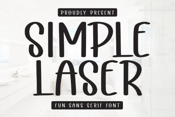
Simple Laser refines minimalism into a friendly, slightly rounded sans serif with a hand-drawn sensibility that reads charmingly across small-format stationery and merchandise. Its narrow strokes and generous counters make it ideal for RSVP cards, favor tags, mugs, and tees, while retaining clarity in captioned photos and labels. For designers assembling Simple Wedding Sans Serif Fonts collections, Simple Laser offers a delicate, modern option that feels personal without sacrificing legibility.
Supplied in common desktop and webfont formats, Simple Laser typically ships as a single clean weight with crisp terminals and open apertures that hold up in print and on screen. Increase tracking for display uses to emphasize airy elegance, or pair it with a flowing script for romantic contrast; it also suits foil and stamp work because its simple shapes emboss cleanly. The restrained personality prevents visual clutter, giving suites a handcrafted, approachable tone.
╰┈➤ Download Simple Laser Font
My Recommendation: I’d reach for Simple Laser when I want a minimalist sans that still feels handmade-perfect for intimate wedding invites, favor labels, and branded gifts. Its clarity at small sizes and soft letterforms make it easy to pair with scripts or decorative ornaments. Use it when the brief calls for simplicity with a touch of charm.
32. Simple Journal Font
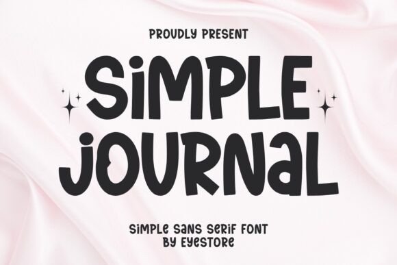
Simple Journal is a confident, modern sans serif with a compact x-height and steady stroke contrast that commands attention in logos and headlines. Its bold character translates well to signage, social banners, and invitation headers where presence and readability matter. Built on clean geometry, it offers a contemporary, editorial tone that balances professional polish with accessible warmth.
Because of its assertive forms, Simple Journal excels in branding systems where scale and hierarchy are paramount; think save-the-date cards, bold RSVP stamps, or minimalist wedding suites paired with a slender script. The font holds up for large-format printing and adapts cleanly to reversed colorways on dark cardstock, and small tracking tweaks eliminate crowding in all-caps treatments. Use its strength to anchor layouts that need a clear, modern focal point without fuss.
╰┈➤ Download Simple Journal Font
My Recommendation: I recommend Simple Journal when a wedding or brand needs strong typographic presence-its boldness gives headings and monograms instant gravitas. It’s ideal for modern couples wanting a clean, editorial look across stationery and social media assets. Pair it with a delicate script to soften headlines while retaining clarity.
33. Astreon Font
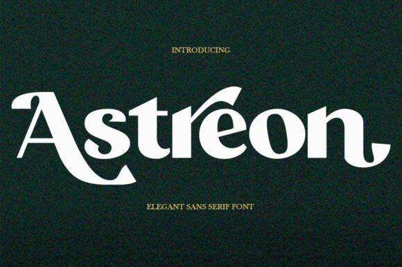
Astreon blends smooth geometry with subtly tapered strokes to create a refined, feminine sans that reads as both modern and romantic. Its open counters and moderate contrast make it equally comfortable in long-form text for programs and menus or as a display face for names and monograms. The type feels quietly glamorous without excess ornamentation, making it a strong choice for fashion-forward stationery and upscale packaging alike.
Use Astreon as a neutral partner for decorative scripts or metallic embellishments; medium weights work beautifully for body copy while semibold serves as a graceful header. The face is well-kerned out of the box and reproduces reliably in letterpress, foil, and digital, which makes it versatile for mixed-media wedding projects. Designers seeking an elegant, readable type that bridges editorial and bridal styles will find it especially useful.
My Recommendation: I would choose Astreon for projects that need understated glamour-think luxury invitations, bridal lookbooks, and boutique labels. Its blend of legibility and chic character makes it an excellent bridge between classic and contemporary layouts. It’s my go-to when clients want elegance without ornamentation.
34. Qedysans Font
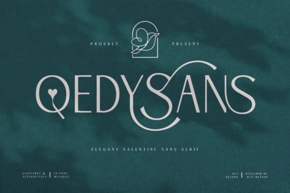
Qedysans blends minimalist geometry with delicate romantic details, creating a clean yet emotive sans serif that works beautifully across wedding collateral. As a considered addition to Simple Wedding Sans Serif Fonts, it reads equally well in body copy and header sizes, bringing a soft elegance to invitations, programs, menus, and venue signage.
The family is PUA-encoded, so decorative glyphs and swashes are simple to access for subtle flourish without patching in separate scripts; careful spacing and open counters preserve legibility at small sizes. Qedysans pairs especially well with light scripts or restrained serif faces, giving designers flexible typographic options for both digital announcements and premium print stationery.
My Recommendation: I’d reach for Qedysans when I want a refined, modern wedding look with a romantic undertone. Its PUA-encoded swashes let me add decorative touches quickly, and its neutrality makes it reliable across print and web. Use it for upscale invitations, signage, or any minimalist stationery that needs a gentle, elegant voice.
35. Weuhate Font
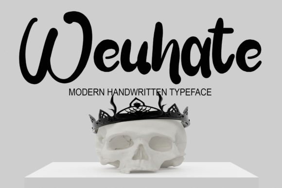
Weuhate is a hand-rendered sans created on a tablet, offering a deliberately simple, human touch that feels casual yet polished. The strokes are clean and purposeful, giving this face a signature-like quality that enhances invites, intimate branding, and editorial overlays without overpowering the layout.
Because its forms are compact and well-kerned, Weuhate performs nicely at small sizes on business cards and thank-you notes while staying expressive at larger scales for posters or social media. The font’s organic rhythm makes it an excellent companion to soft script accents or subtle geometric sans types for balanced, approachable wedding or lifestyle projects.
My Recommendation: I recommend Weuhate when a project calls for warmth and personality without fuss. Its handcrafted feel injects friendliness into minimal layouts, and its clarity keeps practical legibility intact. Use it for personalized stationery, boutique branding, or social posts where authenticity matters more than formality.
36. Lagande Font
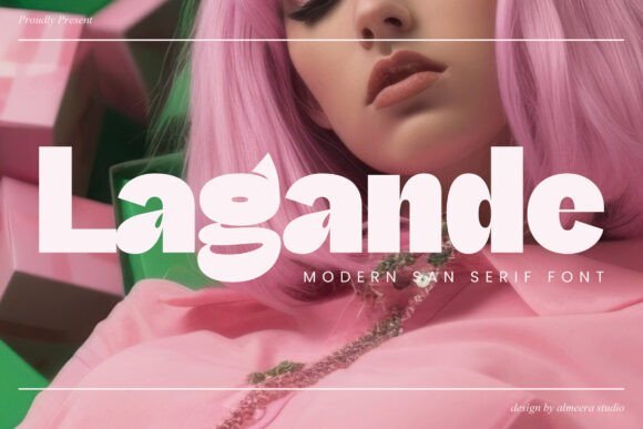
Lagande is a modern display sans with a streamlined, understated profile designed for versatile branding and refined editorial work. Its simplicity makes it an excellent choice for contemporary wedding suites, product labels, social banners, and photography watermarks where restraint and clarity are key.
The letterforms feature balanced proportions and generous x-height, which improve readability across screens and print; subtle terminals and consistent stroke weight allow confident use in logos and signage. Pair Lagande with a textured paper or a delicate script to introduce contrast, or use it alone for sleek, architectural stationery and packaging systems.
My Recommendation: I’d pick Lagande for projects that need a modern, no-nonsense aesthetic with strong utility-think boutique stationery, minimal wedding suites, and clean brand systems. Its neutral temperament makes pairing effortless, and its screen-friendly shapes ensure consistency across devices. Use it when you want a contemporary, polished look without fuss.
Choosing from these 36 Elegant Simple Wedding Sans Serif Fonts makes it easy to craft cohesive, modern wedding materials that read beautifully in print and on screen. Use the suggested pairings and weight choices to match your venue, tone, and invitation layout.
Start by testing two favorites on a sample invitation and check legibility at different sizes. Save this guide as you finalize RSVPs, signage, and day-of prints to keep your wedding typography consistent and stylish in 2026.