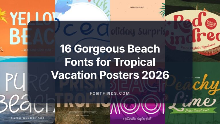
24 Sunny Summer Logo Font Ideas for Beachwear Labels in 2026
Summer logo font choices set the mood long before any other design element does. A well-picked typeface can read airy and relaxed, sun-faded and nostalgic, or crisp and beach-ready within seconds.
This article walks through the full collection of 24 curated typefaces imported from a high-quality database, with quick notes on mood, pairing ideas, and best-fit uses like beachwear labels, café menus, and festival posters.
1. Summer Fresh
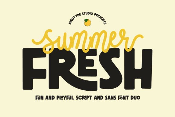
As a Summer logo font Summer Fresh pairs a bouncy monoline script with a chunky, cute sans to make marks that feel friendly and confident. The script’s short lowercase tails keep letterforms compact and modern while the sans brings thick strokes and a handful of ligatures for playful rhythm; each style works alone or as a tight duo for headline-to-subhead relationships.
The overall mood reads cheerful and tactile, which suits stickers, kid-oriented packaging, tumblers, and bold display uses where readability matters at small scale. Swap the script for initials in a logo lockup and use the sans for product labels or captions-colorblocking and heavy ink traps help this pair pop on merch and signage.
My Recommendation: I’d reach for Summer Fresh when I need bold personality without fussy ornament. The script gives warmth for a brand name while the chunky sans carries supporting text legibly across labels, stickers, and tees. It’s especially useful for children’s products, party goods, and casual lifestyle brands that want an upbeat, handcrafted look.
2. Summer Flower
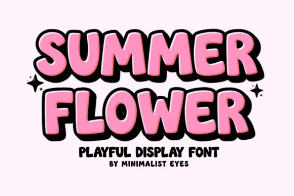
Summer Flower is a rounded display face built to read as hand-drawn and joyful; thick, soft terminals and wide counters make each glyph feel approachable and bold. It comes PUA encoded so accessing alternates and special characters is straightforward, and the heavy curves are forgiving for cutting machines like Cricut and Silhouette, which keeps edges clean on vinyl and heat transfer vinyl projects.
Because its shapes are exaggerated and readable at large sizes, the font excels on greeting cards, party banners, nursery prints, and seasonal packaging where a friendly presence helps sell the mood. Try pairing it with a thin script or a restrained geometric sans to let the bubbly letters take center stage in logos, labels, and social graphics.
My Recommendation: I use Summer Flower when a project needs an instantly cheerful headline that cuts cleanly for craft applications. It’s perfect for party invitations, vinyl decals, kids’ apparel, and seasonal product labels because of its bold curves and PUA support. The type’s straightforward shapes reduce cutting errors and keep production smooth across DIY and small-batch runs.
3. Summer Hipster
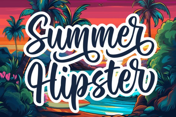
Summer Hipster reads like an upbeat hand-lettered signature: loose, slightly irregular strokes give it an authentic, friendly voice without feeling messy. The design includes a range of glyphs and ligatures that let you switch between compact wordmarks and more decorative headlines, which makes it flexible for logos, packaging, wedding stationery, or blog headers.
Because it’s optimized for legibility at display sizes, Summer Hipster performs well in print and on-screen, particularly when paired with a minimal sans for body text. Use its alternates to craft distinguishing logotypes or to add personality to product tags, social banners, and labels that need a casual, human touch.
My Recommendation: I’d pick Summer Hipster when a brand needs a relaxed, handcrafted tone that still reads clearly across touchpoints. Its ligatures and alternates help create unique name treatments while remaining practical for packaging and editorial headers. It’s my go-to for artisan goods, lifestyle brands, and informal wedding materials that want charm without sacrificing clarity.
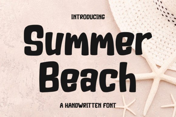
4. Summer Beach
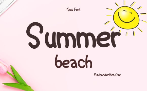
Summer Beach is a refined monoline handwriting with playful swash endings and a relaxed rhythm that reads well at display sizes. As a Summer logo font it blends casual calligraphic strokes with tidy counters, offering alternates and ligatures that give logotypes a handcrafted feel while still keeping composition clean for packaging, invitations, posters, and signwork.
The font ships with PUA Unicode access so stylistic sets and special glyphs are available in most common design apps without extra plug‑ins; that makes it simple to pick swash alternates or create a signature lockup. For best results use slightly tightened tracking for wordmarks, pair it with a neutral sans for extended copy, and convert to outlines before production on labels or embroidery.
My Recommendation: I reach for Summer Beach when I want a brand to feel laid‑back but designed-think coastal cafés, wedding suites, boutique product labels. Its PUA Unicode characters make customization fast, and the swash options let you craft distinctive marks without heavy lettering work. Use it for logotypes, packaging accents, or any project that benefits from a friendly handwritten signature.
5. Summer
Summer is a colorful doodle font that layers hand‑drawn motifs-fruit, waves, suns-directly into letterforms for an instantly playful aesthetic. The artwork reads as decorative color fills in supported apps, making it ideal for seasonal headlines, stickers, kids’ graphics, sublimation tees, and playful social assets where bright, illustrative type brings personality to the layout.
Note that some operating systems will preview the type in monochrome, but apps like Adobe Illustrator, Photoshop, Canva, and Figma will show full color. For print or merchandise exports, flatten the color layers to vector or high‑res PNG in a supported app to preserve the intended palette and avoid surprises when sending files to print or a DTG provider.
My Recommendation: I use this font for projects that need immediate visual charm-merch mockups, planner stickers, and playful campaign headers work especially well. The integrated doodles reduce the need for extra illustrations, speeding up mockups and proofs. Just remember to test color font output in your production workflow so the artwork prints as seen on screen.
6. Cruel Summer
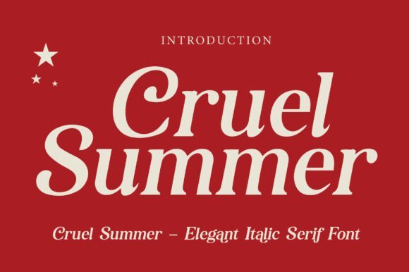
Cruel Summer is an italic serif that combines high‑contrast strokes with refined bracketed serifs, creating an editorial silhouette that reads elegant and assertive on covers and mastheads. The slanted axis gives copy a forward drive while the sharp terminals maintain a couture quality suited to fashion branding, luxury packaging, and magazine headlines.
Use it as a primary display face for titles and brand marks; the letterforms respond well to tight tracking and subtle kerning tweaks for logotypes. Pair with a calm humanist sans for body text, consider foil or emboss finishes to emphasize its form, and test sizes carefully-its details reward large formats but can lose clarity at very small point sizes.
My Recommendation: I pick Cruel Summer when a project needs poised elegance with a modern editorial edge-think boutique lookbooks, high‑end labels, and magazine headers. Its italic tone conveys motion and style, and it pairs beautifully with minimalist sans serifs for supporting text. Use it on covers, product names, or anywhere a refined, fashion‑forward voice is required.
7. Chunky Summer Font
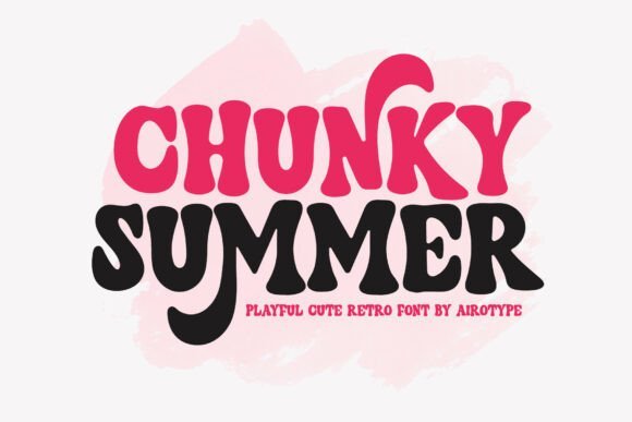
Chunky Summer Font wears a retro, bouncy personality with thick rounded letterforms and playful counters that read like vintage signage. The bold weight and tilted terminals create a cheerful presence on packaging or posters, and it works especially well as a Summer logo font for beach brands, ice cream trucks, or kid-focused identities. The type feels hand-cut rather than mechanical, which gives headlines and labels an immediate friendly identity without needing extra ornamentation.
Use generous tracking at large sizes to keep the forms airy, and switch to tighter spacing for compact badges or labels where the compact bowls hold their charm. It pairs well with a neutral geometric sans for body copy or with light script accents for party invites; consider layered color blocking and halftone textures to amplify the nostalgic mood. File formats include basic Latin support and solid vector outlines suited to t-shirts, stickers, sublimation prints, and craft projects.
╰┈➤ Download Chunky Summer Font
My Recommendation: I’d reach for Chunky Summer Font when a project needs big personality and instant readability-think seasonal menus, kids’ party invites, or a playful retail label. Its chunky shapes print clean on textiles and stickers, and the retro feel helps a brand feel approachable without relying on busy graphics. For me the main draw is how quickly it establishes a warm, carefree tone for summer-focused products.
8. Summer Flower Font
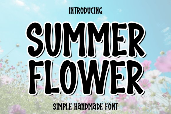
Summer Flower Font is a refined, flowing script with long, airy ascenders and graceful connectors that mimic careful pen strokes. The letterforms strike a balance between modern calligraphy and legible hand lettering, making it a strong choice for wedding suites, luxe product tags, and sophisticated photo overlays where elegance matters. Delicate swashes and alternate characters give designers options to create a bespoke signature look without heavy customization.
Kerning and optical spacing feel intentionally soft, which enhances the romantic mood; pair it with a restrained serif or thin sans to ground layouts and improve contrast. Try applying subtle drop shadows or metallic foil effects to lift the script on stationery and packaging, and keep body text in a neutral companion face to preserve readability. The font’s ornamental alternates are particularly helpful for crafting unique logotypes and headline treatments.
╰┈➤ Download Summer Flower Font
My Recommendation: I would use Summer Flower Font when a project needs a polished, personal touch-wedding invitations, boutique branding, or editorial mastheads are perfect fits. Its range of alternates lets me create distinctive wordmarks without hand lettering, saving time while keeping an artisanal feel. It shines most when paired with minimal layouts and tasteful finishes like letterpress or foil.
9. Summer Soundtrack Font
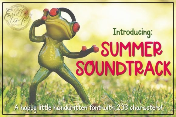
Summer Soundtrack Font offers a cheerful, handwritten look with slightly irregular stroke widths and a friendly baseline wobble that feels casual and human. It reads well at headline sizes and brings a handmade character to social graphics, greeting cards, and classroom materials, making messages feel personal without pretension. The overall rhythm of the letters gives layouts an upbeat cadence that pairs naturally with playful color palettes and textured backgrounds.
As a freebie, it’s ideal for rapid mockups and small-scale projects where budget matters, but check the license for commercial uses before large runs. Combine with a clean sans for longer copy, and increase line-height to preserve clarity when using it for short blocks of text. For thumbnails, posters, and charming packaging, its informal tone helps content feel accessible and lively.
╰┈➤ Download Summer Soundtrack Font
My Recommendation: I often pick Summer Soundtrack Font for quick, friendly headings and crafts because it delivers personality without fuss. It’s especially handy for seasonal promos, classroom prints, and social posts where warmth matters more than strict formality. Just verify the license for commercial distribution, then lean into bright colors and hand-drawn embellishments to get the most character from it.
10. Summer Balance
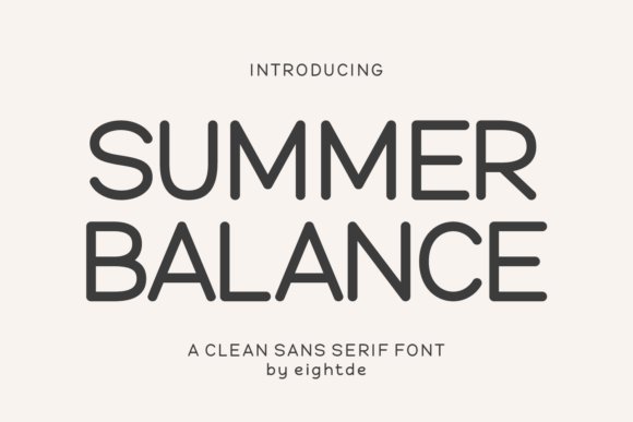
Summer Balance is a rounded sans serif that pairs soft, friendly letterforms with clear breathing room for reliable readability. As a candidate for a Summer logo font , it combines generous counters and gentle terminals so small icons and social avatars keep personality without losing clarity. The strokes hint at handwriting without literal joins, giving a handcrafted vibe that still feels orderly on digital screens.
Apply it to planner spreads, sticker sheets, greeting cards, or compact wordmarks where warmth is required but legibility cannot be sacrificed. Its open x‑height and moderate contrast tolerate tight tracking and colored backgrounds, and the rhythm of the glyphs helps logos read consistently across formats. For identity work, try contrasting it with a thin geometric companion to hold attention and reinforce brand recognition.
My Recommendation: I reach for Summer Balance when a brand needs to come across as approachable yet reliable. Its rounded shapes translate well at tiny sizes like favicons and product tabs, while larger headings keep a calm, friendly presence. Use it for lifestyle brands, stationery lines, and kid-focused products where a human touch matters.
11. Fredoka Summer
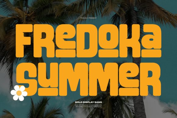
Fredoka Summer is a chunky display sans whose thick, pillowy forms deliver instant visual cheer and a strong headline presence. The generous bowls and wide counters make it ideal for posters, packaging, and social tiles, and built-in alternates and ligatures allow playful typographic tricks without extra drawing. Multilingual glyph coverage keeps visual voice consistent across languages and markets.
This weighty face excels when scale and personality are priorities: festival banners, kids’ apparel tags, or bold food labels all benefit from its tactile feel. Because of the mass of the strokes, watch kerning in compact logotypes to avoid visual crowding but lean into color and texture to amplify charm. Pair it with a narrow, neutral sans or a delicate script to create balance and hierarchy in layouts.
My Recommendation: I use Fredoka Summer for projects that need to shout joyfully from afar-think event posters and playful packaging. Its large, rounded forms create instant brand recall and work especially well with bright palettes. I recommend using it at display sizes and giving it room to breathe so its personality reads clearly.
12. Summer Beach Life Doodle
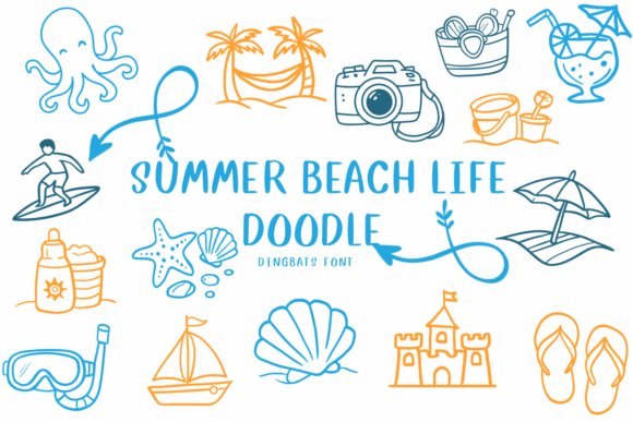
Summer Beach Life Doodle packs seaside iconography into a single dingbats font, turning decorative work into simple typing tasks. Each glyph is a tiny hand-drawn scene-shells, surfboards, palm groupings and ocean critters-so you can compose borders, spot marks, or map pins without assembling separate art files. The consistent line weight and playful imperfections make mixed layouts look cohesive and intentionally crafted.
Because icons are contained in font glyphs, you can recolor, scale, and layer them as you would letters, keeping export workflows fast and precise. This tool is especially handy for party invites, travel journals, product mockups, and any print piece that benefits from repeated motifs. Try pairing the dingbats with a loose brush or rounded display to preserve the hand-made aesthetic across the page.
╰┈➤ Download Summer Beach Life Doodle
My Recommendation: I reach for Summer Beach Life Doodle whenever I need sunny accents quickly-no clip art hunting required. Its consistent stroke style keeps varied compositions unified, which speeds up layout and gives an artisanal feel to commercial work. Ideal for event stationery, scrapbook projects, and seasonal packaging that needs charming, repeatable motifs.
13. Summer Harmony Font – Summer logo font
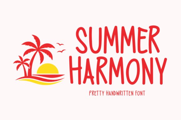
Summer Harmony feels like a hand-written postcard from long, sunny afternoons; its smooth, rounded strokes and gentle baseline bounce give words a relaxed cadence. Summer logo font is present in the way the letterforms balance playful terminals with clear counters, keeping marks legible on labels and profile avatars. Built-in alternates and flowing ligatures let you vary signature styles without bringing in extra families.
On packaging it reads fresh against organic textures, while on posters the whimsical caps add charm without overwhelming imagery. Combine warm citrus palettes and light grain for a lived-in look, or set it against a neutral sans to sharpen contrast. Kerning and weight spread are well tuned for display use and modest copy accents alike.
╰┈➤ Download Summer Harmony Font – Summer logo font
My Recommendation: I reach for Summer Harmony when I want a logo that feels personal and sunny – it suits boutique food brands, coastal cafés, and seasonal product lines. The alternates let me tweak a mark’s attitude without swapping fonts, which saves time in iterations. Use it for labels, social headers, and apparel where a friendly, handwritten identity matters.
14. Groovy Summer Font
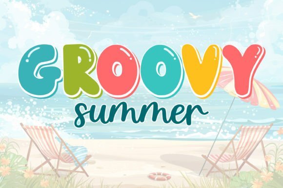
Groovy Summer channels retro boldness with thick, rounded letterforms that dominate short headlines and badge-style logos. The compact spacing and playful counters create a strong visual rhythm, ideal for posters, book covers, and statement merch. A variety of stylistic fills and shadow options make it fun to layer color and texture for a true vintage feel.
It performs best at larger sizes where details register cleanly; for small-scale use apply simple outlines or bold contrasts to retain clarity. Complement layouts with a minimal geometric sans to keep reading order clear while the display face supplies personality. The overall tone lands cheerful and authoritative without tipping into cartoonish territory.
╰┈➤ Download Groovy Summer Font
My Recommendation: I’d pick Groovy Summer for projects that need punchy retro character – festival posters, apparel drops, and playful packaging benefit most. It shines in headline-first work rather than dense body copy. Pair with saturated palettes and tactile backgrounds to maximize its nostalgic energy.
15. Sunkist Summer Font
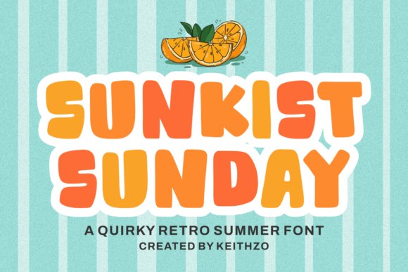
Sunkist Summer serves chunky, hand-made letterforms with a pleasant wobble that reads intentionally crafted rather than random. Generous strokes and rounded terminals help it stand out on busy backgrounds, making it a strong choice for labels and product tags. The friendly weight and readable counters keep it useful in display settings where instant recognition is needed.
Use it to inject retro warmth into packaging, in-store signage, and social templates that aim for a vintage mood. Subtle distressing and layered color treatments amplify its handcrafted charm while maintaining legibility. The family includes styles suitable for inline or drop-shadow treatments, so headlines and logos can carry both weight and detail.
╰┈➤ Download Sunkist Summer Font
My Recommendation: Sunkist Summer is my go-to when I want bold vintage headlines that feel handcrafted – think summer markets, artisan goods, and merch. Its heavy weights work great for stickers and labels where visibility matters. For calmer compositions, offset it with a light, unobtrusive sans to keep layouts balanced.
16. Summer Bubble
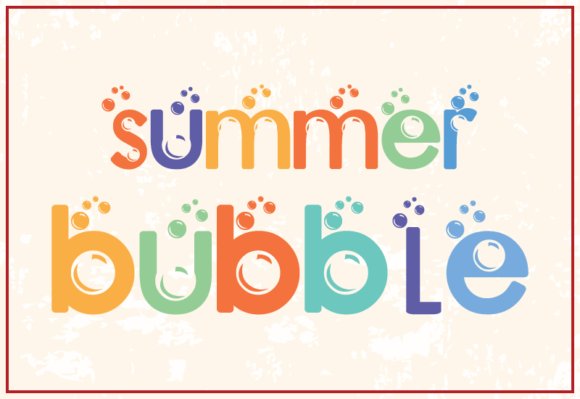
Summer Bubble is a bouncy display that channels a child’s scrawl into polished, rounded letterforms; the generous counters and soft terminals give text a buoyant rhythm that reads well at headline sizes. Whimsical alternates and playful joins inject personality without collapsing legibility, so words stay clear even when the letters lean into cartoonish charm. The overall voice feels nostalgic but contemporary, ideal for designs that want a friendly, hand-rendered presence.
If you’re crafting cheerful branding or seasonal packaging, try Summer Bubble as a Summer logo font for ice cream stands, toy labels, party invitations, and stickers where a warm, approachable mark matters. It pairs neatly with a narrow sans for supporting copy and tolerates bright pastels or bold duotone fills; spacing is generous enough to hold up on badges and enamel pins.
My Recommendation: I reach for Summer Bubble when a project needs instant, youthful warmth-product labels, kids’ event posters, and playful retail badges are natural fits. The font adds a human touch without feeling messy, and its alternates let me tweak endings for variety. Use it when you want a headline that smiles at the viewer and remains legible across print and web.
17. Summer Beach
Summer Beach feels like a casual, handwritten note with light strokes and gentle irregularities that mimic pen pressure; the result is a romantic, intimate tone that reads like personal correspondence. Small swashes and alternate endings give each word a handcrafted flourish, making short lines feel curated rather than manufactured. This face keeps a dainty presence, so it works best for touches of personality rather than heavy blocks of text.
Use Summer Beach for wedding suites, boutique branding, or greeting cards where a soft, human voice complements imagery and layout. Pair it with a neutral serif on stationery or a clean sans for web headers, and stick to restrained color palettes-sand, coral, and soft navy-to reinforce its seaside charm. Web-ready formats and careful kerning mean it renders nicely on screens and printed invites alike.
My Recommendation: I pick Summer Beach when a design needs a gentle, personal accent-wedding invites, boutique logos, and lifestyle goods benefit most. Its hand-drawn flavor pairs well with floral or nautical illustrations and keeps layouts feeling intimate. For longer copy I switch to a simple serif so the script remains a special, readable accent.
18. Always Chunky
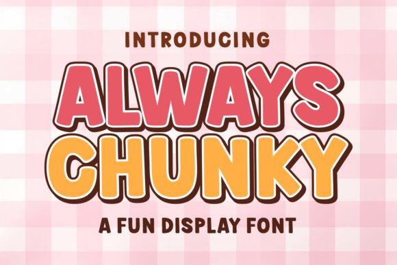
Always Chunky embraces bold, rounded letterforms with a retro twist-think candy-store signage and 70s packaging reimagined for modern headlines. Heavy strokes, playful proportions, and optional stylistic sets produce a loud, optimistic voice that commands attention on posters, apparel, and thumbnails. Color and texture variants, including SVG and layered fills, let you push the vintage vibe without losing clarity.
Despite its weight the design holds up at display sizes and adapts to both digital thumbnails and physical merchandise; toggling alternate glyphs lets you move from tidy headlines to exuberant logotypes. Use tight tracking and bright duotones to emphasize its boho energy, or apply single-color printing for bold, wearable graphics. This is a go-to when a project demands personality and presence rather than subtlety.
My Recommendation: I use Always Chunky when a brief calls for big character-event posters, kid-focused product lines, and retro-themed merch are perfect matches. The font’s weight and color layers cut through noisy feeds and print well on T-shirts and signage. Choose it when you want a headline that’s unmistakable and joyfully loud.
19. Stay Disney Font
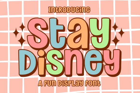
Stay Disney Font is a bouncy display typeface built around oversized bubble shapes and friendly counters that remain readable at headline sizes. Its candy-shop curves and rounded terminals give a nostalgic yet playful tone ideal for children’s packaging, stickers, and upbeat social thumbnails. The generous shapes hold up on small screens, so it suits casual game interfaces and planner covers without losing personality.
The design wears its 70s influences openly – retro swashes and a boho tilt sit alongside modern glyph weights for a lively hybrid look. It ships with SVG, PNG, and Procreate styles so letters can be textured or kept flat depending on the art direction. Try pairing Stay Disney with a Summer logo font for seasonal badges and layered T‑shirt prints to get cheerful, attention-grabbing compositions.
My Recommendation: I would reach for Stay Disney when a project needs unambiguous fun: think birthday invites, toy labels, or playful app headers. The SVG and Procreate variants let me add handcrafted texture without rebuilding charts or ornaments. Its strong counters make it reliable for both print and low-resolution digital displays.
20. Soft Thick Font
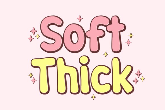
Soft Thick Font emphasizes plush, chunky letterforms with a rounded finish that feels tactile on-screen and in print. Those generous stems and closed counters make it an excellent choice for sublimation, vinyl cutting, and Cricut projects where solid areas matter more than delicate hairlines. The retro lean and compact spacing give headlines a friendly, retro-modern attitude that reads clearly from a distance.
Because the shapes are bold and uncomplicated, this family works well on T‑shirts, banners, and product labels where one-color printing is common. Pairing Soft Thick with a light script or narrow sans creates contrast while keeping the headline dominant. Its forgiving forms also speed up production for high-volume items like stickers or packaging runs where consistency matters.
My Recommendation: I like Soft Thick for merchandise and crafts because it cuts clean on vinyl and looks strong in sublimation. It simplifies production while retaining character, so it’s ideal for apparel runs, signage, and social graphics that need immediate legibility. Use it when you want warmth without fuss.
21. Real Super Font
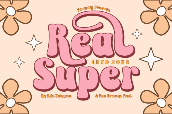
Real Super Font channels a retro-meets-modern sensibility with a library that spans groovy 70s display shapes to more restrained serifs and playful sans options. Each style feels deliberately drawn rather than slapped together, which makes the collection valuable for branding that leans into nostalgia without feeling dated. The set includes dingbats and alternate glyphs that let you build lively badges and party graphics without extra ornament packs.
Seasonal palettes pair naturally with these weights: bright palettes highlight the display cuts, while muted tones let the serifs read as editorial. It’s also suited to sticker sheets, event posters, and eye-catching headers where texture and personality matter. Thoughtful spacing and consistent stroke contrasts make Real Super a solid pick for both print collateral and decorative web headings.
My Recommendation: I would pick Real Super when a project needs personality across multiple touchpoints, from posters to web banners. The variety of weights and extras means I can keep a cohesive look across print and digital without juggling several unrelated families. It’s particularly handy for event branding and retro-inspired packaging where charm and coherence are priorities.
22. Gabilo Display
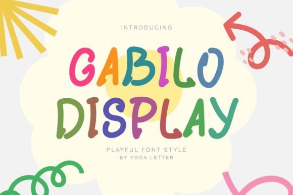
Gabilo Display is a bubbly, cartoonish display font with soft, rounded counters and playful weight shifts that read especially well in short headlines and titles. It ships with uppercase, lowercase, numerals, punctuation and multilingual glyphs, so it handles children’s books, toy packaging and seasonal posters with equal ease; its bright letterforms make a convincing Summer logo font that feels toy-like and approachable.
At larger sizes the quirky terminals and bubbled bowls become a focal point, while tighter tracking keeps compact logos readable. Try layered color fills or simple drop shadows on packaging and posters to give artwork a tactile, sticker-like presence without losing clarity.
My Recommendation: I pick Gabilo when a brief needs instant charm-birthday invites, ice-cream stands, and kid-themed retail all benefit from its cheerful shapes. The complete character set and multilingual support save time when preparing international prints. Use it when you want a sunny, playful identity that reads clearly at headline sizes.
23. Doggy Papaw Font
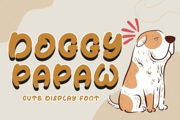
Doggy Papaw is a hand-infused display font with a friendly bounce and rounded terminals that evoke a pet-like warmth. It includes uppercase, lowercase, numerals, punctuation and extended language support, making it practical for stickers, mugs, t-shirts and promotional banners where charm matters as much as legibility.
Letterforms feature subtle irregularities that read as handcrafted, which helps small brand marks gain personality without becoming twee. Pair it with a restrained sans for product labels or use it solo on posters and packaging to create an approachable, pet-focused identity.
My Recommendation: I reach for Doggy Papaw for pet-boutique logos, adoption event posters, and cheerful merchandise because its strokes feel personal and friendly. The font holds up in print and apparel, so it’s reliable across formats. It’s a great choice when you want warmth and personality without resorting to mascots.
24. Stay Lucky Font
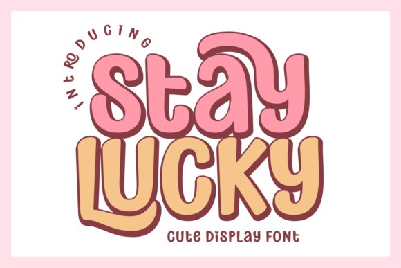
Stay Lucky channels a bold retro spirit with wavy, chunky letterforms that recall 70s display types and candy-store signage; it’s designed to make headlines sing on apparel and social art. The family bundles SVG, PNG and Procreate-ready styles alongside psychedelic, bubble and vintage variants, allowing layered textures and color experiments for posters, thumbnails and product graphics.
Despite its decorative energy, the core letterforms preserve strong readability in short lines and UI headers, which explains its use in casual game menus and bold logo marks. Treat it primarily as a headline tool-stack weights, apply gradients and lean into nostalgic motifs to build striking t-shirts, packaging and band art.
My Recommendation: I reach for Stay Lucky when a project calls for confident retro flair-festival posters, band merch and nostalgic packaging are ideal fits. The broad style set lets me prototype multiple looks quickly without hand-drawing extras. Use it when you want a loud, characterful headline that anchors a visual identity.
Try a few of these 24 options side by side in your real layouts-logos, tags, and signage all reveal different strengths at scale and color. Mixing a warm script with a clear sans or choosing a retro display with restrained spacing often yields the strongest summer vibe.
Use the list as a practical starting point: test fonts on mockups, check legibility at small sizes, and let texture, weight, and personality guide the final pick for your seasonal or coastal projects.