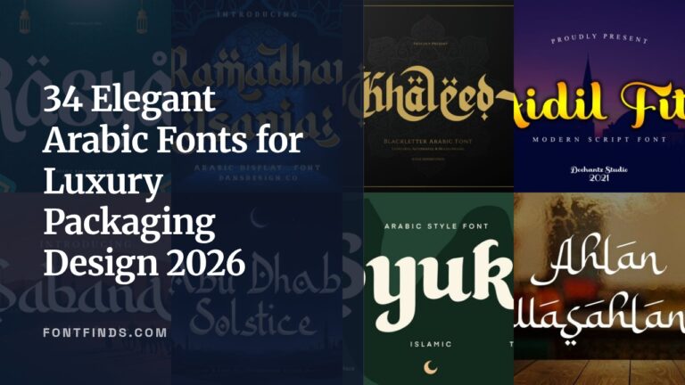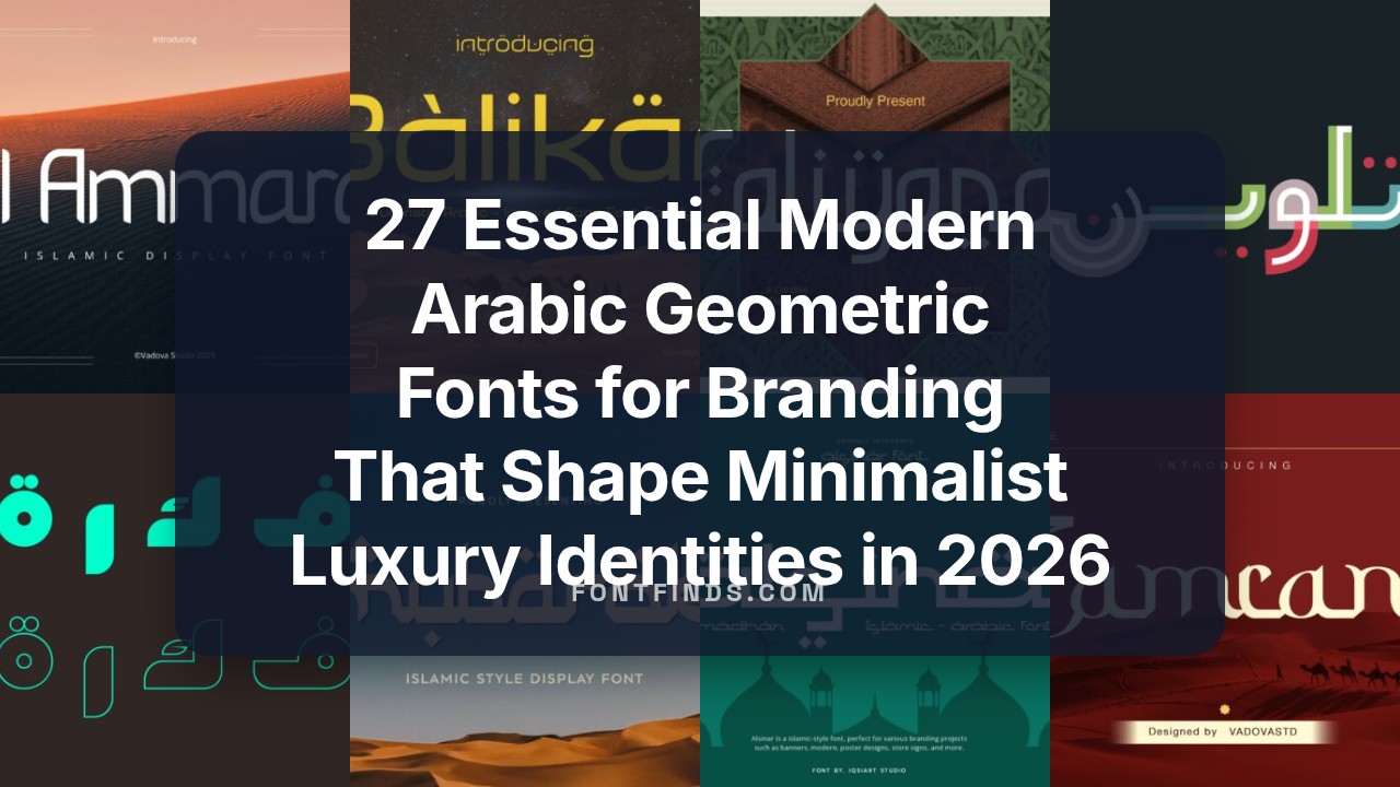
27 Essential Modern Arabic Geometric Fonts for Branding That Shape Minimalist Luxury Identities in 2026
modern arabic geometric fonts for branding are rising in popularity among designers who want clean, structured Arabic type that still feels authentic. Their geometric skeletons improve legibility at display sizes while preserving calligraphic rhythm.
Below you will find 27 curated choices, practical pairing ideas with Latin faces, weight and spacing tips, plus quick licensing pointers. The goal is to help you match form and tone across packaging, signage, editorial, and digital interfaces.
1. Fekrah – Arabic Font
Fekrah is a contemporary Arabic typeface built on geometric Kufi principles, with modular stems, open counters and crisp terminals that give logotypes and headlines an uncluttered, confident voice. Its balanced proportions and measured negative space place it among modern arabic geometric fonts for branding, packaging, and tech identity work where precision and a clear visual signature matter. Use it large for wordmarks or stacked in display layouts to anchor a brand with calm geometric restraint.
The family ships with OpenType alternates, contextual ligatures, and refined kerning pairs to keep tightly set Arabic text readable at display sizes. I appreciate how the glyph set supports bilingual systems-Latin companions with matching x-heights pair neatly-and how the steady rhythm of strokes works for signage, web headers, and printed identity pieces. Designers will find predictable metrics and low-contrast strokes useful when building a repeatable typographic system for brand use.
╰┈➤ Download Fekrah – Arabic Font
My Recommendation: I would reach for Fekrah when a brand needs a precise Arabic mark that reads modern without appearing decorative. Its geometric clarity makes logo work and product packaging straightforward, and the OpenType features give enough flexibility for crafted headlines. Use it for tech brands, minimalist fashion labels, or any identity that demands legible, geometric Arabic typography.
2. Zahara Regular Font
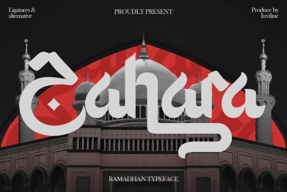
Zahara Regular presents bold strokes and calligraphic detail to create an Arabic-inspired display face that reads like celebration on the page. The design blends flowing ligatures with geometric anchors so Ramadan campaigns, festival posters, and greeting cards gain expressive personality while retaining visual weight. It performs as a showpiece at large sizes and as an ornamental headline in editorial spreads.
The font includes discretionary ligatures and decorative alternates that let you adjust word shapes for banners or printed invites, and its calligraphic terminals respond well to layered color and texture. In bilingual layouts it pairs smoothly with clean sans-serif Latin types, helping maintain hierarchy without competing with imagery. Try it for event branding, seasonal packaging, or any project that benefits from expressive Arabic display typographic voice.
╰┈➤ Download Zahara Regular Font
My Recommendation: I recommend Zahara Regular for cultural or festive projects where a strong, expressive Arabic display type is needed. It shines on posters, event identities, and seasonal packaging thanks to its ligatures and ornamental alternates. For projects that mix Latin and Arabic, pair Zahara with a restrained sans-serif to keep the voice bold yet readable.
3. Walidin Font
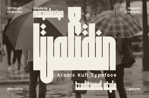
Walidin Font channels classical Kufi into a bold display family, using square terminals and compact horizontals to create a monument-like presence. The thick, block-like letterforms cut through dense backgrounds and are ideal for apparel, signage, or architectural branding where a strong, anchored wordmark is required. A set of dingbats and ornamental glyphs expands options for badges and sealed layouts.
Technically Walidin offers a steady baseline rhythm and minimal curve modulation, which helps when translating marks into carved, embroidered, or printed assets. Given its dense forms, spacing and tracking should be handled deliberately-larger sizes improve readability while tighter tracking suits logotypes. It’s a good choice when you want a historically rooted Arabic look with bold, structural impact.
My Recommendation: I’d use Walidin when a project demands bold Arabic lettering that reads reliably across physical and textile applications. Its Kufi-derived geometry makes it excellent for logos, merchandise, and wayfinding where presence matters. The included dingbats are a handy bonus for badge-style compositions and packaging seals.
4. Minar Block Font
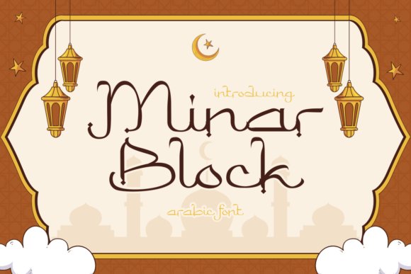
Minar Block Font channels geometric clarity and the visual language of traditional Arabic calligraphy; its letterforms show precise angles and measured curves that read strongly at display sizes. Thoughtful ornamental terminals soften the grid, producing a balance between formal Kufic references and contemporary typographic needs. As part of the wider group of modern arabic geometric fonts for branding, it brings cultural authenticity without sacrificing legibility.
I find its stroke contrast works well with metallic finishes and structured layouts, so headlines, posters, and product marks feel both ceremonial and accessible. The family’s proportions support multilingual typesetting and pair neatly with pattern-driven backgrounds or minimal sans companions. Use it when you need a font that signals Islamic heritage while fitting into modern packaging, event identity, or editorial covers.
My Recommendation: I turn to Minar Block when a design must convey Islamic tradition with a clean, contemporary voice. Its geometric discipline makes it especially effective for luxury packaging, Ramadan and Eid identities, and mosque signage where clarity at display sizes matters. Pairing it with restrained color palettes and ornamental motifs yields an elegant, culturally resonant result.
5. Talween Font
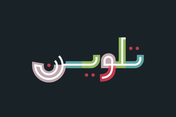
Talween Font introduces color and translucency into Arabic display typography using OpenType-SVG technology; thin letterforms are filled by geometric color blocks that create layered depth on screen. It’s particularly striking for digital banners, motion titles, and social posts where vibrant overlays can animate without losing shape. Note that Talween is an SVG-OpenType color font – compatibility varies across design apps and some cutters; OTF/TTF versions are not included.
When the host application cannot render SVG fonts you can flatten text into vectors or export raster assets to preserve the intended look across platforms. This font shines in campaigns that need playful color combinations and modern Arabic aesthetics, especially in advertising or fashion promos. Test the font in your target workflow early to ensure color layers and translucency behave as expected.
My Recommendation: I reach for Talween when a project benefits from bold color treatments inside Arabic headlines; it gives type a graphic, almost illustrative role. Ideal for animated social content, fashion promos, and web hero visuals where SVG rendering is available. Plan for fallbacks or pre-rasterized assets when delivering to environments that lack OpenType-SVG support.
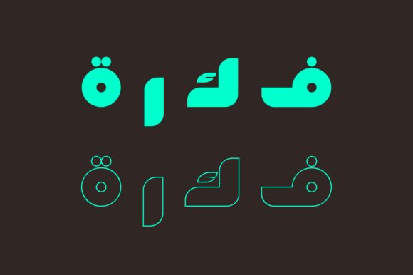
6. Kufica Font
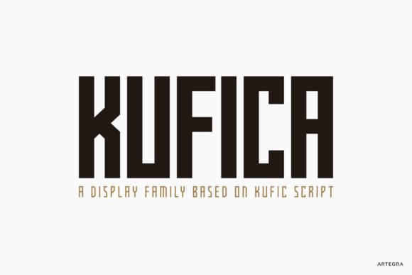
Kufica Font reinterprets historic Kufic letter shapes into a strict geometric sans serif family, producing compact, modular characters that command attention in large formats. The two weights with italics and a glyph set exceeding 430 entries offer strong language coverage and stylistic flexibility for Arabic and bilingual compositions. Its monoline construction and square terminals give a contemporary, slightly futuristic presence suited to logo work and wayfinding.
Because the forms are intentionally simplified, Kufica reads well on packaging and posters while keeping visual consistency across scales and media. Pair it with clean Latin sans families for multinational brands or use it alone to create an authoritative brand voice rooted in Arabic typographic tradition. Designers will appreciate how its geometry supports tight letterspacing and grid-based layouts.
My Recommendation: I use Kufica when a brand needs bold, geometric Arabic display type that remains legible at a distance and across languages. It performs particularly well for tech brands, signage systems, and packaging where a compact, modern Kufic reference is desired. The extensive glyph set removes many localization headaches, so it’s reliable for multinational projects.
7. Jamillah Font
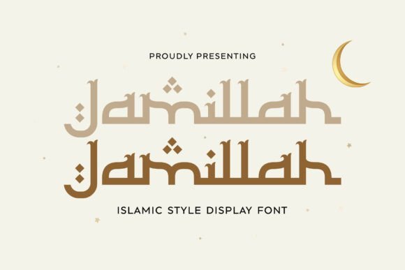
Jamillah is a modern Islamic display font that balances geometric precision with calligraphic flourish. The design marries crisp geometric counters and measured proportions with sweeping terminals, creating a typography that reads as both contemporary and respectful of Arabic script traditions. As a choice among modern arabic geometric fonts for branding, Jamillah works especially well for festive campaigns, cultural brands, and logotypes where a refined Middle Eastern voice is required.
On paper or packaging, its medium-to-heavy stroke contrast holds up at headline sizes and yields strong legibility on posters and invitations. Designers will value its stylistic alternates and ligatures for decorative wordmarks, plus reliable performance across print, web, and social formats when pairing with neutral Latin sans faces.
My Recommendation: I reach for Jamillah when a brief calls for tasteful Arabic presence with measured geometry-ideal for Eid/Ramadan communications, boutique halal food packaging, or travel identity. Its calligraphic details add warmth without diluting impact, and the alternates let you craft memorable logotypes. Use it when you want a dignified, culturally anchored display face that still reads modern.
8. Kasyiro Font
Kasyiro blends geometric rhythm with gentle, flowing curves that reference Arabic penwork to create an approachable display face. The letterforms favor rounded joins and open counters, giving it softer readability at mid-range sizes compared with harder, purely angular scripts. That balance makes Kasyiro suitable for editorial headlines, restaurant menus, and posters where an inviting Middle Eastern personality is desired.
The family includes alternate glyphs and ligatures that let designers shift between decorative expression and restrained clarity, useful for packaging, invitations, and social headers. Color and scale reveal its adaptability: it retains presence on textured paper and reads cleanly on screens, making it a solid choice for lifestyle branding and hospitality identity systems.
My Recommendation: I recommend Kasyiro for brands that want warmth and character without aggressive weight-think boutique cafés, cultural festivals, or hospitality signage. It pairs beautifully with soft photography and tactile materials, yet remains legible in digital campaigns. Choose it when you need a friendly Arabic-inflected display face that feels modern but approachable.
9. Zamrani Font
Zamrani channels Kufic geometry into a bold display font defined by angular cuts and a tight, architectural rhythm. Its heavy weight and rigid terminals produce a commanding headline presence suited to luxury packaging, cinematic titles, and travel identities that reference heritage forms. The type’s structured grammar reads as emblematic and authoritative, ideal for brands seeking a strong visual statement.
Because of its dominant shapes, Zamrani performs best at larger sizes and benefits from generous tracking when used in wordmarks or labels; it also responds exceptionally well to foil, embossing, and other specialty finishes. Designers will find it particularly effective for premium food labels, destination branding, and heritage-inspired hospitality where standout impact is essential.
My Recommendation: I choose Zamrani when a project demands bold authority and cultural resonance, such as premium dates, specialty coffee, or destination identity. Its geometry pairs perfectly with metallic treatments and embossing to increase perceived value. Use it as the principal display face where legibility at scale and visual drama are priorities.
10. Salafushalih Font
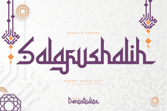
Salafushalih is a bold Arabic-inspired display font that threads traditional calligraphic gestures through geometric discipline, producing a voice that reads both ceremonial and contemporary. Packed with 270+ glyphs, ligatures and alternates, it sits among modern arabic geometric fonts for branding while keeping ornamental details measured so headlines, posters and premium packaging retain clarity. The type’s measured terminals and decorative swashes let designers dial the level of ornament without overwhelming composition.
Technically robust, the family includes contextual alternates and stylistic sets for building rhythmic wordmarks and expressive mastheads. At large sizes the letterforms hold sculptural weight on labels and signage, and they remain legible on-screen thanks to thoughtful spacing and stroke balance. Use cases that benefit most are Islamic event identity, high-end editorial covers and boutique product systems that need a dignified, recognizable Arabic voice.
╰┈➤ Download Salafushalih Font
My Recommendation: I reach for Salafushalih when a brief asks for cultural weight married to geometric precision. Its extensive glyph set and alternates let me craft logotypes and headlines with subtle ornamentation, saving time in custom lettering. Ideal for Ramadan campaigns, luxury packaging, and editorial spreads where a confident Arabic display face must carry the visual identity.
11. Al Ammara Font
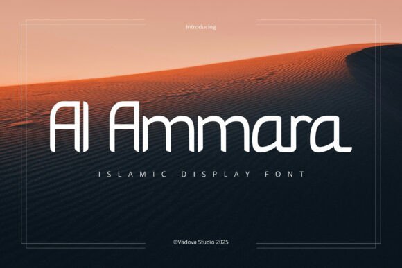
Al Ammara pares Arabic letterforms down to clean geometric construction, yielding a decorative display face that feels both calm and purposeful. Diacritic-style accents act as refined markers rather than flourishes, giving compositions a gentle cultural reference without visual clutter. The minimal stroke contrast and smooth curves create a poised rhythm that suits seasonal campaigns and institutional materials alike.
Because letter shapes are optimized for legibility, the font reads crisply in large headlines and adapts well to social media banners and mosque graphics. Its neutral geometry pairs easily with contemporary Latin sans families for bilingual identities and wayfinding. Choose this face when you need cultural specificity that remains understated and professional for print and digital touchpoints.
My Recommendation: I use Al Ammara when a project requires a polite, modern Islamic aesthetic without heavy ornament. It pairs seamlessly with modern Latin types and behaves predictably across print posters and digital stories. Perfect for community event branding, mosque signage, and Ramadan or Eid campaigns that demand clarity and cultural sensitivity.
12. Samaria Font
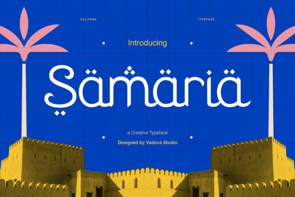
Samaria reinterprets Arabic calligraphic rhythm as a hybrid display face, using monolinear stems, soft circular terminals and playful geometric dots to produce a lively visual texture. The dot motifs and rounded terminals introduce a subtle vibration that animates headlines while keeping forms highly readable. This character makes the type ideal for craft-focused brands, cultural events and architectural mastheads that want a contemporary, hand-formed feel.
OpenType options include alternate dots and contextual joins so art directors can sculpt motion across wordmarks and packaging. In tactile print applications the friendly geometry complements textured materials; on signage the monoline strokes retain clarity from a distance. Reach for Samaria when you want a brand voice with personality that nods to tradition without becoming ornamental.
My Recommendation: I pick Samaria for briefs that need warmth and identity personality rather than strict formality. Its alternates allow for playful logotypes and distinctive headlines, which work brilliantly on boutique food labels, gallery identities, and festival collateral. It performs well in both print and digital formats where a personable, recognizable display face matters.
13. Balikan Font
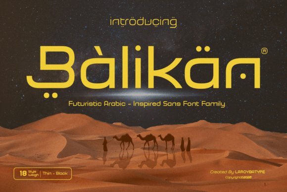
Balikan is a futuristic Arabic-inspired sans serif that marries geometric discipline with refined Middle Eastern motifs. Its letterforms balance clean, open counters and subtle calligraphic terminals, creating a measured rhythm that reads strongly at display sizes and fits among modern arabic geometric fonts for branding with confident proportions. Multiple weights and careful kerning keep the family legible on posters, packaging, and UI headings.
Apply Balikan when you want a contemporary brand voice that nods to Arabic script without heavy ornament: tech identities, boutique luxury labels, and film titles all benefit from its presence. Pair it with a neutral humanist sans for extended copy or a low-contrast serif for editorial elegance; the diacritics and Latin set remain readable across responsive layouts. The result is a premium-feeling face that stays practical for real-world use.
My Recommendation: I reach for Balikan when a project needs a forward-looking Arabic touch that still feels restrained; its geometric clarity and subtle calligraphic hints give logos a refined edge. The range of weights and tight spacing make it simple to adapt across packaging, app headers, and motion titles. Use it for tech brands, upscale labels, or editorial covers where a culturally aware, modern voice is required.
14. Alsinar Font – modern arabic geometric fonts for branding
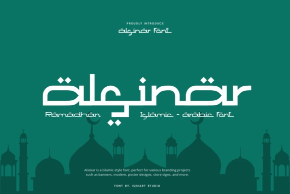
Alsinar is an Islamic-style display font that reinterprets classic calligraphic strokes through a pared-back geometric approach. Bold terminals and distinctive dotted forms reference traditional motifs while the Latin characters remain clear and contemporary. The result is an assertive display face that holds up on banners and cultural posters.
This type excels in seasonal campaigns like Ramadan and Eid, refined halal branding, and high-impact event signage where cultural reference matters. Use heavy weights for primary headlines and lighter cuts for supporting text; the glyph rhythm reads well in large-format print and hero digital banners. Designers will value its clarity and symbolic voice for projects that need visible cultural signals without excess ornament.
╰┈➤ Download Alsinar Font – modern arabic geometric fonts for branding
My Recommendation: I choose Alsinar when a brief calls for visible cultural cues without ornate flourishes; its geometric logic and pronounced dots ensure strong recognition at a glance. It’s a great match for event graphics, boutique food brands, and tasteful cultural publications. For best results I combine it with muted color schemes and roomy layouts to let the letter shapes command attention.
15. Mubarak Font
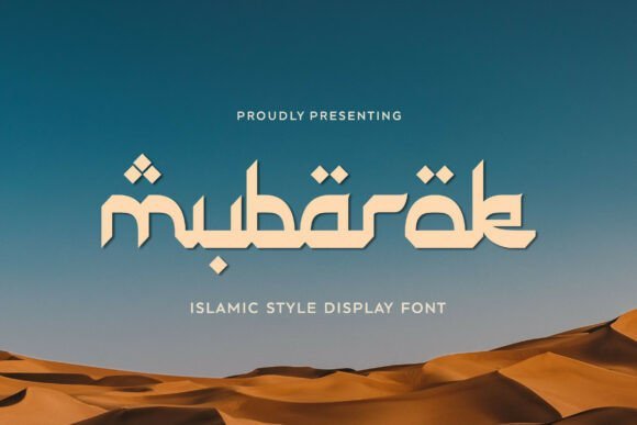
Mubarak blends geometric order with flowing, calligraphic-inspired strokes to produce a warm, celebratory display face. Rounded terminals and measured contrast give headlines a festive, approachable tone while remaining crisp at large sizes. The family leans expressive without becoming ornamental, so it reads clearly across different media.
Ideal for Eid and Ramadan campaigns, hospitality branding, packaging, and editorial headlines, Mubarak performs well on posters, invitations, and social content that need a tasteful Middle Eastern flavor. Strong weights draw the eye on storefronts while lighter styles support hierarchy in layouts; diacritics are handled cleanly for mixed-script usage. This makes it a reliable choice when cultural warmth and legibility are both priorities.
My Recommendation: I pick Mubarak for projects that require a festive yet readable Arabic-inflected voice-wedding stationery, seasonal promotions, and premium food packaging all benefit from its character. The weight range helps you build hierarchy without adding decorative elements. I typically tighten tracking on large headlines and increase line-height in supporting text so the expressive strokes remain legible.
16. Firqatun Najah Font
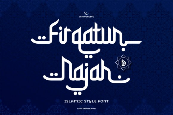
Firqatun Najah reinterprets Kufic geometry with contemporary proportions, producing a display face that feels ceremonial yet modern. Its rigid modular strokes and compact counters give headlines a commanding, architectural presence ideal for identity work and cultural signage that require a clear visual anchor. As part of a toolkit of modern arabic geometric fonts for branding, it pairs well with monochrome layouts and gold foil finishes to emphasize heritage without clutter.
Technically, Firqatun Najah offers tight kerning, consistent stroke weights, and well-considered diacritic placement that preserves legibility at large display sizes. The glyph set leans into Kufic-inspired terminals and square proportions while keeping enough open counters to prevent visual fatigue on posters and covers. Use it where you need bold cultural reference-museum campaigns, ceremonial invitations, or artisanal packaging-because it reads strongly across print and signage.
╰┈➤ Download Firqatun Najah Font
My Recommendation: I reach for Firqatun Najah when a brief calls for a proud, architectural Arabic voice rooted in tradition. It gives logos and event posters a ceremonial weight while remaining readable in large formats. I’d use it for cultural institutions, festival branding, and premium product labels where historic reference must feel contemporary.
17. Nouriyah Font
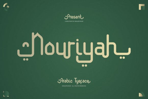
Nouriyah balances monoline strokes with a restrained geometric skeleton, producing an Arabic display face that reads as both graceful and understated. Generous letterspacing and carefully drawn vowel points create breathing room for logotypes and editorial headlines, while the clean terminals maintain clarity at small and large scales. Its smooth rhythm suits high-end packaging and corporate identities that need a quiet confidence rather than overt ornament.
Designers will appreciate Nouriyah’s even contrast and neutral texture, which allow color, photography, and pattern to take center stage without typographic interference. It adapts well to bilingual layouts when paired with modern Latin sans families and supports advanced Arabic features that speed up typesetting. For projects seeking refined legibility-annual reports, luxury labels, and book design-this face performs with restraint and poise.
My Recommendation: I often pick Nouriyah for brands that want an elegant Arabic presence without theatrical flourishes. Its spacing and rhythm make it dependable across print and digital touchpoints. Use it on packaging, executive communications, or art books when you need understated sophistication.
18. Layalina Font
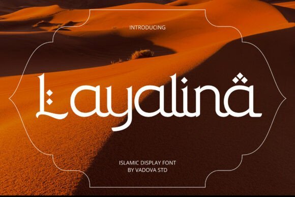
Layalina blends high-contrast strokes with geometric motifs, introducing diamond-shaped diacritics that give each line a decorative cadence. The letterforms balance fluid curves with angular cuts, producing a display type that reads both festive and refined across posters and menus. Its hybrid voice suits cultural celebrations and hospitality identities that benefit from expressive Arabic titling.
Because of its pronounced shapes and rhythmic dots, Layalina works best at headline sizes and on signage where ornament can be appreciated without crowding. It pairs beautifully with minimalist layouts and textured paper stocks to amplify a handcrafted impression for restaurants, boutiques, and festival collateral. Choose it when headline personality and cultural specificity are central to the design brief.
My Recommendation: I reach for Layalina when a project needs lively Arabic display lettering with clear decorative character. It brings warmth and cultural specificity to seasonal campaigns, restaurant identities, and boutique packaging. If headline drama matters more than dense body copy, this typeface creates memorable, photo-friendly mastheads.
19. Caliyana Font
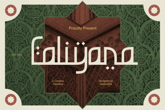
Caliyana Font channels the proportions and rhythmic strokes of Arabic calligraphy into Latin letterforms, producing a modern display face that references arches and muqarnas from Islamic architecture. Its geometric construction and balanced contrast position it among modern arabic geometric fonts for branding, particularly where cultural resonance must pair with contemporary systems. Distinctive ligatures and extended terminals give headlines and logotypes a ceremonial cadence while staying legible at large sizes.
Built with attention to spacing and OpenType features, Caliyana offers contextual alternates and stylistic sets so designers can vary word rhythm without redrawing characters. The type works beautifully on festival posters, mosque signage, and premium packaging; at small scales it keeps presence thanks to robust counters and consistent stroke widths, though a quick kerning pass is advisable for compact words. Use it when the brief asks for measured cultural reference with clear display impact.
My Recommendation: I reach for Caliyana when a project needs dignified Middle Eastern references without resorting to clichés. Its display personality excels on Ramadan/Eid campaigns, religious event posters, and boutique packaging where calligraphic flavor must remain readable. I like pairing it with a simple sans for body copy so the headlines can breathe while the layout stays clean.
20. Bazirah Font
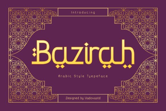
Bazirah Font translates the fluid ornament of Arabic strokes into Latin shapes with a refined sense of rhythm and restraint, producing a decorative yet readable display face. Moderate contrast and elegant terminals give it an air of luxury that reads as handcrafted rather than ornamental for ornament’s sake. Alternate glyphs let designers shift from subdued sophistication to more expressive compositions depending on the campaign.
Because it holds detail well at large sizes, Bazirah is ideal for boutique packaging, perfume labels, magazine mastheads, and gallery promotions where typography must communicate premium tone. The family supports extended Latin characters and common OpenType functions so multilingual identities feel consistent across touchpoints. Use the decorative alternates selectively to preserve hierarchy and avoid visual clutter in dense layouts.
My Recommendation: I would pick Bazirah for upscale retail identities and editorial covers where typography carries the brand story. Its alternates provide control over ornamentation, letting you tune temperament across different pieces. For longer reading, I combine it with a low-contrast serif to keep visual weight balanced and legibility high.
21. Sallafi Font
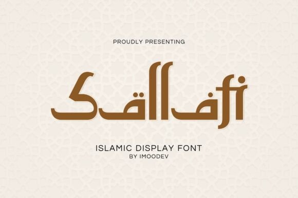
Sallafi Font pairs geometric discipline with softened, calligraphic terminals to create a bold display face that feels modern while referencing Arabic scripts. Strong strokes and open counters give it headline authority, and the rounded joins help guide the eye across words-an advantage for posters and menus where clarity at a glance matters. Its spacing strategy supports readable clusters of words without collapsing into thin textures.
OpenType features include swash alternates and refined kerning presets that introduce gentle motion where needed, making Sallafi well suited to hospitality branding, travel collateral, and halal food packaging. The broad glyph set covers multiple Latin-based languages and holds up in both digital banners and print applications. Choose it when you want a confident cultural accent without heavy ornamentation.
My Recommendation: I use Sallafi when a project needs bold headline presence tied to Middle Eastern reference without ornate detailing. It reads well at a distance and performs reliably on product labels and signage. For balanced layouts I pair it with a neutral sans for body text so the typography maintains strong hierarchy and clean legibility.
22. Kulaefy Font
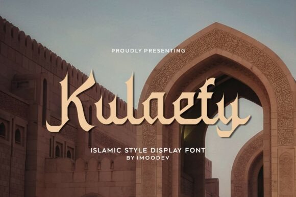
Kulaefy blends sharply geometric letterforms with flowing calligraphic terminals, producing a warm yet assertive display face. The type’s contrast between stable horizontal strokes and graceful curves gives headlines a poised Middle Eastern character while preserving clarity at large sizes. Open forms, alternate glyphs and carefully tuned diacritics make it comfortable for bilingual layouts.
As one of the modern arabic geometric fonts for branding, Kulaefy works particularly well for Eid and Ramadan campaigns, halal and travel food identity, and upscale packaging. It performs well in editorial headlines, poster art, invitations and social graphics where a refined Islamic flavor is desirable. Its solid display presence lends authority to logos while the alternate stylistic sets let designers soften or sharpen tone as needed.
My Recommendation: I reach for Kulaefy when a project needs a true Arabic-flavored voice without feeling dated. Its mix of geometric rhythm and calligraphic detail makes it ideal for festival campaigns and premium food labels. The alternate sets and clear diacritics cut down on manual tweaks, so I can iterate identities faster while keeping a distinct cultural character.
23. Kolillah Font
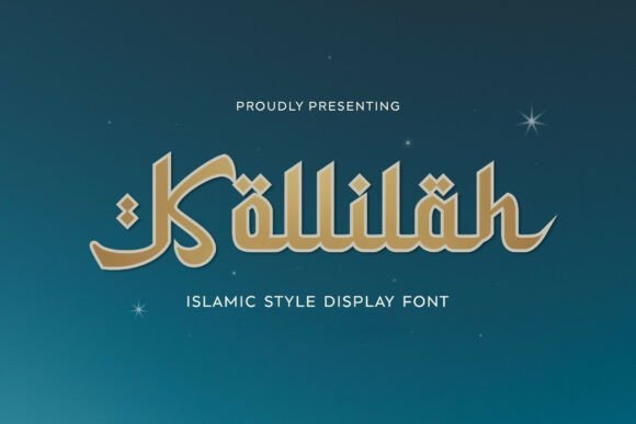
Kolillah pairs tight geometric structure with gentle cursive inflections to create a display face that feels decorative without losing purpose. Letter proportions favor compact, square counters and rhythmic spacing, giving long headlines an organized, measured pulse. Distinctive terminals and optional swashes allow designers to add flourish while keeping high legibility.
Use Kolillah for boutique restaurant menus, artisanal packaging, cultural festival posters and social banners where an Arabic aesthetic should read modern rather than historic. The face scales cleanly at medium-large sizes and ships with alternates for quick headline customization. It suits wordmarks and product labels that need personality without over-decoration.
My Recommendation: I choose Kolillah for projects that want ornamentation without clutter. The compact geometry helps fit long names into narrow layouts while swash alternates provide a handcrafted accent. It’s my go-to for lifestyle brands and specialty packaging that need a contemporary Arabic-inflected touch.
24. Ramadhan Font
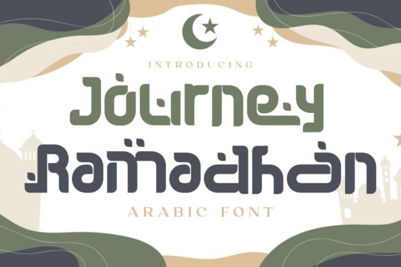
Ramadhan Font channels Kufic-inspired blocks into a modern display system, using modular strokes and decorative terminals to echo sacred geometry while remaining bold and legible. The heavy, squared letters and carved counters create strong silhouettes that hold up across posters, signage and packaging. PUA-encoded ornaments and diacritics are included for straightforward access to festival-specific glyphs.
Its ornamental dots and softened corners let designers apply the face in celebratory contexts-Ramadan greetings, mosque announcements, product tags and cultural event branding-without feeling literal. The font adapts well to both print and digital formats, preserving weight and rhythm across media. It works especially well for large-scale headlines and limited-edition packaging where a cultural gesture is desired within a contemporary visual language.
My Recommendation: I pick Ramadhan Font for seasonal campaigns that need a dignified, festive tone. The included PUA glyphs save time when composing decorative phrases and the blocky shapes read strongly at a distance. It’s especially useful for event posters, special packaging runs and signage where clarity and cultural reference must coexist.
25. Al Mughir Font
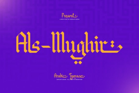
Al Mughir stitches ancestral Arabic calligraphy to crisp geometric construction, resulting in angular, ribbon-like letterforms that read like sculpted initials. Its thick, chiseled strokes and tight counters give text a ceremonial weight, which makes it especially effective as a headline voice and emblematic logotype for premium projects that need presence; designers aiming at modern arabic geometric fonts for branding will find its formal geometry especially useful.
The face performs best at display sizes where its bold shapes and high contrast can anchor a composition, and built-in alternates plus PUA-encoded ornaments let you craft seals, monograms, and decorative headlines without extra tooling. Pair it with a neutral Latin sans to keep bilingual identities legible while preserving Al Mughir’s cultural character on packaging, posters, and album art.
My Recommendation: I use Al Mughir when a brand requires a dignified, unmistakable Arabic headline that reads as both historic and contemporary. Its geometric mass is ideal for luxury logos, editorial covers, and limited-edition labels. The included PUA glyphs make creating decorative marks quick and reliable.
26. Wahiej Font
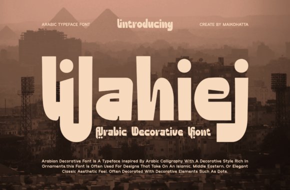
Wahiej channels ornamental Arabic traditions into a decorative display face where bulbous curves meet deliberate geometric joins, producing an expressive yet orderly appearance. Playful terminals and rhythmic dotting give words a handcrafted flair, so titles and labels read with a festive, artisanal energy that suits cultural events and boutique packaging. Stylistic sets and contextual alternates provide control over ornamentation so you can dial the vibe up or down.
This font is designed for short bursts of text rather than paragraphs: use it for logos, posters, signage, and product names where its ornament can breathe. It pairs well with a restrained sans or a thin serif to balance visual density, and metallic inks or textured backgrounds amplify its decorative details without overwhelming the layout.
My Recommendation: I’d reach for Wahiej for projects that need lively, culturally rooted typography-festival posters, handcrafted product labels, or bespoke retail identity work. Its ornamental features give instant personality, but I avoid it for body copy. For best results, combine Wahiej with a calm supporting type and open spacing.
27. Sacred Mubarak Font
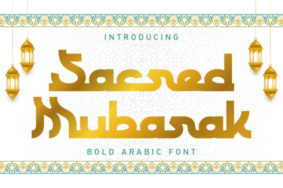
Sacred Mubarak reinterprets Kufic principles into a bold display family defined by broad horizontals and sharply vertical terminals, producing a stately, ceremonial rhythm across words. The letterforms emphasize clarity and monumentality, which makes the face particularly suited for festival branding, wedding stationery, and faith-oriented campaigns where a dignified, emblematic voice is required. A gold-gradient mockup often complements its inherent opulence in visual treatments.
The set ships with full multilingual support and PUA-encoded decorative glyphs-handy crescents, stars, and connecting ornaments that speed up themed headers and seals. Because the font commands attention at large scales, it works well on banners, product lids, and foil-stamped packaging, and it reads beautifully when paired with a delicate script or minimal Latin sans for bilingual identities.
╰┈➤ Download Sacred Mubarak Font
My Recommendation: I recommend Sacred Mubarak when you need a bold, culturally resonant display face for seasonal campaigns, premium packaging, or ceremonial invitations. Its weight holds up to embossing and metallic finishes, making it a reliable choice for high-end print. I tend to limit it to display roles rather than continuous text to preserve its impact.
These 27 selections provide a focused starting point for building brand systems that rely on modern arabic geometric fonts for branding. Testing a few candidates in real layouts will quickly reveal which geometries support your intended voice.
Pay close attention to language coverage and license terms before full rollout. Small tests on headlines, labels, and responsive breakpoints will save time and ensure the chosen font performs where it matters.