25 Elegant UI/UX Fonts for Mobile App Readability in 2026
UI/UX Fonts shape how people read, scan, and interact with digital interfaces. The right typefaces influence hierarchy, legibility, and rendering behavior across devices.
This guide presents 25 handpicked typefaces and families-system stacks, webfonts, and variable fonts-alongside notes on x-height, weight range, and hinting so you can compare how each performs on phones, tablets, and desktop screens.
Along the way you’ll see practical pairing ideas, accessibility tips for contrast and sizing, and suggestions for testing typography in real UI flows.
1. Balimo Font
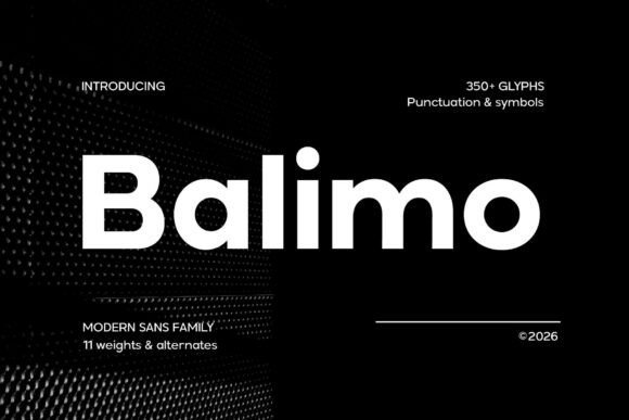
Balimo marries a geometric skeleton with softened terminals, yielding letterforms that stay readable and composed across sizes and contexts. With careful letterspacing and an even x-height, Balimo preserves clarity for both headlines and compact labels; its balanced counters and thoughtful hinting make it particularly effective within UI/UX Fonts workflows where small-type legibility and consistent rhythm matter. The tone is neutral but warm, so it reads confidently in product interfaces and brand collateral alike.
The family scales predictably: weights remain distinct without jarring shifts in colour, italics provide subtle emphasis, and kerning pairs feel finished out of the box. Its multilingual support and restrained personality make Balimo a useful choice for dashboards, marketing sites, and editorial pages that require a single dependable sans to carry visual systems from screens to print.
My Recommendation: I reach for Balimo when a project needs a straightforward sans with character that behaves well across devices. Its spacing and hinting cut down time spent micro-adjusting UI text, which speeds prototyping and handoffs. Use it for SaaS dashboards, product interfaces, and brand systems where legibility and a calm, modern voice are priorities.
2. Gradvis Font
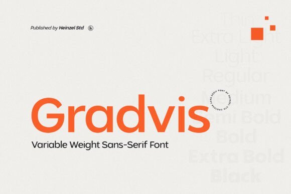
Gradvis offers a precise geometric structure softened by subtle terminals, giving it a composed neutrality that suits both print and screen. The family favours predictable stroke contrast and an approachable x-height, which keeps longer reads calm while allowing larger display sizes to hold presence. Web builds benefit from efficient file weight and careful hinting that improves rendering on low-resolution displays.
Its metrics simplify grid decisions and responsive scaling, so designers can establish hierarchy quickly without chasing optical fixes. Gradvis pairs well with humanist serifs or condensed grotesques for editorial work, packaging, and interface typography where understated clarity is the priority.
My Recommendation: I pick Gradvis when a project asks for a clean, no-nonsense sans that still carries subtle personality. It behaves reliably across weights and sizes, simplifying responsive type systems. Ideal for editorial sites, packaging, and brand identities that need one flexible face to do many tasks.
3. Perfect Corporate
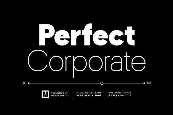
Perfect Corporate is a broad geometric family spanning nine weights, crafted to provide typographic control across demanding brand touchpoints. The wide weight range enables precise hierarchy control from thin captions to bold headlines, while softened joins and consistent proportions keep long documents and slides comfortable to scan. PUA-encoded glyphs make access to alternates and decorative characters straightforward for international branding needs.
On screens the consistent stems and measured counters render cleanly at common UI sizes, allowing teams to apply a single type system across marketing, product, and documentation. Built to integrate with design systems, Perfect Corporate supports tight typographic scales, logotypes, and UI components that require predictable spacing and token-friendly behavior.
╰┈➤ Download Perfect Corporate
My Recommendation: I recommend Perfect Corporate for organizations that need a single, governed type family across many applications. The extensive weights reduce the temptation to mix multiple faces, which helps maintain visual consistency. Use it for corporate identity programs, product interfaces, presentations, and design systems where reliable hierarchy and broad language support are important.
4. Gloomy Arcade
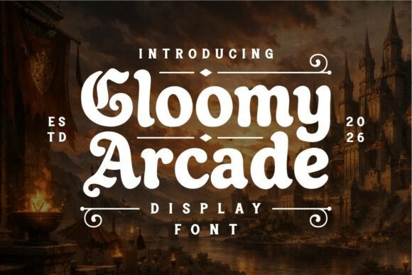
Gloomy Arcade melds retro arcade letterforms with a shadowy medieval temperament, giving headlines and logos an instantly theatrical presence. The glyphs combine heavy silhouettes, slightly irregular terminals and compressed counters so each character reads like a miniature emblem; among UI/UX Fonts, it serves as an arresting display choice when you need mood and clarity at large sizes.
The family includes stylistic alternates and bold weights that hold up on posters, box art and in-game HUDs while careful kerning keeps dense wordmarks legible. Use textured colorways-neon glows or weathered inks-to push the theme, and pair it with a neutral sans for supporting body copy so the ornamentation remains the focal point.
My Recommendation: I reach for Gloomy Arcade when a project needs theatrical attitude without sacrificing readability; it gives game menus, craft-brand logos and poster headlines immediate personality. The alternates let me tune the tone from playful to ominous, and the bold weights render well on merchandise and screen. If you’re crafting a fantasy-tinged arcade title or a brand with a retro-dark aesthetic, this font anchors the visual story quickly.
5. Cenzo Font
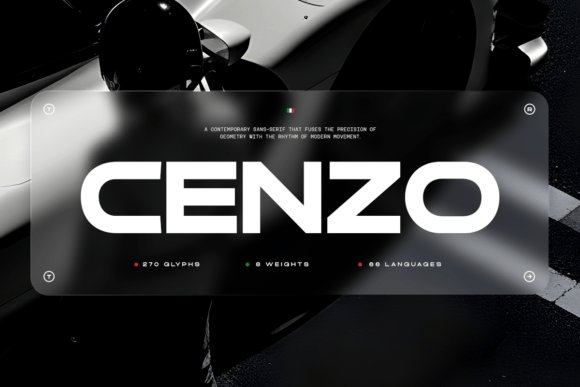
Cenzo is a study in geometric restraint: crisp terminals, a steady x-height and measured stroke contrast produce a controlled voice that reads clearly at both headline and small interface sizes. The design borrows modernist proportions but softens corners and adds subtle terminal cuts, resulting in a sans that feels contemporary without shouting for attention.
The family ships with multiple weights, ligatures and alternates so designers can craft nuanced identities and UI treatments; its consistent rhythm makes it excellent for dashboards, product pages and high-definition displays. Because Cenzo stays composed under tight spacing and heavy information density, it functions well as a primary brand typeface or a systematic interface face across platforms.
My Recommendation: I use Cenzo when a project needs a refined, professional voice that supports content rather than competes with it. Its balanced proportions and alternate characters allow small, deliberate typographic tweaks that strengthen branding work. Ideal for corporate identities, enterprise UIs and editorial layouts where precision and clarity are priorities.
6. Fagor Font
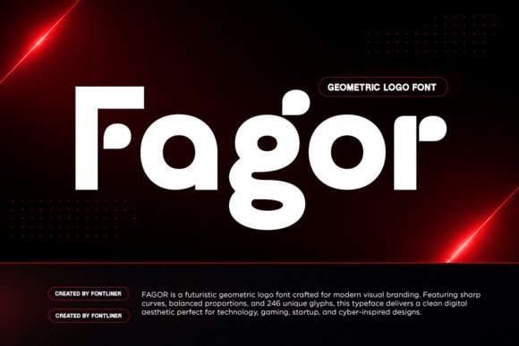
Fagor embraces geometric construction and smooth curves to deliver a tight, futuristic look that reads strongly in logos and display contexts. The letterforms favor monoline strokes and compact counters, which create a bold silhouette for product names, esport branding and tech packaging while remaining surprisingly legible at mid sizes.
Alternate glyphs and stylistic sets push the cyberpunk angle-angled terminals and unusual apertures let you dial in a more mechanical or more human feeling as needed. For identity work I pair Fagor with a neutral text face to avoid visual competition; for posters and UI badges, its compact forms cut through noisy layouts and reinforce a technology-forward aesthetic.
My Recommendation: I pick Fagor when a brand or interface needs a futuristic, confident look without ornate decoration. It’s especially effective for tech startups, gaming brands and product markups that require strong nameplate presence. The alternates give creative flexibility, making it simple to iterate logos and display treatments quickly.
7. Gc Epicpro
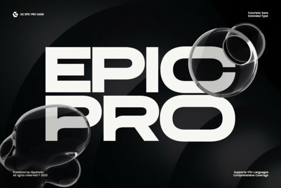
Gc Epicpro is an extended sans-serif display with a futuristic attitude: wide proportions, crisp geometry, and sharp terminals that push attention to headlines and identity marks. Its open counters and generous x-height make it a strong pick among UI/UX Fonts for interfaces and on-screen banners, giving striking presence without sacrificing legibility at medium and large sizes.
The set includes lowercase and uppercase, stylistic alternates, ligatures, and broad language support, plus full PUA encoding for direct access to special glyphs. Tight control over spacing and clear numeric forms mean it works well for esports badges, tech branding, sci‑fi editorial headers, or any project that needs a bold, modern display voice.
My Recommendation: I reach for Gc Epicpro when a project needs a forward-facing headline that reads cleanly on both web and mobile. The robust alternate set and PUA access save time when crafting custom wordmarks or title treatments. Use it for tech brands, gaming identities, app splash screens, and editorial covers where bold typography must remain readable.
8. Barion Font
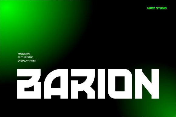
Barion is a modern display font built around a bold, futuristic aesthetic that commands attention in posters, motion graphics, and brand marks. Its sculpted letterforms and assertive proportions give headlines a machine-age feel while preserving clear counters and distinct numerals for readability in big typesetting.
Because the design emphasizes strong silhouettes, Barion performs well in short phrases, hero headers, and interface titles where visual punch matters. Pair it with a neutral text face for body copy or use tighter tracking for high-energy promotional art and cinematic titles that need weight and motion-friendly shapes.
My Recommendation: I recommend Barion when you want a headline that reads like modern industrial design: bold, precise, and graphic. It holds up in animated sequences and large-format posters thanks to its clear shapes and strong numerals. Ideal for tech campaigns, film titles, esports branding, and any project seeking a forward-looking, assertive display voice.
9. Gatecode Font
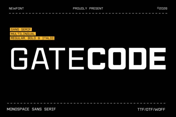
Gatecode is a contemporary monospace sans serif inspired by coding interfaces and digital readouts, offering even character widths and a neutral, technical tone. Its consistent glyph rhythm makes it highly suitable for code editors, terminal-themed UIs, and product screens where column alignment and numeric clarity matter most.
The face delivers crisp punctuation, deliberate letterforms for clear differentiation of similar characters, and balanced spacing that reads well at small sizes on screens. Use Gatecode for developer tools, dashboard tables, tech packaging, and cyber‑styled posters where precise, utilitarian typography is required.
My Recommendation: I use Gatecode when a project needs honest monospace clarity-especially for dev tools, command-line mockups, or dashboards with dense data. The consistent widths simplify layout and improve alignment for tabular content. It’s a reliable option for interfaces and branding that lean into a technical, code-friendly aesthetic.
10. Reang Lanira
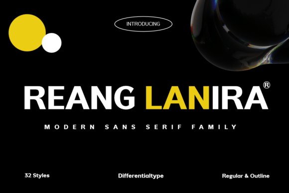
Reang Lanira is a modern sans serif family that pairs geometric precision with industrial character, built around broad apertures and a generous x-height that aid legibility on small screens and large signage alike. The collection spans 32 styles-from restrained Regular to eye-catching Outline-giving designers a predictable weight palette for clear typographic hierarchy. Its crisp letterforms and spatial economy make it a high-performing choice for UI/UX Fonts, corporate headers, and bold editorial treatments.
Use Reang Lanira when you want a confident, no-nonsense voice: it reads strong in navigation bars, hero headlines, and wayfinding systems while retaining subtle humanist details that prevent mechanical sterility. Because strokes remain stable across sizes, it integrates cleanly into component libraries and scaled design systems where consistency and rapid readability matter. Pair it with neutral iconography and restrained color to maintain authority without overwhelming interface elements.
My Recommendation: I reach for Reang Lanira when a project needs a disciplined, assertive typographic voice-particularly for enterprise dashboards or tech brands where clarity at small sizes is non-negotiable. The 32-style range lets me establish nuanced hierarchies without pulling in extra families. It performs equally well in large-format signage, editorial mastheads, and product interfaces where dependable legibility and a strong presence are required.
11. Saga Grotesk
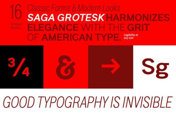
Saga Grotesk balances geometric restraint with elegant proportions, constructed across 16 well-spaced styles from Light to Black and widths from Condensed to Normal. Its metrics take cues from classical ratios, producing a pleasing rhythm in both extended body copy and tight headline settings. Clean counters and calibrated letterspacing make it a smart choice for crisp typography on print pages and on-screen displays.
This family works particularly well for identity systems, editorial mastheads, and presentation layouts where a poised neutral voice is required; Condensed cuts shine in compact labels and data-heavy charts. On digital interfaces the steady stroke contrast and considered apertures aid readability in tight layouts while preserving a composed brand tone. Combine Saga Grotesk with a softer companion for warmth or use it alone to maintain a minimalist typographic palette.
My Recommendation: I recommend Saga Grotesk for brands that need an orderly, refined type family with strong proportional logic. The variety of widths is especially useful when space is limited or responsive adjustments are needed. It’s a go-to for magazines, corporate identities, and interface prototypes where typographic restraint and clarity are priorities.
12. Methane
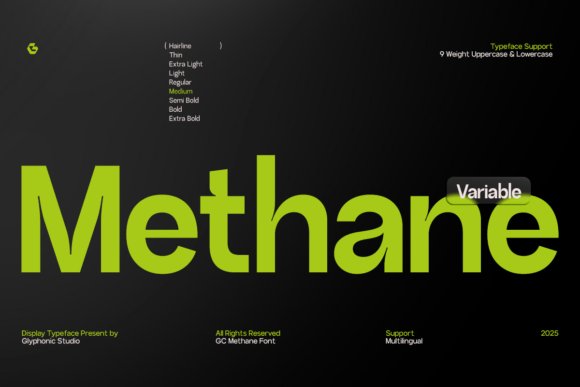
Methane is a clear, purposeful sans built on geometric foundations and measured proportions that read smoothly across pixel grids and print. As a complete type system it offers a broad weight palette suitable for subtle hierarchies as well as emphatic headlines, with each cut tuned to preserve optical balance at differing sizes. Restrained terminals and open counters reduce visual clutter, which helps when configuring compact UI components and dense editorial columns.
Because Methane was conceived as a system, it integrates naturally into component libraries and design tokens, delivering a consistent voice across product touchpoints. The face carries enough personality to stand out in branding work without clashing with iconography or imagery. Choose Methane when a project calls for disciplined legibility and a modern, unshowy typographic presence.
My Recommendation: I pick Methane for digital products that require tight typographic control-dashboards, SaaS interfaces, and magazines where readable scales and dependable weights matter. Its range allows me to establish hierarchy without introducing additional families. Methane feels engineered for teams that prioritize clarity and consistent expression across platforms.
13. Backone Font – UI/UX Fonts
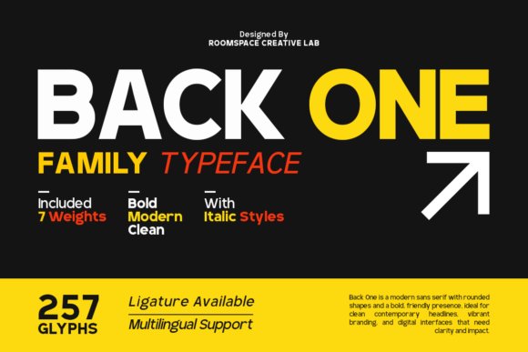
Backone is a geometric sans that balances restrained proportions with generous apertures, built to remain legible on high-density displays and printed collateral alike. The family offers seven weights, true italics and PUA-encoded glyphs for extended language and stylistic coverage, and careful hinting that improves on-screen clarity. With its clear shapes and steady x-height, Backone works naturally inside UI/UX Fonts toolkits where consistent readability across resolutions matters.
Use heavier weights for anchoring headlines and lighter ones for airy captions to establish a fast visual hierarchy; tighter tracking suits bold editorial treatments while spacious letterspacing gives a premium, architectural feel. Wide openings in letters reduce masking on small UI labels and scaling between weights keeps emphasis simple without adding extra families. Pair Backone with a warm humanist serif or a neutral grotesque for contrast in identities, packaging and signage.
╰┈➤ Download Backone Font – UI/UX Fonts
My Recommendation: I pick Backone when a project must look precise on devices and on paper at the same time. The weight range and italics let me build clear hierarchies without juggling multiple typefaces, and PUA glyphs speed up multi-language layouts. It’s a pragmatic choice for tech brands, dashboard interfaces and corporate identity work where legibility and a modern, measured tone are priorities.
14. Exon Display Font
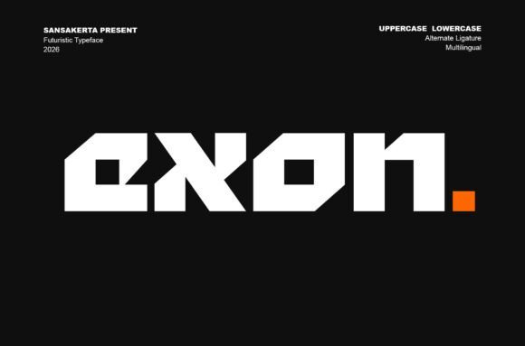
Exon channels a sci-fi, techno edge with sharp terminals, geometric cuts and bold letterforms designed for large-scale display use. Its personality is strongest in headlines, posters and logotypes where the angular strokes create a sense of engineered motion and visual drama. Provided in TTF, OTF and WOFF formats, Exon is straightforward to deploy across web, motion and print workflows.
Treat Exon as an attention-getting accent rather than a body face; its forms demand thoughtful kerning and a touch of extra tracking in compact settings. It pairs well with a neutral text family to preserve reading comfort, and responds effectively to layered effects like glows, masks or animated reveals in trailers and hero banners. For designers aiming for a future-forward identity, Exon supplies bold attitude with minimal setup.
╰┈➤ Download Exon Display Font
My Recommendation: I reach for Exon when a brand needs immediate futuristic character without commissioning custom lettering. It performs brilliantly in thumbnails and hero headers, and the available file formats make integration into web and motion projects painless. Ideal for game studios, esports brands and sci-fi themed campaigns where strong display impact is the primary goal.
15. Opinio Font
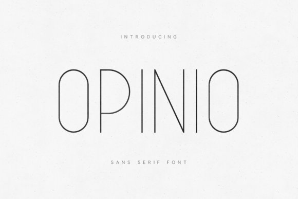
Opinio is a slim geometric sans with a refined voice, defined by delicate strokes, balanced proportions and a calm, open rhythm that reads as elegant rather than fragile. Its airy letterforms and steady x-height make it well suited to upscale editorial layouts, boutique packaging and interface labels that favor a minimal aesthetic. The family retains consistent texture across print and screens, so it behaves predictably in mixed-media projects.
On interfaces Opinio works best for headings, form labels and generous layouts that rely on negative space; avoid using the thinnest weights for dense body text at small sizes. Pair it with a warm serif or a mid-weight grotesque to introduce contrast and improve long-read comfort, or increase weight slightly on high-contrast backgrounds to preserve clarity. Opinio gives projects a quiet, curated typographic presence suited to premium brands and refined digital products.
My Recommendation: I choose Opinio for work that needs a sophisticated, understated tone without feeling frosty. Its fine strokes are great for editorial mastheads and curated product pages, though I often nudge weights up for dense UI copy. Use it for boutique brands, fashion sites and high-end digital experiences that value restraint and precision.
16. Lotrance Font
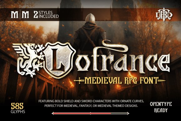
Lotrance Font channels medieval heraldry with shield-shaped counters, sword-like terminals and sweeping curves that read as weighty and ceremonial. The letterforms mix heavy strokes with delicate terminals, giving headings a sculpted presence that holds up at large sizes and on textured backgrounds. Ornament glyphs-banners, crests, and simple sword dingbats-extend branding options without clutter.
As a display choice among UI/UX Fonts, Lotrance works well for title bars, game HUD headers, and splash screens where theatrical tone matters. Careful kerning and strong contrast keep legibility when used in menus or in-app banners, and the palette of alternates lets logos and merchandise read as a coherent identity.
My Recommendation: I reach for Lotrance when a project needs medieval character without resorting to heavy illustration. Its decorative caps and weapon-themed ornaments give instant storybook or RPG flavor while remaining practical for logos and posters. Use it on covers, title screens, festival posters, and any branding that benefits from historical drama and bold display headings.
17. Digittal Font
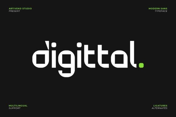
Digittal Font is a geometric sans built for technical identities, with tight geometry, open counters, and steady stroke widths that read clearly at headline and logotype sizes. The overall shapes favor compact lockups, and the simplified terminals reduce visual noise in dense layouts. Thoughtful spacing makes condensed words hang together without collapsing.
On-screen hinting and crisp glyph shapes make Digittal reliable as a webfont and for interface typography, where consistent rendering matters across browsers and devices. Pair it with a warmer text face for long reads, or use the bold and condensed weights for compact navigation, product labels, and app icons that demand a precise, modern tone.
My Recommendation: I pick Digittal for brands that want a technical, confident look across screens and print. It speeds up identity work because the spacing and proportions behave predictably in logos and UI elements. Ideal projects include SaaS products, app interfaces, fintech dashboards, and hardware packaging where a clean, geometric voice is needed.
18. Mega Binory Font
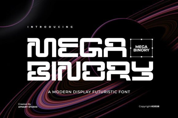
Mega Binory Font embraces sci-fi geometry with sharp corners, angled apertures, and staggered terminals that read like circuitry in motion. The uppercase-forward set includes modular joins and optional inline cuts that add visual tension for posters and motion titles. Letterforms feel engineered to work against neon glows and high-contrast backdrops.
Apply Mega Binory to esports branding, trailer headers, or product thumbnails when you need an assertive tech aesthetic; its bold counters translate well to animated HUDs and neon gradients. A range of alternates and numeric styles helps synchronize scoreboards, thumbnail overlays, and promotional banners without additional layering tricks.
My Recommendation: I use Mega Binory when a project needs a high-energy, sci-fi headline that reads across video and still formats. Its alternate glyphs let me craft distinctive marks quickly, and the strong silhouettes survive low-resolution thumbnails. Best suited for trailers, esports identities, tech event posters, and any graphic that benefits from a bold, engineered display face.
19. Terra Naro
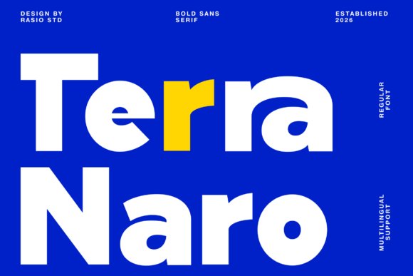
Terra Naro is a bold sans serif built around compact geometry and crisp terminals that give headlines a very deliberate presence. The high contrast between stems and bowls makes text arresting at display sizes while its clean counters preserve legibility on small screens, which is why it sits well among UI/UX Fonts for buttons, banners, and navigation headers. Its character shapes favor tight tracking and confident silhouettes, so branded headlines feel modern without resorting to ornament.
The family includes upper- and lowercase letters, numerals, punctuation, and extensive multilingual coverage, so international projects won’t force last-minute swaps. Pair it with a neutral text face to build clear hierarchy, and use incremental letter-spacing when you need compact labels inside interface modules. For posters, hero banners, or punchy product UI, Terra Naro gives a focused, readable shout rather than a whisper.
My Recommendation: I reach for Terra Naro when I need a headline that reads strong on both mobile and desktop. Its geometry cuts through dense layouts and the multilingual support keeps global launches smooth. Use it for bold brand identities, editorial covers, and product interfaces where clarity and attitude are required.
20. Bigoba Font
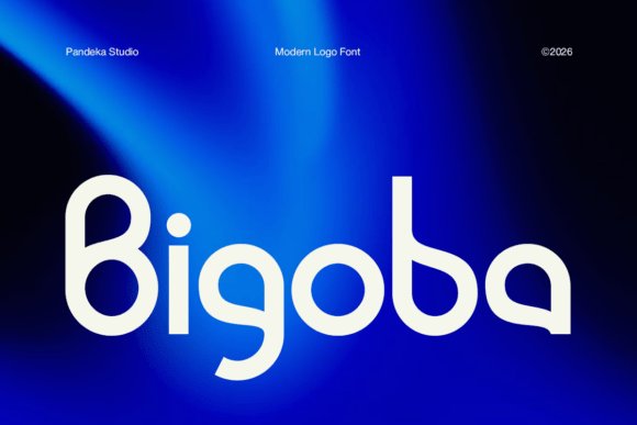
Bigoba Font is a display face shaped from geometric forms and soft curves to produce a sleek, futuristic visual identity for logos and wordmarks. Distinctive terminals and balanced proportions let single-word marks feel memorable without sacrificing readability, which is useful when a logotype must scale from a favicon to a billboard. The letterforms maintain clarity at large sizes, making the face well suited to splash screens and prominent interface headers.
Because its personality is strong, Bigoba works best when paired with a low-contrast, neutral sans for body copy to avoid typographic competition. It adapts well to vector exports and SVG use, so designers can keep crisp edges across responsive interfaces. I’d reserve it for brand systems, product launches, and app identities where a confident, modern mark is the brief.
My Recommendation: I pick Bigoba when a brand needs a memorable logotype that reads cleanly at different scales. The unique letterforms impart character without compromising legibility, which helps in tight identity systems. Ideal for tech startups, product pages, and any project that benefits from a sleek, modern display face.
21. Averion Font
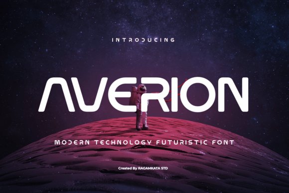
Averion Font channels a space-age aesthetic with modular strokes and open counters that create a sense of motion and precision in headlines. Its geometric rhythm and slightly condensed proportions give a bold, technological tone that holds up in motion graphics, game interfaces, and cinematic posters. When used for short, high-impact copy it reads confidently and commands attention without distracting visual noise.
Reserve Averion for display applications rather than running text, and combine it with a simple grotesque or humanist face for interface copy to maintain comfortable reading. Pay attention to tracking and kerning when working at small sizes or responsive breakpoints, as tighter letter spacing amplifies its character. The type fits branding, gaming visuals, and product launches that need a dramatic, futuristic voice.
My Recommendation: I use Averion when a project needs a bold, sci-fi-inflected headline that feels modern and assertive. It performs well in posters, trailers, and UI headers where short bursts of typography must make an impression. Best paired with unobtrusive text faces so the display letters can hold the spotlight without overwhelming content.
22. Felbion Font
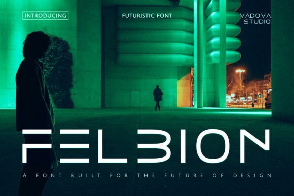
Felbion Font brings a bold, geometric voice to sci-fi and tech-forward visuals; its angled terminals and compressed counters create a crisp, high-impact look that reads well on screens and posters alike. Designed with multilingual glyph coverage and pixel-aware hinting, it sits well within UI/UX Fonts collections when a hard-edged, cinematic headline is required. Apply Felbion to game titles, HUD overlays, or marketing art where a cybernetic personality will grab attention without sacrificing clarity.
The family favors tight tracking and an assertive x-height so small captions remain legible while heavy display weights dominate banners and trailers. Pair it with a neutral humanist for longer copy to keep interfaces calm, and pay attention to letterspacing for buttons and microcopy. I’d reach for Felbion on speculative-fiction branding, immersive UI mockups, and any interface that benefits from a pronounced, futuristic voice.
My Recommendation: I use Felbion when a project needs a distinct sci-fi attitude that still performs on screens. Its strong display presence is ideal for titles, trailers, and HUD work, while the multilingual set makes it practical for international releases. For most interfaces I pair it with a softer sans for body text to avoid visual fatigue and to preserve clarity at smaller sizes.
23. Anuaraga Font
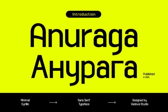
Anuaraga Font offers a clean, minimal Cyrillic sans with a pronounced x-height and steady stroke weights that enhance on-screen legibility. The even rhythm and neutral terminals make it a natural choice for interface typography, product UIs, and editorial grids where consistent reading flow matters. Support for both Latin and Cyrillic ensures typography remains coherent across multilingual pages and app screens.
Delivered in multiple weights with carefully spaced numerals and punctuation, Anuaraga adapts well to responsive layouts and webfont constraints. Its restrained voice helps maintain hierarchy in dashboards and content-rich layouts without stealing visual focus. Designers building international brands or multi-language SaaS products will value its predictability and control in component libraries and style guides.
My Recommendation: I pick Anuaraga for projects that require clean Cyrillic support and dependable screen performance. It shines in dashboards, SaaS interfaces, and editorial systems where small-size legibility and typographic consistency are priorities. When working across languages, this font reduces friction in design systems and keeps visual tone uniform.
24. Kelantis Font
Kelantis Font is a restrained modern sans that focuses on clarity, open apertures, and measured proportions to perform across devices and print. Its neutral personality works equally well for headlines, UI labels, and body copy, helping maintain a calm typographic hierarchy in dense layouts. The letterforms balance space economy with readability, which is useful for navigation, forms, and compact interface components.
With solid hinting and consistent metrics, Kelantis behaves predictably as a webfont and within design systems, simplifying scale tests and responsive typography. It pairs nicely with more expressive display faces when a project needs character in headlines without compromising interface text. I tend to use Kelantis for enterprise dashboards, corporate identities, and app prototypes where reliability and restraint matter most.
My Recommendation: Kelantis is my go-to when a project demands dependable, low-attention typography that still looks polished. It keeps interfaces legible on small screens and scales cleanly for signage or hero headers. I recommend it for enterprise products, design systems, and brand work where a professional, understated voice supports content rather than competes with it.
25. Rimini Font
Rimini’s rounded sans-serif marries clean geometry with gently softened terminals to create an approachable yet contemporary voice. Its open counters, moderate x-height, and even stroke widths keep text highly legible at small sizes, which makes Rimini a strong option among UI/UX Fonts and other interface typography needs. The consistent rhythm across letterforms and carefully tuned spacing make it work equally well for short interface labels and compact headlines.
As a display face it adds warmth to brand marks and packaging while remaining readable in body copy across screen densities. Good hinting and sensible kerning preserve clarity as a webfont, and the rounded strokes harmonize with icon sets that favor soft forms. Pair Rimini with a humanist serif or a monospaced companion for contrast, and increase size slightly on nav elements to improve touch targets and scannability.
My Recommendation: I use Rimini when a project needs a friendly, modern tone without sacrificing legibility. Its rounded shapes bring personality to apps and dashboards, while the clear letterforms perform well in editorial and packaging contexts. For lifestyle brands and consumer products it softens identity systems, and in UI work it helps labels and controls feel more human and readable.
These 25 typefaces give designers a focused starting point when readability, performance, and scalable typography matter most in interface work. Each entry includes usage notes so you can match a font’s strengths to specific UI needs.
Try several in your prototypes, test them at multiple sizes and color contrasts, and favor families with variable axes or reliable hinting for smoother scaling across devices.