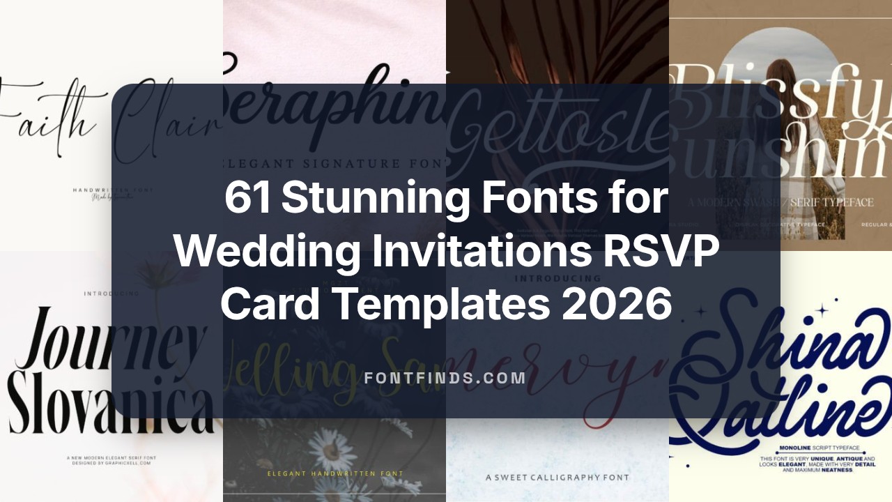
61 Stunning Fonts for Wedding Invitations RSVP Card Templates 2026
Picking fonts for wedding invitations can define the mood before guests even open the envelope. This list of 61 typefaces covers script, serif, sans-serif, and hand-lettered options so you can find styles that suit formal, casual, or modern celebrations.
Each entry includes pairing suggestions, recommended sizes, and print-friendly notes for items like save-the-dates, RSVP cards, and envelopes. Use the samples here to test legibility and paper choices before you commit to a full print run.
1. Tifanny Grania Font
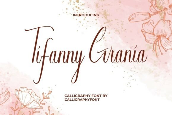
Tifanny Grania Font – Tifanny Grania is an exquisitely delicate calligraphy script that pairs dramatic thick downstrokes with whisper-thin upstrokes, giving words an organic, handcrafted motion. Its signature long swashes and decorative flourishes on both capitals and lowercase letters make single-word monograms and venue nameplates feel bespoke and refined. With an extensive set of ligatures and PUA-encoded alternates, the face makes designing luxe stationery straightforward for ornate invite suites and fonts for wedding invitations.The contrast in stroke weight and fluid connections between characters render beautifully under foil-stamping, letterpress, and deep embossing-qualities that read as premium on thick cotton stock. Designers gain fine control over rhythm by swapping alternates: extend a tail, shorten a loop, or tighten kerning for RSVP cards without losing a hand-lettered look. Use it sparingly for names and headlines and pair with a neutral serif or narrow sans for body copy to preserve legibility across suites.
╰┈➤ Download Tifanny Grania Font
My Recommendation: I reach for Tifanny Grania when a wedding suite needs unmistakable calligraphic flair; its long swashes give names a handcrafted presence that photos and print both love. The PUA glyph set speeds layout because alternates are easy to access in most design apps. It’s ideal for formal ceremonies, luxury brands, and projects destined for letterpress, foil, or heavy-stock stationery.
2. Melanique Font
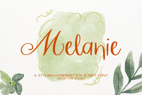
Melanique Font – Melanique is a soft, flowing script with polished strokes that mimic elegant handwriting, lending warmth to feminine and lifestyle compositions. Its clean joins and moderate contrast keep names and short titles readable even at display sizes, and the typeface installs cleanly into Canva, Photoshop, and Illustrator for fast mockups. The overall effect suits boutique logos, beauty packaging, social posts, and bridal headers where a personable, stylish voice is wanted.For layout, set Melanique as a focal script for names and quotes, increase letterspacing slightly for an airy presence, and pair it with a minimal sans for directions and event details. Because the font creates a strong mood on its own, keep backgrounds uncluttered and test printed contrast to avoid ink spread on textured papers. Its friendly curves make it a practical pick when deadlines demand a refined look without extensive typographic tinkering.
My Recommendation: I use Melanique when a project needs a graceful, readable script that works across screens and print; it’s especially helpful for quick branding and social collateral. Its compatibility with major design platforms accelerates client rounds and proofs. Choose this font for boutique stationery, product labels, and digital quotes that benefit from an approachable, handwritten tone.
3. Semilir Font
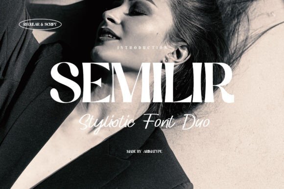
Semilir Font – Semilir pairs a measured geometric serif with companion script alternates, so designers can create cohesive invitation suites without juggling multiple families. The serif provides steady, readable body text for itineraries and directions, while the script alternates add flourish for names, monograms, and section headers. A broad set of ligatures and stylistic alternates gives control over rhythm and texture across save-the-dates, menus, and signage.This hybrid approach streamlines multi-piece stationery: use the serif for RSVP blocks and venue details, and swap in script options for focal names to establish hierarchy through contrast. Semilir responds well to small caps, subtle weight shifts, and tight tracking, which suits printed techniques like debossing and engraving. It works across intimate wedding suites and boutique branding where consistent typographic language matters.
My Recommendation: I pick Semilir when a project needs unity across many printed elements because the serif and script live within the same system, reducing mismatched tones. That cohesion keeps body copy legible while letting names and headlines breathe with personality. It’s perfect for couples who want modern clarity with a touch of handcrafted flair across their full stationery set.
4. Queen California Font
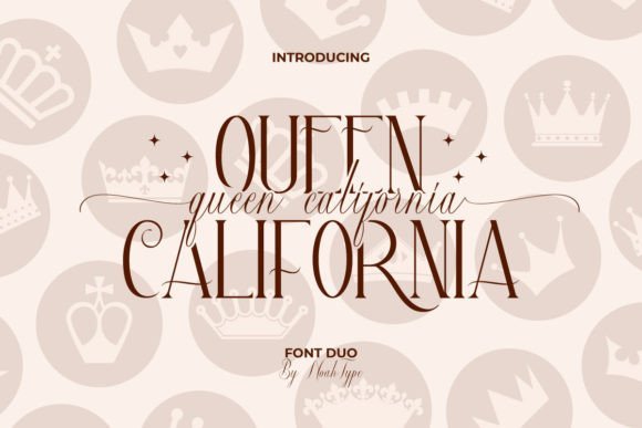
Queen California Font – Queen California pairs a refined serif display with a free‑flowing calligraphic script, creating a high‑contrast duo that feels both formal and personal. The serif anchors headlines while the script supplies fluid names and swashes, making it a natural choice when composing invitation text, envelope addressing, RSVP cards and decorative monograms; the family is also PUA encoded so every alternates and glyph is easy to access. The font’s swash system and coordinated kerning allow careful letter combinations without awkward collisions, and its mix of display and handwritten styles helps craft clear visual hierarchy across suite pieces. If you want type that reads as luxury but still carries the warmth of hand lettering, this pairing handles headings, small print and ornamentation with equal poise, so it’s especially effective when assembling cohesive wedding collateral using fonts for wedding invitations.
╰┈➤ Download Queen California Font
My Recommendation: I’d reach for Queen California when a couple wants a blend of classic polish and handwritten warmth. The ready-made swashes and PUA encoding save time when building coordinated suites, and the contrast between serif and script reads well in print treatments like foil or raised ink. Use it for formal invitations that also need intimate, calligraphic details – think ceremony invites, reply cards and envelope names.
5. Alberth Family Font
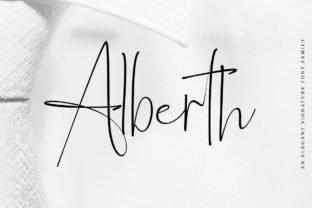
Alberth Family Font – Alberth Family is a multi‑weight serif set that balances grace with clear structure: four weights give you options for strong headlines, comfortable reading in body copy, and subtle variations for captions or date lines. Its letterforms carry refined terminals and measured contrast, so it adapts well to both print and on‑screen use without losing personality. Because the family covers a useful tonal range, it’s simple to create typographic hierarchy across invitations, programs, menus and business cards while keeping a consistent voice. I especially like Alberth for projects that need a classy presence without resorting to ornate scripts – it prints cleanly for blind embossing and performs well in tight layouts or small metal‑stamped tags.
╰┈➤ Download Alberth Family Font
My Recommendation: I recommend Alberth Family when the goal is understated luxury and reliable readability across a complete stationery set. Its multiple weights let you layer headings and body text without introducing another typeface, which is great for designers producing full invitation suites, save‑the‑dates, or branded wedding collateral. The controlled contrast and clear shapes also make it a dependable choice for letterpress and thermographic printing.
6. Militta Font
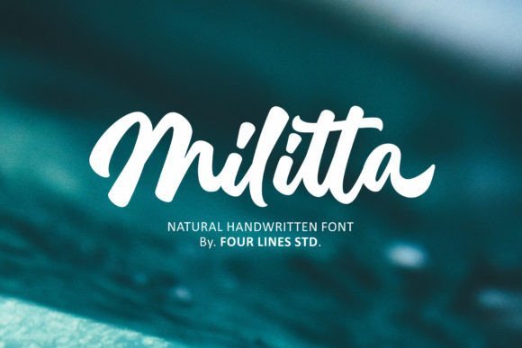
Militta Font – Militta is a soft, hand‑script design with slender strokes and airy counters that suggest hand lettering more than mechanical script. Its flowing connections and playful terminals give a romantic, intimate feel, perfect for name lines, monograms and short display text in bridal stationery or boutique packaging. The face includes alternate characters and ligatures that reduce repetition and produce natural looking phrases when typeset at larger sizes, and it pairs beautifully with a restrained serif for contrast. For printed invites consider pairing Militta with foil stamping or die‑cut edges to emphasize the graceful strokes and keep longer passages in a simpler companion face.
My Recommendation: I’d use Militta when a project needs a feminine, handmade touch without sacrificing legibility. The alternates and ligatures make blocky repetitions feel organic, and it photographs and prints well in foil and emboss treatments. It’s ideal for intimate invitation suites, boutique branding, or any design that benefits from a soft, calligraphic voice.
7. Journey Slovanika Font
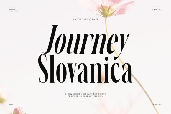
Journey Slovanika Font – Journey Slovanika is a modern serif that balances high-contrast strokes with open counters, giving each letter a poised, fashion-forward appearance. The thin hairlines paired with stronger stems create a rhythmic texture that reads cleanly at display sizes and remains readable in longer passages. It ranks highly among fonts for wedding invitations because it pairs classic formality with a faintly feminine edge, making suites feel curated rather than ornate.The font’s rhythm and variety of strokes suit headlines, invitation bodies, and editorial layouts, while its refined details carry well into logos and packaging. Use light to medium weights for body copy and the bolder cuts for names and headings; pair it with a flowing script for ceremony details to reduce visual clutter. This font is especially effective for brands aiming for a high-fashion bridal look without sacrificing legibility.
╰┈➤ Download Journey Slovanika Font
My Recommendation: I reach for Journey Slovanika when a project needs a refined serif voice that still reads comfortably in blocks of text. It makes names and headings pop on letterpress or foil-stamped pieces while remaining understated for longer passages. Use it for boutique wedding suites, editorial bridal spreads, or brand identities that want a feminine, polished presence.
8. Gettosle Font
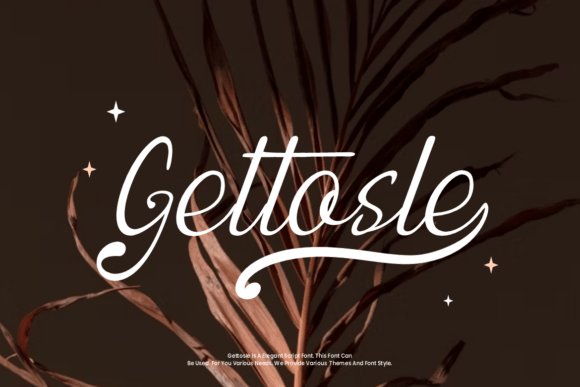
Gettosle Font is a flowing script with continuous strokes that mimic a confident hand, giving text a natural, romantic cadence. Thick-to-thin transitions within strokes add texture while generous swashes on descenders supply dramatic movement without feeling forced. PUA encoding grants easy access to alternates, swashes, and ligatures so designers can craft bespoke nameplates and envelope addressing with pinpoint control.Its expressive forms perform best at larger sizes where the swashes and connections can breathe, making it ideal for invitation headers, monograms, and signature-style logos. Pay attention to kerning and line spacing when setting multi-line text, and consider pairing this script with a restrained sans serif for contrast. The result reads intimate and handcrafted, suitable for premium stationery and romantic branding.
My Recommendation: I use Gettosle whenever a design benefits from handwritten warmth and flourish; the PUA glyphs let me build unique wordmarks and envelope treatments without swapping files. It excels on covers and signage where the swashes can shine, and pairs well with a simple sans for body copy. For romantic branding or luxe invitation covers, this script gives an unmistakable personal touch.
9. Delhi Font
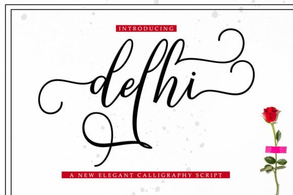
Delhi Font captures the cadence of traditional calligraphy with sweeping strokes and measured contrast, evoking classical stationery without appearing dated. Its letterforms favor elegant terminals and rhythmic connections that suggest hand-lettered signatures, which makes it well suited for formal announcements and ceremony materials. The restrained flourishes keep the style refined, so it reads well on both print invites and digital save-the-dates.Because Delhi performs best with high-resolution output, it pairs especially well with letterpress, foil, and engraving techniques that reveal fine stroke endings. Use it for place cards, certificates, and formal headings, and combine it with a neutral serif for long paragraphs to maintain readability. Designers seeking a timeless, calligraphic voice will find this font useful for classic wedding and event stationery.
My Recommendation: I recommend Delhi when you want a traditional calligraphic presence without excess ornamentation; its calm rhythm and formal capitals suit classic wedding suites and printed programs. It shines on tactile finishes like foil and letterpress, where the delicate stroke endings become visible. Pair it with a plain serif for body text to keep layouts elegant and readable.
10. Mervyn Font
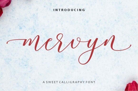
Mervyn Font – Mervyn reproduces the sweep and rhythm of traditional calligraphy with crisp hairlines and pronounced contrast between thick and thin strokes. The family includes a generous set of alternates, contextual ligatures and swashes that let you craft unique name treatments without resorting to custom lettering. Mervyn is especially successful on fine paper and foil-stamped envelopes, and it reads beautifully as fonts for wedding invitations or formal stationery where a handcrafted appearance matters.Despite its flourish-heavy capitals, the lowercase shapes and spacing are tuned for legibility, so names and short blocks remain readable even at modest sizes. It pairs well with a restrained serif or a light geometric sans for balance, and delivers predictable results in letterpress, embossing, or high-resolution digital print. If you need a script that carries authentic calligraphic flair while staying practical for production, Mervyn is a dependable choice.
My Recommendation: I use Mervyn when a design needs genuine calligraphy vibes without commissioning a hand-lettered piece. The alternates and swashes let me create bespoke headers quickly, and it reproduces beautifully on cotton rag or metallic foil. Ideal for black-tie invitations, formal envelopes, and ceremony programs where a refined, artisanal look matters.
11. Welling Sam Font
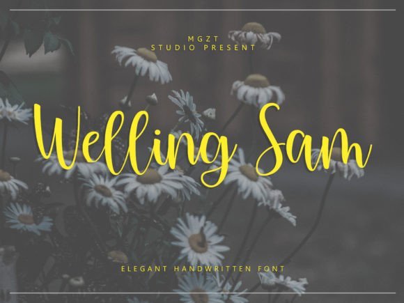
Welling Sam Font – Welling Sam blends the warmth of handwritten script with measured Latin proportions, yielding a modern, personable signature style. Stroke endings are soft and the rhythm across letter pairs feels intentionally human, which makes it suitable for invitation suites, place cards, and boutique branding that benefit from a personal touch. The overall balance favors legibility so the script can be used in both headers and modest body text for stationery applications.The family offers tasteful ligatures and subtle swashes rather than excessive ornamentation, keeping the design readable on textured stock and online mockups alike. For a contemporary wedding identity, pair Welling Sam with a clean sans or a narrow serif to let the handwriting stand out without clutter. It’s an excellent pick when you want warmth and clarity together in printed or digital invites.
My Recommendation: I reach for Welling Sam for modern wedding suites and lifestyle brands because it reads as handcrafted while staying clean and versatile. The restrained swashes give personality without overpowering layouts, and it holds up on both textured paper and web headers. Use it for boutique invitations, small-run stationery, or branded packaging that needs an approachable, refined script.
12. Amettha Font
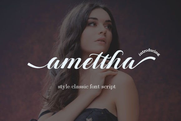
Amettha Font – Amettha pairs feminine curves with contemporary proportions to produce a polished, handcrafted script that suits a broad range of lifestyle projects. The glyph set includes alternate terminals and decorative swashes, so you can dial the flourish up or down depending on whether a design calls for playful charm or subtle grace. It’s well suited to logos, bridal shower invites, labels, and editorial headers where personality and refinement are important.Spacing and x-height have been considered so short phrases remain readable, while larger display sizes reveal the calligraphic detail and stroke modulation. Amettha works nicely against watercolor backgrounds or paired with a warm serif for contrast, and it transfers cleanly to print and social-media visuals. If you want a feminine, modern script that still feels hand-crafted, this one delivers a lot of expressive options.
My Recommendation: I often pick Amettha for projects aimed at brides, lifestyle makers, and product packaging thanks to its delicate yet confident strokes. The alternates make it easy to create varied nameplates without extra editing, and it prints well on textured papers and labels. It’s perfect for bridal shower invites, feminine branding, and boutique product tags where charm and legibility matter.
13. Themystory Font
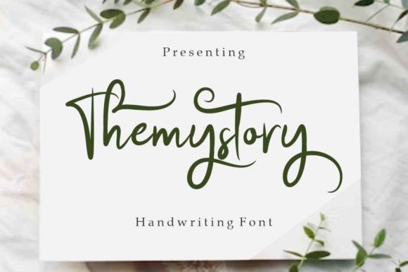
Themystory Font – Themystory channels classic calligraphy with long, elegant strokes and carefully weighted contrast that reads like a practiced hand. It excels for names and headline lines on printed pieces and is one of the stronger options when choosing fonts for wedding invitations because its swashes and alternate characters add ceremony without overwhelming layout.On a technical level the font holds up at both display and modest text sizes thanks to thoughtful spacing and clear counters; OpenType features like ligatures and stylistic sets make custom flourishes easy to apply. Pair it with a restrained serif or a simple geometric sans for RSVP details, and consider cotton or laid paper plus a rich ink or foil to let the forms sing.
My Recommendation: I would pick Themystory when I want a formal, timeless feel for invitation suites. Its calligraphic rhythm creates memorable nameplates and looks particularly good with textured stock or foil stamping. Use it for classic weddings, black-tie events, or anytime you want type that reads handcrafted but remains reliably legible.
14. Nuptalia Font
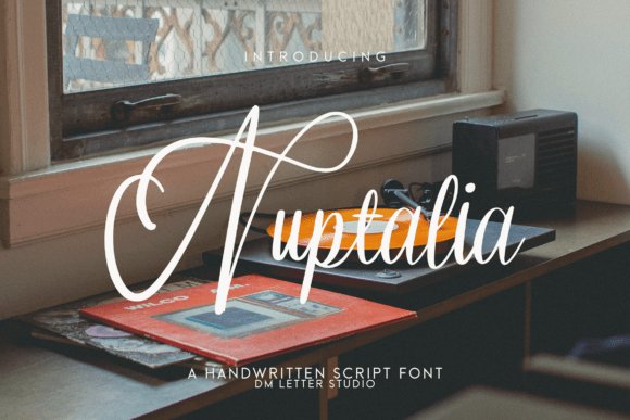
Nuptalia Font – Nuptalia reads like a warm, handwritten script: lively strokes, soft terminals, and just enough irregularity to feel personal without becoming messy. It performs well for medium-length names and short phrases, keeping letter connections fluid so printed pieces look intimate and approachable.The font installs cleanly across common design apps and exports crisply for both digital and offset print, which is helpful when you’re mixing invitation cards and social graphics. I like pairing Nuptalia with a light sans or a modern serif and using airy layouts with ample margins to emphasize its informal elegance on vow books, rehearsal invites, and reception signage.
My Recommendation: I often reach for Nuptalia when a design needs to feel handwritten but tidy-think garden parties, boho celebrations, or small family ceremonies. Its natural flow speeds layout work and keeps lettering readable at smaller sizes. It’s a reliable pick for designers who want warmth without sacrificing clarity.
15. Mate Lawet Font
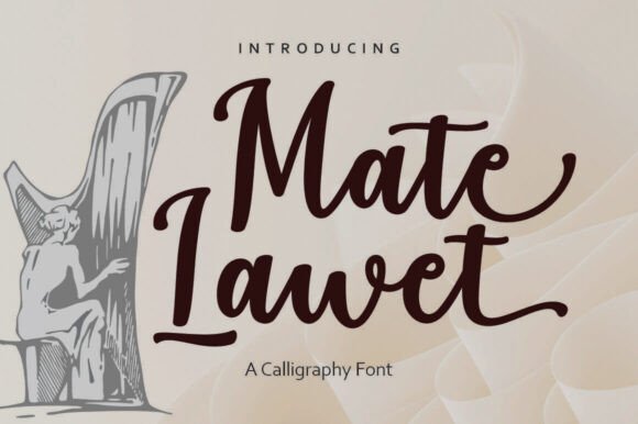
Mate Lawet Font – Mate Lawet presents a refined calligraphic voice with pronounced contrast and decorative terminals that suggest vintage penmanship. The letterforms are ornate enough to feel ceremonial while still staying disciplined, making it a good choice for name treatments, monograms, and formal RSVP headers.Spacing is tight where drama is needed and loosened for clarity in longer lines, plus alternates and swash sets offer plenty of customization for envelopes or place cards. Consider using foil, blind deboss, or letterpress to accentuate its carved shapes, and balance it with a plain serif for event details to avoid visual competition.
My Recommendation: I’d choose Mate Lawet for invitations that aim for classic glamour or historical reference-think period estates, cathedral ceremonies, or gala events. The font’s ornamentation pairs beautifully with tactile finishes like letterpress and foil. Use it where names and monograms must carry the design, then keep supporting text restrained.
16. Elegant Wedding Font
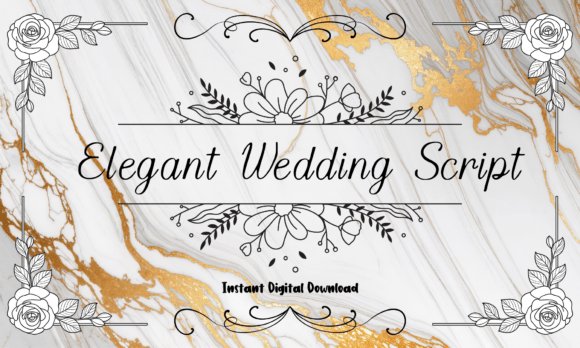
Elegant Wedding Font – Elegant Wedding is a flowing calligraphic script built around graceful curves and narrow, tapered strokes that read beautifully at display sizes. I often reach for Elegant Wedding when assembling fonts for wedding invitations because its swashes, alternates, and balanced x‑height give names and headings a handcrafted, formal feel without sacrificing legibility. The glyph set includes multiple stylistic alternates and contextual ligatures, so small tweaks produce very different looks.On textured cotton or heavy cardstock the thinned terminals retain refinement, while on digital invites reducing swash length keeps names readable at small sizes. Kerning is thoughtful out of the box, and pairing it with a neutral sans or a restrained small‑cap serif creates suites that feel intimate yet polished. Use it for envelope addressing, RSVP headers, place cards, and signage when you want a romantic signature style.
╰┈➤ Download Elegant Wedding Font
My Recommendation: I reach for Elegant Wedding whenever a client wants genuine calligraphy without commissioning custom lettering. The alternates let me make each name feel bespoke while saving time during layout. It’s particularly effective on heavy card stock, envelope scripts, and any stationery that needs a refined, handwritten personality.
17. Advance Elegant Font
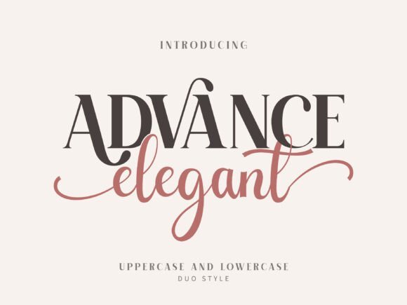
Advance Elegant Font – Advance Elegant pairs a high‑contrast serif skeleton with flowing, calligraphic script strokes to produce a hybrid display face that reads as editorial and decorative at once. It balances structured stems with lively terminals so headlines feel authoritative but personal. Carefully designed ligatures and swash alternates let short words take on bespoke, letterpress‑ready shapes.PUA‑encoded features make special characters and flourishes accessible without extra tools, which is handy for rapid mockups. Combine it with a clean grotesque for body text or let it stand alone for boutique labels, editorial covers, and invitation headers where a couture touch is desired. The font’s spacing holds up in both print and web previews, which simplifies cross‑media layout work.
╰┈➤ Download Advance Elegant Font
My Recommendation: I use Advance Elegant when a project needs fashion‑level polish with a human note. Its ligatures turn simple names into memorable wordmarks, and the PUA support speeds production. Best suited to luxury packaging, editorial mastheads, and upscale stationery suites that benefit from dramatic display type.
18. Elegant Bride Groom Monogram Font
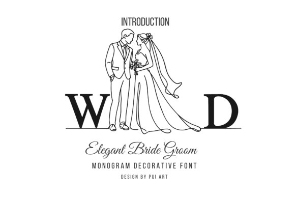
Elegant Bride Groom Monogram Font – Elegant Bride Groom Monogram is a duo alphabet that pairs illustrated uppercase ‘groom’ motifs with delicate lowercase ‘bride’ figures alongside a refined serif A–Z. The set reads like hand‑drawn emblems that slot into monograms, favor tags, and couple logos with immediate recognition. Because the line art is clean, it scales down cleanly for stickers and scales up for acrylic signage.Use the monograms to build matching motifs across stationery suites-mugs, tissue wraps, and ceremony programs-without relettering every element. The collection suits both minimalist and traditionally ornate weddings because the simple lines adapt well to foil stamping, heat pressing, and laser cutting. Designers and crafters will appreciate how quickly a unified look can be produced from a single asset pack.
╰┈➤ Download Elegant Bride Groom Monogram Font
My Recommendation: I keep this monogram set in my toolkit for quick personalization tasks where a couple mark is needed across many items. The illustrated initials speed up production for favors and signage, and the crisp line work translates cleanly to both print and production methods. Ideal for small studios, DIY stationers, and boutiques creating cohesive wedding memorabilia.
19. Elegant Classic Signature Font
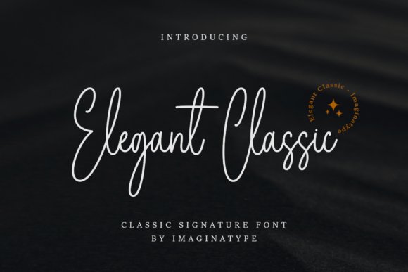
Elegant Classic Signature Font – Elegant Classic Signature is a handwritten script that balances graceful pen strokes with practical legibility; among fonts for wedding invitations it offers a signature-quality look without becoming fussy. The letterforms show refined calligraphic rhythm and measured swashes, so names and headings feel personal while RSVP lines remain readable at small sizes. Alternates and subtle ligatures keep repeating letter combinations from looking mechanical, which helps when a design uses the font across multiple pieces.On the production side the family behaves predictably in print and on screen: consistent stroke contrast and moderate x-height support foil, letterpress, and digital layouts. Pair it with a straightforward serif or narrow sans to let the script sing without competing for attention, and use the alternate glyphs sparingly to preserve cohesion across suites. For designers who want a handwritten signature that still functions across formats, this font is a reliable choice.
╰┈➤ Download Elegant Classic Signature Font
My Recommendation: I use Elegant Classic Signature when a wedding design needs a personal-signed look that still reads well on invitation suites and envelopes. Its alternates and ligatures make it flexible-perfect for names and monograms-while the restrained strokes keep smaller details legible. For upscale or romantic events this font gives a handcrafted feel without sacrificing practical print requirements.
20. Elegant Font
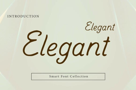
Elegant Font – Elegant is a smooth handwritten script built around flowing curves and a natural rhythm that feels both polished and inviting. The typeface reads clearly at display sizes, which makes it a dependable choice for wedding stationery headings, boutique branding, and social media quote graphics. Soft terminals and gentle slants create a warm signature style without appearing overly casual or ornate.Functionally, Elegant includes useful OpenType features-ligatures and alternates-to prevent repetition and to add selective flourish where needed. It performs well under print finishes like foil or embossing thanks to consistent stroke widths, and it pairs nicely with clean sans-serifs for a modern, refined contrast. Reserve it for names, short phrases, and logos where script texture enhances the design without crowding the layout.
My Recommendation: I recommend Elegant for projects that need a refined handwritten voice without dramatic flourishes. It’s ideal for boutique wedding suites, beauty brands, and product labels where clarity and charm must coexist. Use it for titles and names, pairing it with minimal layouts to keep attention on the script’s rhythm.
21. Gastonia Script Font
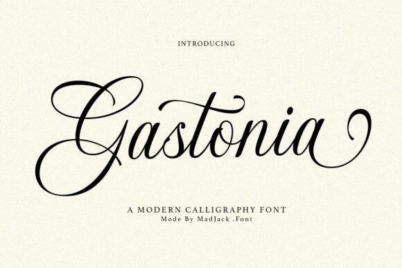
Gastonia Script Font – Gastonia Script channels modern calligraphy with bold, sweeping strokes and a decorative temperament that suits romantic and high-end applications. Its pronounced terminals and elongated flourishes create a theatrical yet controlled presence, making it well suited for headline use on invites, signage, and luxury packaging. The overall effect is expressive without feeling sloppy, thanks to deliberate contrast and carefully shaped joins.Technically the family ships with a generous set of contextual alternates and ligatures to reduce repetition and craft pleasing word shapes, but the ornamental nature means it’s best used sparingly rather than for body text. It pairs effectively with a neutral serif or geometric sans to anchor designs and prevent visual clutter, and it reproduces nicely in foil and letterpress. Choose Gastonia when you want name lines or venue titles to act as focal statements within a refined suite.
╰┈➤ Download Gastonia Script Font
My Recommendation: I reach for Gastonia Script when a project calls for dramatic, romantic lettering that reads as handcrafted art. Its swashes and alternates are great for focal names and headings, though I avoid it for long copy. Best for formal invitation covers, high-end branding, and applications where flourish is an asset rather than a distraction.
22. Shina Qatline Font
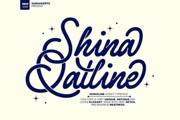
Shina Qatline Font – Shina Qatline is a refined monoline script that balances vintage flourishes with a modern restraint; its smooth strokes and restrained contrast give headlines a graceful, signature-like finish. As one of the most appealing fonts for wedding invitations, it reads well at invitation sizes and holds up under foiling, embossing, and digital printing thanks to consistent stroke weight and thoughtful spacing.The typeface offers subtle alternates and clean terminals that pair beautifully with narrow sans serifs or light serifs, so you can build a clear hierarchy across invitation suites, RSVP cards, and menus. Use it for names and focal lines where you want a romantic, polished impression without sacrificing legibility.
╰┈➤ Download Shina Qatline Font
My Recommendation: I would choose Shina Qatline when I need a script that reads as both elegant and practical. Its monoline construction makes it reliable for print techniques like foil and letterpress, while its refined letterforms lend a high-end feel to stationery. It’s particularly well suited to classic, romantic wedding suites and boutique fashion or beauty branding.
23. Wedding Couple Monogram Font
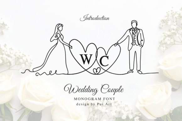
Wedding Couple Monogram Font – Wedding Couple Monogram reimagines initials as single-line illustrations, merging a bride-and-groom motif into the letterforms themselves for a unique emblematic effect. The continuous-line approach creates an intimate, hand-drawn focal mark that remains bold at small sizes and striking when scaled up for signage or backdrops.This decorative font works best as a centerpiece: think save-the-dates, wax seals, engraved favors, or a website header where the monogram anchors the design. Pair the monogram with a neutral body type to keep the look elegant and ensure the illustration-like letters remain the visual star of the suite.
╰┈➤ Download Wedding Couple Monogram Font
My Recommendation: I’d pick the Wedding Couple Monogram when I want a bespoke symbol that tells a couple’s story in a single mark. It’s ideal for couples who want a personalized logo for stationery, favors, or wedding websites, and it translates well to engraving and laser-cut keepsakes. Use it sparingly as the primary decorative element to maintain its impact.
24. Rosalie Kathie Font
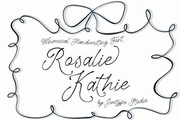
Rosalie Kathie Font – Rosalie Kathie brings a hand-lettered, whimsical energy through soft irregularities and flowing connections that mimic real pen strokes, giving designs a warm, handcrafted personality. The balance between playful loops and readable character shapes makes it a strong choice for invitations that aim to feel intimate without losing clarity.Files include standard web and desktop formats, so you can use the font across envelopes, place cards, social headers, and printed correspondences with minimal fuss. For contrast, set body text in a crisp sans serif or a lightweight serif to preserve the lettering’s charm while maintaining a neat, polished layout.
╰┈➤ Download Rosalie Kathie Font
My Recommendation: I recommend Rosalie Kathie for projects that call for friendly, artisanal typography-think garden weddings, boutique packaging, or personal stationery. Its handcrafted look injects warmth and character into names and headings, while the included file formats make implementation straightforward. Pair it with simple text faces to keep compositions from feeling busy.
25. Seraphina Font
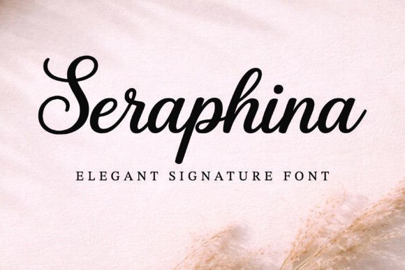
Seraphina Font – Seraphina is a signature script with long, flowing strokes and elegant terminals that remain surprisingly readable at display sizes. It balances modern calligraphy flair with clear letterforms, making it a reliable option among fonts for wedding invitations where names and dates must stand out. OpenType swashes and alternate capitals let you add ornamental touches without overcrowding a layout. The overall rhythm feels refined rather than fussy, which helps maintain clarity on RSVP cards and envelopes.On paper Seraphina prints with consistent hairlines and gentle contrast, so it behaves well under letterpress and offset reproduction and looks crisp on screen for e-vites. Pair it with a restrained serif for body copy or a clean sans for contrast, using tighter tracking on names and looser spacing on addresses. The alternates allow custom monograms and elegant swash endings, and the font reacts predictably to kerning tweaks. For designers seeking a luxe handwritten voice without sacrificing legibility, Seraphina fits neatly into a polished stationery system.
My Recommendation: I choose Seraphina when a project calls for an elegant handwritten voice that still reads easily across formats. Its swashes and alternates give quick personality without needing extra ornament files, and it prints beautifully on cotton or textured stocks. Ideal for intimate ceremonies, boutique invitation suites, and any stationery that benefits from refined calligraphic charm.
26. Fresh Tomato Font
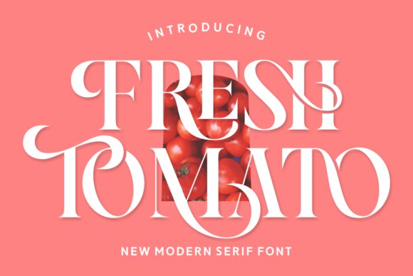
Fresh Tomato Font – Fresh Tomato is a serif with lively terminals and gently rounded bowls that bring warmth to display text and short passages. The family includes italics, ligatures, and stylistic alternates, which make it easy to create playful headlines or romantic save-the-dates with varied rhythm. Its energetic letter shapes translate well to packaging, editorial spreads, and large-format signage where personality matters. A robust multilingual set and clear diacritics expand its usability for international mailings and event materials.Use Fresh Tomato to give stationery a handcrafted feel while retaining typographic structure; it pairs especially well with a neutral sans to keep layouts breathable. Watch leading and hyphenation since the quirky terminals create a visual cadence that must be balanced with generous white space. The alternates prevent repetition across suites, and the italic cut adds a softer voice for captions or quotes. Expect an approachable, slightly nostalgic tone that reads as friendly rather than formal.
╰┈➤ Download Fresh Tomato Font
My Recommendation: I reach for Fresh Tomato when a design needs personality without tipping into whimsy. It injects friendly character into invitations, lifestyle branding, and editorial covers, and the alternates make repeated lines feel bespoke. Great for garden parties, artisanal product labels, and youthful apparel branding.
27. Beyond Perfection Font
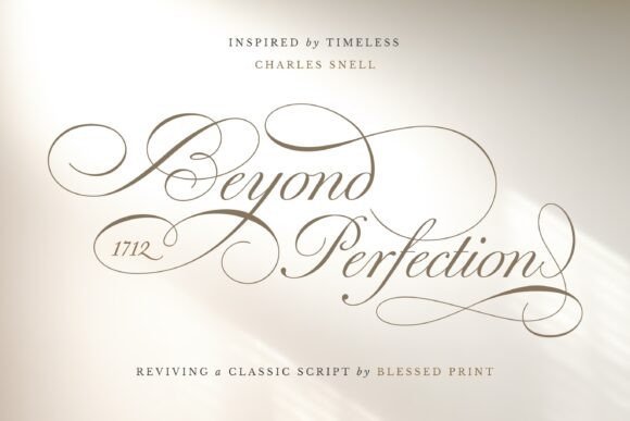
Beyond Perfection Font – Beyond Perfection channels classic calligraphic handwriting with fluid joins and crisp stroke contrast that read as polished hand-lettering. Its extensive set of alternates, swashes, and ligatures-numbering in the hundreds-lets designers vary pairings so names and salutations avoid repetition. The connections between characters remain natural, preserving legibility at display sizes while permitting delicate ornamentation. Contextual alternates help craft flourishes that feel authentic rather than mechanical.The slightly condensed proportions give Beyond Perfection elegant spacing, making it a strong choice for formal suites where venue details sit alongside ornate names. It responds well to kerning and benefits from modest tracking adjustments when used in caps or monograms. For printing techniques such as engraving or thermography, its fine hairlines produce refined impressions on textured stocks. This font suits designers who want classical calligraphic presence with granular control over stylistic variations.
╰┈➤ Download Beyond Perfection Font
My Recommendation: I use Beyond Perfection when a project needs unmistakable calligraphic authority and a wide palette of flourishes. Its alternates and ligatures save time crafting bespoke name treatments, and the refined proportions hold up in both digital mockups and premium print runs. Best for formal invitations, luxury stationery, and monogram-driven suites.
28. Marginale Font
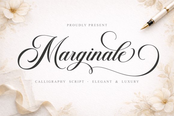
Marginale Font – Marginale is a refined calligraphy script that pairs delicate curves with purposeful strokes to create a feeling of quiet luxury. Its flowing ligatures and generous swashes give designs a handcrafted look while remaining readable at invitation sizes, which makes it one of the stronger choices among fonts for wedding invitations when you want formal flair without losing clarity.The font arrives PUA-encoded so alternate glyphs and swashes are easy to access in most design apps, and the multilingual support helps keep accented names intact. I appreciated how the thinner hairlines print cleanly on textured papers; pair Marginale with a simple serif for RSVP cards or with minimal sans headings to keep layouts modern and balanced.
My Recommendation: I would reach for Marginale when a wedding suite needs classic calligraphy with practical polish. The PUA encoding makes advanced swashes genuinely usable, and the readable counters mean it works across envelopes, invites, and programs. Use it for upscale, formal weddings or any design that benefits from graceful motion without sacrificing legibility.
29. Better Together Font
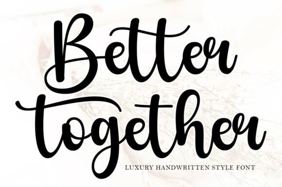
Better Together Font – Better Together is a warm handwritten script whose flowing strokes deliver a romantic, contemporary look without feeling overworked. The letterforms are slightly condensed with soft terminals, offering a personal handwriting vibe that suits save-the-dates and place cards as well as social-media announcements.This font handles small sizes better than many scripts thanks to moderate contrast and clean joinery, and it pairs nicely with a light geometric sans for modern invitation suites. Alternate characters and gentle swashes let you customize word shapes for signature moments, making the type feel bespoke across printed and digital pieces.
╰┈➤ Download Better Together Font
My Recommendation: I like Better Together for couples who want a modern, intimate aesthetic with handwritten warmth. It reads well at envelope scale and adapts to both rustic and contemporary palettes, so it’s a versatile pick for invites, signage, and thank-you notes. I often pair it with a neutral sans for strong hierarchy.
30. Floral Heart Monogram Font
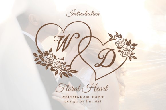
Floral Heart Monogram Font – Floral Heart Monogram is a decorative monogram set built around heart-shaped floral frames and stylish script initials from A–Z, designed to add an ornate, feminine stamp to project pieces. Each frame balances botanical detail with a clear central initial, producing strong single-letter marks for seals, embossing, and tag designs.Files work well with cutting machines and print production, and the high-contrast floral illustrations hold up at larger sizes for signage as well as scaled-down stationery. Consider this monogram when you want a personal motif for favors, custom stamps, or linen tags that reads like a miniature emblem rather than plain type.
╰┈➤ Download Floral Heart Monogram Font
My Recommendation: I recommend Floral Heart Monogram when a wedding identity needs an instantly recognizable emblem – it’s especially useful for favors, stickers, and custom stamps. The floral frames give a handcrafted, romantic feel that translates beautifully across foil, letterpress, and Cricut projects. Use it to create a cohesive motif that ties ceremony details to reception decor.
31. Byetiga Font – fonts for wedding invitations
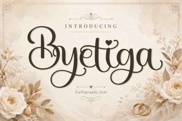
Byetiga Font – fonts for wedding invitations – Byetiga is a graceful modern calligraphy font that blends elegant curves with a playful handcrafted charm, marked by tall swashes and delicate loops. Heart-shaped accents and flowing connections lend a couture, romantic tone while the steady strokes keep the script readable at display sizes. The family includes stylized uppercase and expressive lowercase characters plus alternates that let you craft distinctive headings and monograms.This makes Byetiga one of the most appealing fonts for wedding invitations when the aim is a feminine, intimate aesthetic. Use it large on ceremony cards paired with a restrained serif for RSVP details, or trim decorative swashes for monograms and favor tags. It also handles foiling and embossing well, though the most ornate flourishes work best when used sparingly to protect legibility.
╰┈➤ Download Byetiga Font – fonts for wedding invitations
My Recommendation: I reach for Byetiga when a wedding suite needs a handwritten, romantic touch because the alternate glyphs and swashes let me create unique wordmarks and monograms. It reads cleanly at title sizes yet offers playful ornaments for envelopes, programs, and labels. I’d use it for intimate garden or vintage-inspired weddings and boutique stationery projects where a soft, personal aesthetic is wanted.
32. Megalyn Font
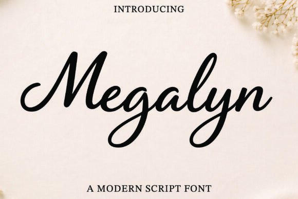
Megalyn Font – Megalyn is a modern script that favors smooth, flowing strokes and a warm, approachable personality rather than rigid formality. Compact, slightly slanted letterforms create a natural handwriting rhythm while maintaining legibility on printed cards. The overall mood skews chic and relaxed, making it a solid option for elegant invites, logos, and lifestyle packaging.Pair Megalyn with a thin sans serif for body copy or add small caps to balance its decorative endings in headers and menus. It performs reliably at medium display sizes and includes alternate swashes to customize titles and save-the-date layouts. Because the strokes remain consistent, it also survives embossing and laser-cut applications where delicate detail must endure production processes.
My Recommendation: When I need a contemporary script that still reads well in print, Megalyn is my go-to because it balances warmth with clarity. The alternates let me vary looks across invitations, signage, and menus without pulling in extra families. I recommend it for modern weddings, boutique branding, and projects that want a refined handwritten voice without fussy flourishes.
33. Romantic Amitha Font
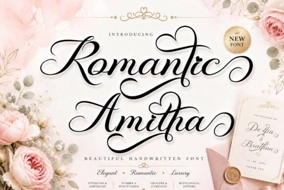
Romantic Amitha Font – Romantic Amitha ships in regular and italic styles, giving designers a wider palette of letter shapes and ligatures than many single-style scripts. It includes swashes, alternates, numerals, punctuation, and multilingual support, which makes it practical for international invites and seasonal cards. The weight leans light to medium and the italics introduce graceful tilts that enhance headline presence without overwhelming layouts.Use Romantic Amitha for ceremony titles, photo overlays, and holiday or Valentine promotions where ornament is welcome but clarity matters. Pair it with a neutral serif for body text or reserve swashes for envelope liners and place cards to keep RSVP sections clean. Alternates help avoid repetition across multiple printed pieces while maintaining a coherent visual identity.
╰┈➤ Download Romantic Amitha Font
My Recommendation: I choose Romantic Amitha when a project calls for ornamental charm that still needs to be production-friendly; the italics and alternates provide plenty of options. It excels for seasonal invitations, photographer watermarks, and boutique packaging where delicate strokes are an asset. For best results, pair it with muted paper stocks and subtle foil accents to emphasize its refined details.
34. Floral Infinity Monogram Font
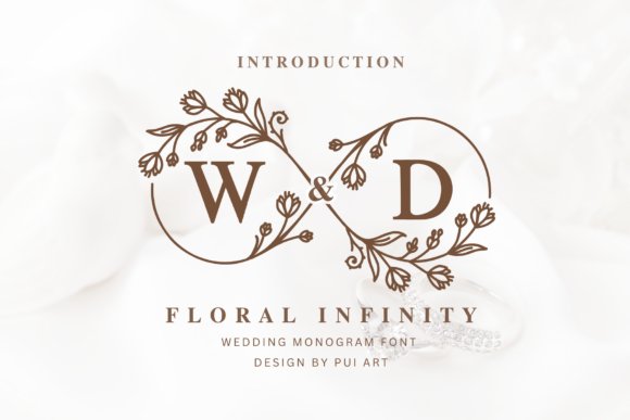
Floral Infinity Monogram Font – Floral Infinity Monogram turns each character into a botanical emblem where fine vines loop into soft infinity-inspired frames, producing initials that read like tiny crests. The ornamentation is delicate rather than fussy, with crisp vector outlines that reproduce cleanly on textured card stock and digital mockups; as part of fonts for wedding invitations it gives a personalized, emblematic accent without overwhelming other type choices.Files include alternate terminals and layered outlines for color fills and foil-ready paths, plus simplified cuts for laser engraving and decals. Use the set as a central monogram on invites, wax seals, or signage; pair it with a minimalist serif or narrow sans to balance the botanical detail, and choose heavier paper stocks to show off the fine vine work.
╰┈➤ Download Floral Infinity Monogram Font
My Recommendation: I would pick Floral Infinity Monogram when a couple wants a distinctive emblem that reads botanical and bespoke. The layered outlines and alternates let me switch between single-color printing, metallic foil, or engraved treatments without redrawing the art. It shines on garden-themed weddings, personalized gift tags, and any stationery where a refined, floral initial is the focal point.
35. Holiday Font

Holiday Font is a candid, handwriting-inspired display face with airy strokes and small, playful terminal flicks that mimic genuine pen movement. Its slightly irregular baseline and subtle ink texture create a friendly, lived-in character, which makes it an appealing option among wedding stationery fonts when the brief calls for warmth rather than strict formality.OpenType alternates and contextual ligatures offer several stylistic moods, from breezy to a touch more restrained, so you can tune the personality across save-the-dates, thank-you notes, and table signage. It pairs well with crisp serifs or calm sans-serifs and scales cleanly for digital invites and printed ephemera used in casual or boho celebrations.
My Recommendation: I often choose Holiday Font for projects that need a personal, handwritten voice without looking amateur. Its alternates give me subtle control over how energetic or composed the lettering feels, which is useful for varying pieces in a suite. Best for backyard ceremonies, intimate elopements, and informal stationery where friendliness and approachability matter.
36. Violetta Font
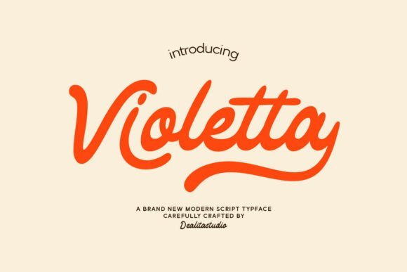
Violetta Font – Violetta is a retro-inspired script that pairs sweeping swashes with tightly connected letterforms, calling to mind mid-century calligraphy with a modern finish. The rhythm of its strokes and the graceful terminals create an elegant, nostalgic presence ideal for invitations and boutique identity work seeking a romantic, slightly feminine tone.The font includes multiple swash sets, discretionary ligatures, small caps, and OpenType features that let you control ornamentation for names and headings without manual editing. It holds up well to foil stamping and embossing, and I typically pair it with a restrained sans to preserve legibility while letting Violetta provide the visual flourish on covers and headers.
My Recommendation: I recommend Violetta when a design requires polished vintage charm and precise typographic tools. The swash and ligature options let me dial in drama selectively-great for names, venue lines, or formal headings-while keeping body copy readable. It suits upscale, black-tie weddings, boutique branding, and premium packaging where a nostalgic, elegant script is desired.
37. Ramashynta Font
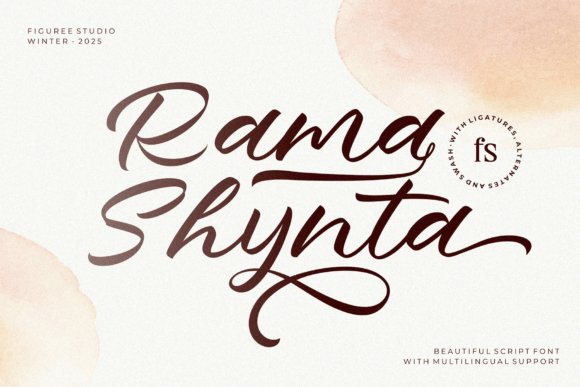
Ramashynta Font – Ramashynta is a flourishing script with long swashes and elegant ligatures that read like modern calligraphy. Its flowing connections and alternate letterforms create a romantic rhythm useful for wedding stationery and for fonts for wedding invitations specifically, where personality in every curve matters. OpenType features include contextual alternates and discretionary ligatures that smooth line breaks and add variety across lines. The stroke contrast remains legible at invitation sizes while preserving decorative flair.Use Ramashynta as a headline face paired with a simple serif or narrow sans for RSVP cards, envelopes, and monograms. It supports multiple languages and includes swash sets that can be toggled for subtle or exuberant styling, plus carefully spaced kerning for tight layouts. Works well in foil stamp, letterpress and digital proofs because the thin-and-thick strokes hold up across print methods. For branding, its personality reads as both refined and friendly without feeling retro.
My Recommendation: I reach for Ramashynta when I want a romantic, hand-calligraphed look that still reads clearly at small sizes. The OpenType alternates let me avoid repeated letterforms in names, and the swashes translate beautifully to foil and emboss finishes. It’s my go-to for save-the-dates, formal invitations, and elegant logos where a handcrafted flourish is needed.
38. Perfect Relationship Font
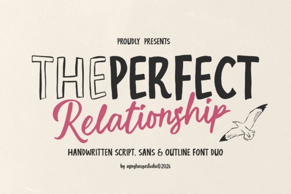
Perfect Relationship Font – Perfect Relationship pairs a casual handwritten script with a crisp, slightly quirky sans and an outline variant that adds playful contrast. The script shows uneven strokes and organic baselines, giving headlines a genuine hand-made feeling while the sans keeps body text dependable and readable. Alternate capitals and lightweight outline glyphs create simple layering effects for menus, social posts and lifestyle packaging, and the family makes building a small identity system straightforward. The overall mood leans informal and personal without becoming fussy.Apply the script to names and focal phrases, the sans to dates and addresses, and the outline for small accent pieces like tags or borders. Tighten letterspacing on the script while keeping the sans breathable to preserve hierarchy, and choose textured papers or warm tones to match the font’s friendly character. This set performs well for cafés, bakeries, social content and casual stationery where a human touch is key. Because the family spans styles, you can craft cohesive layouts without pulling in extra typefaces.
╰┈➤ Download Perfect Relationship Font
My Recommendation: I use Perfect Relationship when a brand needs approachable charm but also clear structure. The contrast between the handwritten script and the clean sans makes hierarchy immediate, and the outline version lets me add whimsy without extra artwork. It’s especially effective for lifestyle brands, packaging, and informal event stationery that should feel personal and inviting.
39. Yolanda Comel Font
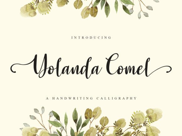
Yolanda Comel Font – Yolanda Comel is a calligraphic script built around long swash tails and refined terminals that sweep into dramatic flourishes. Its weight balance favors elegant curves with controlled contrast, which keeps names readable on invitations while delivering a luxurious impression. OpenType alternates and contextual forms let you manage how tails connect across words so long lines avoid clutter and short names feel ornate without overdoing it. The font’s character suits classic bridal stationery and high-end brand marks.Pair Yolanda Comel with a narrow serif or a clean sans for RSVP panels and maps, and leave breathing room around swashes to prevent ink bleed on textured papers. It prints beautifully in foil, emboss and letterpress because its strokes translate to tactile effects when plates are cut or metals are applied. Use small caps or a simple sans for small details like addresses and times so the script remains the focal point. The face performs best at medium-large sizes where its calligraphic motion can be appreciated.
╰┈➤ Download Yolanda Comel Font
My Recommendation: I pick Yolanda Comel when a project calls for bold, calligraphic headlines that still need to read well in print. Its long swashes look exceptional in foil and emboss finishes, and the alternates let me control flourish density. For bridal stationery, premium packaging, or monogram work that must feel elevated and handcrafted, this font delivers elegant drama.
40. Brethany Font
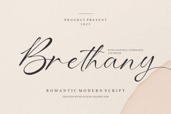
Brethany Font – Brethany is a modern romantic script that balances flowing hand-lettered strokes with clean terminals. Its long, looping swashes and a generous set of alternates make names and headings feel intimate without losing legibility, which explains why Brethany is often chosen among fonts for wedding invitations and luxe stationery. The letterforms show confident contrast between thin connectors and fuller downstrokes, giving a handcrafted look suited to invitations, logos and editorial pull-quotes.OpenType features include discretionary ligatures, contextual alternates and extended swash sets, so you can vary signatures across an invitation suite while keeping visual harmony. Use it at larger sizes for names and section headers, and pair with a restrained sans or a light serif to avoid visual competition. Multilingual support and web-ready formats are included, letting you use Brethany across print, digital RSVP cards and social announcements.
My Recommendation: I would pick Brethany when designing intimate wedding suites or boutique branding because its swashes add personality without overwhelming layouts. The alternates and ligatures let you craft bespoke wordmarks and save-the-date headers that read handcrafted. It performs best on textured paper or with metallic foil to highlight those elegant strokes.
41. Blissful Sunshine Font
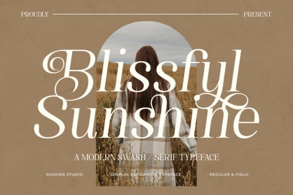
Blissful Sunshine Font – Blissful Sunshine pairs classical serif roots with sweeping swashes, producing a refined voice that suits invitation headlines and boutique packaging. The stroke contrast and high-contrast terminals lend a softly feminine character while keeping characters readable across sizes. Decorative capital forms and swash alternatives make this typeface useful for monograms, crest-like headings and elegant product labels.Feature support covers ligatures, small caps and alternate swash glyphs so you can add ornamentation without introducing extra ornament files. Pair it with a neutral, low-contrast sans for body copy and tighten tracking on swash-heavy lines to prevent collisions. This serif reads particularly well on heavyweight stock and in editorial spreads that call for a touch of formality with flourish.
╰┈➤ Download Blissful Sunshine Font
My Recommendation: I reach for Blissful Sunshine when a project needs classical charm with gentle flourish, such as bridal stationery or boutique identity systems. Its swash alphabet lets you create standout initials for envelopes and programs. It yields best results when printed at larger sizes or in spot color to keep the fine contrast crisp.
42. Patriotic Font
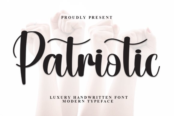
Patriotic Font – Patriotic feels like a polished hand-script with soft pressure contrast and relaxed connectors that mimic real pen work. Its organic rhythm and open counters create a warm, approachable tone well suited to RSVP cards, signage, and casual wedding stationery that prefers personality over formality. Slight irregularities in stroke width deliver character while preserving everyday legibility.The family includes alternate characters and optional swashes so you can move between neat signatures and more expressive headings across an invitation suite. For supporting copy choose a slab or humanist sans and reserve Patriotic for names, short phrases and place cards. It prints cleanly on textured stocks and adapts nicely to ink washes or letterpress techniques for a handcrafted finish.
My Recommendation: I would use Patriotic for events aiming for a friendly, hand-crafted atmosphere-think garden ceremonies or vintage receptions. Its readable, hand-drawn quality makes guest names and informal notes feel personal and authentic. Pair it with earthy color palettes and paper with tooth to emphasize its lettered charm.
43. Pretty Dahlia Font
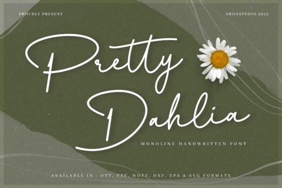
Pretty Dahlia Font – Pretty Dahlia is a stylish script with a delicate hand and playful flourishes that read like modern calligraphy. Its flowing letterforms and generous swashes give headings a soft, romantic personality while remaining readable at common invite sizes. PUA encoding means alternate glyphs and decorative swashes are accessible without specialty software, so you can swap in single-letter ornaments quickly. Pretty Dahlia ranks among the best fonts for wedding invitations when you want a handcrafted, elegant signature across RSVP cards and envelopes.Use it large for names and monograms, pairing with a plain serif or narrow sans for details to preserve contrast and legibility. Pay attention to kerning and line-height-tight tracking enhances the script’s intimacy but can collapse counters if overused. The font’s alternates let you customize each name with unique entry and exit strokes, which is ideal for bespoke suites and logo marks. Color experiments on textured paper give the strokes real depth and a tactile, artisanal finish.
╰┈➤ Download Pretty Dahlia Font
My Recommendation: I’d reach for Pretty Dahlia whenever a wedding suite needs the warmth of hand-lettering without hiring a calligrapher. The PUA glyphs make it simple to create varied word art and elegant swashes for headlines and monograms. It’s especially well-suited to garden, boho, and vintage-inspired celebrations where a personal, handmade look matters.
44. Grimersa Font
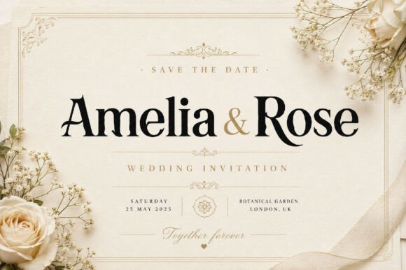
Grimersa Font presents a formal serif voice characterized by sturdy stems and refined bracketed serifs, giving compositions a stately presence. Stroke contrast is moderate, which keeps body copy readable while lending display text an authoritative tone ideal for stationery and editorial headers. Its letter shapes carry a restrained elegance that reads as both historical and current, making it friendly to luxury packaging and polished announcements. The typeface handles both short headlines and longer blocks with assured clarity.Pair Grimersa with a light script for names or a minimalist sans for informational text to build hierarchy without clutter. Its distinct capital forms make it a strong choice for monograms and logotypes where recognizability matters at small sizes. For print, favor higher point sizes and careful ink absorption control to maintain the crisp serifs; for web, use proper hinting and CSS font-smoothing to preserve details. Consider small caps and ligatures to add understated ornamentation without resorting to overlays.
My Recommendation: I would pick Grimersa when a project needs an upscale voice that reads as reliable and polished. It excels on black-tie invitations, magazine mastheads, and premium labels where typographic authority matters. Use it when you want type that carries weight yet remains adaptable across print and digital formats.
45. Floral Wedding Couple Monogram Font
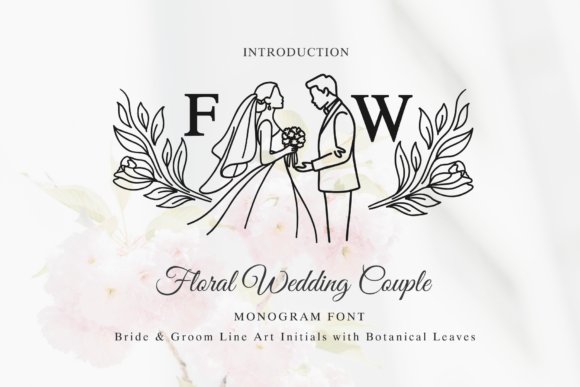
Floral Wedding Couple Monogram Font – Floral Wedding Couple Monogram is a line-art alphabet that pairs delicate botanical swirls with tiny bride-and-groom silhouettes to form charming initials. Each glyph acts as a standalone emblem for place cards, wax seals, or laser-cut signage, and the simple stroke structure translates well across engraving and Cricut cuts. The low-detail outlines keep production costs down while preserving personality, making the set practical for favors and boutique stationery. Because the drawings are vector-friendly, resizing does not sacrifice the crispness that handmade projects demand.Design-wise, these monograms shine when combined with clean, neutral type for body text so the pictorial initials remain the focal point. Try foil stamping or blind embossing to enhance depth without adding color; the thin line work responds especially well to metallic finishes. The alphabet also adapts to color fills for digital invites, or single-color vinyl for signage at receptions. For DIY artisans, the files are simple to isolate and recolor for themed suites and keepsake labels.
╰┈➤ Download Floral Wedding Couple Monogram Font
My Recommendation: I’d use the Floral Wedding Couple Monogram when couples want a personalized emblem that feels like a keepsake. It’s perfect for intimate weddings, handmade favors, or suites where illustration carries the story. The cut-friendly lines and vector forms make production straightforward across print, laser, and craft workflows.
46. Gelgira Font
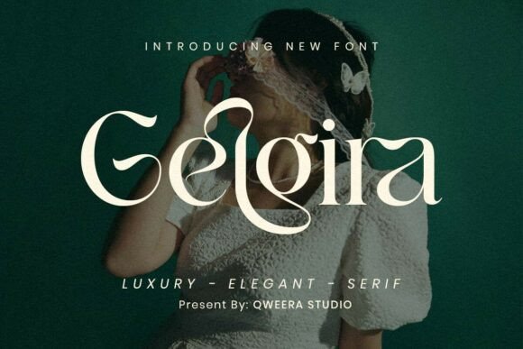
Gelgira Font – Gelgira is a modern romantic serif that balances delicate swashes with pronounced contrast strokes to create a refined, fashion-forward look. If you are assembling stationery for a luxury celebration, Gelgira ranks among the fonts for wedding invitations that give suites a magazine-quality polish while remaining readable at display sizes. Its decorative letterforms feel feminine without becoming fussy, making it equally at home on invitation headers, magazine mastheads, and boutique product labels.Technically, Gelgira performs well in larger sizes where its hairlines and ornaments can breathe; use tighter tracking for headlines and preserve generous leading for body text to avoid visual clutter. Pair it with a neutral sans or a restrained script to highlight its swashes, and choose foil stamping or letterpress to bring the contrast strokes to life. The family’s structure supports identity work and single-piece stationery where a refined, editorial tone is desired.
My Recommendation: I reach for Gelgira when a wedding invitation suite needs a luxe, editorial mood-its swashes read like couture typography and print beautifully in metallics. It’s especially effective for couples who want upscale, feminine styling without ornate flourishes that obscure legibility. Use it for main names or monograms and match with a plain sans for RSVP cards or details.
47. Floral Butterfly Monogram Font
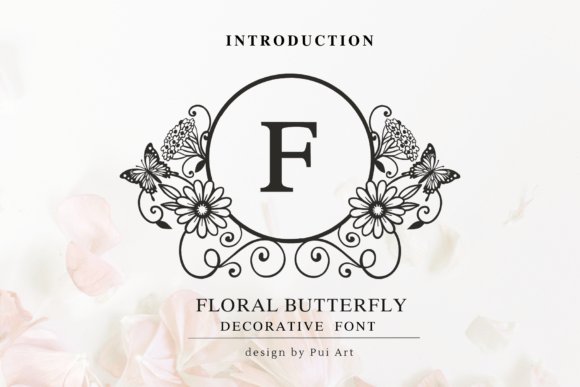
Floral Butterfly Monogram Font – Floral Butterfly Monogram is a decorative set built around embellished initials where tiny butterflies and botanical motifs form delicate letterframes. The design excels at single-letter display work: think wax seals, envelope liners, or a show-stopping invitation monogram that reads like a miniature emblem. Because the ornamentation is integral to each glyph, the font functions like a ready-made crest for garden weddings, vintage-inspired stationery, and personalized gift tags.For best results, use these monograms at larger sizes and reserve them for focal points rather than long text; their detail can become busy at small scales or on highly textured stock. They play wonderfully with simple serif or clean sans companions, and they’re ideal for embossing, die-cut windows, and small-format printed ephemera where the illustration-style letters can be appreciated. Consider alternating color fills or foil touches to make the butterflies and florals stand out.
╰┈➤ Download Floral Butterfly Monogram Font
My Recommendation: I recommend this monogram font when you want an instant signature emblem without commissioning custom illustration. It gives stationery a handcrafted, botanical feel and is perfect for place cards, seals, or programs where a single ornamental initial carries the visual weight. Pair it with minimal type for contrast and use high-resolution printing or foil to preserve the fine details.
48. Rustic Wedding Font
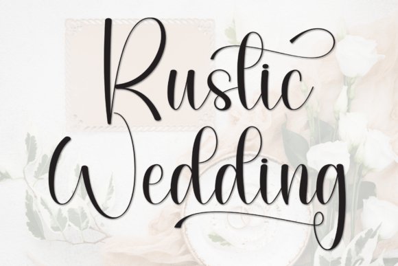
Rustic Wedding Font – Rustic Wedding is a hand-lettered script that blends refined calligraphic strokes with a slightly weathered, down-to-earth character. Its flowing rhythm, delicate alternates, and full set of swashes create a personal, handwritten impression that suits barn venues, vineyard celebrations, and intimate stationery. The font is PUA-encoded, so accessing ligatures and stylistic alternates is straightforward for designers who want control over each flourish.Use Rustic Wedding for invitation headers, ceremony signage, and menu titles where warmth and personality matter more than rigid formality; reserve clean serifs for information-heavy text to maintain readability. For printing, pick paper with moderate tooth and test ink weight to avoid losing fine hairlines, and pair the script with muted palettes or kraft textures to reinforce the rustic aesthetic. Its organic charm makes layouts feel handcrafted without sacrificing professional polish.
╰┈➤ Download Rustic Wedding Font
My Recommendation: I use Rustic Wedding when a couple wants stationery that feels like a handwritten keepsake rather than a formal document. The alternates and swashes let you create custom-looking names and titles, while the PUA encoding saves time in production. It’s ideal for casual venues, vow books, and signage where a warm, intimate tone is the priority.
49. Flyhayer Font
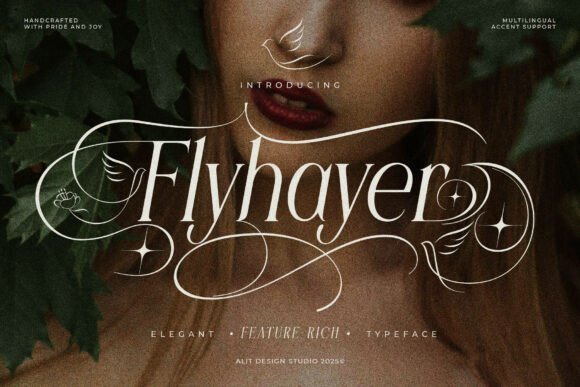
Flyhayer Font – Flyhayer is an ornate serif with generous swashes and decorative terminals inspired by birds, butterflies, and floral filigree. Its alternate characters and sparkling accent glyphs let you add handcrafted ornamentation directly in type, so names and headings take on a poetic, tactile quality-perfect for fonts for wedding invitations and upscale stationery where a romantic flourish matters.Technically, Flyhayer performs best at display sizes: the fine hairlines and elaborate swashes need room to breathe and benefit from careful kerning and OpenType alternates. Pair it with a restrained sans or narrow serif for body text, and reserve its most dramatic glyphs for guest names, monograms, or headline elements to avoid visual clutter.
My Recommendation: I would reach for Flyhayer when designing invitations for nature-themed or luxury weddings because its decorative alternates create real focal points without extra artwork. The font shines on textured paper and when used for names or headers rather than long paragraphs. If you want handcrafted ornamentation built into your type, Flyhayer gives you that without relying on overlays or clip art.
50. White Heart Font
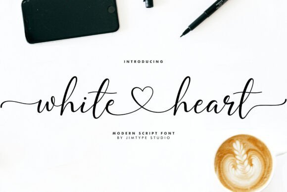
White Heart Font – White Heart is a modern handwritten script with a casual, feminine rhythm and smooth ink-flow strokes that mimic real pen pressure. Included beginning and ending lowercase swashes plus heart connector ligatures make it simple to craft invitations, signage, or packaging with a personal, hand-lettered feel while keeping file management tidy.The letterforms hold up well at mid-to-large sizes but may need slight tracking when you use them in denser lines; they work especially well for save-the-dates, favor tags, and web headers where the playful connectors add charm. Pair White Heart with a clean geometric sans for RSVP blocks or with a light serif for printed inserts to balance whimsy with readability.
My Recommendation: I’d pick White Heart for casual, intimate events-boho elopements, garden parties, or handmade gift tags-because the heart connectors add genuine personality. It’s fast to work with, and the swashes give you that human touch without hand-drawing every word. For best results, use it for names and headlines and keep body copy in a simpler typeface so the script remains the star.
51. Herra Maddison Font
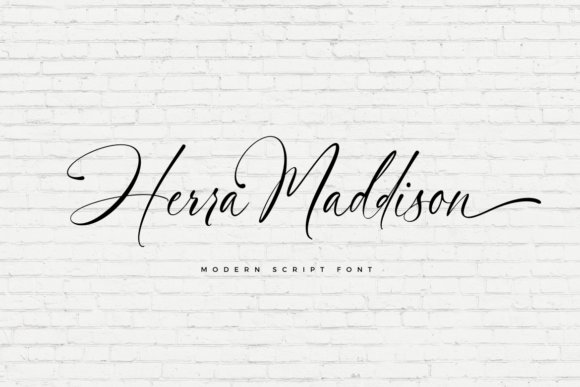
Herra Maddison Font – Herra Maddison is a refined script built around graceful flourishes and sweeping joins that feel like practiced calligraphy. The font is PUA-encoded, so you can access a wide range of alternate glyphs and swashes easily, swapping in subtler or more ornate forms depending on how formal the wedding collateral needs to read.Stroke contrast and smooth joins give Herra Maddison strong presence on fine paper and high-resolution digital proofs, making it ideal for invitation envelopes, programs, and monograms. For practical application, use tighter leading for short lines and increase tracking for long names; combine with a compact serif for RSVP text to keep information legible while retaining a luxurious tone.
╰┈➤ Download Herra Maddison Font
My Recommendation: I’d choose Herra Maddison when a classic, calligraphic look is required-think black-tie or ballroom weddings-because the glyph set provides many flourish options without extra illustration work. The PUA encoding makes swapping alternates straightforward, so you can craft unique wordmarks or monograms quickly. It pairs especially well with narrow serifs for informational cards and simple sans for web invites.
52. Monte Carlo Font
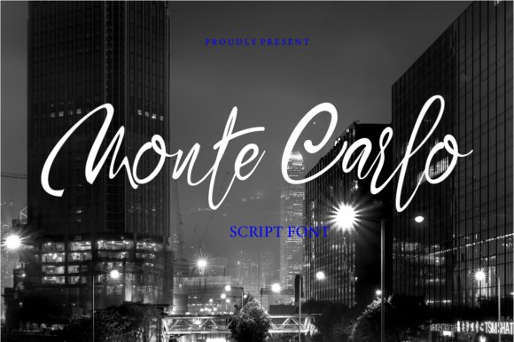
Monte Carlo Font – Monte Carlo’s hand-drawn script mixes loose loops with high-contrast strokes, giving names and headings a chic, readable presence; it ranks among the best fonts for wedding invitations when you want a handwritten signature without losing clarity. Built-in alternates and contextual ligatures tidy awkward joins and add variety, while generous swashes let you create dramatic name lines or subtle tails for envelope addressing. The design holds up in letterpress, foil stamping and digital print, so the same files work across RSVP cards, place cards and signage.For pairing, set body copy in a low-contrast serif to keep attention on the script, and use larger point sizes with slightly tighter kerning for headline names so the loops read as a single gesture. Test stylistic sets to alternate caps and swashes across suites, and watch x-height on smaller inserts to avoid losing counters. Monte Carlo makes ornate calligraphy effects achievable without hand lettering, saving time on layouts and improving consistency across print runs.
My Recommendation: I reach for Monte Carlo when a wedding needs genuine handwriting that still prints predictably; its alternates and ligatures let me vary names without rebuilding layouts. It performs reliably with letterpress and foil, so I use it on luxury suites and modern invitations alike. If you want a script that feels handcrafted but behaves like a professional typeface, this one delivers.
53. Challwa Font
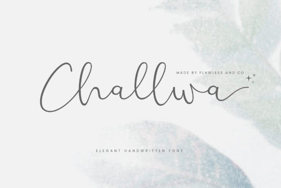
Challwa Font – Challwa reads like careful modern calligraphy: narrow stems, soft terminals and a rhythmic baseline give it a poised, refined personality that flatters upscale stationery. The font includes delicate strokes and multiple stylistic sets that let you swap in modest swashes or pared-down forms depending on how formal the invite needs to feel. OpenType features tidy kerning for long names and preserve graceful joins when used at display sizes on thick cotton stock.Because the letterforms are relatively light, Challwa performs best as headline text or for accent lines rather than dense paragraphs; pair it with a simple sans or a restrained serif for body content. It shines on embossed seals, luxe envelope liners and boutique branding where the script must feel bespoke without appearing handwritten. When working on intimate or editorial-style suites, this font gives a polished, editorial look to few-words-at-a-time layouts.
My Recommendation: I recommend Challwa for projects that need a refined handwritten touch without heavy ornamentation; its subtle stroke contrast reads beautifully on textured paper and upscale print finishes. Use it for main names, monograms and small runs where attention to detail matters. It pairs especially well with minimal typography and muted color palettes.
54. Wedding Script Font
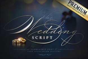
Wedding Script Font – Wedding Script is an ornamented display type with dramatic capitals and flowing terminals that add formal flourish to headlines and titles. Decorative swashes and alternate caps give invitations an old-world, ceremonial feel, but the dense ornamentation means it performs best at larger sizes for focal names or suite covers. Careful kerning and selective use of glyph alternates keep compositions from feeling crowded when paired with textured papers or metallic inks.Because the style is visually strong, limit its use to main headlines and pairing elements-set RSVP text and details in a neutral sans or a readable serif to balance the page. It pairs particularly well with traditional formats like folded invitations and menus where the script can occupy generous space. For vintage, baroque or formal wedding aesthetics this font supplies ready-made gravitas when handled with restraint.
╰┈➤ Download Wedding Script Font
My Recommendation: I tend to choose Wedding Script Font for classical or vintage-themed suites where a bold, ornamental headline is needed. Its caps and swashes create immediate character, but I use it sparingly so the rest of the layout stays legible. Best for large invitations, signage and pieces that can showcase its decorative features.
55. Poschalis Font
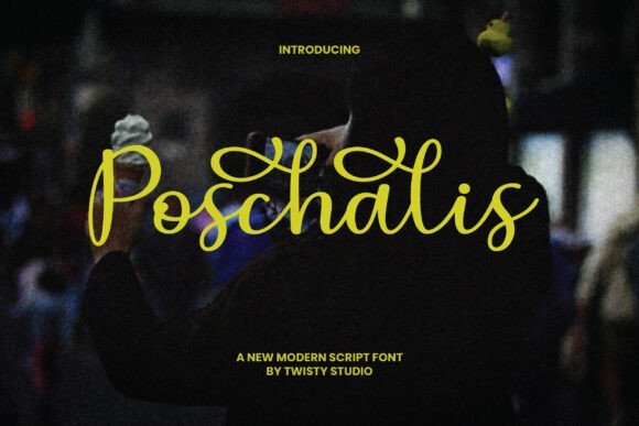
Poschalis Font – Poschalis is a graceful modern script with warm, handwritten character-smooth curves, delicate loops and a soft contrast between strokes give it an intimate, elegant voice suited to invitation text and headings. Poschalis sits near the top of my shortlist for fonts for wedding invitations because its letterforms remain legible at smaller sizes while still carrying ornamental charm. Use it for names, ceremony details and monograms when you want a handcrafted look that reads well across print and digital suites.On the production side, OpenType alternates, contextual ligatures and optional swashes make it simple to craft bespoke wordmarks and repeatable motifs across an entire stationery set, and its spacing behaves predictably in letterpress, foil and digital print workflows. Pair Poschalis with a restrained serif or a clean geometric sans to ground body copy and let the script do the visual storytelling on RSVP cards, envelopes and signage.
My Recommendation: I pick Poschalis when a wedding needs warmth without losing polish; it gives names and headings a personal, artisanal feel while staying readable. The alternates let me create unique initials and flowing lines that tie a full stationery suite together. It performs especially well with soft palettes, textured stock and metallic accents.
56. Balerina Font
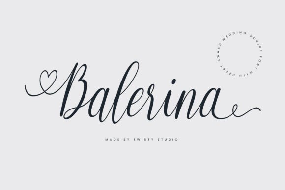
Balerina Font – Balerina brings a romantic, poised script to stationery with long, flowing strokes and slim terminals that feel refined rather than fussy. Its balanced rhythm makes it suitable for invitation covers, program headers and save-the-dates, offering a feminine presence that still reads cleanly in print and on screen. The overall restraint keeps the design timeless, allowing floral or watercolor motifs to coexist without visual competition.Functional features include tasteful ligatures and alternate capitals that help smooth letter connections, and the font responds well to embossing, foil-blocking and blind deboss. For layouts I recommend pairing Balerina with a neutral serif or a minimal sans to maintain hierarchy and ensure body copy remains easy to scan.
My Recommendation: I use Balerina for events that call for delicate elegance-garden ceremonies, bridal showers and romantic receptions. Its lean strokes look beautiful in metallic inks and on cotton papers, and the alternates let me tune the type for long names or stylized initials. Pair it with simple supporting types to keep the suite readable and refined.
57. Royhal Font
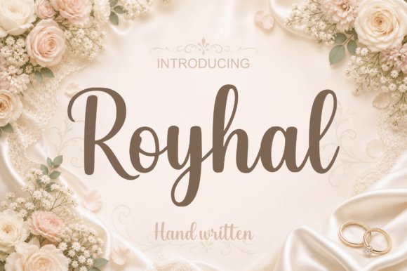
Royhal Font – Royhal is a refined script-calligraphy face with pronounced contrast between thick downstrokes and airy upstrokes, creating a measured, luxurious presence on the page. Smooth connections, generous swashes and a wide set of ligatures let designers compose dramatic headlines and tailored monograms for premium stationery. The type reads as formal and crafted, lending an upscale tone that photographs well and makes a strong first impression.Technically well-equipped, Royhal includes discretionary ligatures, stylistic alternates and thoughtful kerning that suit foil stamping, engraving and large-format signage. For high-end suites I often pair it with a simple humanist sans or a restrained serif to keep layouts modern and maintain clear reading order across inserts, envelopes and signage.
My Recommendation: Royhal is my go-to when a client wants a couture feel for their invitations-the kind that reads as bespoke on thick stock. Its expressive swashes work beautifully with metallic inks and heavyweight papers, producing suites that look and feel premium. Ideal for formal black-tie events, luxury venues or any stationery that aims for high-fashion polish.
58. Lovely Font
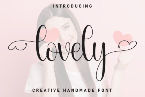
Lovely Font – Lovely is a handcrafted display script with generous loops and playful stroke endings that read as intimate and personal without losing polish. The letterforms balance flourish with legibility, making this family useful for names, RSVP headers, and envelope addressing where warm, human handwriting matters; it sits squarely among the best fonts for wedding invitations when you need personality that still prints crisply.On close inspection the face offers several alternate swashes and tightened kerning pairs that keep words from feeling cramped at large sizes, and it reproduces well in foil, letterpress, and digital invites. Use it as the focal headline paired with a restrained serif for body text, and test line-height and tracking to keep long names readable across folded suites.
My Recommendation: I reach for Lovely when a couple asks for a handcrafted, whimsical look without the messiness of very loose scripts. Its alternates let me fine-tune names and monograms, and it holds up nicely in foil and print runs. I’d use it for boho, garden, or vintage-inspired invitations where warmth and a personalized touch are priorities.
59. Bela Love Font
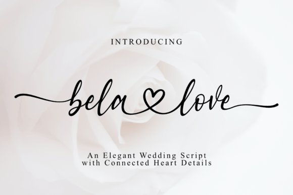
Bela Love Font – Bela Love is a flirtatious script with flowing connections and decorative heart ligatures that give each word a romantic, handcrafted feel. The start-and-end swashes read as elegant punctuation, so names, save-the-dates, and logo marks gain movement without becoming ornate; its clean shapes keep production simple for cut machines and small-scale print runs.Delivered in OTF and TTF, Bela Love plays nicely across Canva, Cricut Design Space, and Adobe suites and retains smooth curves when scaled for signage or social graphics. Pair it with a neutral sans for contrast, and rely on its ligatures for single-word accents rather than long paragraphs to avoid legibility issues at tiny sizes.
My Recommendation: I use Bela Love when a project calls for obvious romance-wedding favors, Valentine campaigns, and hand-lettered logos benefit from its heart ligatures. It cuts well on vinyl and paper, and the swashes add instant charm without extra illustration. For client work I recommend limiting it to headlines or names to preserve clarity.
60. Minimal Rose Heart Font
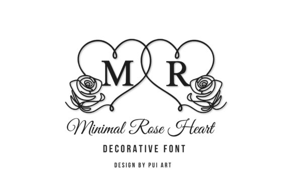
Minimal Rose Heart Font – Minimal Rose Heart pairs a refined serif with delicate heart outlines and fine-line rose motifs to create understated monograms and initials that feel modern yet romantic. The restrained ornamentation is designed to sit comfortably on place cards, wax seals, and packaging where subtle detail matters more than flourish, giving stationery a quiet, upscale personality.Because the lines are thin and the shapes are geometric, this family scales cleanly for embossing, foil, and digital use; it also adapts well to initials locked into circular badges for signage or stamps. Combine it with a soft sans or light script for contrast, and favor high-resolution printing to preserve the floral line work.
╰┈➤ Download Minimal Rose Heart Font
My Recommendation: I pick Minimal Rose Heart for couples seeking minimal romance-clean, simple, and very photogenic on textured papers and foil. It’s ideal for monograms, stamps, and understated branding where tiny floral details add interest without clutter. For printing, I always request sample proofs to ensure the fine lines reproduce as expected.
61. Faith Claire Font
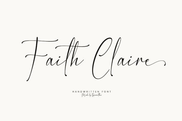
Faith Claire Font – Faith Claire is a handwritten script with graceful, slightly slanted letterforms and fine hairlines that read beautifully on paper and screen; its flowing capitals and discretionary ligatures give invitation copy a personal, hand-addressed feel. This font sits among the best fonts for wedding invitations when you want a feminine, intimate tone without losing legibility-the lowercase spacing stays open at small sizes while the decorative swashes shine at larger display sizes. Pair it with a clean serif or a soft sans for RSVP text to prevent visual clutter, and test line length and leading to keep names prominent on the invite.Under the hood, Faith Claire includes OpenType features such as contextual alternates and discretionary ligatures, plus a full set of punctuation and numerals useful for dates and venue details. Delivered in OTF/TTF and webfont formats, it adapts well to digital suites and print runs; the fine strokes respond beautifully to foil stamping, embossing, and letterpress but may require heavier ink for lower-resolution printers. Use it for ceremony programs, escort cards, and monogram marks where a handcrafted signature feel adds warmth, while avoiding tiny body copy to preserve letter detail.
╰┈➤ Download Faith Claire Font
My Recommendation: I’d reach for Faith Claire when a wedding design needs a personal, handwritten voice that still feels tidy. Its alternates let me dial back or amplify decoration without swapping typefaces, so it suits rustic garden celebrations and intimate chapel ceremonies alike. It’s especially strong on name-focused invite fronts, envelope addressing, and small-batch stationery where print techniques like foil or letterpress will bring out its delicate strokes.
These 61 choices help you pair heading and body faces so your invitation suite feels cohesive and readable. Try a decorative display face for titles combined with a simple serif or sans for body text to maintain clarity across cards and programs.
Preview designs at actual print size and on your chosen paper stock, then adjust spacing and contrast as needed to ensure a polished final result.