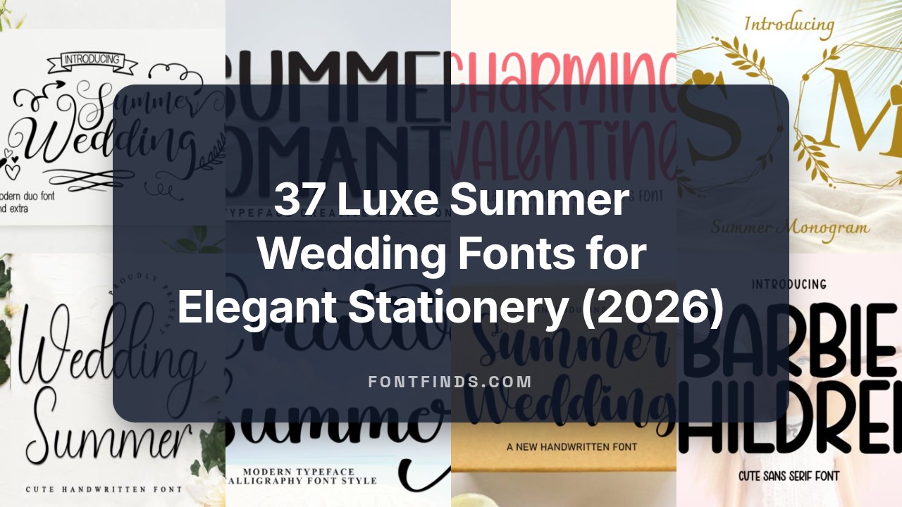
37 Luxe Summer Wedding Fonts for Elegant Stationery (2026)
Summer wedding fonts are ideal for invitations that feel warm, breezy, and personal. Whether you want a handwritten script for a seaside ceremony or a light display face for a garden party, the right typeface makes the design sing.
In this curated collection of 37 options you’ll find calligraphy scripts, modern sans scripts, delicate serif pairings, and playful display faces suited to sunny venues and casual-chic receptions. Each pick includes notes on mood, pairing suggestions, and usage tips for invitations, signage, and RSVPs.
If you plan a beach, backyard, or floral-theme celebration, pay attention to weight, spacing, and contrast-these small choices keep legibility high while preserving a romantic, laid-back vibe.
1. Summer Wedding Font (Script & Handwritten)
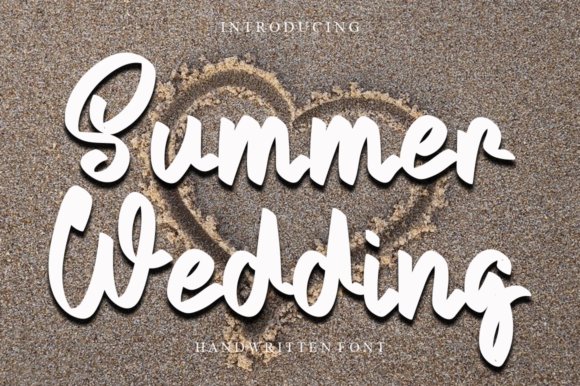
Summer Wedding’s cursive strokes are thin and airy, with gentle loops and tapered terminals that read as delicate handwriting rather than manufactured script. The letters connect with a relaxed rhythm and open counters that keep the text legible at smaller display sizes, giving designs a personal, romantic tone. Small caps and swash alternates are present but restrained, so the overall voice remains soft rather than ornate.
On the technical side the font includes useful OpenType ligatures and carefully adjusted kerning that reduce awkward gaps between character pairs. It pairs particularly well with a geometric sans for RSVP cards or a low-contrast serif for printed menus, where the script supplies personality without overwhelming layout. Use the swashes sparingly to avoid visual clutter and keep the message intimate.
╰┈➤ Download Summer Wedding Font (Script & Handwritten)
My Recommendation: I use this font when I want invitations and stationery to feel handwritten and intimate; its readable lowercase keeps long names legible while the alternates add personality. It’s excellent for wedding suites, boutique branding, and Instagram announcements where warmth matters. The restrained swashes make it versatile for both print and digital pieces.
2. Summer Wedding Font (Slab Serif)
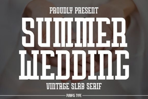
The slab serif version presents a strong, refined silhouette: chunky serifs meet elegant terminals to create a modern take on vintage typography. Generous x-height and squared shoulders give headlines presence without becoming bulky, so the type reads confidently on posters and product labels. Stylistic alternates and contrasted strokes contribute a polished, nostalgic mood that suits premium goods.
Functionally the family includes small caps and tabular figures, making layout work for merchandise and editorial covers straightforward. It performs especially well on tote bags, mugs, and greeting cards where a bold wordmark is needed, while still holding up in larger blocks when used carefully. Pair it with a delicate script or neutral sans to temper its weight and introduce a softer counterpoint.
╰┈➤ Download Summer Wedding Font (Slab Serif)
My Recommendation: I reach for this slab when a brand or poster needs vintage character with contemporary polish-cafés, boutique apparel, and editorial covers are ideal. The alternates and sturdy serifs make headline design fast and expressive, and the font photographs well on textured materials. Use it when you want strong presence that still reads as refined and intentional.
3. Summer Wedding Font (Script & Handwritten – Dancing Baseline)
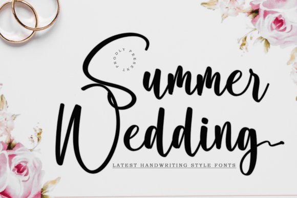
This variant emphasizes movement: characters sway along a playful, irregular baseline so words feel alive on the page. Long ascenders and looping tails supply a handcrafted pulse, yet the designer provides alternates that rein in exuberance for tighter compositions. The light strokes catch highlights beautifully on foil or embossed print, making short phrases feel celebratory and tactile.
Because some glyphs extend more than usual, attentive leading and line length prevent collisions; alternates help tidy tight settings without losing the font’s expressive quality. It excels at short headlines, product labels, and boutique packaging where personality is the point, while longer text benefits from pairing with a neutral sans. Treat it as a display voice-use for mark-making rather than paragraphs.
╰┈➤ Download Summer Wedding Font (Script & Handwritten – Dancing Baseline)
My Recommendation: I pick this dancing-baseline version when a project needs visible character-gift tags, small-batch packaging, and playful event signage are perfect uses. The alternate glyphs let me control exuberant shapes quickly, and the font captures light and texture in printed pieces. Ideal for short copy and brand marks that benefit from a lively, hand-touched feel.
4. Summer Wedding Font
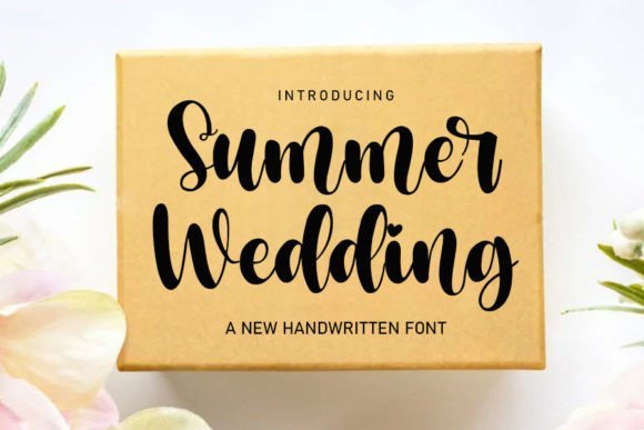
Summer Wedding Font presents graceful, calligraphic strokes that curl and flow with a natural rhythm, lending immediate refinement to printed and digital stationery. The script’s fluctuating baseline and soft junctions deliver a handcrafted feel without sacrificing legibility, so it reads cleanly on wedding invitations, thank-you notes and elegant logos. OpenType alternates and swash variations are generous, allowing designers to swap characters for bespoke word shapes and balanced monograms.
Kerning and spacing arrive tuned for display sizes, and the glyph set includes stylistic sets that smooth awkward letter pairings; a light tracking tweak tightens long names nicely. It pairs well with a restrained sans for RSVP cards or a minimal serif for formal invites, and prints crisply on textured paper as readily as it renders in web headers. Use it where you want handwriting warmth that still feels structured.
╰┈➤ Download Summer Wedding Font
My Recommendation: I reach for Summer Wedding Font when I want a handwritten voice that remains readable across cards and screens. The alternates let me craft unique monograms quickly, and the tuned spacing saves time on manual kerning. It’s ideal for wedding suites, boutique branding, and stationery that needs a refined script with personality.
5. Summer Wedding Font
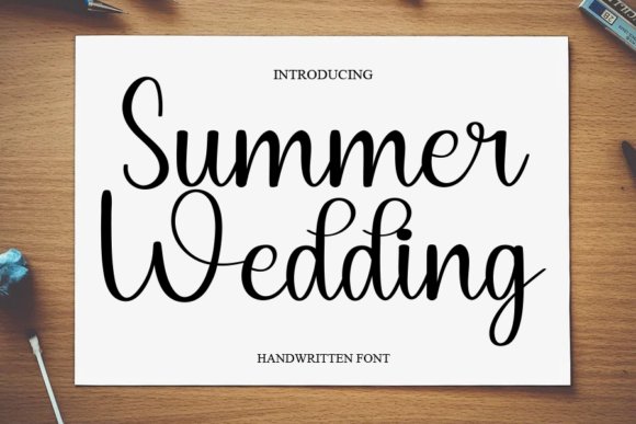
Summer Wedding Font offers a poised, airy script voice that balances slender strokes with occasional fuller terminals to create contrast and rhythm. Its weight distribution avoids heavy clusters and maintains clarity at headline sizes, making it a strong choice for logos and hero text. The included ligatures smooth transitions between tricky letter pairs so words flow without visual hiccups.
Stylistic alternates provide subtle variations to freshen repeated names across a multi-piece suite, and the font behaves predictably in tight layouts when used sparingly. Pair it with a geometric sans for a modern wedding site or a classic serif for printed invitations to establish a clear visual hierarchy. The outcome reads handcrafted but intentional, giving projects a polished, human touch.
╰┈➤ Download Summer Wedding Font
My Recommendation: I like using this Summer Wedding Font when a design needs a refined script that won’t dominate other elements. Its ligatures and alternates offer discreet customization that improves brand cohesion. Use it for wedding identities, boutique packaging, and editorial headings where a measured, hand-lettered tone is required.
6. Summer Wedding Font
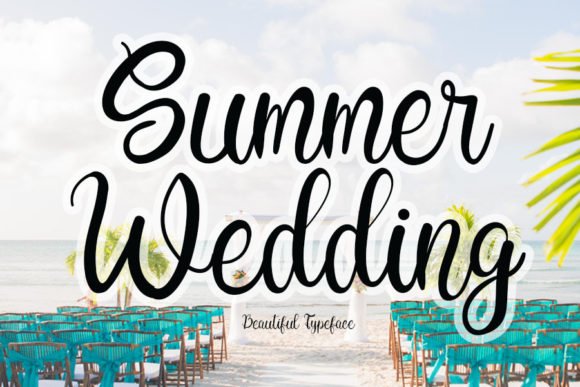
Summer Wedding Font leans into playful motion, with letters that tip and flirt with the baseline to produce a lively, informal tone. The whimsical terminals and looping descenders give designs a friendly, approachable character suited to greeting cards, children’s party invites or artisanal product labels. Despite the exuberant personality, the letterforms retain readable proportions even at smaller sizes.
Swash alternatives and tapered strokes create room for decorative treatment without crowding copy, and the font’s open counters help it reproduce cleanly on textured materials. When used with airy layouts and soft palettes it brings instant charm; on high-contrast designs it functions as a warm personality note that softens rigid grids. It’s a solid pick when you want joyful handwriting rather than stiff calligraphy.
╰┈➤ Download Summer Wedding Font
My Recommendation: I often choose this version of Summer Wedding Font when a project needs charm and movement over formality. It livens invitations, social graphics and labels while remaining legible across sizes. Pick it for playful branding, kid-focused goods, and any work that benefits from a casual, hand-drawn accent.
7. Summer Wedding Font
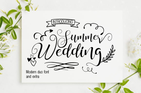
Summer Wedding Font is presented as a three-part family: a flowing handwritten script, a set of dingbats for ornament, and a clean sans serif to handle functional text. The script favors airy loops and measured slants while the sans brings compact geometry, and the dingbats echo the hand-drawn forms so accents feel native rather than stuck-on. That combination lets you keep headings, motifs and body details visually related across invitations, labels and small identity pieces.
The package includes alternate glyphs, basic multilingual coverage, and sensible kerning for common letter pairs, plus OTF/TTF builds for easy installation. Use the dingbats to craft separators or pattern rows, reserve the script for names and feature lines, and put the sans on dates and addresses to preserve legibility. On paper the script reads as hand-lettered without looking messy, and in digital comps the trio keeps a consistent tone from hero art to footers.
╰┈➤ Download Summer Wedding Font
My Recommendation: I would pick Summer Wedding Font when I need a compact toolkit that keeps decorative lettering and practical copy aligned across a suite of wedding materials. The dingbats speed up decorative layout work and the sans stops tiny event details from getting lost. It’s a good fit for invitation suites, pop-up shop signage, and boutique packaging where one cohesive voice matters.
8. Summer Wedding Font
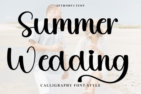
This take on Summer Wedding leans into a soft, slightly irregular stroke that suggests pen on textured paper, giving designs an intimate, human quality. The face offers numerous stylistic alternates and contextual forms so repeated names and phrases can vary without calling attention to repetition. That organic rhythm makes it comfortable to read at medium sizes while remaining expressive in larger headings.
Technically it arrives as standard OTF/TTF files that install across common platforms including Windows and many open-source tools, with OpenType controls available for swashes and ligatures. Because the weight and contrast are modest, it pairs well with narrow serif text or a neutral grotesque for balance, and the character set supports modest language needs. Use it for product labels, handmade craft tags, blog headers, and any project that benefits from a relaxed handwritten signature.
╰┈➤ Download Summer Wedding Font
My Recommendation: I reach for this version of Summer Wedding when a project should feel personal but still behave predictably across apps and print runs. The alternates let me avoid repetition in repeated names, and the gentle stroke reads well on rustic papers and phone screens alike. It’s especially suitable for artisanal product packaging, greeting cards, and lifestyle blog artwork.
9. Wedding Summer Font
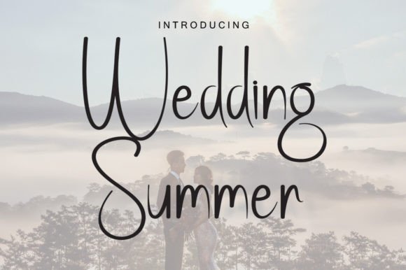
Wedding Summer Font is a cursive script built around generous swashes and tightly connected letterforms that mimic a practiced, romantic hand. It ships with decorative terminal flourishes and a complementary set of floral dingbats so you can frame a headline without adding separate illustrations. The spacing keeps lines airy enough that even longer names maintain legibility despite the ornate joins.
In use, the script excels as a single-line display face for announcements, mastheads and packaging seals; pair it with a restrained sans to give the script room to breathe and avoid visual clutter. The ornaments are handy for creating bespoke separators, corner marks or faux-embossed badges without extra assets. For print, choose textured stock to amplify the handwritten feel; online, keep color contrast high so the delicate strokes don’t disappear.
╰┈➤ Download Wedding Summer Font
My Recommendation: I choose Wedding Summer when a design needs unmistakable romantic character-engagement invites, boutique fragrance labels, or literary covers about love are ideal. The built-in ornaments speed mockups and let me lay out polished proofs fast, and the flowing letterforms photograph beautifully on heavy paper. Use it as a feature element rather than a paragraph face to keep compositions elegant rather than busy.
10. Mother Time Font
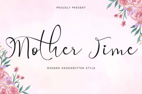
Mother Time presents a warm, hand-brushed script with lively strokes and a relaxed slant that reads like a personal note. It ships with uppercase and lowercase characters, a thoughtful set of ligatures, numbers and punctuation, plus multilingual glyphs, so it performs well across printed invites and on-screen banners. The open counters and moderate contrast keep letterforms legible at display sizes while retaining a handcrafted personality.
Designers will appreciate how swashes and alternates let you adjust rhythm without losing cohesion; pair it with a restrained sans for body text to avoid visual clutter. It shines on wedding stationery, seasonal packaging and boutique logos where a human hand is a selling point, and its language support helps keep brand voice intact across markets.
My Recommendation: I reach for Mother Time when I want type that feels handwritten but composed-perfect for invitations, artisanal labels, and lifestyle branding. Its alternates and ligatures let me add flourish without manual vector work, and the multilingual set removes guesswork for international projects. Use it when you need warmth and craft without losing clarity.
11. Sweet Summer Font
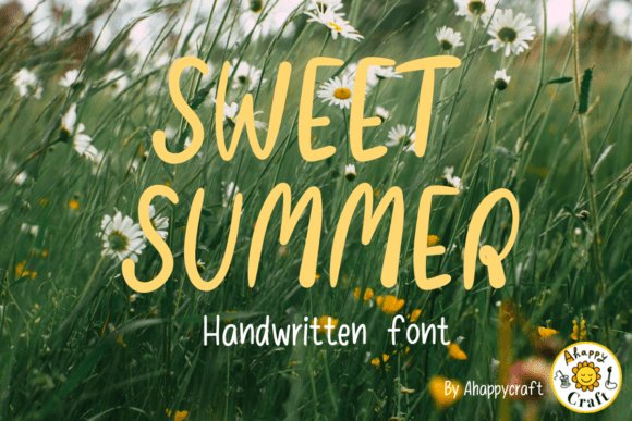
Sweet Summer captures a sunlit, hand-drawn aesthetic through tall, narrow letterforms and gentle, organic curves that suggest relaxed afternoons outdoors. Its airy proportions make it ideal for large headlines, posters and packaging where a nostalgic yet modern voice is required; the type feels handwritten without looking amateurish. Apply it over soft photography or textured paper to amplify its sentimental quality.
The font works well with bright, sun-washed palettes or muted earth tones and benefits from generous tracking at display sizes to keep strokes readable. Alternates and contextual forms help avoid repeated patterns in wordmarks, and the overall weight range copes well with both social media headers and printed festival posters.
╰┈➤ Download Sweet Summer Font
My Recommendation: I use Sweet Summer when a project needs that sun-soaked, human touch-ice-cream labels, boutique festival posters, or lifestyle blog mastheads. It reads with personality at large sizes and pairs cleanly with modern sans serifs for supporting copy. It’s my go-to for seasonal work that wants to feel handmade but still polished.
12. Journal Font
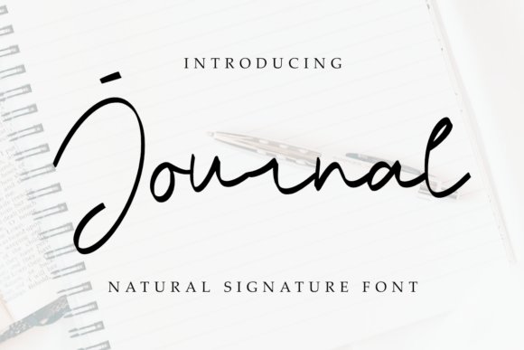
Journal is a natural, friendly handwritten font that reads like casual笔记, making it a strong choice for crafts and merchandise. The strokes are clean enough for vinyl cutting and laser work yet loose enough to convey personality on tumblers, mugs, and tote bags. Its balanced baseline and modest stroke contrast translate well into embroidery and sublimation workflows.
Because Journal keeps forms uncomplicated, it converts smoothly for keychains, stickers and planner layouts without awkward gaps or overly ornate terminals. It adapts easily across seasonal themes-holiday tags, back-to-school names, camping labels-so you can reuse a consistent voice across multiple products and campaigns.
My Recommendation: I pick Journal when I need a reliable hand-lettered look that behaves in production: it’s simple to trace for cutting or to digitize for embroidery and still reads warmly on printed goods. Its straightforward shapes save time when prepping mockups or batch-print runs, and it’s excellent for makers and small brands producing seasonal items. Use it to give everyday products an approachable, handcrafted identity.
13. Wedding Summer Font
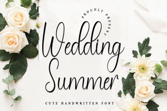
Wedding Summer presents a refined handwritten voice that pairs classic calligraphy proportions with a relaxed, contemporary rhythm. Thin-to-medium stroke contrast and generous ascenders give words an airy presence without sacrificing legibility, which makes it especially effective for display work. Slight irregularities in the pen strokes mimic a practiced hand, so compositions feel deliberately made rather than mass-produced.
The OpenType roster is generous: alternates, contextual ligatures and tasteful swashes allow you to vary letterforms for invitations and monograms, and PUA encoding keeps those extras easy to access in many apps. Kerning is handled thoughtfully and the overall spacing supports both short headlines and modest lines of text; I’d avoid long paragraph use. Pair Wedding Summer with a restrained serif or a geometric sans to keep the script as the focal point.
╰┈➤ Download Wedding Summer Font
My Recommendation: I reach for Wedding Summer when I need a romantic, handcrafted look for wedding stationery, boutique branding or luxe event collateral. Its alternates let me craft bespoke wordmarks quickly, and PUA access removes friction when laying out complex typographic pieces. Use it large, give it breathing room, and let simpler support faces carry body copy.
14. Belanie Lovely Font
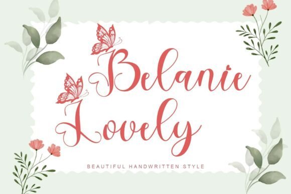
Belanie Lovely Font stands out because each capital letter is embellished with a delicate butterfly motif, giving headlines an immediate whimsical character. The underlying letterforms are open and readable, so the decorative initials feel like an accent rather than a distraction. Complete basic sets-upper and lower case, numerals and punctuation-plus multilingual support make it practical for varied projects.
Because the butterfly ornaments act as decorative initials, Belanie Lovely performs best at display sizes where the tiny details register clearly on cards, banners or product labels. Balance the fanciful caps with a neutral body face to prevent visual overload, and apply the decorated capitals consistently so they read as a designed motif. The font’s reliable glyph coverage simplifies layout work across languages and platforms.
╰┈➤ Download Belanie Lovely Font
My Recommendation: I’d use Belanie Lovely for seasonal greeting cards, children’s party invites, and boutique packaging where a playful, handcrafted accent matters. The butterfly capitals give instant personality without needing custom illustration, and the multilingual set helps when producing for multiple markets. Keep it as a headline or focal element and pair it with a quiet supporting typeface.
15. Creative Summer Font
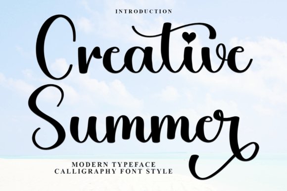
Creative Summer Font feels like a spontaneous calligrapher’s flourish: smooth curves, lively swashes and a tiny heart detail create an upbeat, affectionate tone. Stroke weight and letter spacing land in a middle ground that suits social graphics and printed invitations, allowing the script to remain readable while keeping a handcrafted energy. Its motion-forward rhythm helps convey casual celebrations and seasonal promotions effectively.
The PUA-encoded glyph set includes alternate forms and ligatures so repeated lines can vary naturally, which is useful across multi-card suites or social grids. For logos and headers, pair Creative Summer with a minimal sans and bold color to let those swashes pop; reserve neutral faces for long reads since the decorative strokes tire the eye over extended text. The heart accent works nicely as a repeating motif across collateral systems.
╰┈➤ Download Creative Summer Font
My Recommendation: I’d pick Creative Summer when a project needs a warm, approachable script-festival posters, wedding signage or friendly social campaigns are ideal. The heart glyph is an instant signature that I often pull into badges and patterns, and the alternates keep repeated lines from feeling monotonous. Treat it as a display face and keep supporting typography understated so the script remains the star.
16. Summer Monogram Font
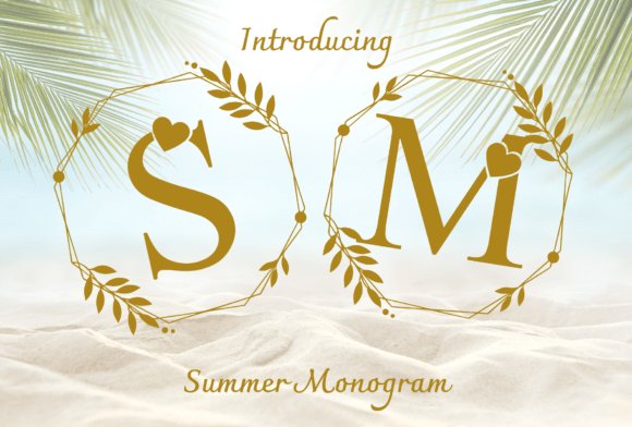
Summer Monogram reimagines classic serif initials with playful heart motifs and delicate botanical wreaths, producing a decorative alphabet that reads like a keepsake stamp. The letters lean slightly condensed so stacked initials stay compact, while alternates and ornaments give you the choice between spare initials and fully ornamented seals. Subtle contrast and narrow counters make the glyphs feel tactile, especially when set against warm golds and natural paper textures.
OpenType extras include swash initials, ligatures and separate wreath vectors so you can layer compositions without heavy manual editing. It responds well to foil stamping, letterpress and embroidery once outlines are converted, and small heart details survive at moderate sizes but reward larger display work. For stationery I often use a single-wreath lockup as a seal and save the more ornate alternates for envelope liners or packaging accents.
╰┈➤ Download Summer Monogram Font
My Recommendation: I use Summer Monogram when a design needs an intimate, seaside-inflected signature – think wedding suites, boutique gift tags, and artisan product labels. The included wreaths and alternates cut layout time and provide ready-made emblem options. It’s ideal for projects that aim to feel handcrafted and polished at the same time.
17. Honeyday Font
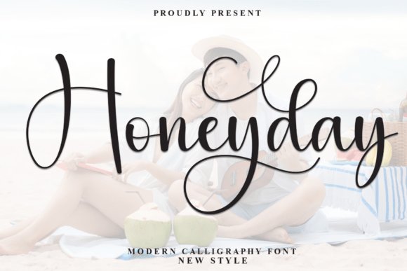
Honeyday is a monoline calligraphic script with long ascenders, looping terminals and a light structural weight that gives words an airy, handwritten cadence. Rhythm and spacing are thoughtfully balanced so that even expressive swashes maintain readability in hero headlines and social banners. The typeface supplies a range of alternates and contextual forms that let you dial the level of ornamentation up or down without losing cohesion.
Because of its tall, narrow letterforms, Honeyday pairs especially well with geometric sans faces that provide grounding contrast and clarity. It performs best as display type on packaging, invitations and headers; small paragraph use will lessen its character. When using the family, tighten tracking slightly for denser word shapes and choose one or two signature swashes to anchor each composition.
My Recommendation: I reach for Honeyday when I want a warm, handwritten headline that still reads cleanly on photos and packaging. Its swash alternates give me expressive options without needing hand lettering, and the tall forms work beautifully with tight layouts. Use it for seaside wedding invites, boutique branding, or blog mastheads that need a gentle, personal voice.
18. Summer Romantic Font
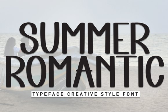
Summer Romantic is a tall sans serif that balances slender proportions with open counters, producing an elegant presence suited to resorts, postcards and editorial covers. The slight humanist touches at terminals keep it from feeling sterile, lending a relaxed refinement ideal for vacation-themed identity systems. High-contrast display use highlights its vertical rhythm while remaining readable on textured stock and screens alike.
Work with the family by pairing a lighter weight for body headers and a medium for main titles to create subtle hierarchy without extra ornament. The default kerning favors compact word shapes, so increasing tracking softens the overall tone and creates a breezy pacing across blocks of text. For digital projects choose the mid-weight for consistent rendering and reserve the tall caps for standout headlines.
╰┈➤ Download Summer Romantic Font
My Recommendation: I pick Summer Romantic when a design needs modern restraint with a whisper of softness – hotel branding, seasonal lookbooks, or travel postcards are perfect fits. Its tall forms deliver presence without overpowering imagery, and the neutral structure makes scaling the system straightforward. Use it when you want clean headlines that still feel gently approachable.
19. Halloween Handwritin Font
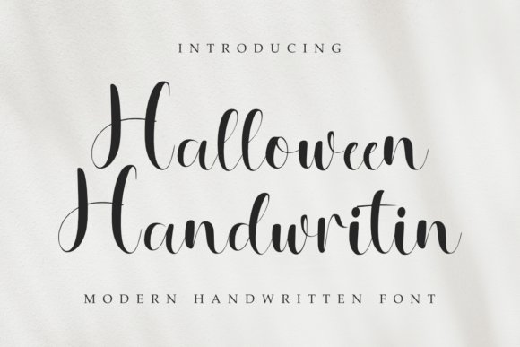
Halloween Handwritin Font captures the small inconsistencies and pressure shifts of a real pen, giving text an intimate, hand-rendered appearance. The irregular baseline and open counters maintain legibility while still reading like genuine handwriting, which makes it useful for laser-cut signage, embroidery patterns, tumblers, and sticker sheets. Files include common desktop and web formats plus alternates so you can swap letters for a varied, organic look.
This face feels at ease on wedding envelopes, teacher stationery, product tags, and seasonal merchandise where a personal touch matters; its letterforms suit Halloween designs without feeling gimmicky and also complements Christmas or patriotic themes. Try pairing it with a restrained sans for body copy, or print it on textured paper to emphasize its artisanal character and soft ink-flow details.
╰┈➤ Download Halloween Handwritin Font
My Recommendation: I use Halloween Handwritin when a project needs to read as if someone wrote a note by hand-it adds warmth without sacrificing clarity. It works especially well for small-run products like mugs, tote bags, and embroidered patches where the strokes translate cleanly to production methods. For best results I keep body text simple and let this font shine in headlines, names, and short phrases.
20. Ballon Romance Font
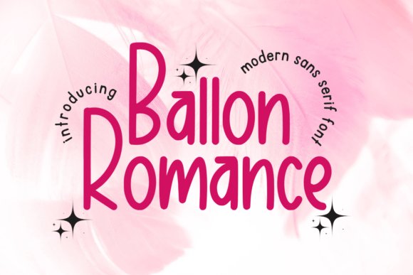
Ballon Romance Font is a cheerful, handwritten sans with plump terminals and a slightly bouncy rhythm that feels immediate and friendly. Its rounded shapes and generous spacing make it highly readable in planners, social posts, and children’s materials, where a gentle, casual tone is desired. Because the forms stay open and uncomplicated, the font reproduces well on fabric labels and screen graphics alike.
Use Ballon Romance for event invites, classroom materials, seasonal posters, or lifestyle branding that needs to communicate approachability without looking childish. It pairs nicely with a narrow serif or a condensed geometric sans when you want hierarchy that stays playful yet orderly. Small adjustments to letter-spacing will keep multi-line layouts from feeling crowded while preserving the font’s approachable character.
╰┈➤ Download Ballon Romance Font
My Recommendation: I add Ballon Romance to kits for planners, kids’ products, and cheerful packaging because it keeps designs light and optimistic. Its readability at small sizes and friendly personality make it a go-to for social graphics and greeting cards. I usually give it a little extra tracking on long lines and reserve bold weights for short, attention-grabbing headlines.
21. Bulluk Font
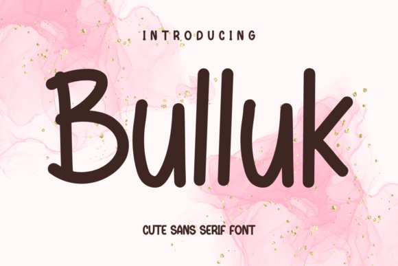
Bulluk Font blends the informal qualities of handwriting with the straight edges of a sans, creating a neat but personable look suitable for modern craft projects. The typeface offers a steady x-height and tidy terminals that hold up across screens, labels, and print, making headlines feel human without becoming sloppy. Thoughtful spacing and clear counter shapes ensure it remains legible at smaller sizes while keeping a friendly voice.
This design suits product tags, casual branding, posters, and apparel where a handcrafted accent needs structural clarity. Try it for short logotypes or packaging copy, pairing it with a narrow serif for contrast or using it alone for minimalist layouts. Its neutral energy makes it adaptable to seasonal themes while retaining a contemporary, approachable presence.
My Recommendation: I reach for Bulluk when I want a soft, human touch that still reads professional-ideal for packaging, signage, and identity work for approachable brands. It holds up in both print and web environments, so I use it in mockups that move from screen to physical production. I find it pairs especially well with textured papers and simple color palettes to keep the overall look modern and honest.
22. Charming Valentine Font
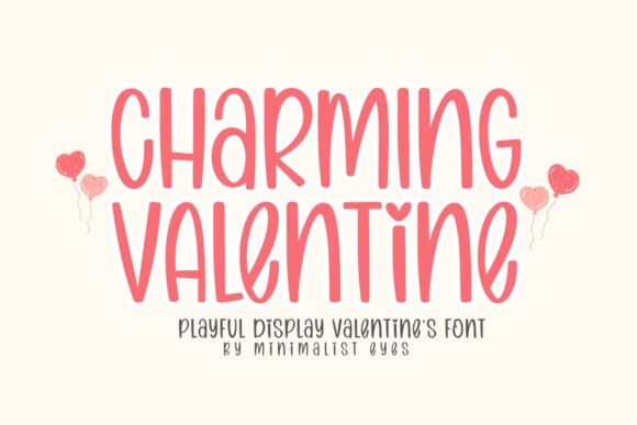
Charming Valentine is a bubbly handwritten display font with rounded terminals, soft curves and playful swashes that read intimate rather than saccharine. Lowercase letters show generous counters and quirky ligatures while alternates include heart-shaped dots and flourish endings for short bursts of ornament. At headline sizes it keeps a warm, personable voice without collapsing legibility.
It shines on greeting cards, wedding signage, kids’ stationery and diary headers where a friendly personality matters. Pair it with a narrow grotesque or a restrained serif to give the swashes room, and tighten tracking slightly for compact layouts. OpenType contextual alternates and discretionary ligatures make styling quicker and help avoid repetitive letter pairs.
╰┈➤ Download Charming Valentine Font
My Recommendation: I use Charming Valentine whenever a piece needs an affectionate, human touch-party invites, seasonal packaging, and social posts all benefit. The heart terminals and swash alternates let me add whimsy without resorting to stickers or illustration. For projects that should feel handcrafted and personal, this font delivers compact charm and practical feature support.
23. Fancy Lovely Font
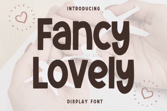
Fancy Lovely is a bold display font with chunky, rounded letterforms that command attention without feeling crude. Heavy strokes and wide counters create iconic silhouettes suited to posters and product labels, and several alternate capitals introduce extra character for hero headlines. The type’s rhythm preserves personality across short lines and large sizes.
Deploy it on merchandise, event banners, children’s book covers or social headers that need a confident, cheerful voice. Contrast the weight with thin sans text to avoid visual fatigue, and use color blocking or duotone to amplify the shapes. Stylistic sets and a full punctuation set make it ready for commercial art direction.
╰┈➤ Download Fancy Lovely Font
My Recommendation: I grab Fancy Lovely when art direction calls for bold friendliness-storefront banners, tee designs and attention-grabbing packaging are perfect fits. Its heft ensures readability from a distance while alternates give compositions a handcrafted feel. If a brand needs to broadcast playful confidence, this font makes the message unmistakable.
24. Camping Planner Font
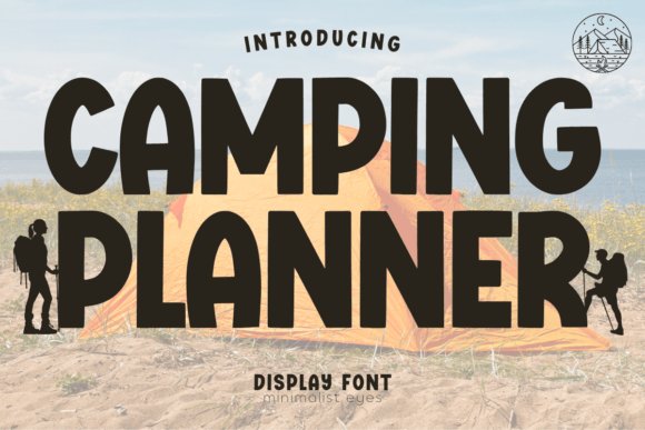
Camping Planner offers a hand-lettered display style with slightly rough edges that suggest inked or stamped artwork rather than slick vector shapes. Irregular terminals and small texture variations give letterforms a tactile, crafted presence ideal for badges and logos. The result feels familiar and authentic on screen and in print.
It excels on camper van decals, gear tags, outdoor event badges and packaging that benefit from a rugged, handmade look. Pair with a condensed sans or a sturdy slab for badge stacks, and choose earthy palettes or subtle textures to reinforce the aesthetic. Heavier tracking helps single-line signage stay legible at a glance.
╰┈➤ Download Camping Planner Font
My Recommendation: I choose Camping Planner for projects that should look crafted and outdoorsy, such as small-batch product labels or festival badges. Its textured details survive printing and embroidery while avoiding cliché timber motifs. For designs needing a lived-in, authentic vibe without over-polishing, this font is a dependable go-to.
25. Welcome Children Font
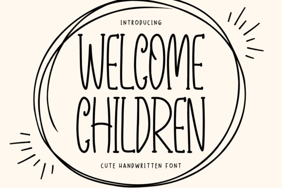
Welcome Children presents warm, hand-drawn letterforms that feel like a child’s handwriting without losing clarity; rounded terminals and uneven stroke widths give it a playful, personal character suited to greeting cards, stickers, and classroom materials. Alternates and subtle swashes add variety so headings never look repetitive, and the generous x-height keeps short phrases readable even at smaller sizes. Capitals sit slightly condensed to prevent crowding while lowercase letters swing with lively descenders that add motion to layouts.
The package ships with one weight plus stylistic alternates and common punctuation; kerning favors openness, so tighten tracking for dense lines or narrow columns. It sings on print projects and social graphics alike-use larger leading to let the strokes breathe, and pair it with a neutral sans for body text to maintain hierarchy. OpenType support makes swapping swashes convenient in most design apps.
╰┈➤ Download Welcome Children Font
My Recommendation: I reach for Welcome Children whenever a project needs a handcrafted, friendly voice-its irregularities read as warmth rather than amateurishness. The alternates make short runs feel bespoke without extra lettering work, and the generous shapes hold up on posters and greeting cards. Use it for party invites, kids’ merchandise, classroom displays, or any design that benefits from a human touch.
26. Children Font
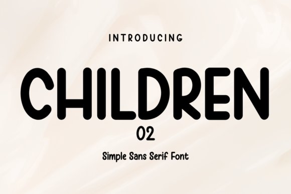
Children Font reduces handwriting playfulness to a tidy sans form: rounded strokes and uniform weight produce a calm, approachable tone that’s ideal for preschool signage, app interfaces, and packaging aimed at families. Its straight baseline and open counters enhance legibility at display sizes, and the minimal contrast keeps text neutral where a handwritten script would distract. Alternates are pared back, so consistency remains strong across short blocks of text or product labels.
Technically it’s modest in file size with sensible kerning and basic Latin support, which makes it practical for web use and responsive layouts. Use it for headlines, badges, and kid-centric logos, and pair it with a warmer secondary serif if you want added texture. For best results keep sizes above 12px on screens to preserve character shapes and maintain clarity.
My Recommendation: I choose Children Font when a project needs a neat, friendly tone without the unpredictability of true handwriting; its restraint makes it versatile across touchpoints. It renders crisply on mobile and keeps identity systems cohesive across labels, signage, and interfaces. Great for daycare branding, toy packaging, and family-focused apps where readability and a soft character matter.
27. Stucked Grinchi Font
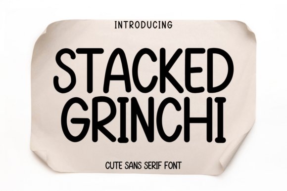
Stucked Grinchi Font leans into eccentric letterforms: uneven baselines, slightly stretched bowls, and playful irregularities give it a mischievous character that fits seasonal posters and novelty merchandise. The jitter in some glyphs reads as hand-sketched mischief rather than sloppy construction, which makes it an asset for Halloween flyers, quirky holiday cards, and any project that needs a whimsically offbeat voice. Use sparing caps and short phrases to keep the energy readable.
On the technical side the family includes alternates and a set of decorative ligatures; avoid using it at very small sizes because the intentional distortions can blur. It pairs well with restrained sans or simple serif companions that ground the composition, and bold color choices help the irregular shapes pop. For printing, increase tracking slightly to preserve each character’s quirky personality.
╰┈➤ Download Stucked Grinchi Font
My Recommendation: I pull Stucked Grinchi Font when I want loud personality that reads as playful chaos-perfect for seasonal posters, zines, and novelty packaging. Its exaggerated forms do the heavy mood-setting so you can skip elaborate illustration. I’d avoid it for body copy and instead use it for headlines, stickers, and short taglines where character drives the message.
28. Barbie Children Font
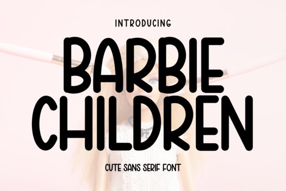
Barbie Children Font is a playful handwritten sans serif with soft, rounded terminals and a gently bouncy baseline that reads like a child’s pen on paper. The uneven stroke widths and slightly quirky letter spacing give each word a handcrafted character while staying legible for short bursts of text. Alternates and loose kerning let you tweak display lines so headings feel lively without becoming chaotic.
It shines in covers, greeting cards, planner headings, and kid-focused packaging where personality matters more than rigid precision. Pair it with a neutral geometric sans to keep layouts grounded, or layer it on pastel backgrounds and doodled illustrations to enhance the friendly tone. Use it for seasonal crafts, classroom printables, social headers, and any project that wants an immediate, affectionate voice.
╰┈➤ Download Barbie Children Font
My Recommendation: I use Barbie Children Font when a design needs warmth and a handcrafted touch; its uneven strokes feel genuine rather than manufactured. It’s perfect for birthday invitations, classroom worksheets, kids’ apparel tags, and parenting blog graphics. Pick it for projects that benefit from clear, playful personality at display sizes.
29. Grinchike Font
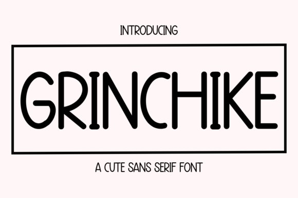
Grinchike Font brings a mischievous, slightly ragged handwritten sans serif that reads like a spirited scrawl. Condensed forms and irregular baselines create an energetic, off-kilter rhythm that works well for bold headlines and themed signage. A set of quirky alternates – exaggerated descenders and playful ligatures – lets you dial up the personality when a title needs to stand out.
This face performs best when used sparingly as the focal point of posters, seasonal promos, sticker designs, and craft labels. Balance its boldness with a calm, open-faced body type so the message remains readable while the display type grabs attention. Ideal for holiday cards, event flyers, and any application that benefits from a cheeky, memorable voice.
My Recommendation: I reach for Grinchike Font when a project needs attitude and a wink; it has enough character to carry a title on its own. Use it for seasonal campaigns, playful product labels, or social posts that aim to be eye-catching. It’s especially handy for quick, bold graphics where a little mischief improves recall.
30. Valentine Midnight Font
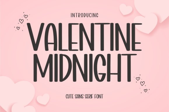
Valentine Midnight Font offers a refined handwritten sans serif with long, elegant strokes and modest contrast that feels intimate without excess flourish. Subtle swashes and tapered terminals suggest hand-painted ink at dusk, lending a restrained decorative quality while preserving legibility. Included alternates and delicate ligatures help craft stationery and small-run packaging with a soft, handcrafted presence.
Use it for wedding envelopes, boutique tags, romantic blog headers, and date-night menus where a gentle, polished hand is desired. Pair with a light serif for an elevated appearance or set it over textured paper to emphasize tactile charm. It’s most effective at medium display sizes where its quiet personality can shape the mood without overwhelming the layout.
╰┈➤ Download Valentine Midnight Font
My Recommendation: I pick Valentine Midnight Font when a design calls for subtle romance rather than grand flourish; its measured strokes feel handmade but never fussy. It suits wedding suites, artisan product labels, and boutique branding that seeks warmth and refinement. Use it as a headline face paired with simple body type to let its character breathe.
31. Candy Font
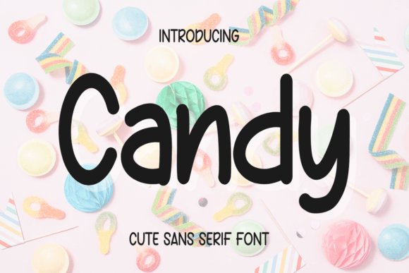
Candy is a rounded sans serif that pairs strong readability with a playful personality; its full-bodied letterforms and soft terminals give headlines a warm, affectionate presence without sacrificing clarity. The open counters and slightly compressed proportions make it comfortable in short blocks of text and striking at display sizes, so it reads well on packaging and posters alike.
Use Candy where a design needs a friendly voice-children’s books, birthday invites, toy labels, ice-cream signage and cheerful social graphics are natural fits. For contrast, combine it with a neutral grotesque for body copy or a light script for decorative accents to maintain balance between whimsy and structure.
My Recommendation: I reach for Candy when a project needs to feel friendly and immediate: product labels for kid-focused brands, playful merchandising, or event posters where warmth matters. Its rounded shapes carry personality at large sizes and remain legible in modest text blocks, which makes the font useful across print and digital. If the brief calls for charm without losing professionalism, Candy is my go-to.
32. Sunday Grinch Font
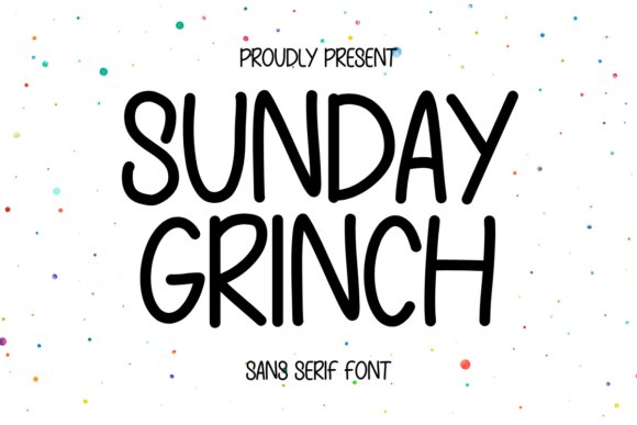
Sunday Grinch wears a handwritten sans voice with bouncy baselines and slightly irregular strokes that evoke a handcrafted note. Letter endings are softened rather than sharp, giving the face a casual, off-the-page warmth that feels honest and homemade instead of overly produced.
It performs especially well on seasonal collateral, scrapbooks, DIY-style packaging and planner pages where informal personality matters more than rigid formality. Try pairing it with textured paper effects or a muted color palette to amplify its friendly, playful character without overwhelming the layout.
╰┈➤ Download Sunday Grinch Font
My Recommendation: I choose Sunday Grinch for projects that call for a lighthearted, human touch-party invites, holiday tags, kids’ apparel mockups and sticker designs all benefit from its handmade feel. It brings instant character to headers and short blocks while keeping legibility intact. For a natural look that reads as written-by-hand, this font is a reliable pick.
33. Andien Handwritten Font
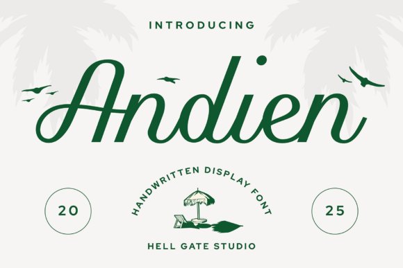
Andien is a refined handwritten display face with flowing strokes and a restrained flourish that reads both personal and polished. Its rhythm and stroke contrast suggest brush or pen influence while remaining stable enough for logos and prominent headlines, giving copy an approachable sophistication.
It excels on wedding suites, boutique labels, and lifestyle branding where a handcrafted yet curated voice is desirable, and it pairs well with a simple sans for body copy to preserve hierarchy. Pay attention to tracking and kerning at very large sizes to keep the elegant flow intact across letter combinations.
╰┈➤ Download Andien Handwritten Font
My Recommendation: I reach for Andien when a project needs to feel intimate but composed-bridal stationery, artisanal packaging, or boutique identity work all suit its temper. It adds personality without feeling fussy, and sits beautifully beside clean sans faces for supporting text. When a brand must read as handcrafted with polish, Andien reliably supplies that tone.
34. Valentine Surprise Font
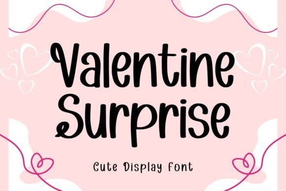
Valentine Surprise Font feels like a handwritten love note: rounded strokes, a playful baseline bounce, and small heart-like terminals on select characters give it an affectionate personality without tipping into saccharine. Alternates and casual swashes appear on capitals and some lowercase forms, so you can dial the charm up or down depending on the layout. At display sizes the face reads clearly and injects an intimate, handcrafted tone appropriate for cards, posters, and product labels.
Treat it as a headline face and pair it with a neutral sans for body copy to keep reading friction low; tighten tracking for tight spaces and loosen it for longer lines to preserve the hand-drawn rhythm. It responds well to pastel palettes or bold white-on-red headers, and its OpenType options reward a little experimentation with ligatures and stylistic sets. For print, favor slightly heavier rendering to retain stroke warmth; for web, check hinting at smaller sizes.
╰┈➤ Download Valentine Surprise Font
My Recommendation: I reach for Valentine Surprise when a project needs genuine, handcrafted warmth-its bouncy letters read friendly without feeling childish. It stands out on greeting cards, boutique packaging, and playful headers for lifestyle blogs. My routine: use alternates sparingly so each flourish keeps impact, and pair with soft textures or paper stocks for extra tactile appeal.
35. Baby Reindeer Font
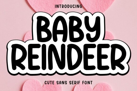
Baby Reindeer Font blends a clean sans base with lively handwritten touches: rounded terminals, slight stroke irregularities, and compact ascenders produce a cheerful, restrained voice. The lowercase set is especially inviting, making short passages feel personal yet legible, while numerals and small caps match the same warm tone. These traits make the face comfortable for kids-focused work without losing typographic discipline.
It scales predictably across labels, nursery signage, and friendly interfaces, so you can use it at small sizes with confidence. Try it on soft, cool palettes or kraft backgrounds to emphasize tactile friendliness, and balance it with a geometric sans when you need clearer hierarchy. For screens, add a touch more line-height to keep phrases airy and readable.
╰┈➤ Download Baby Reindeer Font
My Recommendation: I often pick Baby Reindeer for children’s packaging and event stationery because it keeps the mood light yet remains highly readable at modest sizes. Its compact letter shapes let me squeeze longer copy into tight layouts without feeling cramped. If a brand needs to sound approachable and neat, this typeface is a reliable choice.
36. Simple Flowers Font
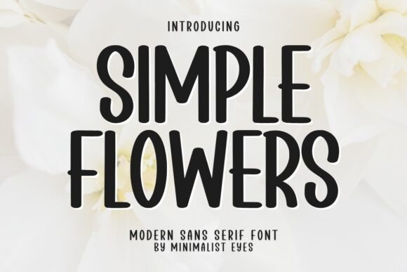
Simple Flowers Font pairs a restrained sans skeleton with a modest set of floral ornaments and alternate terminals, creating a tidy botanical signature that never overwhelms. Letterforms are low-contrast and geometric, while tiny flower glyphs function as decorative punctuation or subtle logos. That balance delivers a nature-tinged look suited to modern stationery and understated branding.
Use the ornaments as separators, bullets, or logo accents and combine the face with monochrome palettes or a single accent hue to maintain visual calm. It performs well in invitations, product labels, and editorial headlines where you want organic detail without ornate script. In print, the small florals hold up at medium sizes-reserve them sparingly to preserve their charm.
╰┈➤ Download Simple Flowers Font
My Recommendation: I choose Simple Flowers when a project needs quiet botanical notes rather than full floral decoration; the ornaments add personality without cluttering the layout. It’s perfect for wedding invites, boutique packaging, and editorial spots that favor restraint. My tip: apply the floral marks selectively so each instance feels intentional and fresh.
37. Fall in Love Font
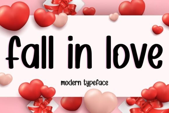
Fall in Love speaks with a warm, handwritten cadence-rounded terminals, a slight bounce on the baseline and modest stroke contrast that reads like a felt-tip note. Lowercase letters have open bowls and playful loops, while selective capitals include soft swashes that add personality without overpowering the line. Thoughtful spacing and a set of alternates and ligatures give short blocks of text a handcrafted look that still stays tidy and readable.
This face is well suited to invitations, diary pages, kids’ products and seasonal greeting cards where a personal touch matters more than formal precision. Try pairing it with a neutral geometric sans for body copy or place it over pastel textures and watercolor washes to amplify warmth. It holds up nicely at display sizes and gives logos, headers and packaging a friendly, approachable signature.
╰┈➤ Download Fall in Love Font
My Recommendation: I reach for Fall in Love Font when I want headlines and accents that feel intimate and approachable without looking messy. The alternates let me vary repeated words so social feeds feel handcrafted, and the gentle swashes add charm to invites and product labels. Use it for casual wedding stationery, children’s apparel tags, seasonal cards or lifestyle blog headers where a human touch matters.
Choose typefaces that match your venue and paper stock: airy scripts for beach ceremonies, organic handwritten faces for boho affairs, and light serifs for refined garden events. The 37 selections above provide a wide palette of moods and practical pairings to make your stationery cohesive.
Test a few combinations on photographed mockups and sample prints before finalizing. That extra step helps ensure your wedding typography reads beautifully in sunlight and on screen, giving your invites the perfect summer feel.