

65 Ultimate Typewriter Fonts for Vintage Book Covers 2026
Typewriter Fonts bring an unmistakable retro tone to printed and digital covers. This roundup lists 65 options that suit vintage book covers, from crisp monospaced styles to worn, ink-smeared designs.
Each entry includes style notes, licensing tips, and suggested pairings so you can match a typewriter-style look to your cover art or layout. Try combining a bold slab or monospaced headline with a light serif for readable body copy.
1. Friary Pro Font
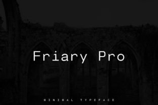
Friary Pro Font – Friary Pro is a minimalist sans serif built around clarity: narrow strokes, generous counters, and a subtle geometric skeleton that keeps text readable at tiny sizes and striking on large signage. Though primarily a sans, it pairs exceptionally well with Typewriter Fonts when a layout needs a mechanical, humanist contrast; use it for headlines that require restraint without stiffness. Its weight range and careful kerning let you fine-tune emphasis from captions to billboards.
The family’s open numerals and neutral italics make it a solid choice for UI, editorial grids, and brand identity work; webfont delivery and good hinting preserve forms on low-resolution screens. Designers will value its predictable metrics and consistent rhythm, which simplify typesetting and pairing with monospaced or textured display faces.
My Recommendation: I reach for Friary Pro when a project calls for clean, unobtrusive typography that still needs personality-especially when pairing with textured or typewriter-inspired headers. Its restrained shapes keep copy legible across print and screens while giving designers control over emphasis. Ideal for magazines, minimalist branding, and poster systems where contrast rather than ornament drives the voice.
2. Tippy Tappy Line Font
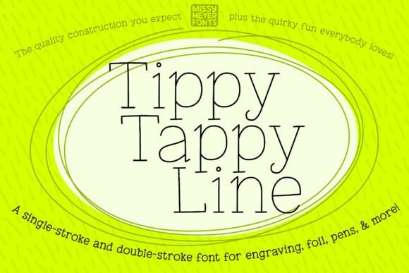
Tippy Tappy Line Font – Tippy Tappy Line reduces each glyph to a single continuous stroke, making it ideal for stylus-based tools, engraving bits, and drawing machines that do not render filled letterforms. The hand-drawn irregularities read as playful and nostalgic, giving handcrafted projects-from greeting cards to personalized jewelry-a charming, slightly imperfect typewriter-inspired look.
The download includes single- and double-stroke variants plus a complete SVG character set so you can export reliable vector paths for Cricut, Glowforge, or engraving software that struggles with font files. Because some platforms (for example, certain cutter workspaces) won’t accept typeable fonts, having SVGs and outlined vectors keeps production predictable and saves time on the shop floor.
╰┈➤ Download Tippy Tappy Line Font
My Recommendation: I use Tippy Tappy Line on laser-engraved gifts and hand-scored boards where a delicate, drawn line is the goal. The single-stroke option reduces toolpath length and produces clean, consistent scores, while the SVG fallback avoids software headaches. It’s a go-to for makers crafting one-off keepsakes and small-batch personalized goods.
3. Rusted Typewriter Font
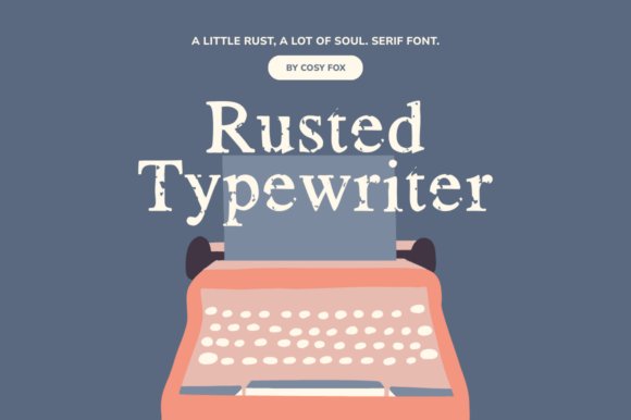
Rusted Typewriter Font – Rusted Typewriter applies vector erosion to a classic serif skeleton, simulating the worn edges and ink loss of long-used metal type. The distressed terminals and textured fills create an authentic aged feel that works well on posters, labels, and merchandise where historic or handcrafted character is desired.
Because the weathering is vector-based, the texture scales cleanly for large signage or small tags without introducing pixel blur, and the included symbols and hand-crafted alternates help build convincing old-school lockups. Pair it with a clean sans for tonal contrast or use it alone to give packaging and editorial spreads a tactile, stamped personality.
╰┈➤ Download Rusted Typewriter Font
My Recommendation: I pick Rusted Typewriter when a design needs a weathered, tactile voice-think craft beer labels, zines, and retro posters. The vector erosion keeps detail crisp at print sizes, so it translates well from apparel to storefront signage. It’s perfect for projects that benefit from a lived-in, analogue aesthetic rather than polished precision.
4. Holy Roller Font
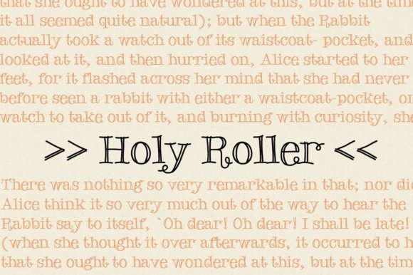
Holy Roller Font – Holy Roller blends hand-drawn charm with the mechanical quirks of old machinery, producing letterforms that feel loose, warm, and slightly askew. It sits comfortably among Typewriter Fonts while keeping a playful personality: rounded terminals, sporadic ink specks, and subtle baseline shifts make each line feel handwritten but legible.
This display face works best where friendliness matters – short headlines, greeting cards, indie zines, and packaging that needs character rather than polish. Pair it with a spare geometric sans to keep layouts readable while Holy Roller supplies the personality and visual interest.
My Recommendation: I reach for Holy Roller when a project needs an approachable, handmade voice without becoming twee. Its imperfections read as human, which is great for posters, labels, or editorial spots that benefit from a handcrafted touch. I typically offset it with a neutral sans so the warmth reads clearly at a glance.
5. Unexpected Typewriter Font
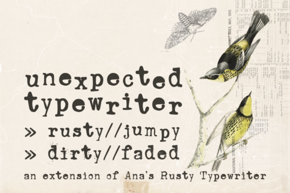
Unexpected Typewriter Font – Unexpected Typewriter channels an old Underwood machine but through a hand-drawn filter, giving each glyph the grit and spacing quirks of genuine keystrokes. The family includes Jumpy, Dirty, and Faded variations; Jumpy uses contextual alternates (OpenType) to introduce randomized offsets and character swaps that mimic mechanical misfires.
Great for designs that want an authentic analogue feel – record sleeves, film titles, posters, and book covers – it handles short blocks of text or display lines best. Remember to confirm your layout tool supports OpenType contextual alternates if you plan to use the Jumpy set to achieve that irregular rhythm.
╰┈➤ Download Unexpected Typewriter Font
My Recommendation: I pick Unexpected Typewriter when I want believable wear and texture without adding photographic distress. The different styles let me dial up or down the grunge depending on the job, from barely aged to thoroughly battered. It shines on covers and packaging where a tactile, historic tone is desired.
6. Vintage Machine Font
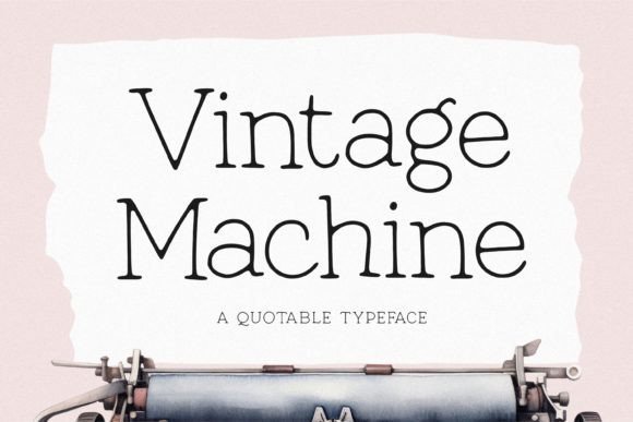
Vintage Machine Font – Vintage Machine recreates the steady cadence of mid-century mechanical typing, pairing monospaced tendencies with gentle irregularities: slightly rough edges, uneven ink coverage, and modest kerning variations that suggest real metal type. The result reads as authentic rather than artificially distressed, carrying a restrained historic personality suitable for both print and screen.
Use it for editorial layouts, period-themed posters, book jackets, and identity work that needs a believable retro signature. It holds up in short paragraphs and captions; combine it with a modern sans to balance nostalgia with contemporary clarity.
╰┈➤ Download Vintage Machine Font
My Recommendation: I use Vintage Machine when projects require a convincing analogue voice without sacrificing legibility. Its steady rhythm anchors layouts while the small imperfections sell the historical reference. It’s particularly effective on book covers, periodicals, and branding that leans into vintage aesthetics.
7. Garphel Font
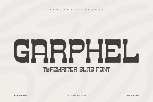
Garphel Font is a rounded slab serif that marries the stamped impact of old machines with softer, friendlier terminals. Thick, compact slab serifs and tightly controlled spacing deliver that authentic mechanical bite, while the rounded edges keep the tone approachable rather than severe. Designers who work with Typewriter Fonts will notice its tactile weight and the subtle ink‑blot suggestions in the counters. The family is PUA encoded, so alternates, swashes, and extended glyphs are readily available without hunting through a glyph palette.
This face excels at short display settings where personality matters: editorial headlines, packaging seals, and logo wordmarks that need a nostalgic stamp without feeling dated. Its legibility at larger sizes and the variety of alternates let you dial the voice from quaint to authoritative without swapping families. The rounded terminals also play well on screen, preserving the typewriter aesthetic while avoiding harsh pixel edges. For projects that want a recognizably mechanical heritage with a softer finish, Garphel makes an effective, characterful choice.
My Recommendation: I use Garphel when a project needs the visual memory of old press types but with a gentler presence-its slab weight reads strong while the rounded terminals add warmth. The PUA access saves production time because I can type swashes and alternates directly. Ideal for retro packaging, headline treatments, and identity work that benefits from a stamped, handcrafted feel.
8. Classic Notes Font
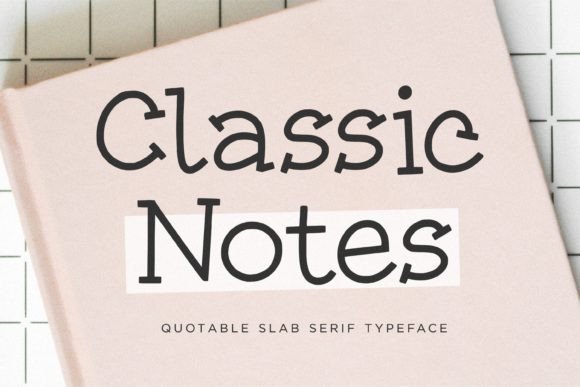
Classic Notes Font channels the irregular ink and compact rhythm of vintage typewriters while keeping letterforms sturdy and readable. Pronounced slab serifs combine with a slightly offset baseline to reproduce the tactile impression of metal type striking paper, which gives quotes and short blocks a stamped authenticity. The face favors strong lowercase shapes and compact caps, so typographic emphasis reads confidently without becoming ornate.
It’s especially useful for book covers, editorial pull quotes, and heritage branding that need an unmistakable analog voice. Small caps and subtle weight options allow hierarchy without losing the printed‑ink texture, making layout decisions straightforward. Pair it with a neutral sans to balance its period charm and prevent layouts from feeling overly historical.
╰┈➤ Download Classic Notes Font
My Recommendation: I reach for Classic Notes when a design calls for a clearly typed, old‑press character-think memoir covers, magazine teasers, and rustic labels. Its quotable profile makes short headlines stand out and gives quotes real presence. Pair with a modern sans for contrast to keep the overall composition current.
9. Candlepin Monogram Font
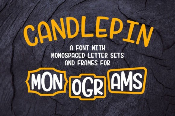
Candlepin Monogram Font reimagines monograms as something playful and quick to assemble: two sets of capitals and numbers plus twenty frame and graphic options mapped to punctuation keys let you create framed initials in seconds. The package includes a clear PDF chart showing which punctuation calls which frame, so a simple sequence (punctuation + lowercase-uppercase-lowercase) yields a stacked emblem without fiddly tools. Frames range from neat circles to quirky decorative borders, giving the same initials a formal or whimsical tilt depending on the chosen glyph.
Outside of monograms, Candlepin functions as two monospace alphabets that stack tidily for vertical layouts, puzzles, and label printing where alignment matters. That practical alignment, combined with the lighthearted framing, makes it ideal for wedding tags, home goods, craft packaging, and playful spreadsheets. Because the workflow is keyboard‑driven, non‑designers can produce polished initials quickly while designers get a reliable toolkit for custom badges and marks.
╰┈➤ Download Candlepin Monogram Font
My Recommendation: I pick Candlepin when clients need attractive monograms fast-the punctuation‑mapped frames speed production and the included chart removes guesswork. The dual monospace alphabets are unexpectedly handy for vertically stacked designs and labeling. Great for stationery, event collateral, small product runs, and craft projects where a handcrafted look should be easy to reproduce.
10. Old Typewriter Font
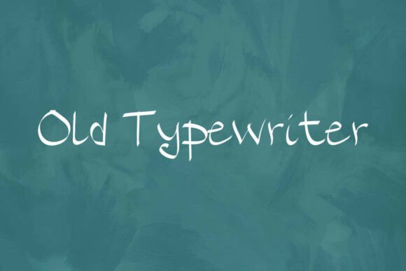
Old Typewriter Font – Old Typewriter is a slab-serif that channels the clatter and grit of antique presses. Its letterforms carry irregular ink-bleed and slight offsets that mimic skipped keystrokes, giving each line a weathered temperament. For designers working with Typewriter Fonts, this face provides a believable analog texture without looking artificially distressed.
The face includes alternates and a compact set of punctuation designed to sit tight in headlines and labels, and the heavy serifs read well at display sizes. Use it for retro book covers, true-crime podcast art, movie props, and detective-styled packaging where authenticity matters. Pair with a neutral sans or paper-grain backgrounds to emphasize the mechanical origin.
╰┈➤ Download Old Typewriter Font
My Recommendation: I reach for Old Typewriter when a project needs the tactile feel of a used machine; it instantly signals age and crafted process. The uneven strokes spare me from faking wear in post-production, while the slab forms keep large type highly legible. Perfect for editorial spreads, podcast covers, and film props that require period-accurate typography.
11. Think Vs Feel Font
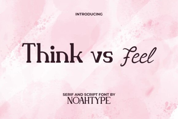
Think Vs Feel Font – Think Vs Feel is a two-part display system pairing a mechanically inspired typewriter-style face with a loose, handwritten script. The contrast is deliberate: one voice reads clipped and structured, the other flows with irregular pen strokes, creating a clear visual hierarchy. Each style stays readable at small sizes and offers alternates for expressive headlines.
This duo suits boutique branding, event stationery, and product labels where personality matters; use the typewriter face for captions and the script for signatures or accents. Kerning and line-height are tuned so the styles stack cleanly, helping designers compose layered artboards faster. Try subtle color shifts or case changes to emphasize the conceptual split suggested by the name.
╰┈➤ Download Think Vs Feel Font
My Recommendation: I use Think Vs Feel when a client needs both concise voice and human warmth in one package; the two styles play off each other without cluttering the palette. It shortens art-direction time by providing matched proportions and alternates. Great for cafés, wedding suites, boutique labels, and social media templates that demand character-driven typography.
12. Old Typewriter Font
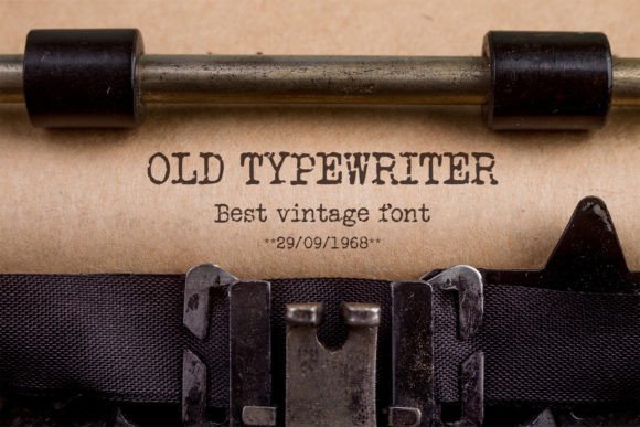
Old Typewriter Font – Old Typewriter takes a charming, thematic approach to slab serif design, with rounded terminals and deliberate misalignment that recall mid-century machines. The weight favors pronounced stems and soft serifs so headlines retain presence without becoming harsh. Its modest distressing reads as handcrafted rather than aggressively worn, which keeps layouts approachable.
The typeface is well suited to forensic-tinged briefs or retro editorial pieces where readable, slightly aged text is required; spacing lets you stack tight columns that mimic old press layouts. It pairs nicely with blocky sans faces and textured paper backgrounds to add a tactile counterpoint. The glyph set covers standard punctuation and numerals, making it practical for poster and merchandise use.
╰┈➤ Download Old Typewriter Font
My Recommendation: I pick this Old Typewriter when I want a playful vintage voice that remains readable at a glance; it adds charm without becoming kitsch. It’s an easy choice for posters, merchandise, and editorial elements that need a nostalgic touch. I often combine it with a geometric sans to keep the overall layout feeling modern.
13. Typewriter Font

This Typewriter Font channels the choppy cadence of old key strikes and the subtle ink variations that come with real metal type, giving designers an immediate vintage voice. It leans into uneven alignment, rounded serifs, and dense strokes to recreate the tactile marks of mechanical presses, and when I need a convincing analog texture I reach for fonts in the Typewriter Fonts family for headings or archival mockups. OpenType alternates and rough glyphs allow you to dial in irregularity without breaking consistency across a page. At display sizes the grain and stroke weight become characterful, while at smaller sizes the strong counters preserve legibility.
Pair this face with a neutral sans for contrast or a light slab for period-accurate posters; it plays well with layered paper textures and subtle halftone overlays to sell age. Because it is monospaced in spirit, it helps maintain readable columns and authentic tabular layouts for letters, labels, and forms. When printing, a slight tracking reduction emphasizes the mechanical density; on screen, soft noise or a tiny blur can mimic ink bleed. Treat it as an actor: give it props (textures, borders, tape) and it will sell a believable story fast.
My Recommendation: I use this Typewriter Font when I want a project to feel lived-in and tangible-book jackets, dossier graphics, and heritage branding all benefit from its imperfections. It brings believable analog texture without heavy post-processing, so you save time on overlays. For best results, reserve it for headlines and ephemera rather than long body copy.
14. Standard Typewriter Font
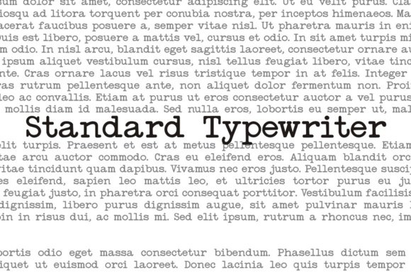
Standard Typewriter Font strips the concept of a typed mark down to clean, even strokes and simple letterforms that mimic classic machines without the fuss of distress. The result is a neat, minimal face with predictable metrics, useful when you want the typed look but need high legibility and tight line rhythm for captions or UI labels. Its restrained shapes make it a reliable choice for layouts where content clarity matters more than decorative texture. At smaller sizes its hinting preserves counters and countersinking, keeping words readable on screen and in print.
Because it reads as neutral, this type functions well for faux-typed notes in editorials, forms, and interface elements where alignment and spacing are critical. If you want more character, add a light grain layer or swap in a distressed companion for headings while keeping this for body text. The font’s monoline rhythm makes column alignment and tabular layouts straightforward, reducing fiddly kerning work. It’s an efficient, low-maintenance option when a typed voice is required without visual clutter.
╰┈➤ Download Standard Typewriter Font
My Recommendation: I reach for Standard Typewriter Font when I need a spare, legible typed aesthetic-forms, field labels, and minimalist posters are its natural home. It keeps layouts tight thanks to predictable spacing, so I spend less time adjusting columns. Pairing it with a textured headline font gives projects personality while preserving readability.
15. Baltimore Typewriter Pack Font

Baltimore Typewriter Pack Font – Baltimore Typewriter Pack bundles several typewriter-inspired cuts so you can switch from clean, mechanical tones to heavily worn, ink-spattered styles without hunting for extras. The collection typically includes alternate characters, uneven sets, and decorative glyphs that recreate the stop-and-skip feel of old machines, making it straightforward to craft authentic-looking letters, posters, or invitation suites. Designers will appreciate having coordinated options for headlines, captions, and ephemera so the visual language stays consistent across a project. It’s a practical toolkit for staging different levels of age and wear.
Use the cleaner faces when you need readable blocks of text and bring the distressed variants forward for signage or simulated archival documents; the included ornament set can frame pages and add period detail. Workflow-wise, toggling alternates produces believable misalignments without manual kerning, and swapping between weights keeps continuity across mockups. The pack suits projects that require both utility and historical flavor, from packaging to editorial spreads, giving you multiple looks from a single family.
╰┈➤ Download Baltimore Typewriter Pack Font
My Recommendation: I keep the Baltimore Typewriter Pack in my asset library because it saves time when I need several grades of vintage tone-clean to battered-all matched for consistent spacing. It’s particularly handy on briefs that ask for archival authenticity across different touchpoints. I tend to use the distressed cuts for covers and the cleaner ones for interior copy so the project reads as cohesive yet carefully aged.
16. Vintage Typewriter Font

Vintage Typewriter Font – Vintage Typewriter sits among classic Typewriter Fonts by imitating the uneven ink, slightly misaligned letters, and thin slab serifs of mid‑century machines. The glyph set balances readable counters with intentional imperfections, and modern kerning keeps word shapes whole while preserving mechanical charm. Small caps and alternates mimic misstruck keys so text looks convincingly hand‑typed without losing compositional control.
This design works especially well at display sizes on book covers, posters, and identity packages where a printed-on-paper presence is desired. Designers will find useful OpenType alternates, well-hinted outlines for crisp screen rendering, and enough weight variation to hold texture in print. Pair it with a neutral sans or paper textures to sell the nostalgic mood without cluttering the layout.
╰┈➤ Download Vintage Typewriter Font
My Recommendation: I reach for Vintage Typewriter when a project needs an honest, lived-in print voice – it reads like a page pulled from an editor’s desk. The alternates and spacing options let me recreate slight misalignments without faking the result. Use it for magazine covers, retro packaging, or any design that benefits from a historically believable typewritten tone.
17. Erased Typewriter 2 Font
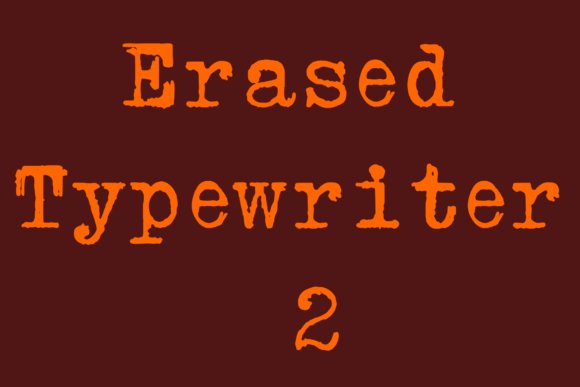
Erased Typewriter 2 Font – Erased Typewriter 2 recreates the blotchy, smudged strokes of a machine that’s seen heavy use, complete with ink gaps and faint ghosts of previous characters. The letterforms keep solid proportions so text remains legible even when the distress is aggressive, which makes it practical for packaging and headline work. Its playful roughness reads as handcrafted and slightly rebellious rather than intentionally sloppy.
Multiple distress levels and alternate glyphs let you adjust the amount of wear for headlines, logos, or label copy. It pairs especially well with bold colorways and tactile materials like kraft or glossy wrappers, where the imperfection becomes a selling point. Consider it for artisanal food labels, indie branding, or promotional posters that need personality over polish.
╰┈➤ Download Erased Typewriter 2 Font
My Recommendation: I pick Erased Typewriter 2 when a brand needs character without sacrificing readability; the distress weights allow precise control from subtle aging to full wear. It’s a quick way to give packaging or posters a handcrafted, vintage feel. Ideal for small-batch food products, indie zines, and cheeky retail identities.
18. Shine Typewriter Font
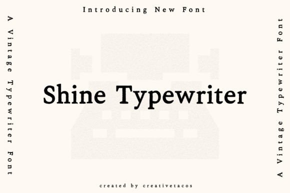
Shine Typewriter Font – Shine Typewriter is a quirky, handmade take on familiar typewriter letterforms, with irregular baselines and playful ink spots that read like pages from a private notebook. Its softer stroke contrast tilts it toward expressive headlines and short blocks of copy where personality matters more than mechanical strictness. Several stylistic sets deliver stamped looks, smudged variants, and cleaner alternates so you can tune the mood quickly.
Because of its strong character, Shine performs best in branding, posters, and album art that aim for a forensic or DIY atmosphere rather than formal editorial use. Use it sparingly for body text and pair it with a neutral sans to keep layouts readable. The handmade flavor makes it a solid pick for creative portfolios, zines, and event posters that want a human touch.
╰┈➤ Download Shine Typewriter Font
My Recommendation: I choose Shine Typewriter when a project needs a bold, personable voice that feels handmade and slightly mischievous. The stylistic sets make it easy to shift from subtle smudging to a cleaner stamped appearance. It’s perfect for album sleeves, indie event posters, and any design that benefits from a distinct, handwritten typewriter vibe.
19. Ab Typewriter Font
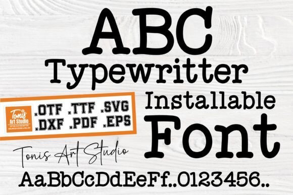
Ab Typewriter Font – Ab Typewriter is a craft-oriented face that accurately channels the imperfect, ink-streaked look of office typewriters. The letterforms show slight baseline shifts, varied counters, and tiny blotches that make Typewriter Fonts read like physical impressions rather than smooth digital outlines. Caps and numerals are modestly condensed, which produces a compact, archival rhythm across blocks of text.
The package is built for makers: TTF/OTF for desktop use, 74 SVG and 74 DXF vectors for cutting machines, plus 73 high-resolution PNGs at 350 dpi and vector EPS/PDF files for print. The split file formats remove conversion headaches with Silhouette and Cricut workflows, while the PNGs make proofing quick; expect to do minor spacing tweaks for headline settings, but the set gives you everything needed for scrapbooks, cards, and tactile paper goods.
╰┈➤ Download Ab Typewriter Font
My Recommendation: I pick Ab Typewriter when I need genuine-looking typed labels or craft-ready artwork because the SVG/DXF bundle saves time with cutting tools and the 350 dpi PNGs print cleanly. The textured, slightly uneven letterforms feel handmade, which is perfect for scrapbooking, vintage invitations, or mixed-media work. If you want a fast route from digital layout to physical craft, this set covers both sides.
20. Enigma Typewriter Sans Font
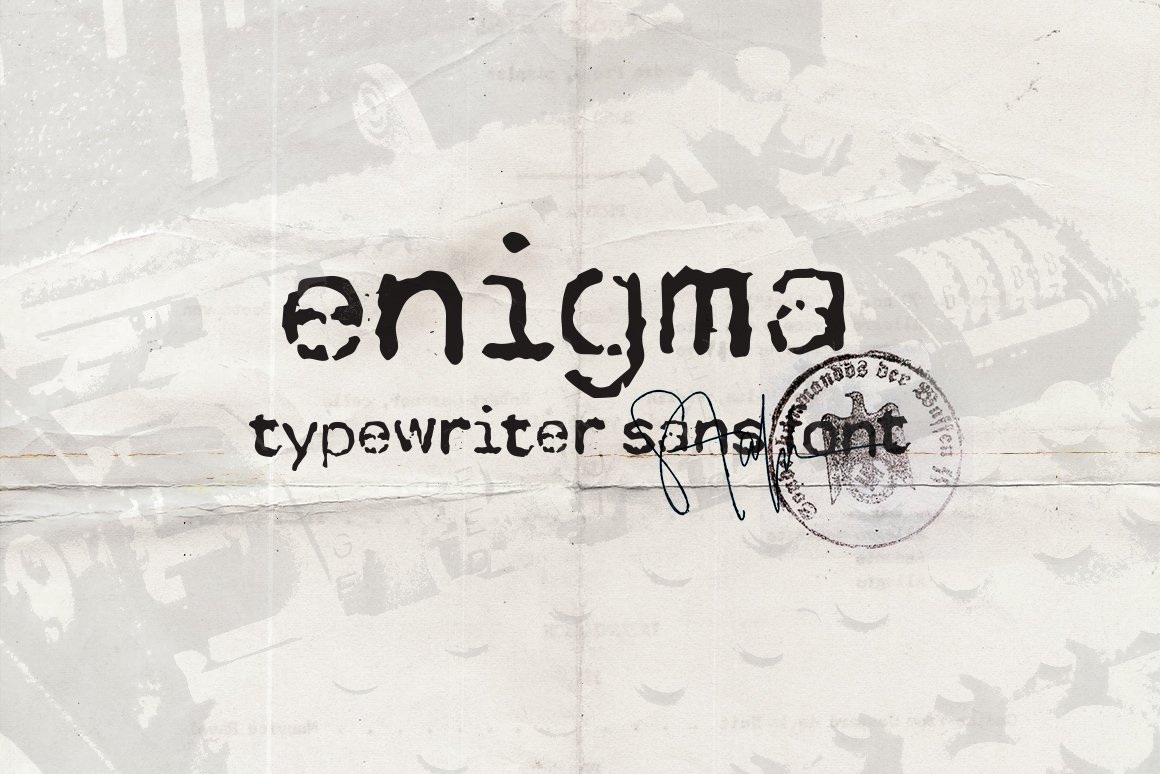
Enigma Typewriter Sans Font – Enigma Typewriter Sans translates the mechanical precision of cipher machines into a refined sans with disciplined proportions and a measured rhythm. Strokes remain even and compact, giving the face the visual cadence of machine-set copy while retaining subtle edge roughness and tiny ink irregularities for authenticity. The restraint in character shapes makes it feel documentary rather than decorative.
Because of its even counters and clear shapes, the design holds up at small sizes and reads well across long passages or dense data tables. It suits dossiers, exhibit labels, or editorial spreads that need a cool, archival tone; pair it with paper textures or a softened serif to add context without competing for attention. Subtle alternates can enhance the period look without sacrificing legibility.
╰┈➤ Download Enigma Typewriter Sans Font
My Recommendation: I keep Enigma Typewriter Sans on hand for projects that call for a pared-down, technical typewritten look-think museum captions, dossiers, and minimalist posters. It remains legible at tight sizes and creates a disciplined atmosphere when used for blocks of text. For more character, I layer it over a faint paper grain or combine it with a warm serif.
21. Thin Typewriter Font
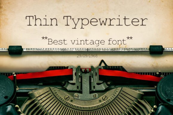
Thin Typewriter Font – Thin Typewriter reduces the usual slab-inspired weight of typewriter faces to a narrow, delicate set of strokes, then adds a distressed texture that evokes worn ribbons and aged paper. The result is an elegant but slightly fragile appearance: letters read as precise yet weathered, carrying the tactile history of a well-used machine. That fine-line styling gives the face a refined antique presence suited to headlines and display work.
Because the strokes are slim and the distressing is pronounced, the font benefits from ample output resolution or generous on-screen size so texture stays visible. It works well when layered over heavy backgrounds, grunge masks, or simulated paper to deepen the aged effect. Designers building steampunk layouts, faux newspapers, or vintage stationery will find its contrast and delicacy especially effective.
╰┈➤ Download Thin Typewriter Font
My Recommendation: I choose Thin Typewriter when I want a refined, antique typing look that leans delicate rather than bold. It performs best at larger sizes or in print, where the distressed details can be appreciated, and it pairs beautifully with textured backgrounds. For small-scale or low-res applications, I recommend enlarging the weight slightly or adding a subtle outline to preserve legibility.
22. Bouncy Typewriter Font
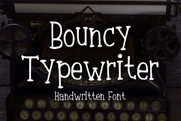
Bouncy Typewriter Font – Bouncy Typewriter blends handwritten warmth with a serif skeleton, giving each letter a playful bounce and a slightly irregular baseline that reads like a lively mechanical strike. This face sits among Typewriter Fonts and offers alternate glyphs, discretionary ligatures, and subtle ink variance to prevent repetition and inject personality into short headlines. On screen and in print it behaves like a spirited headline type, with exaggerated terminals and varied stroke pressure that sell a handcrafted vibe.
Use it for stickers, apparel lettering, comic captions, or logo headers where motion and friendliness matter; pair with a neutral sans to avoid visual clutter. It ships in OTF/TTF with contextual alternates so repeated words don’t look identical-small kerning and tracking tweaks help the rhythm. For tactile projects layer the glyphs over paper grain or halftone textures to emphasize ink bloom and make the bounce feel organic.
╰┈➤ Download Bouncy Typewriter Font
My Recommendation: I reach for Bouncy Typewriter when a brief headline or mark needs playful personality-children’s packaging, indie zines, and whimsical logos benefit most. The alternates and ligatures make short phrases feel improvised instead of mechanical, which saves time when you want an authentic hand-drawn look. Use it big and bold; in long passages the lively baseline can become tiring.
23. Folclorica Typewriter Font

Folclorica Typewriter Font – Folclorica Typewriter recreates the imperfect imprint of old mechanical machines with heavy ink deposits, smudged counters, and faint erasure marks that suggest repeated use. Letterforms carry uneven edges and slight misalignments, producing a tactile, hand-worn impression that reads archival rather than overly stylized. The design leans toward subtle aging-aged paper and restrained distress-so it preserves dignity while hinting at history.
Apply it to museum labels, cookbook covers, artisanal packaging, or film title cards when you want believable wear without theatrical grit; pairing with a crisp modern sans amplifies legibility. It performs best at display sizes-boost tracking or add a gentle noise layer for small reproductions to keep the texture readable. Export high-resolution proofs or rasterize large artwork for print to capture the ink bloom accurately.
╰┈➤ Download Folclorica Typewriter Font
My Recommendation: I choose Folclorica Typewriter for projects that need convincing mechanical wear-heritage branding, boutique food labels, and editorial spreads of historical material. Its subtle distress gives authenticity without dominating the page, so the typography supports rather than competes with imagery. Test at production size to ensure the marks read as intended.
24. Rip Typewriter Font
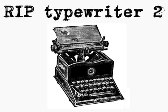
Rip Typewriter Font – Rip Typewriter pushes the classic typewriter aesthetic toward a rough, torn appearance where strokes break, ink pools form, and characters look clipped as if ripped from fragile paper. The font celebrates abrasion and irregularity, producing a confrontational texture that reads clearly at headline scale. Instead of cozy nostalgia, it communicates urgency, decay, and a lived-in edge.
It works especially well for album covers, protest posters, horror titles, and zines that require raw attitude; combine it with high-contrast photography or gritty halftone overlays for an aggressive finish. Because of deliberate gaps and heavy distress, reserve it for display use and run print proofs to confirm legibility. Pair with a neutral monospaced or wide geometric sans to stabilize layouts and give the torn forms room to breathe.
╰┈➤ Download Rip Typewriter Font
My Recommendation: I reach for Rip Typewriter when a project benefits from a deliberately rough, urgent voice-think punk flyers, gritty editorial art, and dark film posters. The fractured letterforms bring immediate attitude and a tactile, analog feel that’s hard to fake digitally. Use it sparingly as a headline element, and always proof in the intended output medium to preserve the intentional breaks.
25. The Old Typewriter Font
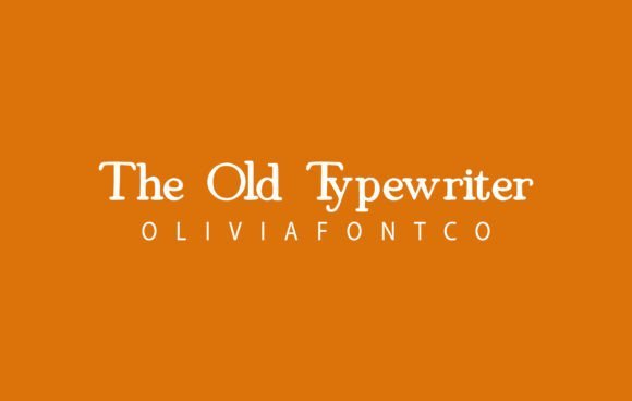
The Old Typewriter Font – The Old Typewriter brings an ink-on-paper quality to letters, with gentle irregularities and soft serifs that read as handcrafted rather than contrived. Strokes show a faint grain and slightly variable pressure, which gives headlines and short blocks of copy a warm, nostalgic presence while remaining readable at smaller sizes. The measured contrast and open counters keep long lines pleasant to the eye, so it works equally well for feature headings and short paragraphs.
As one of the Typewriter Fonts I tested, it pairs tactile charm with practical spacing: kerning and tracking feel balanced across sizes, and the glyph set covers standard Latin plus useful punctuation and numerals. Its textured appearance reproduces nicely in print and on textured web backgrounds without turning muddy. Use it where you want a human touch that suggests old presswork rather than forced distress.
╰┈➤ Download The Old Typewriter Font
My Recommendation: I reach for The Old Typewriter when a project needs romantic, analog character-wedding stationery, boutique branding, and editorial spreads come to mind. It gives text an intimate tone without sacrificing legibility, so it’s great for invitations and magazine headline treatments. Pair it with a clean sans to keep layouts readable and contemporary.
26. Old Typewriter Font
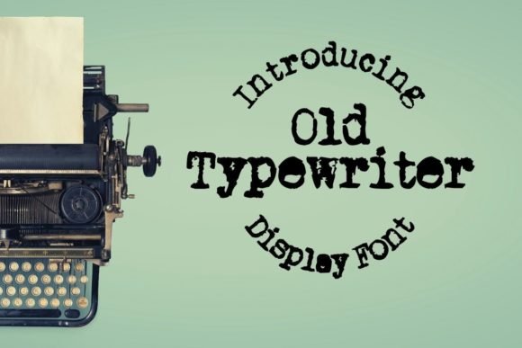
Old Typewriter Font – Old Typewriter is a display face that wears its history openly: cracked ink, irregular edges, and slightly offset baselines create an immediate vintage attitude. The design reads boldly at larger sizes, where the distressed textures become a focal point rather than a distraction, making it a strong choice for posters, labels, and packaging. Despite the weathered look, characterforms remain distinct, so words stay legible even from a distance.
This font shines as a headline tool rather than body text, and it benefits from generous letterspacing to reveal its surface detail. The uneven weight across characters gives compositions an organic, handmade feel that complements retro photography and letterpress mockups. For contrast, use a light geometric sans or a delicate script to keep hierarchy clear and add visual interest.
╰┈➤ Download Old Typewriter Font
My Recommendation: I pick Old Typewriter when I want bold vintage impact-album covers, coffee shop signage, and limited-run posters are ideal uses. It communicates age and authenticity immediately, which is useful for brands aiming for handcrafted credibility. Reserve it for display sizes and let other typefaces carry long-form copy.
27. Dreamers Typewriter Font
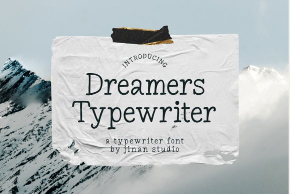
Dreamers Typewriter Font – Dreamers Typewriter mixes typewriter-era quirks with more open, modern spacing so it reads comfortably in both headlines and tighter text settings. Characters show subtle misalignments and rounded terminals that give phrases a conversational, lived-in voice without becoming gimmicky. The result is a warm, slightly whimsical face that brings personality to posters, packaging, and invitations while maintaining clean legibility.
It performs well across media: on-screen rendering preserves its soft imperfections and on paper it reproduces as an approachable, humanistic type. Alternate characters add expressive options for emphasis, and the design favors layouts that allow breathing space so its details register. Pair it with a neutral sans for hierarchy that keeps the typewriter charm from overwhelming the message.
╰┈➤ Download Dreamers Typewriter Font
My Recommendation: I use Dreamers Typewriter when a project needs approachable personality without sacrificing clarity-book covers, event posters, and brand accents are perfect fits. Its gentle irregularities add warmth and help text feel handcrafted, which is great for boutique or artisanal communications. Use alternates sparingly to highlight words and maintain a polished, intentional look.
28. Intellecta Typewriter Font
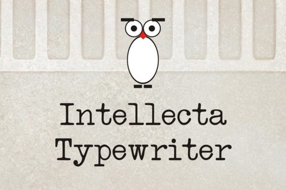
Intellecta Typewriter Font – The Intellecta Typewriter applies serif shaping to a mechanical, monospaced cadence, producing a warm texture that sits between traditional typewriter grit and refined print. Its letterforms exhibit subtle irregularities in stroke contrast and slightly uneven ink coverage, which give blocks of text a hand-struck rhythm; designers often reach for Typewriter Fonts when they want that true printed-on-paper personality. Kerning is intentionally loose in places to preserve the vintage stagger, and punctuation carries a condensed sense that mimics older machines. Small caps and multiple weights make it usable for both body copy and display work without losing the analog character.
On-screen this face reads clearly at medium sizes thanks to open counters and distinct terminals, while printed samples take on convincing tactile presence when combined with paper grain or light distressing. Pair Intellecta with a neutral grotesque for restrained contrast or set it against ruled or kraft textures to emphasize its mechanical origin. It handles long-form editorial content well and also stands strong in packaging where a literary, analogue voice is desired. The overall effect is authentic rather than gimmicky, keeping textual clarity while signaling heritage.
╰┈➤ Download Intellecta Typewriter Font
My Recommendation: I use Intellecta when I want the credibility of a serif with the personality of a typewriter stamp. It brings readable warmth to magazine columns and product copy while preserving the tactile imperfections that suggest printed history. Ideal for editorial spreads, book interiors, and heritage branding where legibility and character must coexist.
29. Typewriter Royale Font
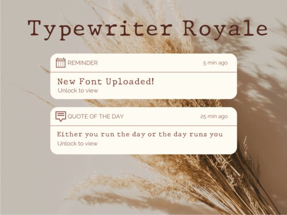
Typewriter Royale Font – Typewriter Royale gives a modern spin to mechanical type with lively irregularities and measured misalignment that read like a carefully typed note. The characters tilt subtly and show varied ink density so words look hand-struck rather than perfectly plotted, which creates immediate visual charm for short passages and headlines. Its compact proportions and pronounced serifs deliver strong display presence without overwhelming adjacent elements. Open counters keep the letterforms legible even when placed over textured backgrounds or distressed artboards.
This font shines in boutique labels, poster graphics, and identity work where a stamped, handmade aura helps communicate craft. Use solid color fields or light paper textures to accentuate the impression of a physical strike, and restrain tracking to preserve the mechanical rhythm. In all-caps it becomes decorative and emphatic; in mixed case it reads more conversational and intimate. It’s a quick way to add a curated, tactile voice when the design needs character rather than slick perfection.
╰┈➤ Download Typewriter Royale Font
My Recommendation: I pick Typewriter Royale for packaging and posters that require a handcrafted touch; it reads like a carefully typed label rather than a mass-produced display face. Its imperfections save time compared with building custom textures, and it pairs well with clean sans serifs to keep layouts readable. Great for artisanal brands, limited-edition prints, and creative identity marks that want approachable personality.
30. Underwood Typewriter Font
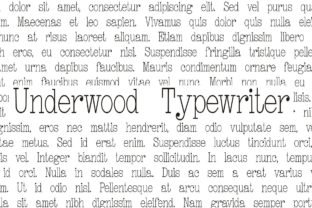
Underwood Typewriter Font – The Underwood Typewriter recreates the heavy, slightly uneven imprint of mid-century machines by combining bold strokes with intermittent spotty fills that feel authentically struck. Letters are intentionally misaligned at times, with faint over-inking at terminals and rigid numerals that recall typewriter mechanics; those quirks give text the convincing look of an archival document. Its weight and contrast maintain visibility across sizes so the mechanical texture remains apparent from headlines down to short captions. The overall construction favors a period-correct aesthetic rather than a sanitized revival.
From a technical standpoint it supplies solid Latin coverage, reliable kerning, and a handful of ornamental ligatures to simulate double-strikes and carriage slips. It excels on posters, prop documents, and editorial spreads that reference postal history or analog correspondence, especially when paired with textured stocks or subtle embossing. For screen use, adding a layer of noise or a faint drop shadow helps preserve the tactile feel. The result reads like a found artifact instead of a polished modern reinterpretation.
╰┈➤ Download Underwood Typewriter Font
My Recommendation: I choose Underwood when a project needs a convincingly aged, mechanical voice-think period posters, film props, or editorial features about postal culture. Its blotchy fills and offset characters offer authenticity without extra image work. Pair it with plain sans serifs and textured paper to maximize the feeling of an actual typed document.
31. Indy Typewriter Font
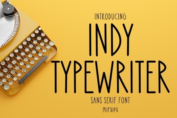
Indy Typewriter Font – Indy Typewriter wears a casual, handwritten sans-serif voice that reads friendly without feeling gimmicky. Letterforms show slightly rounded terminals, an easy baseline rhythm, and a moderate x-height that keeps lines airy and legible; Typewriter Fonts influence is clear in the warm, slightly mechanical rhythm while the face remains contemporary. The result is a type family that feels personal on paper and reliable on-screen.
Technically it behaves well in small blocks of text and short headings thanks to balanced spacing and sensible kerning pairs, and a set of alternate glyphs helps avoid visual monotony in repeated lines. It pairs nicely with paper textures, simple iconography, and soft color palettes, making it useful for planners, personal blogs, and DIY stationery projects.
╰┈➤ Download Indy Typewriter Font
My Recommendation: I reach for Indy Typewriter when I want handwriting that still reads cleanly across UI and print. The alternate characters and clear shapes make repetitive notes feel handcrafted rather than mechanical. Use it for planners, personal websites, social posts, and packaging mockups where warmth matters without losing clarity.
32. Minimalist Typewriter Font

Minimalist Typewriter Font – Minimalist Typewriter pares back ornamental traits to emphasize clean letterforms and even stroke widths, nodding to classic typewriter impressions without heavy distress. Open counters and consistent spacing give it an elegant presence suitable for editorial blocks, book jackets, and posters that demand readability with character. The display weight holds up for large headlines and remains surprisingly legible at short copy sizes when tracking is tightened.
This face works well alongside neutral serif bodies or stark photographic backdrops, offering a restrained vintage hint rather than full-on nostalgia. Subtle paper textures or faint ink gaps can add personality, but the type itself stands confidently in logos, merchandise, and identity work that needs a tasteful retro touch.
╰┈➤ Download Minimalist Typewriter Font
My Recommendation: I recommend Minimalist Typewriter for identity and editorial work where a subtle nod to analog type is wanted without rough textures. It’s excellent on book covers, posters, and premium packaging that favor restraint. Pair it with a warm serif to balance the crisp display forms for strong, composed layouts.
33. Rusty Typewriter – Typewriter Fonts
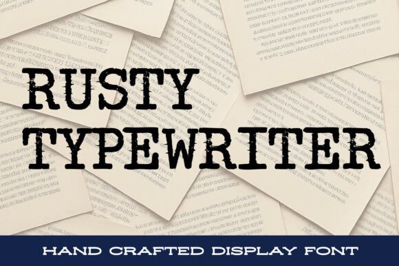
Rusty Typewriter – Typewriter Fonts – Rusty Typewriter wears age like a stylistic choice: glyphs show uneven ink coverage, jagged terminals, and slight baseline drift that read like pages slugged through an old machine. The weathered texture is built into the letter shapes rather than applied as a filter, so headlines and short passages gain immediate tactile mood and narrative depth. It commands attention in sparse compositions where its gritty voice becomes the design’s focal point.
Because the distressing is pronounced, it functions best at display sizes and on printed stock where paper grain or ink behavior enhances the effect; screen use benefits from high-resolution rendering. Use clean sans bodies or monochrome photography as companions to preserve legibility while letting the font’s raw personality set the tone.
╰┈➤ Download Rusty Typewriter – Typewriter Fonts
My Recommendation: I choose Rusty Typewriter when a project needs genuine, hand-typed personality that reads like a found artifact. Its distressed marks add atmosphere to posters, mystery or noir covers, and vintage packaging. Use it sparingly as a headline or focal element so its strong character doesn’t overpower supporting text.
34. American Typewriter Font
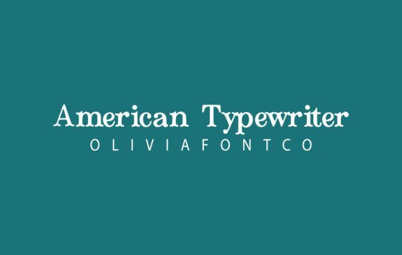
American Typewriter Font – Among Typewriter Fonts, American Typewriter channels the weight and rhythm of old mechanical machines while keeping letterforms clean enough for contemporary layouts. Its slab serifs give each character a grounded, tactile presence: the terminals hold ink-like edges and the counters breathe, so headlines read with authority and body lines remain approachable.
The face handles tight tracking and loose leading equally well, which makes it useful for editorial headers, taglines, and longer passages when you want vintage character without sacrificing clarity. Pair it with a neutral sans for contrast or a delicate script for invitations and packaging to let the slab details sing.
╰┈➤ Download American Typewriter Font
My Recommendation: I reach for American Typewriter when a project needs genuine machine-era personality without feeling gimmicky. It adds warmth to editorial spreads, wedding invites, and retro-inspired branding while staying readable in paragraph text. Use it where tactile, slightly nostalgic letterforms will strengthen the design voice.
35. Olivetti Typewriter Font
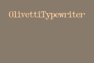
Olivetti Typewriter Font – Olivetti Typewriter reproduces the neat, slightly condensed proportions of mid-century office machines, with generous counters and a faint irregularity in stroke width that simulates real ink pressure. The serif detailing is restrained, which keeps the look readable at small sizes while still giving headlines a subtle vintage stamp.
This font feels at home in labels, editorial sidebars, and packaging where a hint of antiquity is desired without overt distress. Try it alongside a geometric sans or a handwritten display to create contrast between the precise serif forms and softer textures.
╰┈➤ Download Olivetti Typewriter Font
My Recommendation: I use Olivetti when a design needs a quiet retro accent rather than a loud, distressed treatment. It’s perfect for product labels, small editorial elements, and captions where character should be present but not dominant. The crisp shapes also make it a safe choice for print projects that require dependable legibility.
36. Surre Erased Typewriter Font
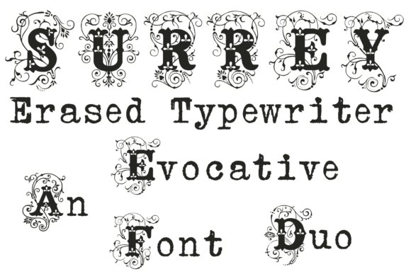
Surre Erased Typewriter Font – The Surre Erased Typewriter set pairs an ornamental initials font with a gritty, eroded typewriter face to create striking contrast between flourish and abrasion. The initials are highly decorative-useful for mark-making and monograms-while the erased-style type mimics rubbed ink, smudges, and imperfect alignment for a lived-in, printed-on-paper effect.
Use the duo for posters, album covers, and book jackets where headline drama matters; the ornamental letters provide a formal entry point and the distressed body font sustains a textured atmosphere. OpenType alternates and swash options let you alternate between clean and worn looks without adding extra layers in production.
╰┈➤ Download Surre Erased Typewriter Font
My Recommendation: I pick this duo when a piece needs theatrical contrast: formal initials anchored by a raw, tactile text face. It’s ideal for editorial covers, music art, and boutique packaging where visible wear enhances authenticity. The alternate glyphs make it easy to craft variations without heavy post-processing.
37. Retro Type-writer Font
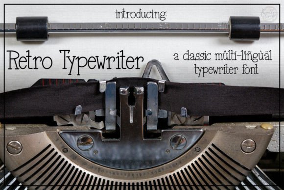
Retro Type-writer Font – Retro Type-writer channels the tactile quirks of aged typebars into a hand-drawn sans that feels lived-in rather than purely mechanical. Retro Type-writer sits among popular Typewriter Fonts as a design that mixes ink speckles, uneven stroke widths, and slightly off-kilter alignment to make each line feel personal. Use it at headline sizes for posters or event invites where the imperfect edges read as authenticity instead of noise.
The sans skeleton keeps letterforms open and modern, so pairing it with a neutral serif or a clean geometric face tames the nostalgia for branding and product labels. Spacing is forgiving, which makes short blocks of copy and greeting-card text easy to set without fuss. Add subtle grain or a faint drop shadow to increase the vintage effect without losing legibility.
╰┈➤ Download Retro Type-writer Font
My Recommendation: I reach for Retro Type-writer when a piece needs warmth and a handcrafted touch-album covers, craft-fair posters, and boutique identity work all benefit. It reads well on both print and digital mockups, so proofs look authentic fast. I usually combine it with a tidy sans to keep layouts balanced and modern.
38. Hotcake Typewriter Font
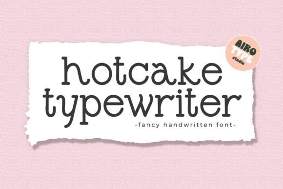
Hotcake Typewriter Font – Hotcake Typewriter wears a monoline stroke with a playful tilt: rounded terminals and slight irregularities give each character a friendly, human voice. The tone is casual and upbeat rather than industrial, which makes this face well suited to stickers, t-shirt graphics, and handmade stationery. Its compact shapes make it punchy for short headlines and label work where personality matters more than rigid structure.
As a single-weight, display-focused family, Hotcake is easy to vectorize for vinyl cuts and sublimation projects, holding crisp outlines at large sizes. The readable counters and steady stroke make it forgiving in low-resolution prints too. Reach for it when you want a handmade, cheerful headline or accent without heavy contrast or decorative fuss.
╰┈➤ Download Hotcake Typewriter Font
My Recommendation: I use Hotcake Typewriter for cheerful merchandise and DIY projects because it brings a playful, handcrafted look that photographs well. Its simple monoline shapes cut clean for stickers and iron-on transfers, which speeds production. For brand work I treat it as an accent face-great for headers and product tags, less so for long text.
39. Olivetti Typewriter Family Font
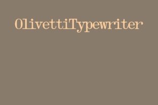
Olivetti Typewriter Family Font – Olivetti Typewriter Family is a thoughtful serif collection inspired by mid-century office machines, offered in regular, wide, bold, shadow and underscore styles. The shadow and underscore cuts add mechanical texture and visual depth that mimic ink-and-paper impressions, while the wide weight provides strong headline presence. Proportions remain controlled so the family feels consistent across body and display settings.
This set scales smoothly from tight editorial copy to attention-grabbing posters thanks to moderate contrast and a steady x-height, making it useful across publishing and packaging. The underscore and shadow variants serve as built-in display embellishments, reducing the need for extra graphic elements. Overall, Olivetti supplies a cohesive set for retro-leaning identities, signage, and magazine work.
╰┈➤ Download Olivetti Typewriter Family Font
My Recommendation: I choose Olivetti when a project requires multiple typewriter-inflected voices without mixing unrelated families. The range-from regular copy to bold display and textured shadow-keeps identity work cohesive and faster to execute. It shines on editorial spreads, product labels, and posters where a lived-in, mechanical character is desired.
40. Typewriter Font
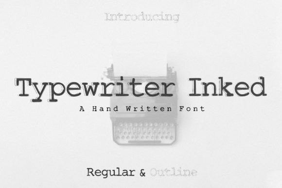
Typewriter Font brings a retro voice with honest imperfections: subtle ink irregularities, variable stroke pressure and slightly misaligned baselines that feel authentic rather than manufactured. That grainy, mechanical rhythm ties into Typewriter Fonts heritage and gives headlines, packaging and posters an instantly tactile identity. The face sits comfortably between display and branding work, lending a warmth that reads as both historic and purposeful.
The design shows a generous x‑height, clear mono‑style spacing and a focused character set that favors headline use; at display sizes the textured counters retain legibility while preserving the worn look. Pair it with a crisp grotesque or a neutral serif to balance the vintage grit, or let it run solo for magazine headings and web hero banners. OpenType features are modest-the charm comes from the irregularities, not heavy ornamentation.
My Recommendation: I pick this font when a project needs believable typewriter character-think editorial covers, retro packaging, or a film title card. It gives a tactile, aged texture without feeling forced and reads well on screen at larger sizes. Use it when you want a clear vintage voice that still behaves cleanly in layout work.
41. Field Trip Typewriter Font
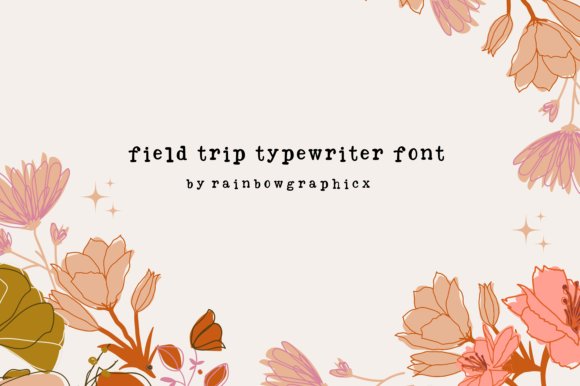
Field Trip Typewriter Font – Field Trip Typewriter leans playful, with chunky slab elements and lively curves that read like a worn schoolhand. Letters wobble slightly and include uneven ink fills that make each word approachable and whimsically imperfect, which makes the font feel handcrafted rather than mechanical. That personality makes it an excellent fit for kid‑oriented printables, posters and decorative headlines.
At display sizes the bold shapes remain friendly and legible, and the ink texture survives simple color fills or outline traps for sticker and label work. Try pairing it with a loose script or bright illustrations to amplify its cheerful tone, or use it for DIY templates and travel‑themed posters where a relaxed, analogue look works best. The set includes basic alternates to vary repeated letters and keep word shapes interesting.
╰┈➤ Download Field Trip Typewriter Font
My Recommendation: I’d use Field Trip Typewriter for educational materials, craft packaging or playful branding because it brings warmth and a homemade feel. It shines in print and printable goods where the ink textures are visible. Keep it large and pair with colorful graphics to maximize its approachable personality.
42. Glitch Typewriter Font
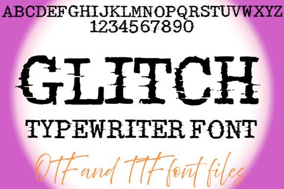
Glitch Typewriter Font – Glitch Typewriter blends analog distress with digital corruption: letterforms look eroded, with fragmented strokes and intermittent noise that mimic a misfiring printhead or a compromised terminal. The aesthetic reads as both menacing and modern, making it ideal for horror posters, cyberpunk covers or tech‑noir branding that needs an uneasy edge. Heavy weight and broken counters demand attention and create a strong focal point in tight layouts.
Use this face as a headline accent layered over scanline textures, VHS grain or inverted color blocks to amplify the corrupted look. In smaller sizes the fine breaks can merge, so reserve it mostly for large display use and titles. Pair it with thin monospaces or clean geometric sans to provide contrast and prevent visual overload.
╰┈➤ Download Glitch Typewriter Font
My Recommendation: I reach for Glitch Typewriter when a design needs a dystopian or hacked aesthetic-album art, indie game posters, or themed event flyers. Its fractured strokes give immediate mood without heavy photo treatments, saving time in composition. For balance, set supporting text in a neutral sans so the headline remains the dramatic focal point.
43. Typewriter Font
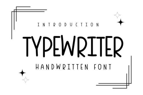
Typewriter Font – Typewriter presents as a warm, handwritten face that mimics quick keystrokes and imperfect ink transfer. Its uneven baselines and soft terminal breaks bring readable personality to notes, diaries, greeting cards, and small-format merch without feeling forced or gimmicky. The rhythm of its strokes reads friendly at body sizes while holding character in display use.
Among Typewriter Fonts, this design leans toward organic, humanized letterforms with open counters and forgiving spacing that prevent a cramped, mechanical look. It offers simple alternates so repeat letters don’t feel repetitive and pairs well with a neutral sans for longer copy or a narrow slab for vintage headers. Works cleanly in print and on the web; avoid heavy overlays that mask its subtle ink details.
My Recommendation: I reach for this font when I want handwritten warmth without sacrificing legibility. Its slight irregularities make layouts feel personal-perfect for postcards, lifestyle blogs, and small-batch product labels. I steer clear of it for formal reports, but it’s ideal for projects that need a human touch and approachable tone.
44. Retro Typewriter Font
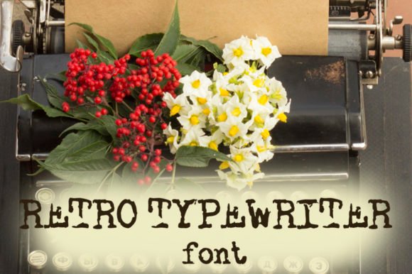
Retro Typewriter Font – Retro Typewriter channels mid-century press machines with compact letterforms, steady strokes, and a slightly condensed width that reads confidently at headline sizes. The design delivers period flavor without heavy ornamentation, making it suitable for posters, packaging, and cinematic titles where clarity matters. Built-in alternates mimic type-bar quirks so text feels historically grounded.
This face performs best in bold, short blocks of text and pairs nicely with geometric sans-serifs or warm serifs to create contrast. Use paper textures, muted palettes, or subtle emboss effects to reinforce the aged look while keeping legibility intact. File formats and licensing are straightforward, so it adapts well for commercial identity and editorial use.
╰┈➤ Download Retro Typewriter Font
My Recommendation: I’d pick Retro Typewriter for branding or poster work that needs a confident vintage voice. Its economical shapes give headlines strong presence, and the spare alternates add character without overdoing the distress. Perfect for labels, retro packaging, and titles that should read like a period piece.
45. Old Destroyed Typewriter Font
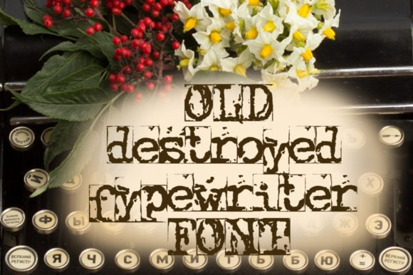
Old Destroyed Typewriter Font – Old Destroyed Typewriter is a heavily distressed display face where ink gaps, scrapes, and uneven edges define each glyph. The pronounced texture reads as analog wear-and-tear, which makes it effective for gritty posters, zines, album covers, and any layout seeking raw, tactile energy. Letterforms vary in opacity and alignment to mimic a battered type bar.
Because of its strong personality, this font works best for short phrases, mastheads, and titles rather than dense copy; contrast it with a simple sans to maintain readability. Layering it over photographic or paper backgrounds amplifies its weathered character; keep sizes large to preserve detail. Ideal when the goal is attitude and visible history.
╰┈➤ Download Old Destroyed Typewriter Font
My Recommendation: I reach for Old Destroyed Typewriter when a project needs unmistakable grit-its texture tells a story at a glance. It’s great for posters, covers, and street-style branding where polish would undermine the message. Use it boldly and sparingly to let the distressing carry the visual weight.
46. Inabitavek Typewriter Font
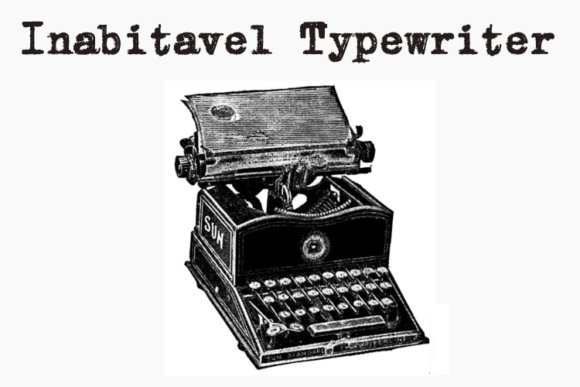
Inabitavek Typewriter Font – Inabitavek Typewriter recreates the worn imprint of mid‑century mechanical machines, with uneven ink deposits and faint erasures that read like a ribbon that has seen many pages. The design mixes narrow serifs and slightly irregular spacing so each letter looks manually struck; the textured counters and stray ink marks bring a tactile authenticity to display work. If you work with Typewriter Fonts for nostalgic branding or editorial pieces, this face gives believable age while staying readable at headline sizes.
The distressing was calibrated to behave at large sizes, where scrapes and blotches become personality rather than noise, and it pairs well with clean geometric sans for contrast. For covers, posters, or packaging, layer subtle paper grain and dimmed highlights to sell the analogue effect; use increased tracking for long lines to prevent crowding. It excels on short passages, captions, and titles where the worn details contribute mood without fatiguing the eye.
╰┈➤ Download Inabitavek Typewriter Font
My Recommendation: I’d reach for Inabitavek when a project needs the convincing patina of an old press – think book covers, retro branding, or film posters set in the mid‑20th century. The ink‑scarred texture reads as authentic in display sizes and gives designs emotional weight without becoming illegible. It’s particularly useful when you want type that reads like a found object rather than a polished digital font.
47. Silly Typewriter Font
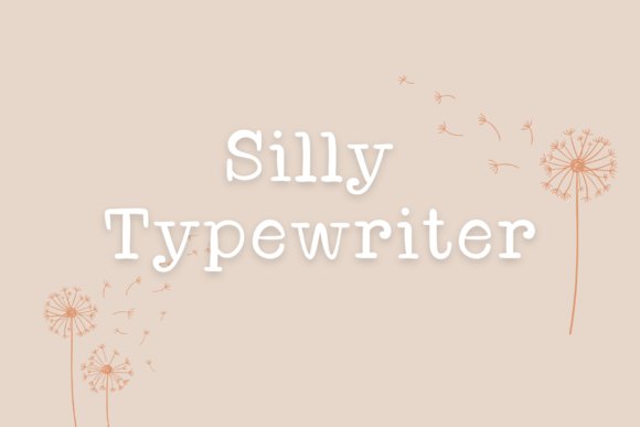
Silly Typewriter Font – Silly Typewriter blends the looseness of a hand lettered alphabet with a playful touch that keeps text approachable and friendly. Strokes are smooth with subtle variation in terminal shapes and an informal baseline that suggests human rhythm rather than mechanical regularity. The result is a warm, casual voice that brings personality to short headlines and invitations.
Use this face for packaging, social posts, greeting cards, or boutique identity systems where a personable tone matters; it pairs well with restrained serifs or narrow sans faces that let the script breathe. At small sizes the shapes remain legible, but the charm shows best in display and medium settings where quirks-like uneven joins and soft swashes-can be appreciated. Consider modest tracking and generous line height to keep the composition airy and playful.
╰┈➤ Download Silly Typewriter Font
My Recommendation: I’d use Silly Typewriter when a project needs a friendly, handcrafted look-brand identities for artisanal products, children’s illustrations, or warm social graphics. Its informal forms give copy a human presence without sacrificing clarity, and it mixes nicely with minimal geometric fonts. It’s ideal when you want typography to feel like a handwritten note rather than a manufactured stamp.
48. Evil Typewriter Font
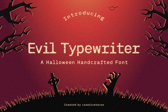
Evil Typewriter Font – Evil Typewriter is a gritty, horror‑leaning grunge face built from jagged edges, ink drips, and ruptured counters that seem salvaged from a damaged platen. Letters show aggressive irregularities and textured breaks that imitate torn paper and frantic keystrokes, producing a visceral, unsettling look suitable for genre work. The personality is loud: this isn’t a subtle distressing preset, it’s ink‑scarred and confrontational by design.
It shines on posters, event flyers, book covers, and game titles where atmosphere must register instantly-pair with deep, desaturated backgrounds and layered noise to amplify the menace. For motion titles, animate the ink fragments or reveal torn edges to heighten tension; combine with tight tracking for a claustrophobic effect or wide spacing for a scattered, chaotic feel. Use sparingly in body text and favor bold settings to keep the texture legible.
╰┈➤ Download Evil Typewriter Font
My Recommendation: I’d pick Evil Typewriter for Halloween campaigns, horror zines, indie game covers, or escape‑room graphics when you need type that contributes to the fright. Its aggressive distressing produces immediate mood and reads well in headlines or stamped treatments. I rely on it when a project calls for typography that looks damaged, urgent, and distinctly eerie.
49. Wanderlust Typewriter Font
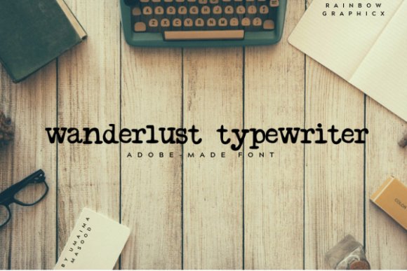
Wanderlust Typewriter Font – Wanderlust Typewriter is an all-lowercase face that recreates the gentle inconsistency of hand-fed paper and inked typebars. Among Typewriter Fonts it stands out for its airy letter spacing and faintly broken strokes, giving text a lived-in charm without feeling overwrought. The lowercase-only set pushes designers toward compositional creativity-titles, pull quotes, or short labels gain personality through its restrained imperfections.
This font responds well to texture overlays and slightly increased letter‑spacing to emphasize its vintage machine character. Pair it with a neutral sans for contrast, or use it on textured paper for stationery and packaging to emphasize tactility. It performs equally well in small doses on web headers and printed ephemera where a nostalgic, human touch is needed.
╰┈➤ Download Wanderlust Typewriter Font
My Recommendation: I’d reach for Wanderlust Typewriter when a project needs quiet character rather than loud ornamentation. Its all-lowercase rhythm creates intimacy in short headlines, product tags, or editorial pull quotes. For wedding menus, indie zines, or boutique packaging it brings personality while staying readable and easy to pair.
50. Typewriter Font
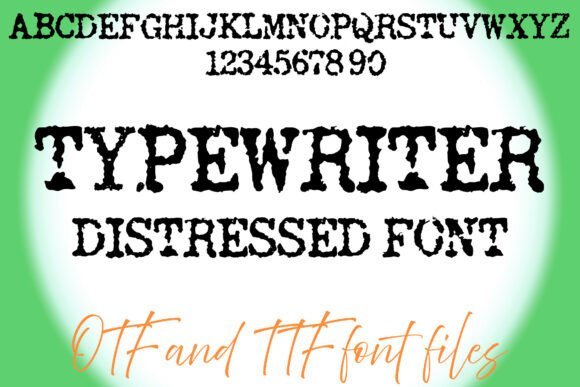
Typewriter Font – This distressed Typewriter Font channels the grit of old office machines: rough edges, ink blots, and variable darkness across characters that mimic worn ribbons and uneven strikes. The texture work reads as authentic rather than gimmicky, which makes it powerful for retro posters, mystery titles, and handcrafted zines where a tactile, analog presence matters. Thick strokes hold up at display sizes while the imperfections create dramatic mood without obscuring legibility.
Both OTF and TTF formats are included, making installation straightforward across design apps and platforms. For best results, layer a subtle paper grain or halftone vignette beneath the letters and pair the type with clean geometric sans for balance. Use it large for headlines or treatment elements rather than dense body copy so the distressed detailing remains impactful.
My Recommendation: I would use this font when a project calls for an aged, tactile feel that reads like the real thing. It’s ideal for posters, book covers, cinematic titles, and any layout that benefits from bold, weathered letterforms. The included OTF/TTF files make it simple to test textures and treatments quickly in both print and digital mockups.
51. Bohemian Typewriter Font
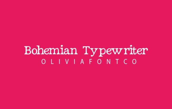
Bohemian Typewriter Font – Bohemian Typewriter blends the cadence of mechanical type with a soft, handwritten sensibility: slightly tapered serifs, gentle stroke contrast, and occasional irregularities that suggest a human hand behind each character. Its design keeps lines readable at headline sizes while offering enough charm for decorative use, striking a balance between formal serif structure and relaxed boho personality. That makes it a strong choice for editorial headings that need warmth without losing authority.
Because it reads well in both short headlines and longer snippets, this face suits wedding stationery, boutique brand marks, and lifestyle packaging. Try it paired with airy script accents or muted paper textures to enhance its romantic angle, or set it against minimal layouts to let the type do the expressive work. It’s particularly effective when color palettes lean toward soft neutrals and organic tones.
╰┈➤ Download Bohemian Typewriter Font
My Recommendation: I’d pick Bohemian Typewriter when a design must feel personal and refined at once-think boutique invitations, lifestyle branding, or magazine covers. Its serif underpinnings keep composition tidy while the hand-leaning details add warmth. Use it for projects that benefit from an elegant yet approachable voice; it pairs especially well with light textures and natural color palettes.
52. Typewriter Font
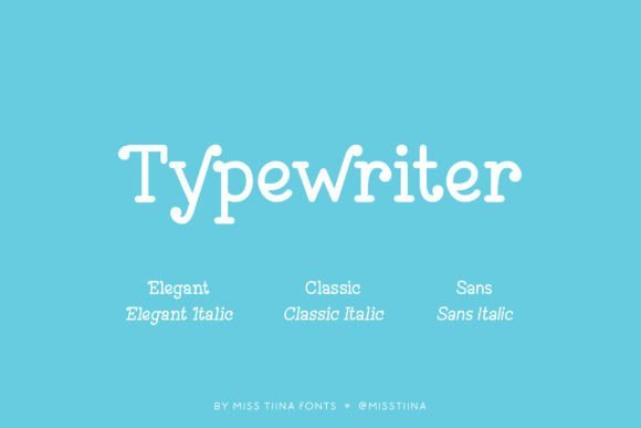
This Typewriter Font bundle presents six distinct styles, ranging from crisp, mechanical cuts to weathered, ink-bleed textures that read like real ribbon impressions. The Typewriter Fonts family covers tight monospaced forms as well as loose, irregular alternates, giving designers options for polished headlines or intentionally aged posters. Alternate characters and subtle noise treatments keep repeated letters believable and prevent the flat, manufactured look common in single-style releases.
OpenType features include discretionary ligatures, stylistic sets, and carefully tuned kerning so the faces hold up at large display sizes; select styles introduce tiny baseline shifts and simulated misalignment for added authenticity. Pair the cleaner styles with a neutral sans for contemporary layouts, or use the distressed cuts on packaging, editorial spreads, and film title cards where tactile texture is desirable. Weights span light to bold, making the set reliable for poster work, branding, and theatrical graphics.
My Recommendation: I reach for this set when a project needs personality that feels handmade rather than artificially aged. The mix of pristine and distressed styles lets me maintain legibility while adding believable wear where appropriate. It’s perfect for posters, album artwork, retro branding, or any piece that benefits from tactile, ribbon-like letterforms.
53. Established Typewriter Font
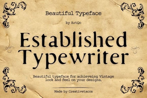
Established Typewriter Font channels the quirks of mid-century press machinery: slightly uneven ink distribution, subtle edge wear, and serifs that read like they were hand-stamped. Those deliberate imperfections give designs an immediate vintage identity suited to period book covers, nostalgic invitations, or retro product labels. The overall effect reads authentic without tipping into parody, so projects that need historical flavor gain credibility rather than cliché.
On the technical side, the face shows modest stroke contrast and open counters, making it best for headline and display use rather than small paragraph text. Contextual alternates help avoid monotonous repetition in short lines, and a restrained range of weights preserves the antique feel. For practical layouts, pair it with a clean grotesque for body copy to keep reading flow steady while retaining the vintage headline character.
╰┈➤ Download Established Typewriter Font
My Recommendation: I use Established Typewriter when the goal is convincingly historical typography-nothing shouty, just lived-in authenticity. The ink-splatter hints and serif detailing make it ideal for book covers, themed invitations, and artisanal product labels. Pairing it with a modern sans for body text keeps the design readable while preserving nostalgic charm.
54. Typewriter Font
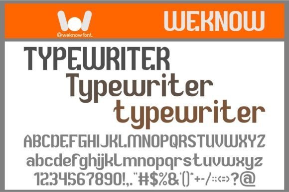
Typewriter Font – This take on the typewriter aesthetic applies a sans-serif sensibility, trading mechanical sternness for a sprightly, humanized rhythm across the alphabet. High x-height and broad counters give the letterforms punch in headlines and thumbnails, while generous internal spacing preserves clarity at smaller display sizes. The overall voice reads slightly offbeat and friendly, which suits indie labels, editorial callouts, or bold logo work that wants character without fragility.
Design features include rounded terminals, optional alternates for repeated characters, and careful screen hinting for crisp web rendering; stylistic sets let you dial how playful the result appears. Use bolder cuts for logotypes and lighter cuts for captions, and counterpoint the face with a condensed serif when you want dramatic contrast. It holds presence on both print and social layouts without competing with imagery, making it a practical choice for visual-first projects.
My Recommendation: I pick this version when the brief asks for a typewriter-inspired look that still feels fresh and modern. Its clarity at small sizes and energetic proportions make it great for posters, social headers, and fashion-brand identities. The optional alternates are a nice touch for avoiding repetition in logotypes and short bursts of copy.
55. Highclass Typewriter Font
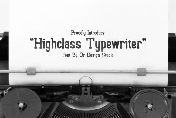
Highclass Typewriter Font – Highclass Typewriter is a slab serif display whose weight and hard-edged serifs recall heavy metal typebars and ribbon-fed impressions. This is one of the Typewriter Fonts I reach for when a design needs both authority and handcrafted grit – the letters show subtle ink texture and slightly irregular terminals that read as authentic rather than manufactured. The package includes OTF and TTF files with full numerals and basic diacritics, so it works across print and web. Its high x-height and open counters keep legibility steady even when the type is reduced or layered over textured backgrounds.
Spacing feels intentionally compact, which helps headlines land with punch while still allowing for confident tracking when used in logotypes or badges. Pair it with a neutral geometric sans to neutralize the vintage heft, or use two stylistically similar slab weights for poster work and packaging. The font’s bold personality suits editorial mastheads, sports branding, and retro-inspired product labels where a mechanical, tactile voice is wanted.
╰┈➤ Download Highclass Typewriter Font
My Recommendation: I use Highclass Typewriter when a brand needs a strong, analog presence with readable letterforms; the slab serifs and inky terminals give print projects that authentic press feel. It stands out for packaging, posters, and any identity work that benefits from vintage machinery character without sacrificing modern legibility. If you want a typeface that reads as deliberately physical and confident, this one hits that mark while remaining straightforward to pair and deploy.
56. Notenic – Typewriter Typeface Font
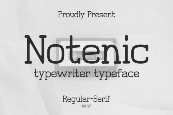
Notenic – Typewriter Typeface Font – Notenic blends classic serif proportions with typewriter-inspired texture to produce a restrained retro voice that doesn’t shout for attention. Stroked serifs and slightly uneven contrast give each glyph the impression of ink-on-paper inconsistency, which is ideal for designs that want a lived-in, archival mood. The family’s punctuation and numerals maintain the overall cadence so text blocks feel coherent rather than forced. It reads particularly well on covers and editorial spreads where a historic attitude is desired without heavy ornamentation.
Letterforms are slightly condensed, helping headlines and bylines sit neatly at the top of layouts, while medium tracking keeps paragraphs tidy in narrow columns. Use Notenic for artisanal product identity, film title cards, or magazine headers to suggest provenance and craft. For contrast, set body copy in a warm humanist sans or a clean slab at lighter weights to keep hierarchy clear and maintain visual rhythm across pages.
╰┈➤ Download Notenic – Typewriter Typeface Font
My Recommendation: I often pick Notenic when a project calls for subtle period character rather than overt retro theatrics; it reads as authentic and composed. Its restrained irregularities work well on book jackets, menus, and boutique branding where a hint of age strengthens the narrative. I recommend pairing it with a modern sans to create a pleasant tension between old and new.
57. Handy Typewriter Font
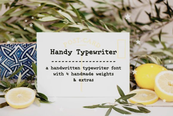
Handy Typewriter Font – Handy Typewriter is a modern handwritten font that carries the warmth of human strokes with light typewriter cues in its terminals and baseline rhythm. The letters have a slightly uneven flow that mimics hand-set copy and lends an intimate, personal tone to stationery and event pieces. It’s especially suited for wedding invitations, greeting cards, and small-run packaging where personality matters more than strict uniformity. The result is friendly copy that still reads cleanly across print and digital mockups.
Open forms and gentle curves make this face comfortable at both display and mid-body sizes, while optional alternates add variability for more organic runs of text. Try pairing it with a restrained serif for invitations or a cool geometric sans for modern lifestyle branding to keep compositions balanced. The hand-drawn energy is beneficial when a project needs to feel approachable and handcrafted without appearing messy.
╰┈➤ Download Handy Typewriter Font
My Recommendation: I reach for Handy Typewriter when a design needs genuine warmth and human imperfection-its flowing shapes feel sincere on personal projects and boutique branding. It shines on invitations, labels, and anything that benefits from an intimate touch while remaining practical to set in longer passages. Use the alternates sparingly to preserve legibility while enhancing the handcrafted appearance.
58. Typewriter Vintage Font

Typewriter Vintage Font – Typewriter Vintage arrives like a headline-maker with heavyweight silhouettes, sharp terminals and a deliberate roughness that reads like aged ink. Among Typewriter Fonts, it stands out for its exaggerated stroke contrast and angled cuts that inject a mechanical urgency while keeping letterforms immediately readable at display sizes. Use it for posters, mastheads or product labels when you want typography that feels tactile and unapologetically bold.
Designers will appreciate tight spacing, sturdy capitals, and authentic distress textures that reproduce well in print and high-resolution screens. It pairs neatly with neutral sans-serifs for longer text and accepts treatments such as letterpress or embossed finishes without losing character. For small captions choose a cleaner companion face so the texture doesn’t compete with legibility.
╰┈➤ Download Typewriter Vintage Font
My Recommendation: I keep Typewriter Vintage in my toolkit for identity work where voice must be unmistakable; its carved letterforms bring grit and presence. It shines on brewery labels, posters, and media kits that benefit from a vintage-industrial attitude. I avoid it for long body copy or tiny UI text where the distress becomes distracting.
59. Vintage Typewriter Font

Vintage Typewriter Font – Vintage Typewriter marries handwritten warmth with faint typewriter artifacts: irregular baselines, soft pressure marks and gentle swashes that read personal rather than manufactured. The family offers alternates and ligatures so repeated words don’t feel identical, giving layouts a handcrafted cadence that suits stationery and boutique branding. Its lighter weight and airy counters make it particularly fitting for invitations, greeting cards and refined packaging.
On textured paper the subtle breaks and ink-like gaps read convincingly authentic, while on-screen smoothing keeps the strokes legible at smaller sizes. Use contextual alternates to avoid mechanical repetition across headlines, and pair the face with a restrained serif for editorial work or a minimalist sans for modern product labels. The result is a friendly, bespoke signature without fuss.
╰┈➤ Download Vintage Typewriter Font
My Recommendation: I use Vintage Typewriter when a project needs human warmth-wedding suites, limited-edition packaging, and personal stationery are perfect fits. Its alternates stop repetition from flattening the design, which saves time during layout. For brand systems that require many lockups, I test legibility across sizes before committing.
60. Perfect Typewriter Font
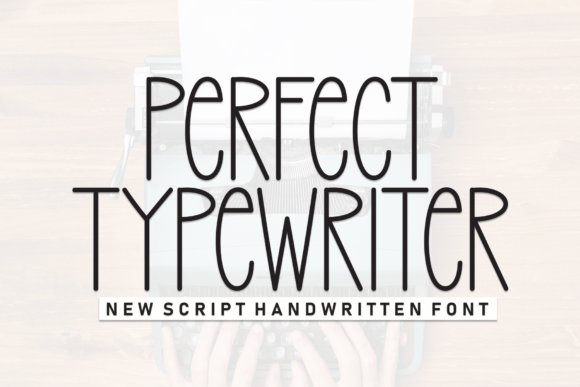
Perfect Typewriter Font – Perfect Typewriter sits between authentic typewriter marks and a refined modern skeleton: narrow proportions, steady stroke weight and slightly tall counters. That balance makes it useful for editorial pull quotes, journaling spreads and digital notebooks where a vintage reference is wanted without overt roughness. It reads cleanly at paragraph sizes yet has enough personality to anchor chapter titles and headers.
OpenType features such as tabular figures and alternate punctuation give consistent rhythm across columns, and the subtle monospacing cues provide an archival, organized feel. Designers often pair it with slab serifs to lean into the retro look or with soft sans-serifs for contrast. If you need a typewriter-leaning face that doesn’t draw attention away from content, this one manages that quietly and reliably.
╰┈➤ Download Perfect Typewriter Font
My Recommendation: I reach for Perfect Typewriter for zines, editorial sidebars and designers’ notebooks-projects that nod to the past without being showy. Its narrow letters save horizontal real estate and keep multi-column layouts tidy. For screen use, I test weights, but on paper it performs consistently across different stocks.
61. Backwards Typewriter Font
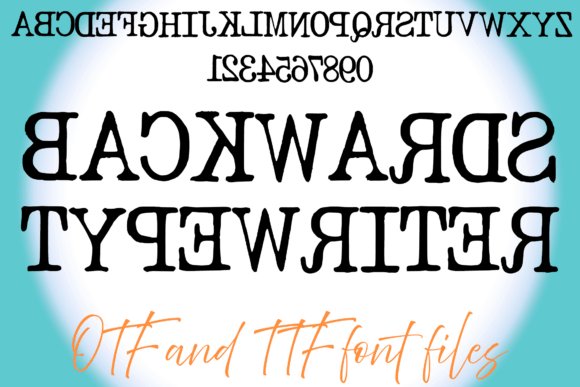
Backwards Typewriter Font – Backwards Typewriter flips the familiar typewriter aesthetic into a mirror image: serifs and stems look inverted, producing a playful optical riddle that reads like a printed negative. That oddball quality makes it a strong choice for puzzle covers, escape-room signage, mystery-themed posters, and editorial spreads that want to interrupt the reader’s gaze. Within a set of Typewriter Fonts, this face stands out for theatrical misprints that force the eye to slow down and engage with each glyph.
Treat it as a display piece rather than body copy-legibility drops at small sizes but the effect is powerful at large scales and on single-word treatments. It pairs well with a neutral sans or a simple slab to restore balance, and printed on textured paper or with halftone overlays the mirrored shapes feel handmade and tactile. Check character support before committing to long passages; the novelty works best as a focal point.
╰┈➤ Download Backwards Typewriter Font
My Recommendation: I reach for Backwards Typewriter when I want a single visual stunt that confounds and delights-think puzzle boxes, theatrical posters, or teaser graphics. The mirrored letterforms create instant curiosity and photograph beautifully on distressed stock. Use it sparingly as a headline or logo element rather than for long copy.
62. Broken Typewriter Font
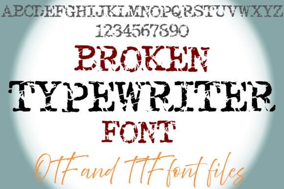
Broken Typewriter Font – Broken Typewriter channels the grit of malfunctioning machinery with chipped serifs, uneven ink density, and textured counters that suggest years of wear. Those irregularities give projects an authentic analog vibe, ideal for underground zines, historical posters, punk-inspired album art, and horror titles where imperfection builds atmosphere. The irregular baseline and pitted strokes read as tactile marks rather than deliberate ornament.
Because the distressing is visually busy, use this font sparingly for display headlines, mastheads, or short pull quotes where the texture can breathe. Combine it with clean geometric sans for hierarchy, and consider printing on uncoated paper or applying light grain to amplify the effect. Verify glyph coverage and OCR sensitivity if you need searchable text-this style favors mood over dense typesetting.
╰┈➤ Download Broken Typewriter Font
My Recommendation: I use Broken Typewriter when a project needs grime and period authenticity-posters, record sleeves, or gritty editorial spreads. Its eroded edges read as hand-set and physical, especially in tactile print. It’s not meant for long reads; treat it as a gritty accent that sets tone.
63. Wonky Typewriter Font
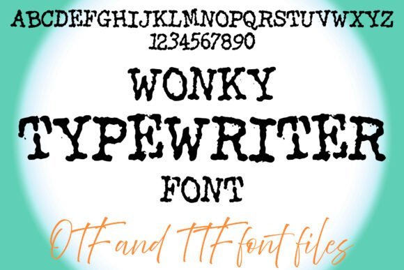
Wonky Typewriter Font – Wonky Typewriter embraces asymmetry with slightly misaligned characters, ink smudges, and irregular outlines that feel hand-drawn rather than mechanized. That playful imperfection makes it ideal for zines, retro posters, children’s mystery covers, and any layout that benefits from a quirky, analog personality. The font’s lively rhythm gives headings a casual, handcrafted energy without feeling sloppy.
Use it at display sizes where the misregistration can be admired; pair with a clean sans to keep hierarchy clear and avoid crowding. Contextual alternates and roughened fills work well with warm paper tones or subtle halftones, and generous letterspacing helps maintain readability. It’s a fun, characterful choice whenever you want type that reads like a human touch.
╰┈➤ Download Wonky Typewriter Font
My Recommendation: I pick Wonky Typewriter for projects that crave warm, imperfect charm-handmade zines, playful posters, or cozy book covers. Its irregular shapes feel personal and invite closer inspection, especially when printed on textured surfaces. Keep it large and paired with simple supporting type to let the personality shine without overwhelming the layout.
64. Slant Typewriter Font
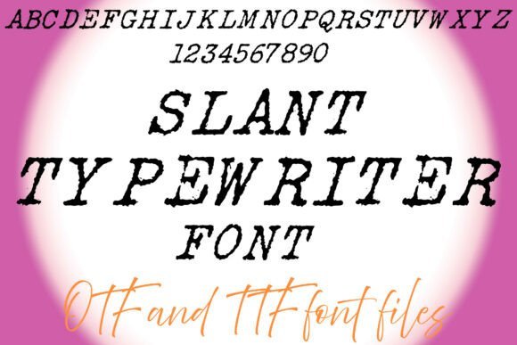
Slant Typewriter Font – Slant Typewriter tilts the familiar mechanical forms into an italic personality, where angled stems and slightly splayed serifs read like a carriage in motion. Distressed textures – ink speckles, uneven stroke breaks, and ragged counters – give each glyph a tactile, analog presence, while loose tracking and playful baseline shifts keep the voice lively rather than uniform. Capitals hold weight for headlines and logotypes, while lowercase quirks deliver personality in short lines.
For applications that call for gritty nostalgia, this face stands out among Typewriter Fonts: it shines on retro posters, zines, record sleeves, and identity work that benefits from visible wear. Pair it against a clean geometric sans to heighten contrast or set it on textured paper and halftone prints to emphasize the analog effect; avoid long body copy since heavy distressing can reduce small-size legibility.
╰┈➤ Download Slant Typewriter Font
My Recommendation: I reach for Slant Typewriter when a design needs to feel lived-in and energetic-like an old press proof that just missed the cut. The slanted forms push compositions forward, and the distressing works beautifully on textured paper and screen treatments that simulate ink. Use it for headlines, album art, posters, and brands that can handle expressive, gritty letterforms.
65. Typewriter Font
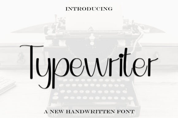
Typewriter Font translates a practiced hand into tidy, readable letterforms that balance personality with restraint. Strokes are well-kerned and consistent, with a medium x-height that keeps words legible at both display and smaller scales; subtle alternates and soft terminals suggest handwriting without overt flourish. The overall rhythm feels human but controlled, making typographic hierarchy simple to manage.
This face suits applications that need approachable character rather than loud texture: wedding invites, boutique product labels, short pull quotes, and social graphics benefit most. Pair it with a neutral sans to avoid visual clutter, and reserve it for short-form text where the handwritten details can add warmth without becoming distracting.
My Recommendation: I use this Typewriter Font when a project needs a friendly, handwritten touch that still reads cleanly across media. It’s great for stationery, boutique packaging, and social posts where personality matters but legibility is not negotiable. For longer passages I pair it with a straightforward sans to keep layouts calm and readable.
These 65 Typewriter Fonts offer a range of moods, from clean mechanical types to heavily distressed faces that read like real typewriter output. Use the notes to narrow choices based on scale, contrast, and intended mood.
Check each font’s license before commercial use and preview at cover sizes to ensure legibility. A thoughtful pairing and modest effects will keep the vintage aesthetic authentic without cluttering your design.