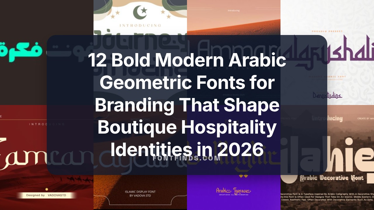
12 Bold Modern Arabic Geometric Fonts for Branding That Shape Boutique Hospitality Identities in 2026
modern arabic geometric fonts for branding bring strict grids and warm counters together, so Arabic reads crisply at display sizes and in tight text. These faces balance modular construction with gestures that preserve legibility and character.
Below I list the 12 typefaces in the collection with short notes on mood, pairing strategies with Latin scripts, and practical use-cases for logos, labels, and wayfinding. Each pick includes quick pairing tips and suggested contexts to help you match tone and scale.
1. Fekrah – Arabic
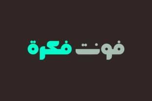
Fekrah – the Arabic word for idea – pares traditional letterforms down to clean, angular geometry that reads crisply in headlines and logotypes. As part of a shortlist of modern arabic geometric fonts for branding, it balances minimal curves with crisp terminals so logos and packaging feel precise and assured. Its monoline strokes and measured spacing make bilingual pairings with Latin sans serifs straightforward.
At display sizes the face has strong presence thanks to squared counters and a steady visual rhythm, while lighter weights remain legible in UI headers and navigation. Alternates and attentive kerning let designers tune the voice from formal to playful without losing structural clarity. I reach for Fekrah when a refined, pared-back Arabic identity is required for tech, fashion, or editorial briefs.
My Recommendation: I would pick Fekrah when a brand needs a minimalist Arabic mark that still carries personality. It’s especially useful for startups, boutique product lines, and bilingual identities because it pairs cleanly with modern Latin type. The alternate glyphs and spacing controls make it flexible enough for packaging and web headers while keeping a distinct geometric signature.
2. Zamrani Font
Zamrani channels Kufic proportions into a muscular display face defined by severe angles and broad counters that dominate wide formats. The glyph architecture stresses vertical strokes and carved negative space, creating a textured headline voice ideal for marquees, cinematic credits, and premium labels. Its heavyweight presence signals authority and crafted heritage, so it reads like a brand statement rather than a subtle accent.
Because of its strong personality, Zamrani benefits from restrained color palettes and generous margins; dense layouts can obscure its rhythmic balance. The family includes stylistic alternates and titling caps that let you shift tone without losing coherence. Reserve it for large-scale use-posters, packaging, signage, and identity marks where its sculptural forms can be appreciated.
My Recommendation: I choose Zamrani when a project needs bold, architectural lettering that communicates legacy and strength. It’s perfect for premium food labels, travel brands, and cinematic treatments where headline impact matters. Pair it with a subtle Latin face and plenty of white space to let the Arabic forms breathe and read with authority.
3. Nouriyah Font
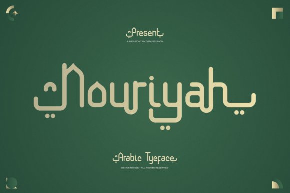
Nouriyah favors smooth monoline strokes and an airy geometric skeleton that brings calm elegance to headlines and editorial layouts. Generous letter spacing and refined vowel points lend a decorative yet readable quality, making it well suited for luxury packaging, book covers, and corporate headers. The proportions strike a balance between traditional reference and contemporary restraint, so display text feels polished without excess flourish.
OpenType features like contextual alternates and lining figures help Nouriyah maintain alignment in mixed-script compositions and numeric data. It adapts well to responsive typography, staying legible at mid sizes while offering graceful contrast at display scale. Use it where a poised, premium Arabic voice is required alongside a warm Latin partner.
My Recommendation: I recommend Nouriyah for upscale brands and editorial projects that require refined Arabic typography with decorative detail. Its OpenType options and clear spacing make it reliable across print and web, while the monoline structure keeps the visual tone elegant and approachable. It performs especially well on labels, invites, and mastheads where sophistication counts.
4. Journey Ramadhan
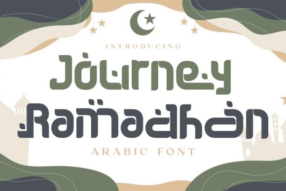
Journey Ramadhan is a display face that borrows Kufic geometry and ornamental Arabic terminals while keeping a Latin-friendly skeleton, producing a bold, ceremonial presence for headlines and marks. The letterforms show block-like construction with decorative cuts and softened curves; small dots and terminal flourishes reference Islamic calligraphy without relying on literal script forms. This design ranks among modern arabic geometric fonts for branding, offering clear, compact shapes that read well at large sizes and carry cultural resonance for festive identities.
The font performs strongly on posters, social creative, mosque signage, and seasonal packaging where a reverent but contemporary voice is needed. Tight spacing and confident stroke endings make it suitable for logotypes and short wordmarks as much as for hero typographic treatments. Color contrasts and textured backgrounds amplify the ornamentation, while its visual rhythm keeps longer headlines legible and impactful.
My Recommendation: I would reach for Journey Ramadhan when a project needs an aesthetic that nods to Islamic tradition without using actual Arabic characters – it brings ceremonial weight and decorative detail to headlines and packaging. The Kufic-inspired modular shapes work well for festival branding, event posters, and mosque announcements where recognition and gravitas matter. Use it for short titles, emblems, or hero banners where bold, symbolic typography creates an immediate cultural connection.
5. Zahara Regular
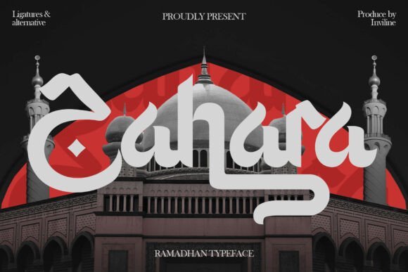
Zahara Regular pairs pronounced calligraphic strokes with crisp, geometric proportions to create a display face that reads as both graceful and assertive. Its set of ligatures and flowing terminals adds a handcrafted touch to each word, while the underlying geometry keeps letter widths consistent for neat typographic color. These qualities make Zahara a strong candidate for designs that require decorative flair without sacrificing readability in headline applications.
Use Zahara for printed greetings, event posters, and editorial covers where expressive letterforms set the tone. The font’s thick-to-thin contrasts and intentional ligature shapes work well in vertical compositions and banner work, and it responds nicely to layered treatments like foil, emboss, or textured printing. It holds up at display sizes and helps establish a refined, culturally aware visual identity for seasonal campaigns.
My Recommendation: I’d choose Zahara Regular when a project calls for elegance with a handcrafted feel – think Eid cards, premium event posters, or editorial covers. The ligatures and calligraphic terminals give designers options for memorable logotypes and ornate headlines. It’s especially effective when paired with restrained layouts that let the letterforms take center stage.
6. Salafushalih
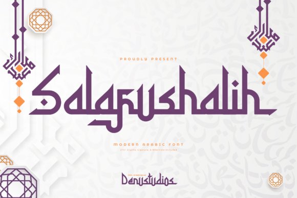
Salafushalih blends ornamental calligraphy with precise geometric construction and ships with an expansive glyph set that supports rich typographic expression. With over 270 glyphs, alternates, and ligatures, it lets designers introduce subtle variances in repeated words and craft bespoke letter combinations for packaging or identity work. The overall effect is a refined, rule-driven aesthetic that still carries warmth through decorative flourishes and measured contrast.
This face excels in contexts that require typographic depth: layered labels, poster series, and editorial spreads where alternates and ligatures avoid monotony across headlines. Its structured terminals and considered stroke modulation lend themselves to bespoke wordmarks and long-run print projects where consistent reproduction matters. Pair it with minimalist graphic elements to let its ornamental features become the visual anchor.
My Recommendation: I recommend Salafushalih when you need a generous glyph palette to create variety within a single visual system – excellent for packaging lines, event collateral, and editorial branding. The alternates and ligatures make it easy to craft distinct headlines without custom lettering. Use it where repeatability and typographic nuance are priorities, especially for print-heavy campaigns.
7. Layalina Font – modern arabic geometric fonts for branding
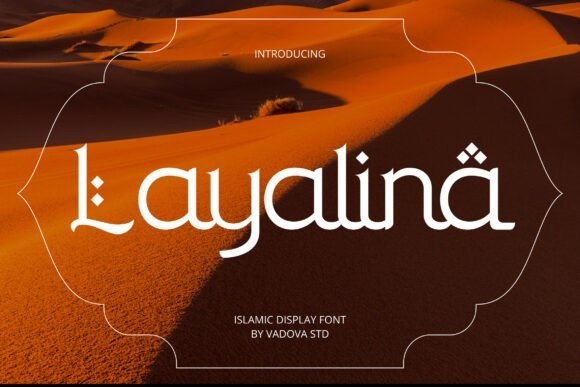
Layalina merges classic Arabic calligraphic rhythms with Latin-aware geometry, producing letterforms that feel both handmade and grid-minded. High-contrast strokes and diamond-shaped diacritics give headlines an ornamental pulse while preserving clarity for bilingual layouts. Designers seeking modern arabic geometric fonts for branding will appreciate how its measured curves and structured terminals balance festive ornament with readable text.
The face works well for Ramadan and Eid campaigns, cultural events, upscale restaurant identities, and spiritual editorials where a refined cultural voice is required. Its proportions hold up on embossed stationery, signage, and hero headers, and pairing it with a neutral Latin sans keeps bilingual compositions steady. Use Layalina when you need a voice that signals ritual and refined presence without heavy embellishment.
╰┈➤ Download Layalina Font – modern arabic geometric fonts for branding
My Recommendation: I reach for Layalina when a brief calls for cultural specificity paired with polished typographic control. Its geometric diacritics and high-contrast strokes make headlines stand out on seasonal campaigns, boutique menus, and editorial covers. For bilingual branding where Arabic must sit confidently beside Latin text, Layalina provides clarity and a distinct, dignified personality.
8. Al Mughir Font
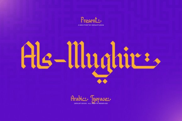
Al Mughir channels early epigraphic forms into a contemporary display face: sharp, angular glyphs and chiseled terminals create a sculptural impression. The ribbon-like, blocky structure produces strong silhouettes that read from a distance, and PUA encoding gives immediate access to decorative alternates without extra tools. Its geometry feels declarative, making it suited to bold headlines and graphical marks that require presence.
Use Al Mughir for premium labels, album art, editorial mastheads, or wayfinding that benefits from a compact yet imposing voice. When paired with restrained palettes and spacious layouts the type’s sharp counters remain legible and dramatic. Designers who want a dignified, culturally anchored identity will find this font reliable across print and digital deliverables.
My Recommendation: I pick Al Mughir for projects that need a strong, architectural Arabic expression-posters, luxury packaging, and headline-driven campaigns are ideal. The PUA glyphs make it fast to prototype decorative layouts, and the font’s carved feel gives work an authoritative tone. It shines where clarity and a bold cultural reference are priorities.
9. Walidin Font
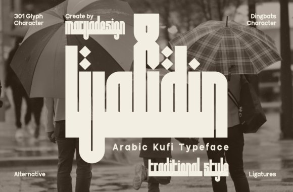
Walidin reinterprets Kufi’s early geometry with thick, square letterforms and minimal curvature, producing an emblematic display face with a compact footprint. The set includes dingbats for seals and patterns, and its pronounced horizontals render well on signage and apparel. This Kufi pays attention to functional clarity so it performs as a strong typographic anchor in brand marks and repeat patterns.
Apply Walidin to logos, architectural signage, merchandise, and packaging that benefit from condensed, emblem-like lettering. Its formal rigidity suits geometric wallpaper and large-format posters while simplified counters maintain legibility at medium sizes. For bilingual systems, pairing Walidin with a light Latin sans preserves scale and produces a clean visual contrast.
My Recommendation: I reach for Walidin when a brand needs bold, emblematic forms-cafés that reference Islamic architecture, streetwear labels, and product packaging come to mind. Its Kufi roots give marks a robust, graphic quality that scales well in print and merch. Pairing it with a restrained Latin type produces a crisp, modern contrast that keeps the identity readable and memorable.
10. Al Ammara
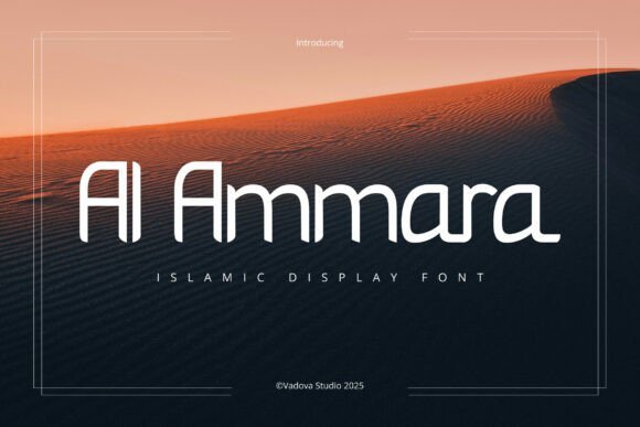
Al Ammara blends geometric construction with gentle Arabic-inspired flourishes, producing letterforms that feel crisp yet culturally familiar. The type shows smooth curves, restrained stroke contrast and diacritic-like accents that add ornament without clutter, positioning it among modern arabic geometric fonts for branding and festival visuals. Its display-focused shapes register strongly at poster scale and on social feeds tied to Ramadan or mosque events. Designers will appreciate how the script-like details warm otherwise minimal layouts.
On a practical level the glyphs keep clarity at large sizes while preserving distinctive silhouettes for logos and hero headers; spacing is generous which makes Latin pairings straightforward. Use rich color blocks or foil treatments to highlight the diacritic accents, and reserve Al Ammara for titles and identity marks rather than body copy. It pairs well with neutral sans faces and suits cultural institutions, event identity, and editorial covers seeking measured ornament.
My Recommendation: I would use Al Ammara when a brief needs a refined Islamic aesthetic that reads clearly at display sizes. The geometric skeleton plus subtle Arabic detailing makes logos and posters feel dignified without heavy ornament. It’s ideal for Ramadan and Eid campaigns, mosque signage, cultural institution identities, and editorial covers where readability and cultural reference must coexist.
11. Caliyana
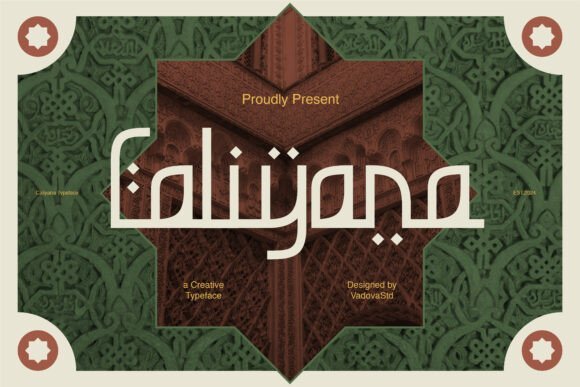
Caliyana channels the rhythm of Arabic calligraphy into Latin letterforms, yielding a display face that reads hand-drawn yet measured. Stylized characters and intentional ligatures echo arches and tiled geometry from Islamic architecture, giving headlines a ceremonial edge suitable for event branding and premium packaging. That balance of flourish and legibility lets the type assert personality without overwhelming supporting elements.
Pay close attention to kerning with Caliyana: its bespoke ligatures can sit tightly in logotypes and often need optical adjustment for small wordmarks. The face rewards use with generous negative space and pairs well with minimal photography or flat color fields for signage and posters. It works especially well for festival graphics, boutique product labels, and cultural identity projects that favor architectural cues over literal ornament.
My Recommendation: I reach for Caliyana when I want cultural reference without obvious pastiche. Its calligraphic rhythm lends packaging and logos a crafted, intentional feel that reads well at headline scale. Use it for boutique food labels, event posters, or any identity that benefits from architectural gestures and elegant ligature work.
12. Wahiej
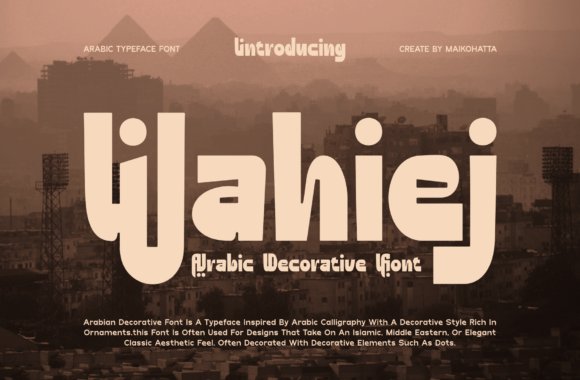
Wahiej is a bold decorative display that mixes calligraphic energy with geometric ornament to create striking headings. Its heavy strokes and stylized terminals form an ornate silhouette that feels rooted in tradition while commanding attention, making it well suited to posters, album covers and standout packaging. The font’s ornamental motifs bring a handcrafted flourish that suits theatrical or artisan brand directions.
Because Wahiej carries strong visual weight, limit its use to short words, logos or feature headlines rather than continuous text, and consider embossing or textured print to amplify its curves. Alternate glyph sets and swash options offer simple customization without redrawing wordshapes. Employ tight art direction, generous margins and restrained supporting type to keep the decorative forms legible and purposeful.
My Recommendation: I’d pick Wahiej for projects that need bold personality and a handcrafted air. Its decorative forms make it excellent for luxury packaging, cultural event posters, or boutique signage where typography must be the focal point. Plan for careful spacing, selective use of alternates, and high-quality production to let the details sing.
These 12 selections demonstrate how geometric principles can yield distinct voices – from precise, architectonic headings to friendly, rounded text faces. The same geometry that enforces clarity also allows subtle tweaks that shift mood without losing presence.
Use the notes and pairing tips to compare proportion, contrast, and spacing at real-world sizes for packaging, signage, and digital. Try a few combinations in situ to confirm tone and legibility before finalizing a brand direction.