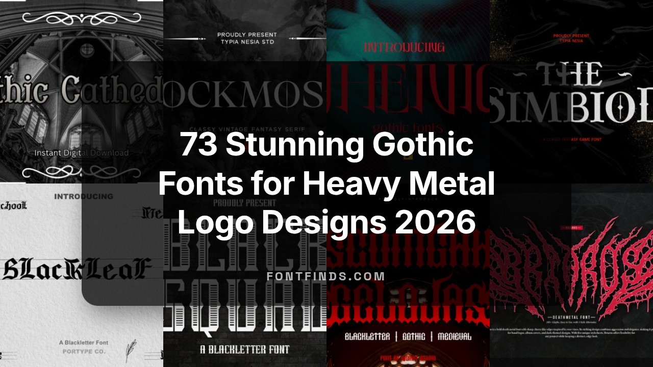
73 Stunning Gothic Fonts for Heavy Metal Logo Designs 2026
Fonts for gothic design shape mood through bold serifs, tight letterforms, and ornamental swashes. These 73 selections span blackletter, Victorian, and contemporary gothic styles suited to branding, editorial spreads, and poster art.
Use the collection to match type personality to project tone-stark display faces for headlines or delicate, calligraphic scripts for ornate layouts. Each entry includes recommended use cases, licensing notes, and pairing suggestions to simplify design choices.
1. Volcano Power Font
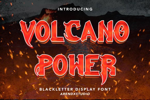
Volcano Power is a theatrical blackletter with teeth: high-contrast strokes, flaring spurs and jagged terminals that evoke carved metal and scorched paper. Its aggressive letterforms read loud at display sizes and carry a raw horror-film energy while remaining surprisingly readable in tight settings. If you work with Fonts for gothic design, this face sits between vintage woodcut and modern heavy-metal typography and offers stylistic alternates for dramatic initials.
Apply it to logotypes, poster headlines, book covers and apparel when a fierce, immediate presence is needed; the condensed caps save space without diluting impact. OpenType ligatures and swashes let you craft one-off badges or album titles, and its heavy strokes tolerate textured printing and embroidery. Pair with a neutral sans for captions to preserve legibility at smaller sizes.
╰┈➤ Download Volcano Power Font
My Recommendation: I reach for Volcano Power when a brief needs theatrical grit: horror posters, metal band identities, limited-edition apparel and genre book jackets all get a hard-edged personality from these letters. The alternates and swashes make each headline feel bespoke without hand lettering, and the bold strokes survive distressed printing and embroidery. If you want loud, historical darkness with practical display performance, Volcano Power is my go-to.
2. Dwaycome Font
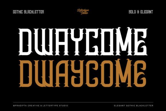
Dwaycome channels classical blackletter ornamentation while trimming excess so text stays readable across spreads and large headlines. The design harmonizes interlocking strokes and delicate serifs with open counters, reducing visual clutter while preserving an old-world presence. Multiple weights and contextual alternates make it useful for both decorative mastheads and refined logotype work.
This face suits editorial layouts, boutique branding and web headings that require Gothic character without overwhelming surrounding elements. Thoughtful kerning and stylistic sets allow the tone to shift from restrained to richly ornate, and neutral colorways highlight its period references. It also adapts cleanly to embossing, foil-stamp finishes and other premium print treatments.
My Recommendation: I choose Dwaycome when a project needs dignified gothic flavor rather than shock value; it works beautifully for boutique labels, book titles and magazine spreads that call for period charm with modern clarity. The alternates let me dial ornamentation up or down without redesigning letterforms, making it flexible in practice. For high-end branding and editorial use where legibility matters, Dwaycome is a reliable selection.
3. Scomgah Gelojas Font
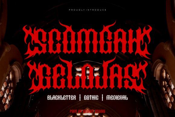
Scomgah Gelojas is unapologetically loud: sharp angles, compressed counters and a forward-leaning posture give the typeface a rebellious voice suited to extreme music and underground posters. Exaggerated serifs and spiky terminals cut through busy visuals, creating instant focal points for band names and event headlines. Its tight rhythm and hefty joins favor all-caps settings where a compact, intense impression is required.
On the technical side, the family includes heavy weights that handle ink-rich processes, tight tracking defaults and alternate glyphs tuned for logo work and initials. The face responds well to texture overlays, distressed treatments and layered color effects, allowing designers to push gritty aesthetics while keeping display clarity. For digital layouts, keep sizes generous and avoid body copy use to maintain character definition.
╰┈➤ Download Scomgah Gelojas Font
My Recommendation: I pick Scomgah Gelojas when I need raw, aggressive attitude-think rock posters, skate-brand tags or festival promos aimed at subculture audiences. Its punchy letterforms read well on posters and shirts, and alternates help create unique logotypes quickly. Use bold treatments and textured printing to maximize its impact.
4. Maythen Font
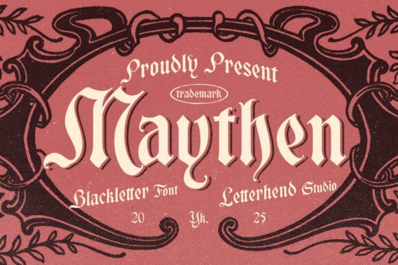
Maythen is a blackletter typeface that channels the formal spirit of medieval calligraphy without feeling heavy-handed. Thick verticals and tapered terminals combine with restrained flourishes to produce a stately, readable display face that feels right at home on book jackets and boutique packaging. The letterforms carry enough personality to command attention while still allowing careful typographic control for headlines and mastheads.
As part of a toolkit of Fonts for gothic design, Maythen works well when you need historical character paired with modern typesetting: think editorial title pages, heritage branding, or theatrical posters. OpenType alternates and discretionary ligatures add expressive options for initials and logotypes, and the font’s spacing responds well to tight tracking or dramatic display sizes.
My Recommendation: I reach for Maythen when a project needs a dignified, vintage look with readable blackletter character. It adds a noble feeling to book covers, premium labels, and fantasy titles without overwhelming the layout. Use it for large display work and add alternate glyphs sparingly for a refined, ceremonial finish.
5. Baracuda Monster Font
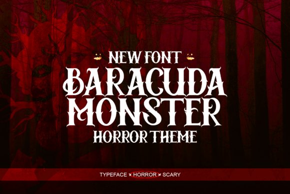
Baracuda Monster leans into horror-show theatrics with jagged terminals, uneven baselines, and exaggerated swashes that read as intentionally unsettling. The style reads like classic Halloween signage reimagined for modern posters: bold, aggressive, and full of attitude, making it ideal for attention-grabbing headlines. It balances ornament with legibility so it remains impactful at a variety of display sizes.
This font is PUA encoded, so alternates and decorative glyphs are easy to access without complex OpenType knowledge, which speeds production on tight schedules. Use Baracuda Monster for film titles, seasonal packaging, haunted event flyers, or merchandise where a pronounced creepy aesthetic is required; pair it with a neutral sans for readable body copy.
╰┈➤ Download Baracuda Monster Font
My Recommendation: I use Baracuda Monster when a project needs theatrical menace rather than subtle gothic cues. Its PUA glyph set saves time when creating stylized wordmarks and posters, and the bold forms hold up on print and merch. Pick this for Halloween campaigns, horror posters, or any design that should feel loud and unsettling.
6. Ranzombie Font
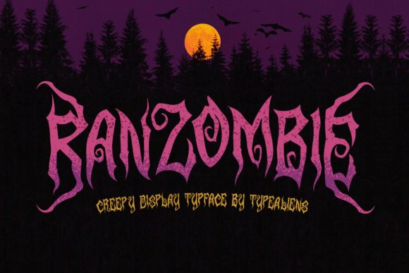
Ranzombie is a distressed display face that wears its scratches and ink drips like a badge: rough edges, inconsistent stroke weight, and splatter-like terminals give it a raw, post-apocalyptic feel. The uneven baseline and quirky counters suggest hand-rendered lettering rather than a polished type specimen, which makes it useful for underground zines, band posters, and indie game titles. It reads best large, where the texture becomes a design feature rather than noise.
Because Ranzombie leans heavily on texture, it pairs well with simple geometric or slab serifs to provide structure and legibility for secondary text. Use it for album covers, streetwear branding, event flyers, or horror-comic covers where an aggressive, gritty display voice is needed; treat it as a headline-only solution and avoid long paragraphs in the same style.
My Recommendation: I pick Ranzombie when a project needs punk energy and visible wear instead of elegant ornament. It’s perfect for music art, gritty posters, and titles that demand a raw attitude. Combine it with clean supporting type so the headline remains the focal point without making the layout feel cluttered.
7. Thorn & Tale Muse Edition Font
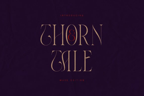
Thorn & Tale Muse Edition is a high-contrast serif that pairs sculpted terminals with dramatic, sweeping curves and pronounced vertical contrast. Its decorative swashes, intertwined ampersand and thorn-like terminals lend a couture-inflected gothic attitude that suits editorial mastheads and luxury labels. For designers assembling Fonts for gothic design collections, this typeface bridges Victorian ornament and contemporary editorial sensibilities.
OpenType features include multiple stylistic sets, discretionary ligatures and elongated stems that behave like typographic ornaments at large sizes. Use it sparingly as a display face-its pronounced contrast and dramatic terminals read best in headlines, packaging logos and book covers where ornamentation can breathe. The Muse Edition’s alternates make it easy to craft bespoke logotypes and couture invitations without heavy manual drawing.
╰┈➤ Download Thorn & Tale Muse Edition Font
My Recommendation: I reach for Thorn & Tale Muse Edition when a project needs aristocratic drama and precise ornamental control. The font’s swashes and alternates let me compose mastheads, luxury packaging and wedding stationery that feel handcrafted. It suits fashion editorials, premium product identities and any brief asking for Victorian elegance with a gothic whisper.
8. Bloody Font
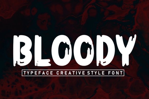
Bloody is a script that mimics ragged ink and torn strokes, with irregular baselines, spatters and sharp flares that read as quick, violent gestures. The letterforms suggest dripping paint and torn paper, giving posters and horror-themed branding an immediate visceral impact. It thrives at large display sizes where texture and edge detail dominate the mood.
Treat Bloody as an accent rather than body type-tight tracking and heavy texture can collapse at small sizes, so use it in headlines, event posters, album art and haunted attraction signage. Pair it with a clean grotesque or a narrow serif to keep legibility while letting the script carry the atmosphere; consider vectorizing for screen sharpness and adding distress textures for print.
My Recommendation: I use Bloody when a design needs raw menace instead of polished refinement. It injects panic and grit into Halloween promos, horror game splash screens and heavy-metal artwork. Best applied large and paired with simpler text faces to preserve legibility while maximizing its macabre character.
9. The Throne Font
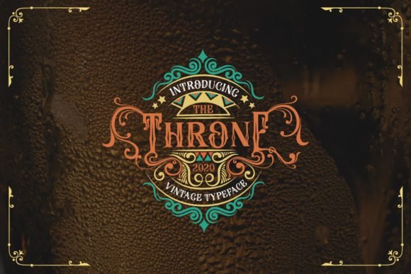
The Throne Font is a heavyweight blackletter with extended serifs, interlocking strokes and dense counters that call back to medieval textura and Victorian revival styles. Its capitals carry ornamental flourishes while lowercase forms maintain a tight, compact rhythm suited to logos and labels. The design gives rock posters and whiskey packaging an authoritative, old-world presence.
OpenType ligatures and alternate capitals let you craft period-appropriate headlines and retail identity marks without adding extra ornament. Because of its density, set generous leading and test at signage sizes; when paired with a muted sans for body copy, The Throne produces high-contrast compositions that read as historic yet contemporary.
My Recommendation: I pick The Throne when a brief calls for historic weight and bold personality-ideal for whiskey labels, tattoo-style branding, rock band badges and boutique apparel tags. The font’s texture performs well on textured paper and dark backgrounds, and its ligatures simplify ornate logotype work. Use at display sizes with careful spacing to keep the forms legible and impactful.
10. Swordstone Font
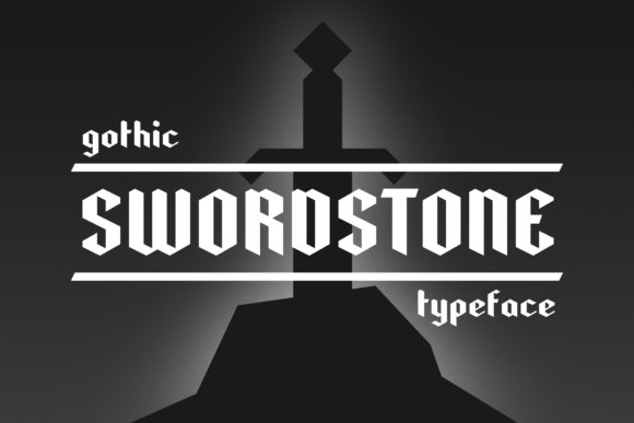
Swordstone is a display font that mixes gothic blackletter cues with playful modern curves, producing letterforms that feel both medieval and slightly whimsical. Sharp terminals and elongated serifs give it an old-world silhouette while rounded bowls and unexpected counters soften the mood. For designers compiling Fonts for gothic design, Swordstone bridges dramatic headline presence with approachable shapes suitable for posters, fantasy covers, and artisan labels.
It includes stylistic alternates, a handful of ligatures, and tight kerning that hold up at large sizes; small caps or multiple weights aren’t necessary because the ornamentation carries the voice. Pair it with a neutral sans for body text or with textured backgrounds to enhance the mystical character. The font prints clean on dark stock and responds well to gold foil, distressed ink, and screen designs for social headers.
My Recommendation: I reach for Swordstone when a project needs drama without feeling overwrought. Its whimsical touches let headlines read as playful instead of forbidding, which works great for indie fantasy books, event posters, and boutique product labels. Use it large, add texture or metallic effects, and keep body copy in a simple sans to let the letterforms breathe.
11. Danger Gothic Font
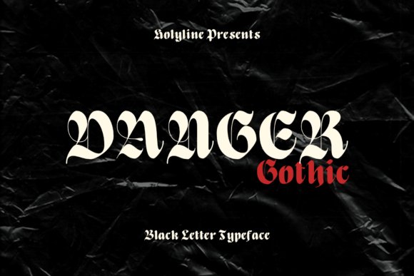
Danger Gothic is a casual blackletter font that flattens some Old English harshness into friendlier, more open shapes. The x-height is slightly taller than historical models and stroke terminals are softened, which improves legibility on packaging and social posts. Its personality reads as stylish and a little rebellious, making it suitable for magazine headlines and apparel branding.
The font comes with alternate caps and decorative swashes that can be mixed sparingly to avoid clutter; careful tracking ensures words remain readable at medium sizes. Use it over textured backgrounds, paired with condensed sans serifs, or as a signature logotype where you want vintage attitude without heavy ornamentation. It prints confidently on paper and vinyl and holds detail when embossed or debossed.
╰┈➤ Download Danger Gothic Font
My Recommendation: I use Danger Gothic when I want blackletter attitude that won’t sacrifice clarity. It’s a reliable choice for streetwear labels, editorial mastheads, and event posters where a historic flavor is desired without full formality. Keep embellishments minimal and let contrast and color carry the mood.
12. Meltta Font
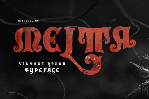
Meltta favors dense, high-contrast strokes and sharp hairlines that channel a traditional gothic blackletter spirit suited to rock and vintage aesthetics. The capitals are ornate but controlled, with repeatable ligatures that add rhythm to display lines and packaging copy. When applied to whiskey bottles or band merch, it reads as heritage-driven and resolute, lending a handcrafted sense.
Technically, Meltta benefits from generous leading and larger point sizes so its details remain distinct; small-format use demands simplified treatment or a companion sans for captions. Consider pairing with warm paper stocks, heavy varnish, or metal embossing to amplify the tactile qualities that the letterforms suggest. The font stands up to distressing effects and looks particularly strong in monochrome or limited palette identities.
My Recommendation: I pick Meltta for projects that need a concentrated gothic voice – labels for spirits, concert posters, and retro product lines are ideal fits. Its dense contrast and ligature system give designs a crafted, tactile feel that responds well to print finishes. Treat it as a display face and reserve simpler faces for body text.
13. Poison Freak Font
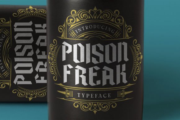
Poison Freak is a raw, angular blackletter specimen that sits squarely among Fonts for gothic design; its dense strokes and spiky terminals evoke vintage occult posters and rock label aesthetics. The letterforms favor tight counters and high contrast between verticals and ornaments, producing a silhouette that reads aggressively at display sizes. Small caps, alternates and a deliberately textured finish make it useful for logotypes, labels and poster headlines.
When set large, Poison Freak preserves intricate detail and the kerning is tuned for compact, assertive headlines, so it holds up under print effects like foil or emboss. Pair it with a clean sans or a restrained script to avoid visual clutter while keeping the gothic typography voice intact. Ideal uses include whiskey packaging, band identity, merch and retro horror posters where vintage grit matters.
╰┈➤ Download Poison Freak Font
My Recommendation: I reach for Poison Freak when a brief calls for heavyweight blackletter that still reads on packaging and posters. Its alternates and texture options let me craft compact logotypes that feel aged and aggressive without losing clarity. Use it on spirits labels, rock band marks and retro-themed collateral when you want a strong gothic character with practical legibility.
14. Primalfang Font
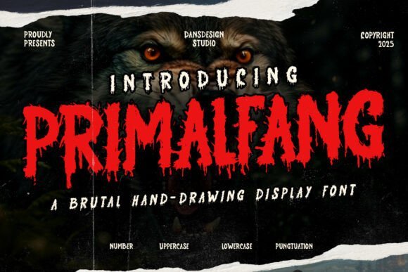
Primalfang is a hand-drawn horror display font that blends graffiti roughness with blackletter bones, producing letterforms that look scored by brush and blade. Jagged terminals and uneven stroke widths give the face an almost violent rhythm, perfect for Halloween headers, punk zines and death-metal artwork. The type carries a raw, kinetic personality that dominates anything placed beside it.
Technically PUA-encoded with full numerals, punctuation and multilingual support, Primalfang drops into most design workflows without fuss. Treat it as a headline-only resource and pair it with simple, high-contrast layouts or distressed imagery to keep the mood cohesive. Alternate glyphs let you dial the chaos up or down depending on whether you want sheer menace or just a hint of grit.
My Recommendation: I use Primalfang when a project needs visible attitude-album sleeves, horror titles and underground flyers are its natural habitat. Its hand-rendered strokes punch through busy art and photograph well on textured print runs. Keep it for display use and balance it with cleaner supporting type so the composition doesn’t become unreadable.
15. Wings Gromeba Font
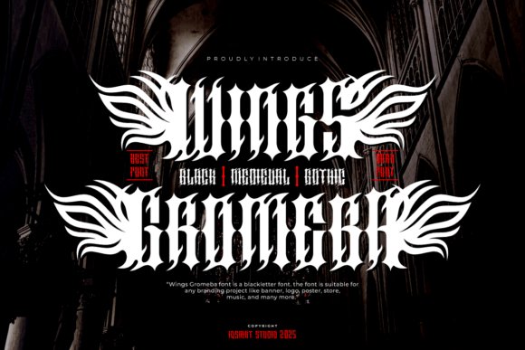
Wings Gromeba channels dramatic medieval calligraphy with spiked embellishments that push it into contemporary metal and dark-fashion territory. The family offers black, medium and gothic styles, so you can choose an aggressive primary mark or a more restrained headline treatment while keeping the same voice. Ornamented terminals are present but controlled, giving the face theatrical presence without collapsing into chaos.
Gromeba is built to perform across band visuals, merchandise and identity systems, handling large-format printing and lower-resolution screens thanks to clear counters and solid shapes. It pairs well with narrow sans types or subtle textures to preserve hierarchy and legibility. Use the heaviest weight for central logos and the lighter cuts for subheads, badges or decorative lockups.
╰┈➤ Download Wings Gromeba Font
My Recommendation: I recommend Wings Gromeba when the brief demands theatrical blackletter with personality-excellent for metal bands, tattoo studios and edgy apparel labels. The multiple weights allow me to design layered systems where a bold wordmark anchors the look and lighter styles provide readable support. Apply it sparingly and contrast with simple typography so the design retains clarity and punch.
16. King Battle Font
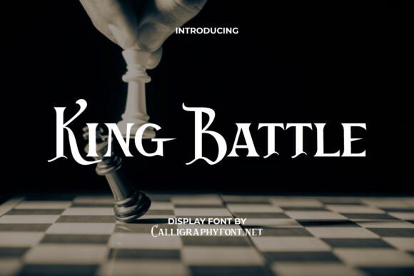
King Battle revives medieval blackletter traits with broad, chiseled strokes and compact counters while trimming ornamental excess so letterforms stay legible at display sizes. It sits squarely among Fonts for gothic design by balancing regal weight and contemporary proportions, offering alternate capitals and tight ligatures that read as both historic and deliberate on posters and logos.
Apply King Battle to headlines, album covers, packaging, and event branding where a noble, slightly weathered voice is needed; pair it with a neutral sans for body copy to keep hierarchy clean. The face responds well to embossed or foil finishes and benefits from subtle kerning adjustments and stylistic sets to prevent crowded interiors when scaled large.
My Recommendation: I turn to King Battle when a project needs medieval drama that still reads clearly across media. Its strong silhouettes make it reliable for posters and premium packaging, and the alternates let me add decorative initials without rebuilding layouts. Use it for festival branding, historical fiction covers, or any logo that asks for regal grit.
17. Gold and After Font
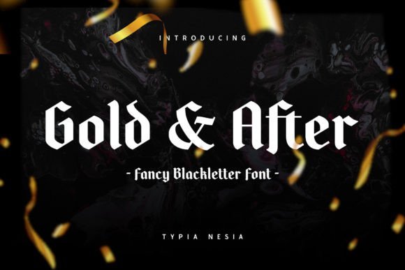
Gold and After channels heavyweight blackletter forms with angular stems and pronounced diamond terminals that feel like hand-cut metal type. The face includes flourished capitals and bold contrast, giving headlines a theatrical, almost heraldic presence that holds up in both print and short-form digital graphics.
This typeface shines on beer labels, band merchandise, editorial covers, and themed event posters where gothic typography must feel authentic and tactile; balance its density with ample negative space and restrained backgrounds. Treat it as a display-only resource and use stylistic sets to swap in decorative alternates for initials rather than running long paragraphs of text.
╰┈➤ Download Gold and After Font
My Recommendation: I reach for Gold and After when a design needs raw blackletter attitude-perfect for craft labels, metal or punk album covers, and Halloween promotions. The ornamental caps give words a sculptural quality that photographs well on textured paper. Keep its use sparing to preserve impact and avoid legibility issues in body copy.
18. Tattoo Font
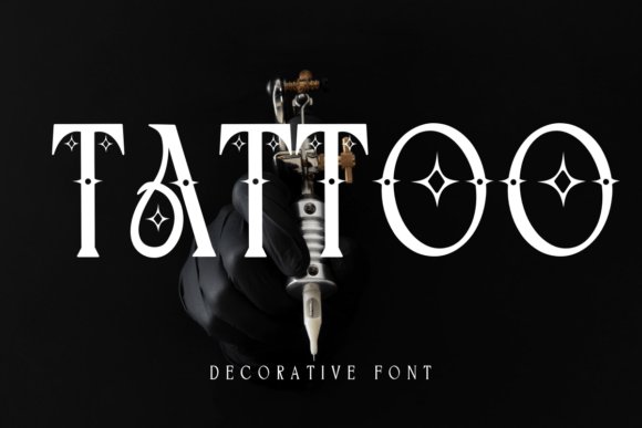
Tattoo Font condenses traditional ink-shop lettering into a bold, decorative display face built around heavy serifs and diamond-shaped accents. Tight counters and strong stroke contrast give it an emblematic quality, and a set of alternates mimics hand-drawn variations that add character without becoming fussy.
Use Tattoo for studio signage, gig flyers, merch, and logos where a gritty, handcrafted look must read from a distance; pair it with a plain sans or a restrained slab to preserve visual hierarchy. For print, consider adding distress or ink traps; on screen, test tracking at various sizes to prevent decorative elements from colliding.
My Recommendation: I pick Tattoo Font when a brief calls for bold, inked personality-shop identities, band posters, and limited-run apparel benefit most. Its decorative shapes hold up in silhouette and scale well for banners. Treat stylistic alternates like sparing ornaments to maintain clarity while keeping attitude.
19. Blackdove Font
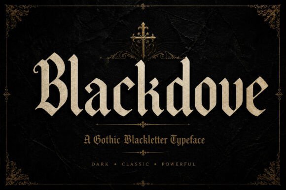
Blackdove is a bold blackletter-inspired display font that balances sharp, jagged terminals with surprisingly modern spacing. Blackdove belongs on any shortlist of Fonts for gothic design because its heavy strokes, ornate ligatures and alternate glyphs summon old-world calligraphy while staying legible at headline sizes. The face includes upper- and lowercase forms, numerals and punctuation, plus decorative swashes that add theatrical emphasis without sacrificing clarity.
On paper and on screen the type holds its presence: tight kerning and crisp vector outlines keep thin counters from filling in at smaller display sizes, while OTF/TTF and webfont support make it practical for logos, album covers, poster headlines, fashion labels and tattoo-style branding. Pair it with a restrained sans for body copy to avoid visual competition, and consider textured backgrounds or metallic inks when producing premium packaging or merch to highlight its gothic character.
My Recommendation: I would reach for Blackdove when a project needs a dramatic, blackletter flavor without becoming unreadable. Its ornamental alternates give a bespoke feel that suits metal album art, boutique goth fashion labels and event posters. Use it for headline-driven layouts where strong personality and historic nods are the goal.
20. Agenda Fantasy Font
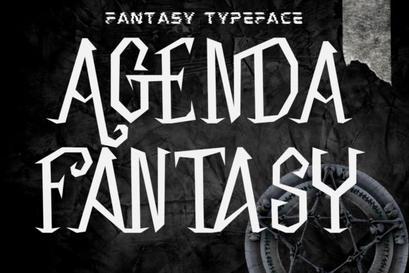
Agenda Fantasy is an expressive serif display that leans into spooky, hand-lettered character with uneven terminals and slightly distressed edges. The letterforms have exaggerated ascenders and quirky terminals that read as playful yet eerie, making the face a go-to for seasonal designs, horror-themed branding and fantasy titles where texture and mood matter more than neutrality. It supports headline work well and brings instant personality to a simple layout.
This font performs best at larger sizes where its decorative quirks can breathe; tighten tracking for posters and loosen it for apparel prints to maintain legibility. It pairs well with muted palettes, grain overlays and ornamental frames for movie posters, game splash screens, t-shirts and editorial covers that need a handcrafted, Gothic-tinged voice. Adjust kerning and use stylistic alternates sparingly to keep emphasis on key words or logotypes.
╰┈➤ Download Agenda Fantasy Font
My Recommendation: I gravitate toward Agenda Fantasy for Halloween campaigns, indie game promos and boutique merch that need a spooky, handcrafted tone. The textured terminals and strong personality help headlines cut through noisy visuals. It’s ideal when you want theatrical, seasonally tuned typography rather than a neutral display face.
21. The Simbiod Font
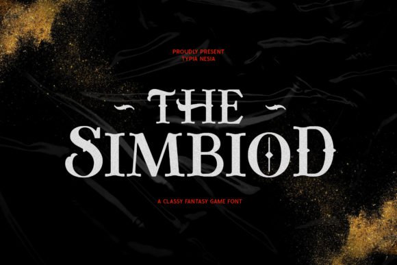
The Simbiod presents a refined fantasy display serif with crisp terminals and subtle medieval cues that avoid feeling overwrought. Its narrow counters and tapered strokes give titles a stately presence suitable for RPG branding, book covers and cinematic posters where a slightly historic, elegant attitude is required. Alternates and elegant ligatures expand expressive options while keeping the primary alphabet tidy for set pieces and logos.
Designed for headline and title use, The Simbiod reads clean in print and on-screen when tracked carefully; use hinting-aware webfonts for tighter displays. It pairs effectively with a neutral sans for body text or with ornamental borders and map-style flourishes for tabletop and game collateral. The face supports multilingual characters, which makes it practical for international releases and packaged editions that demand a period-flavored but readable look.
My Recommendation: I’d choose The Simbiod when a project needs a noble, game-ready serif that still feels contemporary. Its restraint and classy alternates work beautifully for fantasy book jackets, RPG UI headers and cinematic title treatments. Use it where clarity and historic suggestion must coexist.
22. Blackleaf Font
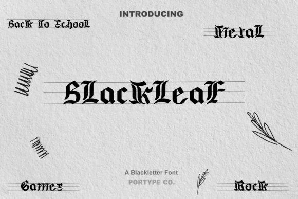
Blackleaf is a bold blackletter display with steep, fractured strokes and elaborate terminal flourishes that read like revived medieval calligraphy. The heavy ink traps and pointed serifs create dramatic silhouettes ideal for posters, album covers, and signage where gothic gravitas is the goal. It reads best at large sizes; at text sizes details can clog, so use sparingly for headlines where ornamentation can breathe. Fonts for gothic design need that balance between historical authenticity and modern spacing; Blackleaf offers precisely that.
OpenType alternates and discretionary ligatures let you swap in simpler letterforms when legibility matters, and kerning pairs are thoughtfully refined to avoid collisions between archaic shapes. The font’s rhythm favors tight tracking with occasional counters to accentuate its profile, and it supports extended Latin sets for multilingual work. Pair with a neutral grotesque or a restrained serif for body copy so the ornamentation doesn’t compete. Use subtle distressing or textured backgrounds to amplify mood without obscuring form.
My Recommendation: I turn to Blackleaf when a design needs a palpable gothic presence-metal album covers, boutique labels, or theatrical posters where a historic voice matters. Its ornamental capitals give instant identity while alternates keep short copy legible. Use it at display sizes and pair it with a clean sans for running text to preserve hierarchy and readability.
23. Jhelo Font
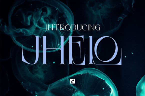
Jhelo is a serif with gothic-inspired details, notable for an elegant ligature system and slightly condensed proportions that lend formality without stiffness. It borrows tapered terminals from historic types while tempering x-height and stroke contrast to behave well in editorial spreads and invitations. Abundant ligatures and stylistic alternates let designers nudge the voice from refined to theatrical with minimal fuss. The overall effect is a serif that nods to gothic flavor while staying practical for contemporary layouts.
Because its cadence leans slightly tight, increase tracking for long paragraphs and reserve heavier stylistic sets for display work. It pairs well with a simple sans for captions and photography-led pages where the serif supplies character and the sans preserves legibility. For print, Jhelo’s hairlines hold up on quality stock; on screen, use hinting or variable font controls if available to keep detail intact at small sizes. Use ligatures sparingly in body copy so readability stays high.
My Recommendation: I use Jhelo when a project wants tasteful gothic hints without full ornamentation-magazine headings, boutique identities, and formal invites work well. Its ligatures provide instant personality without bespoke lettering, and it scales cleanly from page to poster. Pair it with minimalist layouts so those subtle historic cues can breathe.
24. Rockmosh Font
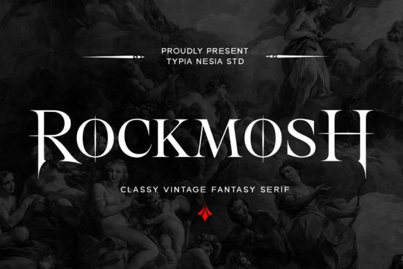
Rockmosh reads like a theater of shadows: rough-textured serifs, irregular terminals and exaggerated stress create an immediate horror-fantasy mood perfect for album art, game titles, and seasonal campaigns. The type carries handcrafted energy-inked edges and uneven baselines suggest hand-lettering rather than a sterile display face, giving headlines raw personality. Use it large and unapologetic; it thrives alongside stark imagery, distressed surfaces, or neon contrasts that amplify its theatricality. At small sizes, switch to cleaner alternates to keep words legible.
Technically, Rockmosh includes alternate sets and stylistic swashes that allow a shift from subtle eeriness to full-on macabre while kerning is tuned to prevent dramatic shapes from colliding. It’s ideal for band marks, poster headlines, or book covers where aggressive attitude is required; pair with a simple slab or narrow sans for supporting copy. For apparel and merchandise, convert outlines and test on fabric to preserve distressed detail. Strong color choices-deep black, blood red, muted ochre-will push the mood where you need it.
My Recommendation: I pick Rockmosh when a project needs immediate theatrical edge-horror film posters, metal band identities, or immersive game headers. Its handmade roughness delivers attitude right away, and alternates let me manage legibility without losing character. Keep it for headlines and identity marks rather than extended text for the best impact.
25. Dark Royalty Font
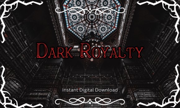
Dark Royalty feels like a theatrical take on medieval serif work: high-contrast strokes, pointed terminals and ornamental flairs that read as ceremonial and ominous at once. When curating Fonts for gothic design, this face stands out for its ability to read regal without losing menace; small caps and decorative swashes give it headline authority while sharp counters keep letterforms legible in tight layouts.
Use it large for book titles, posters or ornate logos where the mood must tilt toward haunted aristocracy; avoid it for dense body text because the details demand breathing room. The font’s kerning is tuned for display use and its alternate characters let you craft initials and decrees that feel hand-inscribed rather than mass-produced.
╰┈➤ Download Dark Royalty Font
My Recommendation: I’d pick Dark Royalty when a project calls for theatrical history with a gothic heartbeat – think vampire novels, period film posters, or gothic wedding invitations. Its ornamentation gives logos a noble edge while the high contrast keeps headings dramatic and readable. I often pair it with a simple sans for body copy so the ornamented caps can shine without competing with text.
26. Lycolips Font
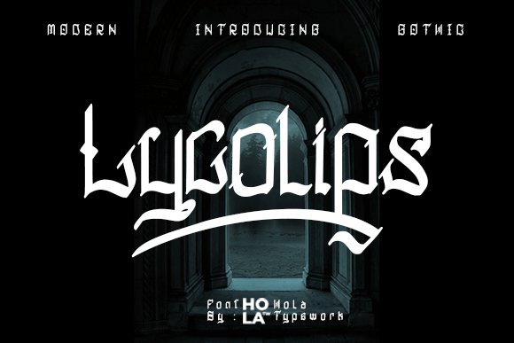
Lycolips modernizes blackletter by stripping excess ballast and refining spine curves, producing a version of gothic typography that feels precise rather than antiquarian. The PUA-encoded glyph set and alternate swashes offer rapid access to contextual ligatures, which is handy for branding, packaging or tattoo lettering where tight control over stylistic alternates matters.
Because its strokes are compact and angular, Lycolips performs best at medium-to-large sizes where the heavy forms can breathe and the eye can track intricate joins. Use it for band art, boutique logos or editorial headings where a cathedral-like presence needs to be readable and confidently contemporary.
My Recommendation: I reach for Lycolips when a design needs the gravity of blackletter without historical clutter – it’s clean enough to work on merchandise and bold enough for record sleeves. The PUA features save time when crafting custom ligatures, and its tightened proportions make it a strong choice for square or vertical layouts. Check license terms for commercial use and test legibility at intended sizes before committing.
27. Economic Promote Font
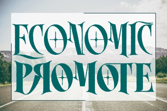
Economic Promote is a serif logo font built around clever ligatures that convert simple letter pairs into distinctive marks, giving names a handcrafted signature quality. Its base serif forms are restrained, which lets the bespoke ligatures become the focal point for wordmarks, monograms and poster headlines without overwhelming supporting design elements.
The font works exceptionally well in identity systems where single-line logos or stacked initials need personality; small caps and alternative pairs streamline monogram creation while keeping spacing consistent. For projects that demand a gothic nod without full blackletter weight – boutique brands, band merchandise, or fantasy posters – it offers a compact, emblematic route that scales neatly across media.
╰┈➤ Download Economic Promote Font
My Recommendation: I would use Economic Promote when a logo needs personality from letterforms rather than added graphics – its ligatures build instant character. It’s especially useful for apparel, band branding, or retro-fantasy posters where you want a handcrafted, slightly severe look. My workflow pairs it with a plain sans for any supporting text, so the ligature-driven logotype remains the visual anchor.
28. Vorvalla Font
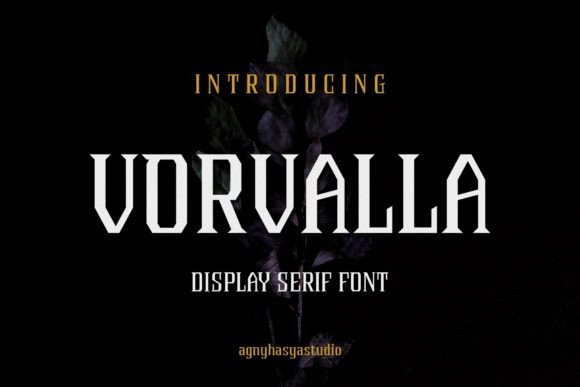
Vorvalla is a gothic decorative serif that channels late-medieval engraving through condensed stems and ornate terminals. Its high-contrast strokes, bracketed serifs and a broad set of contextual alternates create a formal, baroque atmosphere ideal for display work. Fonts for gothic design gain from Vorvalla’s expressive ligatures and swash capitals, which add handcrafted flourish without overwhelming a layout.
Because the family is PUA encoded, every stylistic alternate, discretionary ligature and special glyph sits on accessible code points so you can use them without advanced OpenType support. Apply Vorvalla to book covers, boutique packaging, editorial mastheads and event invitations; pair it with a neutral sans for body copy and increase tracking when used at very large sizes to preserve legibility.
My Recommendation: I reach for Vorvalla when a title or label needs historical weight with decorative polish. The PUA glyphs make experimenting fast, and the swashes let me build individual logotypes without heavy vector edits. It shines on covers, premium packaging and editorial headlines where a gothic tone should feel crafted rather than forced.
29. Lamphor Font
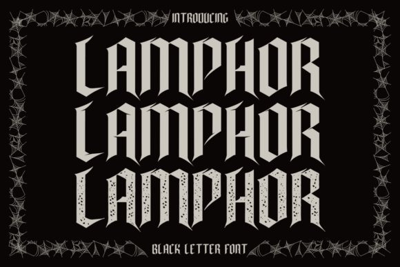
Lamphor is a blackletter face built around acute terminals and angular strokes that favor a hostile, ritual mood. The compact, serrated letterforms generate dense textures that read as raw and aggressive at large scale, making the typeface well suited to album art, posters and theatrical titles. Spiky ascenders and carved diagonals intensify the visual impact while tight counters produce a claustrophobic energy.
The three offered styles-regular, display and texture-let you dial tone from crisp print to weathered, hand-inked surfaces: use the display cut for sharp legibility, then layer the texture version for grit. Lamphor performs best at headline sizes and in bold lockups; allow ample leading and avoid using it for continuous text to keep letter details intact.
My Recommendation: I use Lamphor when a project needs an aggressive, nocturnal attitude, such as metal album covers, horror posters or immersive event identities. The texture layer gives an authentic distressed finish without manual distressing, which saves production time. For logos I simplify alternates and tighten kerning to preserve readability in small applications.
30. Glorious Victory Font
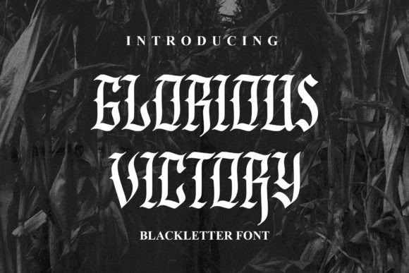
Glorious Victory blends Fraktur architecture with Old English ornamentation into a blackletter that balances flourish and structural clarity. Ornate capitals sport elaborate swashes and hooks while the lower-case forms preserve readable counters, yielding a type that carries ceremonial weight without collapsing into illegibility. The overall effect is theatrical and assertive, suited to apparel, posters and cinematic titles.
Built-in special characters and alternate glyphs allow designers to compose varied headings and logotypes without redrawing letterforms; swap initials, ligatures and swash variants to create bespoke wordmarks. Use Glorious Victory for large display applications-embroidered patches, poster art or limited-run packaging-and keep surrounding elements minimal so the ornate shapes remain the focal point.
╰┈➤ Download Glorious Victory Font
My Recommendation: I choose Glorious Victory when a project needs bold visual authority with a handcrafted feel. Its alternates make it easy to craft distinct lockups for branding or merchandise, and the letter weight reproduces well on both fabric and paper. Great for streetwear labels, film title treatment and any design that wants a defiant, historic character.
31. Jhenic Font
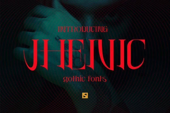
Jhenic is an all-caps blackletter-inspired serif that blends traditional gothic strokes with refined modern proportions; its alternate letterforms and swash options let headings read ornate without collapsing into illegibility. If you’re assembling Fonts for gothic design, Jhenic stands out because every character includes stylistic variants that create rhythmic repetition or deliberate contrast across a title line. Use it large on posters, magazine mastheads, or invitations that lean darkly elegant.
Technically it behaves like a display face. It’s clear at headline scale, responds well to kerning adjustments, and performs best when paired with a plain sans for body copy. The alternates allow quick customization so you can shift tone from solemn to dramatic across branding, packaging, and editorial spreads without losing readability.
My Recommendation: I reach for Jhenic when a project needs gothic character without collapsing into ornament. The breadth of alternate forms makes it simple to tune mood-from stately to theatrical-without commissioning custom lettering. Great for editorial headers, premium event invites, and brands that want a historic voice with a clean, modern finish.
32. Giant Hostel Font
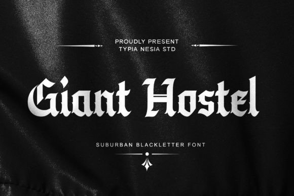
Giant Hostel reads like a streetwise blackletter with aggressive strokes and decorative flairs, built for bold display work such as posters, band logos, and seasonal campaigns. It carries a suburban grit that pairs well with distressed textures and high-contrast layouts, making it an obvious pick for Halloween promotions, hardcore music branding, and urban apparel. The font’s energy is most effective at large sizes where its ornamental shapes can breathe.
Use tight tracking and sparse leading to keep the lettering compact on merchandise, and reserve it for headlines or short phrases rather than body copy to avoid readability issues. It also works nicely with heavy textures or torn-edge treatments to amplify a DIY vibe. Combining Giant Hostel with minimalist elements-clean grids and simple color palettes-lets the type command attention without overwhelming the composition.
╰┈➤ Download Giant Hostel Font
My Recommendation: I pick Giant Hostel for projects that demand attitude-streetwear labels, concert posters, or seasonal event art where raw personality matters. Its decorative blackletter forms translate well to apparel and posters where scale hides fine detail. Keep usage short and bold, and balance it with restrained layouts so the type remains the focal point.
33. Glory Fades Font
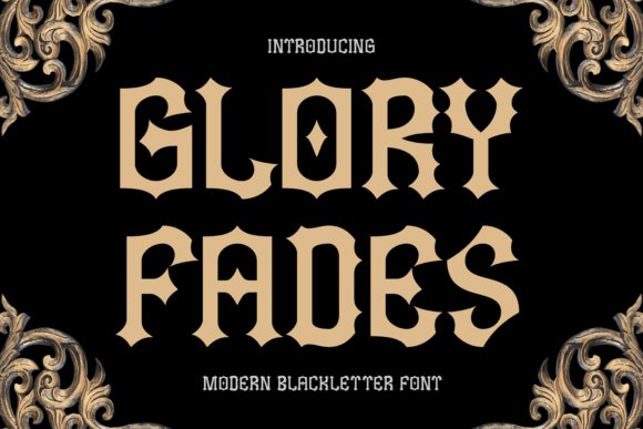
Glory Fades is a modern blackletter whose diamond-shaped counters and sharply pointed serifs give every glyph a jewel-like, aggressive silhouette suited to high-impact identities. The balance between ornament and weight lets it reference historic gothic scripts while speaking to metal, fantasy, and tattoo aesthetics; it reads as theatrical and authoritative in single-word logos or album covers. The rhythm of its shapes creates a distinctive texture when set tight across a headline.
It performs particularly well in print and on merchandise, where strong contrast and precise reproduction preserve the pointed details. On-screen use benefits from careful anti-aliasing and slightly increased tracking. Pair Glory Fades with muted backgrounds and simple sans serifs for captions, and reserve alternate glyphs or all-caps settings for display treatments that demand bold presence.
My Recommendation: I’d reach for Glory Fades when I need hard-edged gothic flair-band artwork, fantasy covers, and tattoo-inspired branding are natural fits. The pointed serifs and compact counters deliver a memorable silhouette that prints and merch reproduce cleanly. Use it prominently, tweak spacing, and let it anchor a minimal supporting palette to maximize impact.
34. Sky Citizen Font
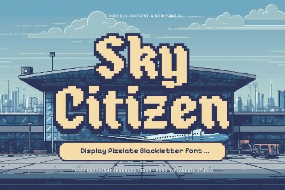
Sky Citizen takes blackletter into a pixelated, digital register: each glyph is built from blocky units that read like a bitmap version of medieval calligraphy. As one of the more unusual entries among Fonts for gothic design, it balances historical letterforms with a cybernetic, arcade-era aesthetic, making every headline feel like a crest for a virtual city.
This all-caps display font performs best at large sizes where its modular construction and tight counter shapes can be appreciated; tweak letterspacing for tighter compositions and use high-contrast color palettes or subtle glow effects to amplify its techno-gothic vibe. Ideal for game titles, posters, and streetwear badges, it also responds well to bitmap textures or animated raster effects for motion graphics.
My Recommendation: I would reach for Sky Citizen when I need a headline that reads as both medieval and digital-perfect for cyberpunk game covers, neon-fused posters, or edgy apparel. Its pixel-block construction gives logos a retro-tech feel that stands out on screens and merch alike. For best results, reserve it for large display use and pair it with a clean sans to keep body text legible.
35. Nyx Arstaily Font
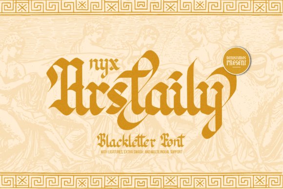
Nyx Arstaily channels classic blackletter virtues with sharply drawn strokes and pronounced terminals that evoke handcrafted ink on parchment. The letterforms lean into dramatic curves and pointed angles, giving a refined medieval air that reads as artisanal rather than ornate; stylistic alternates and ligatures deepen its historical character.
Use Nyx Arstaily for editorial mastheads, craft packaging, or event posters where a vintage gothic tone is required; its temperament rewards high-resolution printing and careful kerning. Pair it with neutral supporting type and consider using vector outlines for spot treatments or embossing to preserve those crisp hairlines in reproduction.
╰┈➤ Download Nyx Arstaily Font
My Recommendation: I tend to choose Nyx Arstaily when a project needs an authentic period feel without feeling fussy-book covers, boutique labels, or festival posters are ideal. Its sharp strokes project authority while stylistic sets let you finesse personality. Treat it as a display face and match it with a restrained sans for modern balance.
36. Black Squad Font
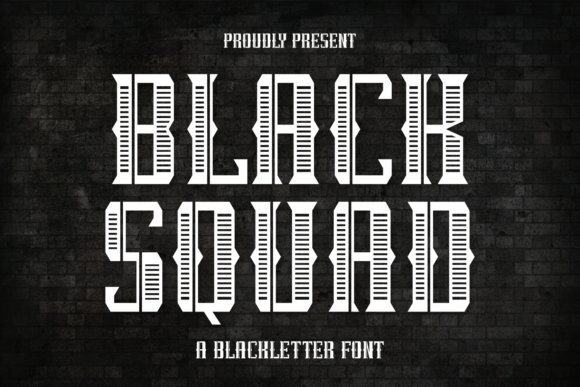
Black Squad leans into a muscular blackletter vocabulary with high-contrast strokes and hard-edged terminals that read bold and confrontational. The design mixes traditional gothic forms with a stripped-back, contemporary silhouette that feels made for impact: letters sit heavy, with aggressive curves and tight counters that demand attention.
Best applied to band logos, apparel graphics, tattoo flash, and poster headlines, Black Squad thrives when textures or distressing are added to give it grit. For screen printing or embroidery, convert to outlines and test at target sizes-its weight can bite into small counters, so reserve it for short lines and strong compositions.
My Recommendation: I reach for Black Squad when the brief calls for attitude and presence-think streetwear drops, metal gig posters, or identity marks that need to read loud. It cuts through busy visuals and pairs well with worn textures or badge treatments. Use it sparingly for main titles and keep supporting text simple to preserve clarity.
37. Thorema Font – Fonts for gothic design
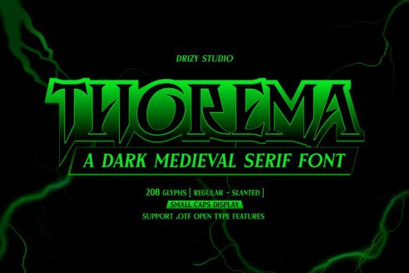
Thorema channels a dark medieval serif voice with pointed terminals, high contrast strokes, and a crisp modern tension that reads strikingly at display sizes. Fonts for gothic design projects benefit from its theatrical shapes and optional swash alternates, which let designers craft album covers and band logos with an archaic yet futuristic attitude. The face balances ornament and clarity through OpenType ligatures and refined kerning, so ornate headlines remain legible without losing their dramatic edge.
In practice, Thorema becomes a headline specialist: its tapered serifs and intricate curves command attention while resisting visual clutter when paired with a pared-back sans. Use it for posters, hero banners, and merch where a moody, storied presence is required; avoid long blocks of text and instead lean into bold, short-wordmarks and typographic monograms. Small tweaks to tracking and selective alternates unlock nuanced variations for logotypes and layered compositions.
╰┈➤ Download Thorema Font – Fonts for gothic design
My Recommendation: I’d use Thorema when a project calls for theatrical, historic character with a modern bite-think gothic metal album art or dark electronica branding. Its swash options and tight display shapes make it perfect for logos and poster headlines, but I keep body copy elsewhere to preserve readability. Paired with a geometric sans it creates a believable contrast that keeps layouts dramatic without looking fussy.
38. Famblack Font
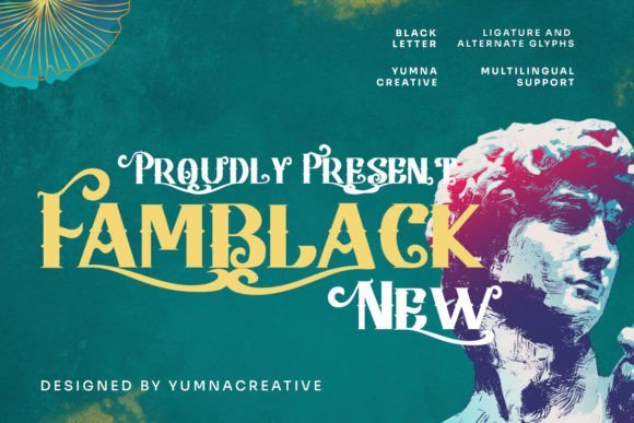
Famblack reinvents blackletter by smoothing junctions and tightening counters, giving traditional Gothic letterforms a cleaner, more contemporary silhouette. The result is a compact, emblematic display face that reads strongly on posters, labels, and large-format signage where decorative weight matters more than long-form legibility. OpenType alternates and discretionary ligatures provide subtle typographic variety for bespoke wordmarks and headline treatments.
Because Famblack is dense and ornamented, careful spacing and measured stroke contrast are necessary to prevent visual crowding-slightly increased tracking often unlocks better readability. It performs beautifully on apparel graphics, festival posters, and editorial covers that need historic references without heavy ornamentation. Pair it with textured backgrounds or monochrome photography to emphasize its Gothic heritage while keeping compositions fashion-forward and assertive.
My Recommendation: I reach for Famblack when a brand needs Gothic attitude without overwhelming ornament-great for T-shirt lines, boutique labels, and event posters. I open up the tracking for longer headlines and rely on alternates to tune the look for logos. Combining it with a neutral sans keeps visual hierarchy clear while letting Famblack play the dramatic lead.
39. Gothic Enemy Font
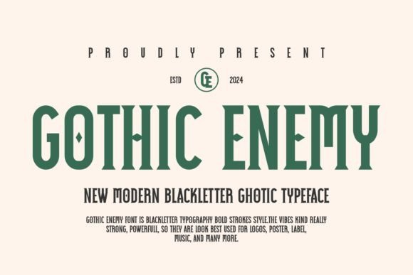
Gothic Enemy is a bold blackletter typeface built around exaggerated strokes and a tight rhythmic flow that prioritizes immediate visual impact over subtlety. Its heavyweight forms carve decisive shapes that dominate posters, stickers, and single-word marks, making it an economical choice for designers seeking a powerful Gothic flavor. The straightforward construction also adapts well to screen mockups and layered texture work where legibility needs to hold up at a glance.
As a free or freely shared option, Gothic Enemy is ideal for rapid concepting and short-run projects, but designers should confirm licensing for commercial use before finalizing files. Best results come from all-caps headlines, generous tracking for multi-word lines, and pairs with decorative borders or metal textures to accentuate the font’s forceful personality. Avoid using it for body copy and focus on high-impact, compact compositions instead.
╰┈➤ Download Gothic Enemy Font
My Recommendation: I keep Gothic Enemy in my toolkit for quick, high-contrast mockups and experimental posters where budget or time is limited. It provides an immediate Gothic presence that reads well at display scale, and it’s handy for proof-of-concept work before switching to a commercial license. For client-facing pieces I treat it as a bold accent-perfect for one-word marks, stickers, or limited-edition merch where attitude matters most.
40. Gothic Cathedral Font
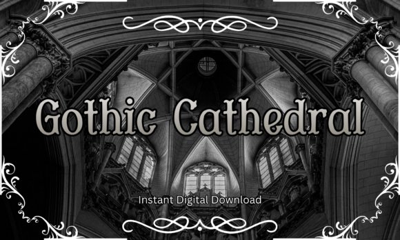
Gothic Cathedral Font channels medieval architecture through tall, flaring serifs and carved terminals that feel sculpted rather than mechanical. Its letterforms echo pointed arches and traceried ornament, making it an expressive choice for posters, book covers, and identity work that needs historic drama; Fonts for gothic design collections will find this face particularly useful for headline-level storytelling. The decorative elements function as built-in flourishes so you can build atmosphere without adding extra illustrations.
The distribution includes TTF and OTF files with full case, numerals, punctuation, alternates and a handful of ligatures for display work. It behaves predictably in vector workflows and opens cleanly in Procreate, Illustrator, and Cricut Design Space; prefer larger point sizes and some tracking to preserve the carved details. It prints crisply on paper, vinyl, and apparel and shines in single-word logotypes or chapter titles rather than long text blocks.
╰┈➤ Download Gothic Cathedral Font
My Recommendation: I reach for Gothic Cathedral when a project needs an unmistakable period voice-book jackets, gothic wedding invites, or atmospheric posters. The decorative serifs give designs energy while staying legible at display sizes. I also use it for laser-cut signage and apparel because the forms hold up well in physical production.
41. Black Male Font
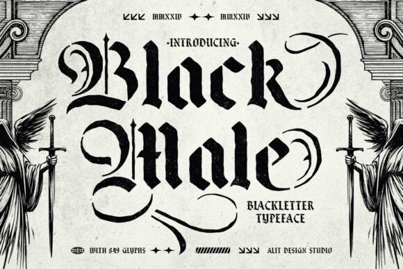
Black Male Font is a blackletter stencil that pairs ornamental calligraphic strokes with engineered cutouts, producing letter shapes that survive screen printing and laser cutting. With an extensive set of 849 glyphs including alternates, swashes, and ligatures, it gives designers many options for expressive headlines, apparel branding, and tattoo layouts. The strategically placed stencil breaks preserve letter integrity on metal, wood, and vinyl, so functionality and historical character coexist.
OpenType features enable quick swaps between stylistic alternates and chained ligatures, and kerning is tuned for headline use rather than body copy. The glyph set supports extended Latin characters, which helps when working on multilingual signage and merch. Use it at medium to large sizes where the stencil personality reads clearly; it performs best in tactile production methods like engraving and screen printing rather than small digital captions.
My Recommendation: I pick Black Male when a brief needs a gritty, old-world attitude that also has to be manufacturable-stenciled murals, laser-cut signage, or streetwear labels are ideal. The built-in gaps make cutting and printing predictable, while the deep glyph set keeps wordforms interesting. It’s a great option when you want bold blackletter presence that stands up in real-world production.
42. Young Dark Font
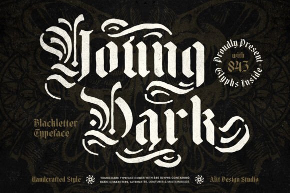
Young Dark Font fuses traditional blackletter strokes with a raw stencil attitude to produce a bold, rebellious display face that reads well over heavy textures and loud layouts. Its sharp counters and high-contrast stems suggest handmade carving, which suits album covers, posters, and clothing graphics in underground music scenes. The overall effect is forceful and expressive without relying on excessive ornamentation.
The family includes alternates and contextual forms to avoid repetition and to create a more handcrafted look, and it pairs well with distressed overlays or halftone screens for print. It thrives at display sizes; tightening leading and adjusting tracking keeps word rhythm tight and legible. For balance, combine it with a clean sans for body text so hierarchy remains obvious and readable.
My Recommendation: I use Young Dark for band posters, album art, and gritty merchandise because it delivers an immediate emotional impact and reads from a distance. The stencil cues make it production-friendly for screen printing, and the alternates let me craft bespoke-looking headlines. It’s my go-to when I want loud, carved typography with attitude.
43. Vladmere Font
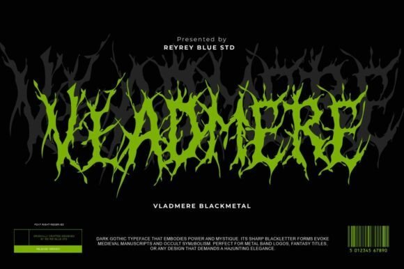
Vladmere is an extreme blackletter typeface built for Fonts for gothic design, pulling visual cues from black metal band logos, medieval calligraphy, and occult sigils. Its thorned, root-like strokes and jagged terminals form lettershapes that look twisted and organic, producing a ferocious presence best viewed at large sizes. Use it for metal band logos, album covers, horror titles, fantasy game typography, tattoo lettering, and dark-brand identity when you need a bold, ritualistic mark.
Technically the font favors display use: high contrast between spiky ascenders and compact counters creates dramatic silhouettes but reduces legibility at small sizes. Look for OpenType stylistic alternates to vary tangled forms, prepare vector masters for merchandise printing, and combine Vladmere with a clean sans for secondary text to keep layouts readable. Overall it punches hard where chaos and menace are the point, making type feel like a carved emblem rather than a neutral label.
My Recommendation: I reach for Vladmere when a project demands uncompromising aggression and ritual mood. Its thorned letterforms cut through visuals on posters and album sleeves, and stylistic alternates let me craft unique band marks. I avoid it for body text but love it for logos, merch art, and horror title treatments.
44. Briaros Font
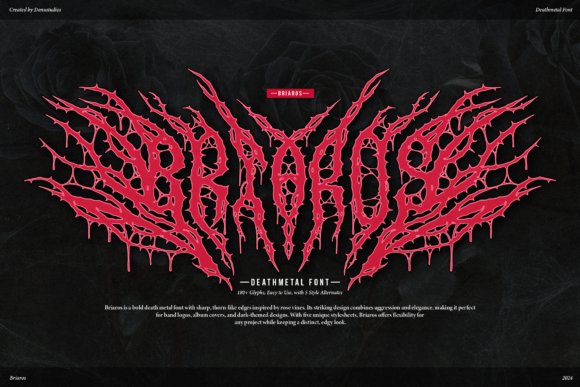
Briaros presents a brutal, organic take on blackletter with serrated edges and vine-like terminals that suggest rot and runoff. The shapes balance chaotic ornamentation with a skeletal structure so logos remain recognisable while keeping a vicious attitude. It reads best as a marquee or headline element on album art, gig posters, streetwear graphics, and horror-themed marketing.
Designers should treat Briaros as a display piece: heavy ink traps and fine barbs can clog at small sizes, so use tight tracking and bold contrasts when printing. Layering it over distressed textures, metallic foils, or tactile backgrounds accentuates the dripping quality, while pairing it with a simple script or neutral sans calms visual noise. Its core strength is aggressive presence rather than subtlety, making it a strong choice for underground identity and expressive artwork.
My Recommendation: I’d pick Briaros for projects that need raw aggression and a tactile, bloodied aesthetic. It’s my go-to for death metal covers and gritty poster runs because the letterforms read like carved scars. For brand work I reserve it for marks and limited-print runs rather than continuous type.
45. Bladge Font
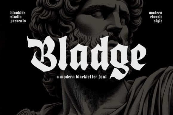
Bladge modernises blackletter by softening harsh angles and widening counters, producing a version of gothic script that reads more cleanly at medium sizes. It keeps decorative flourishes-subtle swashes and tapered strokes-so the voice still feels historic while avoiding ornate excess. That balance gives Bladge a stately, urban character suitable for boutique signage, tattoo studio marks, and apparel labels.
From a practical side it tolerates bolder tracking and small kerning tweaks, making it friendly for print processes like embossing and screen-printing on fabric. Combine it with a slab serif or narrow sans for hierarchy, or set it in gold foil against dark leathers to accentuate the gothic tone without losing clarity. Bladge is less about menace and more about stylistic identity, offering a refined alternative to more aggressive blackletter options.
My Recommendation: I use Bladge when a brief demands gothic flavor but also legibility and polish. It works well for boutique brands, barbershop signage, and apparel that require a heritage look without becoming illegible. For editorial headlines or packaging it gives personality without overwhelming other elements.
46. Black Gorvin Font
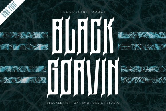
Black Gorvin is a heavyweight blackletter face that reads like a modern heraldic mark, full of angular terminals and compressed counters that give copy a formal, medieval cadence. It sits naturally among Fonts for gothic design, lending headlines, crests, and event stationery a ceremonial gravitas rather than mere ornamentation. The letterforms include alternate capitals and contextual swaps that help avoid repetition in long words while keeping a compact silhouette.
The font’s kerning and spacing are tuned for tight wordmarks, so it holds presence on packaging and posters without collapsing into illegibility at large sizes. Its textured fills and sharp contours respond well to metallic inks, deep embossing, and heavy drop shadows. Use it where you need a dignified, historical voice that still reads clearly as a display type.
╰┈➤ Download Black Gorvin Font
My Recommendation: I reach for Black Gorvin when a project needs a serious, old-world identity rather than a playful decorative touch. It’s perfect for book covers, crest-like logos, formal invitations, and premium packaging where the type must carry authority. The alternates and ligatures make it flexible for repeated letter patterns, so you can craft unique wordmarks without custom lettering.
47. Rawuh Font
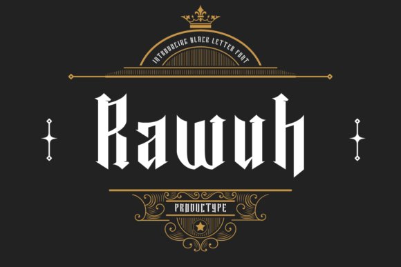
Rawuh is a lean blackletter display with flowing strokes and open counters that make it feel refined rather than overwrought. The moderate contrast keeps letter shapes elegant and fairly legible at display sizes, which makes it comfortable for branding, label work, and tattoo flash. Included stylistic sets and swashes let you toggle between cleaner and more ornate appearances without rebuilding words.
Because Rawuh retains generous interior space, it performs well on small printed labels and embroidered badges where heavier Gothic faces often fill in. Pair it with a neutral sans for modern packaging or add subtle embossing and single-color prints for a boutique feel. It’s a good fit when you want gothic character with practical usability across merchandise and identity pieces.
My Recommendation: I’d pick Rawuh when a brief calls for a refined blackletter that must stay readable at small sizes. It excels on boutique product labels, apparel tags, and tattoo-style logos where clarity matters as much as aesthetic. The stylistic alternates are handy for tuning ornamentation to the project without extra artwork.
48. Dark Spire Font
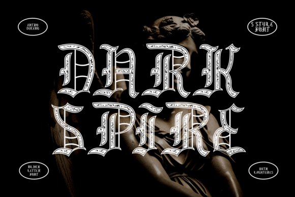
Dark Spire wears ornamental detail like armor: elongated spikes, ornate counters, and dramatic terminals push each glyph toward theatricality while preserving a cohesive blackletter voice. The family ships in five treatments-textured, inline, solid, outline, and distressed-so designers can match intensity to context without swapping typefaces. Stylized ligatures and swash-like terminals create flowing connections that read especially powerful in headlines and logotypes.
Kerning and weight balance are carefully managed so the spiky forms remain surprisingly legible at display scale, and the all-caps approach reinforces a heraldic, formal feel. It pairs well with rough paper, foil stamping, and layered textures that emphasize a handcrafted or ritualistic finish. Use Dark Spire when you want theatrical presence for album art, film posters, streetwear, or event identity work.
My Recommendation: I recommend Dark Spire whenever the brief calls for drama with craftsmanship rather than gimmickry. Its multiple styles let you maintain a unified voice across a shirt, poster, and sticker set while varying visual impact. It’s especially strong for music branding, cinematic headlines, and premium apparel where typography should feel deliberate and intense.
49. Kosegry Font
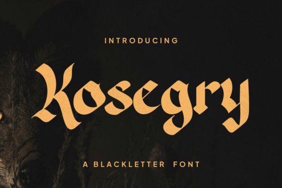
Kosegry presents a severe, high-contrast blackletter where blade-like terminals and thick verticals meet tight counters; each glyph reads as if engraved. The design mixes compressed forms with angular diagonals and emphatic outlines, yielding a display face that commands attention without losing the medieval calligraphic roots.
For projects that call for Fonts for gothic design, Kosegry supplies useful OpenType features-contextual alternates, discretionary ligatures and dramatic swashes-so you can craft compact logotypes or widescreen poster headlines. Best used at large sizes and in systems that support advanced typographic controls, it gives album covers, fantasy titles and dark fashion labels a forceful, historically charged identity.
My Recommendation: I reach for Kosegry when a piece needs a fierce, medieval attitude with legible drama at display scale. Its ligatures and alternates let me create distinctive logos and poster words quickly. Use it when you want a strong blackletter voice that reads crisply from across a room.
50. Soul Cards Font
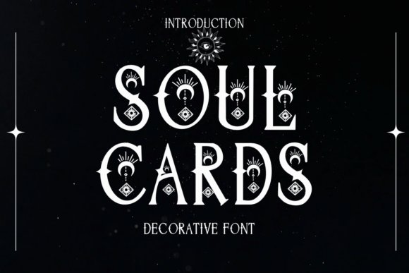
Soul Cards is a decorative display face built from tarot and celestial motifs: tiny stars, crescent terminals and geometric flourishes thread through its uppercase set. The lowercase balances ornamentation with restraint, so headings can carry ritual flair without collapsing into noise.
The font ships with a library of pictorial ornaments, stylistic sets and divider glyphs that suit tarot decks, mystical packaging and editorial covers; mix and match symbols to compose bespoke title treatments. Give its ornamented characters generous tracking and use high-resolution output for best clarity-the detail rewards careful spacing and considered pairing with simpler text faces.
My Recommendation: I would use Soul Cards when a design needs occult charm and handcrafted ornamentation. It saves time by bundling ornaments and alternates that normally require custom drawing. Perfect for boutique stationery, tarot projects, event posters and branding that leans into arcane aesthetics.
51. Fabric Tailor Font
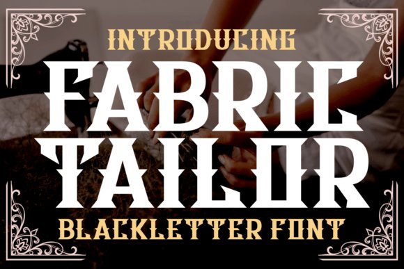
Fabric Tailor channels vintage sign-lettering into a bold blackletter with crisp diagonal cuts and decorative terminals that read well on apparel and packaging. It favors open counters and balanced contrast, giving headlines a sturdy silhouette while retaining handcrafted character.
Included alternates and swash options let designers vary wordmarks and badges without extra artwork, and the face holds up under screen printing and embroidery. Use Fabric Tailor for whiskey or craft-beverage labels, barbershop signage, tattoo flash and retro apparel where a compact, emblematic blackletter adds credibility.
╰┈➤ Download Fabric Tailor Font
My Recommendation: I pick Fabric Tailor for projects that need nostalgic character with strong shapes and reliable reproduction. Its alternates make logo work fun while the core set stays bold in one-color prints. Ideal for labels, streetwear badges and places where a vintage blackletter silhouette helps tell a brand story.
52. Slavice Font
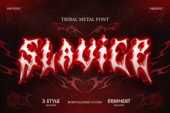
Slavice is a tribal metal blackletter that belongs among the strongest Fonts for gothic design, with razor-edged terminals and aggressive, spiky curves that reference tribal tattoo ornament. Its letterforms balance chaotic spikes with deliberate negative space, producing silhouettes that read as both raw and meticulously shaped. The face is built for display work where attitude and scale take precedence over small-size readability.
The family includes alternate glyphs, discretionary ligatures, and ornamental capitals that let designers craft singular logotypes and band marks. Carefully kerned for compact wordmarks, Slavice excels on album covers, gig posters, merch, and tattoo flash where high-contrast textures amplify its underground metal feel. Pair it with heavy grunge backgrounds or stark monochrome palettes to push the brutal, masculine personality further.
My Recommendation: I reach for Slavice when a project needs visceral impact: metal band logos, gig posters, and tattoo branding benefit from its aggressive shapes. The alternates and ligatures let me tune letterforms into unique marks rather than settling for default text. Use it for projects that need a raw, tribal-metal attitude and bold display presence.
53. Bemore Font
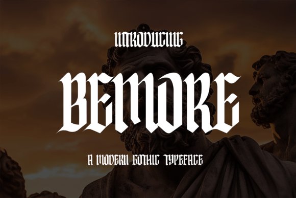
Bemore Font marries formal blackletter skeletons with cleaner, softened strokes to yield headings that nod to history without excessive ornament. It pares back extreme contrast and crowded terminals, improving legibility while preserving condensed proportions and pointed terminals typical of gothic typography. The result reads as period-authentic but calmer, suitable for refined applications that still want a medieval voice.
OpenType features include stylistic alternates, small caps, and extended punctuation to shape texture without adding extra families. Bemore scales well across signage, book covers, posters, and western-themed packaging where period character must coexist with readable display text. It pairs particularly well with slab serifs or neutral sans for balanced compositions that respect blackletter heritage without overwhelming a layout.
My Recommendation: I choose Bemore when a design needs blackletter gravitas but must remain legible across print and digital formats. Its restrained ornament keeps layouts tidy while preserving a gothic aesthetic. Ideal for premium labels, editorial headlines, and themed event identity where historic tone and readability are equally important.
54. Scary Horrible Font
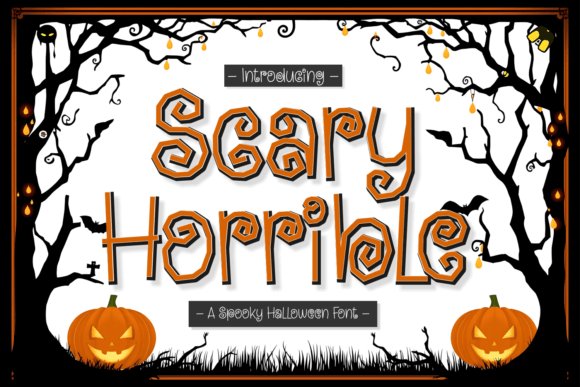
Scary Horrible is a seven-style handwritten collection that leans into playful horror with letterforms that look carved from bone, smeared in ink, or gnawed at the edges. Each style carries a different mood – from campy jack-o’-lantern cheer to solemn, cemetery-slab distress – giving designers a ready palette of spooky personalities. The hand-drawn irregularities keep compositions feeling human, immediate, and characterful.
Files include layered versions, contextual alternates, and decorative dingbats such as bats, tombstones, and dripping elements to enrich layouts. These fonts work best on seasonal posters, festival flyers, party invites, and themed apparel where character outweighs strict typographic restraint. Pair them with a sturdy sans or textured backgrounds to preserve readability while maximizing eerie charm.
╰┈➤ Download Scary Horrible Font
My Recommendation: I use Scary Horrible for Halloween campaigns, party flyers, and seasonal merch when personality is the priority. The variety of styles lets me mix lighthearted and eerie tones without juggling multiple families. It’s a go-to for festival graphics, kids’ event invites, and playful horror merchandise that needs instant visual character.
55. Beltino Font
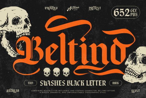
Beltino is a bold swash blackletter that pairs gothic lineage with a gritty vintage attitude, making each word feel handcrafted and confrontational. Sharp angles, heavy strokes and expressive swashes create real presence in headlines, logos and merch; this kind of approach ranks among top Fonts for gothic design choices for projects that need an intense, streetwise voice.
Under the hood it ships with alternates, ligatures, full A–Z sets, punctuation, numbers and multilingual coverage, plus Regular and Slant in OTF/TTF/WOFF. For best results apply distressed textures, tight tracking and high-contrast palettes, and pair with a neutral geometric sans to tame the ornamentation on branding or apparel pieces.
My Recommendation: I reach for Beltino when I want typography to hit like a statement piece – it reads as handcrafted, aggressive and authentic. The alternates let me dial between classic blackletter and a modern, raw attitude quickly. Perfect for streetwear labels, metal or tattoo branding, and Halloween or biker-themed artwork where personality matters.
56. Rednoisr Font
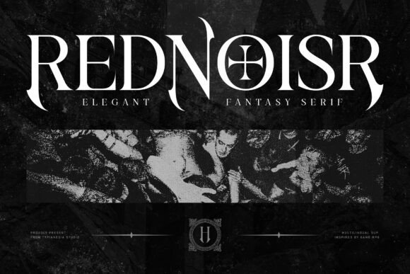
Rednoisr is a fantasy serif that leans into dramatic, narrative-driven letterforms: pronounced serifs, deliberate stroke contrast and a cache of alternate characters give it a cinematic presence. It evokes RPG and dark-fantasy sensibilities while keeping each glyph readable enough for bold display use like covers, posters and logos. The face feels both regal and slightly menacing, ideal when typography must set mood instantly.
OpenType alternates and contextual swaps let you craft bespoke word shapes, while multilingual coverage makes it practical for international releases. Use large sizes with generous leading or pair with a low-key sans for longer text runs; avoid small-size body copy. Great choices include fantasy book jackets, game title screens, album art and festival posters with a gothic or noir tilt.
My Recommendation: I pick Rednoisr when a project needs theatrical serif drama without becoming fussy. The alternates are excellent for tailoring wordmarks and giving titles unique silhouettes. Use it on book covers, game branding or event artwork where a moody, cinematic type voice makes the first impression.
57. Dryba Font
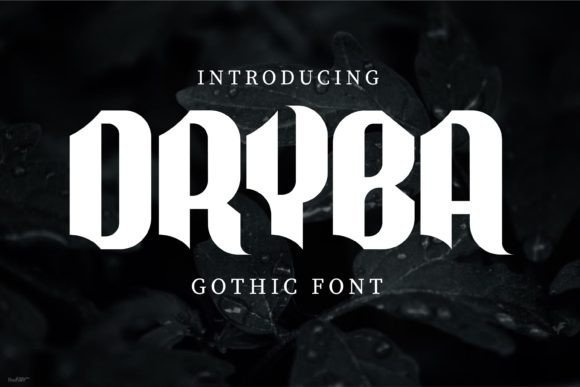
Dryba reworks blackletter for contemporary use by trimming ornamental excess and emphasizing clearer proportions and spacing. It preserves characteristic gothic markers-angled terminals and condensed counters-while softening joins and improving rhythm so it reads better at medium sizes and on screens. That balance makes it a practical choice when you want a historic nod without full revivalist ornament.
The family includes stylistic alternates and carefully tuned kerning, so setting logos and editorial headings is straightforward. Pair Dryba with a light sans or minimal textures to let the letterforms breathe, and avoid dense body copy or tiny text sizes. Available in standard web and print formats for cross-media projects.
My Recommendation: I’d choose Dryba for branding that needs a gothic hint but must remain legible across print and digital. Its cleaner strokes simplify production and reduce the need for heavy raster effects. Use it for craft labels, indie film posters or boutique packaging where character is required without sacrificing control.
58. Dark Romance Font
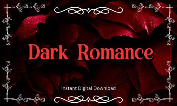
Dark Romance wears theatrical serif forms with swollen stems and tapered terminals that read as both elegant and ominous; the shapes favor dramatic headlines and novel covers. As one of the stronger entries among Fonts for gothic design, it balances bold display presence with surprisingly good readability so titles remain legible even when ornate. The overall temperament leans into vampire and moody fantasy aesthetics, making it ideal when you need typographic passion without losing structure.
Delivered in TTF and OTF, the family includes upper- and lowercase, numerals and basic punctuation and plays nicely in Canva, Procreate and Adobe apps. Use it large for book covers, posters and merch where the curving swashes can be admired, or pair it with a neutral sans for body copy to prevent visual fatigue. Minor kerning adjustments and occasional swash substitutions bring out its romantic character for stickers, apparel or tattoo designs.
╰┈➤ Download Dark Romance Font
My Recommendation: I reach for Dark Romance when a project needs poetic drama with readable letterforms-romance covers, moody valentines and BookTok headers are natural fits. The font gives a period feel without becoming overly ornate, so it works well on merch and editorial covers. For best results I pair it with muted palettes and restrained layouts so the type carries the emotional weight.
59. Forgore Blackletter Font
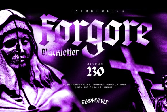
Forgore Blackletter presents a modernized take on traditional blackletter with knife-like serifs and stark stroke contrast that reads as ritualistic and forceful. Its compact glyphs and aggressive terminals feel carved, lending titles and logos a raw, ancestral presence that suits heavy music and gritty streetwear. Decorative alternates and ligatures let designers tune intensity, from stark mastheads to intricate wordmarks.
Best applied at display sizes, Forgore thrives on album art, editorial covers and branded apparel where the type can dominate composition. Careful kerning and generous leading keep the dense forms legible, and pairing it with minimalist sans elements prevents visual competition. Use high-contrast imagery or textured black-and-white layouts to amplify the type’s brooding character without flattening detail.
╰┈➤ Download Forgore Blackletter Font
My Recommendation: I recommend Forgore for projects that demand a severe, rite-like typographic voice-metal bands, underground labels and bold editorial spreads benefit most. It makes an immediate statement, so limit its use to headlines and marks rather than long passages. When scaled and paired with restrained art direction, Forgore delivers a memorable, authoritative aesthetic.
60. Destroy Glass Font
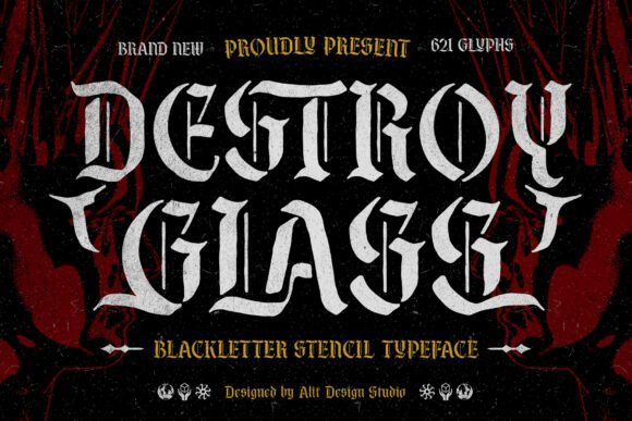
Destroy Glass is a blackletter stencil that stitches classic gothic letter skeletons with deliberate cutouts, producing a utilitarian yet ornamental silhouette. The stencil interruptions introduce breath and rhythm into dense letterforms, which helps the face read clearly at distance and on coarse surfaces. The result is a hybrid look that feels both handcrafted and industrial-perfect for posters, signage and worn apparel.
Its open counters and stroke breaks make this face forgiving on textured prints and adaptable for screen use at sufficient sizes, while layered textures and two-tone ink treatments highlight the stencil effect. For logotypes, give extra tracking and pair with simple icons to avoid cluttered compositions. This type performs well when you want gothic attitude with a contemporary, fabricated edge.
╰┈➤ Download Destroy Glass Font
My Recommendation: I pick Destroy Glass when a design needs gothic roots with a workmanlike twist-think gig posters, reclaimed-fashion tags and urban signage. The stencil gaps help it survive rough printing and fabric applications. I like combining it with distressed photography and bold color blocks to emphasize its industrial personality.
61. Lethalik Font
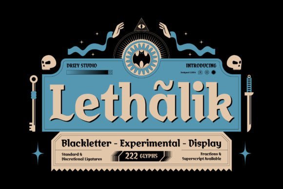
Lethalik pairs aggressive blackletter strokes with experimental details that feel both sinister and stylish; this makes it a strong pick for Fonts for gothic design where atmosphere matters as much as letterform. The characters show sharp terminals and broken bows that read clearly at display sizes, while alternate glyphs and tight kerning let you push a headline toward theatrical or understated menace with small tweaks.
On posters and event flyers the weight carries across from print to pixel without losing its bite, and the font’s uneven stress gives compositions an unpredictable edge that suits horror-themed packaging and immersive installations. Use sparingly as a focal treatment-its presence commands attention, so balancing it with clean body type keeps layouts legible and dramatic.
My Recommendation: I reach for Lethalik when a project needs bold, ominous personality without becoming illegible. Its alternates and heavy strokes are excellent for Halloween posters, haunted attraction branding, and edgy editorial spreads. For maximum impact I pair it with a neutral sans for body text so the blackletter remains the visual anchor.
62. Blacknite Font
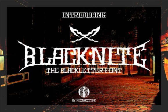
Blacknite channels the raw energy of underground music scenes into a modern blackletter suited for posters, album covers, and apparel graphics; the included ornament set broadens creative options by offering decorative dividers and flourishes that match the type’s tone. Letter proportions favor strong verticals and condensed counters, which makes it effective for tight headlines and signage where space is limited but presence is required.
Typographic details like sharp swashes and alternate capitals allow designers to craft custom logotypes or event titles without heavy manual manipulation, and the font’s heavy personality pairs well with distressed textures and photographic backdrops. For projects that need a gothic-metal attitude-shops, murals, or band merch-Blacknite streamlines the path from concept to finished art while keeping a consistent aesthetic voice.
My Recommendation: I recommend Blacknite for projects that demand an unapologetic gothic-metal attitude, such as band posters, streetwear labels, and venue signage. The extra ornament set saves time when building cohesive layouts and helps maintain a signature mood across collateral. Use it as a primary display face and reserve simpler type for supporting copy to preserve readability.
63. Wushin Font
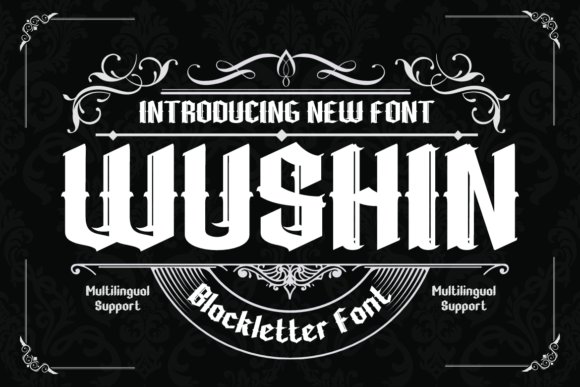
Wushin offers a refined blackletter interpretation with smoother curves and thoughtful counterforms that read as elegant rather than abrasive, making it suitable for high-end packaging, book covers, and editorial headlines seeking a gothic nod. The design favors balanced spacing and graceful ligatures, so extended headlines maintain rhythm without feeling cramped or fussy.
Because Wushin leans toward controlled contrast and legible shapes, it adapts well to both print and web headings where clarity matters alongside stylistic flair. Pairing it with minimal sans serifs enhances its ornamental qualities without competing for attention, and its subtle personality works nicely in identity systems that want gothic roots without overt theatrics.
My Recommendation: I choose Wushin when a project needs gothic character that reads as polished and wearable rather than aggressive. It’s a great match for boutique packaging, book jackets, and brand marks that seek historic references with modern readability. For best results, use it as a headline or logo face and combine with restrained supporting typography.
64. Qiuba Font
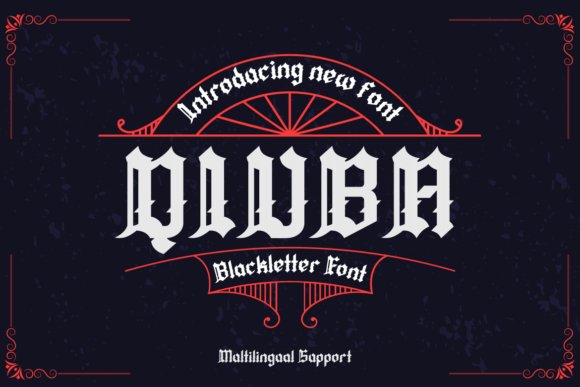
Qiuba reinterprets classic blackletter with high-contrast strokes and rounded terminals, giving traditional Gothic lettering a friendlier, retro edge. Its extensive set of alternates, ligatures, and stylistic sets positions it among Fonts for gothic design, handling everything from compact labels to oversized poster headlines with consistent personality.
OpenType features make swapping characters fast; kerning is tuned for dense compositions and the family includes shadowed and stamped alternatives for vintage rubber-stamp effects. Pair Qiuba with a neutral sans for balance, or place it on textured paper and metallic inks to emphasize its period flavor in badges, beer labels, and event posters.
My Recommendation: I pick Qiuba when a design needs unmistakable Gothic flavor without losing readability. The alternates and stamped weights let me craft logos, festival posters, and packaging that feel handcrafted and historic. Use it when you want blackletter character that reads well at display sizes and holds up in print.
65. The Lastring Font
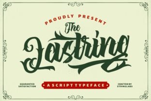
The Lastring is a decorative display font that channels tattoo-style flourishes and Victorian ornamentation into tall, narrow letterforms. Long swashes and interlocking terminals create a strong single-line presence that reads as gothic-vintage rather than strict medieval blackletter, which works beautifully for marks and sleeve-style lettering.
Alternates and a handful of ligatures mimic hand-drawn script, so convert outlines for tight production runs to avoid kerning surprises. Use The Lastring at large sizes with textured inks or embroidered finishes; it pairs well with hand-illustrated backgrounds or muted colorways for a nostalgic, crafted look.
╰┈➤ Download The Lastring Font
My Recommendation: I’d choose The Lastring for tattoo flash, boutique apparel, and ornamental signage where decorative script must take center stage. Its long swashes reward scale and careful composition, making it ideal for posters and jacket prints rather than tiny labels. When a project calls for ornate gothic-vintage flair, this font is an effective, characterful option.
66. Black Murder Font
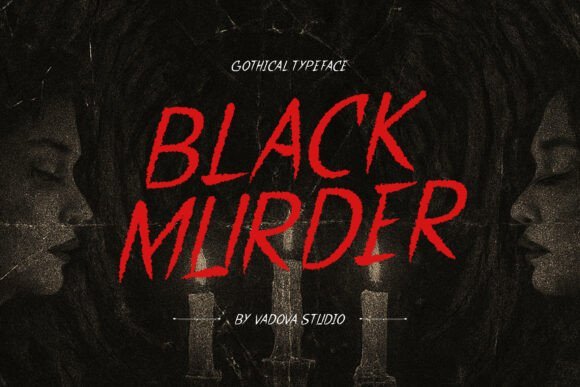
Black Murder pushes blackletter toward theatrical intensity with abrupt thicks, sharp spurs, and exaggerated terminals that read both ceremonial and menacing. Dense counters and stark stroke contrast create a heavy silhouette tailored for metal band logos, horror covers, and dark fantasy posters, though it sacrifices comfort for prolonged reading.
The family includes ornamental caps and optional distress textures that translate well to print, patches, and merch; reverse type on dark backgrounds maximizes its dramatic impact. Keep tracking open on multi-word headlines and support it with a simple sans or restrained serif to avoid visual competition and maintain legibility.
╰┈➤ Download Black Murder Font
My Recommendation: I reach for Black Murder when a headline must hit hard-album art, festival posters, and occult zines are perfect fits. The heavy weight and distressed alternates read well on merchandise and distance viewing, giving instant mood and attitude. Avoid using it for body copy; treat it as a display weapon for high-impact designs.
67. Bold Blackletter Font
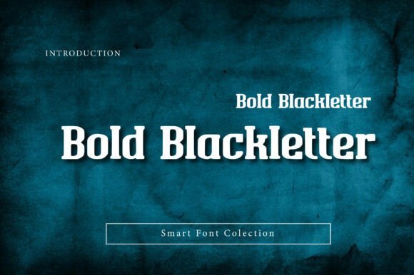
Bold Blackletter remaps medieval Gothic calligraphy into a display typeface that balances brooding authority with readable letterforms. Fonts for gothic design enthusiasts will find its dense vertical strokes, angular terminals, and tightened counters give headlines a commanding presence without collapsing legibility. The face keeps modern spacing and hinting so ornate letterforms remain crisp in print and on-screen.
This blackletter excels as a headline voice for craft brewery labels, tattoo-studio identity, and heavy-metal merchandise where attitude must read at a glance. It also works well on certificates, upscale packaging, and apparel when paired with a geometric sans to ease contrast and establish typographic hierarchy. Use sparingly as a statement face rather than body copy to preserve its impact.
╰┈➤ Download Bold Blackletter Font
My Recommendation: I reach for Bold Blackletter when a project needs historical weight with a punk edge – think limited-run beer labels or band posters. Its tight, bold shapes demand attention and photograph well on textured materials. I’d avoid long text blocks and instead pair it with a neutral sans for balance.
68. Night Scape Font
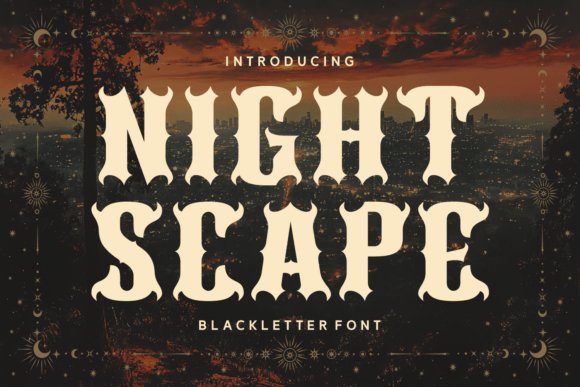
Night Scape projects a nocturnal, theatrical energy through sweeping, flame-like serifs and pronounced stroke contrast that read as both gothic and slightly otherworldly. The weight and sculpted terminals make it ideal for fantasy posters, Halloween promos, and album art where a moody, emblematic title is needed. Its stage-ready presence holds up at large display sizes and on high-contrast backgrounds.
The design includes ligatures and dramatic alternate forms to inject variety into logotypes and mastheads, so you can tune the personality from refined to raw. Tight tracking and careful kerning are important because its ornaments can collide in narrow settings. Pair Night Scape with understated sans or a restrained serif for readable supporting text while keeping the focal type theatrical.
My Recommendation: I use Night Scape when a project asks for gothic drama with a hint of mysticism, such as event posters or theatrical branding. The alternates let me craft bespoke wordmarks without hand-drawing each letter. Keep it large and let the ornamentation breathe; it loses impact at small sizes.
69. Become Mature Font
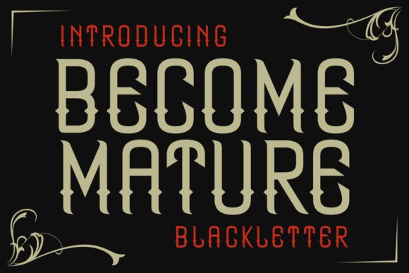
Become Mature blends condensed blackletter proportions with crisp geometric details for a look that feels both historic and engineered. The tall, narrow letters and sharp decorative accents make it an efficient display face where vertical rhythm matters, giving headlines an assertive silhouette in tight columns or stacked logos. Its balance of tradition and modernism gives pieces a distinctive, slightly confrontational tone.
Stylistic alternates and a compact fit make Become Mature useful for monograms, label copy, and album covers where space is limited but personality is required. Pay attention to tracking and pair it with a wide, neutral type for secondary information to avoid visual crowding. It performs best in short bursts – headlines, badges, and statement graphics rather than blocks of copy.
╰┈➤ Download Become Mature Font
My Recommendation: I pick Become Mature for projects that need gothic attitude in confined spaces, like vertical posters, mastheads, or apparel tags. Its condensed forms save space while still reading as bold and stylized. I recommend pairing it with a plain grotesque and using alternates for custom lettering touches.
70. Aboxic Font
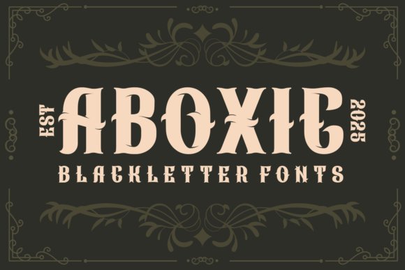
Aboxic is a bold blackletter display with chiseled terminals and pointed strokes that keep a medieval personality while remaining unusually readable for the style. Its dense counters and crisp serifs make for commanding headlines and logotypes that cut through textured backgrounds without losing detail. Fonts for gothic design are well represented here: the font ships with OpenType alternates, swash capitals, and contextual ligatures so you can shift between authentic old-world flair and a more pared-down modern look.
On the production side Aboxic includes complete kerning and webfont-ready files, and it tolerates tighter tracking for merch and tattoo layouts. Pair it with a neutral sans to provide breathing room or place it over distressed papers and metallic finishes to amplify its historic character; avoid using it for long passages because the heavy blackletter shapes read best in short, punchy blocks. In practice I reach for Aboxic for brewery labels, band marks, and posters when a stout medieval voice is needed.
My Recommendation: I use Aboxic when a project needs a dramatic medieval tone but still must read at mid sizes. Its alternates and ligatures make custom wordmarks quick to craft, and the weight reproduces cleanly on apparel and packaging. It’s ideal for branding that wants a historic presence-think labels, tattoos, and bold poster headlines.
71. Old English Spider Font
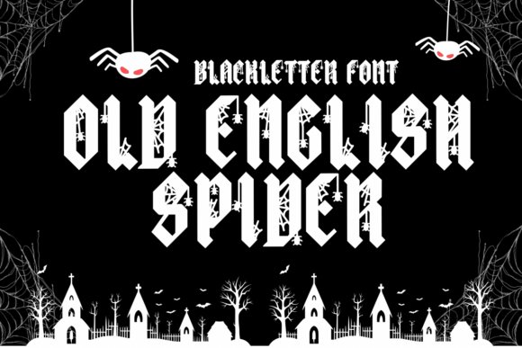
Old English Spider grafts cobweb ornament into traditional blackletter letterforms to create a theatrical, horror-leaning display face. The tiny web details are placed in ascenders and swash capitals so the effect reads as pattern rather than mere gimmick when scaled for posters or garment prints. Stylistic alternates let you vary the spooky accents across headlines so repeated text doesn’t feel identical.
As a high-contrast display type it performs best at larger sizes and can require vector outlines for clean screen printing of the fine hairlines. For maximum impact use it against muted palettes or distressed textures and reserve dense informational copy for a simpler secondary face. I reach for Old English Spider on seasonal event posters, haunted-house branding, and limited-run apparel when atmosphere matters more than micro-legibility.
╰┈➤ Download Old English Spider Font
My Recommendation: I’d choose Old English Spider for themed campaigns and seasonal pieces that need instant spooky character. The built-in webbed alternates make it easy to apply a consistent horror motif without heavy manual editing. It shines on posters, invitations, and merchandise where dramatic display typography is the priority.
72. Black Flames Font
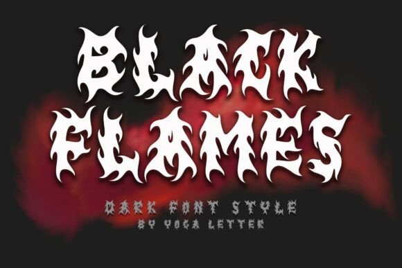
Black Flames is a blackletter display cut with flame-shaped terminals and jagged edges that suggest motion and aggression rather than delicate ornament. Its condensed silhouettes create intense headlines that work well for metal band covers, action game titles, and energetic tournament branding. Alternate flame glyphs allow layering effects and decorative fills that emphasize the burning contours of each letter.
The family is optimized for short-copy situations and reproduces strongly in foil, emboss, or heavy screen printing; avoid using it for body text where the sharp forms become tiring. For visual balance pair it with a geometric sans or a wide slab to temper the aggression, and consider single-color printing to preserve the letter detail. I reach for Black Flames when a project calls for raw energy and immediate impact-album art and e-sports posters are natural fits.
╰┈➤ Download Black Flames Font
My Recommendation: I recommend Black Flames when the brief demands ferocity and high energy from type alone. Its flame-attached serifs stand out on dark backgrounds and print crisply on merchandise. Use it for album covers, esports branding, or action-movie titles to give visuals a visceral, attention-grabbing edge.
73. Fabian Font
Fabian Font is a bold vintage serif that pairs ornamental flourishes with compact letterforms. Its gothic-inspired shapes, pronounced terminals, and arched serifs give display text theatrical presence without becoming fussy. For designers working on Fonts for gothic design, Fabian offers dramatic glyphs that remain legible at poster scale and in logotypes.
The release includes a heavy display weight with discretionary ligatures, swash capitals, and alternate characters so you can dial in period detail. OpenType features let you swap in ornaments for headlines or strip them back for cleaner packaging and editorial spreads. It pairs cleanly with a neutral sans for running copy and prints reliably on textured substrates, making it a practical choice for brand marks and retro-inspired collateral.
My Recommendation: I reach for Fabian when a brief calls for gothic attitude without sacrificing readability. Its ornamental alternates let me inject character into posters, craft packaging, and heritage branding while keeping layout flexible. Use it for headlines, logotypes, and editorial covers where a pronounced serif voice will carry the concept.
These Fonts for gothic design offer a wide range of moods, from harsh blackletter to refined gothic scripts that suit different visual directions. Apply them to headlines, packaging, and display work to anchor a dark or vintage aesthetic.
Check licensing details and pairing tips before finalizing art. With 73 options you can match style to intent and complete projects with greater confidence.