31 Classic Serif Fonts for Editorial Magazine Layouts 2026
If you need type that reads beautifully on the printed page, these 31 Stylish Serif Fonts are a strong starting point. They range from restrained old-style serifs to bold display serifs, all suited to upscale book covers.
The guide groups faces by mood-classic, modern, and decorative-and highlights pairing suggestions, weight choices, and basic licensing notes so you can make informed picks quickly.
1. Delphin Font
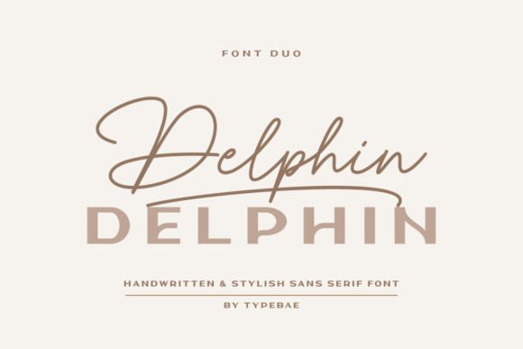
Delphin Font – Delphin is a matched set combining a handwritten script with a clean sans to produce an elegant contrast between flowing swashes and restrained display letters. Swashes live at the start and end of glyphs-type ‘a1’ for an initial flourish and ‘a2’ for a final one; the same shortcuts apply to lowercase-to shape headlines quickly. Though primarily scripted and sans, Delphin pairs exceptionally well with stylish serif fonts when a layout needs classic warmth alongside contemporary brushwork.
The family is PUA-encoded so alternates and ligatures are easy to access even in simpler apps, and its weight balance keeps text blocks readable while allowing the script to claim attention in short bursts. This makes Delphin suitable for logos, invitations, brand marks and social graphics where contrast between humanist stroke and geometric letterforms creates personality. Kerning is thoughtfully tuned so small display sizes stay tidy while larger treatments benefit from the swash options.
My Recommendation: I use Delphin when a project needs a handcrafted voice without losing structure-the script supplies warmth and the sans provides reliable body text. The PUA encoding speeds up iteration in common design tools, letting me test swash combinations fast. Ideal for boutique branding, wedding suites, and social headers where a little flourish makes a big difference.
2. Modern Serif Bundle Font
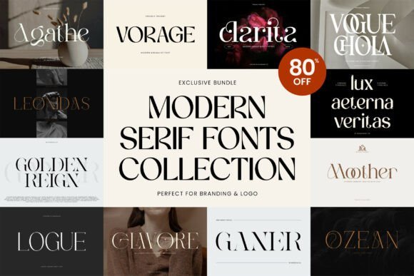
Modern Serif Bundle Font – The Modern Serif Bundle gathers eight distinct serif typefaces that span from spare, geometric text faces to richly detailed display serifs, giving designers a flexible toolkit for refined typographic work. Each face shows careful attention to terminals, contrast and stroke modulation so headlines and body copy read with clarity and character. PUA-encoded alternates, swashes and small caps are included to make creative treatments accessible even when advanced OpenType controls aren’t available.
Because the set covers transitional and contemporary serif voices, it’s easy to pair a restrained text face with a more expressive logo serif to build hierarchy across print and digital layouts. Applications that benefit most include magazines, fashion branding, premium packaging and poster design where type carries the mood. Licensing and file organization feel straightforward, which helps when juggling multiple client projects or agency deliverables.
╰┈➤ Download Modern Serif Bundle Font
My Recommendation: I recommend this bundle when a project needs several complementary serif voices without hunting for individual licenses-it’s a practical, time-saving collection. The range lets me assign clear roles: dependable text, attention-grabbing headings and decorative alternates for brand work. Great for editorial teams, fashion labels and packaging designers who want cohesive typography fast.
3. Carizo Font
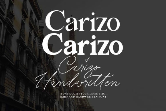
Carizo Font – Carizo pairs a poised serif with a sweeping companion script so each style complements rather than competes, creating a balanced look that reads as polished yet personable. The serif provides structure and legibility for longer lines, while the script delivers tasteful flourishes suited to names, short slogans and eye-catching hero lines. That contrast makes the pairing especially useful for projects that need both elegance and a handcrafted touch.
Spacing and contrast are tuned so the two styles sit comfortably in lockups and on packaging, and the script’s alternates help smooth joins in longer titles. Try the serif for captions and the script for hero copy to keep readability high while injecting personality; the pair also adapts well to print invitations and social headers. It’s a compact combo that performs across boutique labels and intimate brand identities.
My Recommendation: I reach for Carizo for boutique identities and event stationery where a human touch matters; the script gives warmth while the serif keeps information readable. Its restrained size makes it easy to deploy across small projects without overcomplication. Perfect for wedding invites, artisanal product labels and lifestyle sites that want an approachable, refined look.
4. Avathor Type Font

Avathor Type Font – Avathor Type is a condensed serif family that pairs a retro attitude with pared-down geometry, producing a headline face that refuses to be subtle. The tight proportions and pronounced curves create clear, commanding letterforms that read brilliantly at display sizes; designers will appreciate how uppercase and lowercase shapes interact when set in tight tracking. This font lives among stylish serif fonts aimed at posters, album art, and fashion logos where presence matters without ornamentation.
On the technical side, Avathor’s consistent stroke widths and deliberate contrast make kerning straightforward while preserving strong personality in logos and editorial titling. It benefits from larger sizes and careful letterspacing-tiny text can feel cramped-so use it for mastheads, signage, and packaging. For pairing, try a neutral sans for body copy or a light serif for diplay/subheads to keep hierarchy clear.
╰┈➤ Download Avathor Type Font
My Recommendation: I reach for Avathor Type when a project needs immediate visual authority-its condensed shapes punch above their weight for posters, record covers, and fashion labels. The strong curves and tidy counters give logos a memorable silhouette, and the family holds up well in both print and high-res digital art. I would avoid using it for long paragraphs, but it shines wherever a bold, compact voice is required.
5. Holen Vintage Font
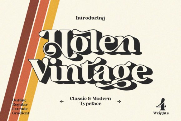
Holen Vintage Font – Holen Vintage marries classic serif details with modern finishing, producing warm, groovy letterforms that read as both refined and charming. The design shows generous curves, subtle contrast, and decorative swashes that feel luxe without appearing fussy; those alternate glyphs are accessible via PUA encoding, so you can pull elegant flourishes straight from your character palette. Use it where personality and a hint of nostalgia will strengthen a brand rather than overwhelm it.
Typographic features include expressive terminals, optional ligatures, and tapered serifs that create a rhythmic texture across headlines and labels. It performs beautifully on boutique packaging, invitation suites, and lifestyle branding where ornate titling adds perceived value; for body text choose a plainer serif or a neutral sans to preserve legibility and hierarchy. Swashes work best at larger sizes where their detail can breathe.
╰┈➤ Download Holen Vintage Font
My Recommendation: I recommend Holen Vintage for projects that want a luxury, retro-leaning voice-think boutique shops, artisanal goods, and wedding stationery. The PUA swashes make it easy to create bespoke logotypes without deep OpenType know-how, which speeds up mockups and client rounds. Keep it prominent and paired with clean support type, and it will elevate packaging and editorial headings with graceful character.
6. Armenia Font
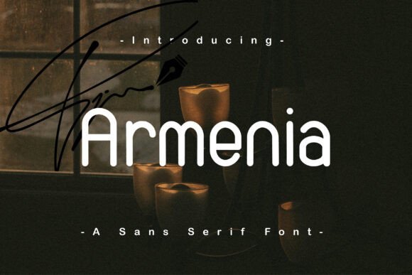
Armenia Font – Armenia is a pared-back sans-serif with a focus on clarity and modern proportions, designed to read cleanly across screens and print. Its restrained outlines and balanced x-height give text a steady rhythm, while multi-language support broadens its practical reach for global projects. Weights span from subtle light to firm bold, lending it flexibility for interface labels, navigation, and longer web copy when paired with careful spacing.
On the technical side, Armenia offers thoughtful hinting and consistent kerning pairs that reduce optical awkwardness at small sizes, making it a solid candidate for UI systems and corporate identities. Use it as a neutral backbone for branding, pairing it with a display serif for headlines if you need visual contrast. The family fits marketing materials, websites, and product interfaces where restraint and legibility are priorities.
My Recommendation: I often choose Armenia when a project requires a clean, modern voice without visual fuss-it’s dependable for websites, apps, and corporate materials. Its multi-language glyph set means fewer compromises on international launches, and the range of weights helps maintain consistent hierarchy. For clients who want a restrained, professional look, Armenia makes routine typographic decisions feel simple and reliable.
7. Different Cultures Font
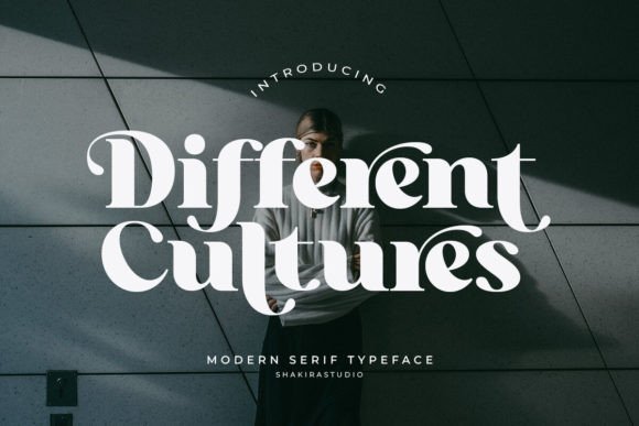
Different Cultures Font is a modern serif display that balances dramatic contrast between thick and thin strokes, placing it among stylish serif fonts ideal for high-impact headlines and premium packaging. The letterforms show careful attention to terminals and counters so text reads boldly at large sizes while remaining clean in tighter settings. Alternates and ligatures are plentiful, letting you tweak word shapes for custom logotypes without resorting to manual letter swapping.
The face rewards typographic fine-tuning: subtle tapering on ascenders and slightly compressed bowls give words a distinctive silhouette that anchors editorial covers and posters. Pair it with a neutral grotesque for extended copy or a restrained script for accent lines; OpenType features make switching alternates straightforward across print and screen. It feels crafted for projects that need presence and personality rather than generic ornamentation.
╰┈➤ Download Different Cultures Font
My Recommendation: I would use Different Cultures when a project needs a serif with confident contrast and flexible display options. Its alternates and ligatures let me shape wordmarks with character, and the bold/thin interplay reads beautifully on covers and packaging. Best for fashion editorials, boutique branding, and poster work where the type must command attention.
8. Melodies Romantic Font Family
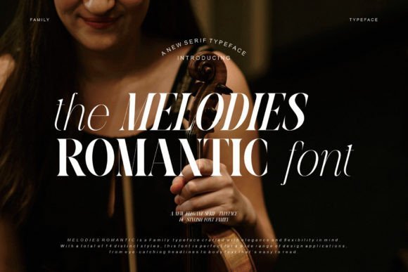
Melodies Romantic Font Family offers fourteen coordinated styles that range from delicate hairlines to sturdy extra-bold weights, giving designers a broad tonal palette for hierarchy and emphasis. Italics and bold italics retain graceful forms while tightening rhythm so headings and short blocks share a consistent personality. The overall impression is one of elegant restraint: clean serifs and softly rounded bowls that add warmth without becoming overly ornate.
Stylistic sets and alternates introduce tasteful quirks-flared terminals and subtle swashes-that work well on invitations, labels, and logos while leaving body text readable. Kerning arrives well-adjusted and the family pairs smoothly with stronger sans options when a modern contrast is required. Because the family covers wide weight needs, you can maintain brand cohesion from stationery to large-format display.
╰┈➤ Download Melodies Romantic Font Family
My Recommendation: I reach for Melodies Romantic when a project calls for refined warmth alongside typographic control. The wide weight range lets me move from delicate invites to bold headlines without swapping families, and the alternates add personality where needed. Ideal uses include wedding suites, boutique packaging, and elegant magazine layouts.
9. Rise of Beauty Duo Font
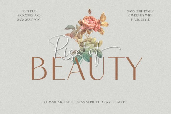
Rise of Beauty Duo Font pairs an expressive script with a clean sans variant to create an immediate visual contrast that reads as a cohesive system. The script offers energetic strokes, optional swashes and lively ligatures; the sans provides neutral support for longer passages and functional UI text. That tension-handcrafted flourish against geometric restraint-makes the duo suitable for logos, social posts, and product labels that need both charm and clarity.
Use the script for short headlines or signature-style marks and rely on the sans for captions, ingredient lists, or body copy to preserve legibility at small sizes. OpenType alternates expand flourish choices while the sans maintains balanced spacing to avoid visual clutter in layouts. This compact pairing is particularly effective for wedding branding, beauty labels, and lifestyle campaigns that want a handcrafted look without sacrificing readability.
╰┈➤ Download Rise of Beauty Duo Font
My Recommendation: I pick Rise of Beauty Duo when a design needs personality with practical readabilty. The script brings handcrafted warmth while the sans holds the structure for longer text, making the two work well together in brand systems. Great for wedding invitations, boutique beauty identities, and eye-catching social media content.
10. Chasa Marelo Font
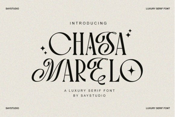
Chasa Marelo Font – Chasa Marelo channels old-style proportions and modern contrast to produce a luxurious display serif. Its high-contrast strokes and gently bracketed serifs create an immediate sense of luxury and restraint, placing it among the stylish serif fonts favored for premium identity work. The italic and small-cap features include refined ligatures and tapered terminals that read beautifully at headline sizes.
On the production side Chasa Marelo ships with multiple optical sizes and carefully tuned kerning pairs, which preserves detail across print and digital outputs. The bold weight holds up on packaging while hairline cuts supply dramatic interplay in editorial spreads; pairing it with a neutral grotesk for captions balances warmth and clarity. Thoughtful alternates and numeral sets make it easy to establish a sophisticated typographic system.
╰┈➤ Download Chasa Marelo Font
My Recommendation: I reach for Chasa Marelo when a brand needs to read as premium without shouting. Its high-contrast roman and elegant ligatures let headlines feel bespoke while the optical sizes keep body text readable. Use it for luxury goods, magazines, wedding stationery and identity systems where refinement is the goal.
11. Arpine Font
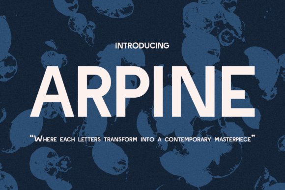
Arpine Font – Arpine is a bold sans serif with geometric cues and pronounced angles that give each glyph a confident silhouette. The letterforms balance heavy strokes with surprisingly open counters, keeping short headlines legible while projecting a contemporary voice. Distinctive terminals and tight joins create memorable logotype potential without relying on added ornament.
Available in a range of weights, Arpine shines at display scale for posters, web headers, and product labels where presence matters; a touch of negative tracking helps compact dense lines. Stylistic alternates and tabular figures make it practical for numeric-heavy layouts and interface mockups. Pairing Arpine with a low-contrast serif adds warmth and clear hierarchy in editorial or branding work.
My Recommendation: I use Arpine when a project needs a modern voice with attitude-ideal for tech launches and bold packaging. Its strong forms cut through busy layouts, and the alternates allow small, effective tweaks that keep a brand distinctive. For longer passages I combine it with a softer serif to reduce visual strain.
12. Bertha Font
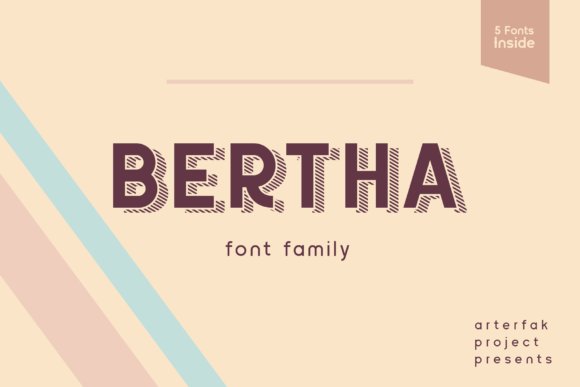
Bertha Font – Bertha is a compact sans serif family composed of five coordinated styles designed to play well together. Each weight includes subtle spacing and stroke shifts so mixing two or three faces creates clear typographic tiers without extra ornament. The overall voice is friendly but composed, making it a reliable choice for UI labels, headers, and magazine body text.
Because the family stays intentionally restrained, Bertha adapts to long-form reading at moderate sizes while still providing enough color for strong headings and in-layout emphasis. Use italics and medium weights to build emphasis and heavier cuts for short headlines or callouts. Hinting and balanced proportions simplify responsive scaling across devices, which speeds web deployment.
My Recommendation: I pick Bertha for projects that demand consistent typography across digital and print touchpoints, especially when a brand needs a steady sans voice across scales. The five-style system makes it easy to build hierarchy without introducing unrelated faces. It’s a solid choice for corporate sites, editorial templates, and app interfaces.
13. Gladish Stylish Font
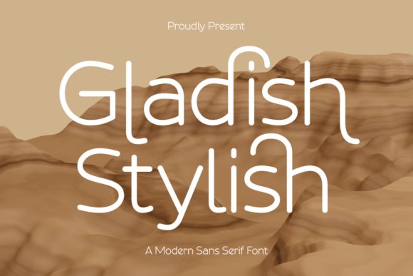
Gladish Stylish Font – Gladish Stylish is a modern sans serif with lively handwritten ligatures and a loose, signature-like rhythm that reads as personable without sacrificing clarity. The promotional visuals lean into warm, earthy palettes to suggest late-summer and autumn campaigns, and the type’s irregular terminals lend a handcrafted sensibility that pairs beautifully with stylish serif fonts when you need contrast between headline and body. Its characterful marks make it ideal for boutique packaging, seasonal identity systems, and social art where a human touch matters.
Under the hood Gladish offers contextual alternates and OpenType ligatures that smooth out repeating letter pairs and speed layout work, while generous spacing maintains legibility at display and small sizes. Use it to soften geometrically driven layouts or to add a voicey accent in editorial mastheads, websites, and product labels. Treat the face as a brand accent: it brings warmth without becoming gimmicky.
╰┈➤ Download Gladish Stylish Font
My Recommendation: I’d pick Gladish when a project needs approachable personality-seasonal campaigns, artisan labels, and social templates get an instant identity boost. The included ligatures feel handmade and reduce the need for manual adjustments during typesetting. I often pair it with a restrained serif or a neutral sans to create contrast while keeping the overall composition readable.
14. Chanceux Modern Stylish Serif Font
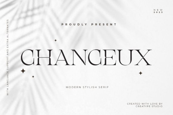
Chanceux Modern Stylish Serif Font – Chanceux reads like a contemporary take on refined book serifs, with crisp hairlines, elegant terminals, and a selection of flourishes that nod toward hand-lettering. The type supplies plenty of swashes and ornamental glyphs, and because it is PUA encoded you can access those extras in ordinary design apps without extra tooling. Its proportions balance elegance and readability, making it a natural choice for branding, wedding stationery, and premium packaging where a formal yet personable voice is wanted.
On a technical level Chanceux maintains solid spacing and thoughtful kerning so decorative elements don’t overwhelm short headlines or logotypes, and heavier weights hold up in signage while thinner cuts read beautifully in invitations. Pair it with a clean sans for modern editorial spreads or use single-word logotypes to showcase its swash set. The result is a polished typographic presence that feels intentionally curated rather than ornate for ornament’s sake.
╰┈➤ Download Chanceux Modern Stylish Serif Font
My Recommendation: I use Chanceux for work that calls for understated luxury-boutique labels, event invites, and editorial covers are perfect fits. The PUA-encoded swashes let me build distinct wordmarks quickly, saving time on custom lettering. I recommend combining it with a minimal sans for contrast so the serif can act as the focal voice.
15. Stylish Serif Font
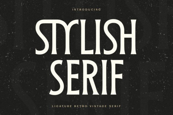
Stylish Serif Font – Stylish Serif leans into retro vintage sensibilities while keeping proportions suited for contemporary display work, which makes it ideal for logos and headline-led layouts. The family includes alternate characters and stylistic sets tailored for nostalgic branding, and its sturdy serifs survive textured printing and poster-scale treatments without losing personality. It’s designed for short, impact-driven typography rather than long passages of body text.
Practical touches include tight uppercase forms for compact logotypes and open lowercase spacing when you want airier headlines, so the font adapts well to packaging, posters, and product labels. Slight irregularities in stroke endings give compositions a handcrafted edge that photographs and letterpress finishes relish. Pair it with a muted sans or a lively script depending on whether you want retro glamour or playful nostalgia.
╰┈➤ Download Stylish Serif Font
My Recommendation: I reach for Stylish Serif when a project needs vintage character with modern usability-think boutique packaging, poster work, and identity systems. The alternates let me quickly create variety without juggling multiple typefaces. It performs especially well when paired with tactile finishes like letterpress or foil, bringing an authentic, analog feel to the final piece.
16. Patcher – stylish serif fonts
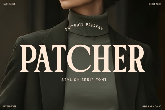
Patcher – stylish serif fonts – Patcher is a serif with crisp, slightly bracketed terminals and a high-contrast profile that reads like a modern luxury typeface. Its clean counters and open apertures give headlines a poised, editorial presence while the glyph shapes retain a warm, handcrafted feel. As one of the more refined stylish serif fonts, Patcher excels for fashion labels, beauty campaigns, and premium packaging where a polished typographic voice matters.
At smaller sizes the generous x-height and clear letterforms maintain legibility, and at display scale the contrast lends dramatic mastheads and brand marks real character. The family covers multiple weights and includes useful alternates and ligatures so designers can tune tone without losing cohesion. Pair it with a neutral sans for body copy to keep systems balanced and readable across print and web.
╰┈➤ Download Patcher – stylish serif fonts
My Recommendation: I reach for Patcher when a project demands a luxe yet contemporary look – magazine covers, boutique identities, or premium product labels. Its high-contrast strokes make headlines immediately recognizable while its careful spacing keeps text readable in smaller formats. The alternates let me add subtle flourish without compromising a brand’s clarity, which makes it an excellent go-to for any high-end visual system.
17. Kaviera Font
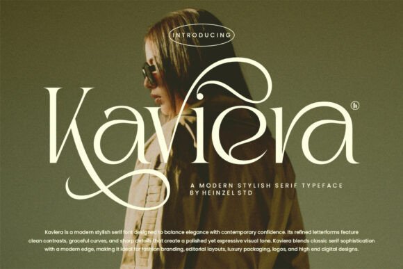
Kaviera Font – Kaviera balances classical serif proportions with assertive strokes and refined curves, producing a confident voice for headers and logotypes. The letterforms mix pronounced contrast with graceful terminals, giving layouts a poised editorial rhythm that suits magazines and premium product labels. Its character sits between a contemporary display serif and a serviceable text face, so it adapts well across both print and screen.
Designers will appreciate the purposeful italics and well-tuned kerning that make tight mastheads and neat packaging text possible. Pair Kaviera with a neutral grotesque for supporting copy to preserve hierarchy without visual conflict. The inclusion of small caps and alternate glyphs gives subtle options for branding details and typographic refinement.
My Recommendation: I choose Kaviera when a project needs a serif with personality that still plays nicely across pages and screens. It gives editorial spreads and luxury logos a crisp, polished energy while remaining reliable for longer headlines. The italics and alternates are practical extras that let me craft distinct titles and brand marks without adding complexity.
18. Raveny Font
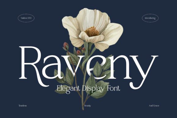
Raveny Font – Raveny is a refined serif that marries classic proportions with a contemporary cut: high-contrast strokes, narrow shoulders, and slightly tapered serifs create a graceful silhouette on the page. Its clean shapes and steady rhythm perform especially well in invitations, boutique branding, and feature headlines where a formal but approachable tone is desired. Careful spacing keeps legibility intact even when set tightly for display work.
The face translates cleanly between print and digital thanks to thoughtful hinting and crisp counters, giving logos and editorial subheads a dignified presence without feeling stiff. Subtle stylistic alternates let you soften the voice for wedding stationery or sharpen it for upscale packaging. For multi-part systems, Raveny pairs effectively with a humanist sans to retain warmth in body text.
My Recommendation: I reach for Raveny when a job calls for understated elegance – think wedding suites, artisanal labels, or boutique magazine features. Its restrained forms deliver a high-end impression while staying readable across sizes. The alternates are a nice touch for adding personality in headlines without disrupting overall visual consistency.
19. Et Emilia Grace Font
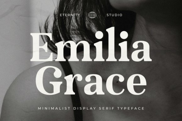
Et Emilia Grace Font – Et Emilia Grace balances delicate strokes with confident terminals to create a refined display face that reads as both romantic and composed. Subtle contrast between thick and thin strokes and generous counters produce an airy texture that suits upscale branding and editorial mastheads, placing it among the most elegant stylish serif fonts for projects that need a romantic yet professional voice. Its slightly condensed proportions and calligraphic hints make initials and logotypes feel handcrafted without tipping into florid ornamentation.
The family ships in OTF and TTF with a full set of uppercase and lowercase characters, numerals, punctuation and multilingual support, so it integrates smoothly into print and web workflows. Make use of alternates and ligatures where available to refine display settings, and rely on its careful spacing to shorten your kerning pass. Pair Et Emilia Grace with a low-contrast sans for body text to preserve hierarchy while keeping the overall tone polished and intimate.
╰┈➤ Download Et Emilia Grace Font
My Recommendation: I reach for Et Emilia Grace when a headline or identity needs to read as sophisticated but approachable. Its narrow proportions and measured contrast make it ideal for boutique brands, wedding suites, and magazine titles where a refined voice matters. I appreciate how it holds character at large sizes while remaining legible in smaller captions, so it’s a go-to for projects that require a graceful centerpiece.
20. Gibs Font
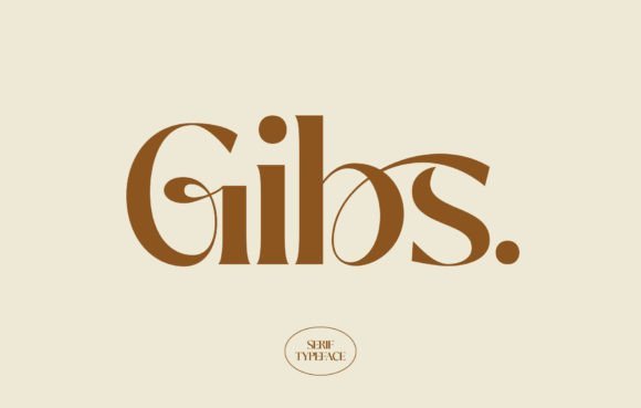
Gibs Font – Gibs presents a restrained elegance through sturdy serifs and balanced proportions, producing a calm yet authoritative typographic voice. Moderate stroke contrast and open counters give it clarity on printed spreads and luxury packaging, while a slightly squared finish lends a contemporary edge without abandoning traditional serif roots. The overall rhythm feels steady, which helps headlines and subheads maintain consistent presence across formats.
Because of its readable forms and harmonious proportions, Gibs adapts well between identity work and longer-form editorial use where visual poise is important. It pairs naturally with humanist or geometric sans faces to create modern hierarchies, and its steady metrics make responsive web rendering predictable. Reserve its stronger weights for display use and lighter weights for subtle, text-forward accents in layouts.
My Recommendation: I choose Gibs when a project needs quiet luxury rather than loud ornament. It lends premium editorial spreads and packaging a grounded, readable voice while keeping the design restrained. For brand identities that want a classic feel with contemporary balance, I pair Gibs with a simple sans and use the bolder cuts for headlines.
21. Fantasy Magist Font
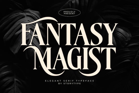
Fantasy Magist Font – Fantasy Magist blends classic serif structure with decorative flourishes to produce a dramatic display face well suited to invitations and social graphics. Expressive terminals and ornamental ligatures give initial letters a handcrafted flair, making short blocks of text feel intentionally styled. Many alternate characters are PUA encoded, which simplifies access to ornaments and swashes in apps that don’t expose OpenType panels.
This font works best when used sparingly as a focal accent-wedding suites, boutique packaging, or poster headlines-where its personality becomes part of the narrative rather than the entire voice. Because of its decorative tendencies, careful tracking and selective application are important to avoid clutter. Combine it with a straightforward sans or slab to keep compositions balanced and let the glyphs act as punctuation points in the design.
╰┈➤ Download Fantasy Magist Font
My Recommendation: I pick Fantasy Magist when a piece needs flourish and character without sacrificing legibility in short lines. The PUA-encoded alternates are a practical advantage for quickly styling initials and accents in mainstream design apps. Use it for invitation headings, social tiles, or packaging labels where ornate details can breathe and make an immediate impression.
22. Poina Font
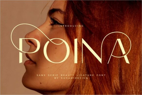
Poina Font – Poina presents a poised, modern serif that balances graceful terminals with confident stroke contrast; its built-in ligatures and alternates give headline treatments a refined personality while preserving legibility for short blocks of text. As one of the more fashion-forward options among stylish serif fonts, Poina excels at brand identities for beauty and cosmetics, editorial mastheads, and luxury wordmarks where an elegant presence is required.
The letterforms show a moderately tall x-height and tasteful spacing that helps maintain clarity on business cards and social posts without losing character at large display sizes. OpenType features like discretionary ligatures and stylistic sets let designers craft bespoke logotypes and packaging copy that feel bespoke and polished.
My Recommendation: I often reach for Poina when a project needs a fashionable but readable serif: it adds personality to logos and product packaging without feeling fussy. Its ligatures and alternates are great for crafting distinctive wordmarks, and the overall balance makes it reliable across print and social formats. Use it for beauty brands, boutique magazines, and any identity work that benefits from a classy, typographic voice.
23. American Vintage Font
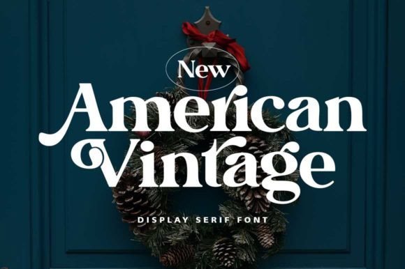
American Vintage Font – American Vintage channels classic typographic forms with gently flared serifs and warm, rounded terminals that evoke mid-century print and signage. The face reads as nostalgic without feeling dated, making it suitable for headline-heavy layouts, logos that want a handcrafted touch, and editorial spreads that need a bit of character.
At display sizes the subtle irregularities in stroke width give headlines a tactile, analog feel, while tighter tracking reveals its suitability for wordmarks and mastheads. Pair it with a neutral sans for modern applications or with textured paper and restrained color palettes to sell the retro aesthetic convincingly.
╰┈➤ Download American Vintage Font
My Recommendation: I would pick American Vintage for projects that benefit from a hint of nostalgia-think craft packaging, boutique coffee labels, or lifestyle editorials. It brings personality to headers without overwhelming supporting type, and it photographs well on textured materials. For a cohesive look, combine it with a simple geometric sans or use it alone for iconic logotype treatments.
24. Sendra Font
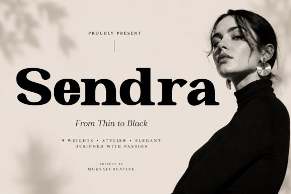
Sendra Font – Sendra is a refined serif family that spans thin to black weights, offering a wide tonal range for building sophisticated typographic hierarchies. Its clean structure, smooth curves, and measured contrast feel at home in luxury editorials and high-end branding, where subtlety and presence must coexist in both display and supporting roles.
The consistent proportions across weights make Sendra particularly effective for campaigns that require flexible scale-large display headlines, refined subheads, and restrained body copy can all share the same voice. Designers will appreciate how the heavier weights deliver dramatic impact while the lighter cuts retain elegance for delicate layouts and invitation work.
My Recommendation: I reach for Sendra when a project needs a cohesive family that can handle everything from dramatic covers to understated body text. Its weight range makes it easy to craft layered typography with clear visual order, and the refined details read as premium in print and digital. Ideal for fashion editorials, luxury packaging, and brands that demand an upscale typographic system.
25. Kolwer Font
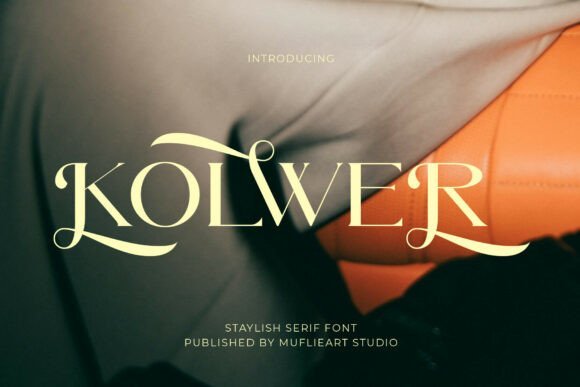
Kolwer Font – Kolwer is a high-fashion editorial serif with graceful, sweeping swashes and distinctive ball terminals that read like bespoke calligraphy. Its sharp contrast and elongated flourishes give headlines a couture attitude, and the marquee shapes sing in large sizes; as one of the more expressive stylish serif fonts, Kolwer signals premium positioning for labels, mastheads, and hero banners.
Apply Kolwer where display presence matters: luxury cosmetic packaging, boutique logotypes, and magazine covers where a strong signature is the goal. Pair it with a quiet geometric sans for supporting copy, use discretionary ligatures and small caps to build a unique voice, and reserve denser weights so the flourishes never compete with layout space.
My Recommendation: I reach for Kolwer when a brief calls for couture character and immediate shelf impact. Its swashes feel handcrafted, which lifts single-word logos and product names into memorable territory. Use it for high-end packaging and editorial covers, pairing with a neutral sans to keep supporting copy calm.
26. Melkova Font
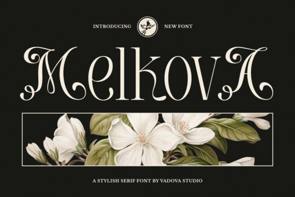
Melkova Font – Melkova blends classical serif proportions with decorative terminals and gentle curves that suggest vintage book types without tipping into fussy ornamentation. The letterforms are balanced and readable at display sizes: counters and spacing are measured so that flourishes add personality while preserving clarity. Alternates and small caps give designers options for dialing tone across headlines, invitations, and branding marks.
Because Melkova keeps stroke contrast moderate, it suits editorial headings, upscale collateral, and packaging where a composed, refined voice is required. Test it in short blocks and pairing scenarios-its ornamental touches perform best when used selectively-then combine it with a warm humanist sans for body text to maintain approachability while letting Melkova carry the expression.
My Recommendation: I pick Melkova for projects that need cultured, old-style charm without losing modern readability. It works beautifully on wedding stationery, boutique identity, and book jackets where a tasteful serif adds presence. I recommend using its alternates sparingly so the decorative features feel intentional rather than overwhelming.
27. The Amsterdam Vintage Display Font
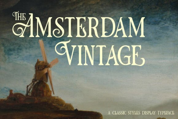
The Amsterdam Vintage Display Font channels mid-century shop signage with warm stroke contrast and pronounced wedge serifs that age well on textured paper. Its slightly condensed proportions make headlines appear bold without sprawling, and a wide set of alternates and decorative ligatures lets designers mix authentic period details into posters, labels, and packaging. The face reads with character at large sizes and pairs naturally with distressed textures.
Reserve this display face for headlines, posters, and product packaging where a nostalgic voice is desirable-brewery labels, farmers’ market signs, and artisan food brands are natural fits. Because the shapes are distinctive, avoid long passages and support it with a plain sans or a low-contrast serif for body copy. In print, try subtle distressing and careful ink choices to amplify the retro feel without harming legibility.
╰┈➤ Download The Amsterdam Vintage Display Font
My Recommendation: I reach for The Amsterdam Vintage when a brief asks for friendly nostalgia and strong retail presence. It gives posters and packaging an immediate period flavor while staying legible at display sizes. Use it for headline-only applications and back it with a neutral body face to keep longer text easy to read.
28. Angel Stencil Font
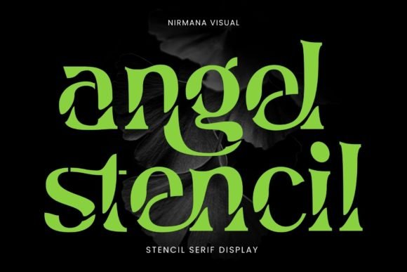
Angel Stencil Font – Angel Stencil is a contemporary stencil-style serif that pairs delicate bracketed serifs with cut-out counters for a display-focused personality. As one of the more eye-catching stylish serif fonts, it balances airy strokes and firm terminals so headlines hold up on product packaging, magazine covers, and wedding stationery. The stencil apertures lend a handcrafted editorial edge without sacrificing clarity at larger sizes.
Kerning arrives well-tuned and the default weight sits in a sweet spot for logotypes, social media headers, and branded hero text where ornament meets legibility. It isn’t intended for body copy-its interrupted shapes read best in short bursts and on photographed textures. Pair it with a neutral sans for supporting copy to keep compositions grounded and readable.
╰┈➤ Download Angel Stencil Font
My Recommendation: I reach for Angel Stencil when I want a bold, decorative headline that still reads cleanly on photos and packaging. The cut-out counters add character without becoming fussy, so it works well for boutique products and editorial covers. My typical setup pairs Angel Stencil with a plain grotesque for body text and reserves the stencil for titles and callouts.
29. Bavire Font
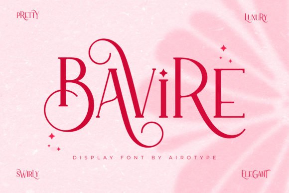
Bavire Font brings an elegant, slightly calligraphic temperament to serif display work, with a generous set of alternates and ornamental swashes. It is PUA-encoded, so designers can type decorative glyphs directly rather than hunting through OpenType panels, which speeds up mockups and rapid styling. Moderate stroke contrast keeps it readable at headline sizes while still feeling decorative.
The font’s extensive glyph set invites playful headline variations and refined logotype experiments without changing type families. Good kerning and on-screen hinting preserve crisp shapes in web mockups and social graphics. Consider pairing Bavire with restrained sans faces or light scripts for invitations, labels, and boutique branding work that needs variety in its typographic voice.
My Recommendation: I use Bavire when a project benefits from built-in flourishes and easy access to swashes-wedding invites and boutique labels come to mind. Because the PUA encoding makes alternates quick to type, it speeds iteration during layout work. I normally keep line lengths short and pair it with a simple sans to let the decorative forms breathe.
30. Becaose Font
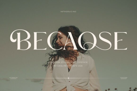
Becaose Font leans into high-contrast strokes and a rhythmic, elongated silhouette that reads like modern editorial typography tuned for luxe applications. Tall capitals and refined terminals give headlines a poised, classic-meets-modern presence ideal for boutique packaging and magazine mastheads. At display sizes, the pronounced contrast and hairlines create a refined highlight that photographs attractively.
Because its strengths are in display, use Becaose for main headlines, cover titles, or marquee logos rather than extended text. Pair it with a low-contrast sans for supporting copy and apply slight letterspacing at larger sizes to maintain clarity. The overall voice is polished and confident, a smart choice when a brand needs a poised typographic identity.
My Recommendation: I pick Becaose for projects that demand a premium editorial feel-think luxury product launches and fashion spreads. Its high-contrast shapes give headings a distinctive presence while pairing neatly with minimal sans text. In practice I test tight tracking on caps and a few ligature options to dial in a sophisticated, magazine-ready look.
31. Mithiya Font
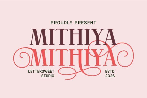
Mithiya Font pairs pronounced high-contrast serifs with flowing swashes and ornamental terminals that read like crafted handwriting at display size. The family includes discretionary ligatures, alternate glyphs and a refined italic, so designers can switch between ornate headlines and cleaner logotype forms without rebuilding lettershapes. Its generous stroke endings hold up in print and on retina screens, making it suitable for boutique branding, wedding suites, beauty packaging and editorial mastheads.
Among stylish serif fonts, Mithiya stands out for balancing decorative personality with practical spacing: swashes add flourish without breaking kerning or line-height, and the capitals have distinctive shapes that anchor a visual identity. Pair it with a neutral grotesque for modern contrast or a humanist sans to soften the look; use it large for impact and stick to OTF/Webfont versions to access contextual alternates and ligatures for the best results.
My Recommendation: I reach for Mithiya when a project needs refined, feminine character-its swash alternates let headlines feel bespoke while keeping logotypes crisp. The OpenType features saved me time on a recent boutique packaging brief by automatically applying tasteful ligatures. I avoid it for long-form body copy, but it excels on invitations, luxury branding, and editorial covers where decorative serif details can shine.
These 31 Stylish Serif Fonts give clear options when you want a refined, book-ready look. Testing a few candidates on mock covers and checking small-size legibility will reveal which face best supports your title and layout.
Use the grouping and notes provided to narrow choices, verify license terms, and finalize a type that enhances both cover art and printed presence.