

25 Stunning Classy Fonts for Luxury Brand Packaging 2026
Looking for classy fonts for a luxury wedding invite? This collection of 25 classy fonts covers serif, script, and modern faces suited to elegant invitation suites.
Each font entry includes a sample, mood notes, suggested pairings, and licensing details so you can match type to layout, monograms, and envelope addresses. Quick filters make it simple to sort by serif, script, or sans families.
1. Riclose Duo Font

Riclose Duo Font – Riclose Duo pairs a restrained serif with a flowing script so you get two complementary styles in one package. Both faces are PUA-encoded, so glyphs and ligatures are easy to access and apply across logos, wedding invitations, social posts, advertising and product art. If you like polished letterforms that read well at display sizes, Riclose Duo is a tidy example of how classy fonts can balance formality with hand-drawn warmth.
The serif offers crisp contrast and consistent proportions while the script supplies motion through generous alternates and swashes. Kerning and OpenType features are thoughtfully set up, which speeds layout work when composing monograms or headline/subhead pairings. I reach for Riclose Duo when a design needs refined presence without feeling stiff-boutique branding, editorial mastheads and upscale packaging all benefit.
My Recommendation: I use Riclose Duo when a project needs both authority and personality: the serif anchors the design while the script injects a handcrafted touch. The PUA encoding makes stylistic sets and ligatures immediately accessible in common design apps, cutting setup time. Best suited for wedding suites, boutique marques, and premium product labels where a matching script/serif voice adds cohesion.
2. Classy Bundle Vol. I Font

Classy Bundle Vol. I Font – Classy Bundle Vol. I gathers retro display faces with refined serif and script options to cover a broad range of nostalgic-to-elegant looks. The set includes display weights, decorative alternates and serif cuts that work for logotypes as well as posters and packaging. Files ship in common formats with OpenType features, so swapping stylistic sets and ligatures is straightforward without rebuilding layouts. This range lets designers pair a period headline with a cleaner serif subhead to create compelling contrast.
For identity work the bundle is useful because you can audition different period references quickly, from mid-century character to quiet refinement. Pay attention to spacing when using heavy display faces at small sizes and favor the serif cuts for longer text blocks. Pair decorative elements from the bundle with a neutral sans in digital contexts to preserve legibility while retaining graphic personality.
╰┈➤ Download Classy Bundle Vol. I Font
My Recommendation: I keep this bundle in my toolkit when clients ask for retro charm with a polished finish-it’s fast to test multiple voices without sourcing individual licenses. The mix of display and text-friendly serifs handles posters, labels and social campaigns equally well. Ideal for packaging, hospitality branding and editorial spreads that benefit from a period touch paired with readable copy.
3. Koela Font

Koela Font is a modern serif built with playful stylistic alternates and a useful set of ligatures that soften its formal structure. Its letterforms show modest contrast and gentle terminals, which give headlines a romantic, slightly whimsical character while remaining legible. Designers will appreciate how single-character alternates can shift the tone from restrained to expressive with a few keystrokes.
Koela performs well for fashion editorials, boutique identities and wedding stationery where type needs personality at display sizes. For extended text, pair Koela with a neutral sans or a simpler serif to avoid reader fatigue and maintain rhythm. The family’s spacing and weight choices also print cleanly, making it a reliable option for both web headlines and letterpress-ready pieces.
My Recommendation: I pick Koela when a project asks for a serif with distinct personality but not a heavy-handed look-its alternates let me introduce flair without custom lettering. It saves time over commissioning bespoke marks while still delivering memorable typographic flavor. Great for magazines, lookbooks and boutique brand work where headlines need to stand out.
4. Elegant Fashion Font

Elegant Fashion Font reads like a polished editorial serif built for attention: refined serifs, a controlled contrast, and smooth curves give it the clarity of a magazine masthead while still feeling delicate. Its letterforms balance narrow and open counters, producing elegant display lines that carry well across logos, covers, and premium packaging. Designed with careful spacing and consistent stroke modulation, it favors headlines and short settings where the subtle details matter.
Among classy fonts, Elegant Fashion stands out because its subtle calligraphic hints and strict serif grammar create an upscale voice without being fussy. The family supports larger sizes with crisp hairlines and clean terminals while maintaining legibility on printed labels or digital banners. For brands that want a poised typographic signature, this serif offers a readable presence and a refined silhouette suited to fashion and luxury contexts.
╰┈➤ Download Elegant Fashion Font
My Recommendation: I reach for Elegant Fashion when crafting identities that need a classic magazine feel; its serifs suggest heritage while its proportions keep things modern. It shines on logos, fashion lookbooks, and upscale packaging where headline typography must carry the brand voice. Pair it with a neutral sans for body copy so the serif remains the focal element.
5. Solarie Halsy Font

Solarie Halsy Font pairs a measured serif with flowing calligraphic alternates, allowing designers to switch between formal headings and expressive swashes without changing families. The base set keeps steady stroke contrast while alternates add hand-drawn flourishes, discretionary ligatures, and contextual forms for bespoke word shapes. That duality makes the typeface excellent for titles and logotypes that need both refinement and character.
OpenType features are generous: stylistic sets, swash characters, and ligatures let you compose vintage-inspired mastheads or modern editorial layouts using one package. Because serif and script components were tuned to work together, kerning and weight transitions feel natural even when mixing styles on the same line. Use it on branding, packaging, and wedding materials where custom lettering and readability must coexist.
╰┈➤ Download Solarie Halsy Font
My Recommendation: I reach for Solarie Halsy when a brief asks for handcrafted charm without losing typographic control; the alternates make headlines feel bespoke. It’s ideal for wedding branding, boutique packaging, and retro-modern ads. Combine the serif for structure and the script alternates for signatures or taglines to keep designs readable yet distinctive.
6. Modymel Script Font

Modymel Script Font offers a refined handwritten voice: soft arches, gentle loops, and a steady rhythm create an intimate, polished look suited to short display text. Stroke endings are restrained rather than flamboyant, which helps the face read clearly on invitations, gift tags, and boutique labels. The result feels like a practiced signature-personal but composed.
Built with alternate glyphs and smart ligatures, Modymel avoids repetitive patterns and keeps repeated names or phrases lively. It performs best at display sizes where the interplay between thin and fuller strokes can be appreciated, and it pairs well with a structured serif for contrast. Use it to give copy a handcrafted finish while retaining a professional tone.
╰┈➤ Download Modymel Script Font
My Recommendation: I favor Modymel when a project needs an approachable yet refined signature; its alternates let you craft unique wordmarks quickly. It works beautifully on wedding suites, boutique logos, and premium social graphics. Keep body text neutral and reserve Modymel for focal elements so the script remains legible and elegant.
7. Thermal Script Font

Thermal Script Font – Thermal Script slips into designs with polished, calligraphic curves and refined terminals that read as both soft and deliberate. Its ligatures and subtle swashes are controlled rather than ornate, giving it a poised personality often found among classy fonts used on invitations, boutique labels, and editorial accents.
The face performs best at display sizes: generous counters and balanced spacing keep names legible while OpenType alternates add tasteful variety without breaking line rhythm. Pair it with a low-contrast serif for magazine mastheads or a clean sans for modern packaging to maintain hierarchy and a delicate visual identity.
╰┈➤ Download Thermal Script Font
My Recommendation: I reach for Thermal Script when a brief calls for graceful, feminine typography-wedding suites, luxury product labels, or boutique identities. Its alternates let me inject personality selectively, so the design stays readable and refined. For projects that need a soft but assured signature, this typeface rarely disappoints.
8. Say Amen Font

Say Amen Font pares letterforms to crisply cut strokes and wide apertures, producing a clean, contemporary presence across both display and body sizes. The subtle circuitry-inspired terminals give the face character without becoming literal, which helps it feel modern and approachable at the same time.
Multiple weights, small caps, and precise tracking controls make it useful for identity systems, bold headlines, and editorial spreads where clarity must carry personality. Use it when a project needs a confident sans with a distinct silhouette-tech brands, posters, and magazine headers are natural fits.
My Recommendation: I pick Say Amen for branding work that needs a modern, readable voice with a slight technical edge. Its skeleton is neutral enough to pair with many design elements, yet memorable when used large. It’s especially handy for logos and headlines that must cut through clutter without being loud.
9. Kreata Agnore Font
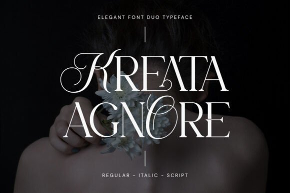
Kreata Agnore Font – Kreata Agnore combines classical serif proportions with contemporary cuts: high-contrast strokes, gentle brackets, and elegant terminals produce a headline face that feels both authoritative and stylish. The family includes roman, italic, and display alternates that add flourish where a brand needs typographic personality.
Thoughtful kerning and a range of weights let it handle tight-set mastheads as well as more open editorial layouts, while its decorative shapes give logos and packaging a premium tone. For projects that require a refined serif with expressive options, this design provides practical versatility and character.
╰┈➤ Download Kreata Agnore Font
My Recommendation: I choose Kreata Agnore when a project demands a poised, typographic identity-magazine covers, upscale packaging, and logotypes benefit most. Its alternates reduce the need for additional display faces, simplifying art direction. When you want a classic voice with contemporary precision, this family delivers.
10. Backrows Font

Backrows Font – Backrows blends blackletter calligraphy with a restrained sans serif, producing an engaging contrast between ornate strokes and clean geometry. The pairing creates a headline voice where decorative capitals sit beside neutral lowercase forms, keeping legibility high while still feeling expressive. Alternate glyphs, swashes and discretionary ligatures let you dial ornamentation up or down, so the face can read formal or more casual depending on context. Backrows ranks among classy fonts when you need historic gravitas without sacrificing modern clarity.
Technically, the family ships with careful kerning pairs, multiple stylistic sets and ligatures that preserve letter spacing at display sizes. The sans components soften heavy blackletter shapes for screen use, though the most intricate forms demand generous leading and ample size in print. Pair it with a muted sans for body text or use contrasty textures and metallic printing to emphasize craft. Treat Backrows as a display face-its power is in short bursts like covers, badges and logos rather than long passages.
My Recommendation: I reach for Backrows when a project needs heritage character with contemporary readability; its alternates let me fine-tune the drama. The mix of blackletter weight and sans restraint works especially well for fashion labels, editorial mastheads, and boutique packaging. Use it for headlines and strong logo marks where ornamentation can be shown off without losing clarity.
11. Golden Allure Font

Golden Allure Font – Golden Allure pairs a poised modern serif with an airy handwritten script to create a warm, polished identity. The serif provides structure with elegant contrast and modest bracketed terminals, while the script supplies fluid swashes and natural irregularity that read as bespoke signatures. Together they form a voice that suits wedding stationery, premium product packaging and refined brand marks. Both styles include alternates and contextual forms to make monograms and logotypes feel handcrafted.
From a usage standpoint, reserve the script for names, signatures and short decorative lines while letting the serif handle headings and extended fragments where readability matters. Look for opentype features, stylistic sets and ligatures that smooth transitions between the two styles, and tighten tracking for close-fit wordmarks. For print, keep an eye on ink spread around delicate strokes; for web, use high-quality webfonts or SVG to preserve swashes. Test at actual sizes to ensure the script’s loops remain open and legible.
╰┈➤ Download Golden Allure Font
My Recommendation: I use Golden Allure when a brief needs a human, upscale touch-the serif keeps hierarchy clear while the script injects personality. It’s perfect for boutique brands, wedding collaterals and boutique retail where a handcrafted feeling is desired. The duo makes designing elegant wordmarks straightforward while allowing subtle flourishes for premium presentation.
12. Outside Collection Font Pack

Outside Collection Font Pack – Outside Collection is a matched set of sans and script styles that combine neutral geometric letterforms with relaxed hand-drawn scripts to produce cohesive typographic systems. The family is designed so neutral sans weights stabilize livelier script marks, making logos, posters and social headers feel thoughtfully balanced. Included alternates and swashes enable both restrained identity work and more expressive display use without awkward contrast. This collection suits lifestyle brands, editorial sidebars and product tags that need consistent tone across touchpoints.
On the technical side, weights and italics share baseline metrics so pairing is plug-and-play and alignment stays tidy across layouts. Use bolder sans weights for hierarchy and reserve scripts for emphasis; small-size scripts may require smoothing or raster tweaks in exports. Because the pack is engineered to match, switching between web and print requires fewer adjustments and keeps brand voice steady. Keep script usage deliberate to avoid legibility loss on tiny labels.
╰┈➤ Download Outside Collection Font Pack
My Recommendation: I recommend the Outside Collection when a project needs a single, dependable palette that behaves predictably across media. It saves time on pairing decisions and tightens brand consistency between packaging, web and print. Ideal for cafés, indie labels and editorial projects where a controlled, approachable look is the aim.
13. Couple Match Font – classy fonts

Couple Match Font – classy fonts – Couple Match pairs a tall, modern serif with a flowing handwritten script to form a deliberate two-face system. The serif offers elongated proportions and refined stroke contrast while the script delivers a signature, human rhythm; together they read as luxurious and approachable. Support for extended languages, numerals, and symbols makes it reliable for international pieces. As one of the more pronounced classy fonts in this collection, it excels for wedding invitations and high-end branding.
The balance between restraint and flourish is carefully handled: the serif anchors layouts with tight kerning and vertical emphasis while the script supplies expressive nameplates and taglines. OpenType alternates and ligatures smooth repeating forms, and both faces retain clarity at display sizes and in print. Use this duo across packaging, editorial mastheads, and bespoke stationery when a refined contrast is required.
╰┈➤ Download Couple Match Font – classy fonts
My Recommendation: I’d reach for Couple Match when a project needs formal structure with a handwritten flourish – think luxury invites, boutique product labels, or premium branding. The contrast between the tall serif and signature script creates immediate personality without losing legibility. Multilingual coverage and a full symbol set mean fewer workarounds when localizing or fine-tuning layouts.
14. Chaome Font

Chaome Font – Chaome adapts classic serif anatomy with contemporary gestures: softened terminals, a comfortable x-height, and restrained contrast that give text a distinct but readable voice. It performs well in long read settings while offering enough character to lift headlines, thanks to open counters and balanced proportions. The overall texture is calm and polished, making it a reliable choice for mixed media work.
Spacing and weight distribution allow Chaome to scale cleanly from body copy to display, and its even kerning keeps columns tidy. It pairs especially well with a neutral sans for corporate identity or with a narrow sans for editorial layouts. Designers who need a serif that reads cleanly across print and responsive screens will find a dependable option here.
My Recommendation: I’d choose Chaome for magazine typography, brand systems, or long-form editorial where you want a serif with subtle personality. It holds up at small sizes and gives headlines a cultured, restrained tone without demanding heavy ornamentation. Pair it with a geometric sans to add modern contrast while keeping overall clarity.
15. Amber Queen Font

Amber Queen Font – Amber Queen channels calligraphic tradition into a modern script with lively stroke contrast and graceful swashes. The letterforms move with intentional irregularity-handmade in feel but refined for crisp digital reproduction-and a generous set of alternates and ligatures lets you craft bespoke wordmarks. Its rhythm reads energetic and expressive at display sizes.
Best used for covers, packaging, and luxury stationery, Amber Queen sings when given space to breathe; adjusting tracking prevents crowded joins from overwhelming the eye. It pairs well with restrained serifs or minimalist sans faces when a focal, handwritten headline is required. The font’s clean vectors simplify production for print, foil, or engraving applications.
My Recommendation: I’d pick Amber Queen for brands that want a handwritten presence without losing sophistication – bridal boutiques, artisan packaging, and fashion covers benefit most. The alternates and ligatures let you tune a signature look across applications. Keep it large and let the script lead the composition while supporting it with simple color and shapes.
16. The Fourth Avenue Font

The Fourth Avenue Font – The Fourth Avenue pairs a graceful script with a clean sans to create a pleasant contrast between flourish and restraint; the script offers fluid, hand-lettered swashes while the sans provides quiet, supportive structure. This combination reads as refined and modern, and the designers included carefully tuned kerning plus alternate characters so headlines and logotypes keep character without losing legibility – a smart entry in the category of classy fonts for editorial or brand use.
On the technical side the pair handles display sizes well: the script’s open counters stay readable at larger scales while the sans works comfortably for short bodies and captions. Use the script for signatures and focal headlines, reserve the sans for secondary copy, and experiment with letterspacing and ligatures to get a bespoke feeling for invitations, packaging, and boutique websites.
╰┈➤ Download The Fourth Avenue Font
My Recommendation: I would reach for The Fourth Avenue when a project needs expressive headlines that still play nicely with clean text – the script adds personality while the sans keeps the layout readable. Its alternates and kerning make it quick to craft polished logotypes or wedding stationery without heavy customization. For boutique branding, premium event invites, and social graphics that need a hand-crafted look, this font pair makes production fast and convincing.
17. Mugiyako Font

Mugiyako Font – Mugiyako is a display serif that blends tall, graceful serifs with a contemporary silhouette; its moderate contrast and slightly tapered terminals give type a poised, editorial feel. The letterforms carry a hint of old-style warmth while remaining crisply modern, which makes the face especially suited to premium packaging, logos, and magazine mastheads where presence matters more than long-form reading comfort.
The family includes refined capitals and carefully considered punctuation, plus tight but friendly kerning that helps display words sit confidently in tight compositions. Pair Mugiyako with a neutral sans for informational copy or use it solo for labels and posters when you want a recognizable, upscale identity with quiet personality.
My Recommendation: I’d pick Mugiyako when a brand needs regal but not fussy typography – it conveys heritage without feeling dated. Its strong presence on labels and covers makes it ideal for boutique goods, book jackets, and premium food packaging. Use it for logotypes or hero headlines where a sense of poise and craft is required.
18. Cafgone Font

Cafgone Font – Cafgone is a modern sans serif with smooth strokes and a generous x-height that keeps short bursts of text instantly legible; the subtle contrast in strokes and slightly rounded terminals soften its mechanical geometry, giving it an approachable but sophisticated voice. It reads well across screens and print, which makes it a reliable choice for brand systems that need consistency without looking clinical.
The family’s weight range and open counters make it useful from logotype to signage, and its spacing survives tight tracking in headlines while retaining clarity at smaller sizes. For layouts that require a contemporary, restrained look, pair Cafgone with a tasteful serif for editorial depth or use it alone for clean packaging, wayfinding, and digital interfaces.
My Recommendation: I would use Cafgone when a project calls for uncomplicated typography that still feels polished – its balance of warmth and geometry fits tech lifestyle brands and modern hospitality concepts. The range of weights simplifies hierarchy work across print and web. For corporate identity, packaging, or UI where unobtrusive clarity is the goal, Cafgone is a dependable option.
19. Germany Duo Font

Germany Duo Font – Germany Duo pairs a fluid script with a high-contrast sans and a crisp monoline variant, forming a refined toolkit for identity work. The script reads like a natural signature with discretionary ligatures while the sans presents uppercase-only strength; separate ligatures and a monoline option extend creative control. If you want classy fonts that balance expressive signatures with structured wordmarks, this collection covers both ends for logos, wedding suites and social campaigns.
The bundle includes 12 editable logo templates that show practical pairings and speed early concepting, so you can test lockups without rebuilding from scratch. Turn on OpenType ligatures for richer script connections, swap to the monoline for understated labels, or rely on the uppercase sans to build punchy mastheads. For boutique brands and event designers seeking a polished but personable voice, Germany Duo makes maintaining consistency simple and fast.
My Recommendation: I choose Germany Duo when a project needs both personality and restraint: the script gives warmth while the uppercase sans provides authority. The logo templates alone save hours in mockups and make proportion decisions obvious. Use it for boutique packaging, wedding branding and signature logos where a refined typographic pairing is key.
20. Bronx Simpul Duo Font

Bronx Simpul Duo Font – Bronx Simpul Duo contrasts a traced-outline serif with an expressive script companion to create distinctive nameplates and watermark treatments. The script includes upper and lowercase, numerals and wide punctuation along with discretionary ligatures to smooth common connections. A second ‘clean’ version swaps alternate letterforms so repeated words look hand-crafted rather than mechanical, giving typographic variety without extra drawing work.
Placing the outline serif against a filled script produces crisp contrast that holds up on both light and dark backgrounds and reads well in small sizes for social badges. Switching between the three stylistic options lets you quickly test mood and word shape during branding sprints. This pair is particularly effective for boutique labels, event stationery and editorial headers that need character alongside clarity.
╰┈➤ Download Bronx Simpul Duo Font
My Recommendation: I reach for Bronx Simpul Duo when a project needs personality without sacrificing legibility. The outline serif is excellent for watermark-style marks while the script supplies warmth and motion. Try it on boutique product labels, wedding invites and social headers where distinctive letterforms make an impact.
21. Authentic Trio Typeface Font

Authentic Trio Typeface Font – Authentic Trio packages three distinct faces designed to work together so you can build layered typographic systems from a single download. One member can command headlines, another provide readable supporting text and the third add decorative accents, creating built-in hierarchy and contrast. That internal variety removes the guesswork of pairing disparate families and keeps tone consistent across formats.
Use the bold display for posters or hero banners, reserve the subtler companion for body copy, and deploy the decorative sibling for logos, badges or callouts to add personality. Small tweaks to tracking and leading align the trio across web and print, making transitions between screens and paper smoother. This set is a smart choice for small studios or startups that want a reliable, multi-role type palette without juggling multiple licenses.
╰┈➤ Download Authentic Trio Typeface Font
My Recommendation: I pick Authentic Trio when a project needs a cohesive typographic strategy with built-in contrast. The three styles simplify hierarchy decisions and reduce time spent searching for matching faces. It’s ideal for branding systems, editorial layouts and promotional posters that benefit from a unified yet varied type palette.
22. Chrono Sphere Duo Font

Chrono Sphere Duo Font – Chrono Sphere Duo pairs a refined serif with an expressive script, producing contrast that feels measured and upscale. The serif supplies structure and legibility for headlines and blocks of text while the script injects motion and personality for signatures, monograms, or accent lines. Use the script sparingly so the composition remains readable and let the serif anchor longer passages. This combination sits squarely among classy fonts for work that needs both formality and a human touch.
OpenType alternates and ligatures are thoughtfully included, letting you tweak letter shapes for monograms or premium packaging; careful kerning helps the two styles integrate. It performs well on printed stationery, editorial covers, and identity systems where typographic contrast signals a higher price point. Try pairing the serif at medium-to-heavy weights with a lighter script to maintain clear hierarchy. The overall balance favors projects that require polished typography without feeling overwrought.
╰┈➤ Download Chrono Sphere Duo Font
My Recommendation: I reach for Chrono Sphere Duo when a brief asks for refined contrast-think boutique hotels, upscale invitations, or magazine covers. The script gives personality without overpowering thanks to sensible alternates, and the serif remains readable in extended settings. It’s my choice when a design must feel polished yet intentionally crafted.
23. Moon Delight Font

Moon Delight Font is a modern sans serif that references classic and contemporary forms, then pares them back to emphasize clear shapes and open counters. The OpenType set contains alternate uppercase forms and ligatures so you can craft a more elevated headline or logotype without adding heavy ornament. Stroke endings are modestly tapered, which introduces a subtle humanist quality and keeps the face from feeling mechanical.
The family suits brand marks, apparel labels, and editorial titles where a restrained aesthetic is wanted. Use the alternate uppercase characters to create a premium look on product packaging or mastheads, and consider tighter tracking for compact logos. Pair Moon Delight with a warm serif or a soft script to introduce contrast while maintaining a modern tone across print and web touchpoints.
╰┈➤ Download Moon Delight Font
My Recommendation: I’d choose Moon Delight for projects that need a clean, friendly sans with a refined presence-boutique retail identities and clothing brands benefit most. The alternate characters let a single letter change the mark’s personality, which is a small but powerful tool. It’s reliable across both print and digital applications.
24. Fontega Duo Font

Fontega Duo Font combines a sculpted serif with a flowing script to produce a formal yet lively display pairing. Each set includes uppercase and lowercase, punctuation, numerals, and multilingual support, so it’s ready for international packaging and invitations. The serif shows noticeable stroke contrast while the script favors sweeping terminals, making the duo effective for headline systems that require flair.
As a display family, Fontega excels on logotypes, invitation suites, and headline work where ornamentation should still read clearly at larger sizes. Pay close attention to spacing when both styles appear together: small tracking adjustments prevent collisions and preserve a refined silhouette. The face is best used when typographic drama must read as intentional rather than decorative excess.
My Recommendation: I recommend Fontega Duo when a brief calls for decorative typography that still reads cleanly-luxury brands, event stationery, and premium packaging are ideal. Its multilingual coverage removes barriers for global projects, and the included numerals and punctuation mean fewer compromises. For best results, set the script larger and let the serif handle short headlines to retain clarity.
25. Stay Classy Font

Stay Classy Font is a handwritten script that balances soft calligraphic strokes with restrained swash details, making letterforms feel both personal and tidy. It sits comfortably among classy fonts thanks to moderate contrast, open counters and a steady baseline that preserve legibility at headline sizes. The design leans modern rather than fussy, so it fits boutique identities, invitation suites and editorial pull-quotes without vying for attention. Alternate glyphs and smooth connections give short phrases a handcrafted cadence while keeping composition control simple.
Out of the box the spacing and kerning behave predictably, and the x-height reads well for short blocks and larger web text, though I would skip it for long body copy. Pair this script with a neutral sans for contemporary packaging or with a warm serif for magazine layouts; subtle tracking and small caps help keep logos balanced. File builds include standard OTF/TTF and webfont-ready formats, and its restrained personality adapts to color and texture treatments with minimal fuss.
My Recommendation: I reach for Stay Classy when a project needs the warmth of handwriting without ornamental excess. Its tidy joins and moderated swashes give logos, wedding stationery and boutique product labels a handcrafted feel while staying readable. Use it when you want personality that reads clearly across print and web-especially for short headlines, signatures, and packaging where clarity matters.
These 25 classy fonts offer a broad range of formal and contemporary styles tailored to wedding stationery. Use the sample images and pairing suggestions to choose a face that fits your invitation mood.
If you want a short list, start with the serif and script picks; they typically work best for printed invites and monograms. Happy designing.

