I Rounded Up 19 Vintage Serif Fonts With Real Old-World Charm for 2026
Vintage serifs are tricky to compare because so many look similar in a thumbnail. So I lined up 19 vintage serif fonts side by side, gave each a short great-for and watch-out note, and grouped them by how much character they carry. If the format itself is new to you, here is the role of a display typeface.
These are display faces first, meaning they shine on short lines at large sizes and lose their charm when set small. Pair any of them with a clean sans for the real reading. For the polished, high-contrast end of serifs, see luxury serif fonts; for handwriting with the same nostalgic streak, romantic calligraphy fonts.
- The bold vintage serif fonts at a glance
- Bold, characterful faces
- Refined and editorial
- Classic multipurpose picks
The bold vintage serif fonts at a glance
Start here if you want the characterful, attention-grabbing ones. The table sums up the loudest five before the detail below.
| Font | Best for | Feel |
|---|---|---|
| Alteron | Logos and posters | Confident, classic |
| Emerale | Luxury covers | Ornate, dramatic |
| Mosca Laroke | Characterful branding | Quirky, expressive |
| Rebmale | Bold wordmarks | Heavy, decorative |
| Hottera | High-end headlines | Solid, modern |
Bold, characterful faces
Strong presence, big personality. Give these room and keep the rest of the layout simple so they do not fight it.
Alteron
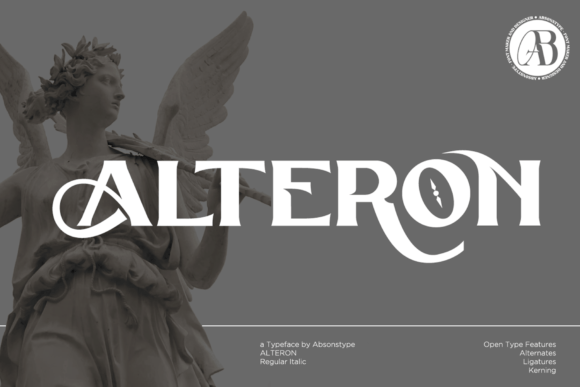
Alteron is a display serif with classic, stylish curves that mix romantic, classy, and modern cues. Great for logos, posters, and headlines that want some history without feeling dated. The proportions are clear and confident, so it holds attention at a glance. Watch out for its strong character, which a busy layout will fight, so give it room. Pair it with a minimal sans for the details and keep Alteron as the lead. In a single deep tone, it reads as considered and a little vintage, a strong wordmark face.
Emerale
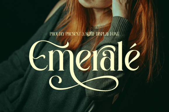
Emerale is a serif display face with expressive, ornamental detailing and a strong sense of refinement. Great for luxury logos, poster titles, and editorial covers that want some flourish. The ornamentation gives it real presence, so one word can carry a layout. Watch out for that same detail crowding quickly, so give it space and avoid tight lockups. Pair it with a clean sans for the details. In a single rich tone with open tracking, Emerale reads as ornate and upscale, a face for headlines rather than body text.
Mosca Laroke
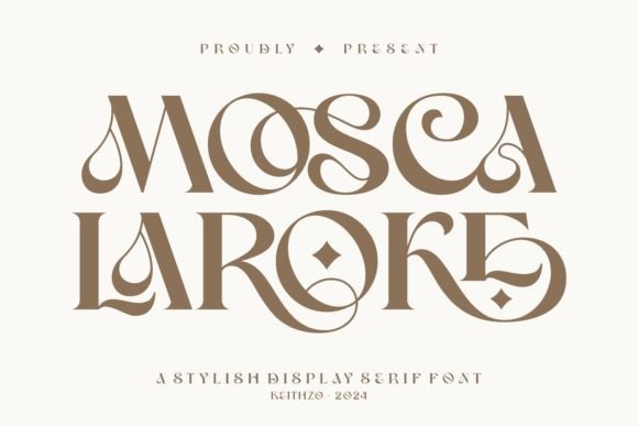
Mosca Laroke is a stylish display serif with an unusual, slightly quirky character drawn from a romantic mood. Great for multipurpose branding, posters, and headers that want personality over polish. The distinctive shapes make it memorable, which helps a wordmark stand out. Watch out for that strong character, so it suits short lines and clean layouts rather than dense text. Pair it with a minimal sans and keep Mosca Laroke as the lead. In a single tone with open spacing, it reads as expressive and a little vintage, good for a brand with some attitude.
Rebmale

Rebmale is a bold modern serif with a classic, distinctive shape and a set of decorative alternates and ligatures. Great for strong logos, posters, and headers where you want weight and history at once. The bold structure reads clearly and holds attention, while the alternates let you fine-tune a name. Watch out for the boldness overwhelming a delicate layout, so give it space and contrast. Pair it with a clean sans for the details. In a single deep tone, Rebmale gives a wordmark a confident, slightly vintage presence with room to customize.
Hottera
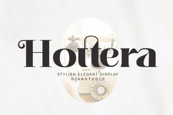
Hottera is a display serif drawn from current display trends, with a thick, balanced, well-varied structure made for luxury work. Great for fashion logos, poster titles, and packaging that wants confident, modern presence. The fairly even weight gives it solid, readable letterforms rather than fragile hairlines. Watch out for its real character, so a busy layout will fight it; give it room. Pair it with a minimal sans for the details. In a single deep tone with open tracking, Hottera reads as bold and upscale, a strong headline face.
Refined and editorial
More restraint, more polish. These carry a vintage mood while still reading as grown-up and magazine-ready.
Flyhayer
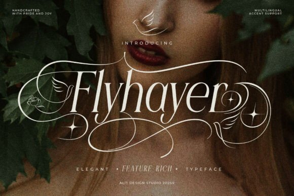
Flyhayer is a romantic serif with fine detailing and a graceful, slightly old-world character. Great for book covers, perfume labels, and editorial titles that want a hint of nostalgia. The strokes have a delicate contrast that gives headlines a refined, vintage-leaning snap. Watch out for the fine hairlines, which can drop out at small sizes or on textured stock, so keep it large and print it clean. Pair it with a plain sans for body copy. In a muted, slightly aged palette, Flyhayer reads as both romantic and established.
Diemha
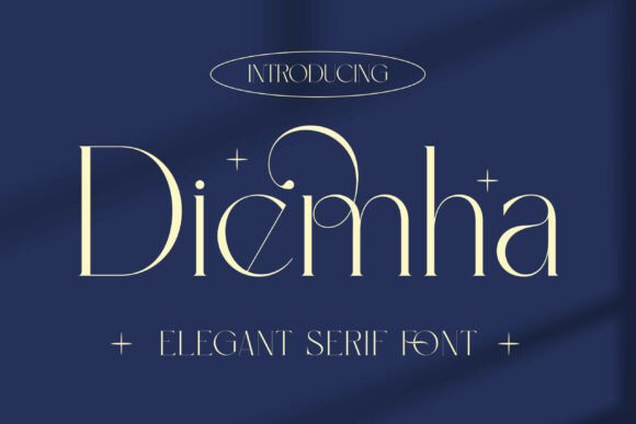
Diemha is a soft serif with a celestial feel and a gentle stroke contrast. Great for beauty branding, wedding monograms, and dreamy editorial spreads. The shapes are graceful and a little airy, which gives a layout a calm, romantic mood. Watch out for that softness reading as too delicate on busy backgrounds, so give it space and a quiet setting. Pair it with a clean sans and a pale palette. Set large with open tracking, Diemha carries a short, important line with a light, refined touch.
Lathenia
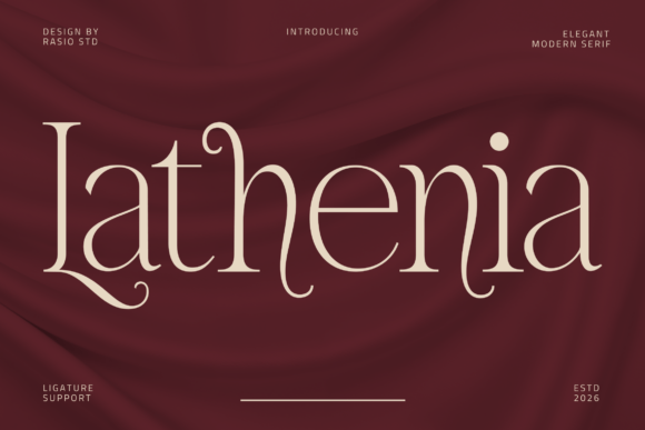
Lathenia is a modern display serif with a romantic, editorial mood and fluid, graceful movement. Great for magazine titles, fashion lookbooks, and brand names that want a literary feel. The shapes flow nicely, giving headlines a refined, story-like quality. Watch out for it losing character below headline sizes, as a display face, so keep it large. Pair it with a minimal sans for the supporting text. In a single deep tone with open spacing, Lathenia gives a layout a poised, editorial headline that reads as both modern and a little romantic.
Lovepin
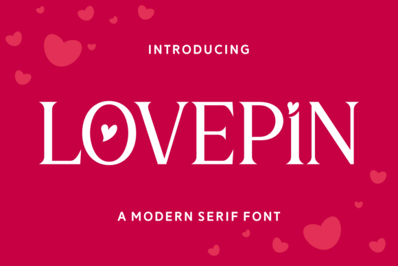
Lovepin is a modern serif with romantic, whimsical decorative touches and a high stroke contrast. Great for beauty packaging, stationery, and playful editorial headers. The decorative letters give names a soft, ornamental finish that feels hand-considered. Watch out for the decorative detail and fine strokes both preferring larger sizes, so reserve it for headlines. Pair it with a clean sans for body copy and let the serif carry the personality. In a muted palette with open tracking, Lovepin reads as romantic and a touch playful without tipping into fussy.
Qaster
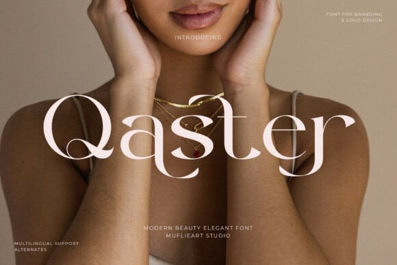
Qaster is a modern display serif that takes a classical skeleton and sharpens the proportions for a current feel. Great for fashion logos, editorial titles, and packaging that wants heritage with an edge. The shapes are clean and confident, giving headlines a polished snap. Watch out for the contrast preferring larger sizes, so reserve it for display use. Pair it with a minimal sans for the functional text and keep Qaster as the lead. In a single deep tone with open tracking, it reads as both established and modern, a flexible headline face.
Paris Forbel
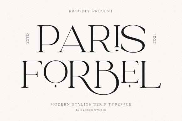
Paris Forbel is a modern display serif with a refined, slightly continental air. Great for fashion branding, editorial titles, and packaging that wants understated polish. The shapes are clean and graceful, giving headlines a poised quality. Watch out for it leaning display, so it loses subtlety at small sizes and suits short lines best. Pair it with a minimal sans for body copy and keep Paris Forbel as the lead. In a muted palette with open tracking, it reads as modern and a little romantic, a tidy headline face for a refined brand.
Berlys
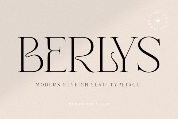
Berlys is a modern display serif with a clean, refined structure. Great for fashion branding, editorial titles, and packaging that wants understated polish. The shapes are graceful and clear, giving headlines a poised quality without much ornamentation. Watch out for it showing best at larger sizes and suiting short lines, since it leans display. Pair it with a minimal sans for the supporting text and keep Berlys as the lead. In a muted palette with open tracking, it reads as modern and a little romantic, a flexible headline face for a refined brand.
Classic multipurpose picks
The dependable middle: clear, slightly retro and easy to use across logos, covers and headings.
Notica Serif
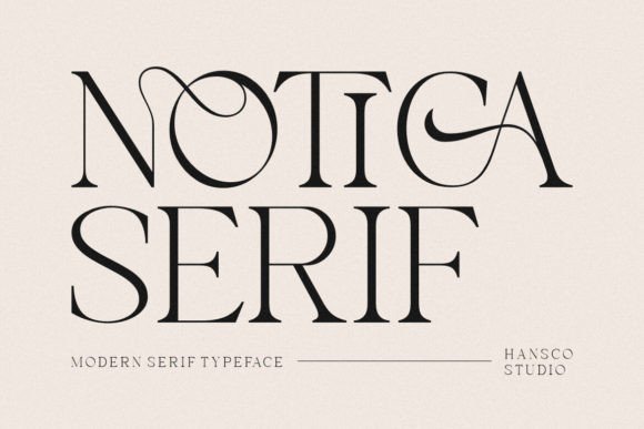
Notica Serif is a classy display serif with a clean, slightly retro look and a steady, readable structure. Great for logos, book covers, and headers where you want history with clarity. The shapes are confident without heavy ornamentation, so it reads clearly at a glance. Watch out for it leaning display, so it shows best at larger sizes and loses subtlety when set small. Pair it with a clean sans for body copy. In a muted palette, Notica Serif gives a wordmark a tidy, vintage-leaning polish that suits a wide range of projects.
Chorles
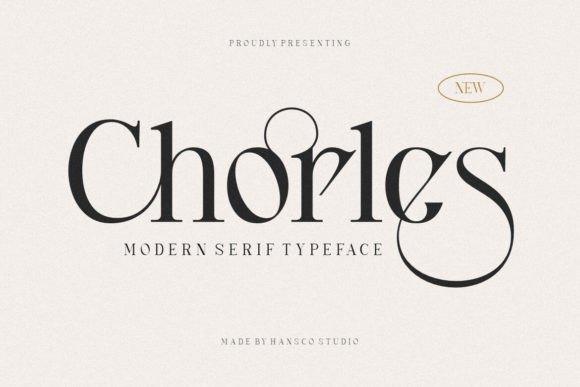
Chorles is a classy display serif with a distinctive look rooted in a romantic, vintage mood. Great for multipurpose branding, posters, and chapter headings that want some character. The shapes are clear and a little decorative, which gives a wordmark presence without much fuss. Watch out for it suiting short lines, not paragraphs, and showing best when set large. Pair it with a clean sans for body copy. In a muted palette with open spacing, Chorles reads as considered and slightly retro, a dependable face for a vintage-leaning brand.
Gemola
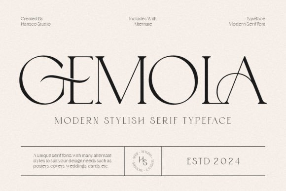
Gemola is a modern display serif with a soft, vintage-tinged mood. Great for beauty branding, posters, and headers that want warmth with a hint of nostalgia. The shapes are graceful and clear, giving a wordmark a gentle, romantic presence. Watch out for it leaning display, so reserve it for short lines and larger sizes. Pair it with a minimal sans for body copy. In a muted palette with open tracking, Gemola reads as refined and a little old-world, a tidy headline face for a soft, vintage-leaning brand.
Soora Chenival
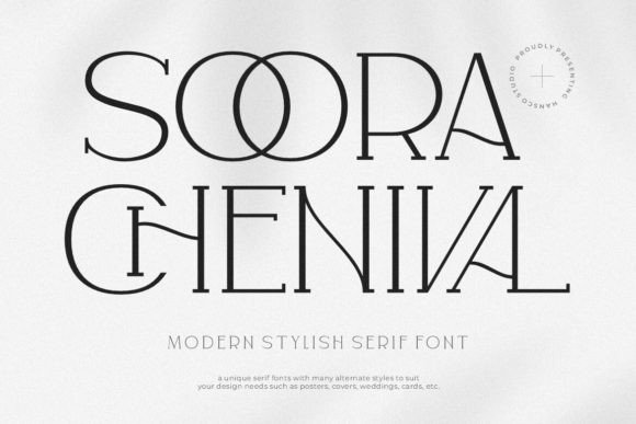
Soora Chenival is a classy display serif with a distinctive look and a romantic, vintage character. Great for multipurpose branding, book covers, and feature headings. The shapes carry some flair without heavy ornamentation, so a name stays clear while still feeling considered. Watch out for it suiting short lines and showing best when set large, as a display face. Pair it with a clean sans for the details. In a muted palette with open spacing, Soora Chenival reads as polished and slightly retro, a dependable headline face across projects.
Stefania
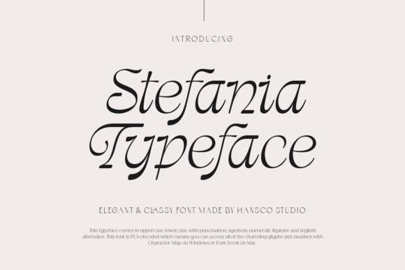
Stefania is a classy display serif drawn from a romantic mood, with clear, slightly decorative shapes. Great for logos, posters, and chapter headings that want some personality. The structure reads cleanly at a glance, which keeps a wordmark legible while still feeling characterful. Watch out for it losing subtlety at small sizes, since it leans display, so reserve it for short lines. Pair it with a minimal sans for body copy. In a single deep tone with open tracking, Stefania reads as considered and a touch vintage, a tidy face for a heritage-leaning brand.
Gitter Neormis
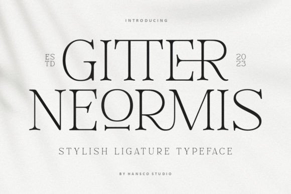
Gitter Neormis is a classy display serif with a distinctive character rooted in a romantic, vintage mood. Great for multipurpose branding, posters, and headers that want some flair. The shapes are clear and a little decorative, which gives a wordmark presence while staying legible. Watch out for it leaning display, so reserve it for short lines and larger sizes. Pair it with a clean sans for body copy. In a muted palette with open spacing, Gitter Neormis reads as polished and slightly retro, a dependable headline face for a vintage-leaning brand.
Anggie
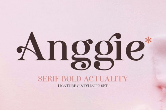
Anggie reads like a display serif with a creative, well-balanced mood, built for luxury and romantic projects. Great for boutique logos, editorial titles, and packaging that wants a refined, slightly artistic headline. The shapes are clear and considered, giving a wordmark presence without heavy ornamentation. Watch out for it suiting short lines and larger sizes, where its proportions show best. Pair it with a clean sans for body copy and keep Anggie as the lead. In a muted palette with open spacing, it reads as polished and a little romantic.
If you want my single favorite, Alteron does the most with the least fuss, a confident wordmark face that does not tip into costume. But if your project leans editorial, the refined group will serve you better. See how these sit against everything else in the elegant fonts roundup.
Disclosure: some links on this page are affiliate links. If you buy through them I may earn a small commission, at no extra cost to you. I only feature fonts I would be happy to use in my own work.