Trending Font Colors: A Practical Guide to the 2026 Color Trends
Every year a handful of colour authorities announce their pick, and every year designers screenshot the swatch and then quietly carry on using the same charcoal they always have. The gap is practical: a colour that works on a wall or a garment does not automatically work as type. This guide takes the 2026 color trends and translates them into something usable, with hex codes, contrast warnings, tested pairings, and a clear answer to where each one belongs in a layout.
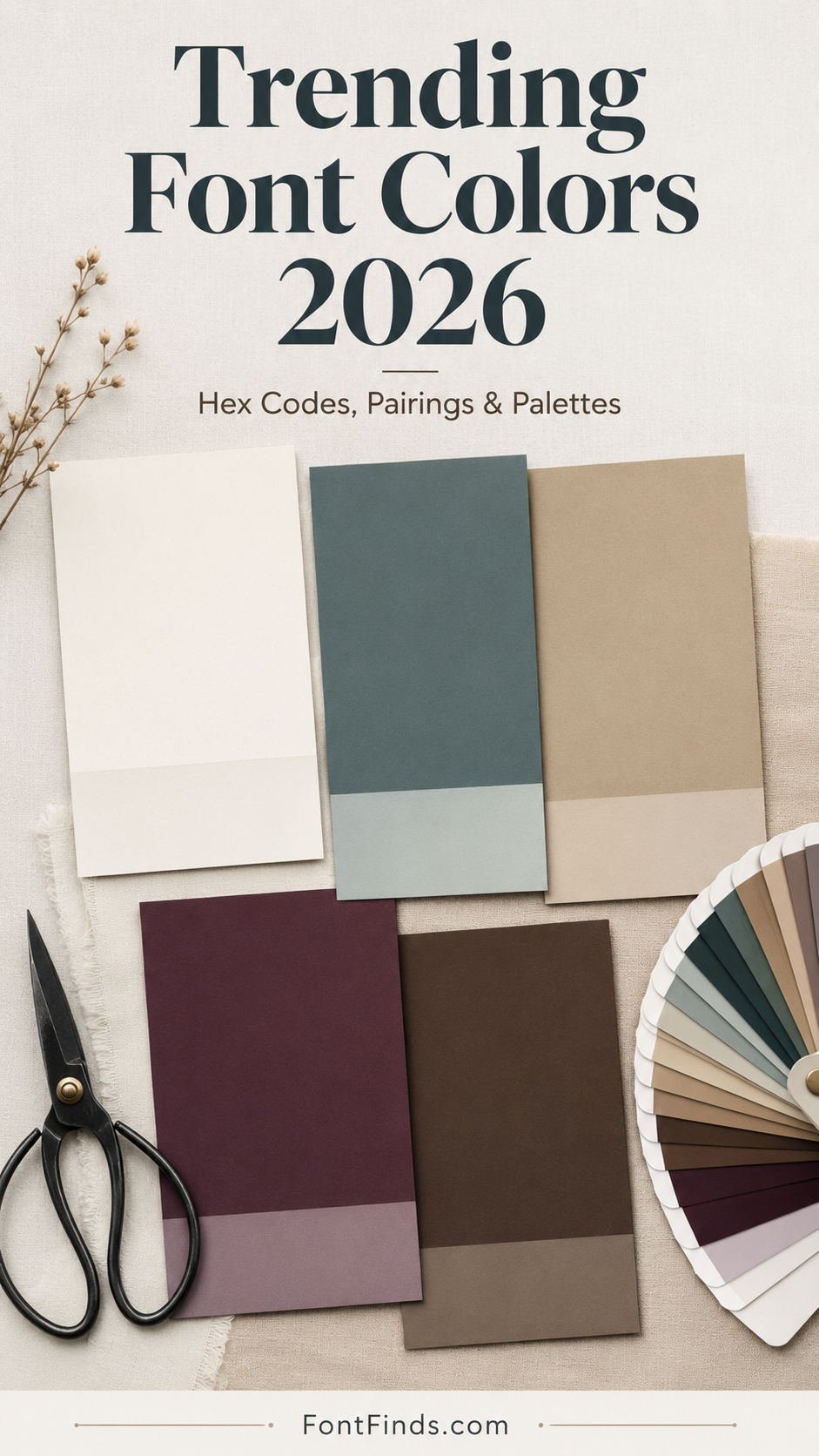
The One Story Behind All the 2026 Color Trends
Look at the announcements side by side and something obvious emerges. The 2026 color trends split into two camps, and they are saying the same thing from opposite directions.
On one side sits serene, weightless light. Pantone chose Cloud Dancer, a lofty white, and described it as a calming influence in a frenetic society. Sherwin-Williams went with Universal Khaki under a forecast titled Tailored and Timeless. On the other side sits grounded, tactile earth: smoky teals from Behr and WGSN, warm walnut browns across several paint brands, deep plum from Graham and Brown.
Both camps point away from the saturated, screen-bright palettes that dominated the early 2020s. One does it by removing colour, the other by rooting it in soil and water. Read as a whole, the 2026 color trends are a reaction to digital fatigue, which matters for typography specifically: type set in these colours is meant to feel calm and considered rather than shout.
The Eight Colours, With Hex Codes and Pairings
| Colour | Hex | Source | |
|---|---|---|---|
| Cloud Dancer | #F0EEE9 | Pantone Color of the Year 2026 | |
| Transformative Teal | #1C7E84 | WGSN and Coloro Color of the Year 2026 | |
| Hidden Gem | #3E5B54 | Behr Color of the Year 2026 | |
| Universal Khaki | #B8A88A | Sherwin-Williams Color of the Year 2026 | |
| Divine Damson | #5B3348 | Graham and Brown Color of the Year 2026 | |
| Warm Walnut | #6B4A32 | Grounded earth trend, seen across Benjamin Moore, Glidden and Minwax picks | |
| Amber Haze | #E8A33D | Coloro and WGSN Spring/Summer 2026 palette | |
| Electric Fuchsia | #D6297E | Coloro and WGSN Spring/Summer 2026 palette |
Four Rules for Colouring Type
1. Colour the message, not the paragraph
Trend colours belong on headlines, logotypes, and single emphasised words. Body copy should stay near-black or near-white almost always, because readability is not a place to be fashionable.
2. One saturated colour per layout
Transformative Teal and Electric Fuchsia both want to lead. Put them in the same design and neither wins. Pick one, then build the rest of the palette from neutrals.
3. Match the colour temperature across the palette
Warm Walnut beside a cool grey looks like a mistake. The 2026 neutrals lean warm across the board, so keep your greys and whites warm too.
4. Let the typeface and the colour agree
A delicate high-contrast serif in Divine Damson reads as luxury. The same colour on a heavy grunge display face reads as horror. Colour does not override the letterform, it amplifies whatever is already there.
Building a Color Palette Branding System From These
A trend swatch is not a brand palette. Turning these 2026 color trends into a working color palette branding system means assigning roles, and the structure that survives contact with real projects looks like this: one dominant neutral covering roughly seventy percent of surfaces, one supporting mid-tone at around twenty percent, and one accent at ten percent or less.
Three color palette branding combinations built from the colours above, each tested for contrast and pointed at a different market:
Quiet Luxury
Cloud Dancer as the dominant surface, Universal Khaki carrying secondary panels and dividers, near-black for all type. This is the safest color palette branding route for 2026 and the hardest to get wrong. Set a high-contrast serif logotype in the charcoal and let the whites do the work.
Earth-First Wellness
Transformative Teal leading, Cloud Dancer as breathing room, Amber Haze reserved strictly for calls to action. Reads as sustainable without resorting to the obvious leaf-green cliche. Works well with a clean geometric sans serif.
Warm Editorial
Divine Damson for display headlines, a warm off-white ground, muted gold for rules and small caps. Suited to beauty, fragrance, and anything print-adjacent. Pair it with a serif that has real stroke contrast, since flat sans serifs waste the depth of the plum.
The Contrast Problem Nobody Mentions
The two headline colours of 2026 are a very light white and a set of mid-tone earth colours. Both create the same trap: insufficient contrast between text and background. Cloud Dancer on any pale ground is effectively invisible. Universal Khaki and Amber Haze both fail standard contrast thresholds against white at body-text sizes.
The working fix is to treat these as pairs rather than singles. Cloud Dancer needs a dark ground behind it. Universal Khaki needs to be the background with dark type on top, not the other way round. Amber Haze needs to be reserved for large display sizes or bounded inside a dark button. Before finalising anything, run the combination through a contrast checker and view the layout at thumbnail size, which is where most colour decisions quietly fall apart.
For the underlying reasoning on why some colour pairings feel balanced and others do not, the basics of colour theory are worth twenty minutes of reading if you have never formally covered them.
Where the 2026 Color Trends Actually Apply
Logo design is the obvious one, but these 2026 color trends are most useful in the places where colour and type are inseparable: packaging where the product name is the design, social graphics that live or die at thumbnail scale, and colour fonts where the palette is baked directly into the glyphs. That last category is worth watching, since OpenType-SVG fonts let you build a trend palette into the typeface itself rather than applying it afterwards.
Questions People Ask
What are the main 2026 color trends for designers?
Two directions running in parallel: serene, weightless neutrals led by Pantone’s Cloud Dancer and Sherwin-Williams’ Universal Khaki, and grounded earth tones led by WGSN’s Transformative Teal, Behr’s Hidden Gem, and a broad move toward warm walnut browns.
What is the Pantone Color of the Year for 2026?
Cloud Dancer, PANTONE 11-4201, a soft off-white. It is the first true white chosen since the programme started in 1999, described by Pantone as a symbol of calming influence and new beginnings.
Can I use trending colours for body text?
Generally no. Almost every colour on this list fails contrast requirements at body-text size. Use them for headlines, logotypes, and accents, and keep body copy near-black or near-white.
How many colours should a color palette branding system contain?
Three does most of the work: a dominant neutral, a supporting mid-tone, and one accent. A fourth is occasionally justified for a specific functional need, such as an error state, but more than that usually signals an undecided brand rather than a rich one.
Do these colours work for print as well as screen?
The directions do, but the hex codes here are screen approximations. Pantone references and paint colours have their own official specifications, so pull those directly from the brand before sending anything to press.
Looking for typefaces to put these palettes on? Browse the full Creative Fabrica font library →