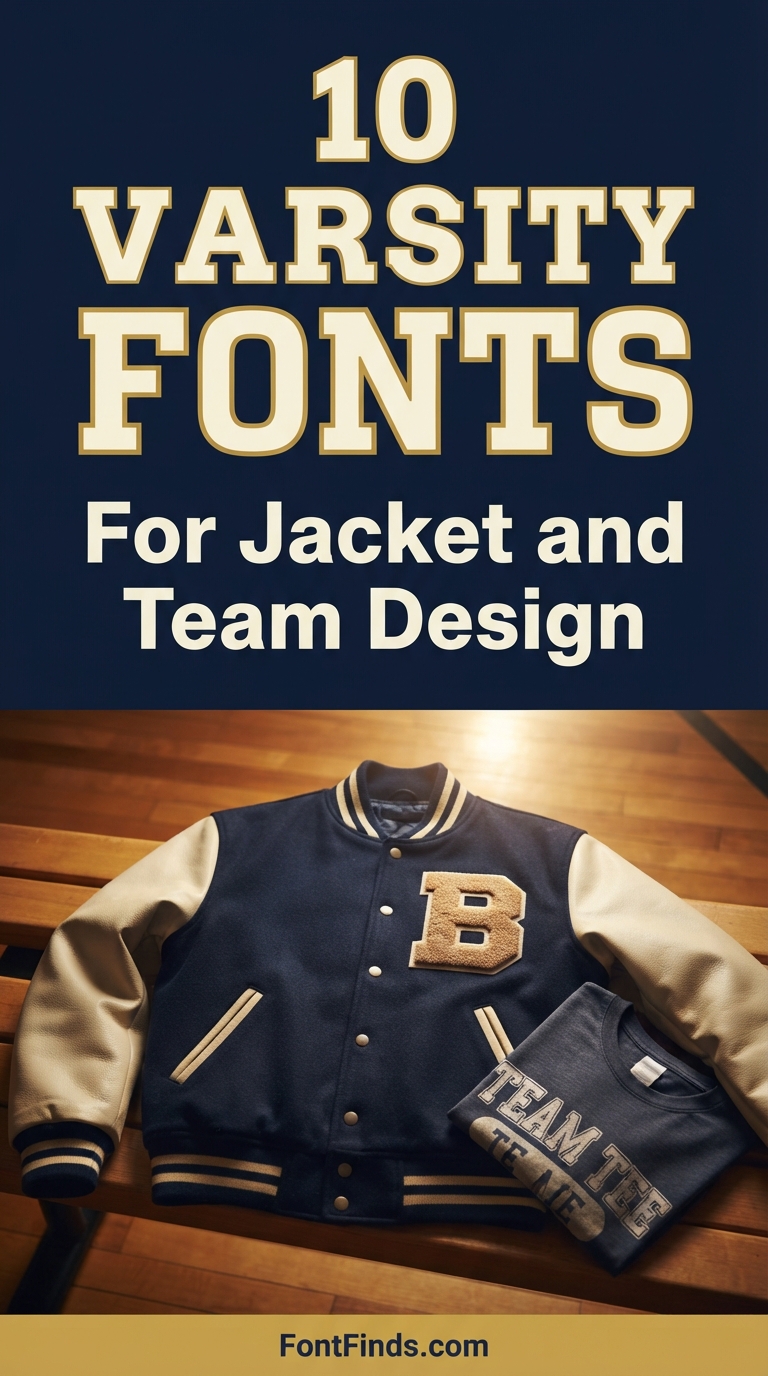
Varsity lettering is one of the few type styles whose entire appearance was dictated by manufacturing. Heavy slabs, uniform stroke weight and wide proportions all exist because the original letters were chenille patches sewn onto wool, and chenille cannot render anything fine. Understanding that constraint explains why some varsity fonts work beautifully on a real jacket and others fall apart the moment they reach a production floor.
Why Varsity Jacket Design Looks the Way It Does
American collegiate athletics awarded letters for achievement, and those letters were made from chenille, a fabric with a raised pile that cannot hold a sharp edge or a thin stroke. Every visual characteristic of varsity type follows from that material.
The heavy slab serifs exist because a thin serif would disintegrate in chenille. The uniform stroke weight exists because varying weight is impossible to control in a sewn pile. The wide proportions exist because a narrow letter loses too much area to the pile edge. The contrasting outline exists because a single-colour patch on a wool jacket needs a border to separate it from the ground.
None of that is decoration. It is all manufacturing, and it is why varsity type still works on modern apparel: the constraints that shaped it are similar to the constraints of embroidery and screen printing today.
Decide the production method first. This category more than any other punishes choosing a font before knowing how it will be made. Distressed textures cannot be embroidered. Connected scripts cannot be cut as separate letters. Layered outlines multiply screen printing costs. The font decision and the production decision are the same decision.
10 Fonts for Varsity Jacket Design
Collegiate Classic
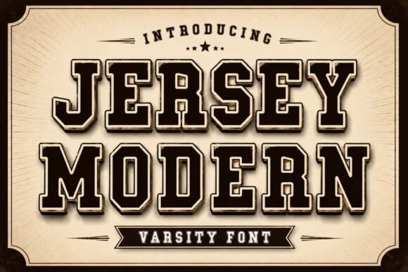
1. Jersey Modern
Jersey Modern draws directly on classic collegiate lettering and championship jersey numbering. Authentic varsity type has a specific structure: heavy slab serifs, near-uniform stroke weight, and letterforms wide enough to read from the stands.
Those proportions exist for a practical reason. Varsity lettering was originally chenille patches sewn onto wool, and chenille cannot render fine detail. Every characteristic of the style traces back to that manufacturing limit, which is why the same fonts still work when you send them to an embroiderer today.
My take: The most historically correct option here. If the jacket is going to a real embroiderer, this construction will translate cleanly.
View This Font →
Distressed Varsity
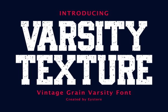
2. Varsity Texture
Varsity Texture applies vintage distressing to classic American college lettering, which changes the intended production method entirely. Distressed textures cannot be embroidered or chenille-patched, because both require solid shapes.
This is a print font. Screen printing, DTG and heat transfer all reproduce texture, and a distressed varsity face on a printed tee reads as a genuinely old jacket in a way clean lettering does not. Just do not send it to an embroidery shop.
My take: Print only. The texture that makes it look authentically worn is exactly what embroidery machines cannot reproduce.
View This Font →
High Energy Duo
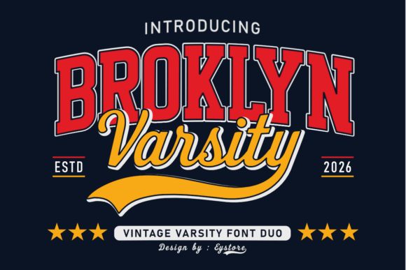
3. Broklyn Varsity
Brooklyn Varsity is a duo, which solves a specific varsity design problem. Jackets and team apparel almost always need two type treatments: a large letter or number, and a smaller name or year.
Using the same font at two sizes looks flat. Using two unrelated fonts looks accidental. A matched duo gives you contrast that still reads as one system, which is precisely what jacket backs, sleeve details and chest hits need.
My take: Buy duos for apparel specifically. Jackets need two type treatments and a matched pair prevents the mismatch that gives away amateur work.
View This Font →
Vintage Varsity
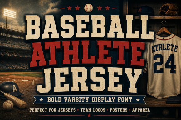
4. Baseball Athlete Jersey
Baseball Athlete Jersey brings vintage varsity styling with baseball-specific reference. Baseball lettering differs from football and basketball lettering in a way most people feel without being able to name.
Baseball script leans, connects and curves. Football and basketball lettering stays upright and blocky. If your design references a specific sport, matching the lettering tradition to that sport is a detail the audience will register even if they cannot articulate why it feels right.
My take: Match the lettering tradition to the sport. Baseball leans and connects where football stays upright and blocky.
View This Font →
Retro Sport Script
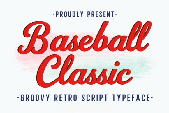
5. Baseball Classic
Baseball Classic is a bold retro script with a vintage sporty feel, sitting in the script rather than block tradition. Sports script has one significant production constraint that block lettering does not.
Connected scripts cannot be cut into separate letters, which means chenille patches and individual letter appliqué are off the table. It has to be printed, embroidered as a single unit, or cut as one connected piece of vinyl. Plan the production before falling for the look.
My take: Beautiful but production-limiting. Connected script cannot be applied as individual letters, which rules out traditional patch construction.
View This Font →
Bold Authority
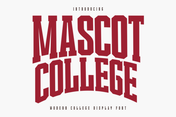
6. Mascot College
Mascot College is a bold authoritative college display face, built for the kind of institutional lettering that appears on gym walls and team banners rather than on jackets specifically.
Institutional lettering is wider and heavier than jacket lettering, because it is read from further away. Applying gym-wall proportions to a chest hit produces something that overwhelms the garment, so scale down the weight if you are moving it onto apparel.
My take: Built for large-format rather than apparel. Reduce the weight if you move it onto a chest print.
View This Font →
Craft Friendly
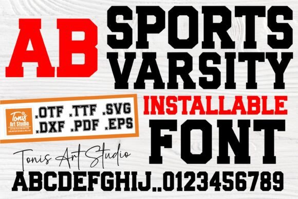
7. Sports Varsity
Sports Varsity is aimed explicitly at craft projects, which usually signals clean vector outlines suitable for cutting machines. For varsity work that matters enormously.
Varsity fonts frequently include layered outlines, and layered designs are where cutting goes wrong. Overlapping paths produce double cuts, and unclosed shapes produce holes. A font built for crafters has usually had those problems resolved before release.
My take: The safest choice for Cricut varsity projects. Layered outlines cause more cutting problems than any other font feature.
View This Font →
Versatile Classic
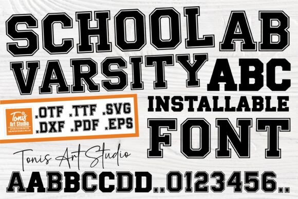
8. School Varsity
School Varsity is a versatile take on classic varsity style, positioned for general use rather than for a specific sport or era. Versatility in this category means moderate weight and simple outlines.
That makes it the practical default. Extremely heavy varsity faces dominate a garment and extremely decorative ones limit production options, while a moderate face works on jackets, tees, banners and signage without modification.
My take: The sensible default when you do not know yet what the design will be printed on. Moderate weight keeps every option open.
View This Font →
Stadium Impact
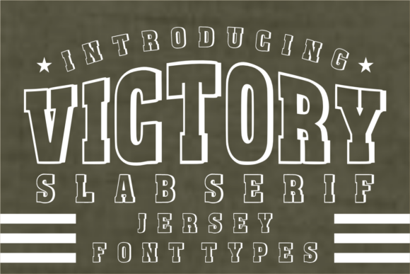
9. Victory
Victory is a powerful blocky high-impact face designed around stadium energy. Blocky construction with minimal internal detail is what allows varsity lettering to work at genuinely large sizes.
Jacket backs are among the largest single-piece applications in apparel, often 300mm or more across. At that scale, letterforms with fine detail start showing their construction flaws, whereas simple blocky shapes stay clean no matter how large you push them.
My take: The one for jacket backs. Large-format application exposes flaws in detailed fonts and this has nothing to expose.
View This Font → Free.
Ligature Display
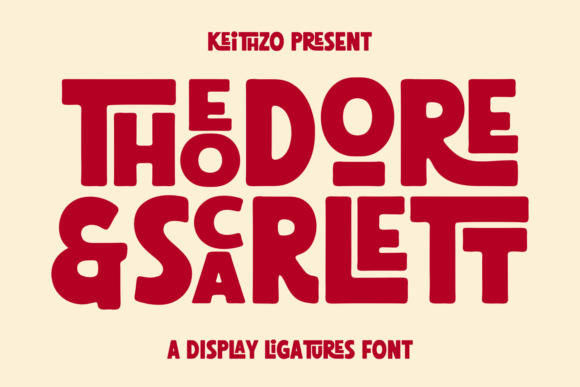
10. Theodore and Scarlett
Theodore and Scarlett is a bold display face with extensive ligature support, which is unusual in the varsity category and genuinely useful for team names.
Team names produce awkward letter combinations that standard spacing handles badly, particularly when a name runs long across a jacket back. Ligatures let specific pairs nest more tightly, which can be the difference between a name fitting the garment and needing to be shrunk.
My take: Check the ligatures against your actual team name. They can buy you the width you need on a jacket back.
View This Font →
Matching Varsity Jacket Design to Production
Chenille and appliqué
Needs solid separate letters with simple outlines. Rules out distressed textures, connected scripts and anything with fine internal detail. This is the most restrictive method and the most authentic.
Embroidery
Minimum stroke width around 1.5mm. Handles solid shapes well and texture not at all. Layered outlines are possible but each layer adds thread count and cost.
Screen printing
Each colour is a separate screen. A two-colour varsity font with an outline means two screens minimum, three if the garment is dark and needs a white underbase.
DTG and heat transfer
The most permissive. Handles distressing, gradients and unlimited colours. Weaker durability than screen printing and softer colour on dark garments.
Questions People Ask
What font is used in varsity jacket design?
Traditionally a heavy slab serif with a contrasting outline, derived from chenille patch lettering. Modern jackets use digital recreations of that style, several of which are covered above.
How big should lettering be on a varsity jacket back?
Typically 250 to 300mm across for a name or team, with individual letters often 75 to 100mm tall. Chest and sleeve details run considerably smaller, usually 60 to 90mm.
Can I embroider a distressed varsity font?
No. Distressing works by removing small irregular areas from the letterform, and embroidery cannot reproduce those gaps. Use a clean varsity face for embroidery and save distressed versions for printing.
Why does my varsity font look wrong at small sizes?
The outline. Varsity outlines are proportionally sized for large application, and at small sizes the outline closes the counters inside letters. Either remove the outline for small uses or scale it down separately.
Where do people go wrong with varsity jacket design?
Choosing the font before deciding the production method. Distressed textures cannot be embroidered and connected scripts cannot be applied as separate letters, so the two decisions have to happen together.
Do I need a commercial licence for team apparel?
If you are selling the garments, almost certainly. Check whether the licence covers merchandise specifically, since that is often separate from general commercial use.
Related: fonts for clothing brand logos, streetwear logo design ideas, or browse Creative Fabrica →


One Comment