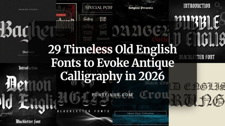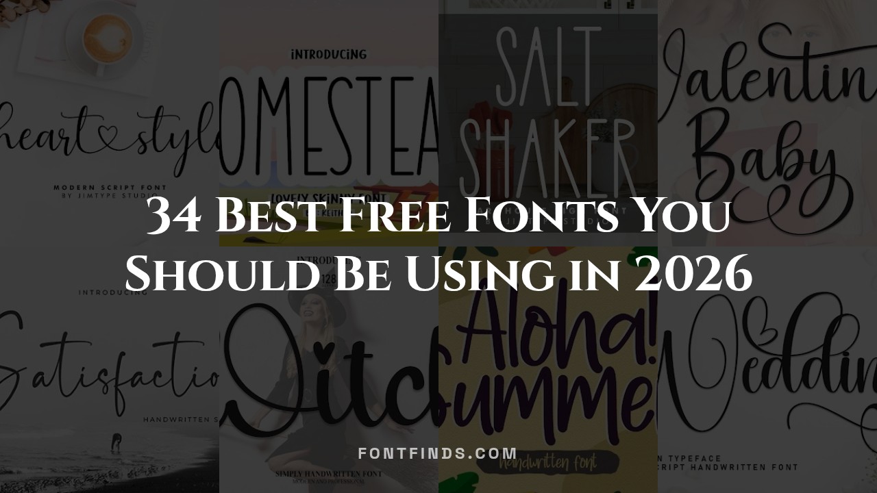
34 Best Free Fonts You Should Be Using in 2026
Let’s be honest: finding the perfect typography can eat up hours of your workflow, especially when you are on a tight budget. We have all been down that rabbit hole of clicking through endless pages of basic typefaces looking for that one hidden gem. Whether you are building a website, designing a logo, or putting together a brand kit in 2026, the right lettering makes all the difference. I have spent the last few weeks testing out hundreds of options to bring you this hand-picked list of 34 amazing free fonts that actually look premium.
1. Heart Style Script font
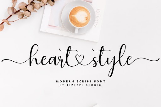
Heart Style is an incredibly fluid script font that effortlessly bridges the gap between casual handwriting and formal calligraphy. What immediately stands out during a professional review is its beautifully balanced baseline, which anchors the sweeping, romantic energy of the letters and prevents the overall composition from looking messy. The strokes carry a natural weight variation that mimics a real brush pen, giving digital projects an authentic, handcrafted warmth that is highly sought after in 2026’s design landscape. It manages to maintain excellent legibility even at smaller sizes, a rare trait for such an expressive typeface.
From a practical standpoint, this font is a powerhouse for personalized branding and event design. It is an absolute standout choice for wedding invitations, Valentine’s Day marketing campaigns, and boutique apparel logos. When working with Heart Style, I highly recommend pairing it with a clean, geometric sans-serif for your body copy. This contrast allows the swooshing ascenders and descenders of the script to shine as the hero element without overwhelming the viewer. Give it plenty of line height to let those elegant loops breathe.
2. Aloha Summer Display font
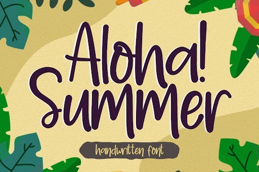
Aloha Summer is a vibrant, energetic display font that perfectly captures the essence of sun-drenched beach days and tropical getaways. It features chunky, playful letterforms with subtle, organic imperfections that give it the nostalgic feel of a hand-painted wooden sign at a coastal surf shop. The generous x-height and bold weight distribution make it highly readable from a distance, which is exactly what you want in a high-impact display typeface. It brings an undeniable sense of joy and movement to the canvas, immediately drawing the reader’s eye.
This font thrives in lively, seasonal applications. It is my go-to recommendation for summer sales banners, beachwear apparel graphics, vibrant event posters, and tropical beverage packaging. As a piece of practical advice, Aloha Summer should be used sparingly as a hero font for headlines and titles rather than for lengthy body text. Try applying a slight baseline shift to alternating letters or warping the text along a subtle curve to amplify its bouncy, carefree personality. Pair it with a minimalist, monoline sans-serif to keep the focus entirely on its exuberant charm.
3. Juliet Love Calligraphy font
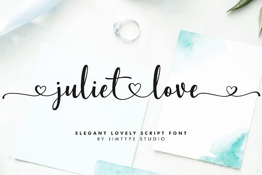
Juliet Love is a sophisticated calligraphy font that exudes timeless romance and high-end elegance. What makes this typeface remarkable is its meticulous attention to letter spacing and connecting ligatures. The designer has masterfully crafted dramatic, sweeping swashes that flow seamlessly from one character to the next, creating a continuous ribbon of text. Despite its intricate detailing and luxurious flourishes, Juliet Love maintains remarkable legibility, making it an essential tool for high-end, professional design work where both aesthetics and communication are critical.
This typeface is the ultimate choice for luxury event stationery, premium product packaging, and upscale cosmetic branding. When working with Juliet Love, the golden rule is to provide ample white space around your typography. Allowing the intricate loops and tails to act as standalone visual art will elevate your entire layout. It looks absolutely spectacular when rendered in metallic gold foil, letterpress, or embossed formats. For a modern, editorial aesthetic, pair it with a classic serif with sharp, contrasting strokes.
4. Jasmine Serif font
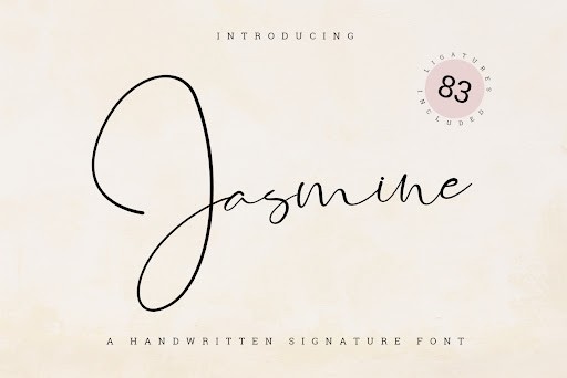
Jasmine is a wonderfully refined serif font that brings a modern, stylistic twist to classical typographic proportions. It features sharp, delicate serifs that contrast beautifully against thicker, confident vertical strokes. This high-contrast architecture is synonymous with the high-fashion editorial aesthetic that continues to dominate premium branding in 2026. The subtle, sweeping curves soften its formal, rigid structure, giving it an approachable yet undeniably luxurious feel that commands authority without feeling overly traditional or dated.
I highly recommend integrating Jasmine into editorial layouts, magazine covers, and upscale lifestyle blog headers. It performs exceptionally well in both print mediums and high-resolution digital displays. For a truly striking composition, use this font in large point sizes to fully showcase the elegant stroke contrast. It acts beautifully as a display serif, especially when tracked out slightly for a sophisticated, cinematic title effect. Pair it with a highly legible, neutral sans-serif for secondary text to create a balanced, professional typographic hierarchy.
5. Fairy Mother Handwritten font
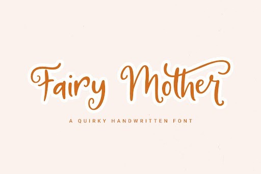
Fairy Mother brings an irresistible touch of whimsy and storybook charm to any creative project. This charming handwritten font is characterized by its bouncy, unpredictable baseline, varying letter heights, and delightfully quirky curves. It mimics the authentic, spontaneous feel of quick, expressive journaling. Unlike many whimsical fonts that sacrifice readability for personality, Fairy Mother retains distinct letterforms that are easy to parse, striking the perfect balance between childhood innocence and professional usability.
This font truly shines in applications requiring a friendly, approachable voice. It is an outstanding choice for children’s book illustrations, indie craft packaging, playful classroom materials, and engaging social media graphics. To get the absolute most out of Fairy Mother, explore the alternate characters if your design software supports OpenType features; mixing and matching alternate glyphs enhances the illusion of authentic, organic handwriting. It pairs wonderfully with colorful vector illustrations, watercolor textures, and soft pastel color palettes.
6. Raemoon Display font
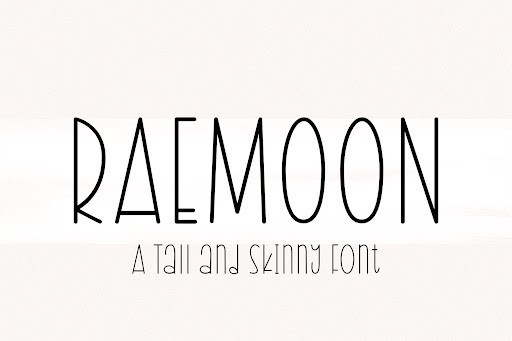
Raemoon steps into the 2026 design scene as a remarkably bold and charismatic display font, engineered specifically to grab attention without sacrificing legibility. Unlike many heavily stylized typefaces that struggle at smaller scales, this robust font maintains crisp edges and exceptional clarity across both digital interfaces and printed materials. Its slightly condensed proportions make it an absolute powerhouse for designers needing to pack impactful typography into tight layout constraints, making it a favorite for modern branding and editorial headers.
When it comes to practical application, Raemoon truly shines in high-contrast environments. I highly recommend deploying it for striking packaging design, energetic event posters, or as the hero typography in contemporary web design. Pair it with a highly geometric, neutral sans-serif for body copy to allow Raemoon’s distinct personality to command the spotlight. If you are developing a visual identity that needs to feel confident and slightly unconventional, this font provides exactly the right amount of edge.
7. Salt Shaker Handwritten font
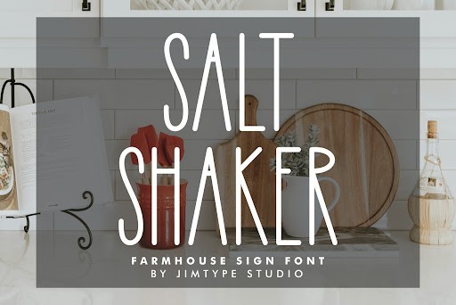
Injecting a dose of authentic charm into any project, Salt Shaker is a beautifully textured handwritten font that captures the organic flow of natural penmanship. In an era where digital design often feels overly sterile, this typeface introduces a much-needed human touch with its slightly irregular baseline and naturally varying stroke weights. The subtle distressed detailing built into the letterforms gives it a delightfully rustic aesthetic, making it look as though it was just freshly inked onto textured paper.
This font is an absolute goldmine for lifestyle brands, artisanal food packaging, and boutique retail identities. It works flawlessly when integrated into social media quote graphics or customized greeting cards where approachability is key. For best results, use Salt Shaker at medium to large point sizes to fully showcase its intricate edge textures. Combining it with a clean, light serif or an understated sans-serif creates a beautiful typographical hierarchy that feels both inviting and highly professional.
8. Magtina Serif font
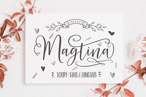
Magtina emerges as a breathtakingly elegant serif typeface that perfectly bridges the gap between classic editorial typography and contemporary design sensibilities. With its sweeping curves, razor-sharp serifs, and dramatic variations in stroke contrast, it exudes a level of sophistication that feels inherently luxurious. The font designer has meticulously crafted every ligature and terminal, ensuring that the characters dance beautifully across the baseline while maintaining the strict structural integrity required for high-end commercial use.
If you are working on premium branding, fashion magazine layouts, or upscale cosmetic packaging in 2026, Magtina is a non-negotiable addition to your typographic arsenal. It thrives when given plenty of negative space, allowing its refined letterforms to serve as standalone artistic elements. Try utilizing it for expansive hero headers or elegant pull quotes, paired alongside a minimalist sans-serif for functional reading text. This combination guarantees an aesthetic that is simultaneously timeless and fiercely modern.
9. Autography Script font
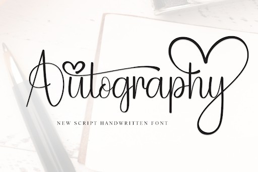
Autography is a masterful signature script font that replicates the swift, confident strokes of a seasoned calligrapher with astonishing accuracy. Designed with fluid, sweeping ascenders and dramatically elongated descenders, this typeface carries an air of exclusivity and personalized craftsmanship. What sets Autography apart from standard cursive fonts is its incredibly dynamic baseline and the seamless, natural connections between characters, completely avoiding the repetitive, mechanical look that often plagues digital scripts.
This is the definitive choice for projects that demand a bespoke, high-end signature aesthetic. It is exceptionally well-suited for luxury real estate branding, high-fashion photography watermarks, and sophisticated wedding stationery. To maximize its visual impact, use Autography sparingly as an accent font—think elegant sign-offs, prominent names on business cards, or stylish logo marks. Ensure you allow for generous line height so its expressive loops do not clash with surrounding design elements.
10. Valentine Baby Handwritten font
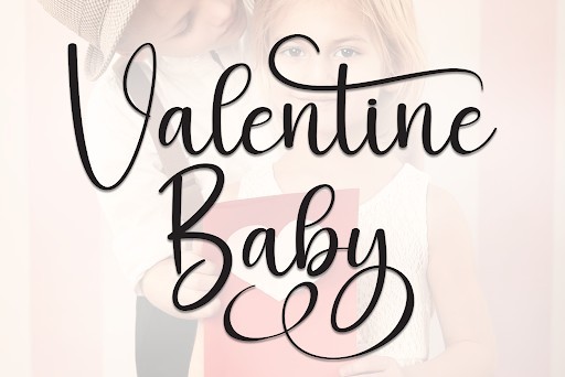
Radiating pure joy and playful energy, Valentine Baby is a delightfully bouncy handwritten font that instantly elevates the mood of any creative project. Its wonderfully plump, rounded letterforms and intentionally uneven baseline create a friendly, approachable aesthetic that feels like a warm embrace. Despite its whimsical nature, the creator has ensured excellent legibility, making it far more versatile than your typical novelty typeface. It is a fantastic asset for designers looking to inject a sense of youthful exuberance into their work.
The ideal use cases for Valentine Baby are incredibly broad, ranging from engaging children’s book covers to vibrant apparel designs and quirky, modern greeting cards. It performs beautifully in pastel or brightly colored palettes, particularly when used for eye-catching social media graphics or playful product packaging. For a balanced composition, I suggest contrasting its heavy, soft characteristics with a highly legible, monolinear sans-serif, ensuring your core message remains clear while the display typography does the heavy lifting in capturing attention.
11. Digital Display font
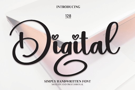
When it comes to evoking a sense of nostalgia or technological precision, the Digital Display font stands out as an exceptional choice. Reminiscent of classic alarm clocks, vintage arcade games, and early computing interfaces, this typeface instantly transports your audience back to the golden era of electronics. Its structured, blocky letterforms are incredibly legible at varying sizes, making it a reliable asset for projects that require a futuristic or cyberpunk aesthetic without sacrificing readability.
From a practical standpoint, this font is highly versatile for modern digital design. Whether you are designing user interfaces for a retro-themed indie video game, creating dynamic stream overlays for Twitch, or putting together tech-focused marketing materials, the Digital font commands attention. Pair it with neon color palettes or subtle glowing effects to truly maximize its impact. Its inclusion of a commercial license ensures that you can comfortably deploy it across both personal and high-stakes client projects.
12. XGroovy Heart Retro font
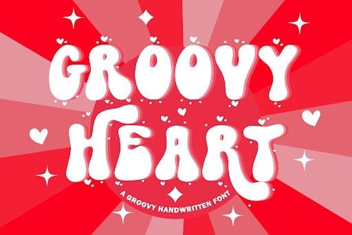
Injecting a wave of 1970s nostalgia into your design toolkit is effortless with the XGroovy Heart Retro font. This typeface captures the quintessential funky, bold, and bubbly essence of the disco era, complete with smooth curves and a delightfully chunky weight. The subtle integration of heart motifs within the letterforms adds a layer of playful romance, making it incredibly unique and highly expressive. It is a font that refuses to be ignored, radiating a warm, optimistic energy that perfectly aligns with modern retro revival trends.
As an expert recommendation, XGroovy Heart shines brightest in large-scale display applications where its personality can take center stage. Think vibrant t-shirt designs, eye-catching event posters, playful packaging for boutique cosmetics, or engaging social media graphics for Valentine’s Day campaigns. Because the letterforms are heavily stylized, it is best to use this typeface for headers and short, punchy titles, pairing it with a clean, understated sans-serif for body copy to maintain visual balance and overall accessibility.
13. Hey Baby Handwritten font
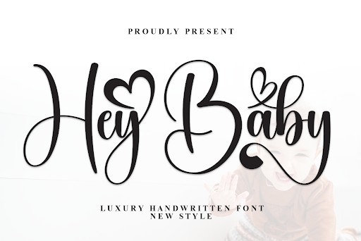
The Hey Baby Handwritten font is a masterclass in approachable, organic typography. Crafted to mimic the fluid, imperfect strokes of casual handwriting, this font brings a distinctly human touch to any digital canvas. Its bouncy baseline and smooth ligatures give the impression of a marker gliding across paper, evoking feelings of warmth, friendliness, and authenticity. In a landscape often dominated by rigid, geometric typefaces, Hey Baby provides a refreshing and charming alternative that instantly breaks the ice with your audience.
This font is an absolute workhorse for lifestyle brands, children’s apparel, and bespoke stationery design. If you are creating nursery art prints, engaging Instagram quote graphics, or personalized greeting cards, Hey Baby fits the bill flawlessly. To achieve the best results, experiment with varying the leading and tracking to enhance its natural flow. It pairs wonderfully with watercolor design elements and pastel color palettes, ensuring your final composition feels both professionally designed and intimately crafted.
14. Wedding Script font
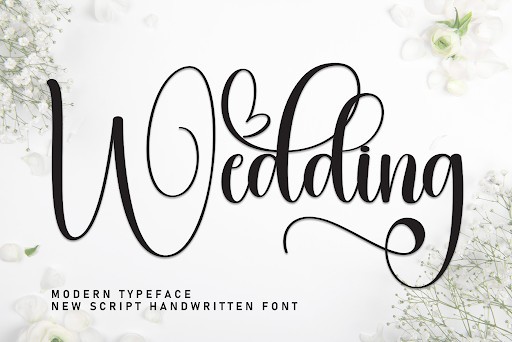
Elegance and sophistication are at the forefront of the Wedding Script font, a typeface meticulously designed to capture the romance of traditional calligraphy. Featuring sweeping ascenders, graceful descenders, and delicate, hairline swashes, this font exudes a timeless beauty that instantly elevates any premium design. The fluidity of the letter connections is expertly handled, ensuring that each word looks like a custom piece of hand-lettered art rather than a standard, typed output.
Unsurprisingly, this font is the ultimate go-to for bridal and event typography. It is perfect for designing luxurious wedding invitations, sophisticated RSVP cards, elegant menu layouts, and bespoke branding for high-end boutique businesses. When using the Wedding Script font, it is crucial to give it plenty of breathing room; generous negative space around the text will allow its intricate details to truly shine. For a modern, editorial aesthetic, pair this exquisite script with a sharp, high-contrast serif font to create a beautifully balanced typographic hierarchy.
15. Lemon Milk Sans Serif font
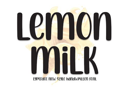
Lemon Milk Sans Serif font is a powerhouse of modern typography, celebrated for its bold, geometric structure and commanding presence. Characterized by its clean lines, sharp angles, and an inherently contemporary vibe, this typeface is the epitome of urban chic. Its slightly condensed proportions and uniform stroke width make it incredibly solid and impactful, delivering your message with an air of absolute authority and minimalist sophistication. It is a font that understands the assignment when you need something robust yet highly refined.
The utility of Lemon Milk in the design world cannot be overstated. It is an exceptional choice for editorial headlines, striking magazine layouts, modern tech startup branding, and high-impact poster designs. Because of its sturdy architecture, it holds up brilliantly when overlaid on complex photographic backgrounds or utilized in dynamic video motion graphics. To create a cutting-edge visual hierarchy, try using the bolder weights for your main titles while employing a lighter, more spacious sans-serif for the supporting text, ensuring a sleek, professional finish across the board.
16. Satisfaction Script font
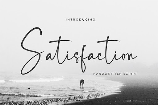
The Satisfaction font brings a refreshing touch of elegance and organic flow to the world of typography. As a beautifully crafted script typeface, it perfectly balances casual handwritten charm with a polished, professional aesthetic. In 2026, where digital authenticity is highly prized by brands, this font stands out by offering natural-looking ligatures and smooth letter transitions. Whether you are designing wedding invitations, boutique logos, or luxury packaging, the subtle imperfections in its strokes give it a deeply personal and custom-made feel that resonates instantly with audiences.
From a practical standpoint, this versatile script integrates seamlessly into modern design workflows. I highly recommend pairing Satisfaction with a clean, geometric sans-serif to create a striking visual hierarchy that draws the eye naturally down the page. It shines exceptionally well as a headline or signature sign-off in email newsletters and editorial spreads. When utilizing this typeface, ensure you give it plenty of negative space to breathe, as script fonts can quickly become cluttered if set at too small a size or with insufficient leading. This is a must-have addition to any contemporary designer’s typographic toolkit.
17. Hello Baby Karl Display Duo font
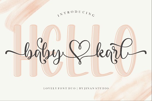
Typography pairing can often be one of the most time-consuming aspects of graphic design, but the Hello Baby Karl Display Duo font effortlessly solves this dilemma. By offering a meticulously matched set of typefaces out of the box, it removes the guesswork and provides instant typographic harmony. The playful, handcrafted nature of this duo makes it an absolute delight for projects aimed at children, lifestyle branding, or whimsical social media campaigns. Entering 2026, we are seeing a massive resurgence in approachable, friendly design languages, and this duo captures that warm, inviting spirit perfectly without sacrificing legibility.
When working with the Hello Baby Karl Duo, the key to maximizing its potential lies in scale and contrast. Use the bolder, display-oriented component for eye-catching titles and expressive social media graphics, while leaning on its complementary partner for subheadings or short bursts of supportive text. It is incredibly effective for apparel design, such as quirky t-shirt prints, as well as captivating book covers and greeting cards. To maintain its inherently cheerful vibe, try rendering the font in soft pastel palettes or vibrant, high-contrast colors, ensuring your message pops off the canvas with joy and energy.
18. Ashley Southine Signature font
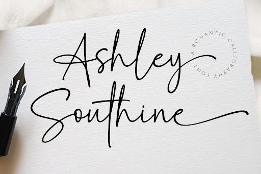
For those seeking an injection of high-end sophistication, the Ashley Southine Signature font is a masterful choice that exudes luxury and refinement. This typeface replicates the fluid, sweeping motions of a seasoned calligrapher’s pen, resulting in a design that feels both exclusive and intimately human. In the current 2026 design landscape, where premium brands are pivoting back to bespoke artistry, Ashley Southine offers a shortcut to that high-fashion editorial look. Its dramatic swashes and elegant baseline variations make it an immediate standout for projects that demand a touch of class and individuality.
In terms of practical application, this font is a powerhouse for branding identity and upscale merchandise. It performs brilliantly on cosmetics packaging, boutique hotel stationery, and minimalist fashion lookbooks. To get the absolute best results, use Ashley Southine sparingly as an accent font rather than for long-form body copy. Letting a single word or short phrase take center stage over a striking photograph or a solid, muted background will create a stunning visual impact. Pairing it with a tracked-out serif font will further elevate the overall aesthetic, giving your project a curated, museum-quality finish.
19. Witch Display font
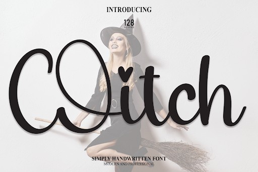
The Witch Display font is a thrillingly atmospheric typeface that perfectly captures an edgy, mystical aesthetic without falling into cheap novelty clichés. Its jagged, unpredictable strokes and slightly distressed letterforms give it a raw, supernatural energy that commands attention. While it is obviously a premier choice for seasonal Halloween promotions or horror-themed event posters, its utility extends far beyond autumn festivities. In 2026, the alternative and grunge aesthetics are experiencing a massive revival in the indie music scene and streetwear fashion, making this font highly relevant for cutting-edge, rebellious brand identities.
Deploying the Witch Display font effectively requires a bold design approach. It thrives in large-scale applications where the intricate, scratchy details of each character can be fully appreciated. I recommend using it for album artwork, spine-chilling book covers, or immersive video game user interfaces. To enhance its eerie appeal, experiment with texturing techniques like inner shadows or glow effects to make the text appear as though it is glowing in the dark or etched into stone. Just remember to keep surrounding elements relatively understated so the typography can firmly hold the spotlight and deliver its spooky charm.
20. Chubby Display font
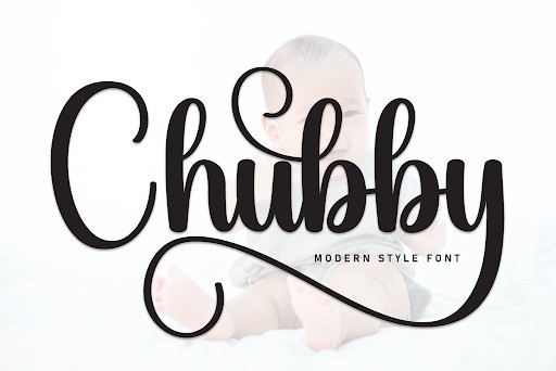
Embracing soft curves and an undeniably joyful presence, the Chubby Display font is a breath of fresh air in a world often dominated by rigid, minimalist typography. This delightfully plump typeface features heavy, rounded letterforms that instantly convey a sense of comfort, approachability, and fun. As we navigate the design trends of 2026, there is a distinct shift towards nostalgic, retro-inspired graphics that evoke happiness, and this font fits that mold flawlessly. It is an exceptional tool for breaking the ice with your audience and establishing a lighthearted, friendly brand voice from the very first glance.
The practical applications for the Chubby font are vast, particularly in the realms of food packaging, children’s educational materials, and vibrant mobile app interfaces. Because of its thick weight, it guarantees excellent readability even from a distance, making it ideal for point-of-purchase displays and billboard advertising. To truly make this typeface shine, incorporate it into designs featuring bold, saturated color blocking or retro 1970s palettes. You can also apply a subtle 3D drop shadow or a thick stroke outline to give the letters a tactile, sticker-like quality that users simply cannot ignore.
21. Santa Christmas Display font
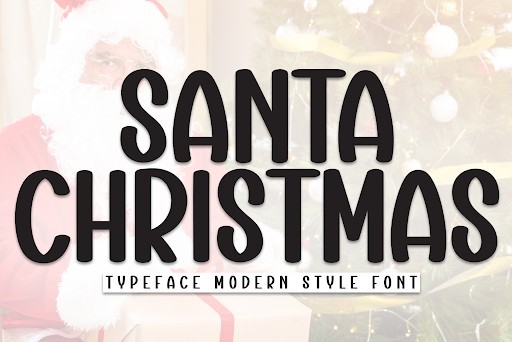
When it comes to seasonal design work, finding a typeface that embodies holiday cheer without feeling overly cliché is always a challenge. The Santa Christmas font strikes that perfect balance, offering a whimsical, handcrafted aesthetic that immediately evokes the warmth of the winter holidays. Its playful baseline and slightly irregular letterforms give it an authentic, personalized touch, making it stand out among the sea of traditional, overly rigid festive fonts available in 2026. The subtle bounce in the characters keeps the eye engaged while maintaining excellent readability, which is crucial for both print and digital mediums.
From a practical standpoint, this display font is an absolute powerhouse for holiday-themed projects. I highly recommend using it for greeting cards, seasonal sale flyers, and festive packaging design. Because of its highly decorative nature, it truly shines when used for headlines and primary focal points rather than dense body copy. For a modern, balanced layout, try pairing the Santa Christmas font with a clean, geometric sans-serif typeface. This contrast allows the festive typography to pop as the star of the show while ensuring your secondary information remains perfectly legible.
22. Stayhome Handwritten font
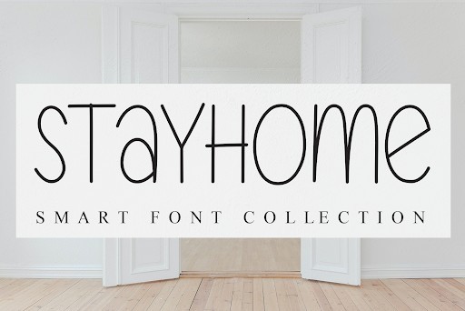
The Stayhome font captures the cozy, intimate essence of authentic handwriting, making it a standout choice for projects that require a personal touch. What makes this typeface particularly remarkable is its organic flow and the careful attention paid to the natural imperfections of pen on paper. Unlike many digital script fonts that look entirely too uniform, Stayhome features slight variations in stroke thickness and relaxed letter connections. This creates a comforting, relatable aesthetic that feels highly human and approachable, perfectly aligning with the ongoing trend of authentic, DIY-inspired design in 2026.
As an expert typography choice, this font excels in spaces where building a personal connection with the audience is key. It is exceptionally well-suited for lifestyle blog headers, Instagram quote graphics, and custom apparel designs. When working with Stayhome, I advise using it generously scaled up as an accent typeface to let its charming details shine. It pairs beautifully with muted, earthy color palettes and works best when contrasted with a highly structured serif font for subheadings. Just remember to give the characters plenty of breathing room, as handwritten fonts can quickly become visually cluttered if the leading is too tight.
23. Thick Sans Serif font
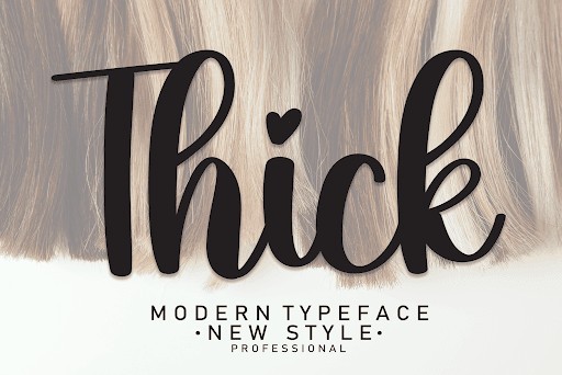
Sometimes, your design simply needs to command attention, and the Thick font does exactly that with unapologetic confidence. This bold, chunky sans-serif typeface is engineered for maximum visual impact, featuring heavy-weight strokes and a sturdy, geometric foundation. Despite its massive presence, the designer has expertly balanced the negative space within the letterforms to ensure it remains surprisingly legible even at extreme weights. It is a fantastic example of contemporary display typography that brings a modern, assertive energy to any canvas without feeling aggressive or overwhelming.
I frequently turn to the Thick font when working on high-impact projects that require instant readability from a distance. It is an exceptional choice for poster design, YouTube thumbnails, striking packaging, and bold website hero headers. To get the most out of this typeface, try experimenting with tight kerning; pushing the heavy letters closer together creates a trendy, solid block of text that serves as a powerful graphic element in its own right. Pair it with a highly legible, lighter-weight sans-serif for your body text to establish a strong, satisfying visual hierarchy.
24. Book Signature Script font
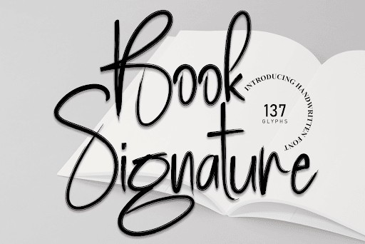
Elegance and fluidity are the defining characteristics of the Book Signature font, a premium-feeling script that mimics the sophisticated stroke of a fountain pen. In a digital landscape crowded with overly distressed or casual handwritten fonts, this typeface offers a refined alternative. The high contrast between the thick downstrokes and razor-thin upstrokes gives it a luxurious, dynamic rhythm that dances across the baseline. It perfectly captures the essence of a celebrity autograph or a high-end brand mark, bringing a sense of exclusivity and professional polish to your design assets.
This font is an absolute must-have for projects rooted in luxury, romance, or personal branding. It performs brilliantly on wedding invitation suites, boutique business cards, photography watermarks, and author logos. When working with Book Signature, the golden rule of script typography applies: never use it in all-caps. Allow the beautiful ascenders and descenders to interact naturally in title case or lowercase formats. For a truly high-end editorial look, pair this stunning signature script with a classic, high-contrast serif font, and let the graceful loops of the script serve as your primary visual hook.
25. Daddy Handwritten font
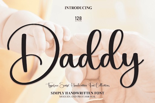
The Daddy font brings a delightfully casual and friendly marker-style aesthetic to the table, bursting with character and approachable charm. What I love most about this typeface is its raw, unpretentious energy. It looks exactly like the quick, confident handwriting of a cool dad jotting down a note, complete with slightly rounded terminals and a delightfully bouncy rhythm. The characters carry a certain weight that mimics a felt-tip pen, providing enough thickness to stand out beautifully on both light and dark backgrounds while maintaining a distinctly relaxed, everyday vibe.
This typeface is incredibly versatile for any project that needs to strip away corporate stiffness and inject some genuine fun. I highly recommend it for children’s book covers, casual dining menus, comic-style illustrations, and quirky personal branding. Because of its heavier marker-like stroke, it holds up exceptionally well when printed on textured materials or used in vibrant, colorful digital compositions. To maximize its playful nature, try rotating the text along a slight angle or path, and pair it with a clean, rounded sans-serif to keep your overall design looking cohesive and professionally grounded.
26. Boho Handwritten font
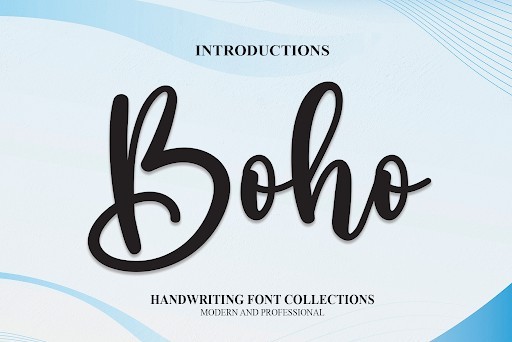
As we navigate the design trends of 2026, the demand for authentic, organic typography has only grown stronger, and the Boho Handwritten font delivers exactly that. This typeface captures a delightfully free-spirited aesthetic with its beautifully imperfect, natural strokes. It effortlessly bridges the gap between casual charm and professional legibility, making it an essential tool for designers looking to inject a human touch into their digital canvases. The fluid baseline and varied letter heights create a dynamic rhythm that instantly draws the eye without overwhelming the overall composition.
In terms of practical application, this font is incredibly versatile for any project requiring a relaxed, approachable vibe. It shines brilliantly when used for boutique branding, organic skincare packaging, or lifestyle blog headers. Social media managers will also find it invaluable for creating engaging Instagram quote graphics or Pinterest pins. To maximize its impact, try pairing the Boho Handwritten font with a clean, understated sans-serif typeface to ensure your primary message remains grounded while the handwritten elements add personality and flair.
27. Happy Birthday Display font
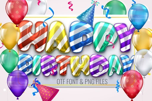
When a project calls for pure joy and celebratory energy, the Happy Birthday Display font is an absolute standout for your 2026 design toolkit. This typeface is bursting with a fun, bubbly personality that instantly elevates the mood of any layout. Unlike many novelty fonts that sacrifice readability for character, this design maintains crisp, clear letterforms that ensure your message is communicated effectively. The thick, bouncy weight of the characters gives the text a satisfying visual presence that anchors the design while keeping the atmosphere light and festive.
This font is tailor-made for event-based designs, making it a go-to choice for invitation cards, party decorations, and vibrant event flyers. Beyond literal birthday applications, it works wonderfully for children’s book covers, playful product packaging, and upbeat retail signage. For the best results, use it as a headline or focal point rather than body copy, and do not be afraid to experiment with bright, contrasting color palettes or subtle drop shadows to make the letters truly pop off the page.
28. Samantha Signature Script font
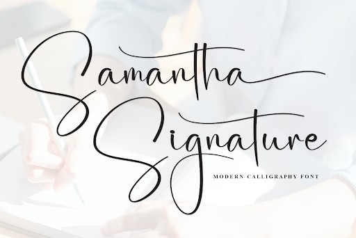
Elegance and sophistication are the defining hallmarks of the Samantha Signature Script font, making it a premium addition to any designer’s collection in 2026. This font masterfully mimics the sweeping, confident strokes of professional calligraphy, offering a high-end custom look right out of the box. The delicate ascenders and generous loops provide a sweeping sense of motion, ensuring that every word typeset in this font feels bespoke and deeply personal. It is a brilliant example of how digital typography can capture the tactile, artisanal quality of ink on paper.
Practically speaking, this font is a powerhouse for luxury branding and high-stakes personal designs. It is perfectly suited for wedding invitation suites, upscale boutique logos, and elegant photography watermarks where conveying prestige is paramount. When working with Samantha Signature, be sure to utilize its included ligatures and swashes to create seamless, natural connections between letters. Pair it with an ultra-minimalist, tracking-heavy serif font to establish a gorgeous typographic hierarchy that feels both modern and timeless.
29. Homestead Rustic Serif font
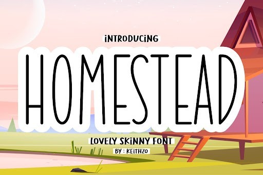
Tapping into a timeless, earthy aesthetic, the Homestead Rustic Serif font brings a rugged yet refined sensibility to contemporary design projects. As the design landscape in 2026 continues to embrace heritage and craftsmanship, this font provides the perfect blend of vintage charm and modern utility. Its strong, structural letterforms are softened by subtle distressing and slightly rounded corners, giving the impression of an old letterpress print or a hand-painted wooden sign. The sheer character embedded in this typeface makes it a commanding choice for designs that need to project reliability and tradition.
You will find this font exceptionally useful when working on branding for outdoor apparel, artisanal food and beverage packaging, or farmhouse-style home decor. It commands attention effortlessly on large signage, t-shirt graphics, and craft beer labels. To fully leverage its rustic appeal, try applying subtle texture overlays or using it in earthy color palettes like deep forest greens, burnt oranges, and rich browns. It stands incredibly well on its own, requiring very little embellishment to make a strong visual statement.
30. Candara Beauty Font Duo font
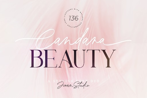
Finding the perfect typographic pairing can often take hours of tedious trial and error, which is why the Candara Beauty Font Duo is an absolute lifesaver for fast-paced 2026 design projects. This brilliant combination takes the guesswork out of font matching by offering a meticulously balanced script and sans-serif pairing. The sweeping, romantic curves of the script font contrast beautifully against the clean, structured lines of its companion, creating an instant sense of visual harmony. It is a masterful study in contrast, ensuring that your designs look cohesive, polished, and professionally curated.
This duo is highly recommended for projects that require a clear typographic hierarchy infused with elegance. It is ideal for beauty brand packaging, editorial magazine layouts, high-end lifestyle blogs, and cosmetic advertising campaigns. By using the script for eye-catching headlines or accent words, and the sans-serif for essential product information or body copy, you can achieve a sophisticated layout in minutes. This paired approach ensures maximum readability while still delivering the high-fashion aesthetic your clients crave.
31. Birthday Flowers Script font
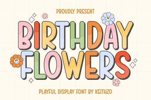
Birthday Flowers is a delightfully bouncy script font that instantly injects a sense of celebration and warmth into your design work. As we navigate the evolving design trends of 2026, handcrafted typography continues to dominate, and this particular typeface hits all the right notes with its fluid, organic letterforms and charming imperfections. It bridges the gap between elegant calligraphy and casual handwriting, making it an incredibly versatile asset for designers looking to add a personal, human touch to their digital or print projects without feeling overly formal or rigid.
When it comes to practical application, Birthday Flowers truly shines in event stationery, custom greeting cards, and boutique branding. I highly recommend pairing it with a clean, understated sans-serif to keep your layouts balanced and prevent the visual hierarchy from becoming too cluttered. It is also a fantastic choice for social media graphics and packaging design, especially in the lifestyle or floral industries. Because it comes with a commercial license, you can confidently deploy it across client projects, knowing its legibility holds up beautifully even at medium sizes.
32. Birthday Party Display font
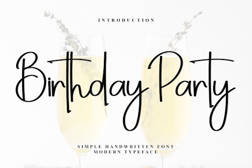
If you are looking to capture pure joy and energetic fun in a typeface, the Birthday Party display font is an absolute must-have for your typographical toolkit. This font features bold, chunky characters that are practically bursting with personality, making it a standout choice in 2026 for grabbing attention instantly. What makes it so compelling from a design standpoint is its playful geometry; it manages to be incredibly whimsical without sacrificing readability, a common pitfall in heavily stylized display fonts. It radiates a festive energy that immediately tells the viewer exactly what kind of mood to expect.
Functionally, the Birthday Party font is tailor-made for high-impact headers, children’s book covers, party invitations, and dynamic YouTube thumbnails. My pro tip for utilizing this font effectively is to experiment with vibrant color palettes and subtle drop shadows to make the letters truly pop off the screen or page. Keep it restricted to short bursts of text—like titles, logos, or call-out graphics—and contrast it with a simple, highly legible body font. Its robust weight ensures that it works exceptionally well for die-cut stickers and apparel design, giving you plenty of creative freedom for physical merchandise.
33. Vintage Mother Serif font
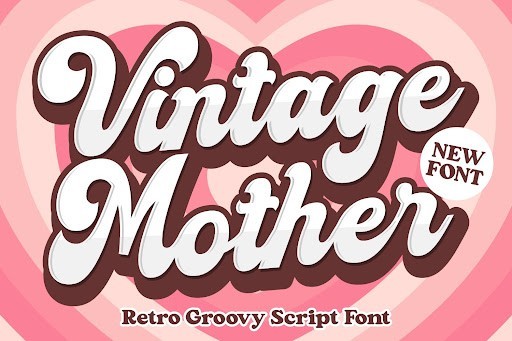
Nostalgia remains a powerful driving force in contemporary design, and the Vintage Mother serif font is a masterclass in capturing retro elegance. This typeface beautifully channels the aesthetic of mid-century advertising and classic editorial layouts, bringing a sophisticated yet approachable vintage flair to modern projects. The letterforms are characterized by their smooth curves and refined serifs, striking a delicate balance between old-world charm and contemporary crispness. In 2026, where brands are increasingly seeking authenticity and heritage, this font offers an instant sense of established trust and timeless beauty.
I frequently reach for Vintage Mother when working on branding projects for artisanal products, boutique coffee shops, or organic skincare lines. It commands attention beautifully when used for logotypes and packaging, specifically when paired with textured paper backgrounds or muted, earthy color palettes. For the best typographic results, try applying a generous amount of tracking (letter-spacing) when using it in all-caps for subheadings; this gives the text a highly premium, editorial feel. Because it retains excellent legibility, it also works remarkably well for pull quotes and short introductory paragraphs in magazine layouts.
34. Vintage Calligraphy Script font
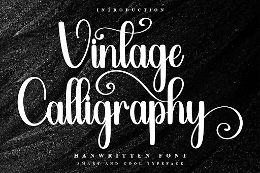
The Vintage Calligraphy script font is a breathtaking homage to traditional penmanship, offering designers a level of flourish and grace that is hard to find in free typography. Evoking the meticulous artistry of historical manuscripts and dip-pen lettering, this font features dramatic swashes, varying stroke weights, and an effortless flow that guides the eye beautifully across the baseline. As the digital landscape of 2026 continues to embrace high-end, bespoke aesthetics, having a reliable, commercial-ready calligraphy font of this caliber in your arsenal is absolutely essential for luxury design work.
This typeface is undeniably the perfect candidate for high-end wedding invitations, upscale restaurant menus, and sophisticated wine label designs. To maximize its elegance, I advise using it sparingly as an accent font alongside a very rigid, minimalist serif or sans-serif. This contrast not only highlights the ornate details of the calligraphy but also ensures your overall design remains anchored and readable. Be sure to take advantage of any alternate characters or ligatures if your design software supports them, as these subtle variations will make your typography look genuinely handcrafted and bespoke.
There you have it, 34 gorgeous free fonts ready to be downloaded and dropped right into your creative workflow. Great typography is the secret sauce to making any project look professional, and as we have seen, you do not need a massive budget to get your hands on top-tier assets. Grab your favorites from this list, play around with different pairings, and let your design skills shine on your next project.