24 Best Real Estate Serif Fonts for Elegant, Trustworthy Property Branding in 2026
Finding the right real estate serif fonts can transform a property brand from generic to distinguished. Serif typefaces convey trust, tradition, and luxury – ideal for agents, brokers, and developers who want classic appeal.
In this curated list of 24 serif selections, you’ll find options for logos, signage, listings, and print collateral. We include pairing tips, usage ideas, and recommendations for luxury, modern, and heritage-style real estate typography to help you choose the perfect match.
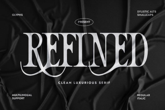
1. Grandeur – Elegant Classic Serif Font
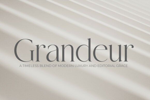
Grandeur sits at the intersection of editorial poise and architectural clarity. As a high-contrast transitional serif, it evokes quiet luxury with clean lines, tapered serifs, and a measured rhythm that reads as both modern and timeless. For designers focused on premium property identity work, Grandeur ranks among the best real estate serif fonts for communicating exclusivity and refinement.
The face’s generous counters and subtle contrast make display headlines breathe while preserving legibility in captions and smaller blocks of text. It pairs especially well with monochrome photography, restrained color palettes, and abundant white space, making it a natural choice for luxury property brochures, boutique hotel collateral, and high-end editorial spreads. Use its refined capitals for signage and its italics for elegant supporting copy.
Technically, Grandeur ships with multiple weights and optical sizes so you can scale from large-format facades to fine print without losing character. Kerning and spacing are tuned for tight editorial settings, and small details like tapered terminals and modest ball terminals give the face instant recognition. Combine it with a neutral sans for body copy to balance tradition with contemporary usability.
Download Grandeur – Elegant Classic Serif Font
My Recommendation: I would reach for Grandeur when a project needs to signal premium value at first glance. Its editorial elegance and architectural proportions elevate brochures, signage, and luxury brand systems with minimal fuss. If you want a serif that reads like a curated, high-end publication for property and hospitality projects, this is the one to use.
2. Kordano Font
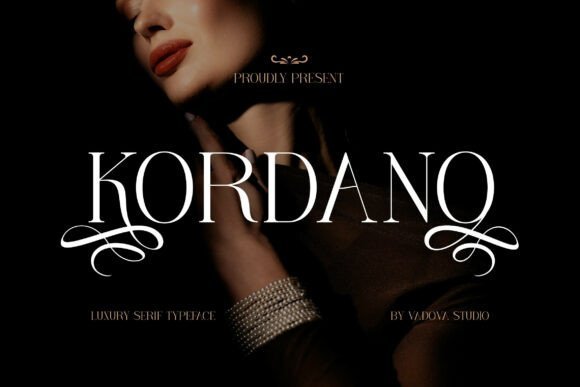
Kordano is a refined serif with graceful curves, measured contrast, and thoughtfully designed ligatures that lend a bespoke air to any composition. The letterforms feel simultaneously handcrafted and composed, so the type delivers personality without overwhelming layout hierarchy. It’s particularly suited to identity systems that need a tasteful, memorable voice.
This family excels in display roles-logos, mastheads, and premium packaging-where subtle details like angled terminals and elegant joins become signature touches. In print it reproduces beautifully on textured stocks, and on screen it maintains clarity at larger sizes. Pair Kordano with a low-contrast sans for extended copy to keep long reading blocks neutral while letting the serif handle expressive moments.
Kordano also includes stylistic alternates and ligature options that let designers create rhythmic wordmarks and tasteful monograms. Its balance of contemporary sensibility and classical proportion makes it flexible for boutique fashion, luxury product labels, and upscale property identities that favor personality over flash. Expect reliable kerning and variant sets that speed up brand work.
My Recommendation: I use Kordano when I want a serif that feels handcrafted but still polished for professional systems. Its ligatures and alternates are perfect for crafting distinctive logos and packaging. It’s a go-to for boutique brands, editorial covers, and refined identity projects where typographic character matters.
3. Dakota Spring Font
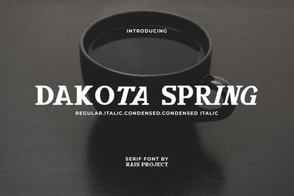
Dakota Spring is a versatile serif family offering Regular, Italic, Condensed, and Condensed Italic styles that give designers significant flexibility across formats. The condensed cuts are engineered for tight horizontal spaces while the regular cuts provide warmth and readability for longer copy. Overall, the tone is approachable and artisanal rather than severe, which helps soften commercial materials.
The variety of weights and condensed options make Dakota Spring adaptable across many industries-from cafés and boutiques to lifestyle editorial and compact marketing collateral. Its condensed italic works well for narrow signage and labels, while the regular styles are excellent for menus, brochures, and small-format booklets. The forms print reliably on textured papers and render cleanly on modern digital screens.
From a practical standpoint, Dakota Spring includes considered kerning pairs and clear punctuation that reduce layout tinkering in production. The family is a pragmatic choice when you need both personality and space efficiency in one package. For a contemporary editorial system, try pairing it with a humanist sans to create contrast and maintain readability.
My Recommendation: I recommend Dakota Spring for projects that need typographic flexibility without losing character. The condensed variants are invaluable when layout real estate is limited, and the regular cuts offer pleasing legibility for longer text. Use it for cafés, boutique packaging, lifestyle magazines, and compact promotional materials where charm and utility must coexist.
4. Serena Loren Font
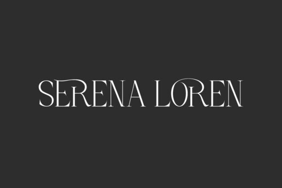
Serena Loren announces itself with cinematic strokes and a slender silhouette that reads like couture on the page. The face balances ultra-fine serifs against high-contrast stems, giving headlines a poised, editorial feel while still feeling modern rather than nostalgic. Each character moves with a rhythm that feels deliberately composed, making it ideal where typography must carry tone as much as content.
This display serif shines on identity work and premium collateral: think mastheads, luxury logo marks, and fashion-forward property brochures. Designers will find Serena Loren especially compelling among real estate serif fonts as it communicates a restrained glamour that suits upscale listings, boutique agencies, and architect-led developments.
Technically, Serena Loren is generous with expressive ligatures and thoughtfully spaced glyphs; PUA-encoded alternates are included to speed creative treatments without extra software. Pair it with minimal sans serifs and monochrome photography to let its delicate terminals breathe; use heavier tracking at display sizes to preserve legibility while keeping its jewel-like character intact.
My Recommendation: I reach for Serena Loren when a project demands a poised, editorial voice-luxury branding, boutique property campaigns, or architectural monographs. Its ligatures and precise counters deliver a bespoke look without manual lettering, saving time while preserving elegance. Use it sparingly at large sizes to preserve the delicacy that makes it feel exclusive.
5. Flora Sentani Font
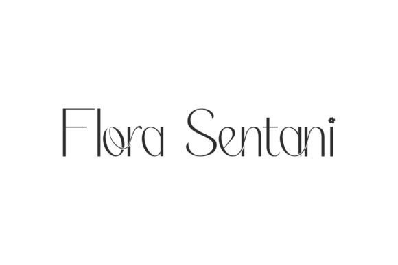
Flora Sentani is a light, refined serif that reads fresh and approachable while still conveying sophistication. Its simple terminals and open counters give text a breathable, contemporary presence that works well on printed stationery and digital headers alike. The sensation is delicate but confident-less about ornamentation and more about graceful proportion.
This face is highly adaptable for lifestyle and boutique brands, from interior designers and perfumers to boutique realtors seeking an understated identity. It complements soft color schemes and botanical imagery, which accentuate the font’s subtle elegance without overpowering messaging.
On the technical side, Flora Sentani performs well at display and mid sizes; it pairs naturally with neutral sans-serifs for body copy and with serif titling styles when you need added hierarchy. For web use, increase line-height slightly to maintain its airy feel, and reserve small caps or light weights for accent pieces to preserve balance.
My Recommendation: I’d use Flora Sentani for boutique branding where refinement must feel effortless-think artisanal studios, editorial websites, or refined storefront signage. It translates beautifully across print and screen, especially when paired with soft palettes and clean layouts. If you want an elegant yet approachable serif that won’t dominate imagery, this is a strong choice.
6. Sword Cane Font
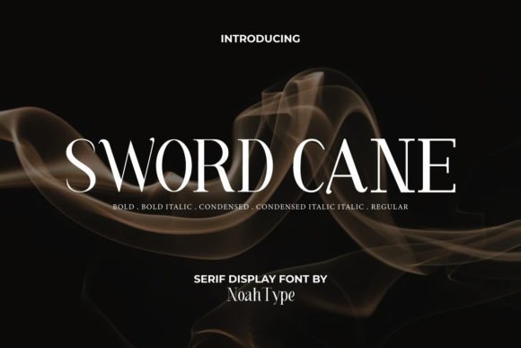
Sword Cane is a modern display serif family with a tailored sensibility: crisp serifs, confident stems, and an economy of flourish. The collection of six styles-from Regular to Condensed Italic-gives designers flexibility across display contexts, from expansive cover treatments to compact labels. Its geometry reads contemporary without sacrificing character, making it useful where a sharp, professional tone is required.
The condensed cuts are particularly useful for tight layouts like property listings, editorial sidebars, and signage, where space is limited but impact is still required. Bold and italic weights provide quick contrast for calls-to-action and feature lines, while the regular styles work for refined headlines and titlecases across hospitality, retail, and real estate communications.
Practically, Sword Cane’s consistent stroke modulation and tight kerning make it dependable for print signage and responsive web headers; its condensed variants also excel for narrow mastheads or placards. Pair it with a neutral grotesque for longer copy to keep hierarchy clear and maintain visual tension between modern and classic elements.
My Recommendation: I choose Sword Cane when a project needs a confident serif that adapts to tight spaces without losing presence-property brochures, restaurant menus, and product packaging are prime fits. The variety of weights and condensed options means fewer font switches and more coherent design systems. It’s my go-to when I need a versatile, serviceable serif with a contemporary edge.
7. Sakem Elegance Font
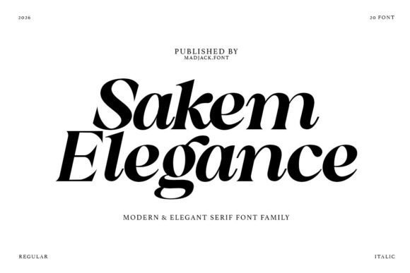
Sakem Elegance is a high-contrast editorial serif that feels both contemporary and timeless. Its dramatic vertical strokes and fine horizontals create a rhythmic tension that reads as confident and curated, ideal for mastheads, magazine covers, and premium packaging. The type’s refined retro undertone gives headlines an unmistakable sense of luxury without becoming fussy.
For brand systems that must communicate trust and exclusivity-think boutique developers or upscale agencies-Sakem Elegance performs beautifully: designers building high-end property identities and printed materials often reach for real estate serif fonts to communicate permanence and sophistication. Pair it with generous white space and monochrome photography to amplify a sense of curated value and to let the letterforms breathe.
Technically, the family ships in multiple weights with italics and PUA-encoded glyphs, so special characters and ligatures are accessible in most editors. Use heavier weights for bold display treatment and the lighter cuts for secondary headings; combine with a simple grotesque for body text to keep layouts balanced. Because of its contrast, Sakem reads best at larger sizes where its craftsmanship can be appreciated.
My Recommendation: I reach for Sakem Elegance when I need typography that instantly reads premium-luxury brochures, developer identities, or high-end editorial spreads. Its high-contrast forms deliver presence on covers and large headlines, while PUA access keeps special characters handy. Use it when you want a refined, curated look that signals quality and discipline.
8. Zabriela Font
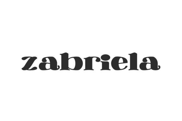
Zabriela is a retro-inspired display serif with broad, confident letterforms and a clean, modern finish. Its slightly expanded proportions give headlines a vintage charm while retaining contemporary readability, making it an attention-grabbing choice for banners, posters, and hero text. The overall silhouette reads both stylish and grounded, which helps messaging feel assured and accessible.
Because of its bold presence, Zabriela excels in environments that demand instant recognition: signage, logotypes, and promotional collateral benefit from the font’s assertive shapes. It balances decorative character with professional restraint, so it works as well on café menus and boutique packaging as it does on property flyers and lifestyle websites.
Practical to use, Zabriela scales cleanly across print and digital mediums and pairs smartly with a neutral sans for body copy. Its distinctive forms also make it a strong choice for limited-word headlines and invitations where space and impact are both priorities. Designers will appreciate how the font elevates simple layouts into memorable compositions.
My Recommendation: I’d pick Zabriela when a project needs vintage personality without sacrificing modern clarity-think boutique brand identities, posters, or lifestyle property promotions. It gives headlines instant character and works especially well for bold, minimal layouts. If you want a typeface that reads stylish and dependable, Zabriela is a reliable pick.
9. Beliago Font
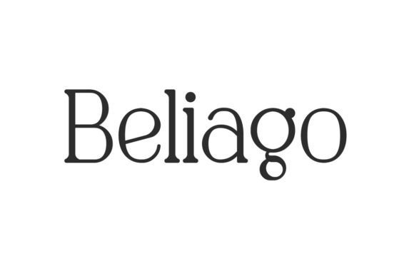
Beliago blends classical serif roots with a contemporary, artistic sensibility, producing a typeface that feels cultured and approachable. Its refined terminals and measured contrast make it ideal for editorial spreads and identity systems where a touch of heritage is desired without feeling dated. The design balances ornament and utility, giving layouts a handcrafted yet professional aura.
The font’s warmth and clarity lend themselves well to architectural and interior-focused brands: stationeries, property brochures, gallery catalogs, and signage all benefit from its composed voice. Beliago scales smoothly across display and medium text sizes, making it versatile for both headlines and longer captions when paired with a neutral sans-serif.
On the technical side, Beliago is forgiving in complex layouts and prints crisply on textured stock, which reinforces perceived quality. Use it with understated color palettes and generous margins to highlight its classical proportions. For designers who want a serif that communicates craftsmanship and modern refinement, Beliago is a practical and stylish option.
My Recommendation: I recommend Beliago for projects that need a cultivated yet modern serif-architectural briefs, boutique realty materials, or lifestyle magazines. It brings an artisan sensibility to formal contexts and prints beautifully on premium paper. Choose Beliago when you want a serif that feels established but refreshingly contemporary.
10. Nura Gliote Font
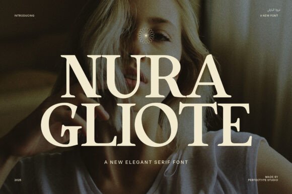
Nura Gliote is a refined, contemporary serif that blends classic proportions with modern detailing. Its slender terminals and subtly flared serifs give letterforms an elegant rhythm without feeling fussy, making headlines feel both poised and current. The overall impression is one of quiet luxury: restrained, deliberate, and crafted for premium visual identities.
The font’s rich set of ligatures and alternate glyphs is where it truly earns its place in upscale branding. If you’re exploring real estate serif fonts for high-end property identities, Nura Gliote provides tasteful alternatives and bespoke letter connections that lift logos and signage above generic solutions. These features let designers create signature wordmarks while keeping legibility intact at larger scales.
Across digital and print the typeface performs reliably: generous counters aid on-screen reading while refined stroke contrast scans beautifully in print. Pair it with a neutral sans for body copy or use a tight tracking for elegant mastheads; careful kerning reveals the font’s personality. In short, Nura Gliote is a specialist tool for projects that demand subtlety and bespoke typographic character.
My Recommendation: I’d pick Nura Gliote when a project needs understated luxury-think boutique agencies, premium product labels, or high-end property identities. Its ligatures and alternates let me craft a distinctive wordmark without custom lettering. Use it where refinement matters and every letter should feel deliberately chosen.
11. Sovelis Font
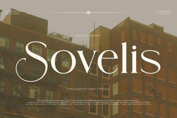
Sovelis reads like architecture translated into type: high-contrast strokes, dramatic curves, and razor-sharp details give it an immediately confident presence. The display-oriented construction favors large sizes, where its sculpted serifs and vertical stress create a cinematic, editorial look. It’s a statement face-designed to be seen and remembered.
Alternates and rhythmic ligatures expand Sovelis beyond a single voice, allowing bespoke headlines and variable logotypes that feel hand-tuned. Designers will appreciate how the alternates can shift tone from modern minimalism to opulent sophistication without swapping families. This flexibility is especially useful for campaigns that require multiple visual moods while maintaining a single typographic anchor.
For practical use, balance Sovelis with a soft, neutral sans for body text to avoid visual fatigue in long reads. It shines in magazine spreads, luxury retail branding, and bold social headers where contrast and presence are assets. When careful spacing and restrained color palettes are applied, Sovelis becomes an unmistakable visual signature.
My Recommendation: I’d use Sovelis for projects that need a bold, architectural voice-fashion editorials, luxury hospitality identities, or prominent billboard headlines. Its high-contrast shapes create instant impact and refine an upscale image. Pair carefully with a simple sans for longer copy to keep the design breathable.
12. Blue Denim Font
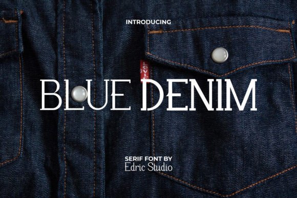
Blue Denim is a straightforward serif family that blends classic proportions with a friendly, modern sensibility. The pack’s Regular, Bold, and Italic styles give it practical flexibility: Regular for trustworthy body text, Bold for emphatic headlines, and Italic for subtle emphasis or pull quotes. Its uncomplicated shapes make it easy to read across sizes and contexts.
What sets Blue Denim apart is its adaptability. It carries a casual, approachable feel that suits lifestyle brands and service-oriented businesses as easily as it does editorial or stationery work. Because the forms remain relatively neutral, the face acts as a reliable workhorse across menus, brochures, and online listings without overpowering other visual elements.
When integrating Blue Denim, pay attention to leading and small-size clarity-its open counters help, but measured spacing preserves warmth and legibility. Use Bold sparingly to create hierarchy, and lean on Italic for captions or author lines to add subtle texture. This makes the family a practical choice for multi-platform projects that need consistent, readable typography.
My Recommendation: I recommend Blue Denim when you want a dependable serif that’s easy to deploy across print and web-ideal for catalogs, lifestyle sites, and corporate collateral. Its three-style system keeps workflow simple while providing enough variety for clear hierarchy. It’s a solid, no-nonsense choice when clarity and versatility matter most.
13. Lord Madame Font – real estate serif fonts
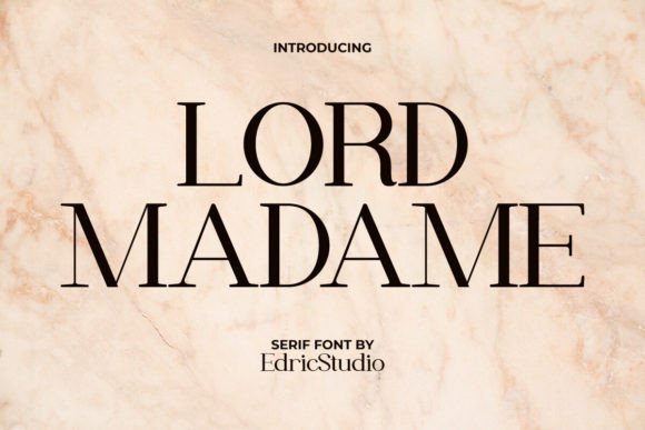
Lord Madame is a charming high‑contrast serif that blends vintage warmth with contemporary structure. Its contrasting stroke widths and elegant terminals give headlines an immediate, refined presence while remaining surprisingly versatile. Among real estate serif fonts , Lord Madame delivers a heritage tone that reads as trustworthy and boutique‑level, ideal for premium property identities and luxury interiors.
The family is meticulously spaced, with open counters and carefully tuned kerning that keep letterforms crisp at all sizes. You’ll find alternates and punctuation that let designers craft distinctive logos and editorial spreads without resorting to heavy tracking adjustments. Its balanced proportions make it reliable for both large signage and printed collateral.
In practice, Lord Madame excels on billboards, brochure covers, and property signage where personality must be visible from a distance; at smaller scales it still holds up for business cards, price tags, and wedding stationery. Pair it with a minimalist sans for modern contrast or with delicate script accents for a more artisanal look. This typeface translates a handcrafted sensibility into professional, high‑end brand applications.
Download Lord Madame Font – real estate serif fonts
My Recommendation: I recommend Lord Madame when you want a serif that feels both historic and fresh-perfect for luxury property brochures, boutique branding, and premium editorial. Its refined stroke contrast and thoughtful spacing make it easy to use across signage and print without losing character. Use it when you need to communicate trust, elegance, and a handcrafted touch.
14. Ultimate Strength Font
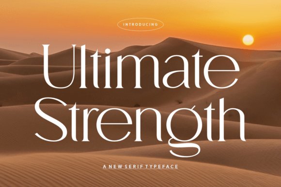
Ultimate Strength is a tall, assertive serif designed to command attention while maintaining refined detail. Its vertical emphasis and smooth transitions produce a stately rhythm that reads confidently in large display settings. The effect is one of modern luxury-powerful without appearing blunt.
The typeface is engineered for headline applications: generous cap height, precise contrast, and carefully adjusted spacing let it perform well in print, signage, and digital hero areas. Subtle terminal flairs and thoughtful stroke endings prevent the letterforms from feeling heavy, preserving legibility even at condensed sizes.
For branding work, Ultimate Strength pairs best with a neutral sans for body copy to preserve hierarchy and readability. It’s particularly effective for fashion, editorial, and high‑end property marketing where clarity and presence are essential. Use it for logos, mastheads, and title treatments that need to read as confident and polished.
Download Ultimate Strength Font
My Recommendation: I’d reach for Ultimate Strength when a brand needs unmistakable presence-ideal for developer headlines, luxury product launches, or magazine covers. It communicates poise and authority without sacrificing refinement and scales beautifully from signage to online hero images. Use it primarily for display so its power remains focused and effective.
15. Dark Idea Font
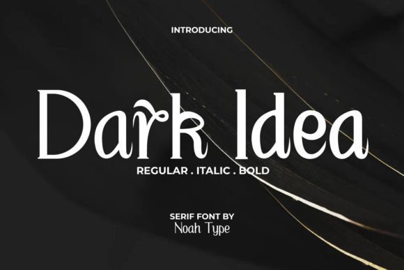
Dark Idea is an eccentric display serif that injects personality into headlines and creative packaging. Offered in Regular, Italic, and Bold, the family experiments with unexpected terminals and tapered strokes, producing a slightly theatrical, artisanal silhouette. Its distinct voice makes it an immediate eye‑catcher.
Because the forms are deliberately stylized, Dark Idea shines in short, expressive uses-posters, editorial covers, boutique menus, and creative property listings where visual drama is desirable. The three styles give you scope to build hierarchy: Regular for texture, Italic for motion, and Bold for emphatic statements.
Reserve Dark Idea for display rather than long passages of body text; it pairs best with a clean geometric sans to stabilize layouts. If your project needs a memorable, unconventional face that stands apart from classical serifs, this one brings a handcrafted, slightly rebellious charm to the table.
My Recommendation: I’d use Dark Idea when I want a brand to feel bold, quirky, and unmistakable-great for independent shops, editorial headlines, or standout promotional posters. Its multiple styles allow hierarchy while maintaining a unified personality. Avoid long copy; let it make short, deliberate statements for maximum impact.
16. Extraordinaire Font
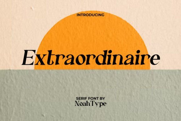
Extraordinaire Font is a refined modern serif that balances slender strokes with graceful curves, available in Regular and Italic styles. Its high-contrast hairlines and gently flared terminals give headlines and logotypes a polished, editorial quality without feeling ornate. The airy counters and elongated proportions make it legible at display sizes while retaining personality in short blocks of text.
Because of its poised presence, Extraordinaire works exceptionally well across lifestyle and property sectors, from boutique brochures to upscale signage. Use it when you want a classy, approachable look for marketing collateral-especially among real estate serif fonts where clarity and trustworthiness are paramount. Pairing it with a neutral sans for body copy preserves hierarchy while letting Extraordinaire command attention.
Technically, the family’s spacing and italic rhythm are tuned for professional typesetting: clean kerning, consistent weight balance, and reliable punctuation. It thrives on textured paper, architectural photography, and clean layouts with generous margins. For designers, Extraordinaire is a versatile choice when a project needs sophistication without pretension.
My Recommendation: I recommend Extraordinaire when you need an elegant yet readable serif that elevates brand materials without overpowering imagery. Its italics feel purposeful, making it great for captions and pull quotes in property brochures and boutique catalogs. Use it for editorial-style real estate marketing, boutique retail identities, or any project that needs a refined, contemporary serif voice.
17. Luxury Boe Font
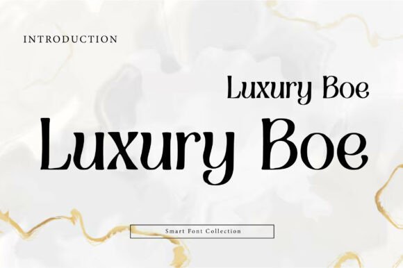
Luxury Boe Font projects calm authority through tall x-heights, narrow proportions, and understated terminals that read as modern classical. Its clean columns and minimalist serifs give headings an architectural presence, perfect for brands that want a restrained, premium aesthetic. The design’s restraint makes it surprisingly versatile across print and digital uses.
This typeface shines in high-end editorial layouts, fashion editorials, and upscale property branding where terseness and elegance matter. On luxury brochures, signage, and packaging it helps communicate value and attention to detail without decorative distractions. Combine Luxury Boe with rich photography and ample white space to emphasize refinement and exclusivity.
From a technical standpoint, Luxury Boe offers consistent weight distribution and tight but forgiving tracking, which helps maintain legibility at display sizes. It pairs beautifully with humanist sans fonts for body copy or with a delicate script for accent marks. If your project needs architectural clarity and a quiet but confident voice, this is a reliable go-to serif.
My Recommendation: I’d reach for Luxury Boe when building identities for premium brands-fashion labels, boutique hotels, or upscale property firms-because it reads as both modern and time-tested. Its refined proportions lend a disciplined, editorial tone that elevates packaging and cover pages. Use it when you want typography to signal quality without overt embellishment.
18. Wonder Glamour Font
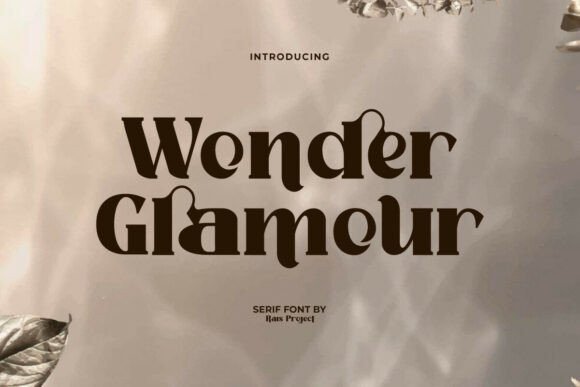
Wonder Glamour Font is a decorative serif display with flourish and finesse; its ornamental curves and generous ligatures give headlines a theatrical, glamorous presence. Designed for display use, it includes a comprehensive set of uppercase and lowercase glyphs along with numerals and punctuation designed to maintain rhythm in tightly set layouts. The overall impression is one of celebration-perfect for event-led or lifestyle applications.
The font’s built-in ligatures and multilingual support make it practical across global campaigns, while its distinctive shapes work well on invitations, product labels, and boutique signage. It’s especially effective where you want typography to double as visual ornament-packaging, posters, and editorial covers all benefit from its show-stopping forms. Use contrasting simple backgrounds to avoid competing visual noise.
Technically, Wonder Glamour installs cleanly across common design tools and performs well in layered compositions where texture and photography are present. For digital hero banners and print stationery, its display nature reads as confident and celebratory without sacrificing legibility at large sizes. Treat it as an accent typeface to inject personality and charm into a refined layout.
My Recommendation: I recommend Wonder Glamour for projects that need theatrical flair-invites, boutique branding, and lifestyle editorials where a statement serif can carry the mood. It’s a fantastic choice when you want type to be both decorative and functional, especially in headlines and packaging. Use it sparingly as a focal element paired with simple supporting fonts to keep compositions elegant.
19. Decouple Font
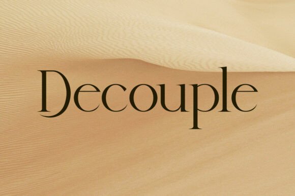
Decouple is a refined minimalist serif that balances modern geometry with subtle classical details. Its clean terminals and modest contrast give text a polished, professional presence without feeling fussy, making it immediately flattering for brands that want understatement with authority.
On practical projects the type shines in identity systems, signage, and printed materials: its open counters and consistent rhythm make headlines memorable and body snippets readable. For real estate-focused projects, Decouple pairs exceptionally well with elevated layouts-it’s one of the go-to real estate serif fonts
Technically, Decouple’s straightforward character set and reliable kerning reduce friction in multi-platform workflows, while its restrained stylistic nuances provide personality where needed. Use it when you want a serif that reads modern, photographs well on property shots, and scales cleanly from business cards to large banners.
My Recommendation: I’d reach for Decouple when crafting high-end agency identities or property brochures where a subtle, composed tone is essential. It brings a calm sophistication that elevates photography and layout without overpowering them. For commercial real estate, boutique developments, or architecture studios, its measured elegance creates trust and timeless appeal.
20. Buaser Font
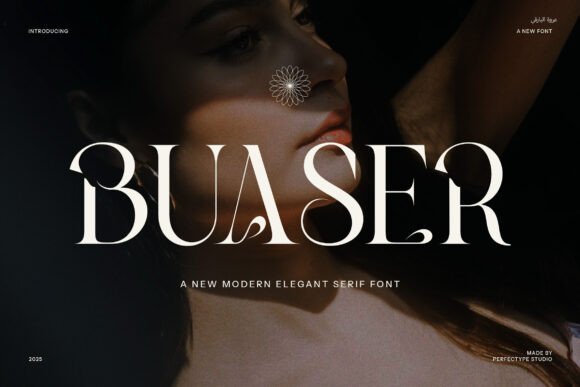
Buaser is a contemporary serif built around elegance and expressive detail. Its distinctive ligatures and alternate letterforms introduce a handcrafted rhythm to type, making headlines feel bespoke and logos feel intentionally curated.
The font’s refined stroke contrast and ornamental swashes work especially well in premium packaging, magazine mastheads, and invitations where an elevated aesthetic is required. In marketing materials and property brochures it conveys sophistication-pair Buaser with a neutral sans for body text to keep layouts readable while preserving a luxe appearance.
Beyond its visual charm, Buaser offers useful OpenType features so designers can tune typographic texture without resorting to manual tweaks. Use this face when you want typography that reads both modern and artisanal, adding a memorable flourish to branding and editorial applications.
My Recommendation: I recommend Buaser for projects that need a refined, fashion-forward voice-luxury retail, boutique hospitality, and premium editorial pieces. Its ligatures and alternates let you craft distinctive headlines that feel hand-tailored. I’d avoid long paragraphs in Buaser and instead use it for display work where its personality can shine.
21. Gentani Font
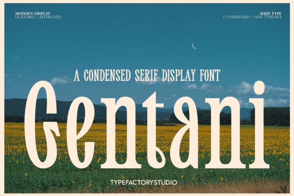
Gentani is a condensed serif display typeface designed for headline-first layouts where space is at a premium. Its narrow proportions and confident serifs give copy immediate presence-ideal for bold magazine covers and identity marks that must read across tight columns.
The design’s elegant ligatures and balanced counter shapes make Gentani especially effective in luxury branding and high-impact signage. In property marketing and upscale editorial spreads, it creates a potent visual rhythm that directs attention to key information without crowding the page.
With multilingual support and tasteful alternates, Gentani is practical for international campaigns and polished editorial systems. Pair it with a neutral humanist sans for longer reads; use Gentani as the headline engine to inject refinement and clarity into complex layouts.
My Recommendation: I’d use Gentani when I need a strong, compact display face for headlines, property brochure covers, or high-fashion editorial. Its condensed form lets you deliver dramatic, readable headlines in tight layouts. For premium realty presentations or upscale packaging, Gentani provides a chic, space-efficient solution that commands attention.
22. Emalia Font
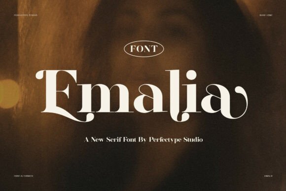
Emalia is a modern serif that balances graceful curves with sharply cut terminals to communicate instant refinement. Its letterforms show a confident contrast between thick and thin strokes, giving headlines a luxurious presence while maintaining crisp legibility at larger sizes. Every character feels measured-wide counters and gently tapered serifs produce an overall rhythm that reads as both contemporary and classic.
In practical branding work Emalia excels where polish matters: premium signage, property brochures, and sophisticated digital hero headers all benefit from its authoritative tone. Because of its regal modulation and refined terminals, Emalia sits among the strongest real estate serif fonts, lending upscale property logos and luxury listings an immediately trustworthy, editorial quality. Use it to anchor visual systems that need to communicate provenance and high value without feeling overwrought.
For pairing, Emalia thrives beside a restrained sans for body copy or a neutral grotesque for UI text-this contrast preserves its display power while keeping long reads comfortable. It also responds beautifully to metallic foils and deep, desaturated palettes (navy, charcoal, warm cream), and the font’s spacing and weights are forgiving in foil-stamp and large-format print. Tweak tracking slightly for very large applications to preserve the airy, premium look.
My Recommendation: I reach for Emalia when a project needs an unmistakable air of luxury-think high-end property brochures, boutique hotel identities, and premium lifestyle publications. Its refined strokes make headlines sing while still pairing cleanly with modern sans-serif body fonts. If you want a serif that reads as both current and eternally elegant, Emalia is a reliable, high-impact choice.
23. Moravine Font
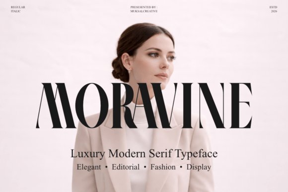
Moravine is a high-contrast editorial serif built for visual impact: its tall stems and razor-sharp terminals create a statuesque profile ideal for fashion-forward applications. The typeface carries a couture sensibility-every curve and bracket feels intentional, offering a sense of quiet prestige without flamboyant ornamentation. Its personality is bold in display use yet controlled enough to support refined typographic systems.
Designed with magazine mastheads and boutique branding in mind, Moravine shines on covers, packaging, and logo marks where stature matters. The family’s high contrast and detailed terminals emphasize photography and negative space, making headlines feel editorial and authoritative. PUA-encoded stylistic sets provide elegant alternates and ligatures, giving designers expressive options without extra tool complexity.
For composition, combine Moravine with a soft humanist sans to soften its contrast or a narrow grotesque to extend modernity into body copy-the juxtaposition keeps layouts feeling contemporary and disciplined. Pay attention to optical sizes and letterspacing when scaling from billboard to caption: slight tracking adjustments preserve the letterforms’ intention across print and screen. Use muted palettes and high-res imagery to let the type breathe and carry the brand’s luxury narrative.
My Recommendation: I’d choose Moravine when a brand needs to read like an editorial icon-luxury fashion labels, boutique catalogs, and stylish hotel collateral are perfect fits. Its refined contrasts create memorable headlines while PUA features let you add discreet flourishes. If your project aims for high-end visibility with a measured, fashion-conscious voice, Moravine will deliver.
24. Oceansunday Font
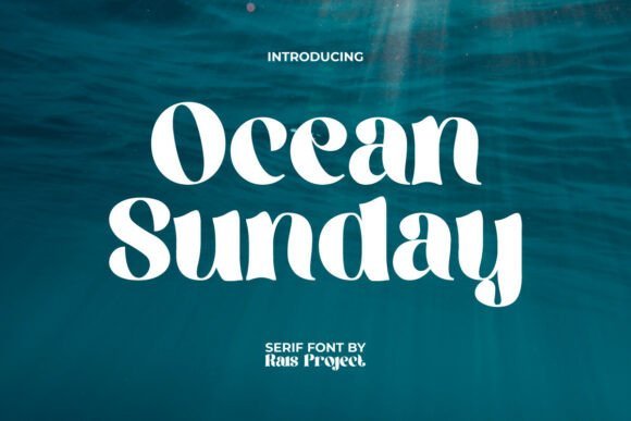
Oceansunday brings a breezy, coastal spirit to the serif genre with organically curved stems and understated terminals that recall tides and shoreline forms. The letterforms are relaxed yet purposeful: playful swashes and soft joins give the font a friendly human touch without sacrificing craft. It reads as approachable lifestyle typography rather than stiff tradition, making it ideal for more informal luxury contexts.
The family includes a full character set and thoughtful punctuation, which makes it versatile for invitations, café menus, spa branding, and seaside hospitality identities. Its personality is especially effective when paired with tactile materials-linen papers and warm inks accentuate the font’s handcrafted vibe. Designers can lean into its coastal soul for seasonal campaigns or evergreen lifestyle brands that want a gentle, elevated presence.
When pairing, combine Oceansunday with a simple geometric sans for digital interfaces or a warm serif for printed stationery to maintain a cohesive look. Color palettes of seafoam, sand, and soft coral amplify the theme, while careful tracking keeps the airy feel intact at headline sizes. This typeface is particularly effective when you want typography to feel like an invitation rather than an announcement.
My Recommendation: I’d use Oceansunday for beach resorts, boutique cafés, and wellness brands that aim for an elegant yet relaxed image. Its informal serifs and coastal character are great for lifestyle collateral and event invitations where personality matters. If your project needs warmth and approachability without losing design sophistication, Oceansunday is a delightful choice.
Choosing from these 24 real estate serif fonts gives you a head start on creating memorable, trustworthy property branding. Apply the pairing suggestions and usage notes to achieve the tone you want-whether elegant, authoritative, or approachable.
Always test fonts on real mockups, check legibility across sizes, and verify licensing for commercial use. With the right serif choices, your real estate marketing will feel more established and professional in 2026.