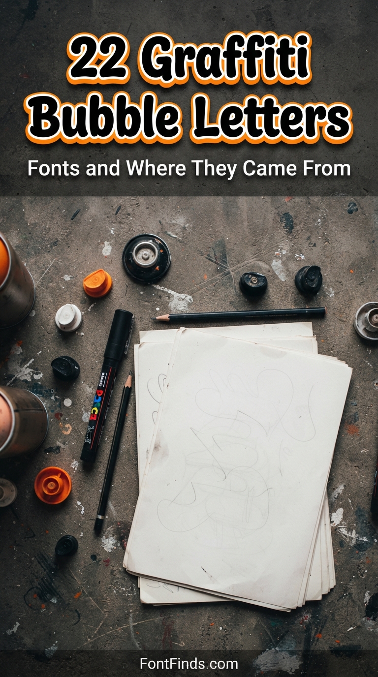
Graffiti bubble letters were never designed to look cute. They exist because a writer needed to cover a large surface fast, in low light, with a can in one hand. Rounded letters fill quickly, connect easily and stay readable from a moving train. Everything the style is used for now, birthday banners and sticker packs included, traces back to that constraint.
Where the Style Came From
The bubble letter is generally credited to New York writers in the early 1970s, developed as part of the throw-up: a fast, two-colour piece using an outline and a single fill. Speed was the point. Rounded forms need fewer directional changes than angular ones, which means fewer moments where the can has to stop and restart.
That functional origin is why bubble letters graffiti style still read as energetic even on a party invitation. The proportions carry the memory of being drawn quickly at arm’s length, and digital cleanup never fully removes it.
Throw-Up, Bubble and Wildstyle
Throw-up
Two colours, outline plus fill, executed fast. Usually a short tag name. Built for volume rather than detail.
Bubble letters
The letterform itself: rounded, inflated, consistent stroke weight. Readable by design, which is why it crossed into commercial work so easily.
Wildstyle
The opposite end. Interlocking, angular, deliberately hard for outsiders to read. Almost never used commercially, because legibility is not the goal.
Most fonts sold as graffiti art bubble letters sit in the middle category, which is the useful one. They carry the visual energy without the legibility problem, and most ship with a full graffiti bubble letters alphabet including numbers.
22 Graffiti Bubble Letters Fonts
Ranging from clean and commercial to genuinely rough. The further down, the more the letterforms look drawn rather than typed.
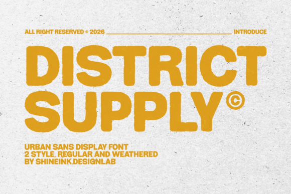
1. District Supply
Meet District Supply, a bold urban display font inspired by vintage street signs, skate culture, workwear labels, and modern apparel branding.
View Font →
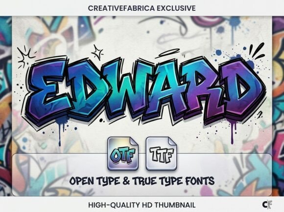
2. Edward
Edward | Stylish Graffiti Font Inject raw energy and urban edge into your work with Edward, a bold, hand-drawn graffiti typeface.
View Font →
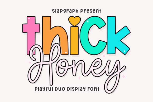
3. Thick Honey Duo
The Thick Honey font is a delightful playful duo display typeface designed to inject personality and sweetness into every design.This Thick Honey typeface combines a bold, chunky display style with a charmingly fluid script, making it a versatile choice for creators who want to balance high-impact headers with a soft, hand-drawn touch.
View Font →
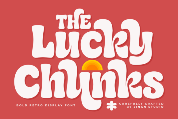
4. Lucky Chunks
Lucky Chunks is a bold retro display font with a playful groovy vibe and soft rounded curves that bring a warm vintage feeling to every design.
View Font →
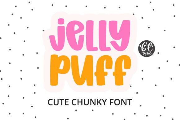
5. Jelly Puff
Jelly Puff is an irresistibly cute and supremely chunky font that looks as squishy and delightful as a balloon or a piece of candy.The typeface boasts exceptionally thick, rounded letterforms with absolutely no sharp edges, giving every character a bouncy, plush, and volumetric feel.
View Font →
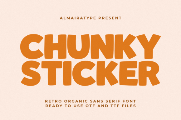
6. Chunky Sticker
Chunky Sticker is a retro organic sans serif font meticulously designed to bring a delightful vintage warmth and high-impact aesthetic to your modern creative projects.
View Font →
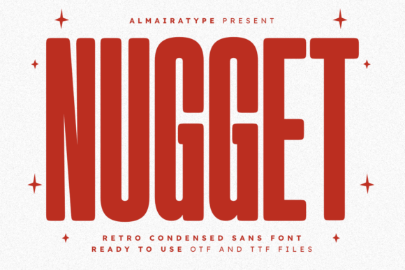
7. Nugget
Nugget is a bold and versatile retro condensed sans font that masterfully blends vintage nostalgic charm with a clean, modern aesthetic.
View Font →
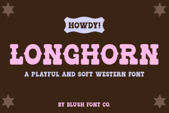
8. Longhorn Western
Longhorn Western Font. Add a bold western feel to your next project with this soft vintage-inspired font.
View Font →
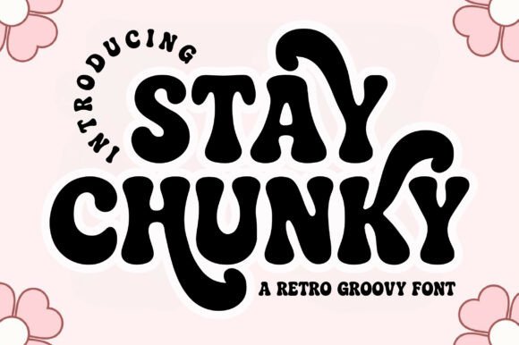
9. Stay Chunky
Bring a bold, bubbly, and nostalgic vibe to your designs with Stay Chunky, a playful retro groovy font inspired by 70s letterforms.
View Font →
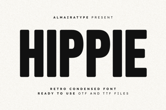
10. Hippie
Hippie is a bold and versatile retro condensed font that perfectly blends vintage nostalgia with a clean, modern minimalist aesthetic.
View Font →
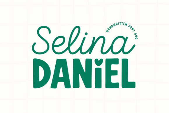
11. Selina Daniel Duo Font
Discover the creative power of contrast with Selina Daniel Duo Font, a versatile handwritten font duo that skillfully pairs an elegant, flowing script with a cute, chunky sans-serif, offering two complementary aesthetics in one package.The ‘Selina’ script is light, spontaneous, and romantic, while the ‘Daniel’ sans-serif is thick, playful, and grounded, featuring a unique heart-shaped dot over the ‘i’ that adds an extra touch of charm.
View Font →
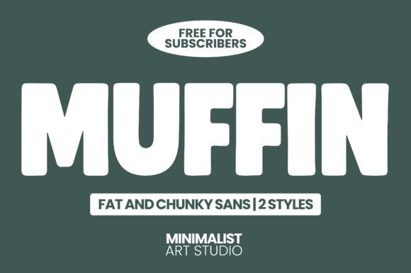
12. Muffin
MUFFIN – Bold, Chunky & Minimalist Sans Serif Font Meet MUFFIN, the playful yet powerful fat sans serif font designed to make your text pop with irresistible personality.
View Font →
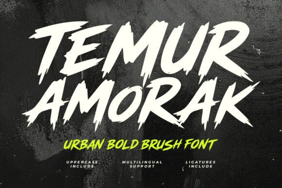
13. Temur Amorak Urban Bold Brush Font
Temur Amorak is a high-impact, hand-drawn brush font designed to deliver raw energy and aggressive motion to any visual project.
View Font →
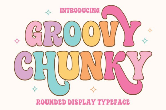
14. Groovy Chunky
Groovy Chunky is a bold and playful display font with soft rounded shapes and a cheerful retro feel.
View Font →
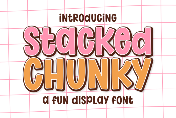
15. Stacked Chunky
Introducing the spirited Stacked Chunky font, a typeface that effortlessly combines boldness with bounciness for an irresistibly fun vibe.
View Font →
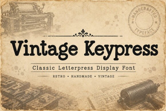
16. Vintage Keypress
Bring timeless craftsmanship into your designs with Vintage Keypress, a bold display font inspired by traditional letterpress printing, vintage signage, and old print shop typography.
View Font →
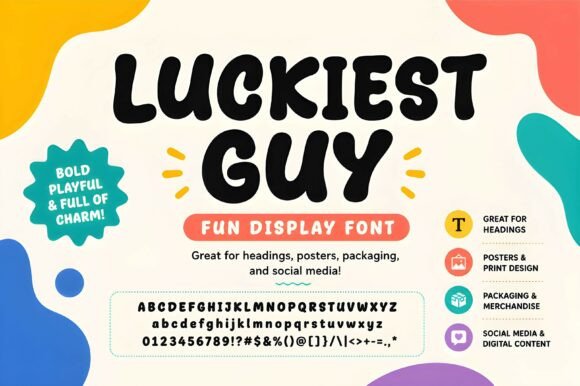
17. Luckiest Guy
Luckiest Guy is a bold playful display font with thick rounded letterforms and a cheerful cartoon character.
View Font →
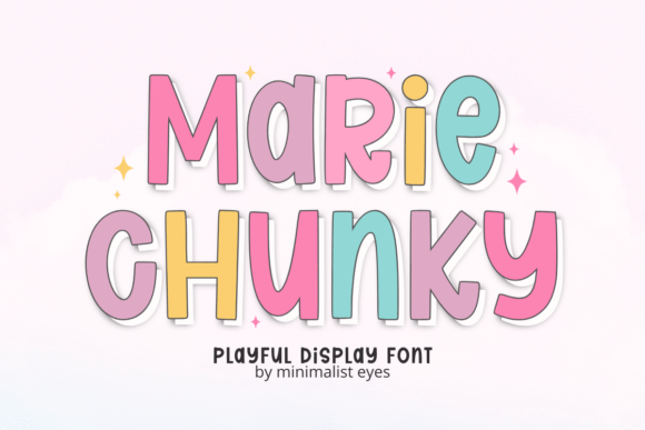
18. Marie Chunky
Marie Chunky font is a bold, “bouncy,” and irresistibly fun typeface that brings a playful energy to every design.Characterized by its soft, rounded edges and heavy visual weight, this Marie Chunky typeface is designed to jump off the page with a sense of excitement.
View Font →
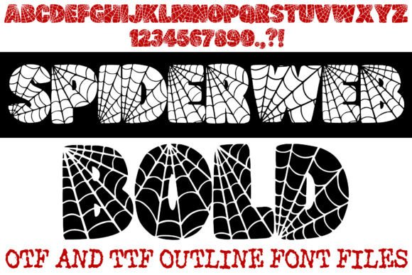
19. Spiderweb Bold
Spin a spooky web of creativity with the Spiderweb Bold Font!This high-impact display typeface is intricately designed with a built-in spiderweb pattern, making it the ultimate choice for Halloween party invitations, spooky branding, horror-themed apparel, and seasonal home decor.The font features thick, rounded “bubble” characters that provide excellent legibility while maintaining a playful yet eerie aesthetic.
View Font →
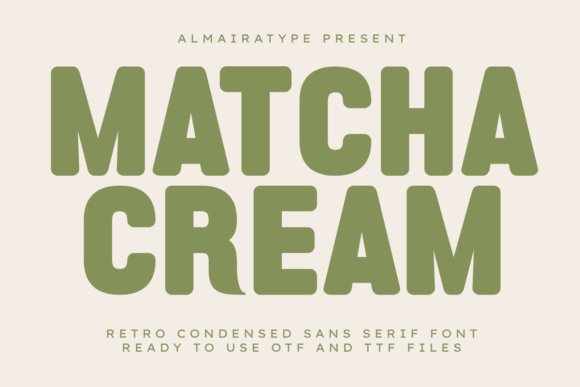
20. Matcha Cream
Matcha Cream is a bold retro condensed sans serif font meticulously designed to bring a delightful vintage warmth and high-impact aesthetic to your modern creative projects.
View Font →
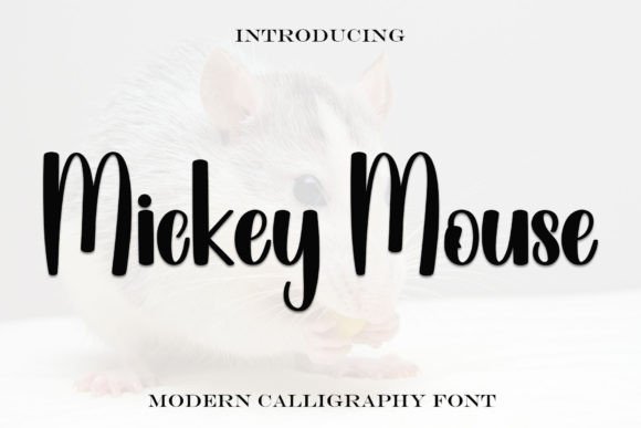
21. Mickey Mouse
Mickey Mouse font has a bold, playful handwritten style. It has thick, rounded letters that look like they were drawn by hand.
View Font →
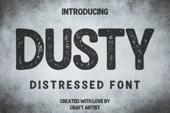
22. Dusty
Dusty font is a powerful, rugged display typeface that utilizes a heavy, integrated distressed texture to evoke a sense of age, grit, and authentic, vintage wear-and-tear.This bold, all-caps Distressed Font has a slightly rounded, block-like structure that ensures excellent readability, while the intentional noise and speckling within the letterforms give it a genuine stamp or screen-printed aesthetic.
View Font →
Using Graffiti Bubble Letters Without Looking Like a Costume
Let the baseline move. Real throw-ups do not sit on a ruler. A slight rotation reads as authentic where perfect alignment reads as clip art.
Keep the colour count low. Two colours is the traditional formula and still looks strongest. Gradients date fast.
One loud font per layout. Pair it with something plain for the details. Our guide to streetwear logo design applies the same principle to apparel.
Questions People Ask
What is the difference between plain and graffiti bubble letters?
Plain bubble letters are soft and symmetrical. The graffiti version carries marks of fast hand execution: uneven weight, tilted baselines, connecting strokes and a heavier outline.
Do these fonts include lowercase?
Most do, though graffiti bubble letters lowercase sets vary in quality since the tradition is capital-heavy. Check the sample image for a lowercase word before buying.
Why do graffiti letters use an outline?
Practicality. An outline lets a fast fill stay inside the shape and makes letters read against a busy background. Digitally it does the same job over photographs.
Are graffiti bubble letters still current?
The style has been in continuous use for over fifty years, a longer run than almost any other display trend. It cycles in and out of mainstream design but never fully leaves.
Can I use graffiti fonts commercially?
Check each licence. Most Creative Fabrica fonts permit commercial use, but terms vary by designer, especially for merchandise.
Want more options? Browse the full Creative Fabrica font library →